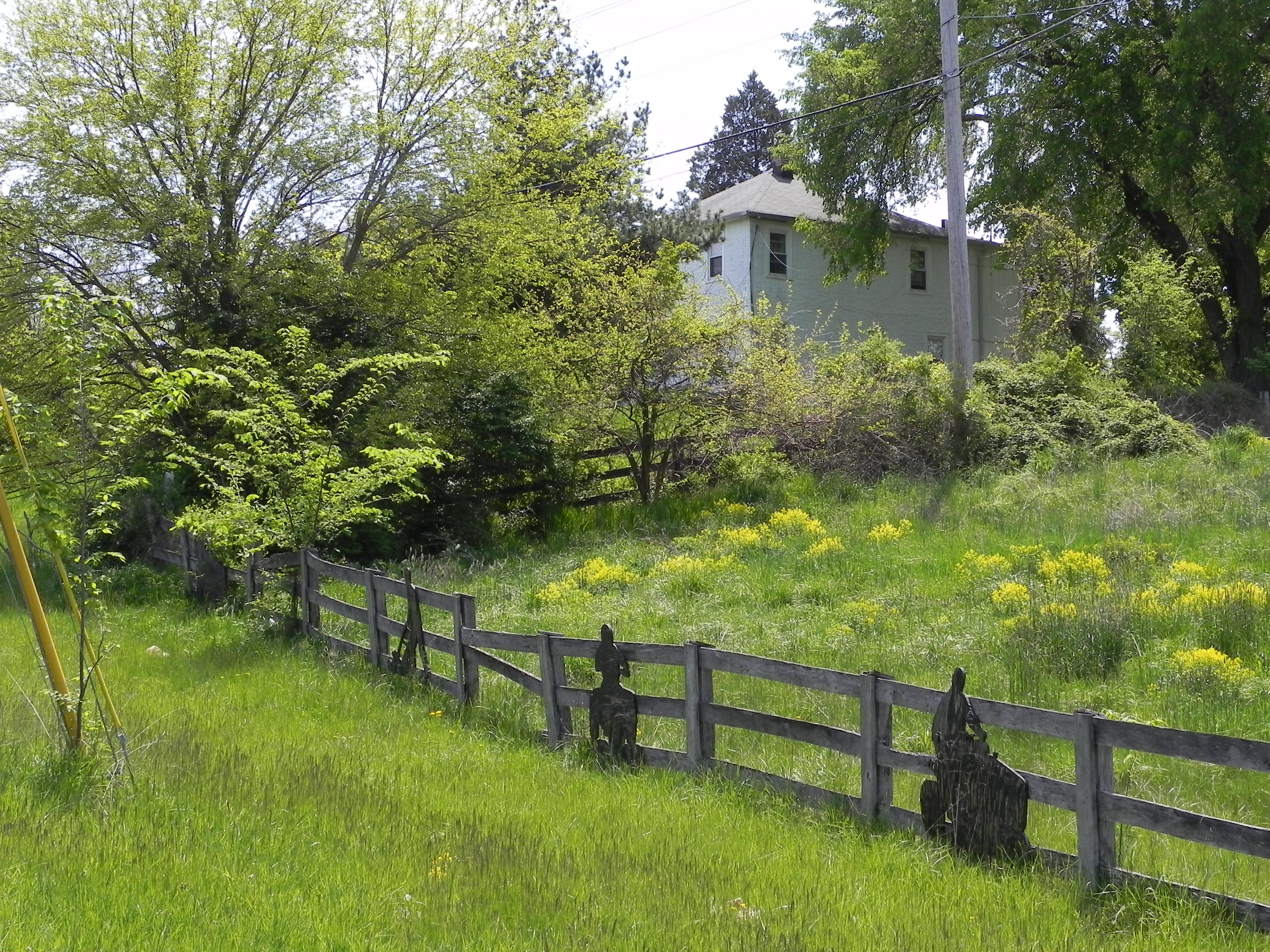
Reference photo of house on corner of 355 and Comus Rd.
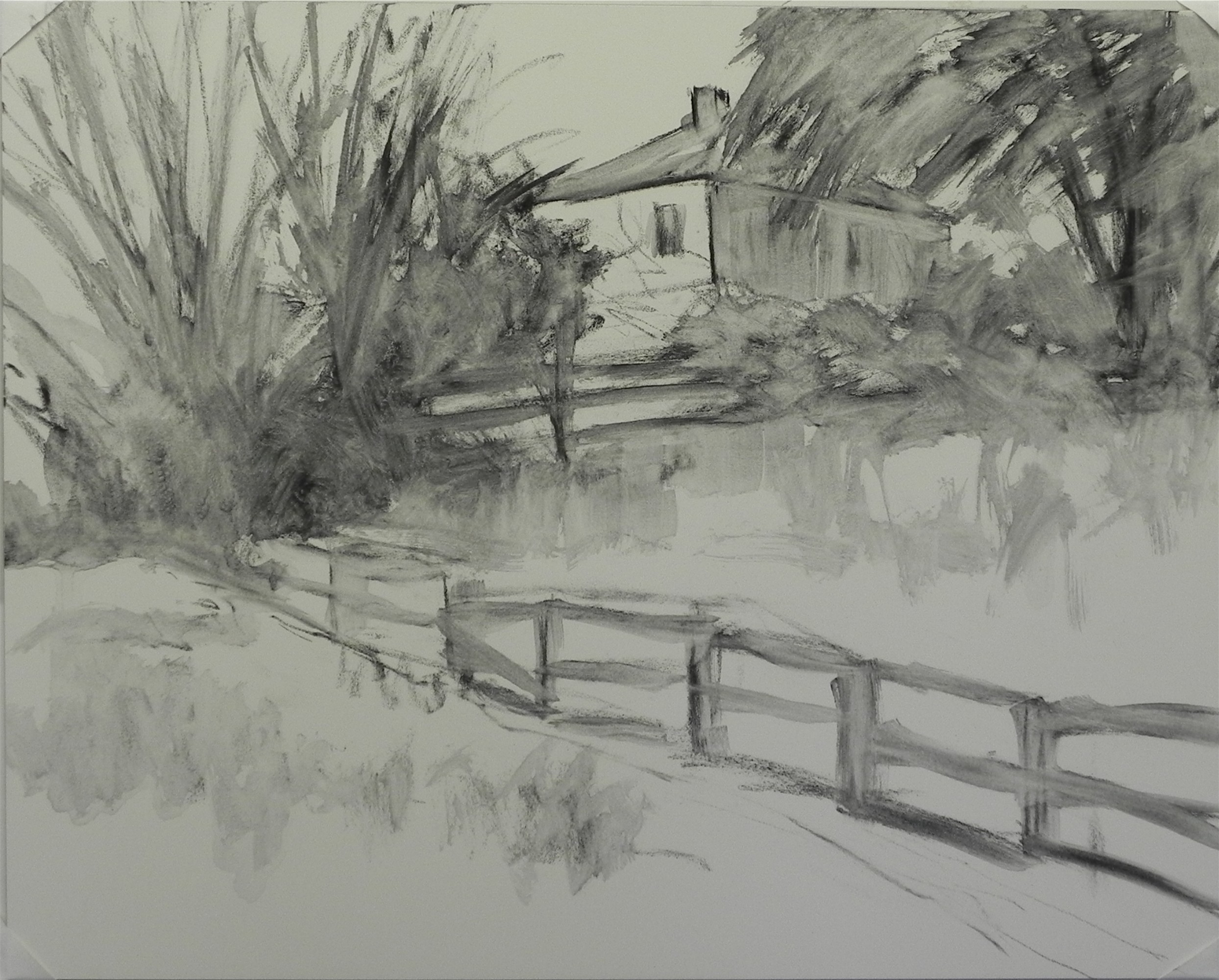
Charcoal wash lay-in on pastelbord
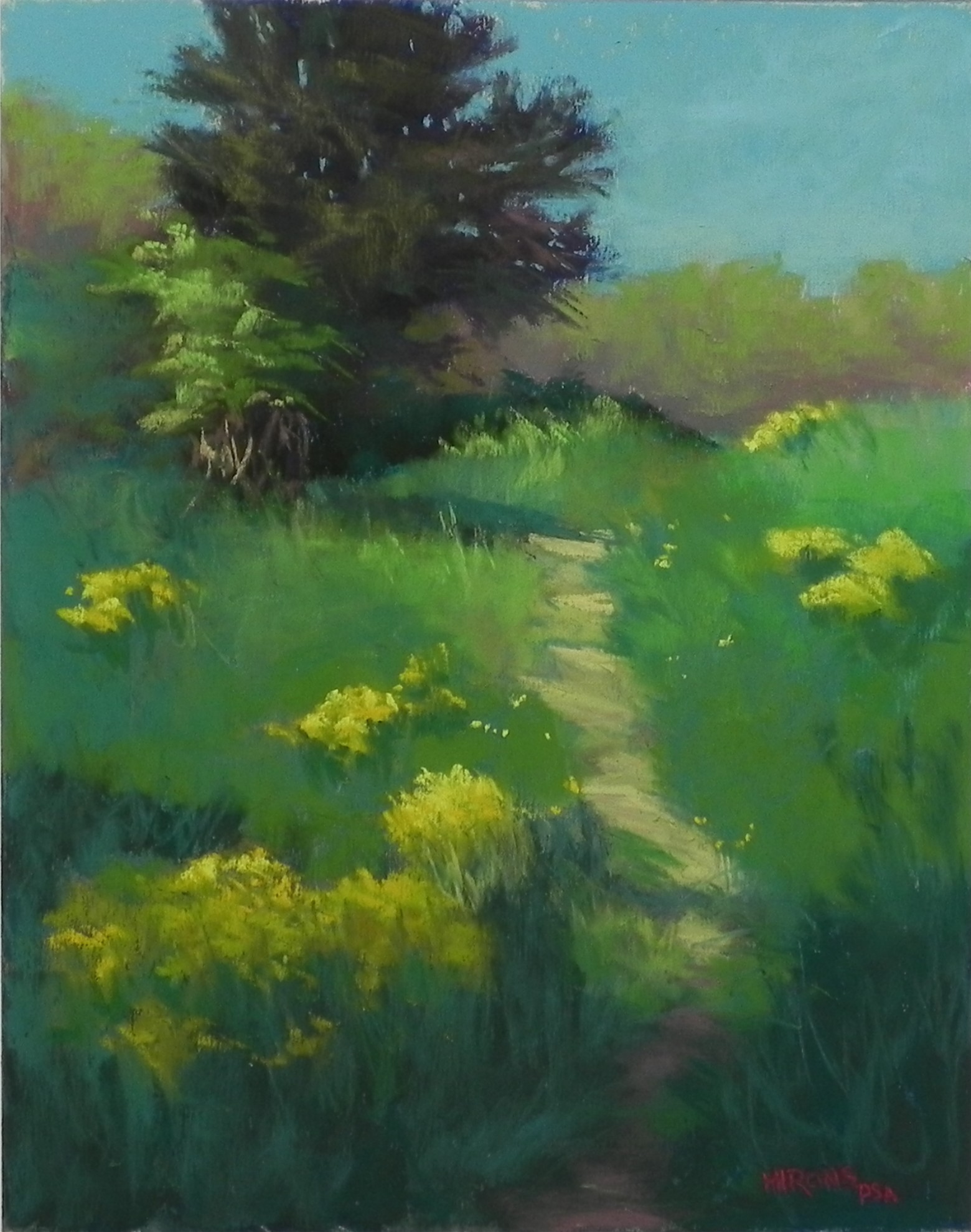
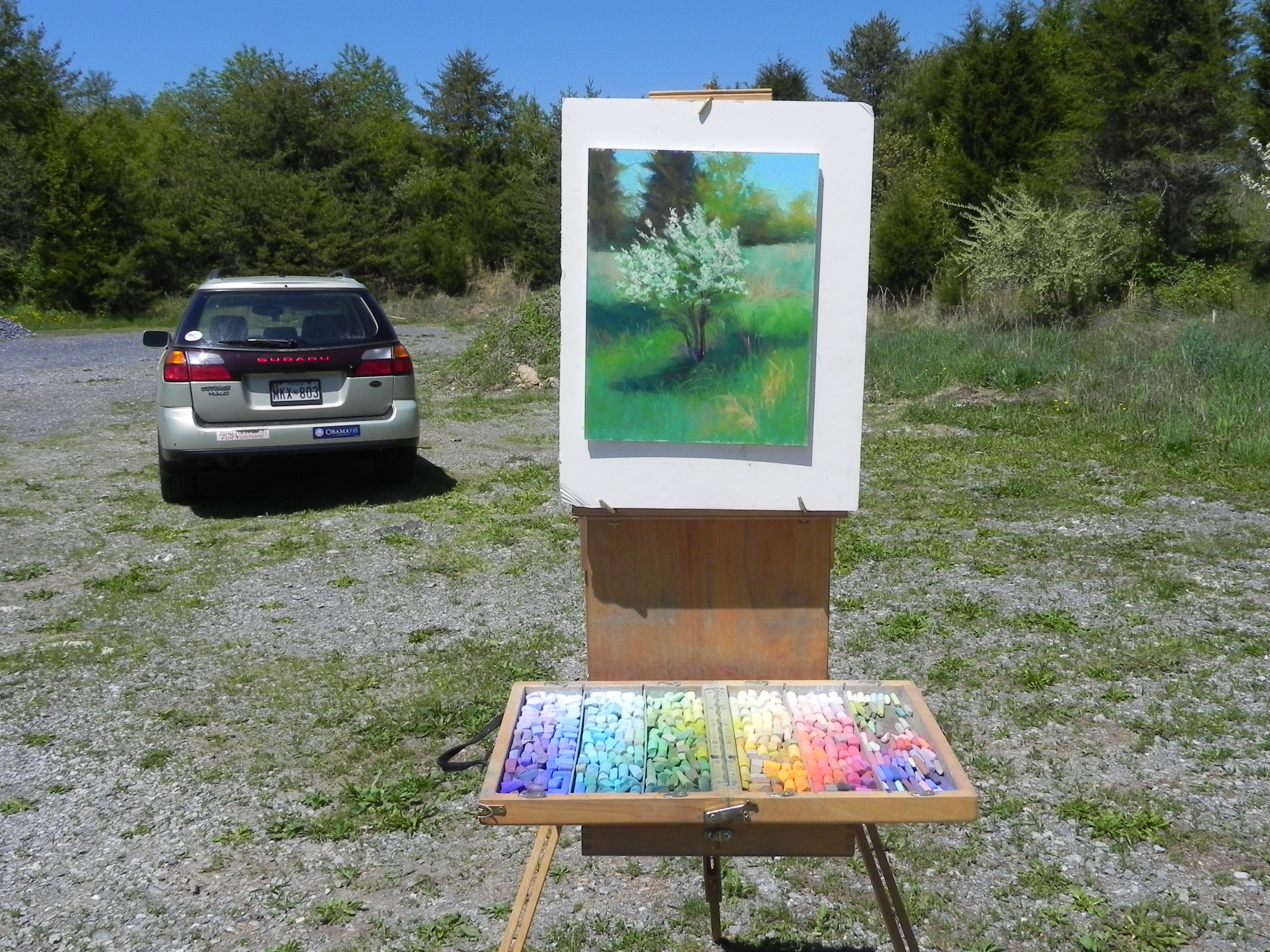
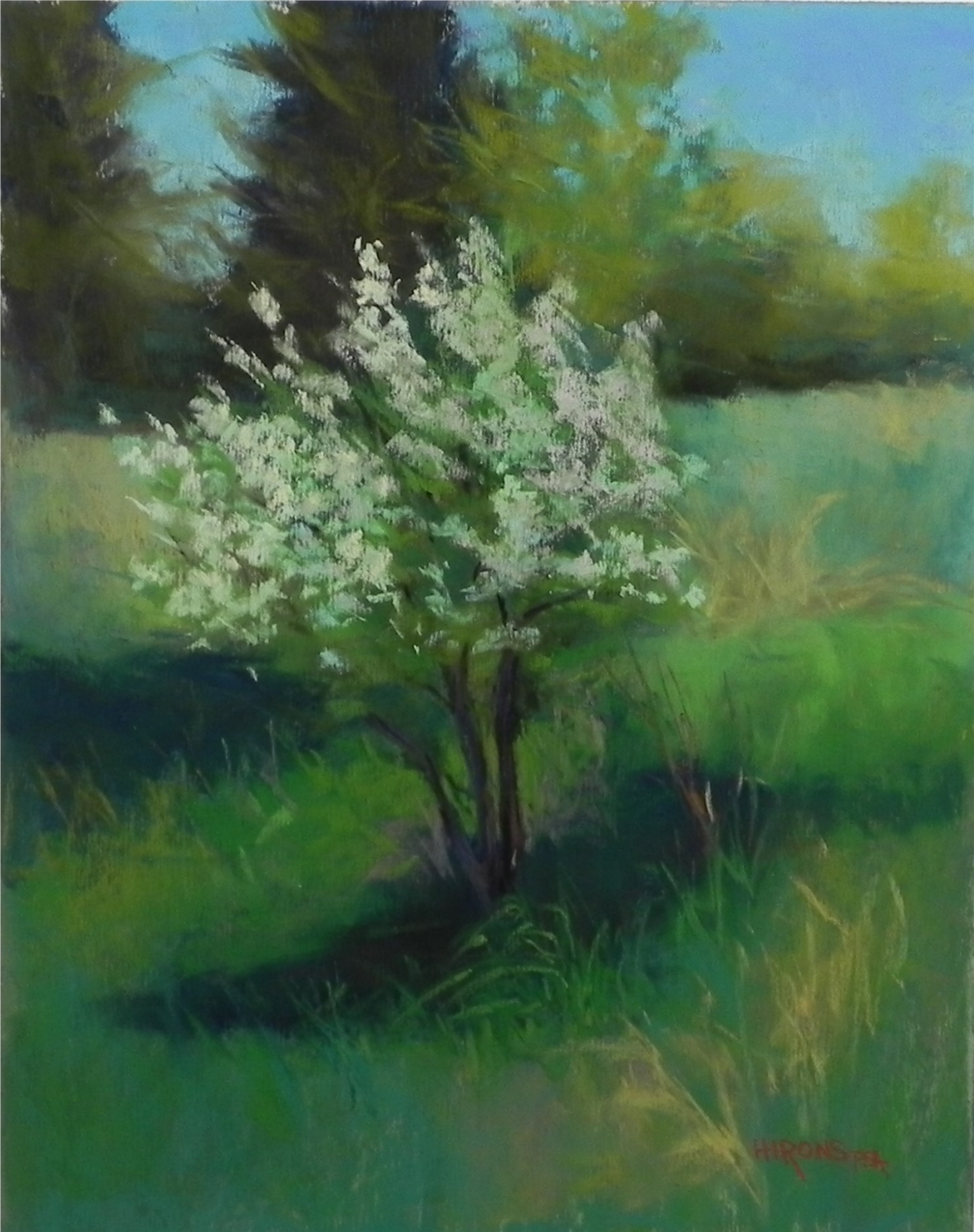
It’s going to be a cold, wet week, with no chance to paint outside. But on my way home from painting on Friday, I stopped to film a favorite house that I’ve always wanted to paint. I love the way it sits up on the hill and the triangle created by the fence. What struck me this time was the lovely little locust tree surrounded by dark foliage and located just where the fences come together. The wild mustard also adds a little extra color and there is bugle in the foreground that I’ll make more of. I knew right away that this would be a 16 x 20 on Pastelbord and that I would treat it similarly to my painting On the Road to Jackson. I started with charcoal to rough in the house, fence and foliage. I thought about leaving out the lower fence and adding it after the underpainting, but it is too critical to the composition and I wanted to get its location right. I need to change the length of some of the sections, but I’m happy with it’s positioning.