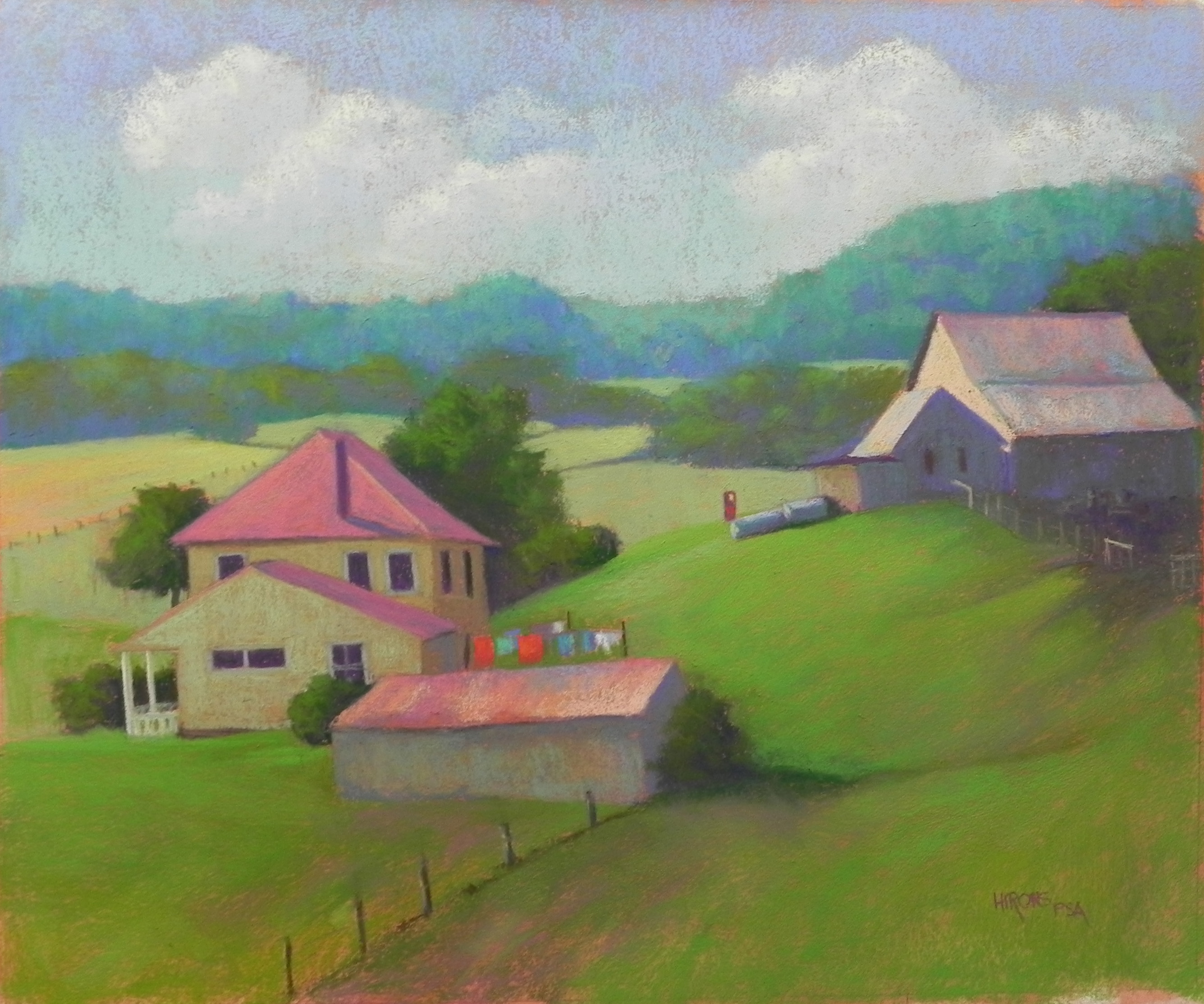
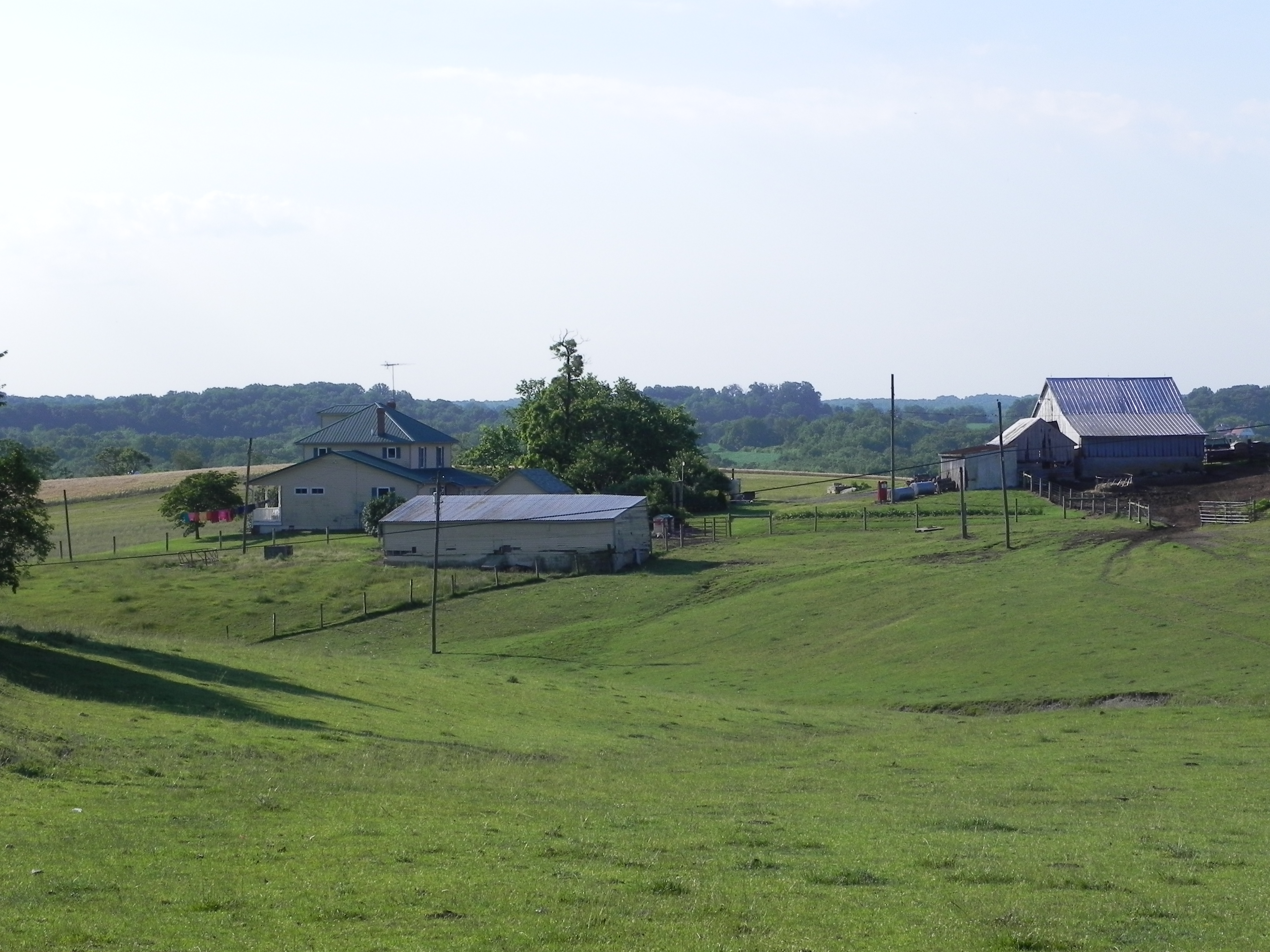
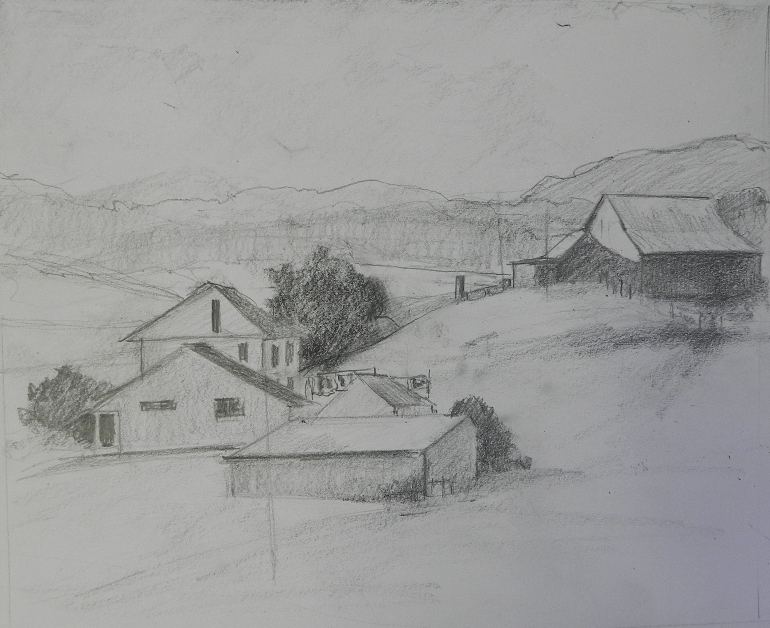
I’ve just been revising the picture and nitpicking it to death! I first attacked the clouds on the right. I had two identical cloud shapes which I really didn’t like. I removed a small chimney from back of the house roof that was confusing. I also decided to darken the roofs and back of house that were away from the sun. Add cooler blue violets to the roofs, then some of the original magenta back into them. I think they look better and relate better to the building on right. Another thing that was bothering me was the porch at far left. I darkened it and added only small hints of light on it, as well as straightening. And I did a lot of other little stuff! This is what finishing a picture is like. It’s never really done until it’s framed, but I do try not to play with them too much once I consider them done. What’s interesting is how easy it is to see things I don’t like once I film them. When I’m trying to decide when a piece is done, I ask myself honestly whether anything is bothering me. If I was about to sell it would I be embarrassed by anything? Too often I haven’t done this and have been sorry once the painting was framed. Hopefully, I’ve caught the problem areas in this piece. Note: there is actually more room on the right–the roof isn’t touching the edge but every time I film it it seems to come out this way! I give up!!!
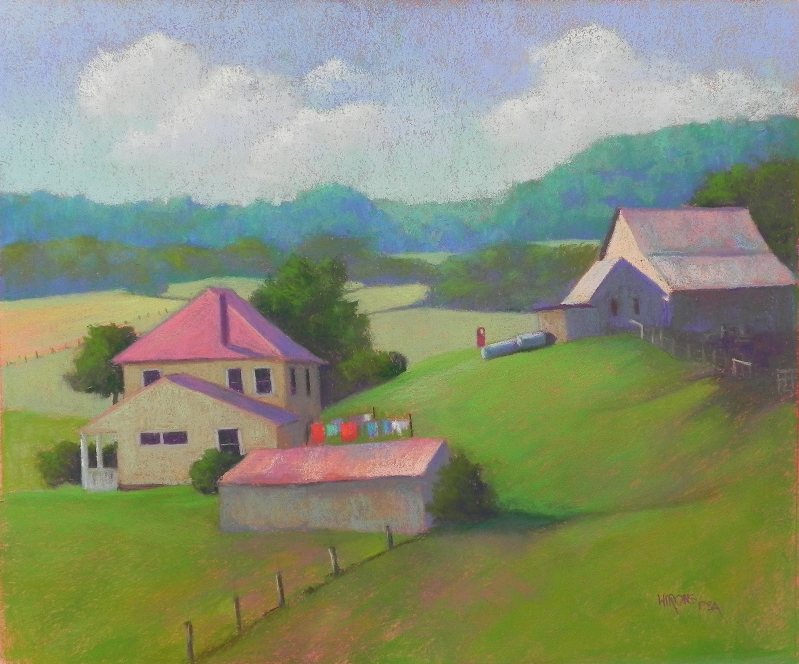
Hill Farm, 20 x 24, Rives and Colourfix liquid primer