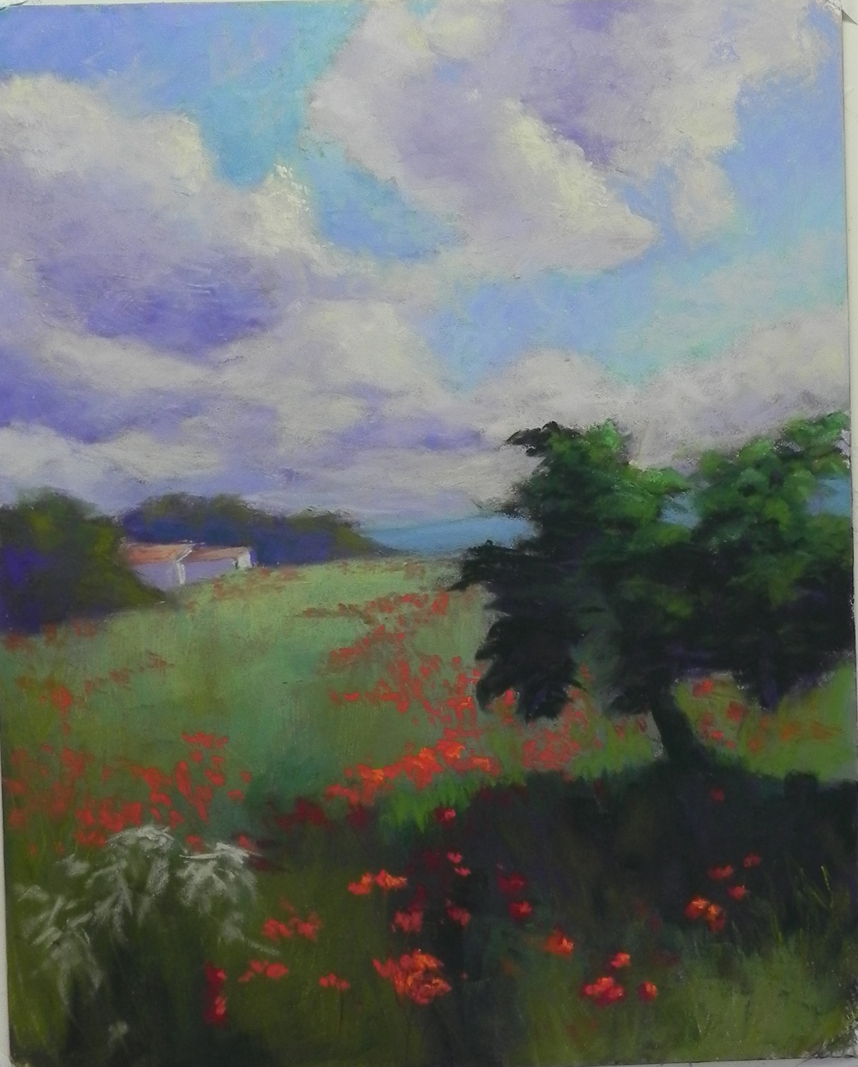
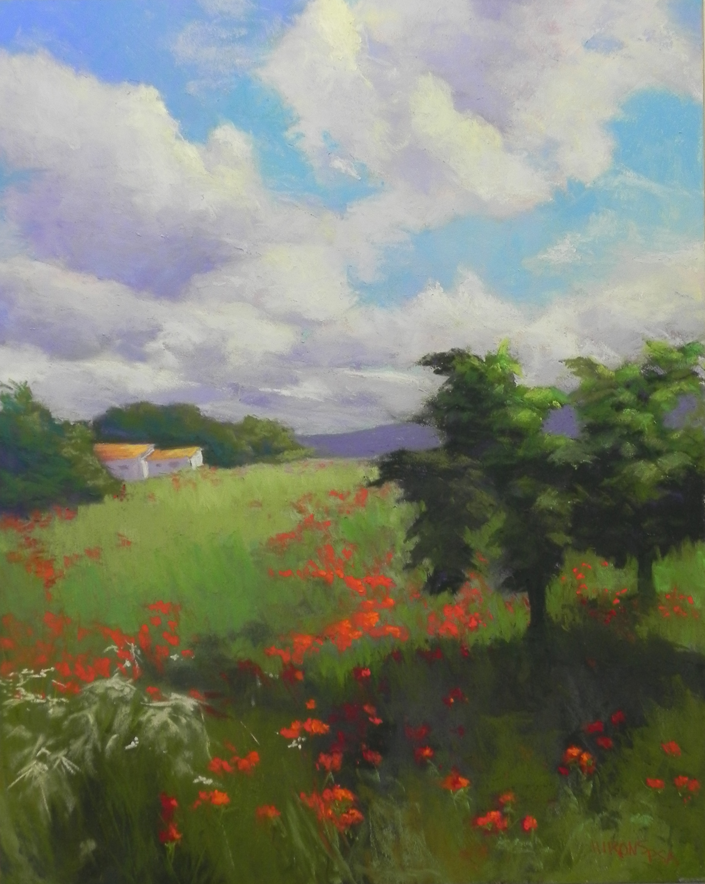
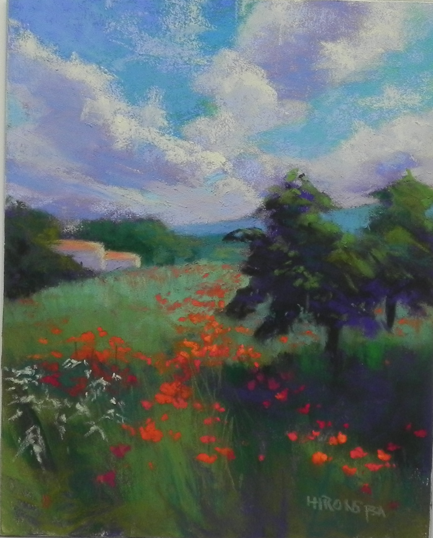
I did some more work on this picture and decided to share the final version with you. I took it too the framers this morning, so now it really is final. I worked more on the sky, particularly the lower left to break up a rather strong diagonal line. I also did a lot more with the trees and lightened the shadow beneath. And of course, did some more work on the poppies.
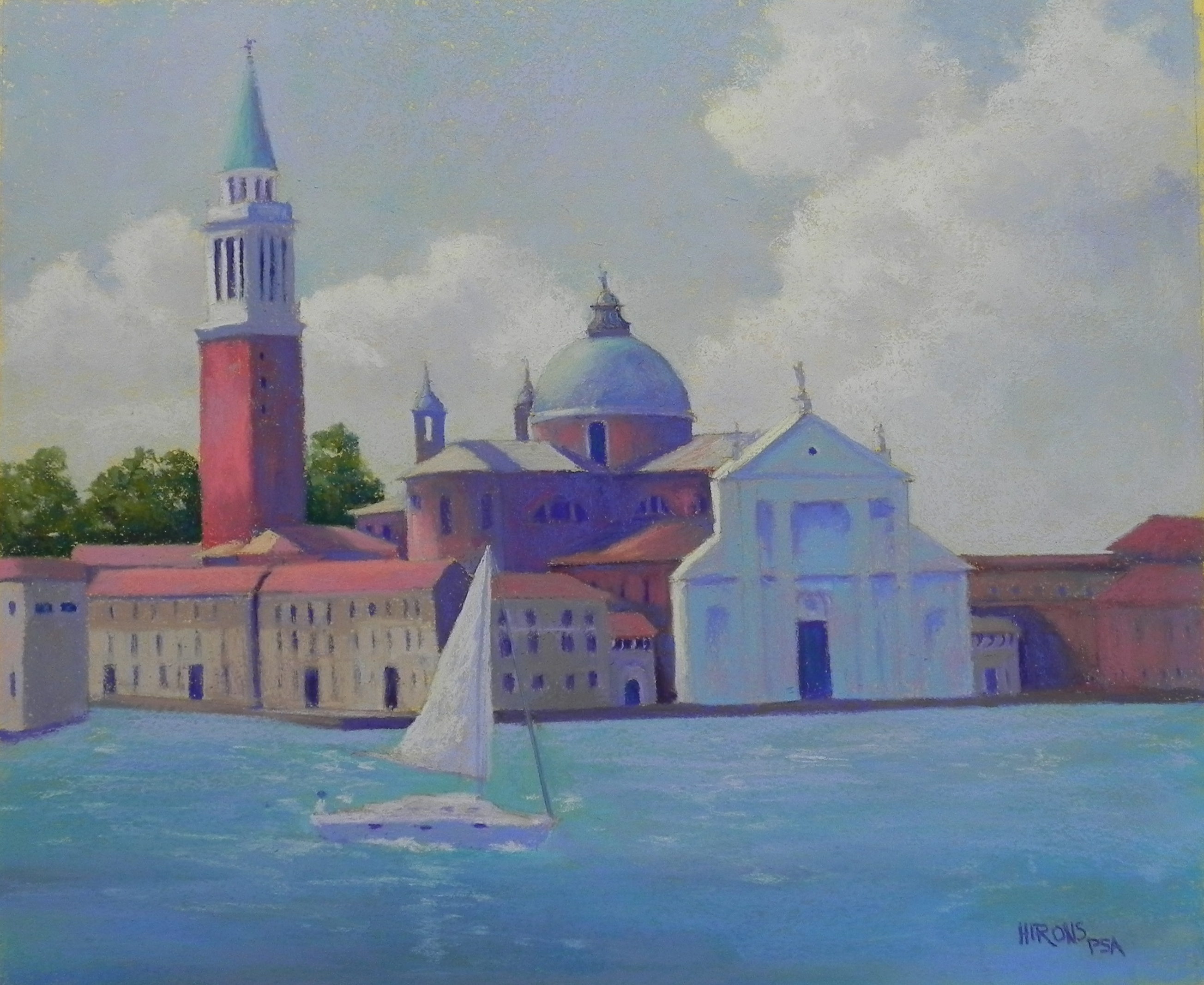
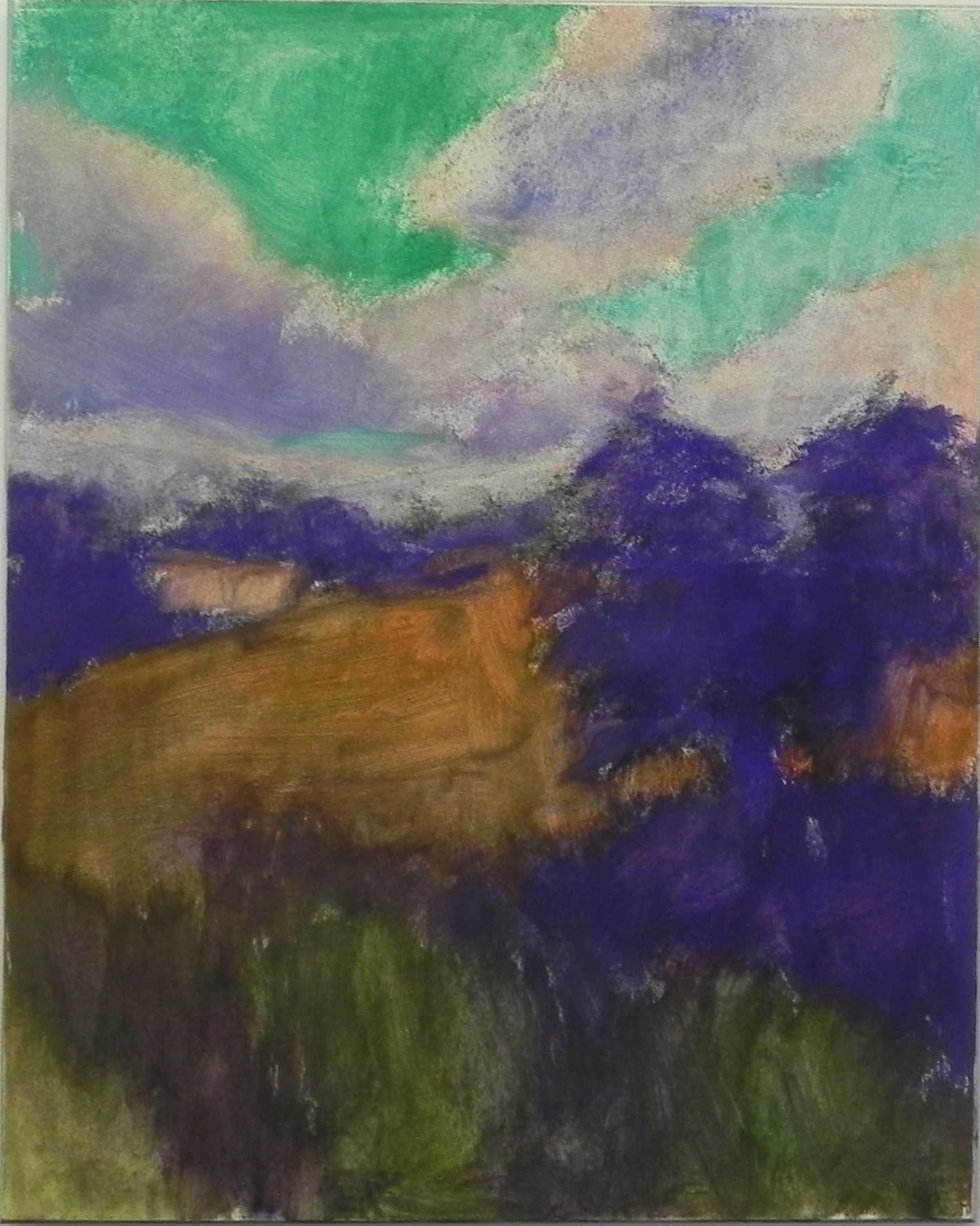
I thought I’d share what I’ve been going through since last Saturday morning, the day I did the demo. I learned in the morning that my mother had collapsed, probably from a stroke and was in the hospital. I did this demo, not having a clue as to her status, and it all seemed so unreal. When I got home that day, there was a message from my sister Marcia saying that the hospital told her my mother was “brain dead.” But then my sister Carol called and said that my mother knew them, thanked them, and was certainly not brain dead! On Sunday Marcia went in and my mother was cheerful and had regained the use of her right hand. That cheered me up.
Then on Monday, Carol called to say that my mother would have to go to a nursing home. This was the worst thing I could imagine. My mother is 95, but very intelligent, vibrant, and interested in life. I cried all day. But my mother has made wonderful progress and will be going to rehab, then to assisted living. This means having her own apartment AND her cat! She is very happy about it and so are all of us. What a relief. I never thought that the words “assisted living” would sound so good!!!
I will be driving up on Saturday and will visit her most days. I am so thankful for her strength and good nature. She has a lot of therapy ahead of her, but she’s already able to string together many more words. AND –they have equipped her with a hearing device so that now she can hear much more normally. Deafness was the most serious problem she had prior to this. Thanks for “listening” and for all of your support. I wanted to share this with you.
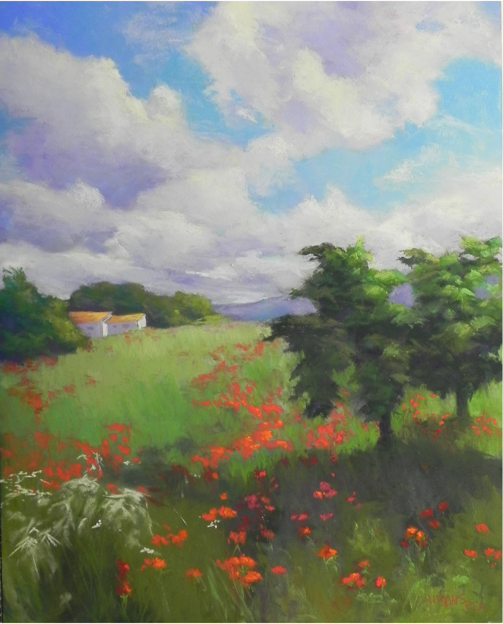
Poppies and Figs, 16 x 20, Pastelbord