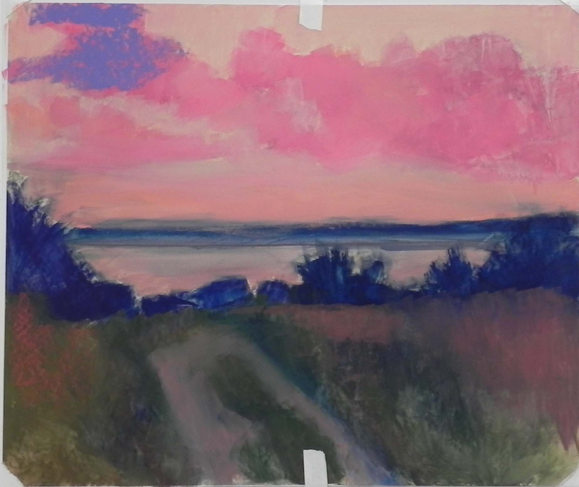
I spent today in the studio completing a painting I began working on last Saturday. I took a long time on the drawing and getting it right on the paper. Yesterday I did the underpainting and lost some of it! But it was OK, I could still see the lines. Painting something like this is complicated because it’s hard to know where to begin. I decided that I needed to rough in the tree branch before doing the sky. But I needed to do the chimney and roof before the tree! I worked back and forth for awhile. In the second image, you can see the initial work on the house. I used light red violets in the trim and several soft yellows for the house. I was happy when I had covered up all of the blue! The hydrangeas were fun to do, as they were the only things catching any light. I decided to keep the sky in the grayed violet spectrum, to give the sense of an overcast day or fog (this is another Mattapoisett house).
The photo has a large tree/bush going up the entire right side of the picture. I didn’t want that. Instead, I added another, smaller and duller hydrangea, then a bit of lawn and some background trees. I struggled with the background a bit, but when I added violet over the cool greens and some very dull orange, it came together. I may work on the leaves some more, but for now I’m happy with it and thought I’d share it with you.
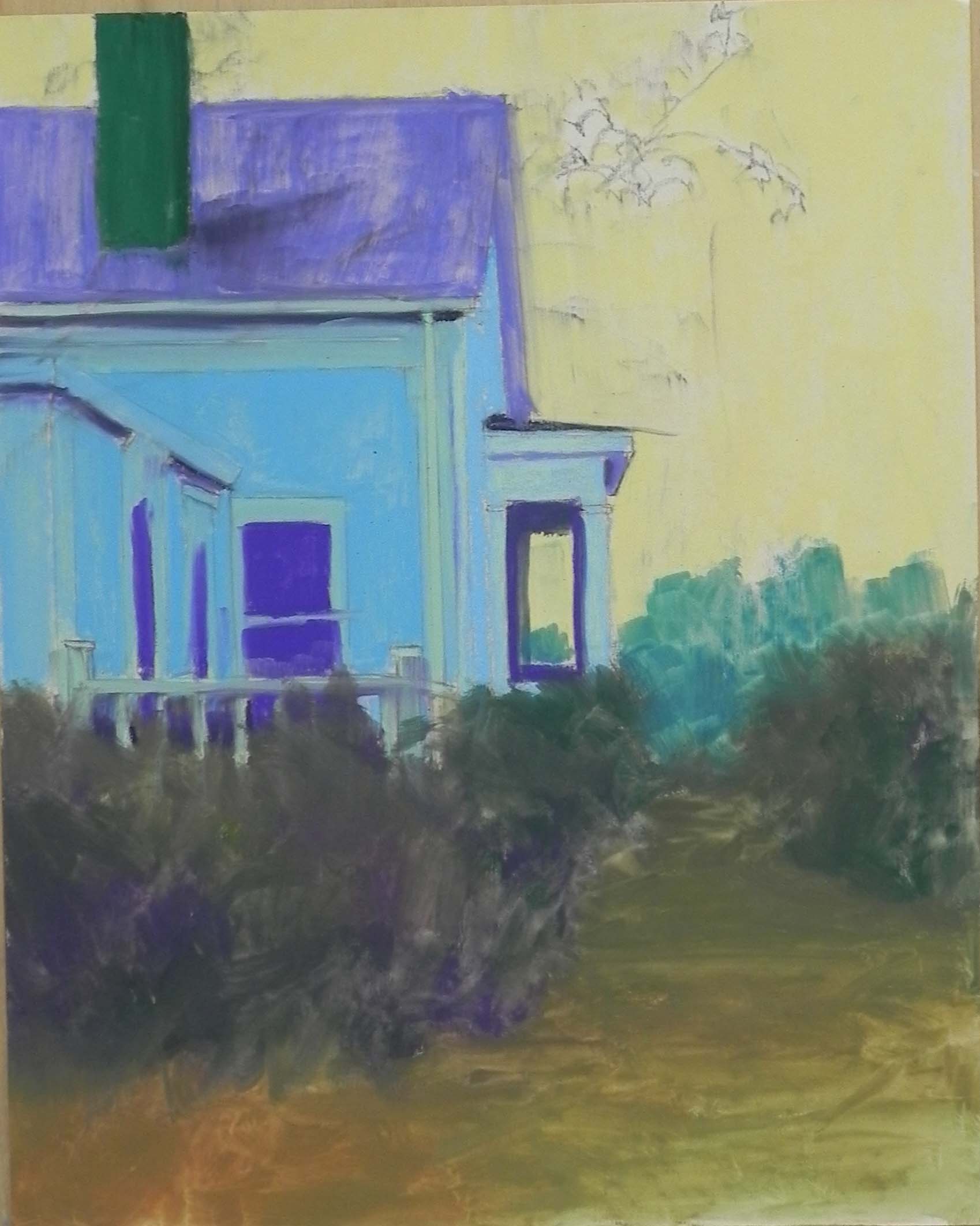
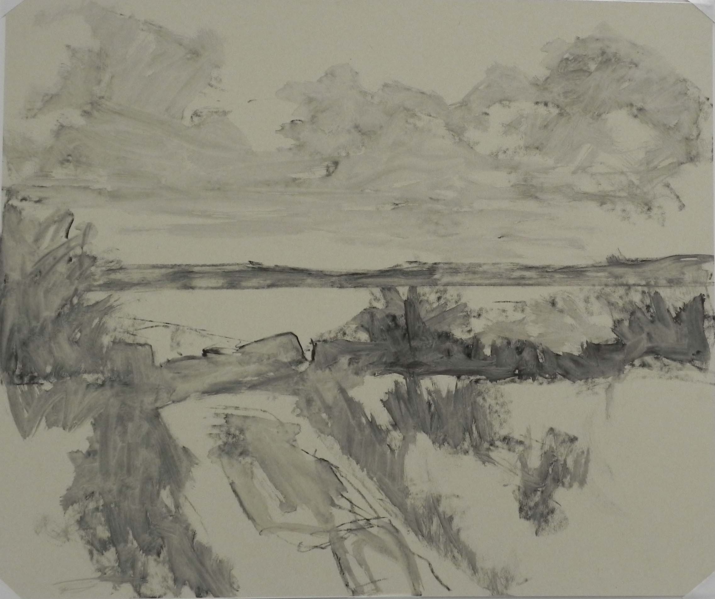
Hard pastel underpainting
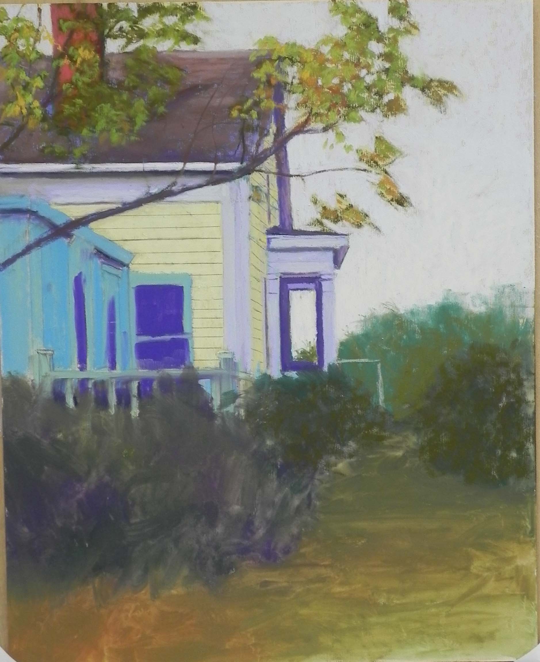
Partial completion of house
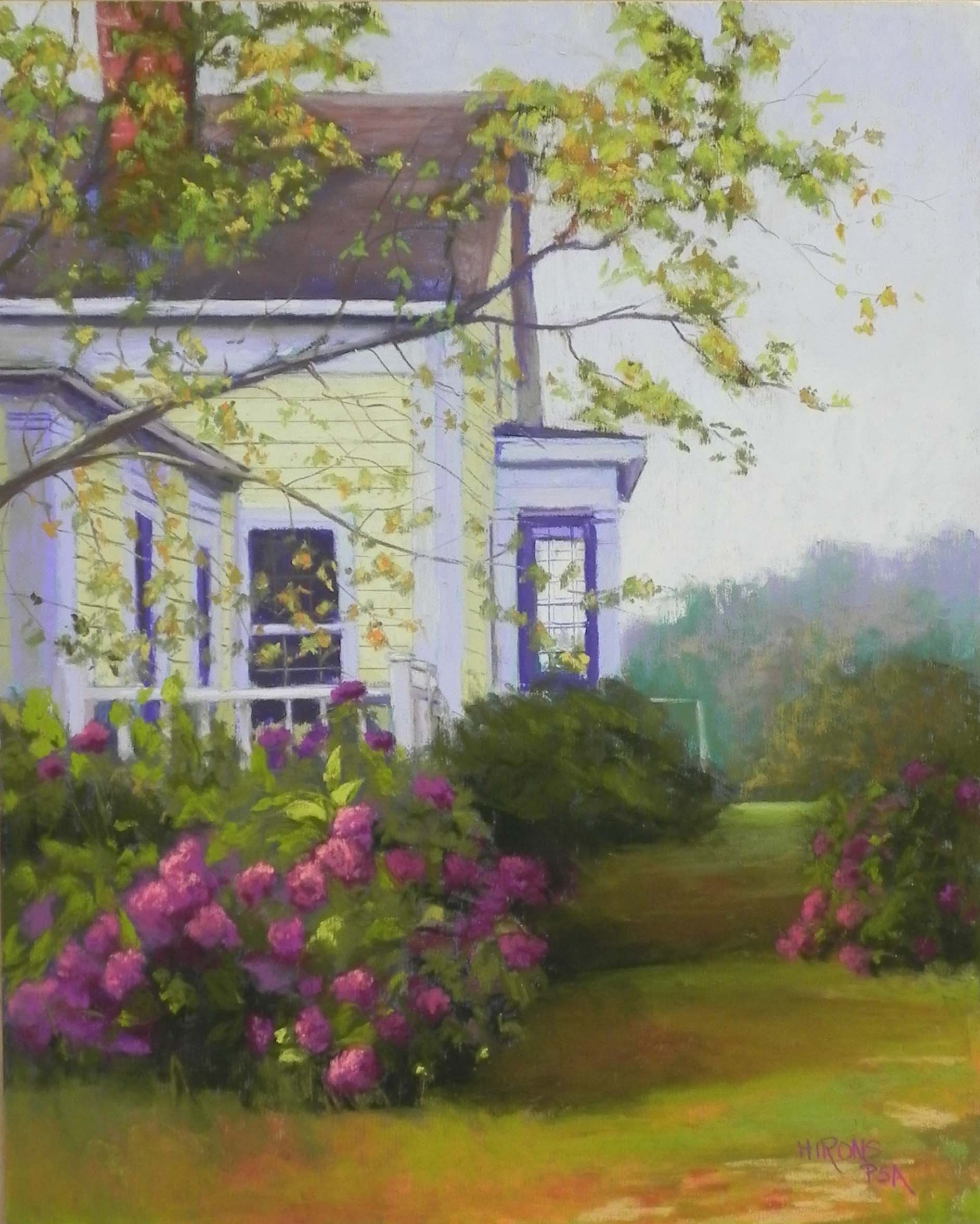
House with Purple Hydrangea, 20 x 16, UART 500