I’ve just shipped this painting to Kira Maas, the daughter of an old friend of mine for her wedding present from her mother. Sharon and I worked together in our very first library jobs in Massachusetts. They now live in Maine and Kira wanted a picture of their camp house with the lake in snow. There was too much at Thanksgiving and not enough at Christmas, but the reference photos gave me something to work from. As you will see, I had to make some serious adjustments! First, I decided to place the cabin closer to the lake and took out the large evergreen that is blocking the view. Then I changed the time of day and lighting so as to provide more interest and drama. The building is a light gray, not a color I use! So, by changing it to late afternoon light, I could use darker gray violets, and warm orange browns on the front. I also made up the shadows of the trees and added more snow! Making up shadows isn’t easy! I wanted it to look like the trees are below the ridge of a hill, rather than at ground level, as in the photo, since the cabin appears to be perched above the lake. The shadows are somewhat stylized, being made up, but I like the effect. The last addition was the signs on the left side of the house, with three names (one of which isn’t even there yet!). What really pleased me was that the sign for “Maas” has a yellow background, so I was able to carry some of the same color from the sunlit side of the house to the shadowed side! A small detail, but it keeps the color from being isolated. Best wishes to Kira and her husband and to all of you for a healthy and productive new years!
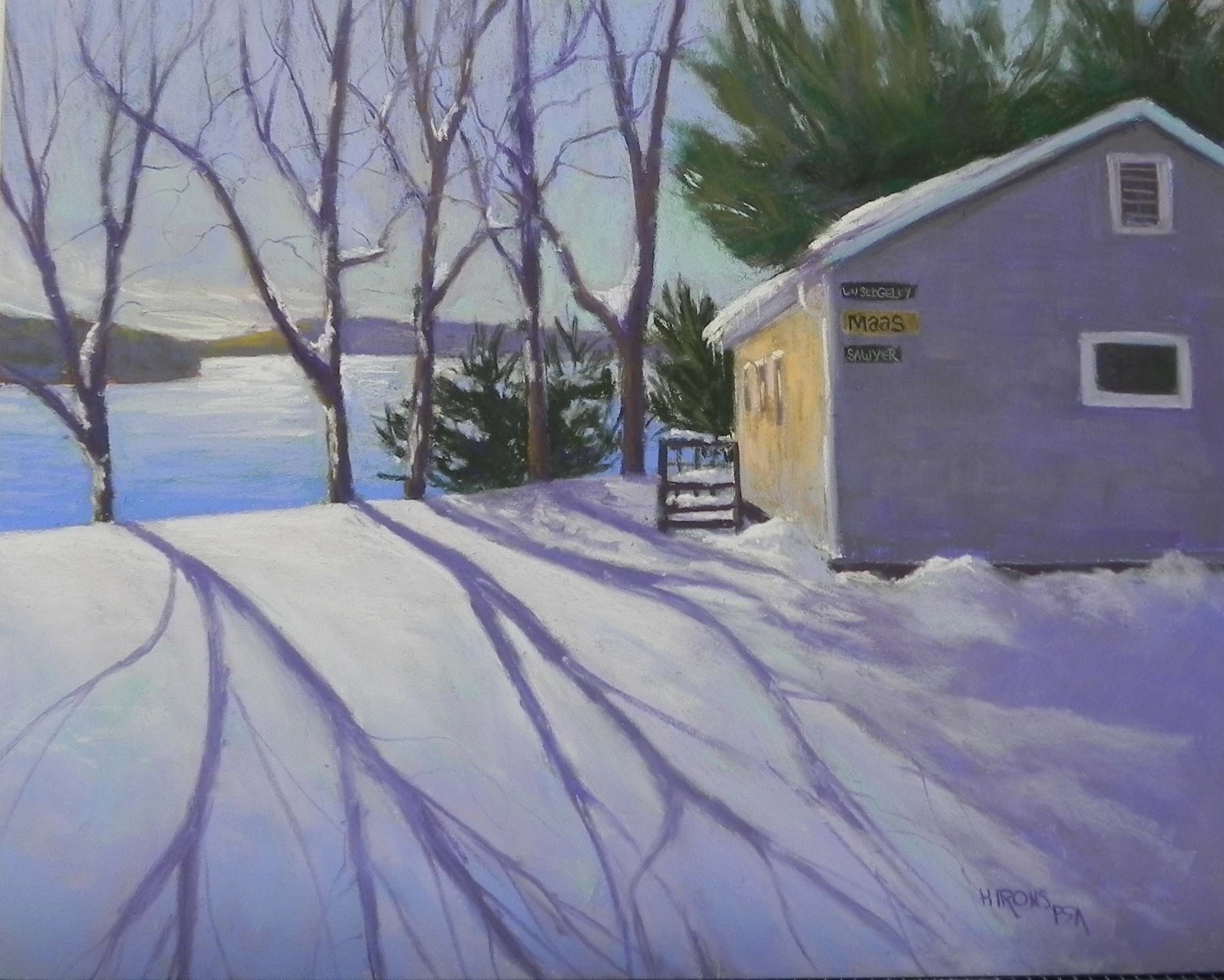
Long Shadows, for Kira Maas, 16 x 20, Pastelbord
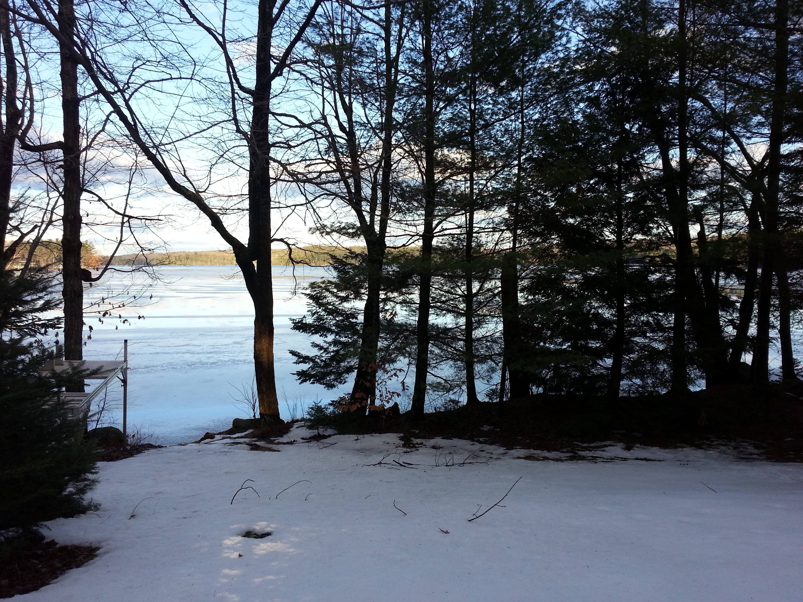
Reference photo of lake
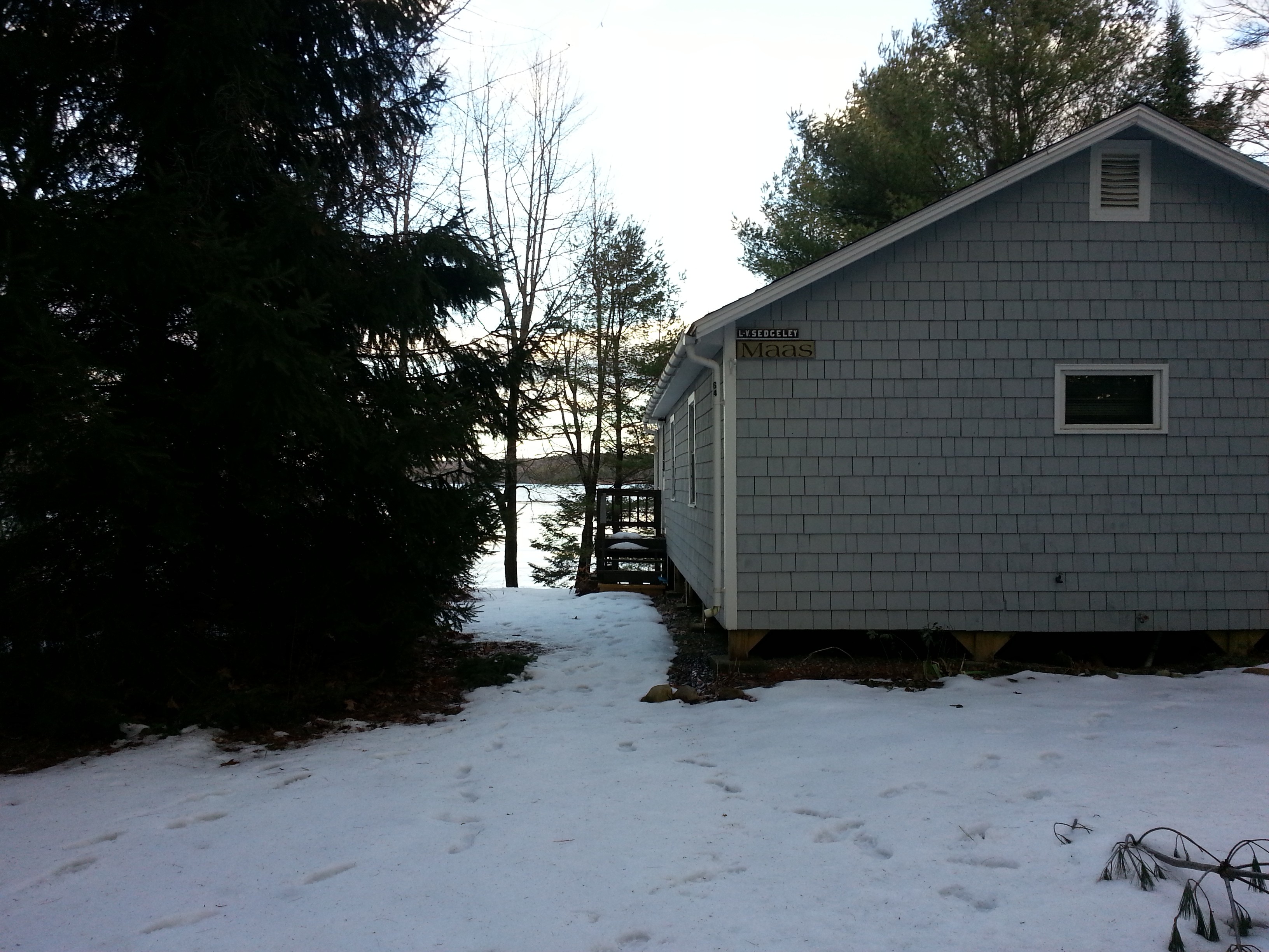
Reference photo of cabin