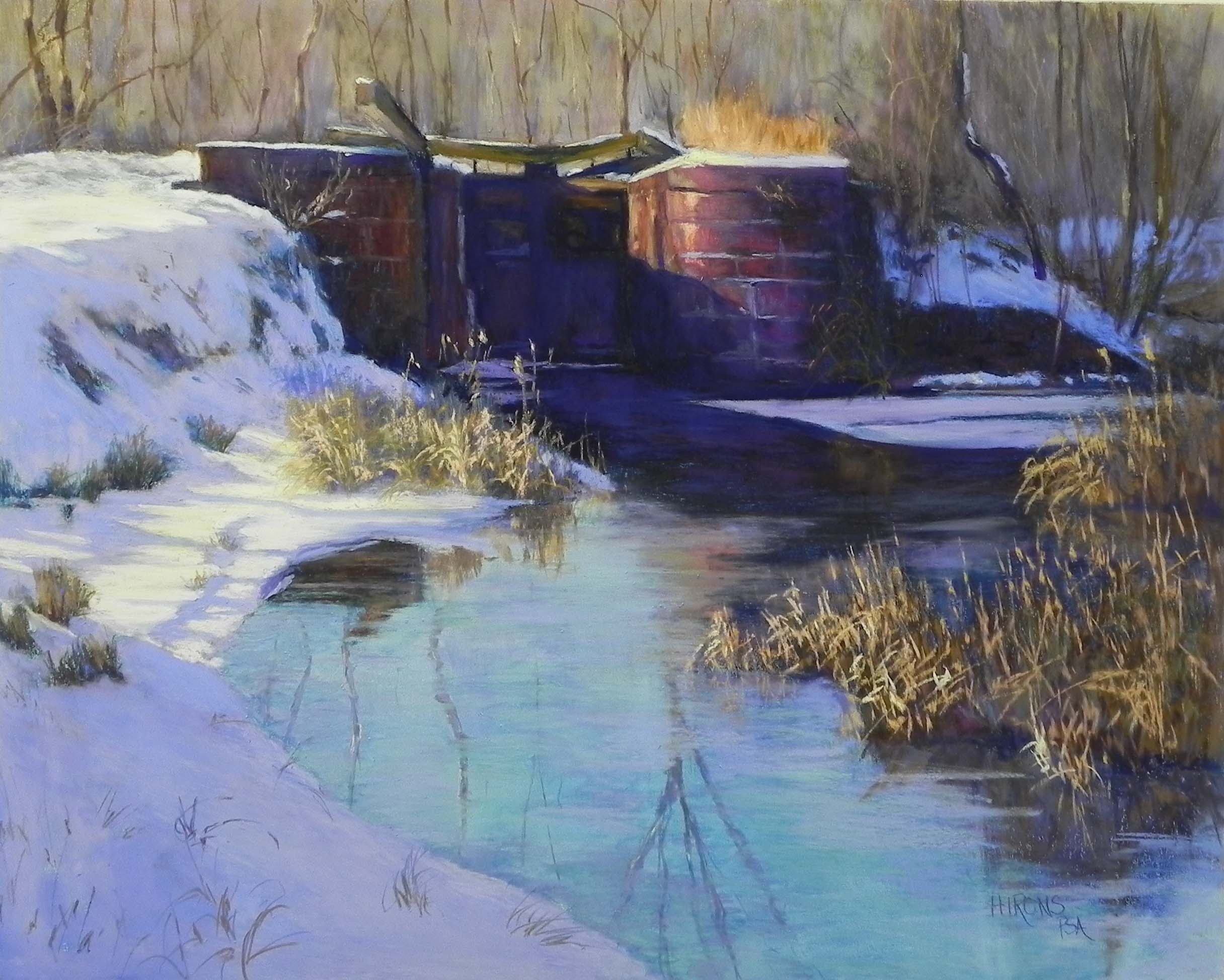
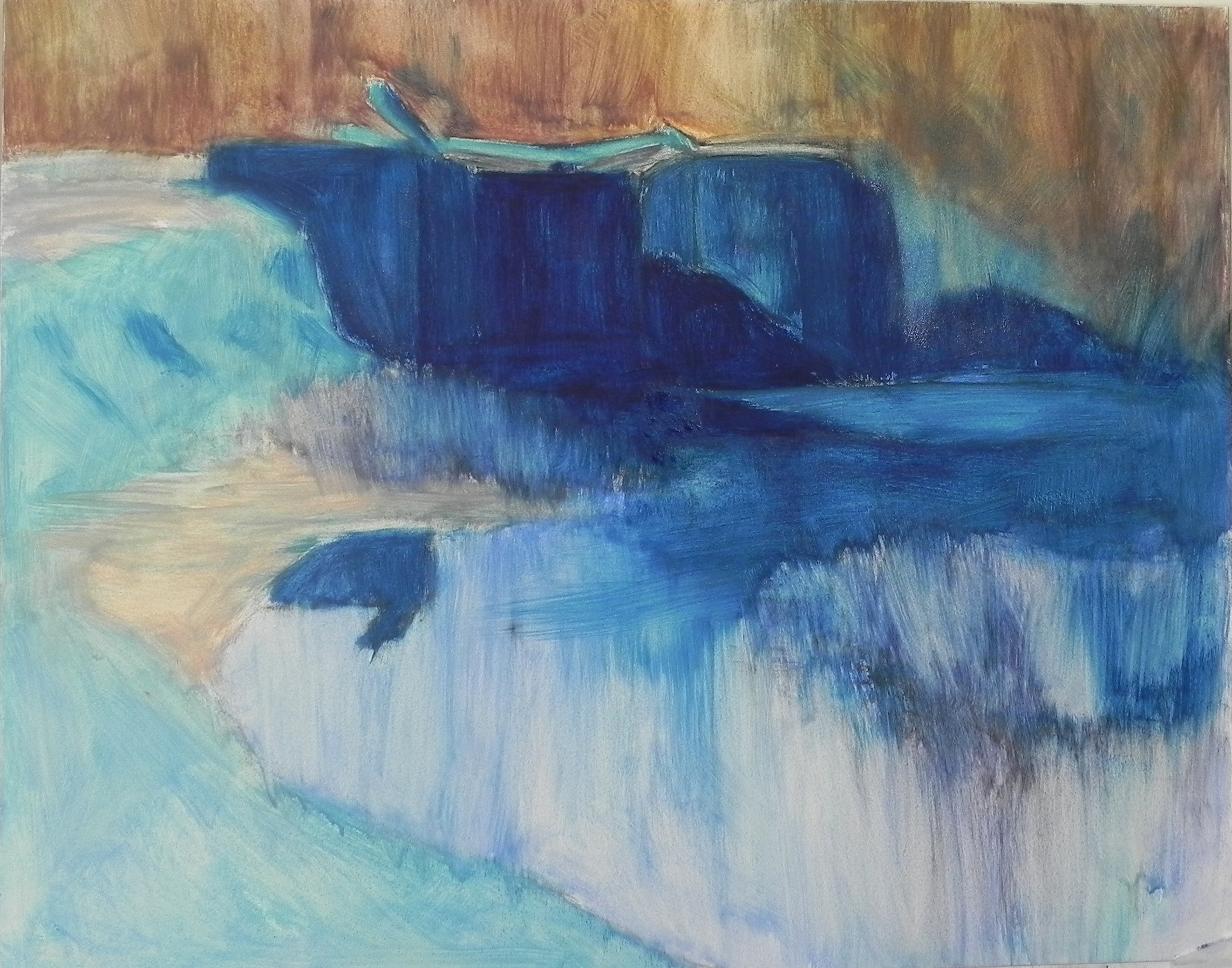
I’ve just spent several hours in my studio completing this painting that I began on Monday. It’s from my photo shoot at Great Falls on the 17th. I loved the position of the tavern and the tire tracks and shadows leading to the building. But the photograph was really dull: blue sky and gray snow. So I decided to work from the black and white photo. My original thinking was to make it be later in the day with yellow in the sky, playing against the violets in the snow. I wasn’t sure where to go with the underpainting, so I decided to begin by toning the board with burnt sienna watercolor. It faded very quickly! You can see it in the building in the underpainting. I decided I couldn’t proceed without an underpainting, so I used hard pastels and alcohol. I went warm under the trees, and used three values of blue greens under the sky. My thinking for the color scheme was that it would be blue violet, blue green, and yellow orange. I wanted the center of interest to be the wall of the tavern where the light is hitting it. I quickly realized that if the light was behind the building, there was no way that it could be hitting the front of it, nor would the shadows work. After observing several sunsets out of my dining room window, I saw a lot of green in the sky further from the sun and and also noted that the snow was still relatively light. So I decided to use various greens in the sky and use warm yellow oranges in the trees to indicate the light hitting them from the left. I made several changes to the composition–increasing the size of the building, removing a number of trees, and the benches and light posts. I did include several people walking on the path, in between the two central trees. I tried to integrate color by adding some cool blues in the shadows of the building and some warm brown in the shadows in the tire tracks. I used a combination of blue violet and blue green for the snow. The only yellows are in the edge of the track and in the building. I used one of the Art Spectrum tinted whites to do the paw prints in the lower right. I worked a lot on this picture, continually tweaking it until I finally decided it was OK.
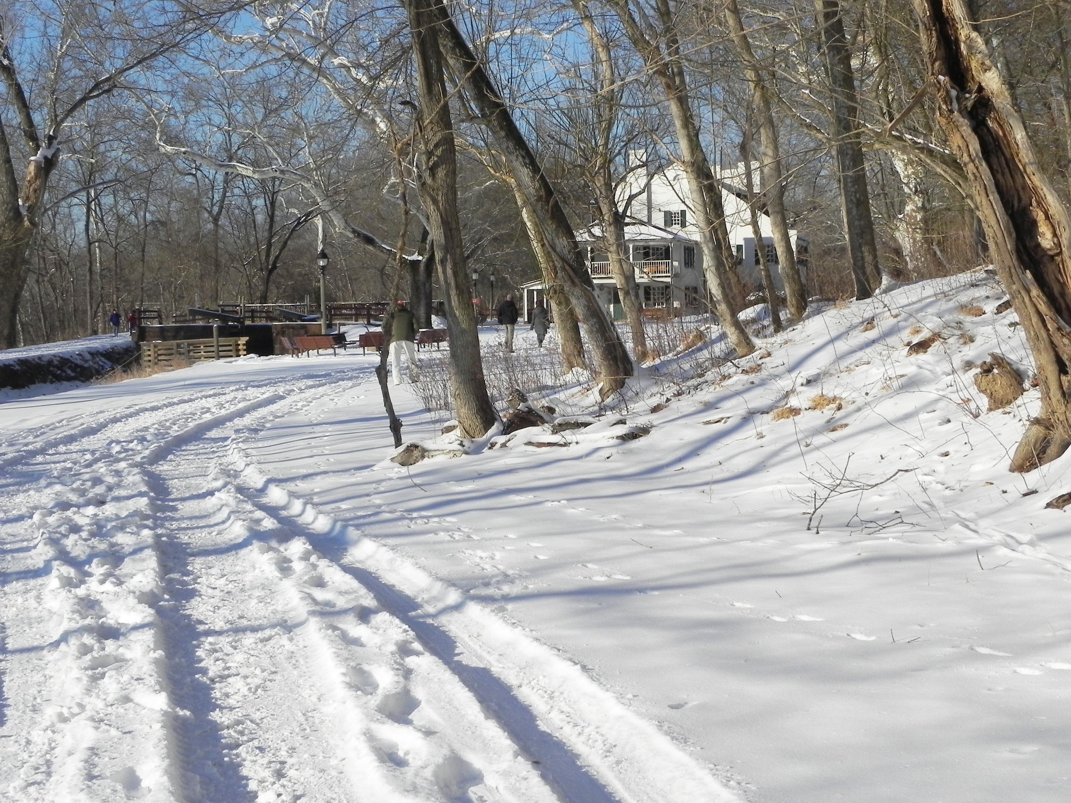
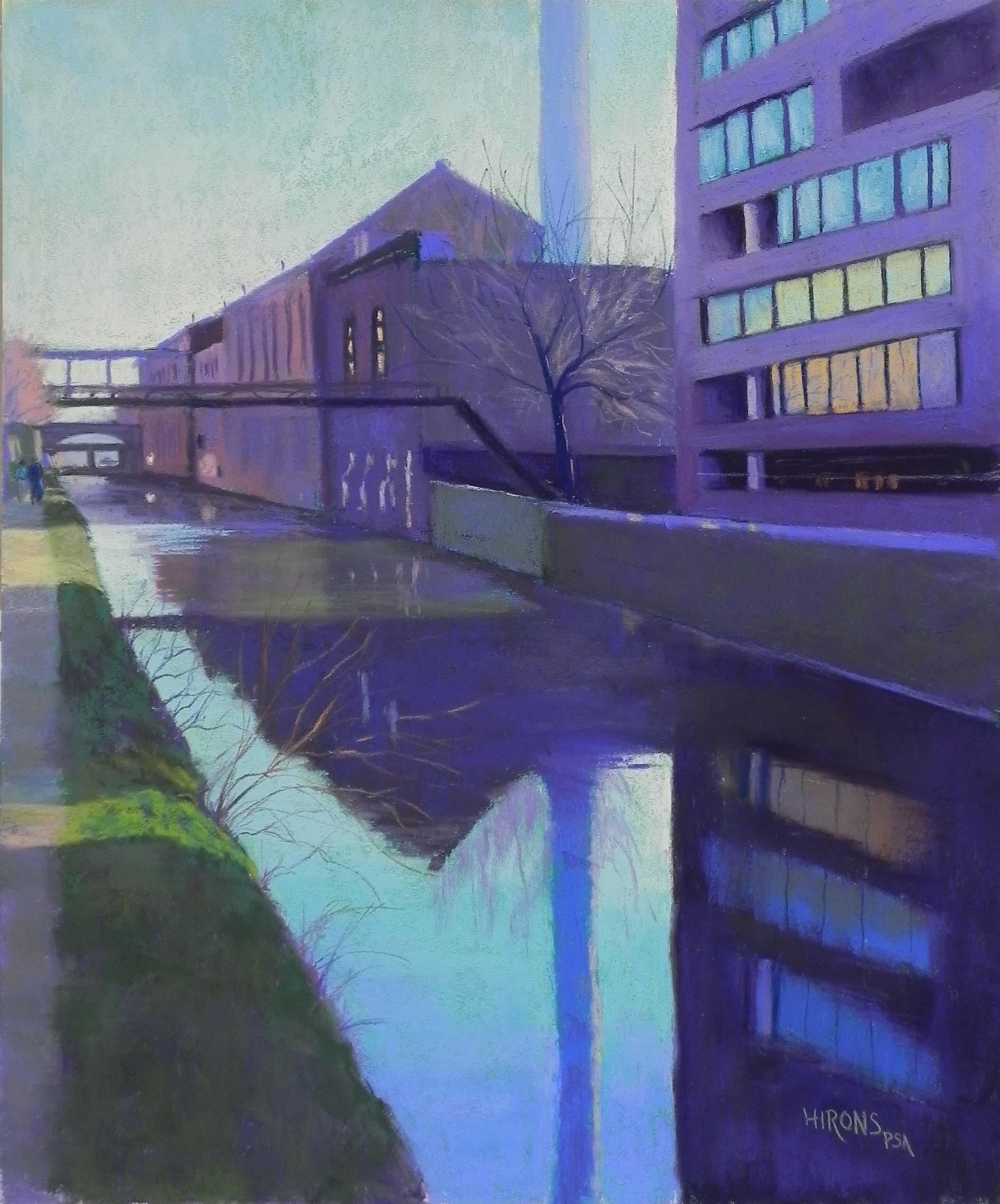
Reference photo
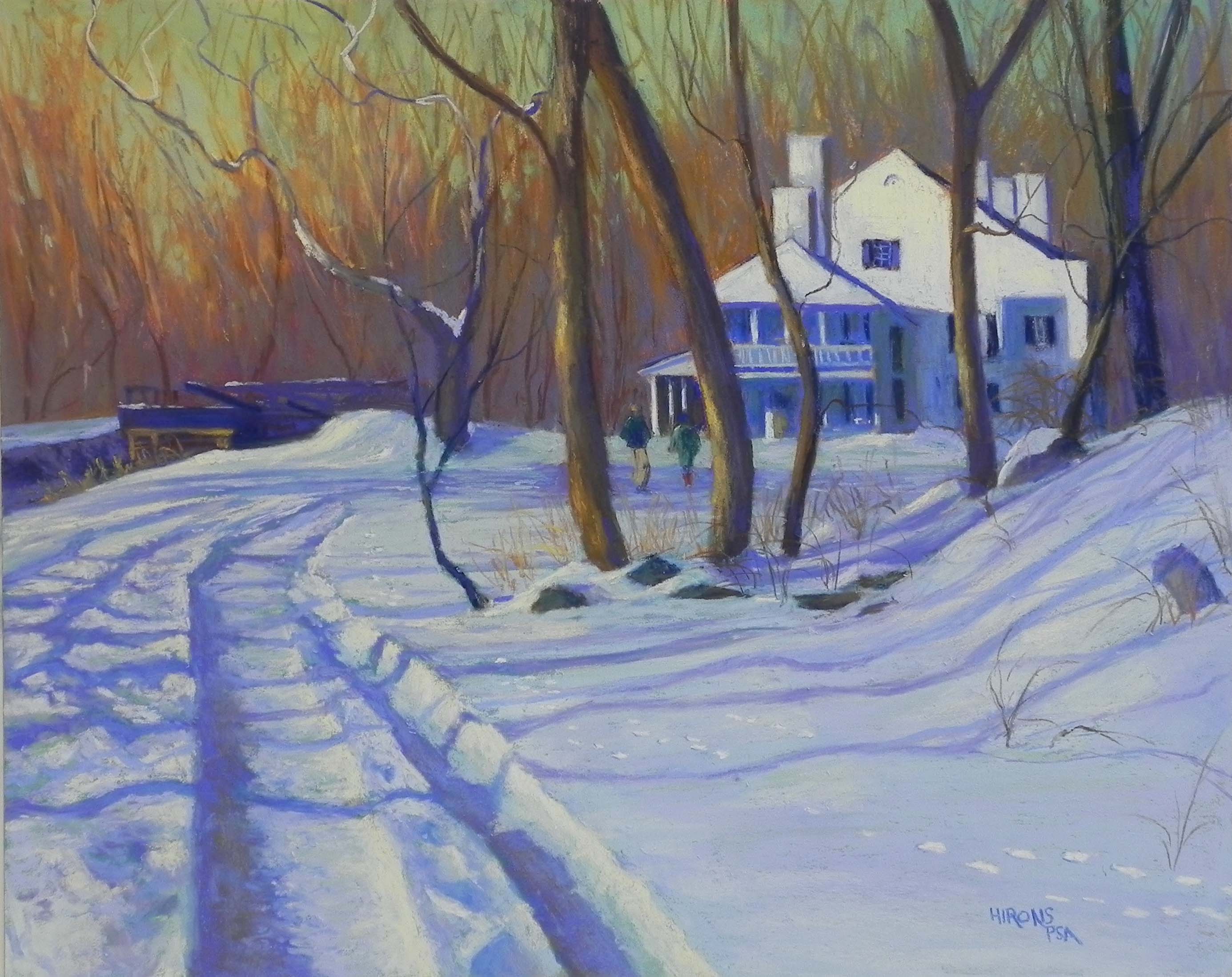
Great Falls Tavern in Winter, 16 x 20, Pastelbord
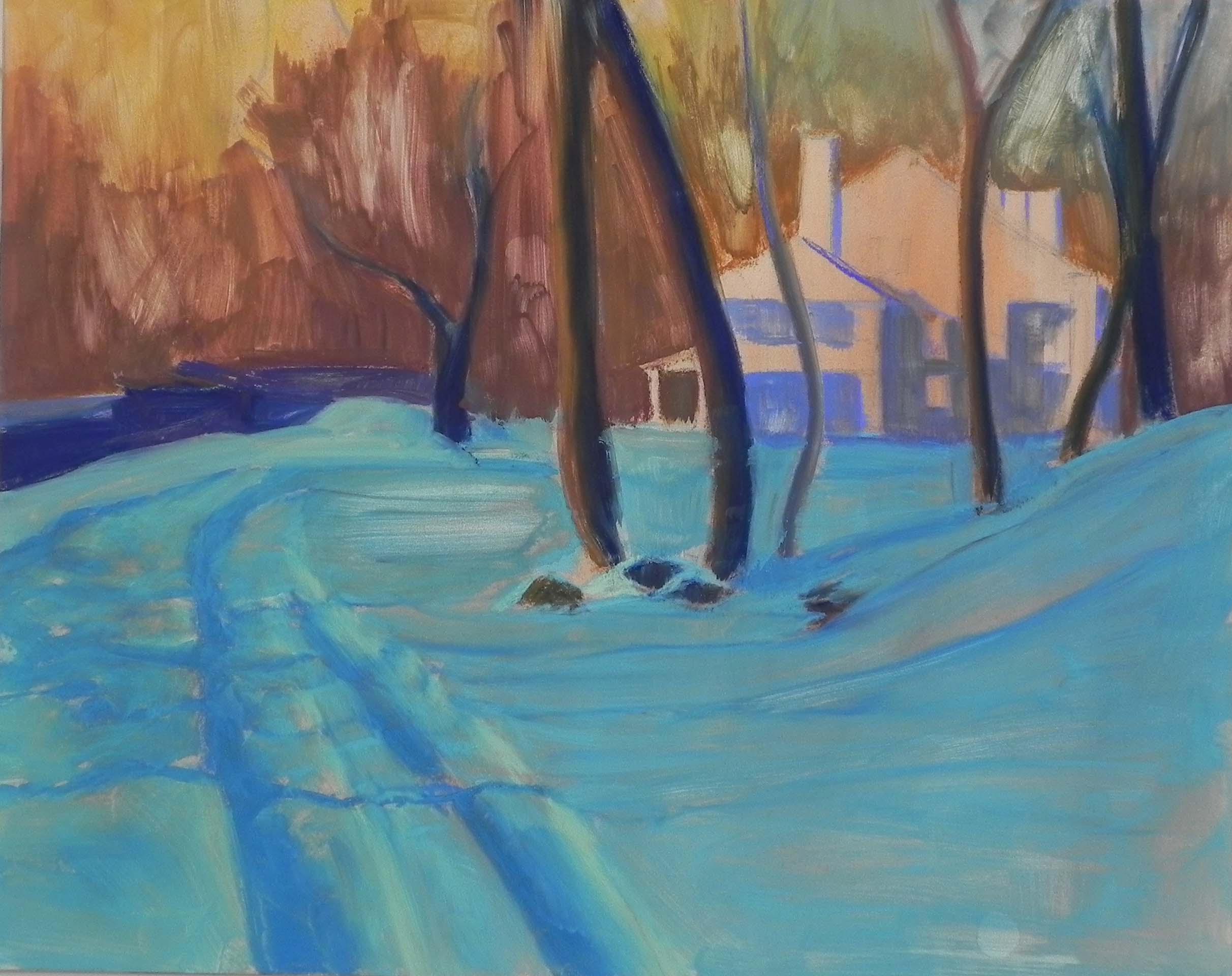
Underpainting done with hard pastel and alcohol