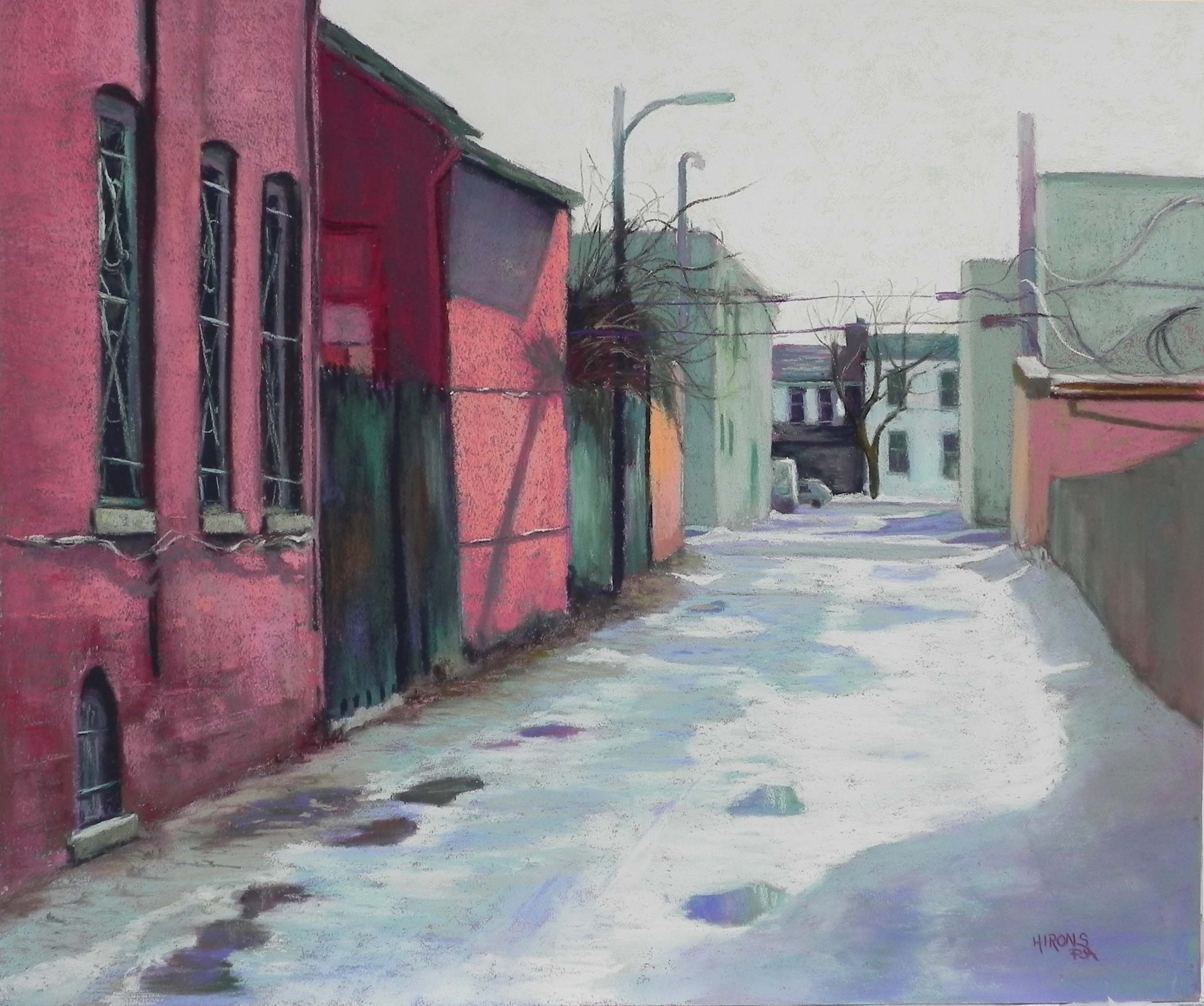
I finished my second alley painting today. I worked primarily from a black and white photo but knew that the background buildings were white and red and that the trash cans were blue. I used the liberty of the B&W photo to supply the colors to the buildings on the left and the snow colors. I also gave serious consideration to the greenery–something not expected in a February picture with snow! I decided that these must be magnolias, or other evergreens. The colors in the photo were warmer but I chose to use dark blues and cool greens to keep them in more of a winter palette. This alley is a continuation of the first one I painted. It’s on the other side of East Capitol Street. I found it interesting that the alley in the color photo of the first appeared to be more greenish, while this one was definitely red! It doesn’t really matter. I liked using the cool red in the alley and added red in the right foreground. The green in the building on the left is one color added over a green underpainting. I found that it worked perfectly with the other colors in the painting and chose not to add anything else to it. I had the most fun with the trash cans–putting them where I wanted, and removing a few to let the alley move off to the left in the distance. I used a royal blue, which is a color I love!
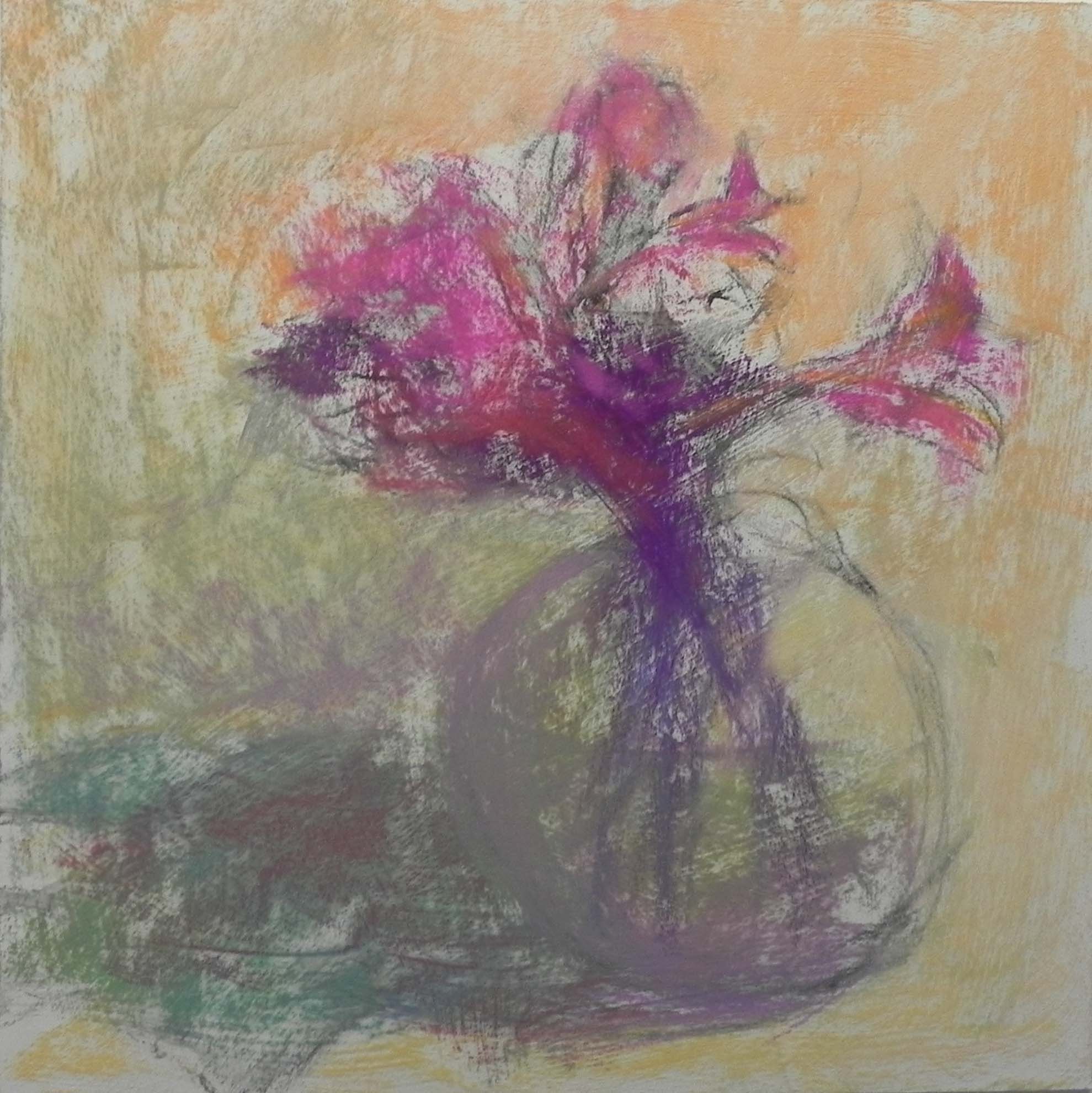
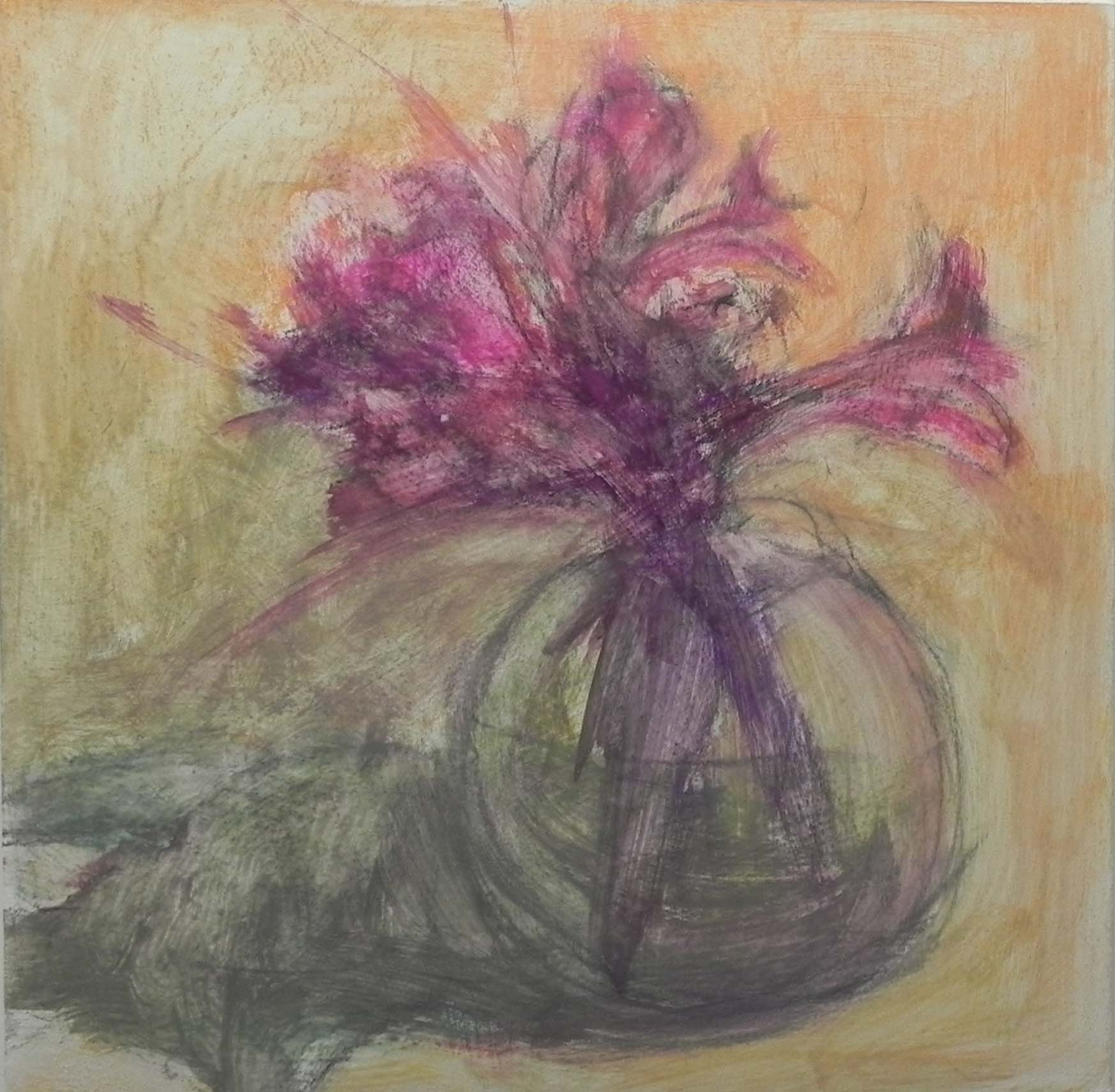
In beginning this second series of DC paintings, I realized that I’m on to something that is quite different from my regular work. I’ve decided to set up an overarching series called “The Insider’s Washington” that will consist of various series of paintings. With the Georgetown Canal series and this new alley series, I think I have a growing body of work that is good for reproduction. So I plan to make giclee reproductions for these and market them differently than I do my regular paintings. I’m really excited about this. I’ve always loved Washington and this gives me the chance to continue exploring it with a new eye to possibilies!
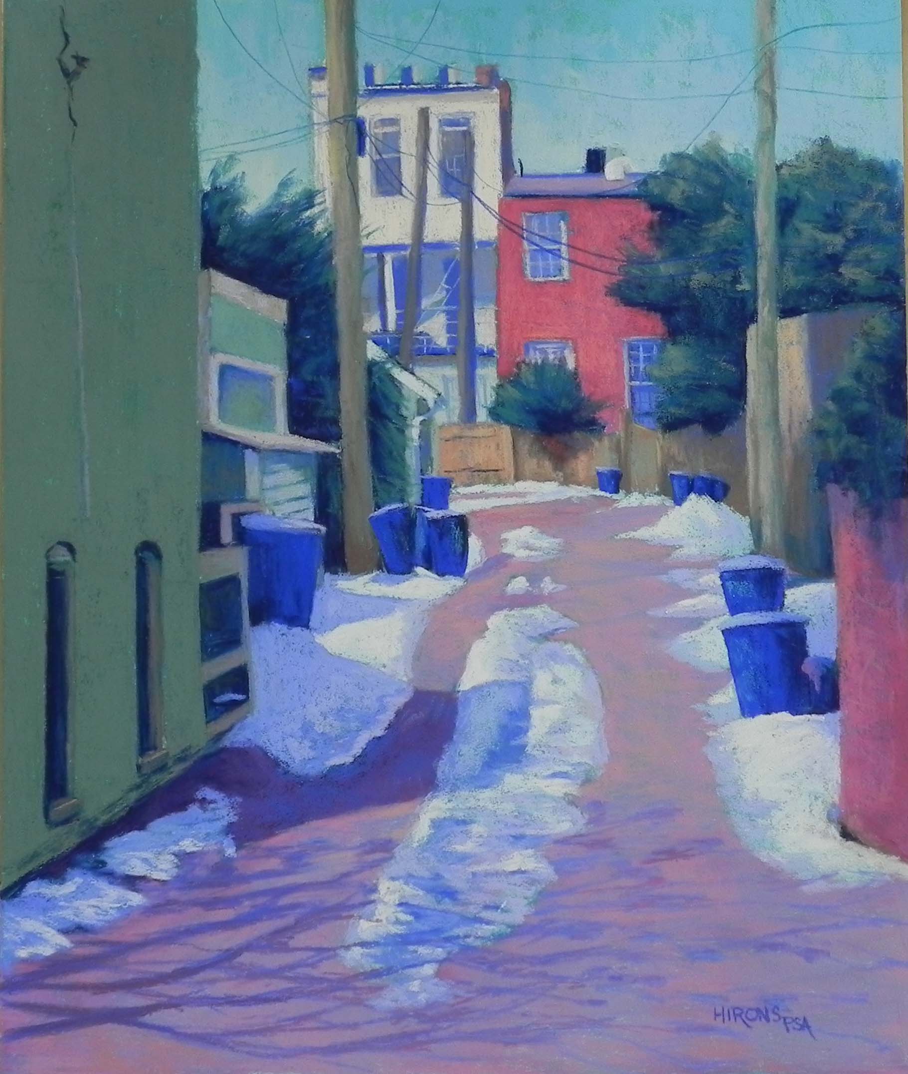
Alley with Blue Trash Cans, 24 x 20, Pastel Premiere 400