
I’m back from IAPS (it was wonderful!!!) and I’ve just had time to finish my first studio painting from Chincoteague, VA. We leave for France on Saturday to the Dordogne and a visit with “Pastel Philippe” and a tour of the pastel museum in Saint-Aulaye. I’ll put a report on the blog when I return. Back to the painting, I did this using 3 different black and white photos. One featured the path, another the trees with light, and another the distant trees. I printed them out and worked on several charcoal sketches, using white conte to highlight. Then did the composition for the painting based on the sketch. I did a color study using a re-purposed small Pastelbord. The surface was a lot darker than the very gold surface that I created for the painting. I envisioned using red violets and warm greens (the colors I saw when there), which are evident in the color study. However, when I got to the painting, the gold surface made me use blue violets in the stand of trees, with red violets and orange brushed on top to indicate the light. I was pleased with this and with the lighter violet trees in the background, particularly as I wanted a lot of yellow in the sky. For the sky, I started with a light blue green in the upper left and moved towards yellow as it got towards the center, then back to the blue green on the far right with a cooler yellow on top. I let some of the gold show through and liked the effect. I envisioned using yellow oranges for the grasses, given that I had moved to the blue violet. However, I picked up various reds and used those and really liked them! I then added some warmer color to the right to show the light hitting them. My biggest challenge was the path. I liked the way it came out in the color study but I was concerned that it not be the center of interest. I began with yellow green and blue greens. It related to the sky but not to the other grasses. So today, I added a lighter color of pink over the blue greens, then added some yellow ocher over the yellow greens. I felt that this toned it down and didn’t fight with the area of trees against sky that I really cared about. Compositionally, I added another bush just above the far left bush in order to lead the eye back to the right towards the open trees, and I made the line of the path straighter to lead the eye as well.
I’m happy at this point. I really loved doing this as I felt that I was creating a “painting.” If you have read the interview with Duane Wakeham in the latest Artists Magazine, you’ll know what I’m talking about. I liked having the ability to create my own composition and color and to keep evaluating it as to what it needed in the way of changes with both composition and color. I hope to do a series of paintings from Chincoteague similar to this. I’m also very happy to be working on the Rives again and i think that it’s the perfect surface for this type of painting.
I showed my Georgetown and Capitol Hill pictures yesterday to several art consultants and plan to make giclee reproductions of them. They were both very enthusiastic about the series. Those paintings are intended for the commercial market, this type of painting is intended for galleries and the personal home market. I’m happy to have finally come up with a distinction between my paintings and the ability to work with both markets in mind.
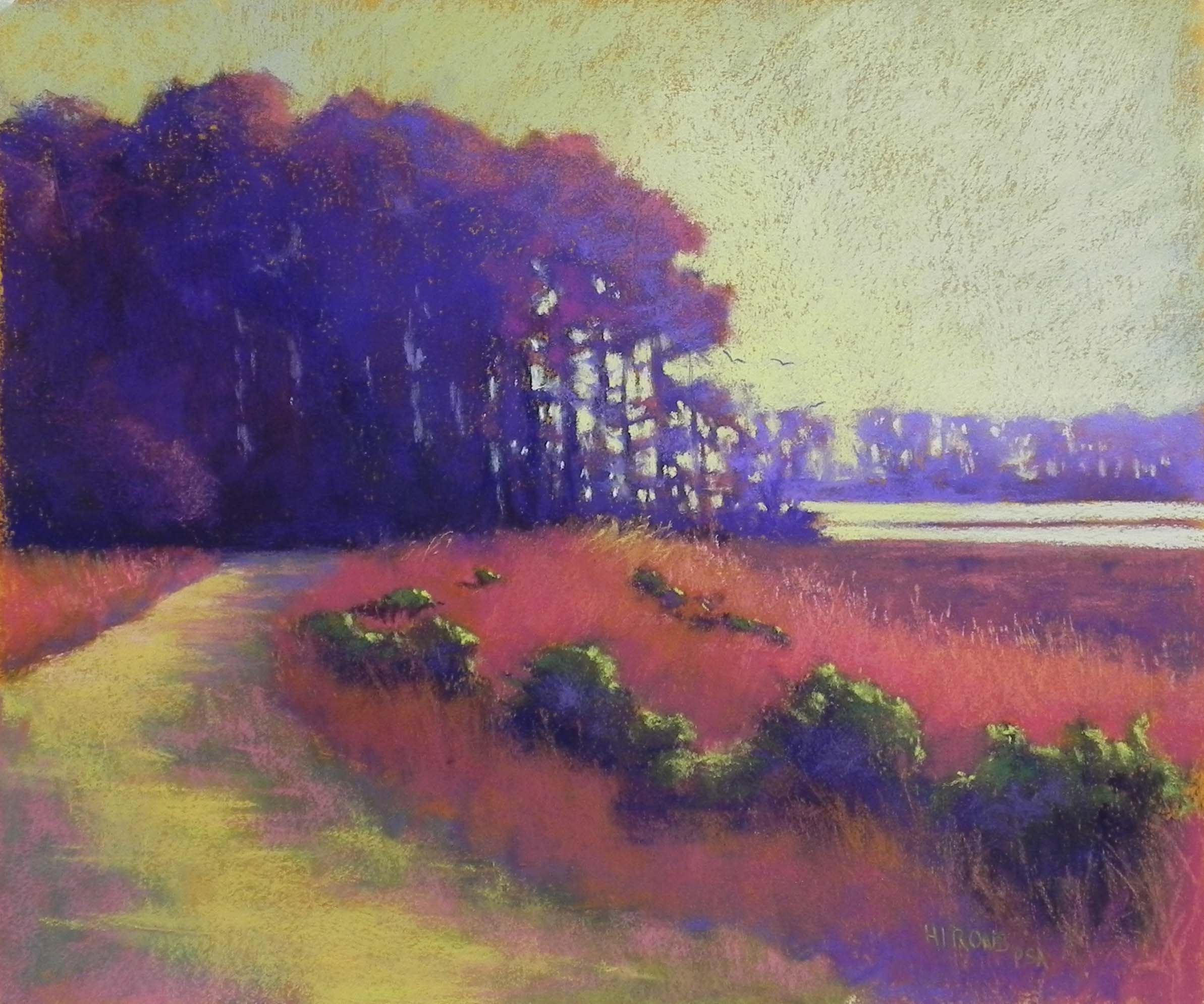
Marsh Walk, 20 x 24, BFK Rives and Colourfix Liquid Primer
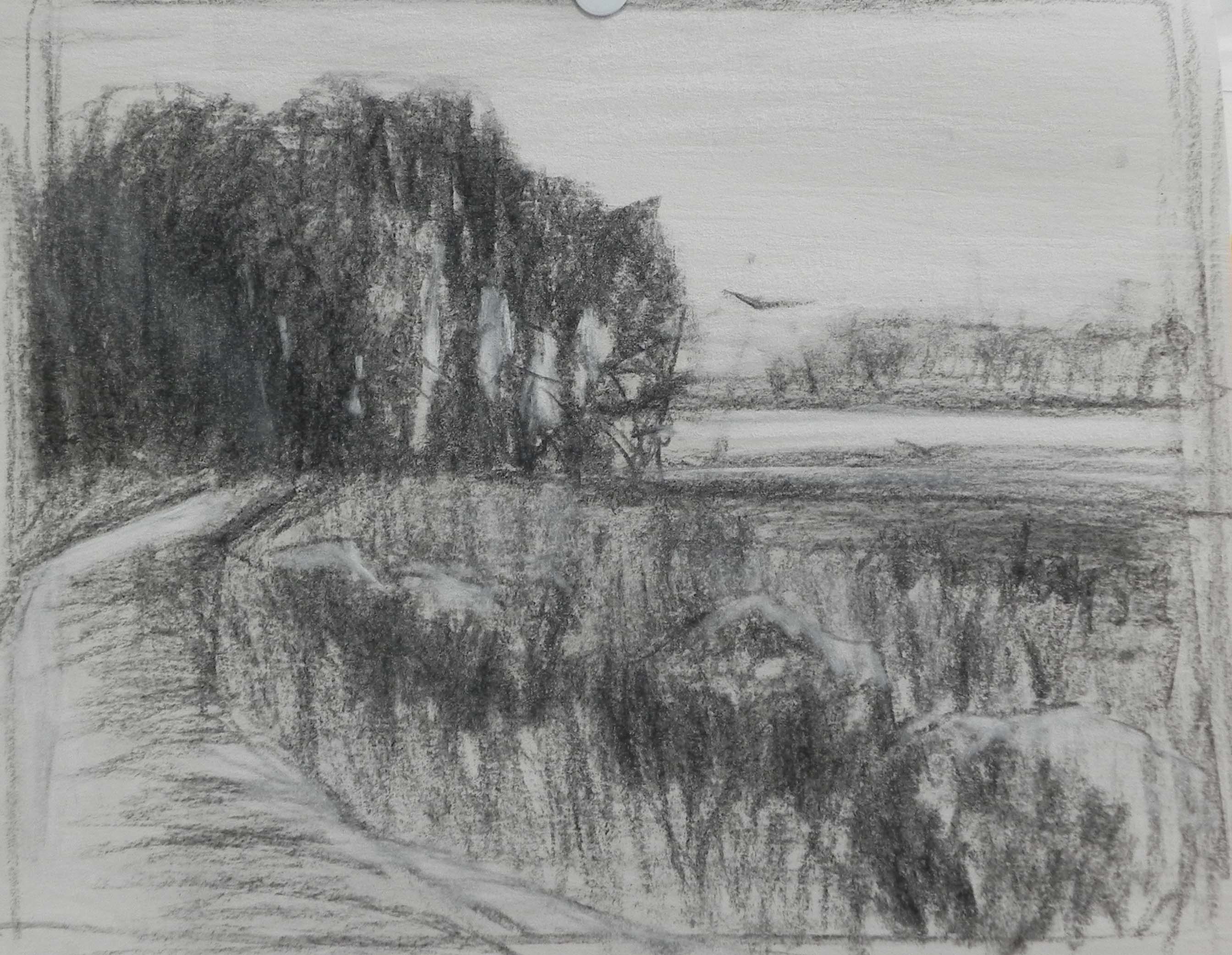
Charcoal sketch
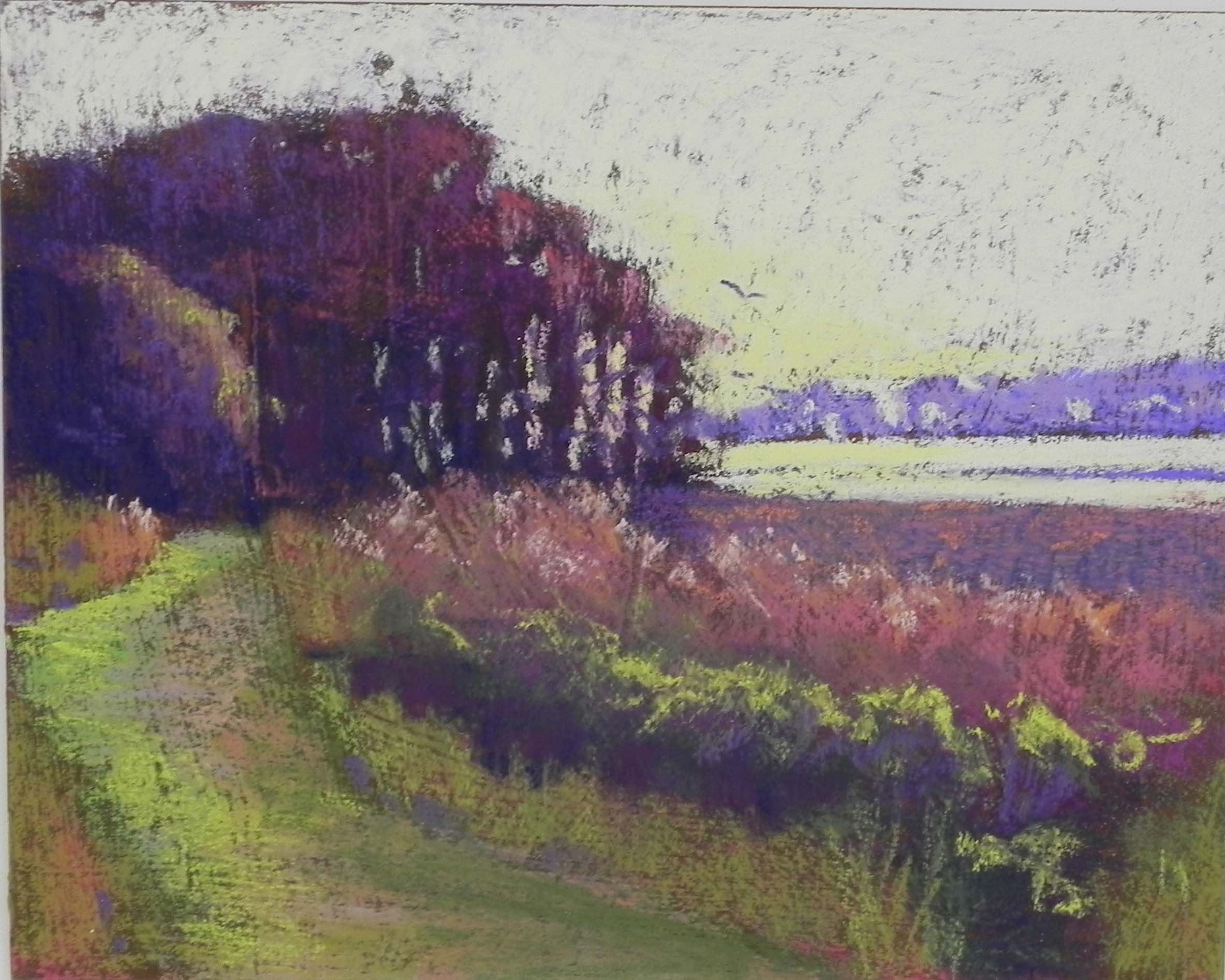
Color Study, 10 x 8 or recoated pastelbord