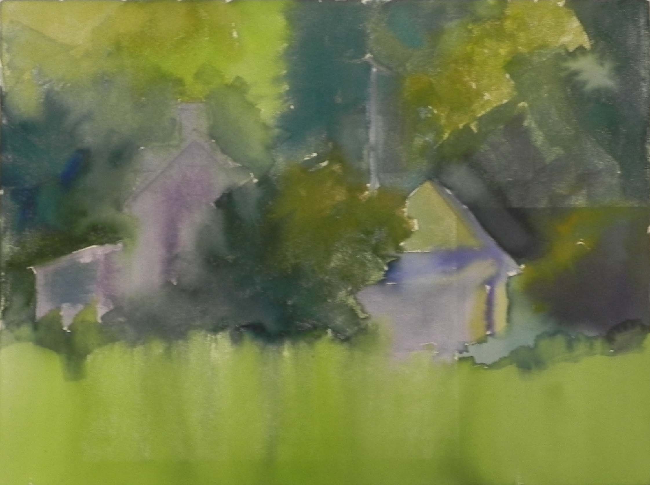
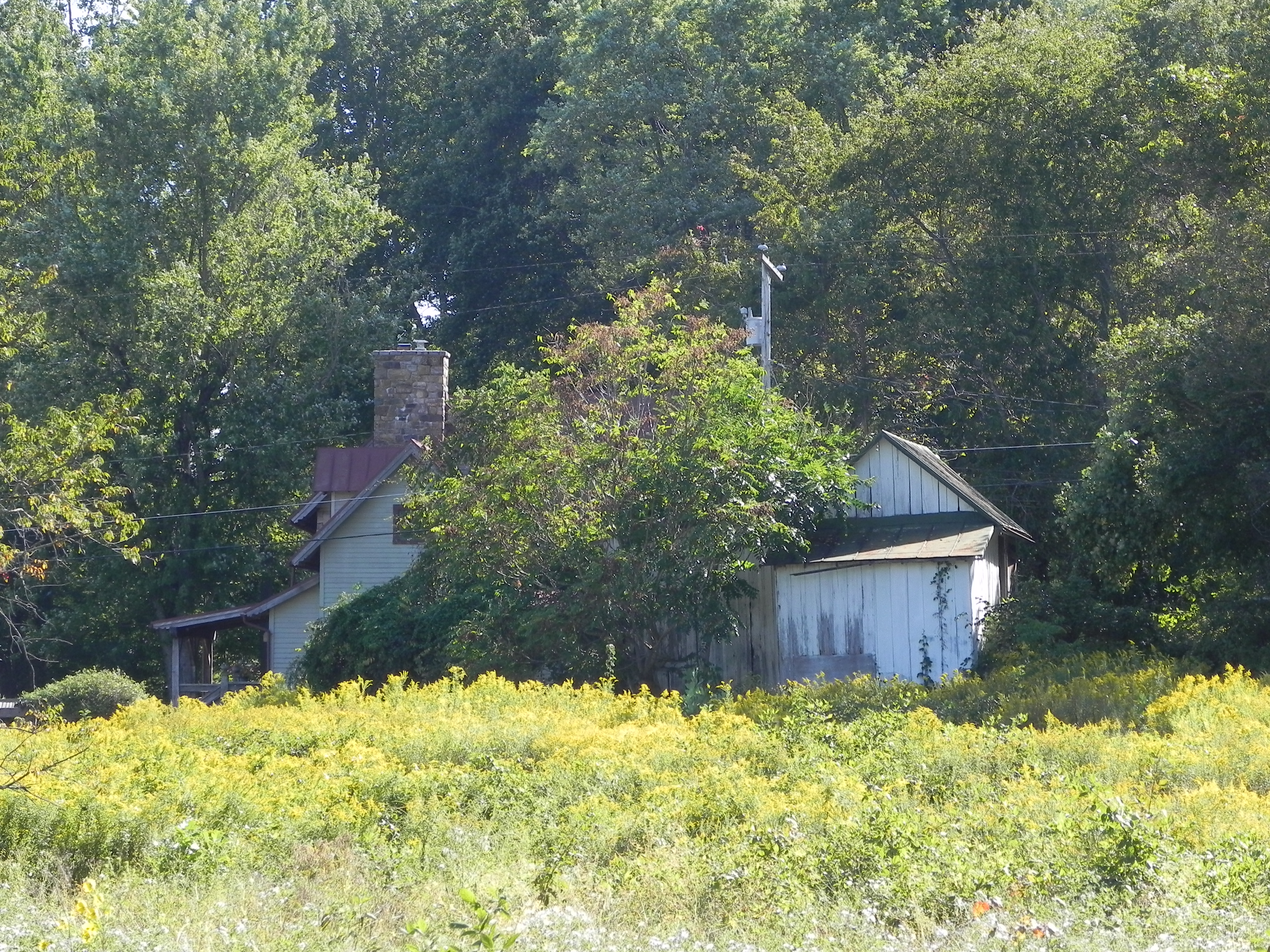
I did a demo and discussion for my class today on creating a “useful” underpainting. My original intention for this was to do my usual hard pastel and alcohol underpainting and discuss color choices. As noted in an earlier post, I realized that this subject matter would lend itself nicely to a center of interest approach with a watercolor underpainting. My newer students have never seen me do a watercolor underpainting and it’s not something I’ve done in a long time! I went through my “Richard McKinley phase” some years ago, trying to apply watercolor to gatorfoam and other surfaces on an upright easel. A few of them were successful, but on the whole, I decided it wasn’t for me. I was a “big shape” painter and hard pastel worked better. Doing this painting today was a revelation and sheer joy! But I made some changes from past practice.
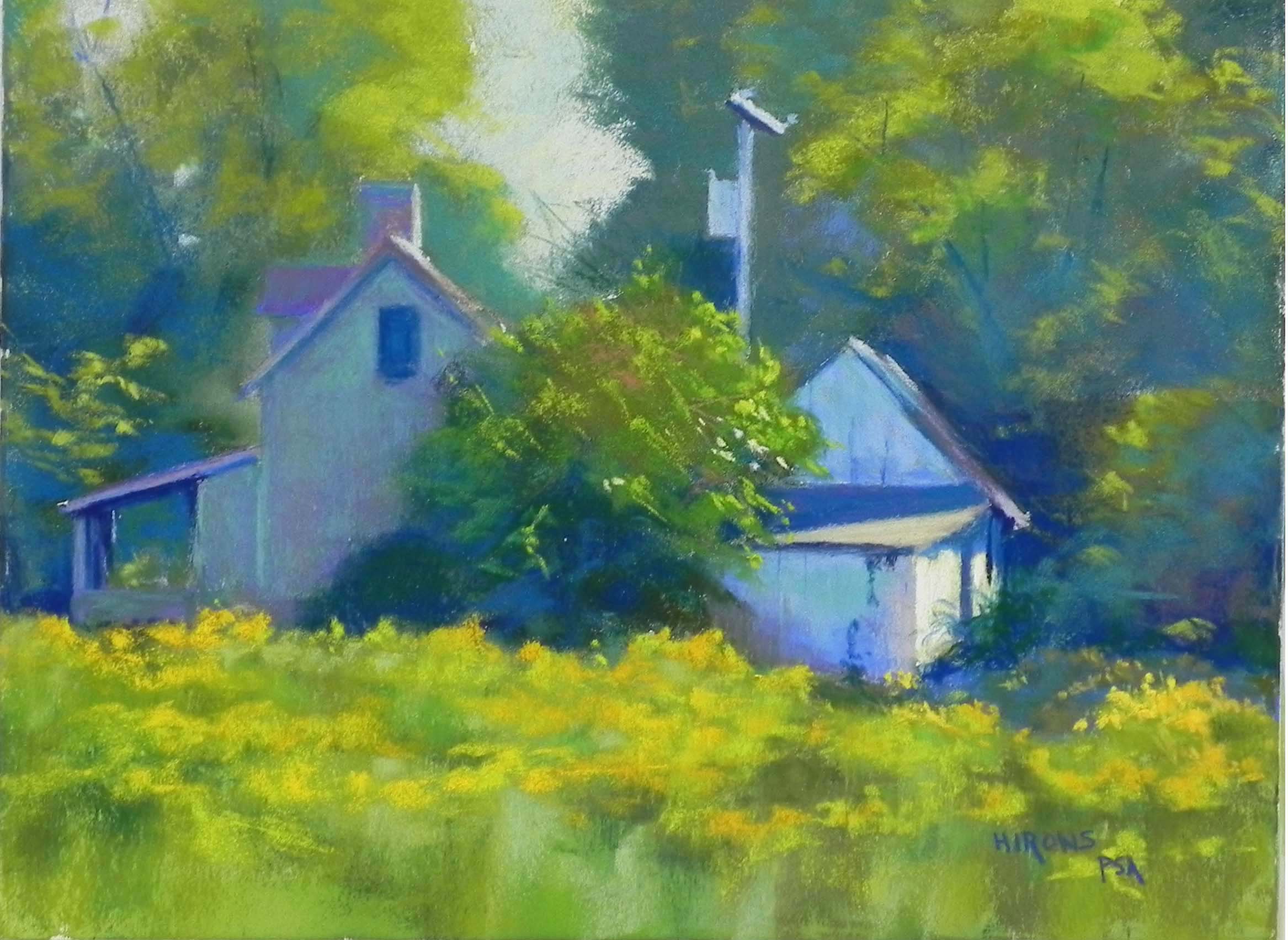
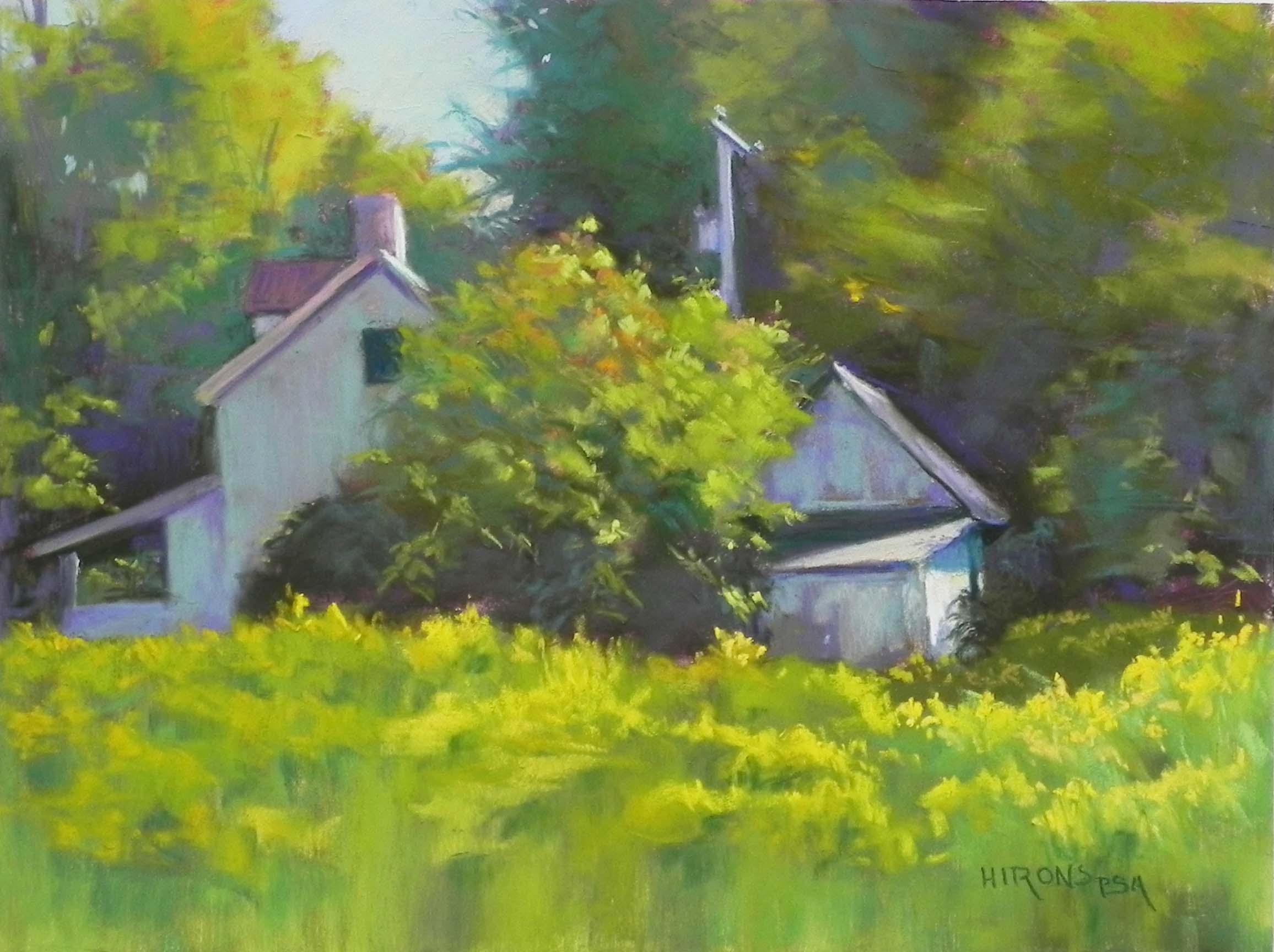
I worked on Pastelbord (white) and I worked flat when applying the watercolor. I didn’t want it to run down and pool at the bottom. I found that the surface didn’t take it very well immediately, then realized that it took it if there was enough water in the brush. I could have added more but didn’t want to take the time. I had to use the hair dryer to dry it, unlike alcohol. What I learned from the past is that you have to be careful not to use heavy, dark applications of pastel over the watercolor. It doesn’t look right and you end up covering it all up. Giraults are perfect and I opted for lighter values than what I used in the first painting. What I discovered in layering the Girault on the board was that the surface hadn’t been compromised at all, as it is with the hard pastel, and I had a lot more grit to work with. It was great! I was in heaven!!! I worked more slowly, carefully, and sensitively (as Richard teaches), putting small pieces on and taking my time. I really loved how the colors layered and the light effects that I could get with the Girault. In a few places (to the left of the house on left) I left the watercolor with no pastel. In other places I applied it very lightly. I used the softer pastels on the shed and the goldenrod (using a yellow green and two yellow Blue Earth pastels).
I totally enjoyed the experience of doing this painting. If you compare it to the first iteration, you will see that the colors are different. While waiting at a stop light this morning, I observed the distant trees with light hitting them and the beauty of the blue greens and decided that this was my palatte! I think both paintings work, but I really enjoyed doing something different in this one. If you compare them both you may not see alot of difference, but the first is clearly darker and the applications of pastel are heavier.
On Nov. 2, I’ll be doing a class on making your own surface and I plan to do this again on the toned Rives. I’ll put all three of them on the blog so you can compare them. It’s a good thing I found a picture that I like so much!!! I’ve just invested a lot of money in Pastelboard, so you can expect to see more with watercolor underpaintings.
Last week I attended a demo with Doug Dawson. He’s been doing the same kind of painting for years now. I can’t seem to keep to just one thing. I’m constantly searching for the perfect surface, the perfect feel. Today I found it–for now! But I know it won’t work for everything.
Water color underpainting
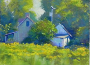
Catching the Light no. 2, 12 x 16, Pastelbord