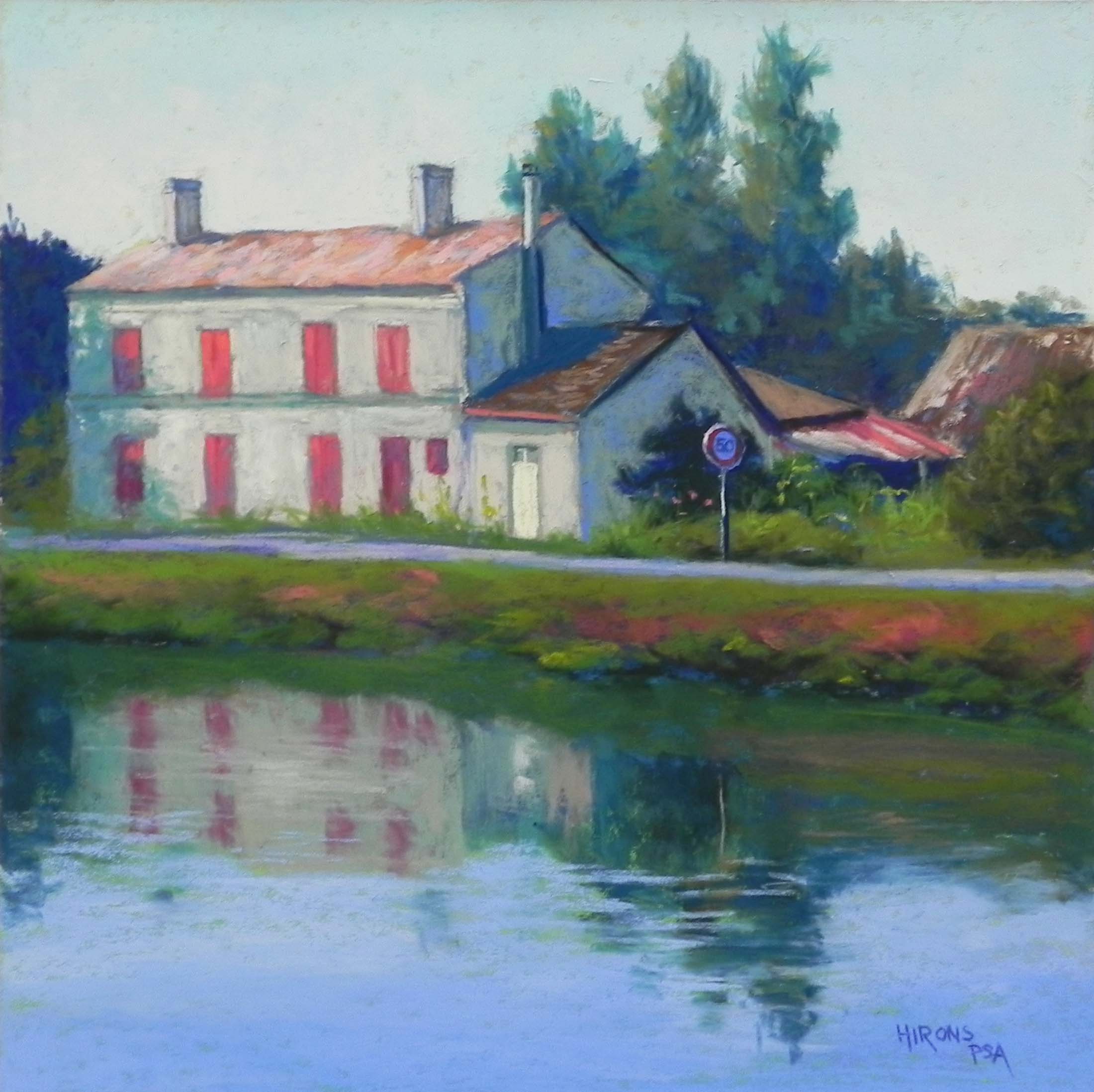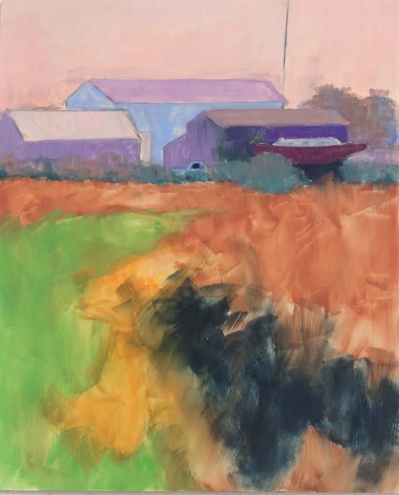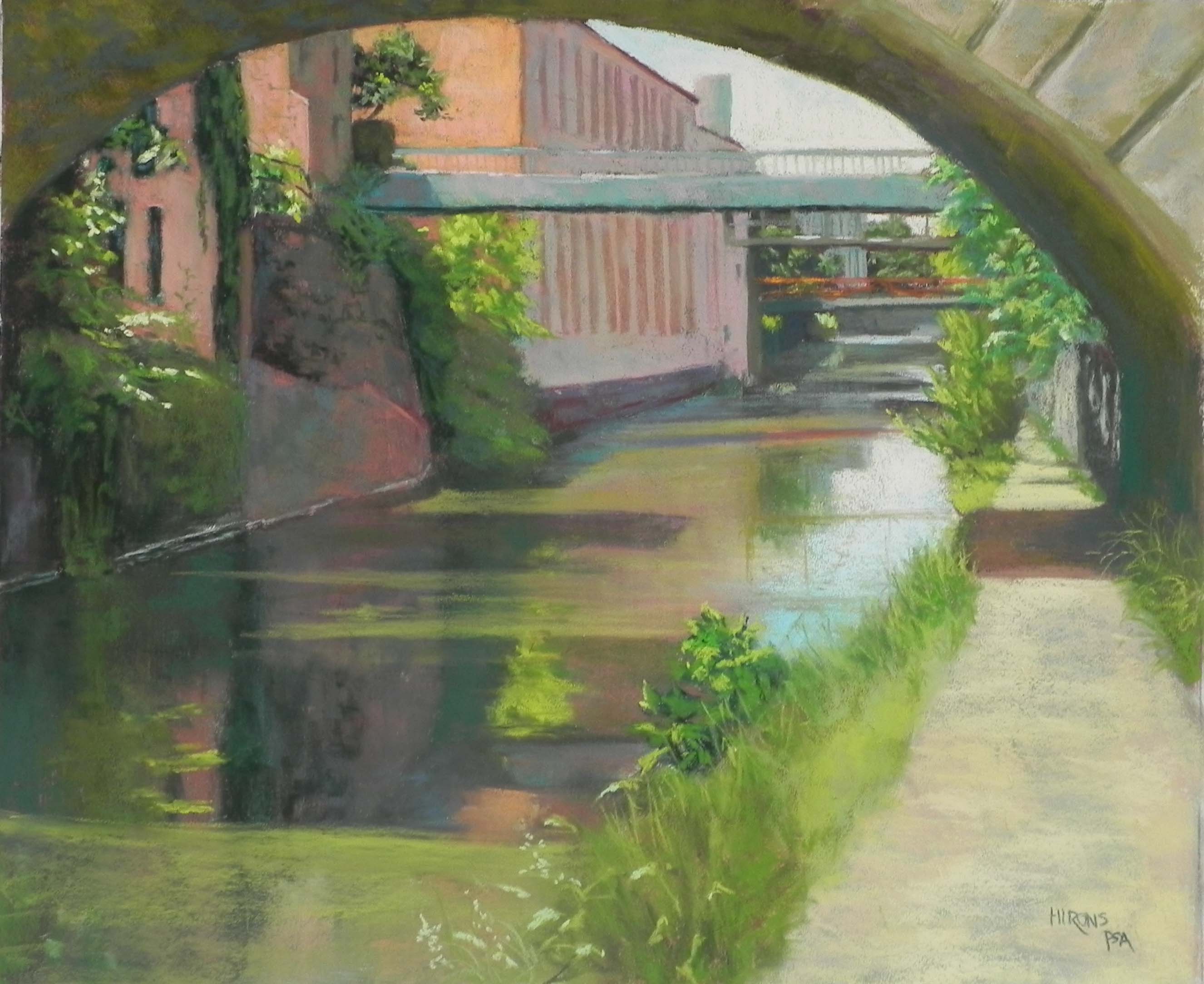
Georgetown Canal in Summer, 20″ x 24″, Pastel Premiere white
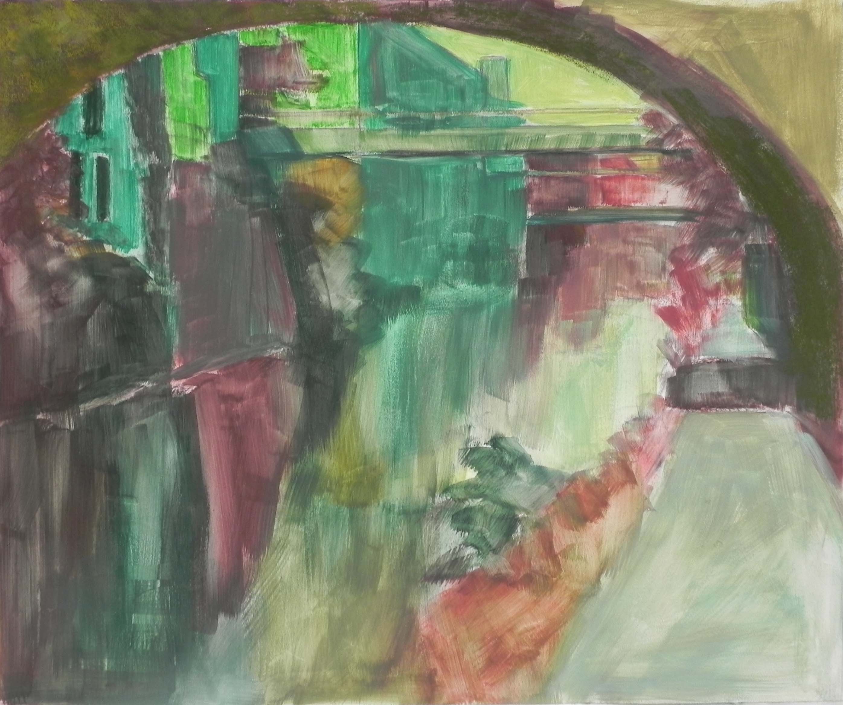
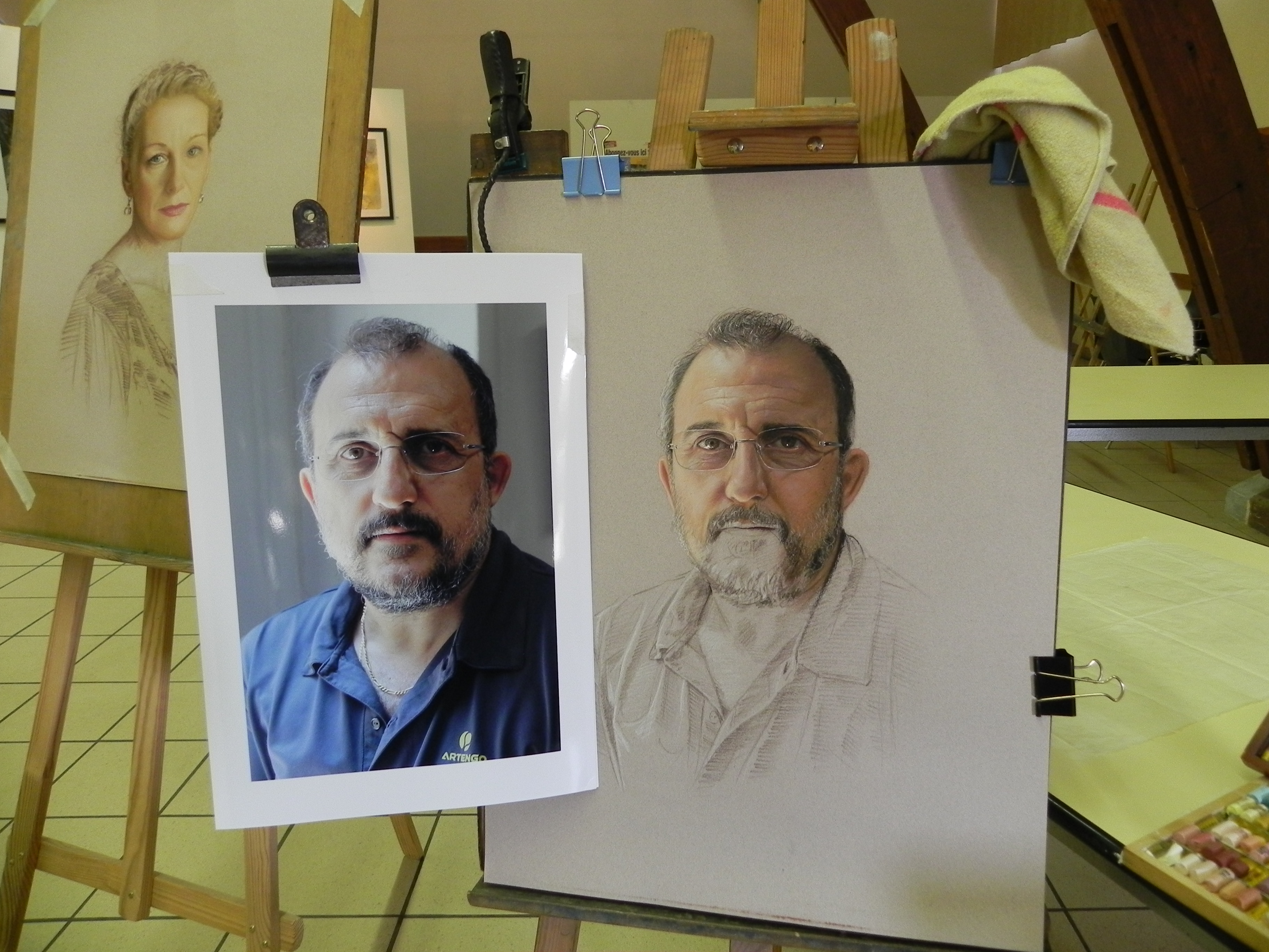
Underpainting
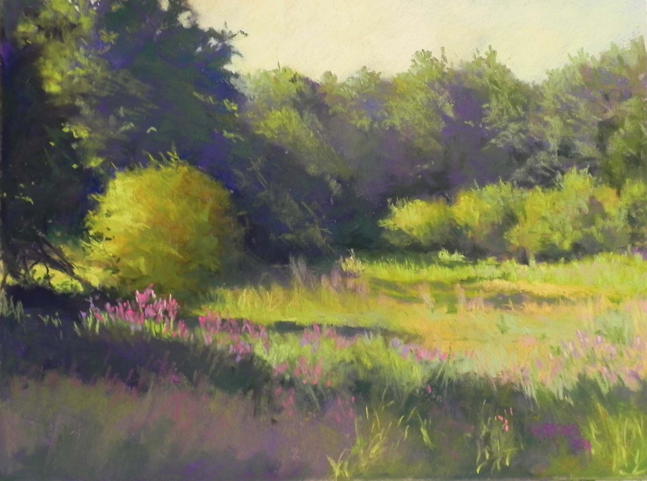
Last Tuesday, an artist friend and I met in Georgetown to find and film alleys. And we DID do that. But on the way back, we did a little walking on the canal, and it was the images from that walk that made me know I had to paint it–again! You may recall that I did a series of six paintings from the first of January 2015. Because the light was so different, those pictures are all in blue/violet color palettes, whereas this one is definitely dominated by the greens and oranges of the buildings. As a result, this seems softer than the winter pictures.
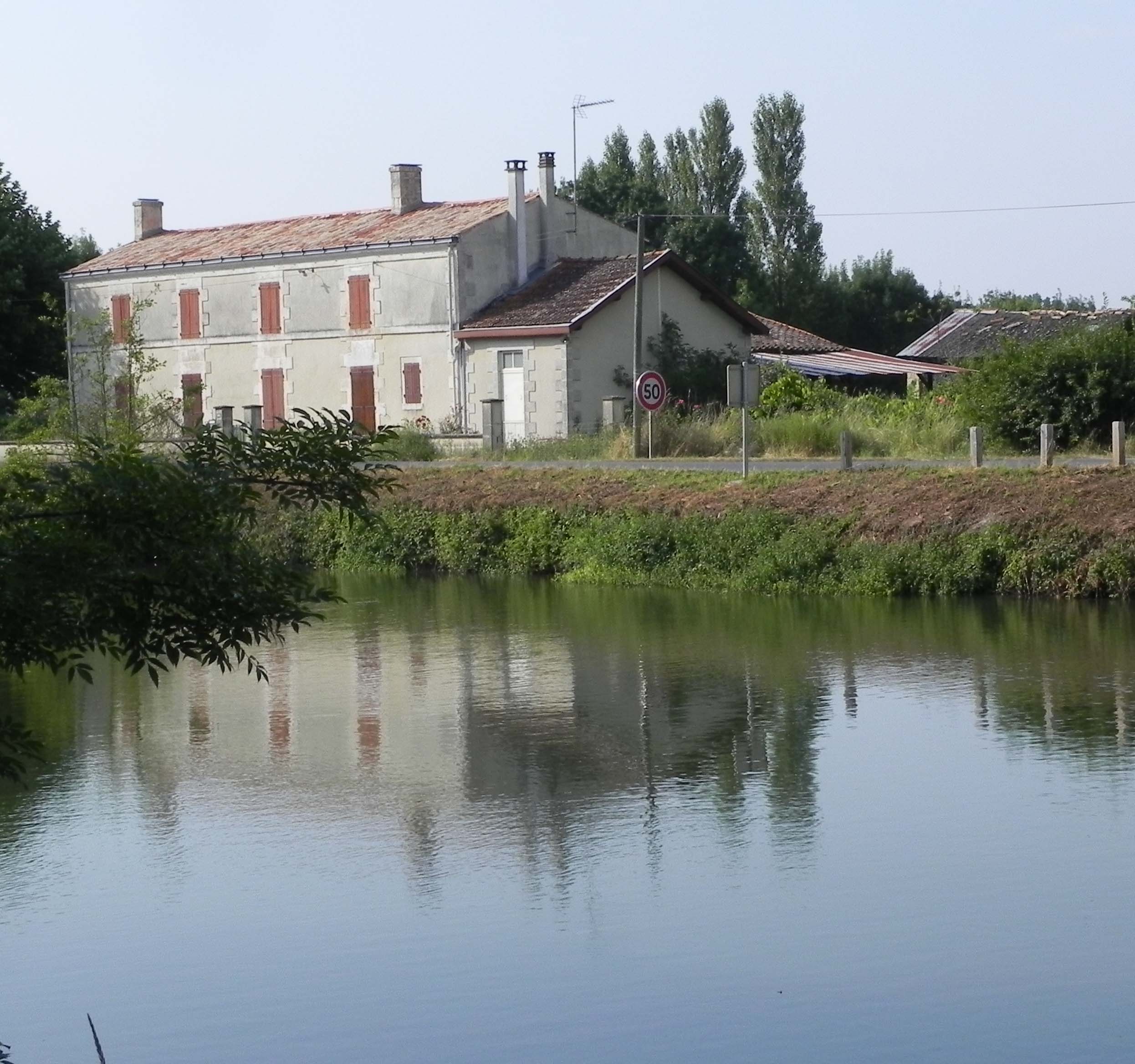
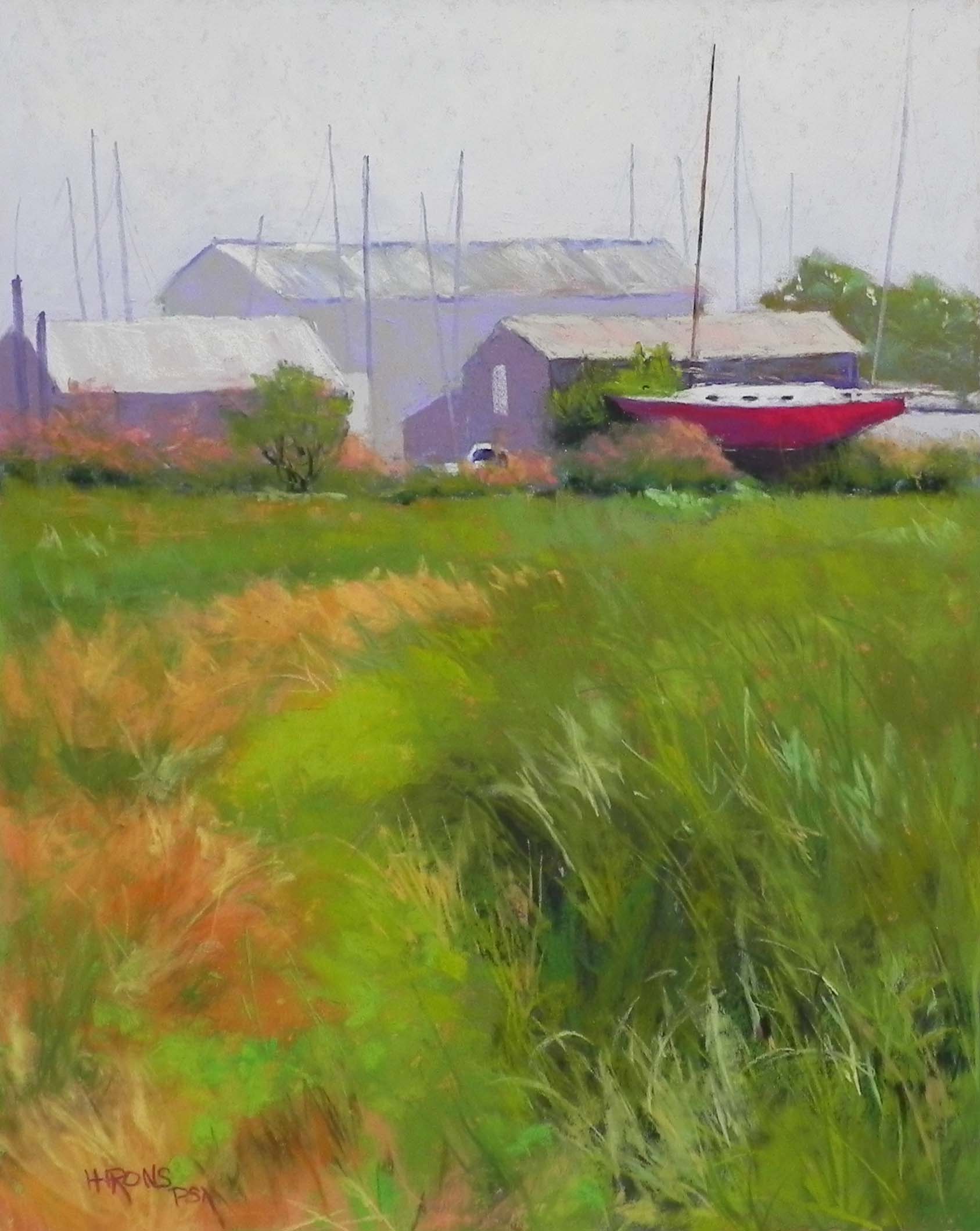
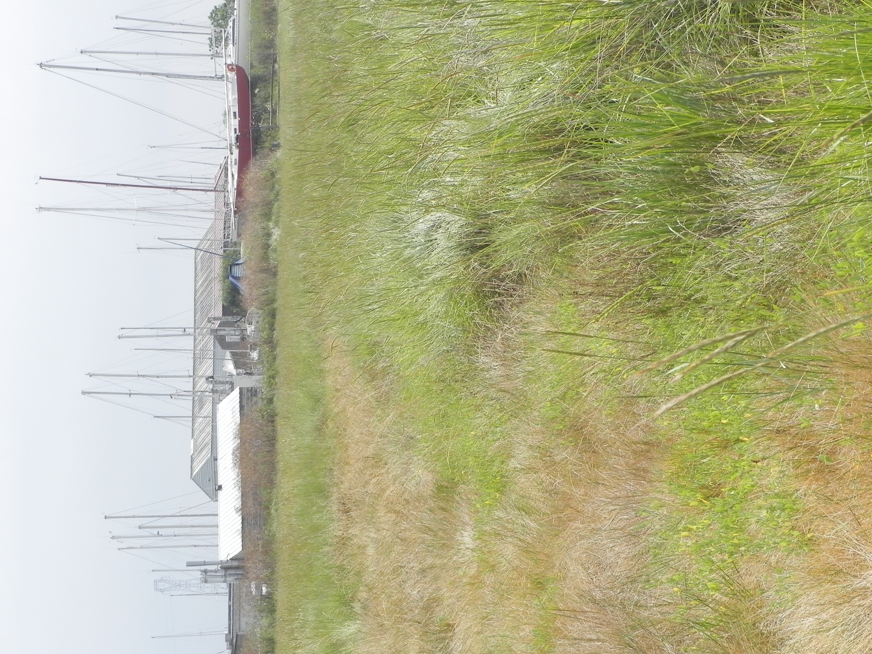
I used two photos, taken seconds apart, but very different in values. The composition was developed from both of them and doesn’t match either as to the bridge. In one the foreground was washed out; in the other the underside of the bridge was too black. So I used the lighter one primarily, but referred to the darker one for the foreground.
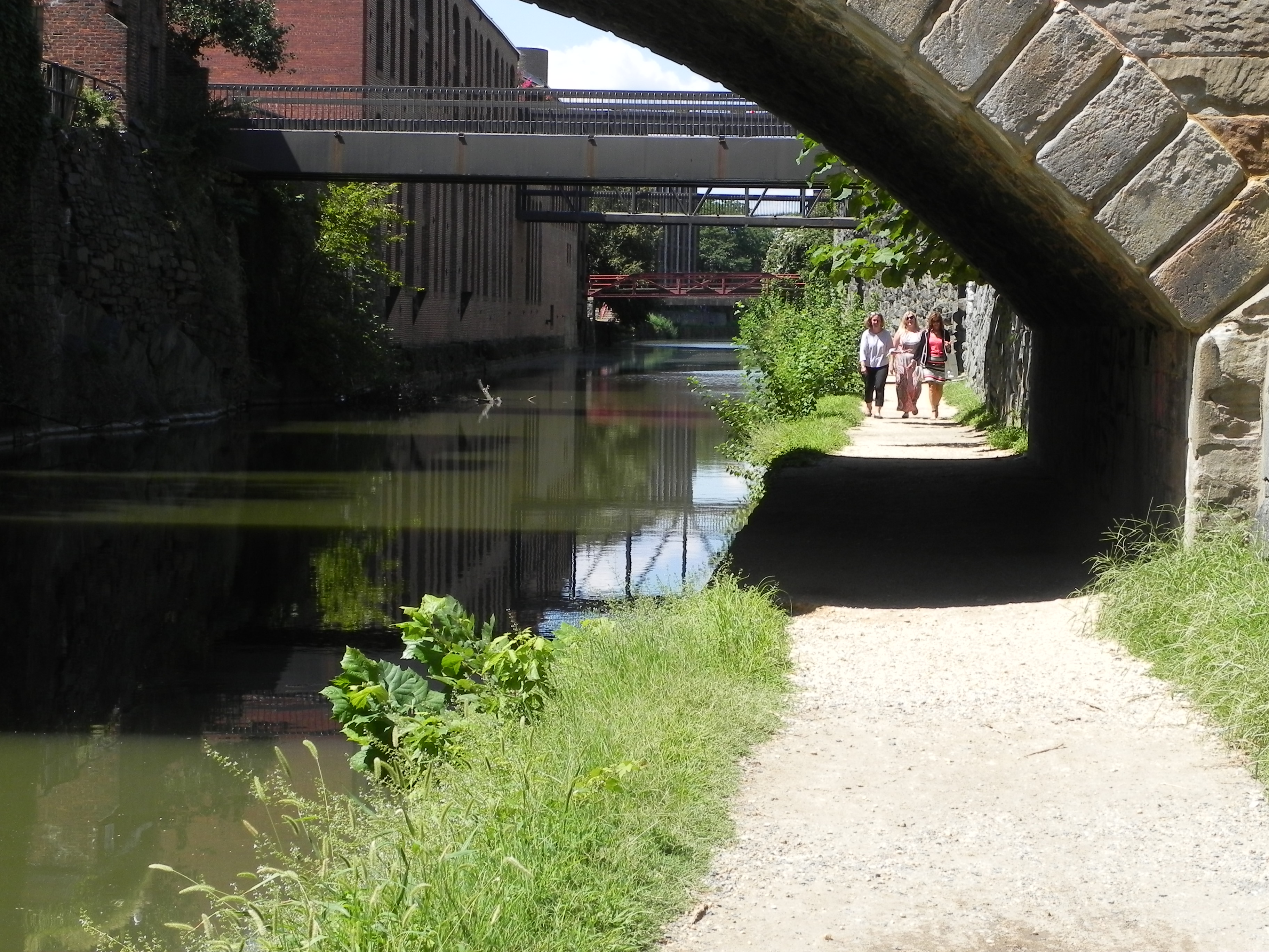
Photo reference 2
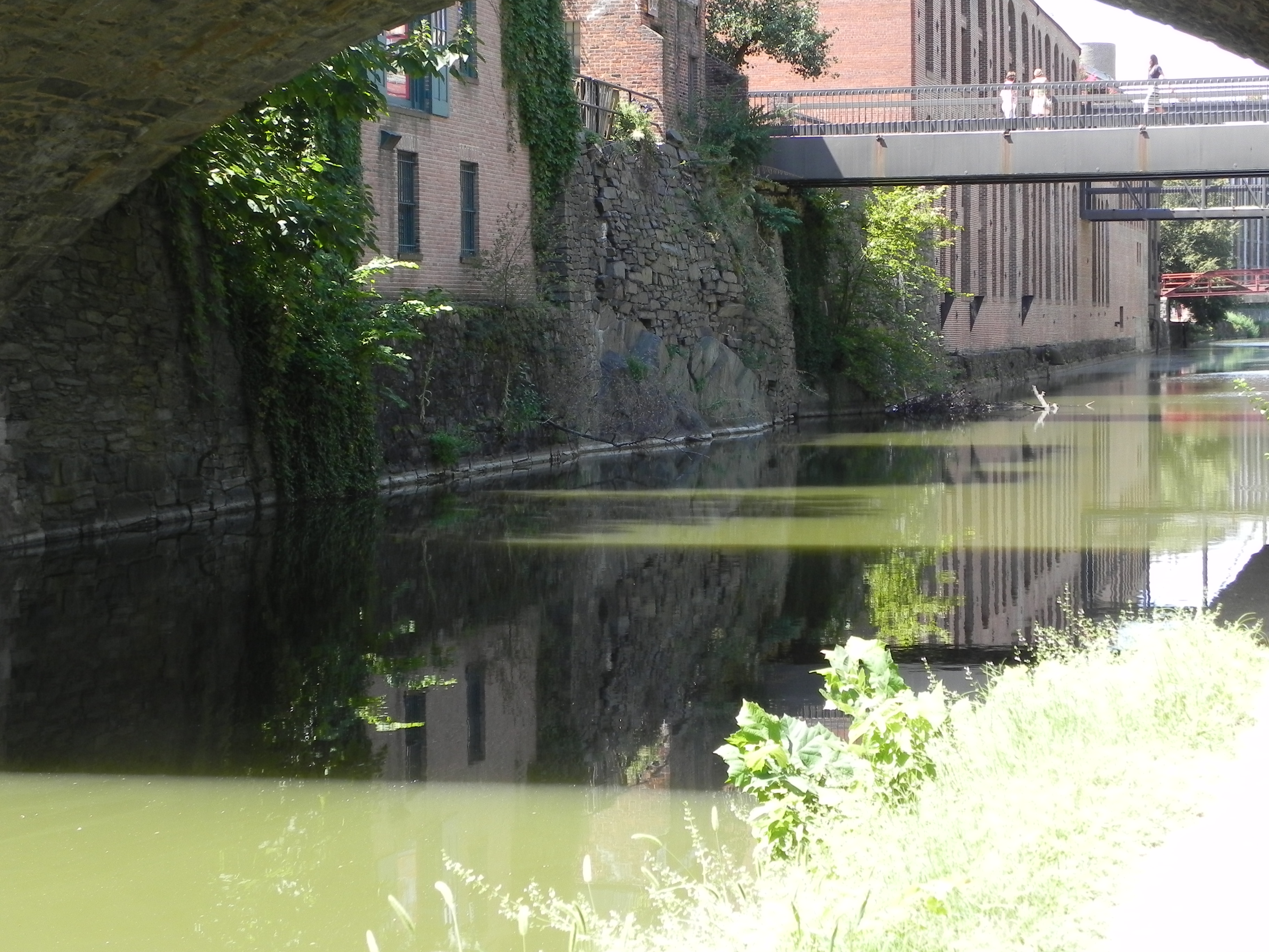
Photo reference 1
I did a basic drawing and redid it many times, trying to fit things in correctly. Then I did a hard pastel underpainting and lost a lot of it! I’m thinking that maybe I should work on the Italian clay. But I do like the way the under color shows through on the premiere paper. It’s grittier than UART and is very nice for buildings, paths, etc.
Getting the reflections right was the most challenging part of the painting, particularly having the light and darker parts in right places! I began with what was underneath, using darker values and vertical strokes. Then used a variety of Girault greens and grayed greens to brush over the water and give the light effects. It didn’t really come alive, however, until the blue green was added into the sky and water. At first I had the sky all in pale orange; but then I added some blue to the left of the tower and it felt really right! I had to up the value of it to make it come out in the photograph.
The path was also a potential problem as it was so one-dimensional in the photo. I began with dark colors, including a grayed blue, and let some of it show through when I added the warm tones, so that there is a pattern of dark leading into the picture.
One other challenge was that the paper wasn’t mounted, and, while I had it fairly well taped, it buckled everywhere. I will have my framer mount it from now one or buy it mounted from Dakota. (It’s too bad that True Grit Pastel Panels only come in UART.)
I will be having a show at the Dumbarton Church in Georgetown in mid-October, so I had an ulterior motive for doing this painting. I’ll be showing my winter canal series and the three unsold alley pictures, and this one, along with smaller paintings. It’s Oct. 15, 6-8, followed by a concert of Italian madrigals! If you are in the area, please come!