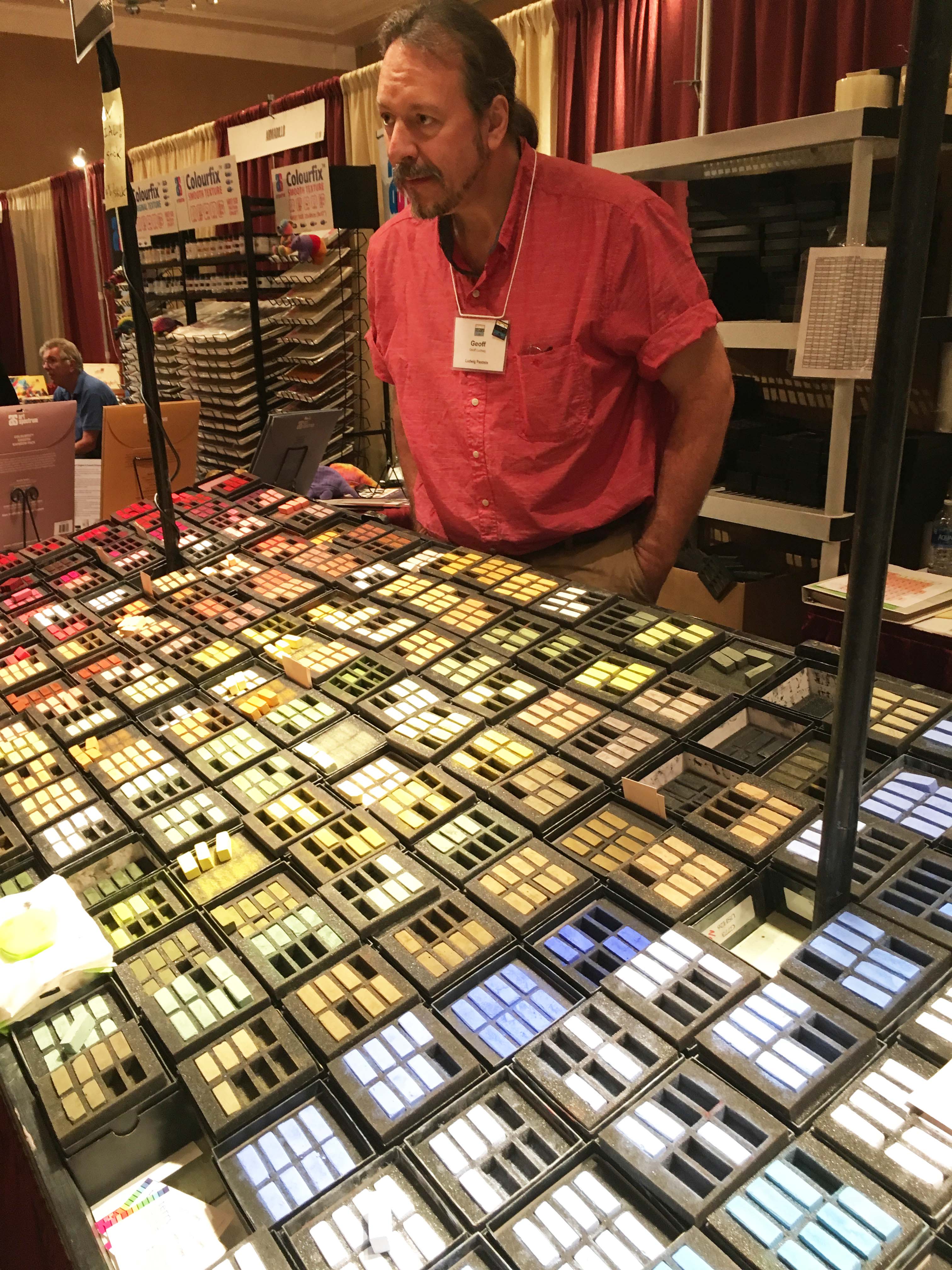
Terry’s son Geoff at the Ludwig counter
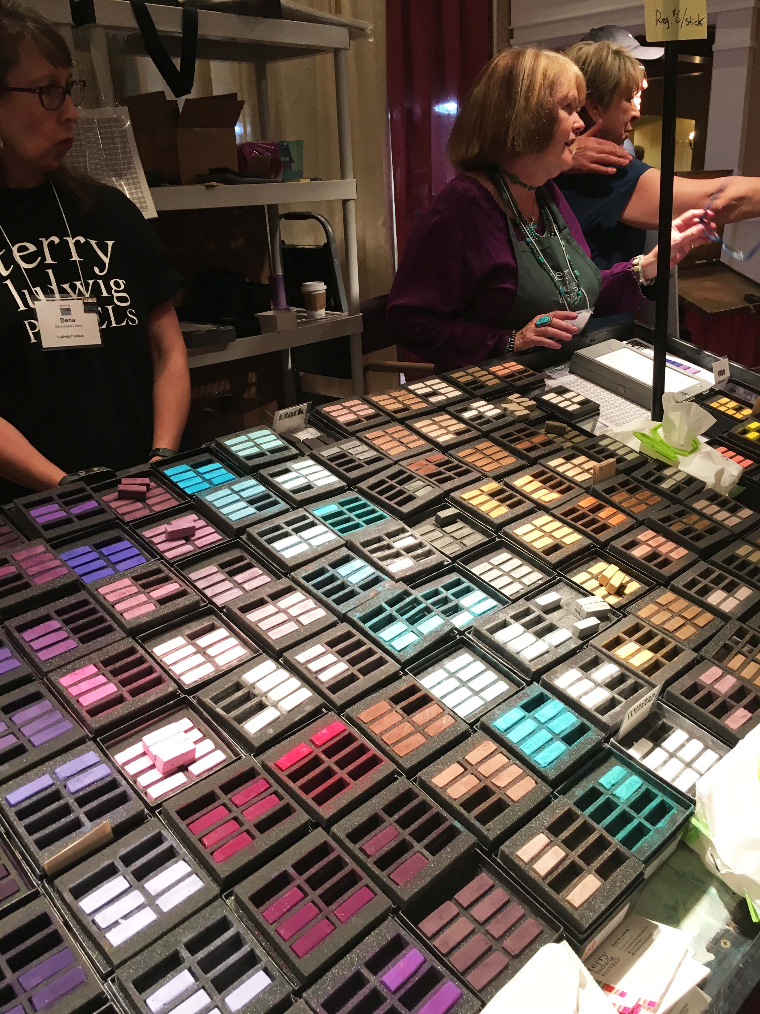
More Ludwigs
I spent a lot of time in the trade show at the convention, looking primarily for new products that might be of interest. And, also, for good sets for beginners in my classes and workshops. Of course, the old favorites, like Ludwigs were there and irresistible. I bought a box of 14.
One thing that is evident is that the manufacturers are getting older! But fortunately, their descendants are taking over. Terry Ludwig recently announced his retirement, but his son Geoff will take over the company. I also spoke to Marge Heilmann (of the Heilmann box). She noted that both she and John are having difficulties, but fortunately, one of their grandsons is taking over the business and he was there at the booth. This is a wonderful thing to see, since so many of the products we use are family businesses. Jack Richeson is also looking older, but his kids and employees were there taking care of business. So, hopefully, things will go on, but it’s too bad we’ve lost Wallis paper!
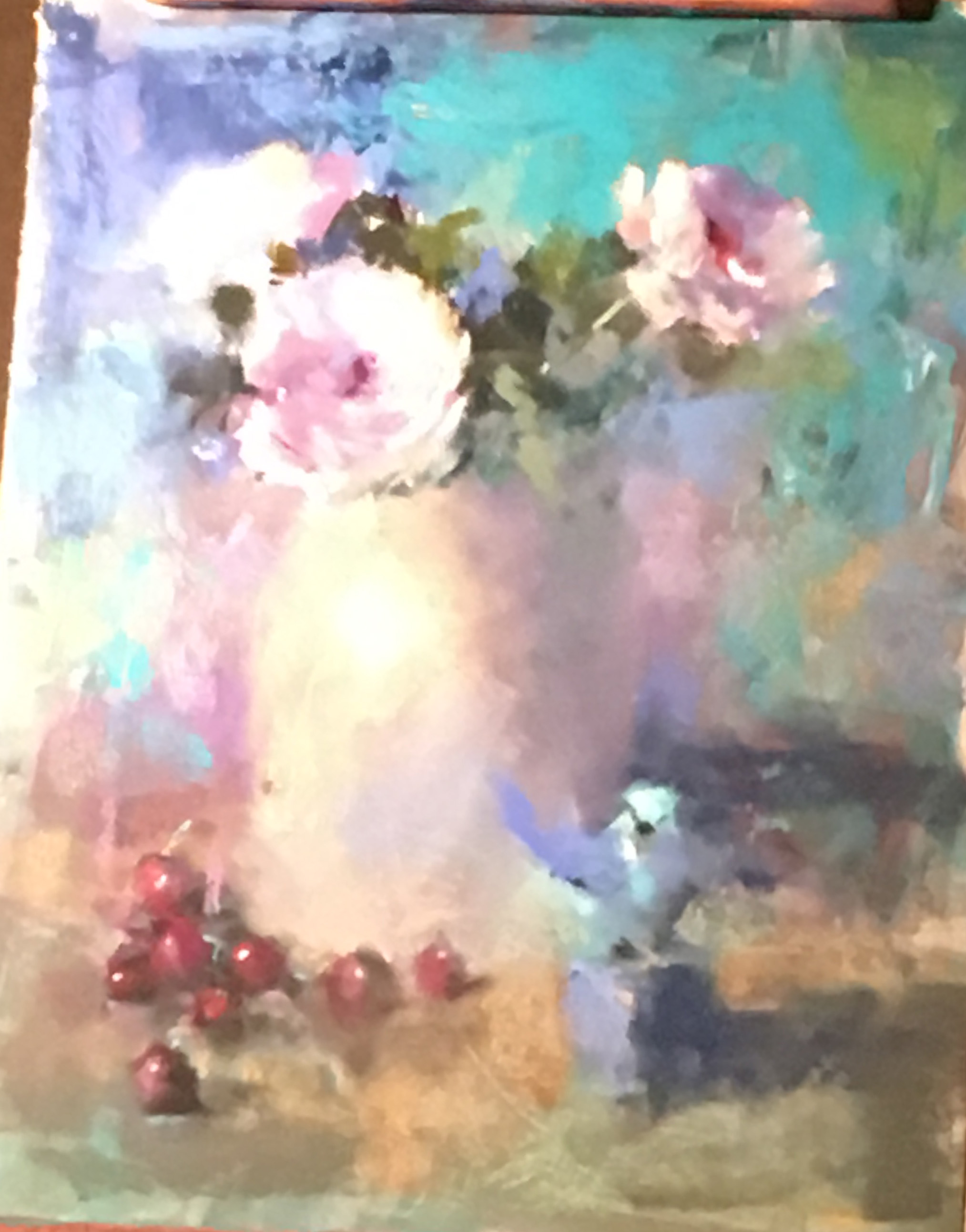
Speaking of Richeson, they have a whole new line of 500 small, soft pastels that will be available soon. They were giving out boxes with 20 spaces with the first 10 free. So, of course, I got a box. And I looked at their various sets. The 80 piece landscape set (pictured below) looks quite good and might be just the thing for new pastel artists. I have a number of potential new students, so I’m quite eager to find good products that are affordable. I still love the 120 Unison half stick set (Richeson owns Unison) but I think these new sticks will be a lot less. They should be available from Dakota and other stores soon. The convention price was $120, but will no doubt be more. I also spoke to a representative about Plaza Art (our local art store) and hope they might carry them.
I stopped by the Dakota/Blue Earth booth and found out that they have come out with new blue violets, something they were definitely missing! So I bought them–of course! I love the Blue Earth and use them regularly, depending on the type of surface I’m using.
More good news from Dakota: Pastel Premiere (made for Dakota) is now mounting their surfaces in many sizes. I bought some 16 x 20s and some smaller 8 x 8 and 6 x 8 in 2 packs. Quite nice. And they will be coming out with a new mounting of eco-board (not sure what it is, but it was very lightweight). I’m happy to hear this, given the demise of True Grit pastel panels and the fact that UART is only mounting in three sizes. I will probably be using more of the white Pastel Premiere in the future.
The Chinese sent a large contingent of painters and paintings to the convention, along with a new Chinese paper. It’s somewhat similar to pastel premiere (feels like an iron oxide finish). I have a sample of it. (We shipped everything back so I don’t have it now). Also, Art Spectrum has a new “Smooth” paper. I assume that this replaces their “suede”. I have a small sample of that, as well. Am assuming that this is meant to be like Pastelmat. We’ll see!
That’s it. If any of my readers were there and found interesting products, do let us all know.
I’m off to Massachusetts and Maine on Monday. Will deliver paintings to two galleries, give a one day workshop, and celebrate my mothers’ 98th! Will be back on the 28th. Busy times. Hope you are enjoying the summer.
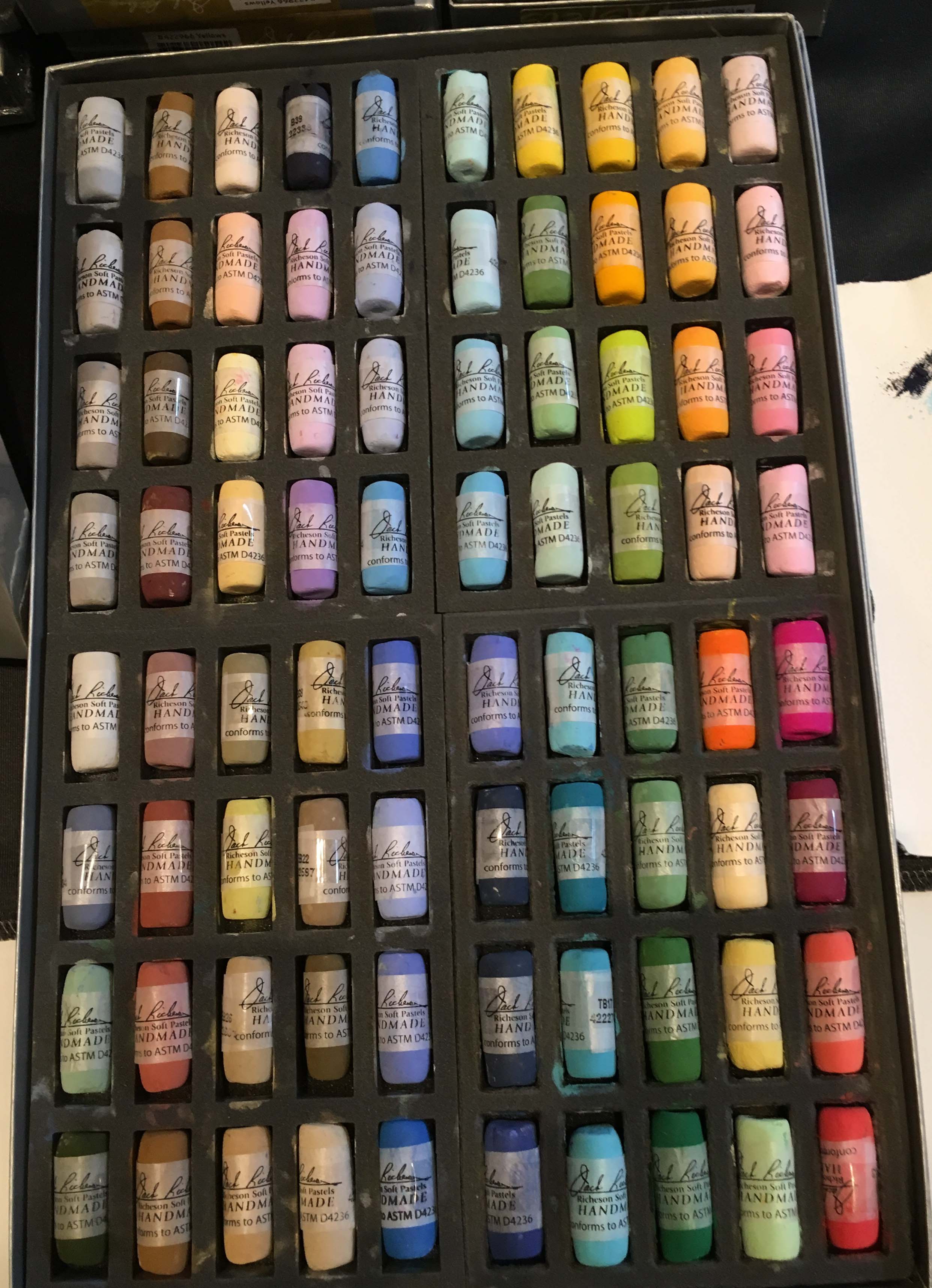
Richeson landscape set of new soft pastels