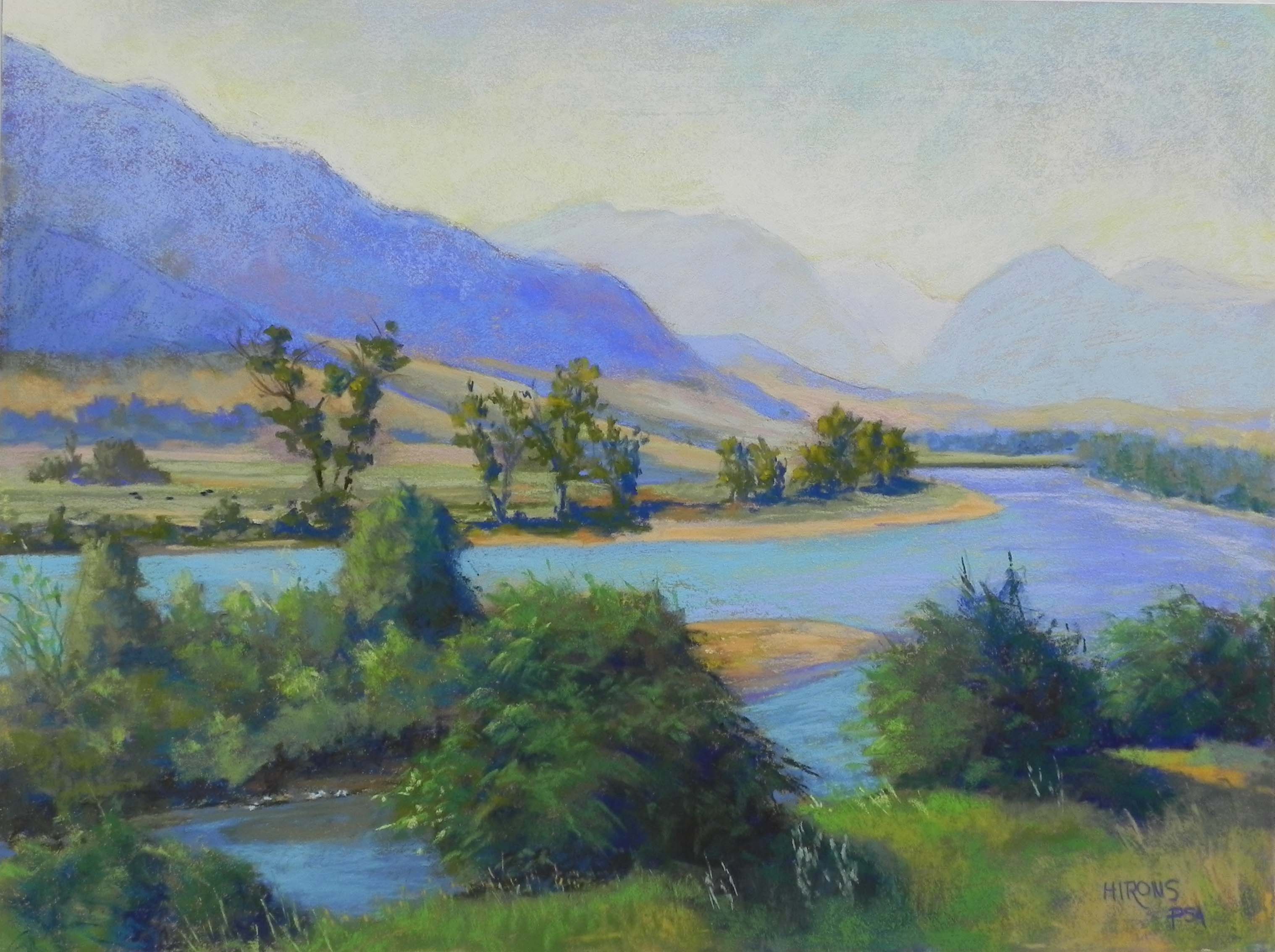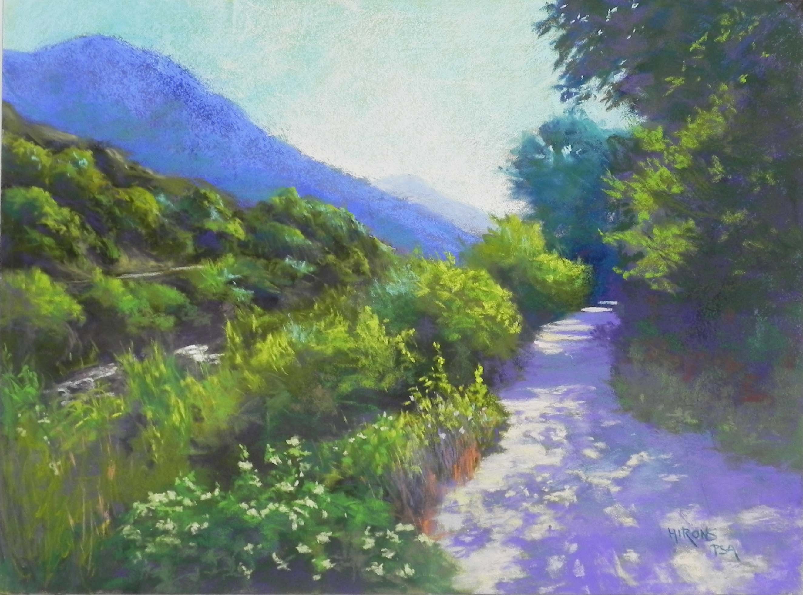
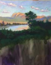
Evening Light, Waterton Lakes, 20″ x 16″, pastelbord
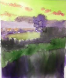
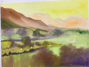
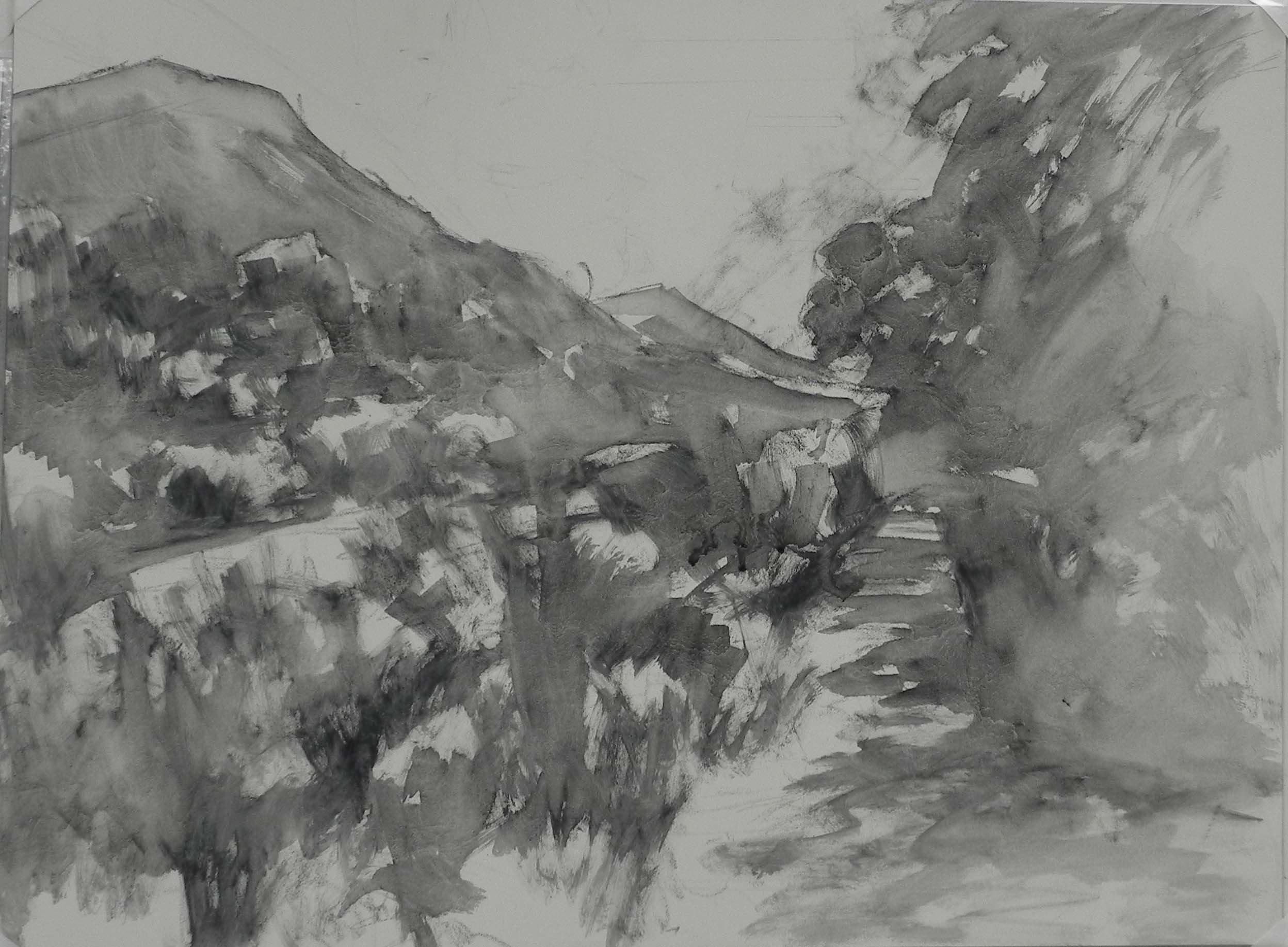
Watercolor underpainting
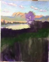
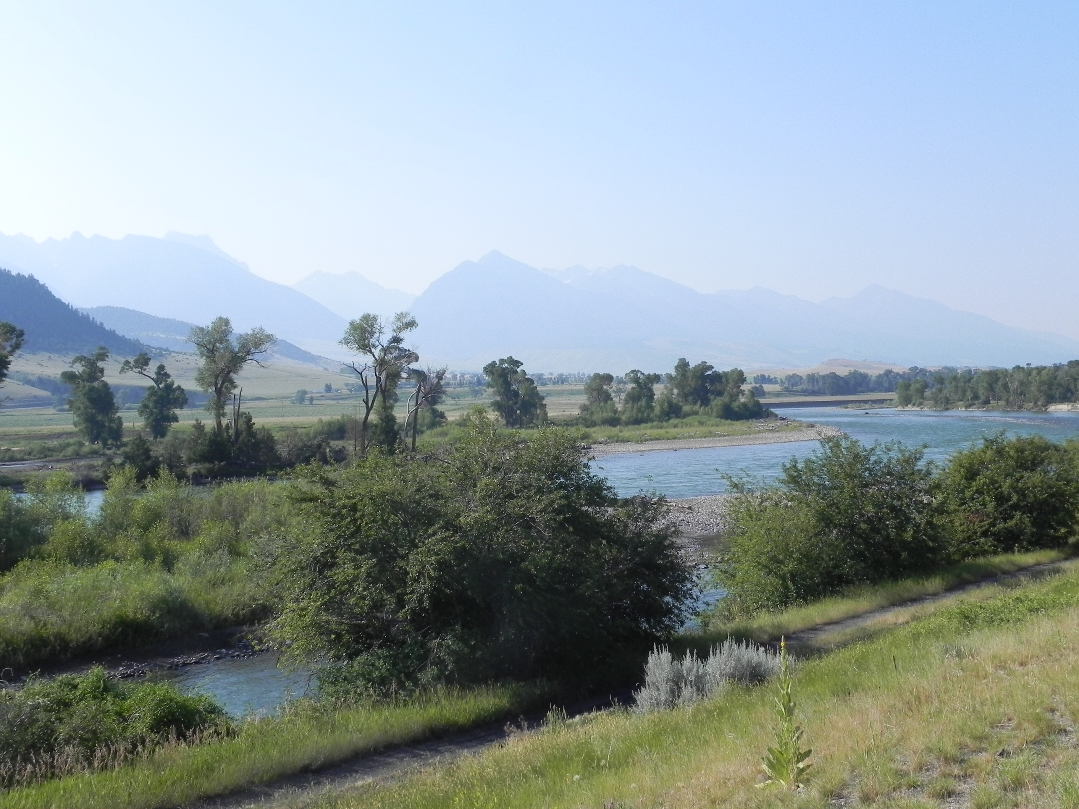
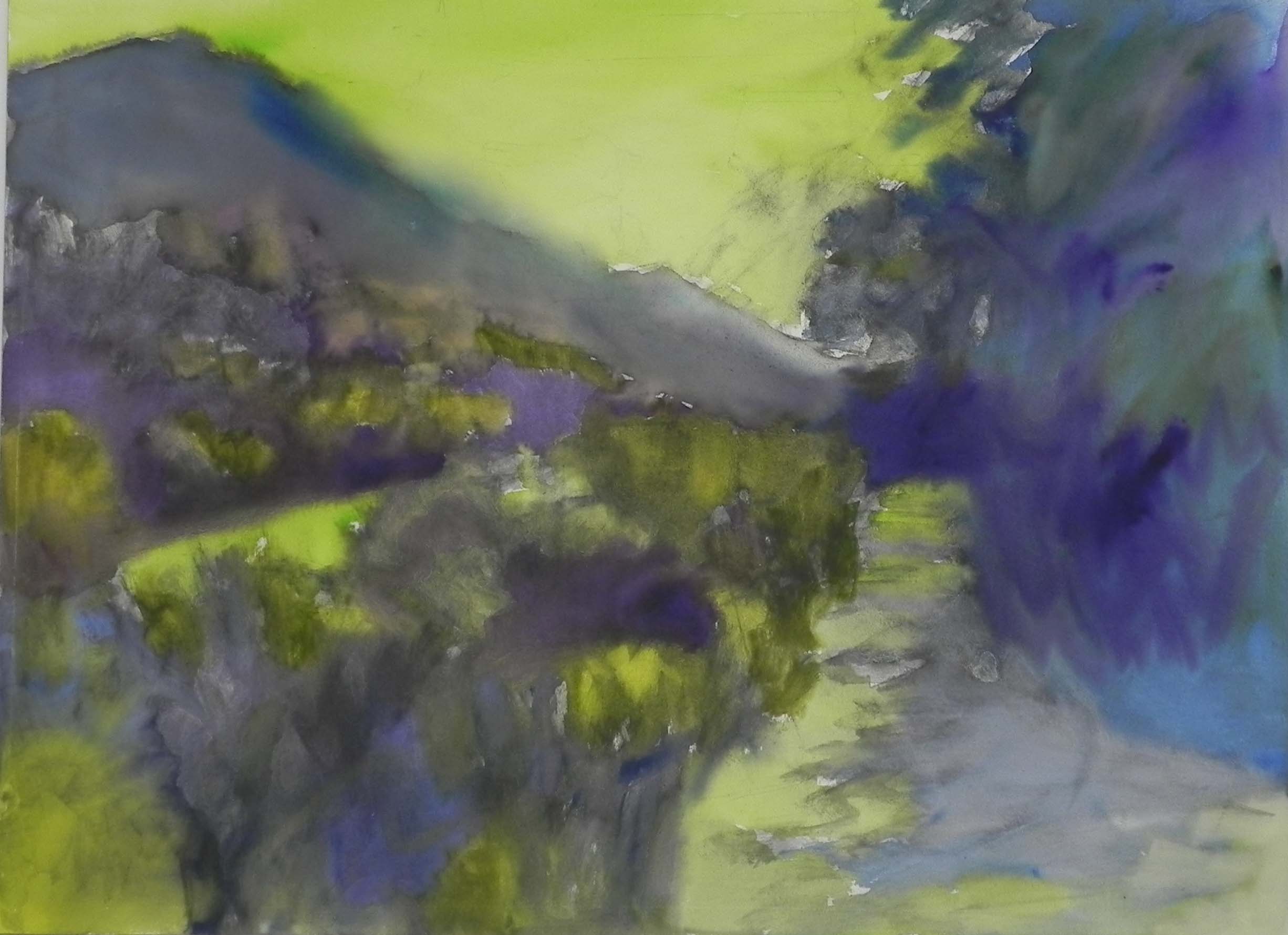
Day 1 painting and repainted underpainting
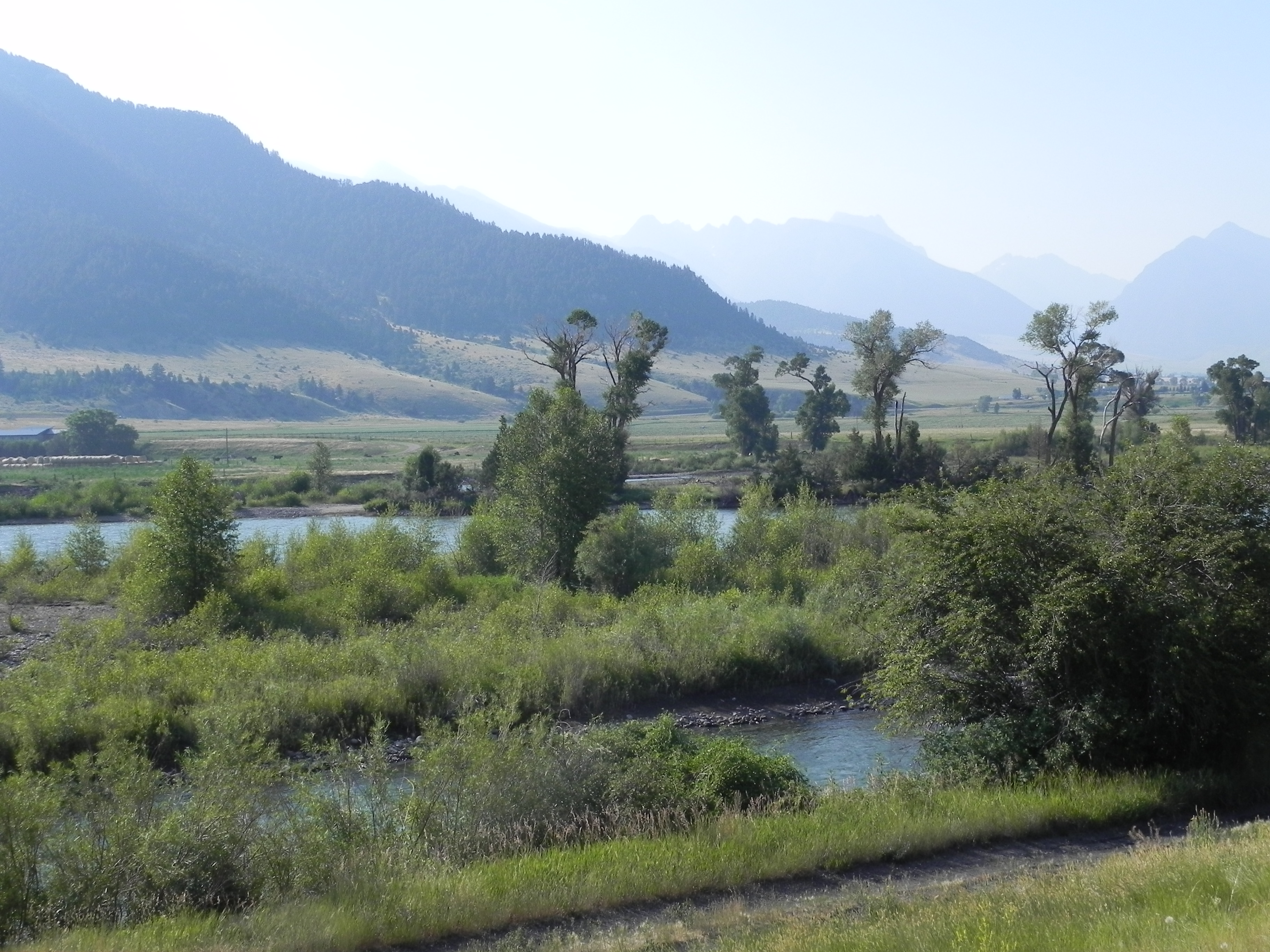
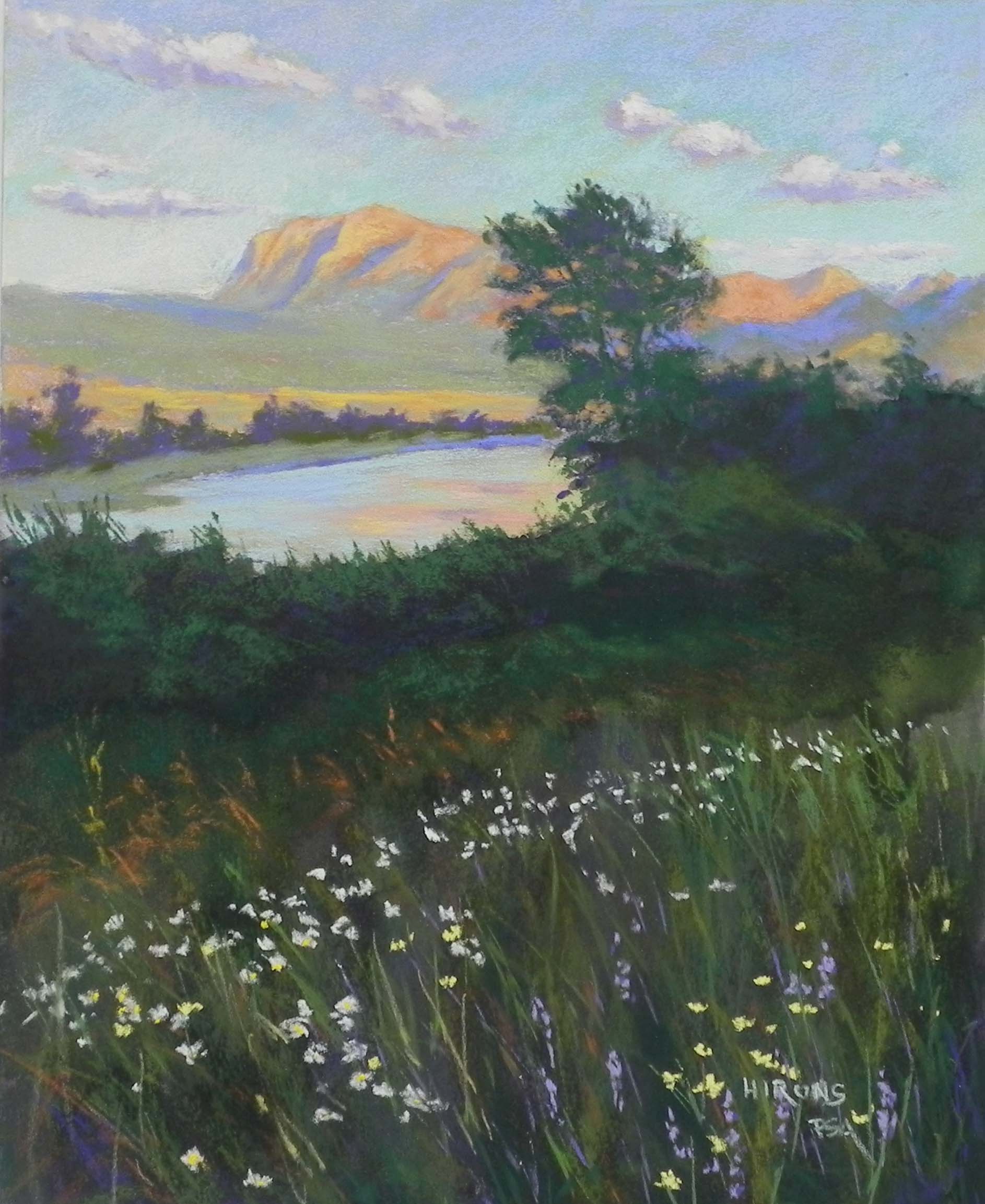
Day 2 painting-water, tree, bushes
Last week I gave my regular three-day “Beat the Heat” workshop in Rockville. Rather than doing a demo in the first morning, as I always have, I decided to do the demo in three parts, finishing on the third day. I chose an image from my trip that had everything–sky with clouds, mountains with late afternoon light, water and reflections, tree against sky, bushes, and a field of flowers! What a gold mine for teaching landscape painting!!!
I took all of the in-process shots with my cell phone and they are very small images–sorry, will have to learn to change them!
Waterton Lakes is just north of Glacier National Park and is in Alberta, CA. It is an amazingly beautiful place! There are so many flowers (and bears!) and wonderful places to walk (with bears!). We ran into a mother grizzly on the first morning (not so good), then a smallish black bear the next day who went for a swim in the lake (much better!)
This image was taken after dinner on the road that leads into the park. Quite beautiful!
Day 1: Underpainting, sky and mountains. I used watercolor for the underpainting, which faded of course. I later added more violet to the dark bushes. But it produced a gorgeous gold color under the lake. I painted the sky and clouds with Ludwigs and used Giraults for the mountain and distant grasses. In my photo the distant trees were very dark and I made them lighter. Late in the day, I decided to add more watercolor to the un-painted portions of the surface and you can see the difference! The dark violet really made the golden water glow!
Day 2: Water, tree, and bushes. I hated to cover up the water! I very lightly applied a blue green Ludwig, letting some of the gold show through, then added some peachy color for the reflection. Then I worked on the tree, using greens and violets. In the photo, this whole area is very dark. I purposely lightened it a little, as I know what late day photography does, and I wanted it to have more interest as well. I began the bushes with very dark green and violet, then added slightly lighter greens on over, leaving the dark in the underneath parts. It was enough to provide a good contrast with the water.
Day 3: Field of flowers. I began by adding darker swaths of greens and some browns in the field, to build up the grasses. Added some blades of grass with the sides of Giraults. I began with the orange seed heads of the grasses in the back of the field and liked the way they looked over the dark green. Then I added the flowers: white daises, yellow flowers at right, and some purple ones I made up. Finally, I added stalks of grass over the flowers to push them into the field.
Today, I took a final look at it and made a few more changes. I softened the shadows in the distant mountain (too blue) by adding some light red violet and I felt much happier with it.