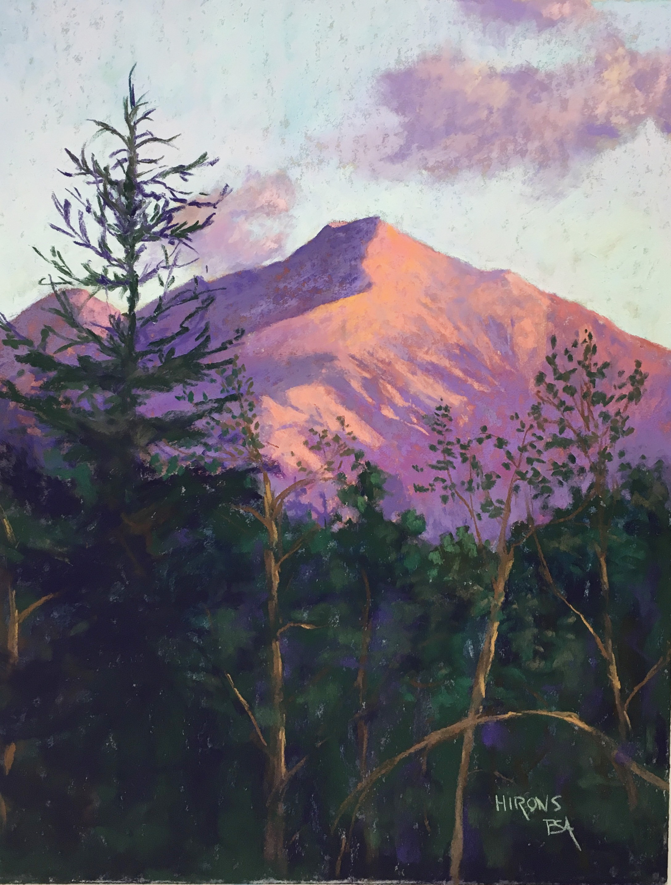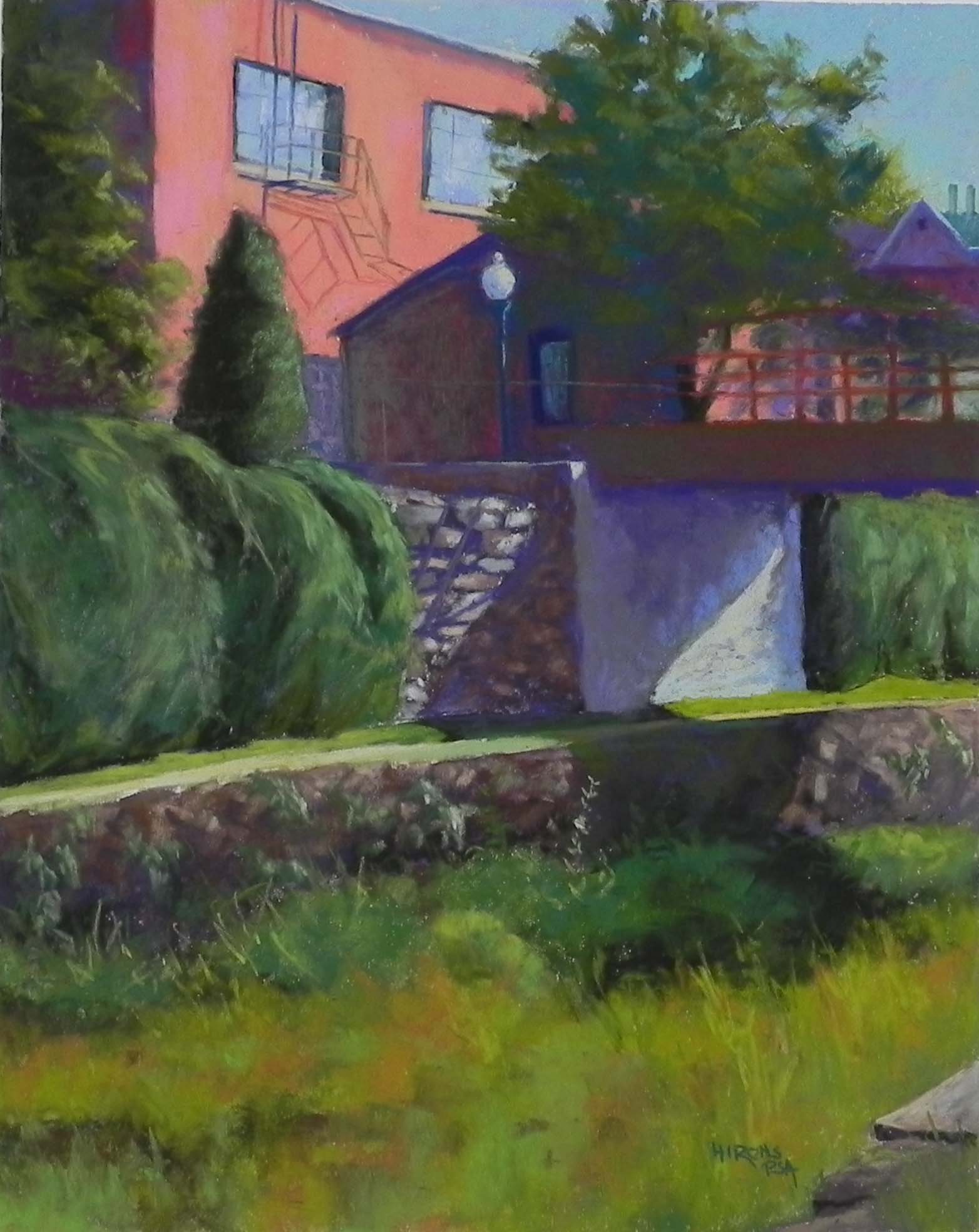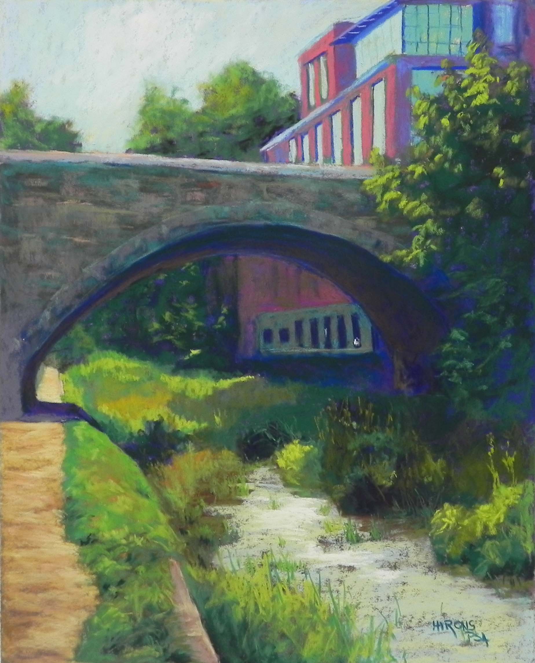
Light Under the Bridge, Georgetown, 20″ x 16″, UART 320
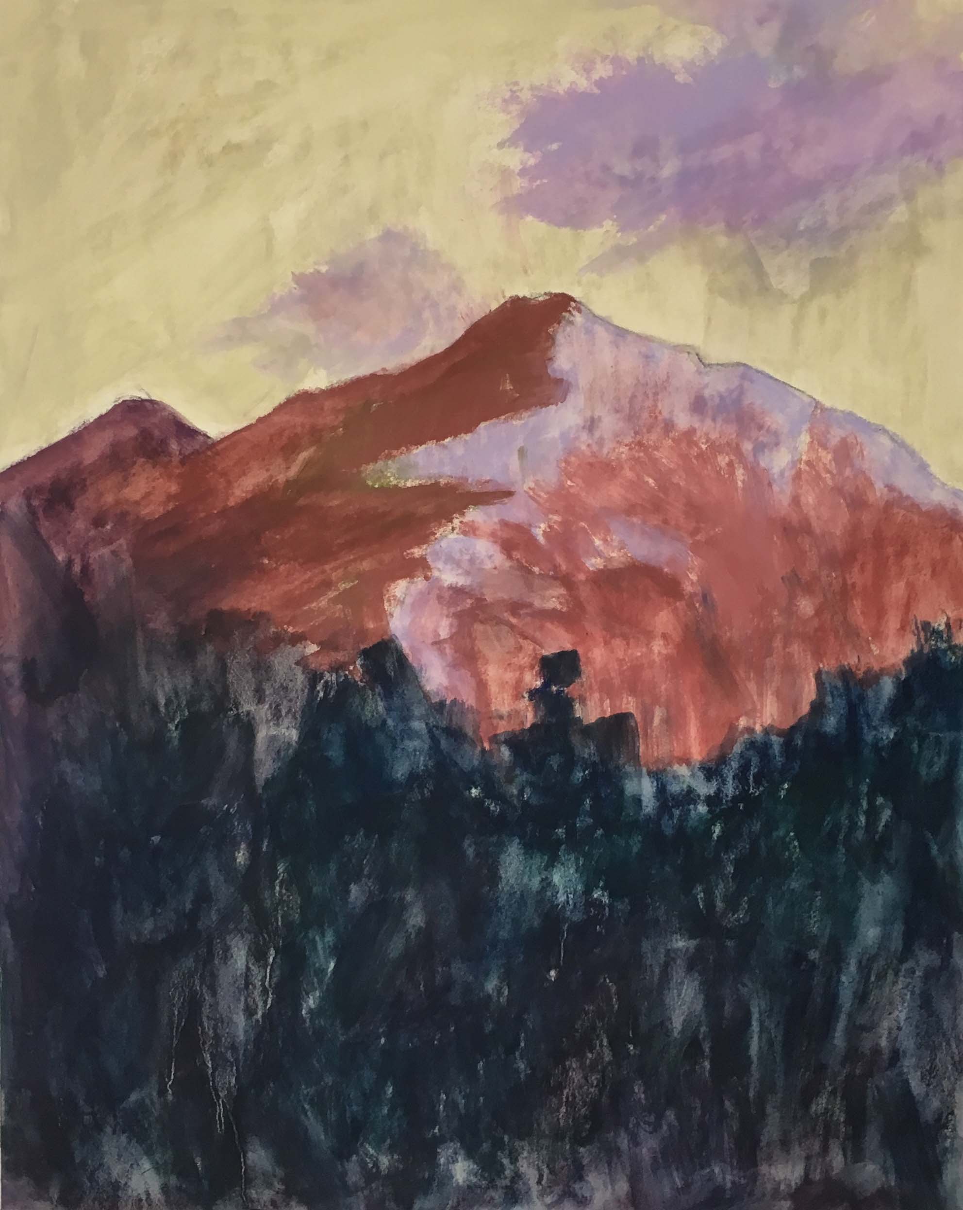
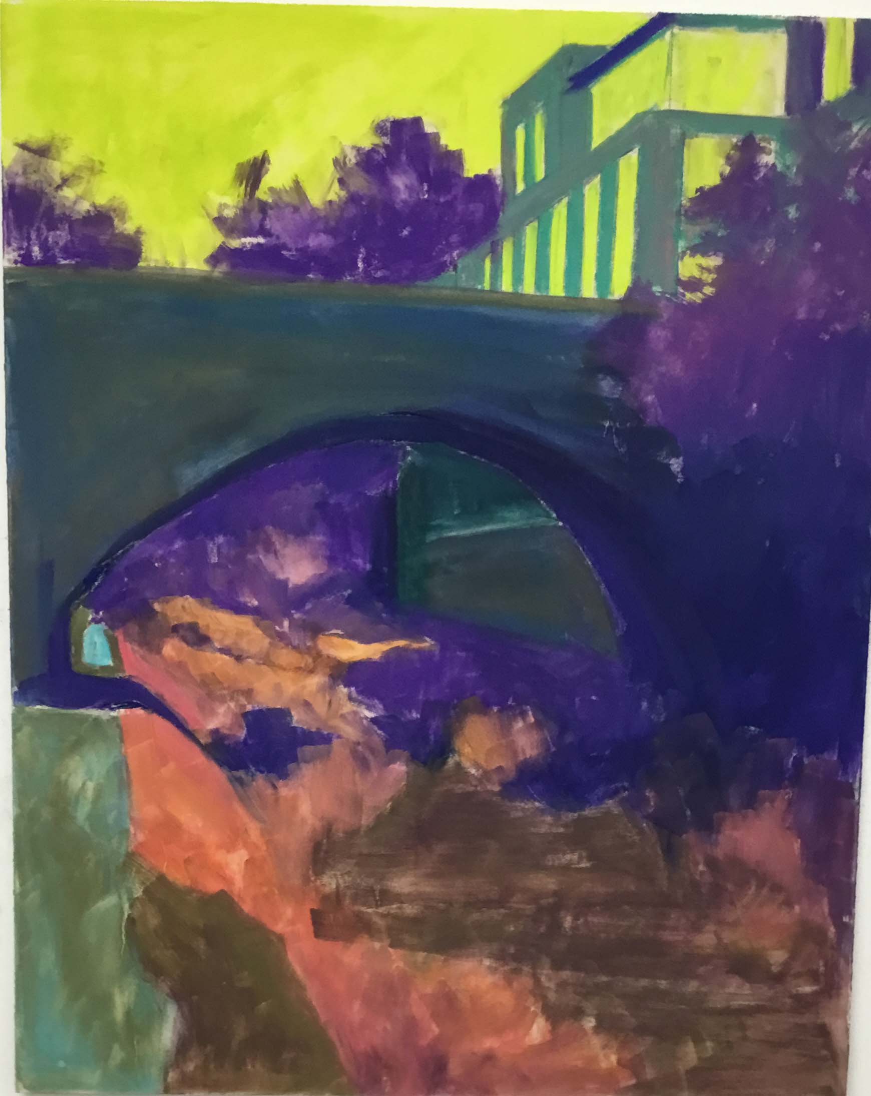
Underpainting, first stage
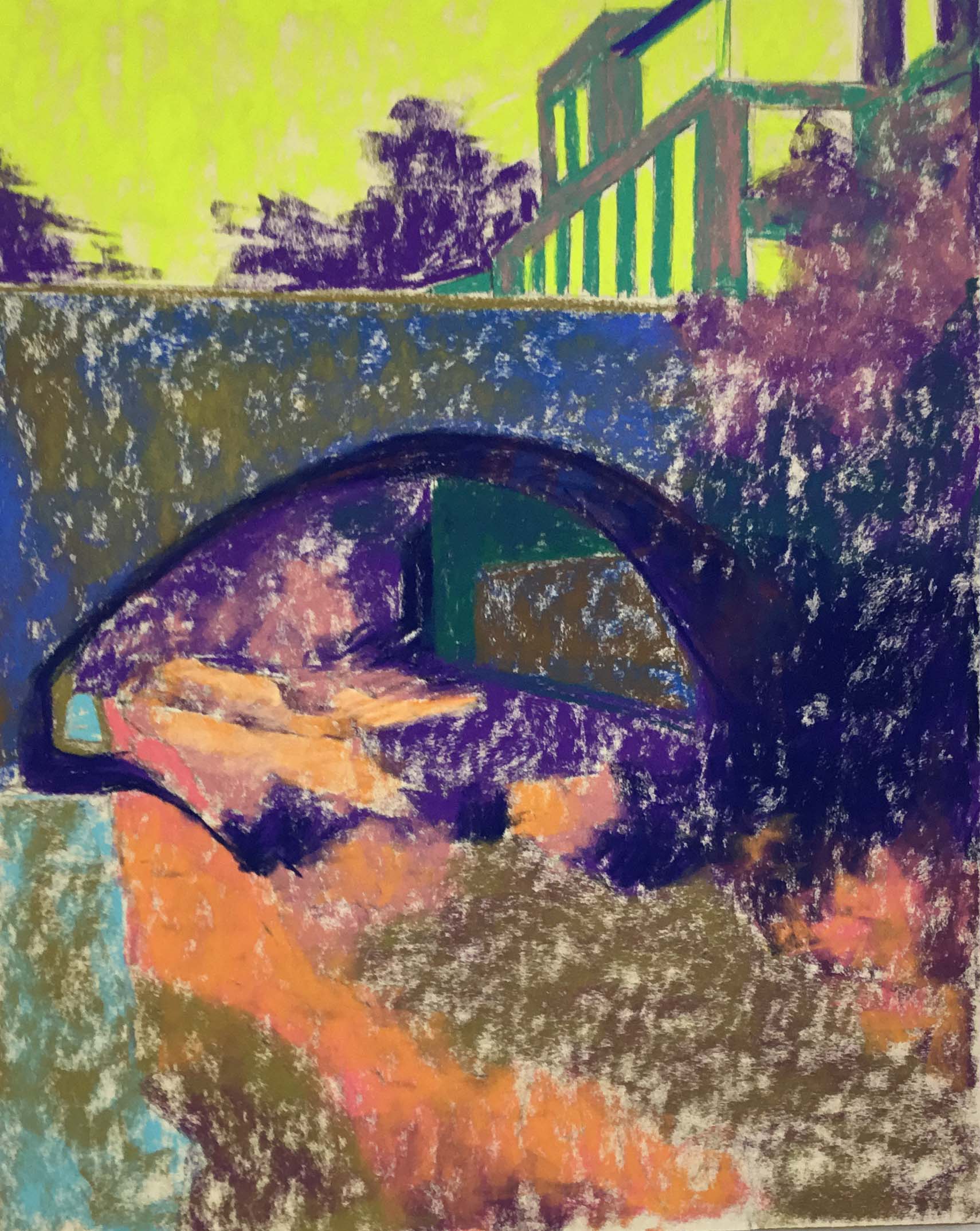
Underpainting with alcohol
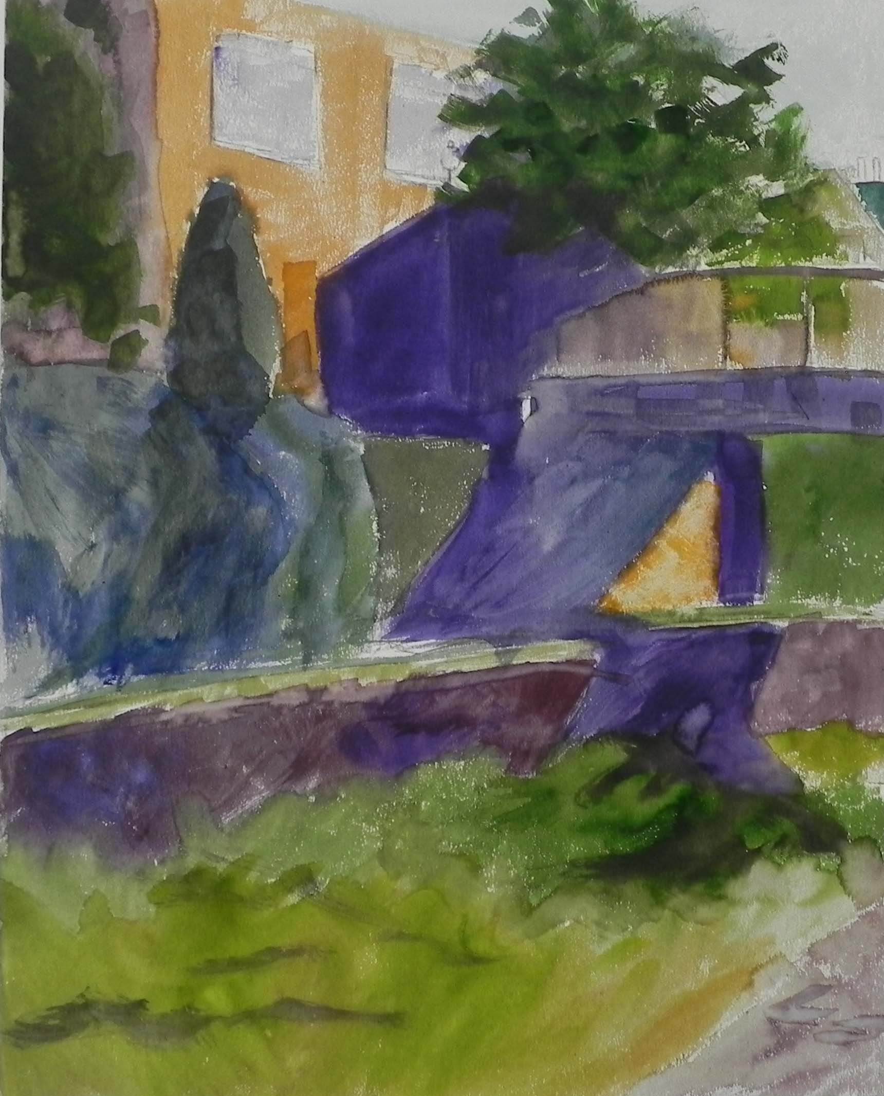
On Wednesday, I spent the day in the studio painting another scene from the Georgetown Canal sans water. But this one actually had a little water and the light was gleaming off of it. So it was fun to paint. I liked the view of the stone bridge with the lovely grasses in light and shadow and the one building complex at upper right, which I tried to minimize. I wanted to get a really rich, dark underpainting, so I chose UART and used hard pastel and alcohol. I used the bright yellow green for the sky and windows, a mixture of darks in the dark areas, and oranges and browns under the grasses.
I used a combination of blue green, brown, and grayed violet Giraults for the bridge, using the sides, and just layering them on. I was really happy with the way it came out, with the feeling of the stones without specific articulation. I loved doing the various greens and I particularly tried hard to keep the values close on the right side, while keeping interest in it.
Doing the water was the most fun! I decided the brown underpainting wasn’t dark enough (after doing all the green around it) and I laid on my hard pastel and very carefully added alcohol. Then I began with two Giraults–aqua, then yellow and laid in the pond scum (!). I finished with a soft lighter yellow, added it with more force near the middle of the picture.
When I first filmed it, the dark blue that I had used under the bridge and in various other darks was way too striking. So today I added dark green and brown into it, which made it look a lot more natural.
The last thing I did was to take some of the light yellow and add it to the sky to give a sense of a light cloud. I felt that that finished the picture nicely!