In anticipation of our upcoming Open Studios Weekend at Artists and Makers–Nov. 4-5–I decided to do a series of 12 x 12’s of pictures from our Western trip in July. Last week I did three demos for three different classes on 12 x 12’s, one of which will be washed
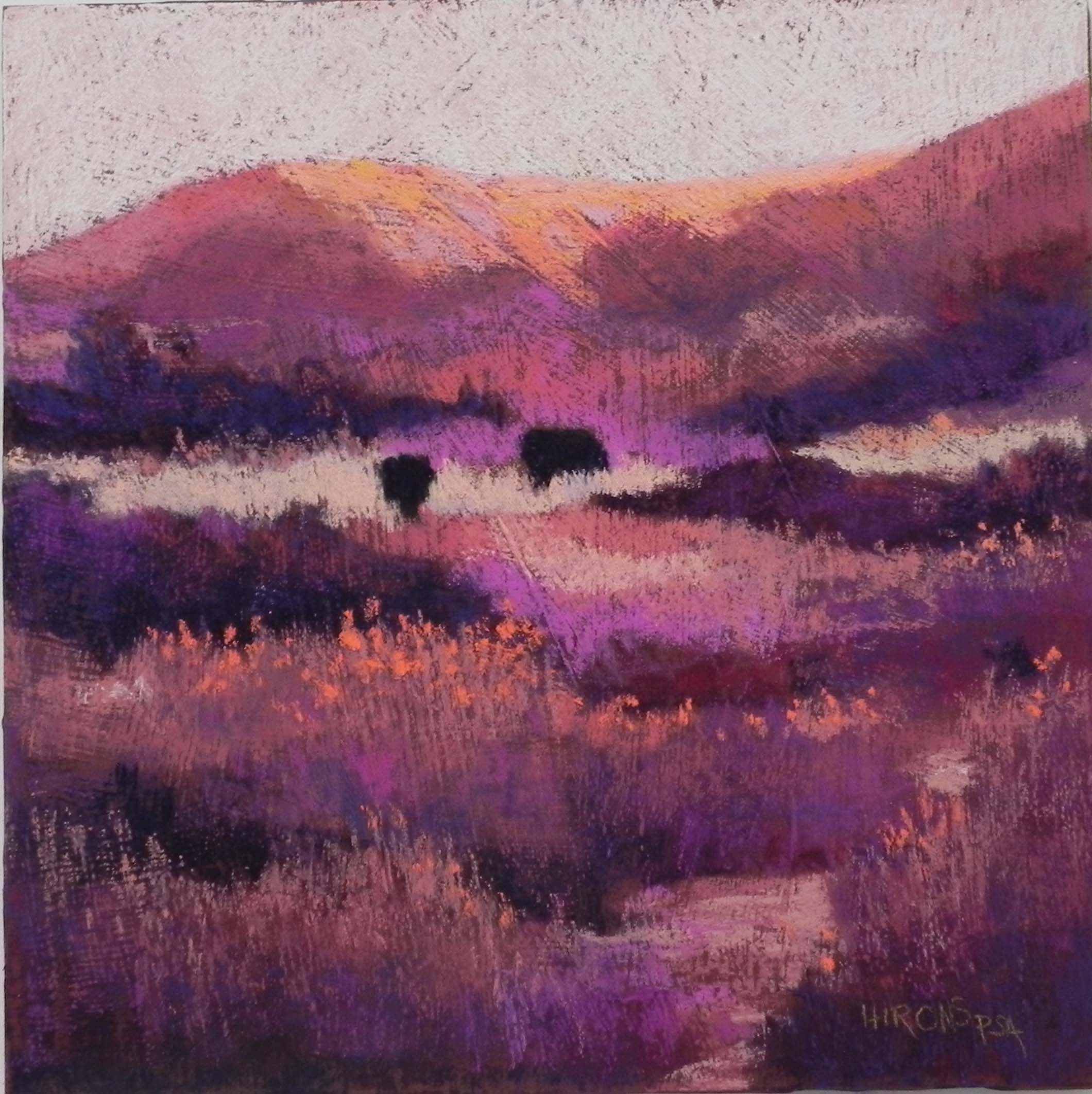
Through the Fields, 12 x 12, gray pastelbord
off! The other two are OK, but not in this post. In the past two days I’ve done three more that I’m sharing with you. First, I want to mention that when we were in Bozeman and Waterton Lakes taking the walks from which these paintings come, I kept thinking about doing larger, more abstracted pieces, with less detail. So I tried to keep that in mind while I was doing these. I began with the textured painting “Warm Fields”, done on a resurfaced pastelbord. I toned Art Spectrum liquid primer with a very dark brown liquid acrylic (too much fell in!). This gives the painting an overall dark appearance compared to the other two. For this painting, I used a lot of my American ArtWorks pastels. One of my students has the red “Try me” set, which I’ve been ogling for some time, but knowing that I own the complete set, meant that I no doubt had all of those colors! So I brought them to the studio and had great fun pairing warm and cool reds, browns and oranges. I loved working on the surface and probably over did it with the little orange flowers, but I couldn’t help myself! The combination of pastelbord and the liquid primer makes a very hard surface, so it requires soft pastels. One of my fellow artists saw the painting and said she loved everything but the texture in the sky. I told her that: 1) I didn’t have a choice with this, and 2) it wouldn’t look right if there was texture everywhere else but not in the sky. I’ve learned that from experience.
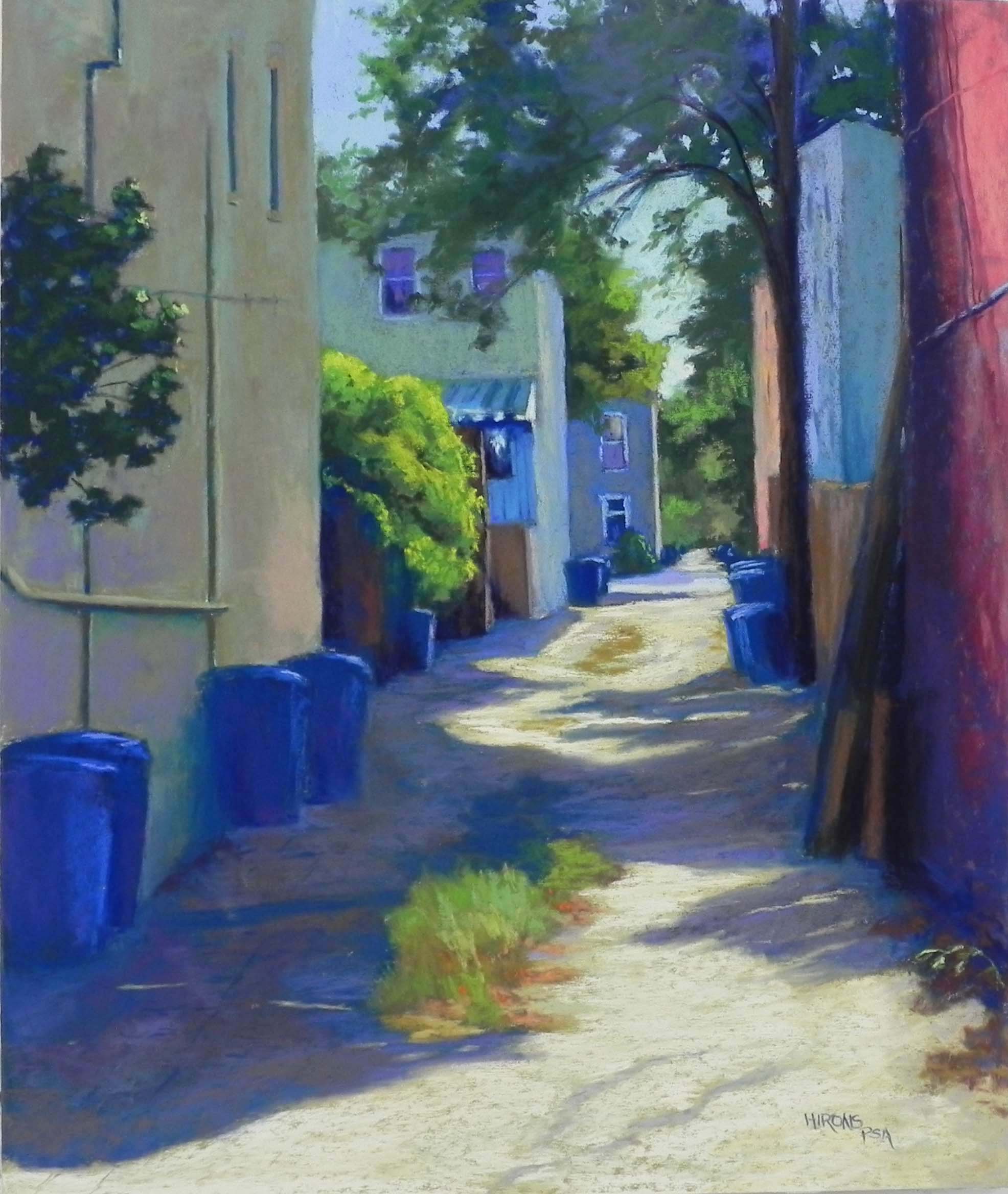
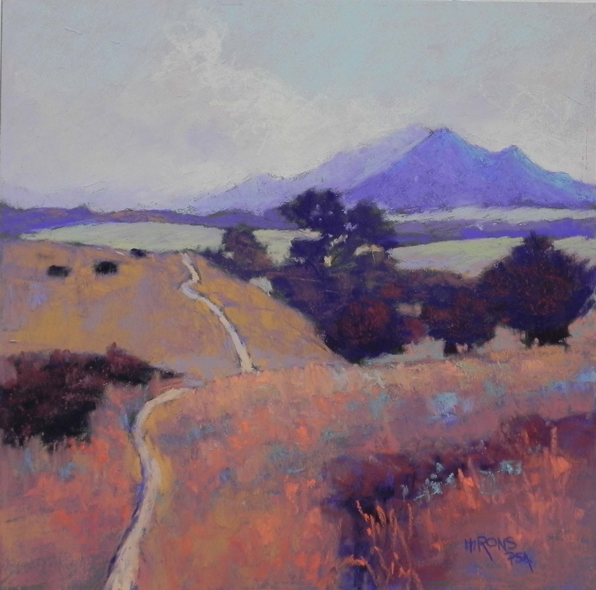
The second painting I did was “Through the Fields”. This and “Warm Fields” are both from the Painted Hills area on the south side of Bozeman. I’ve tried to do several paintings from this area and haven’t liked any of them. I think the problem was the blue and green landscape. For this one, I used a gray pastelbord, so direct application of pastel. But I worked from a black and white photo (which I also did for “Warm Fields”). The surface was completely different from the first, much smoother. I began the sky with the same soft pinks and oranges I had used before, but hated it! So I brushed it off, making the surface even smoother. I then applied a light violet with aqua on over it. The violet makes it look like rain is imminent! I then added a light suggestion of cloud. This was all done with soft Great Americans and they hardly made a dent!!! For this painting, I used a combination of violets, oranges, greens, and aquas. I did a lot of layering, beginning the fields with violet, than adding the oranges on top. The combination of warm and cool grays down the colors, making them more subdued. I used some darker, brighter oranges and turquoises in the foreground to perk it up. Compositionally, I really liked this scene because of the triangle of dark trees nestled near the hills and the shape of the path leading into the distance.
My last painting was done on mounted UART and it felt really nice after the hard board. For this one, I used the color photo. I was really happy that I had changed the picture to a square as it meant less of the foreground and I like the resulting composition, which leads the eye into the area of trees, flat fields, and distant mountains. I did an underpainting for this one, using a bright yellowish green for the sky, and a lot of the Caran d’ache brownish “almond” colors for the fields and mountains, which produced a lovely warm color, particularly for the distant mountain on the left. I was careful with the value of the mountains, beginning with the lightest and working forward. I liked the fact that the mountain at right is darker than the one at left and I really liked the subtle pieces of lighter color (rocks) in the left mountain. I used Ludwigs and Great Americans and a few Giraults for this. Even though I was working on a softer, more grabby surface, I continued using soft pastels and liked the feel. But when I got into the more detailed path with grasses, I used some of the Giraults to have better control. The large patch of green on the left was a challenge, but I broke it up with ochre grasses, pieces of dark blue shadow, and finally a few orange flowers just to the left of the path that look like California poppies. The flowers that were there were violet and yellow, and wouldn’t have worked in this painting.
These paintings were all really fun to do. I enjoyed pushing myself to use the completely warm palette, then trying other color palettes. I have four 20 x 20 boards of UART 320 that my framer prepared for me and I’m trying to decide what to use them for. Perhaps one of these, or perhaps another from the West. We’ll see!
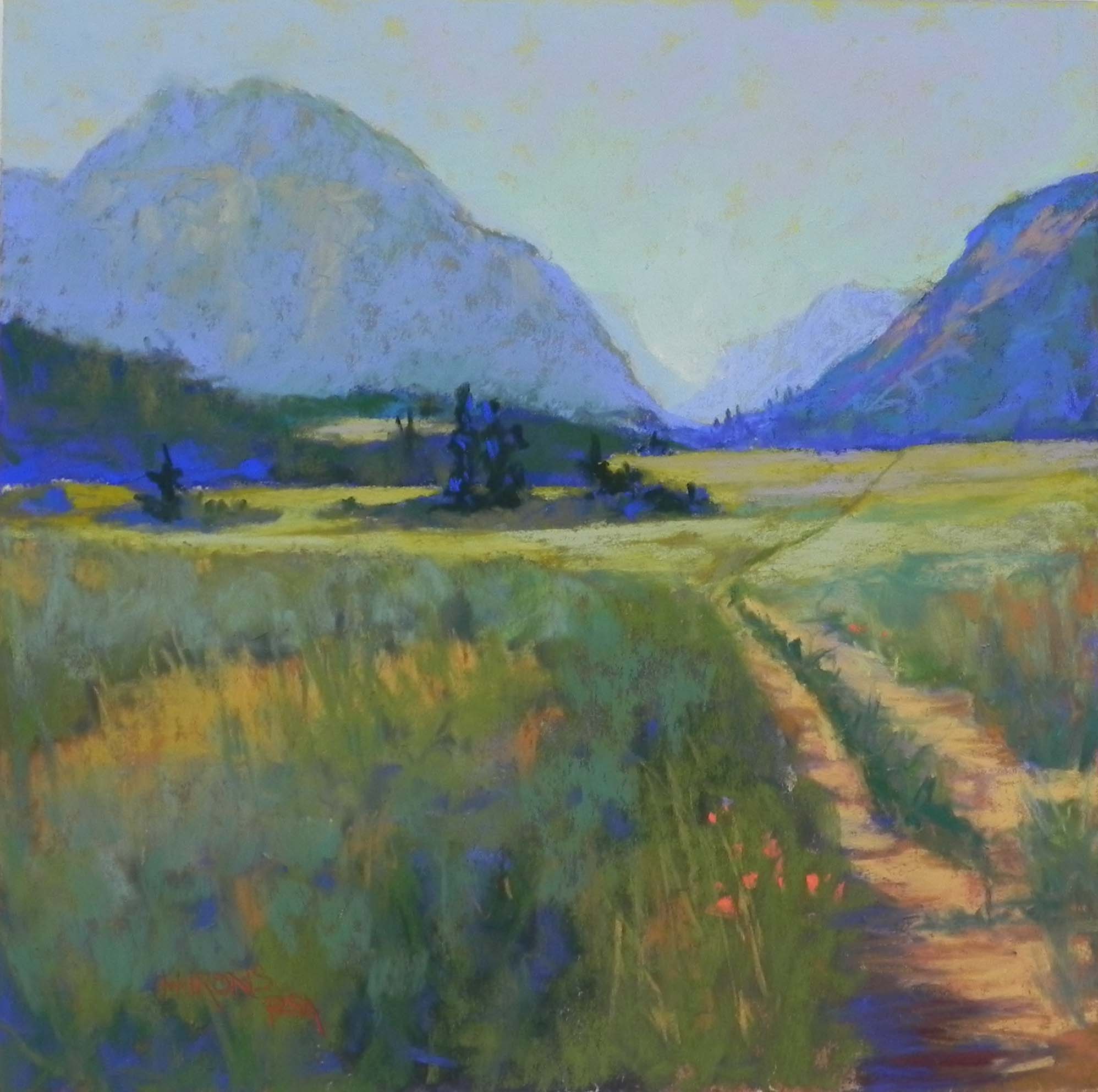
Into the Mountains, 12 x 12, mounted UART 400
Warm Fields, 12 x 12, resurfaced pastelbord