
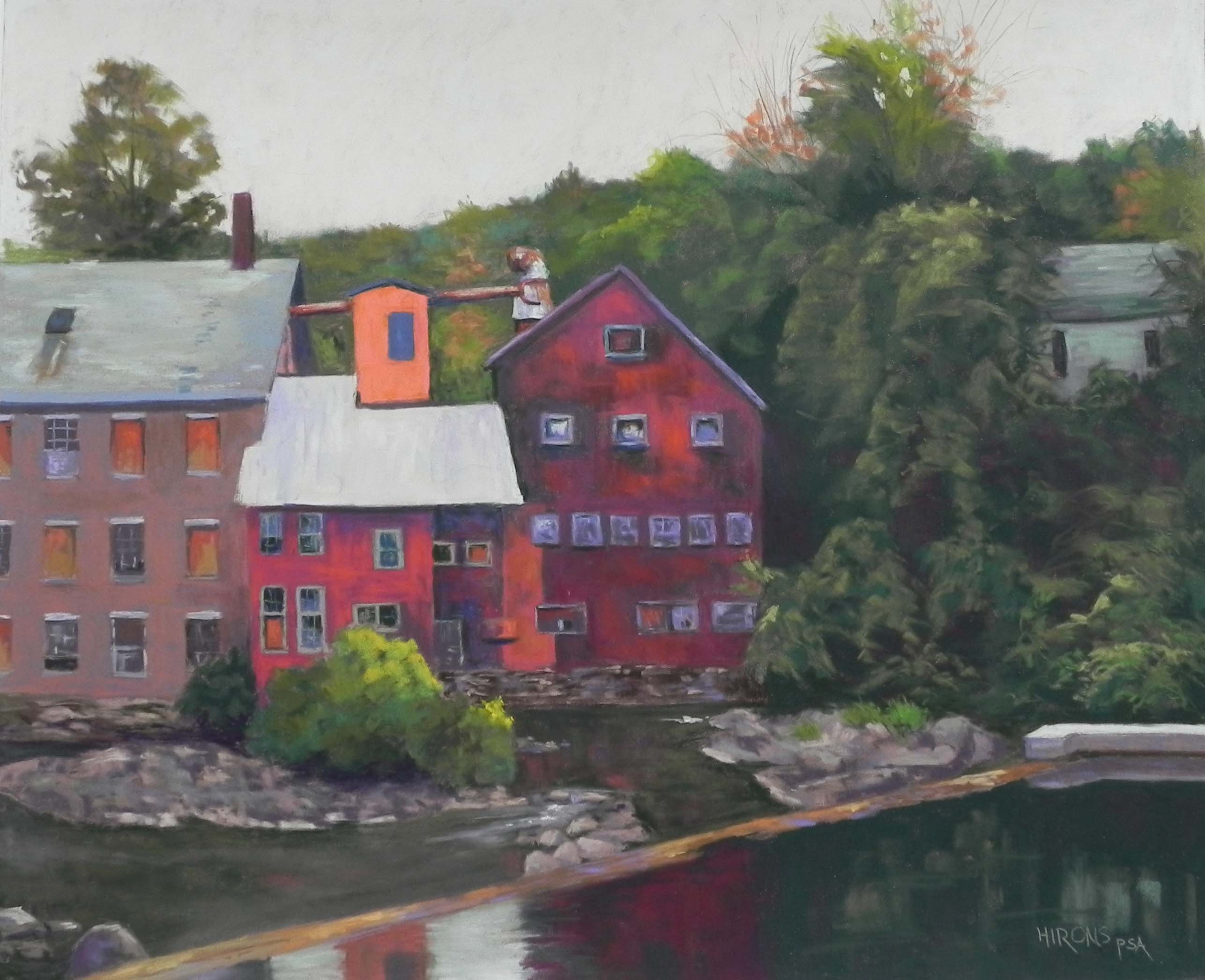
Abandoned Mill, Springfield, VT, 20″ x 24″, pastelmat
Today I finished working on a painting that I began some weeks ago. It’s from our Sept. trip to Vermont and I loved the photo and spent a lot of time on the drawing. However, I decided to do it on brown Pastelmat, which I hadn’t worked on in some time, and I found it kind of frustrating. I got back to it this week and realized that I could do a good job with it and just did it! It was not having an underpainting that bothered me, as I love to do buildings over underpaintings. By working straight from the drawing to the painting, I felt a little like I was coloring in the lines!
The picture was taken the same dreary day that I took the picture of the fog on Mt. Ascutney. Got the best pictures that day! At this point, it was gray with no sun, but not raining. I took a lot of pictures of this mill complex from various points of view and chose this one. I like the way the green foliage and its reflection in the water kind of nestles the buildings.
I used dark violet and some green to begin with under the two red buildings to keep the reds from being too bright. (The digital photography of this is always a problem and i had to adjust the photo as the orange and red were really jumping off the page!Now it appears a little too dark.) I saw this as a red/green complementary painting and used a pale green and pink in the sky.
My first problem, and the reason I stopped working on it, was that the metal roof in the middle was way too bright when I first did it (copying the photo too closely). I tried to brush off as much as possible, which isn’t easy on Pastelmat, and gradually added slightly darker greens and violets into it, until I was happier with it. Adding the same color of light green into the top of the dam (at right) helped bring the color around. I also used similar colors in the roof at left and the hidden house at right. I omitted a large building behind the red building at right that looks like a school. But most other things are pretty much as I saw them. I adjusted the large tree on the right to go off the top of the page, and brought some oranges around it to bring that color into other parts of the painting.
I wanted to come up with a really great title for this but couldn’t think of anything. It reminds me of the great days of manufacturing in the 19th and early 20th century in New England (not that I was around). So it’s rather a poignant and timely reminder of what we have lost. I hope that these buildings are or will be used for something else. Meanwhile, perhaps I’ll start a series of old mill paintings! There are plenty of them in my home area around New Bedford and Fall River. Beautiful old stone and brick buildings that were hell to work in!