
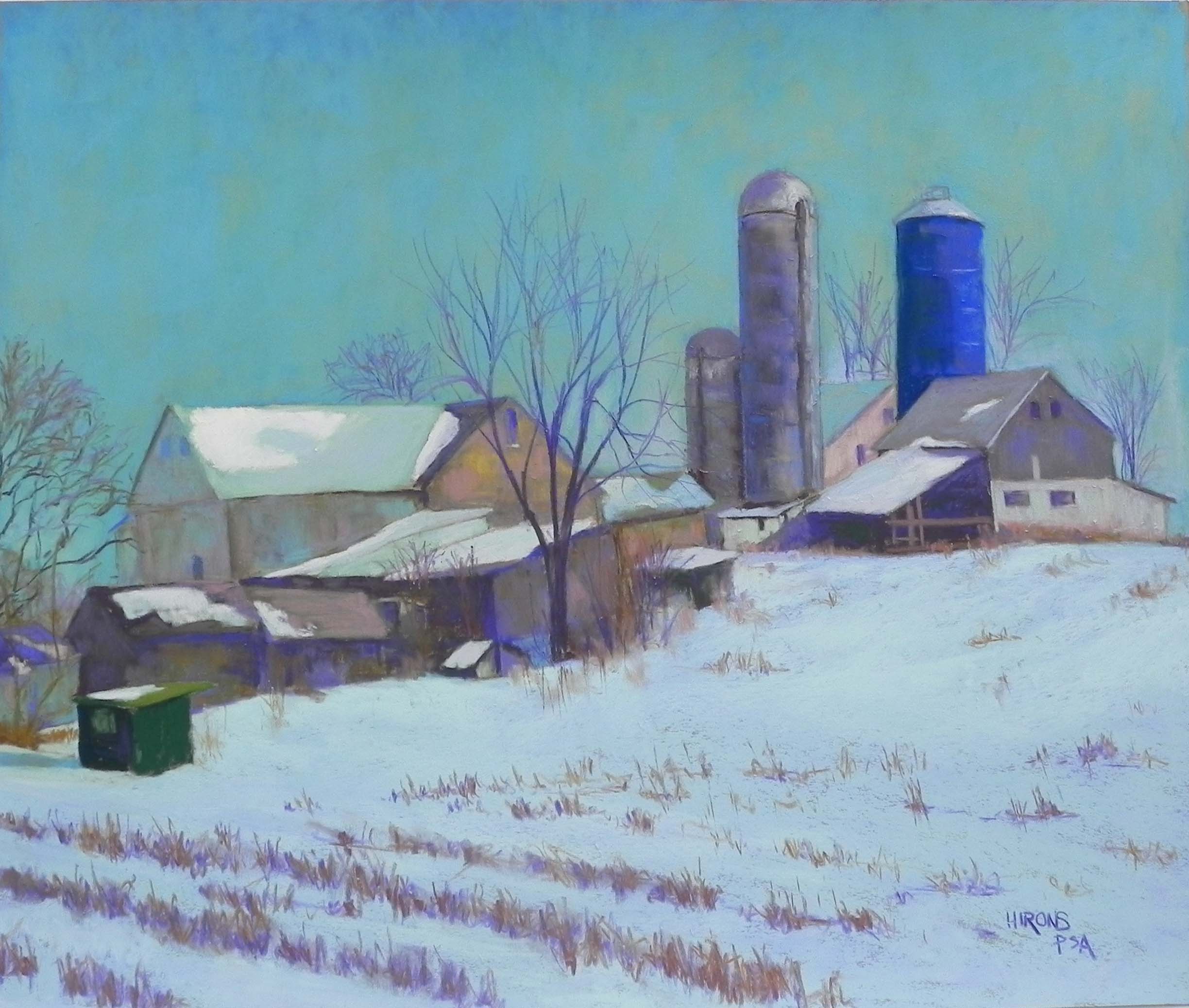
Amish Farm Revisited, 20 x 24, Pastel Premiere Italian clay
I used to pride myself at being a seasonal painter. But lately, I’ve been painting whatever I wanted to in my studio and this is the latest painting–more snow! It’s from a photo I shot from the car in Dec. 2013 on the way to Mass. Some of you might remember seeing my earlier painting (I actually did two). I was in an abstract mood at the time and I exaggerated the hill and worked from black and white, putting in lots of colors that weren’t there. I also did both paintings on Reeves, so they had a much more textured broken color look to them. Recently, I was going through photos and came across it in color and B&W and I decided that I really loved the original (real) version of the scene and that I should paint that.
I would have done an underpainting but I didn’t have any mounted light paper in 20 x 24, so I used a sheet of Pastel Premiere Italian clay. I liked the idea of working directly over the drawing. The challenge for me was the coloring. At the time, I remember that the sky was infused with yellow light. It was probably 10-10:30 in the morning on a winter’s day and the light was quite amazing. I loved the fact that the sky was darker than the snow, but that the snow had lots of corn popping up in it. So composition wasn’t an issue, but color was. I cut a small piece of the same paper and did some studies for the sky. I started with Ludwigs and immediately put them down–too soft! I didn’t want the sky to look cakey. I went to Girault instead (of course!). I worked with several blues, blue greens, and a wonderful grayed yellow green that brought the sense of yellow into the sky that I remembered. It’s not exact, of course, but I like the effect of it. I decided to make it pretty much the same all over, but did lighten the bottom a little on the right.
One of the color aspects that I really liked in the photo were the dark green building on the lower left and the solid blue silo on the right, both in about the same value and solidness of color. After completing everything, I added some of the blue to the dark green, and some of the green to the dark parts of sheds going up the hill. It helped tie them together, and added more dimension to the shadows. I used Giraults exclusively for the buildings. But when I got to the snow, I instinctively went for the Ludwigs. I began with a blue violet, then two blue greens on top. They seemed perfect for the snow, which has more mass than the sky. I used hard pastels for the corn and the tree branches against the sky.
I wasn’t sure about this picture when I began it, because I really DO love working over underpaintings. But now I’m quite happy with it. And even though I worked from the photo, it’s still not all that realistic! I mean, who has ever seen a sky this color!!! But I really like it.