Potomac Gold

Potomac Gold, 24″ x 20″ , UART 320 board

Underpainting with alcohol

Painting as it was in late October

Today I finished the painting I was working on last fall when I broke my arm!  I thought it would take a lot more time but I decided I was pretty happy with it and called it quits.  What was really interesting about the painting was that I learned how to do negative painting.  This happened first in the sky.  The dark green branches were too thick as I originally laid them in so I used the blue pastel I’d used for the sky and started “sculpting” them.  It was really fun and resulted in leaf forms.  Today I did it again with the dark green bush at lower left.  I put in the darks and laid several colors on over, then the branches that are standing out.  The whole shape was too dark and massive. So I used the blue of the water to cut it back, allowing more greens to become little branches.   This is really fun!

I simplified this picture, particularly at the bottom. There were a lot more rocks and sandy patches.  I first added them in, then decided they were a distraction and removed them. I decided to concentrate on the colors and light and reflections in the water.  I”m glad I did as I think it works.

I had to make up the bottom right as it wasn’t like this. No opening of sand as I have added, but I think it’s an important entry into the picture.

I wanted the yellow greens of the tree to be the primary focus.  But the blues in the water are pretty strong.  I added a thin layer of orange Girault over it to try to gray it a bit. Not sure that worked but there’s so much orange in the upper left that it made sense to have more in the water.  I also added a piece of light on the sand at the edge of the water and the tree branch seems to be pointing to it.  So I like this touch.

It’s kind of hard to paint brilliant autumn in drab January!  I”m certainly not inspired by what i”m seeing outside.  But I was happy to finally finish this painting after it sat in my studio for two lonely months!

Painting Again!

Marsh commissioned painting, 12 x 16, UART 320

Photo reference

Hello Friends.  I haven’t posted anything since October because I haven’t been able to paint since breaking my right arm in early November.  This is getting to be a real drag and hopefully, I”ll be taking some new medication and trying hard to avoid falls. But, fortunately, I can now drive to my studio and I can paint.  A good friend from my library days, who now lives in South Carolina, sent me this image and asked if I could paint it.  I said yes, of course, but that was in December.  I was able to do some drawings and played with the composition.  But in the end, I kept it pretty close to what was there.  However, I decided to add more color and make it more impressionistic.  The image of the painting is lighter than the original, but it shows the many strokes of color in the sky.

After working on the harder, mounted home-made surfaces that I’ve been playing with, doing this painting was sheer joy!  I started the sky with a blue green, then added pieces of blue violet over, keeping the overall warm green color. Then, underneath the clouds, I added pieces of light yellowy orange to reflect the marsh in sulight below.  I loved the effect of this and plan to keep working on this approach in future paintings.

The marsh in the picture, as you can see, is very dark. There must be clouds overhead that don’t show.  I found it quite boring.  But I started it dark with violets, and deep red browns, then gradually added warmed colors in. Again, the painting is darker and not as bright and the owner said she really loves it.  So, I was very thankful to have a lovely, small, and relatively easy subject to get me back into painting again.

I start teaching on Mondays and Wednesdays, both in person and on zoom.  Not many students this winter–everyone seems to want a break. But that’s OK as I want more time to experiment myself.  I’m about done with the paintings for my show in March which I’m calling “Intuitive Landscape.” (For those in the area, it’s at Artists and Makers on Parklawn Drive and the opening is Friday, March 3rd, 5-9.) I will post the last painting when it is complete. I went through color struggles with it that I’ll share.  It’s getting much better!  But I’m tired of the hard surface and I want to return to sanded paper. I really enjoyed working on the Orkney painting, the last one I posted in October, which was painted on Lux Archival. I”m thinking of investing in more of that paper as it is quite nice and doesn’t need mounting.  It will be easier to store and not weigh as much.  And I can play with more toning with inks, etc.

I hope that you are getting a good start to the year–unless you are in California or buried in Buffalo!  I really feel for the people out West and what they are going through.  Here it is just cold and dreary and I plan to paint more from my imagination, if that is possible!  Best wishes.


Jean

Two Boats, Orkney

Two Boats, Orkney, 20″ x 16″, Lux Archival with ink tint

Painting in process showing color of tint

I spent four days in the last two weeks working on this painting from our August trip.  I used three different photos and moved things around until I was happy with the composition.  A main challenge was that the large stone pier in the foreground was more in the center and took up and enormous amount of space!  And it was really dark.  So I had to move it over.

I decided to do the painting on Lux Archival to see whether I want to invest in more paper for my “regular” paintings (I’ve decided that I do).  As I’ve noted, I don’t think there is much tooth as the UART.  So I decided to tint the paper with acrylic ink.  This time (unlike in the past), I used the ink straight out of the bottle with a brush and it created a beautiful terra cotta surface that was perfect for this rather cool painting with lots of neutrals.  The color is darker than what appears in this cell phone image.  But you can see that it was easy to draw on it and see the pencil marks.  I have to say that I loved working on the surface and the color.  Of course, I was doing buildings and boats–no trees or shrubbery.  I made sure to leave lots of little pieces of red showing through (particularly in the whitish boat).

I’ve noted the challenge of the pier in front.  The large dark open space in the building was also a potential problem.  But I used various colors, indicated small lights from a back window, then put a lovely little post in front of it, that has a nice edge of light on the left side.  At the very end, I added the sea gull in front of it as well, thus making it a good backdrop for details of interest.

A major problem intially was that the turquoise boat was too much like the water around it.  I added the violet from the clouds in lighter places and some of the green from the roof and darkened the blue around it.  Now, I’m happy with it.

This was a challenging painting but it was also a happy picture to work on.  Our visit to Orkney was probably the highlight of the trip as it was so beautifully sunny with lovely clouds.  If only Shetland could have been this way!

PS.  I took the sea gull from a painting I have up in the studio of Port Clyde, Maine.  That one was much larger.  For this guy, I used NuPastels finishing him with the pointed edge of a while (completely unused) stick!

Montivideo Bridge

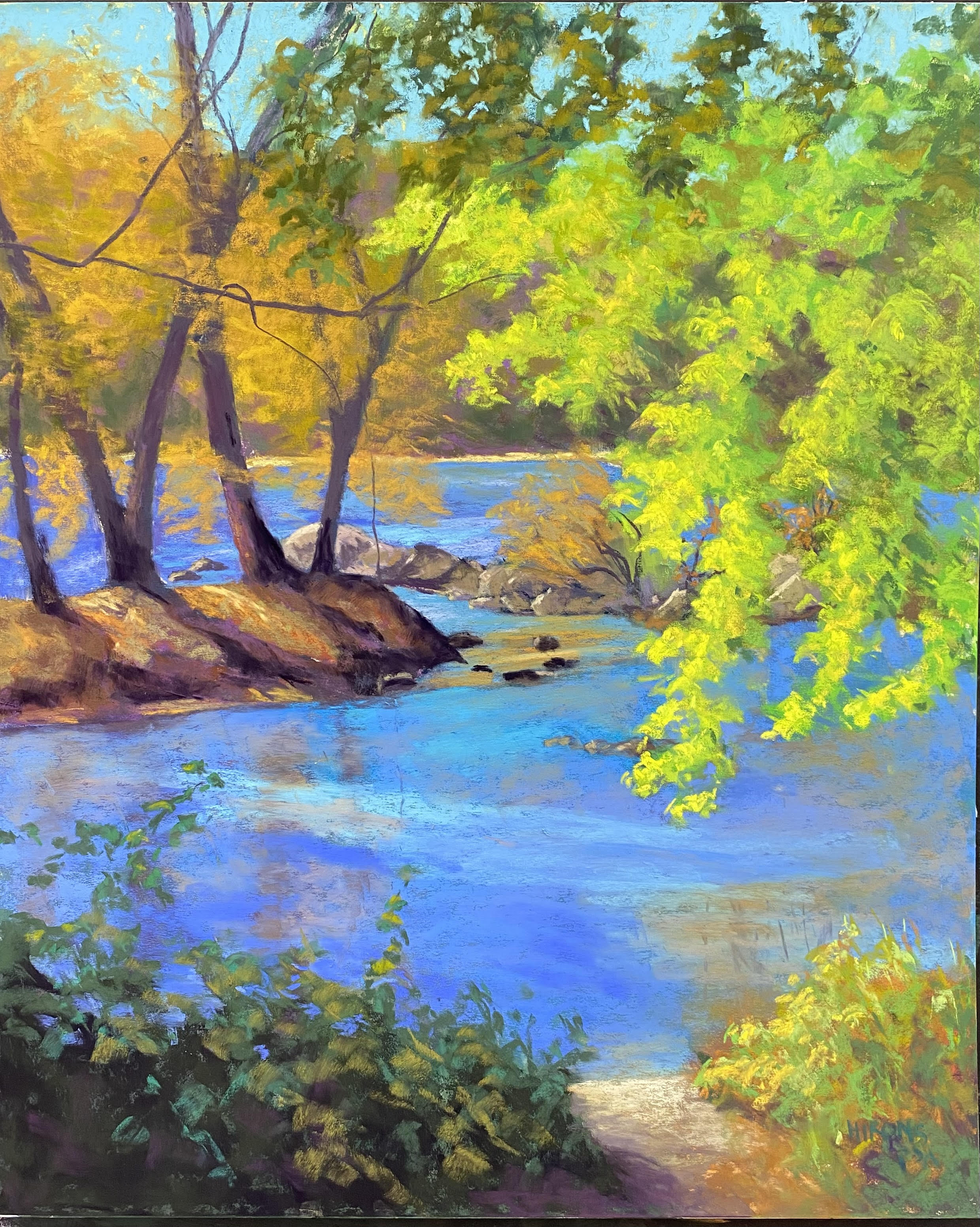
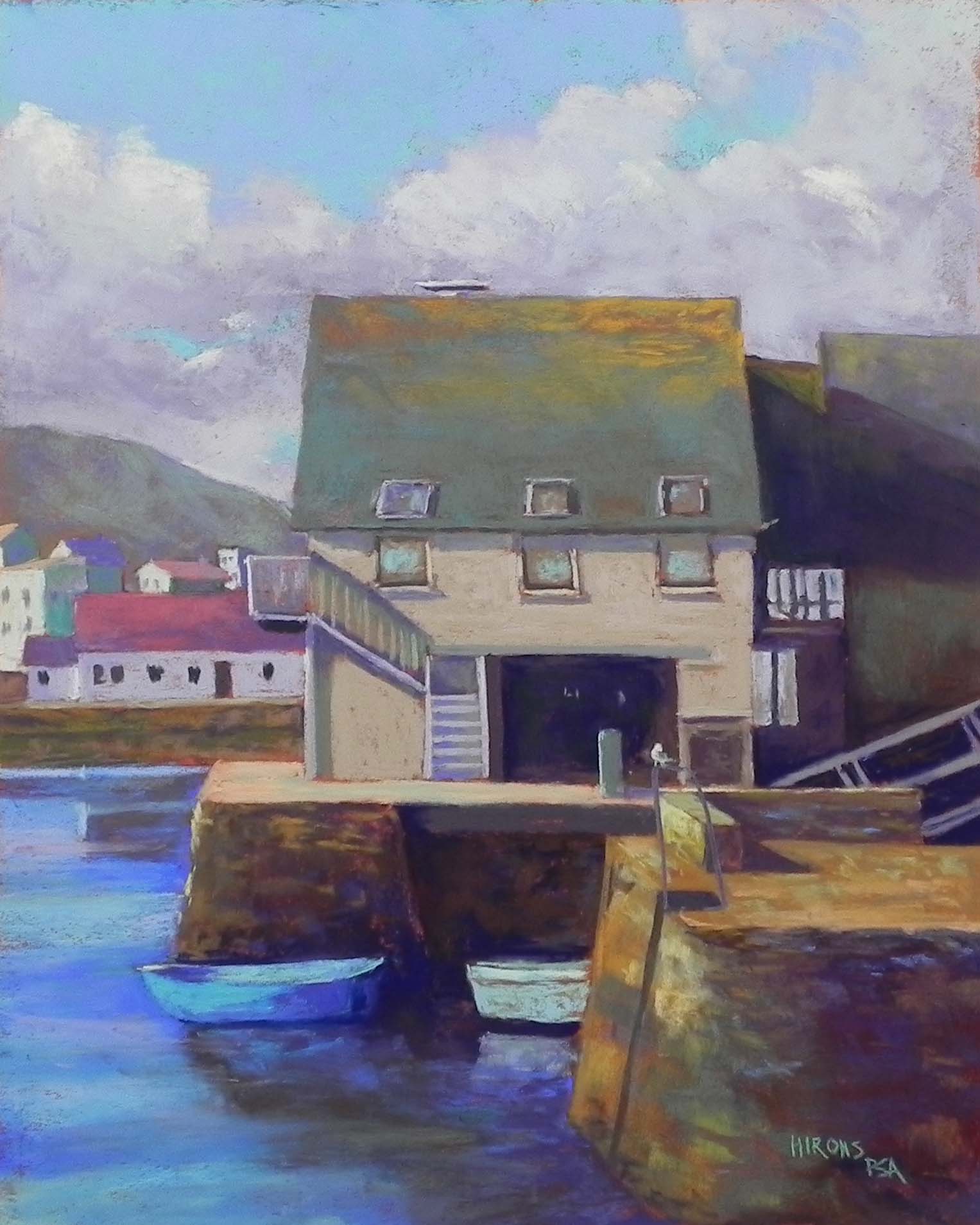
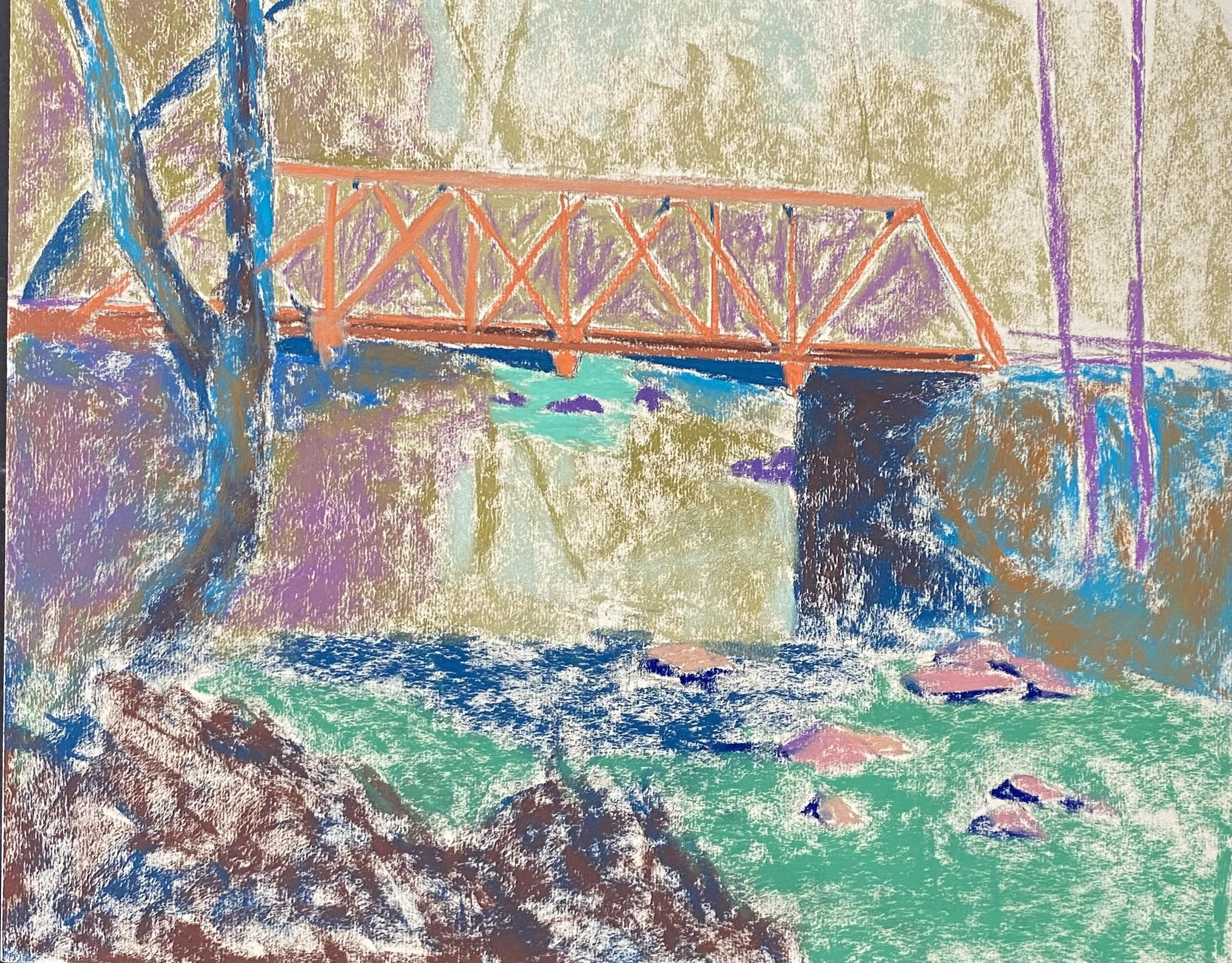
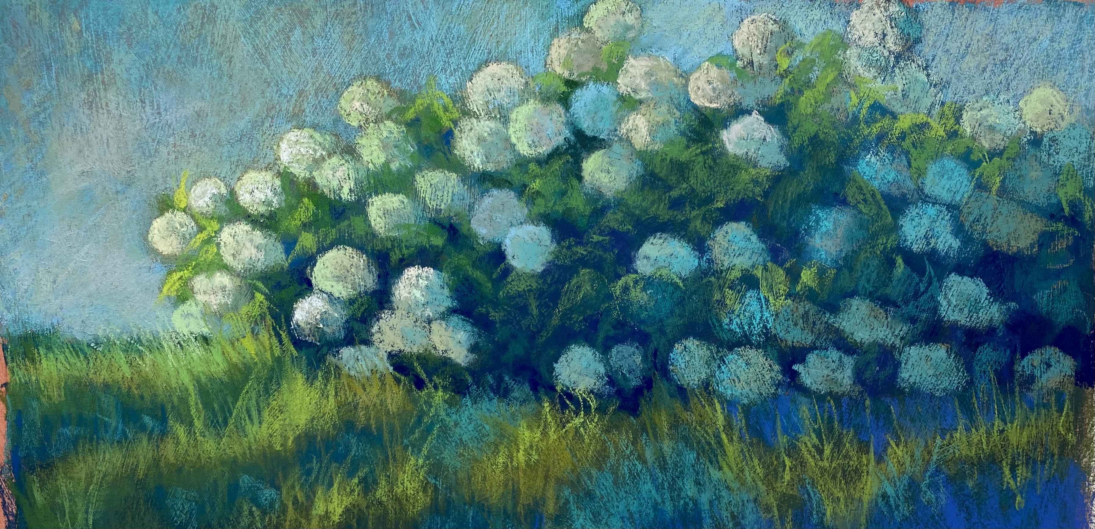
Montivideo Bridge, 16 x 20, UART 320 board

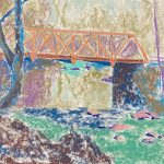
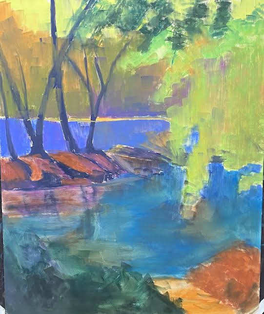
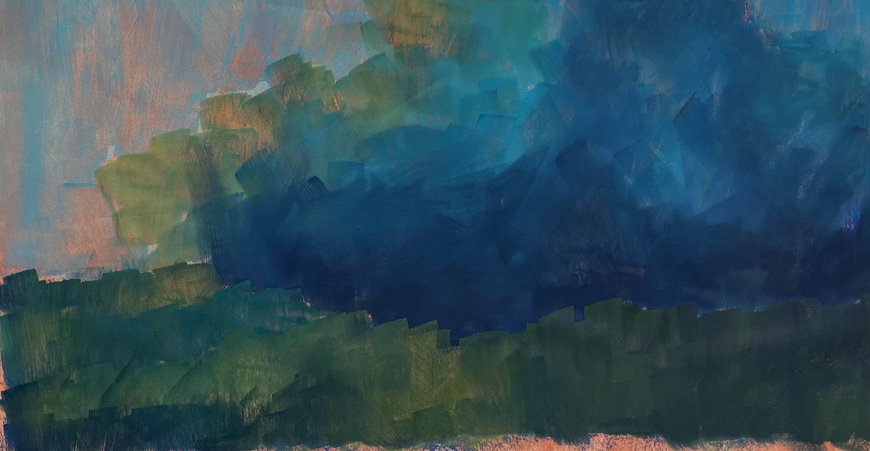
Underpainting, stage 1

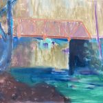
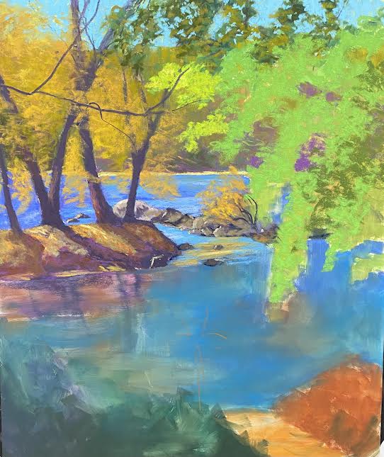
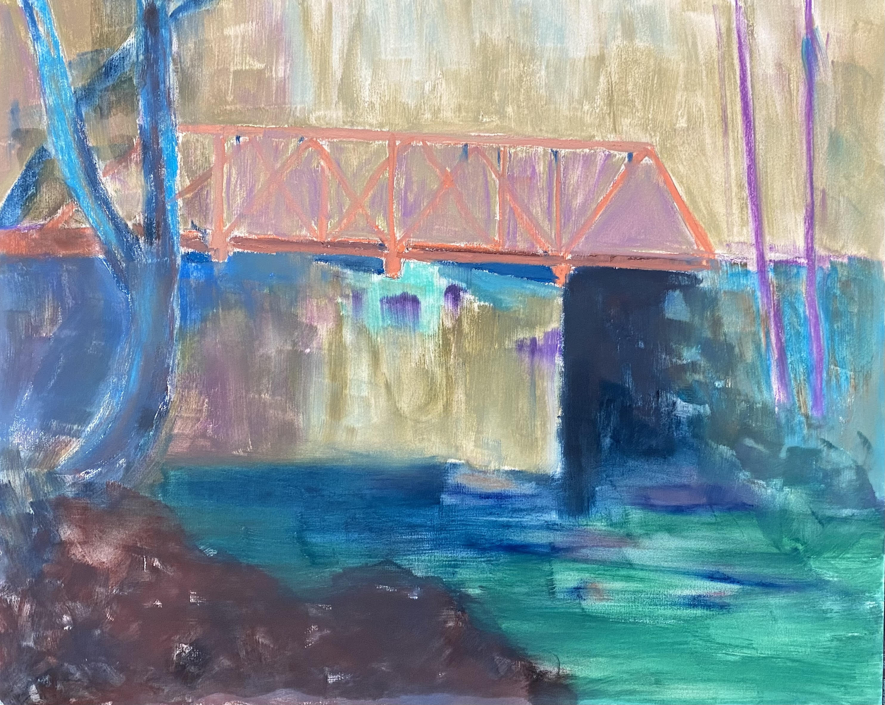
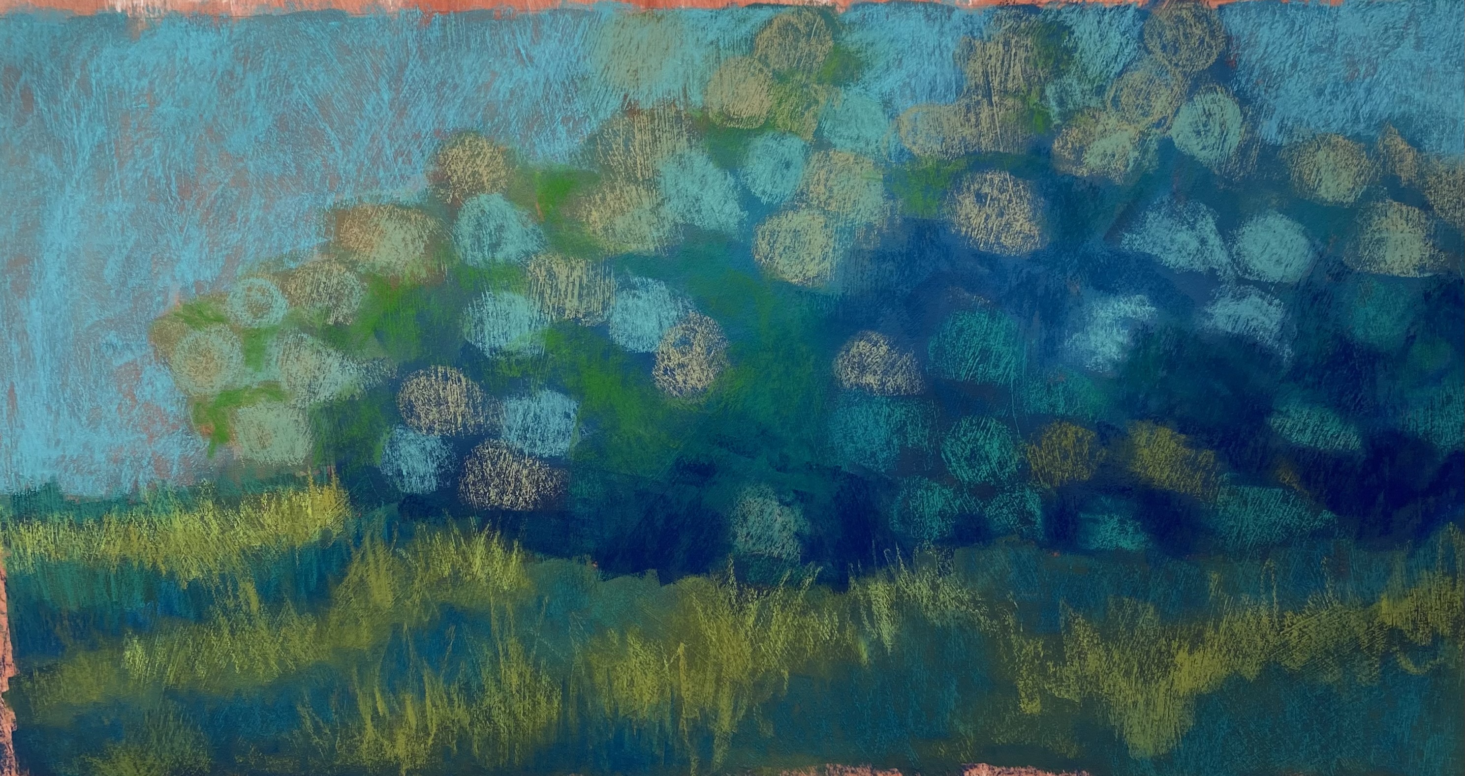
Underpainting, stage 2

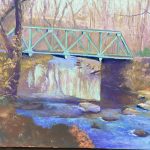
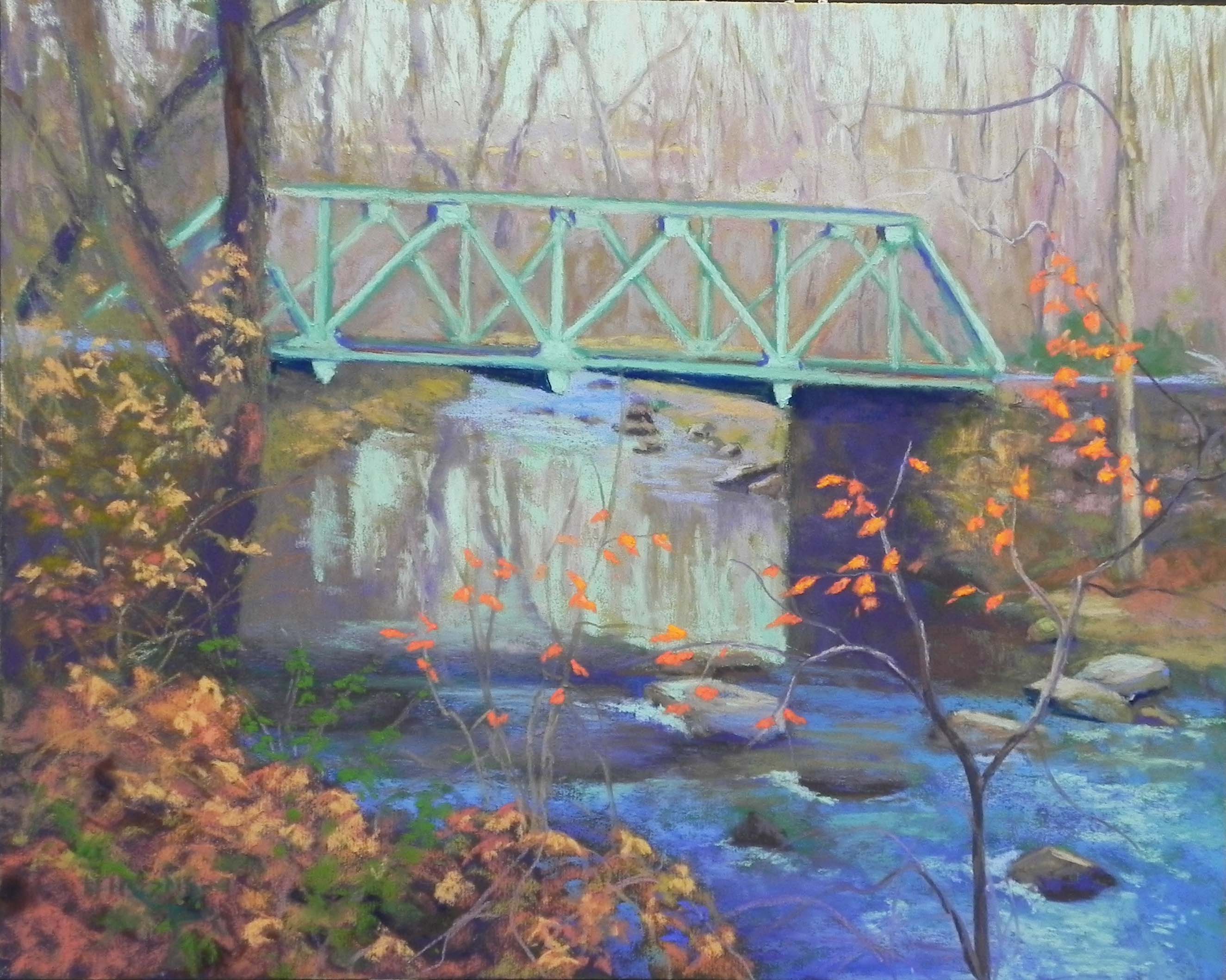
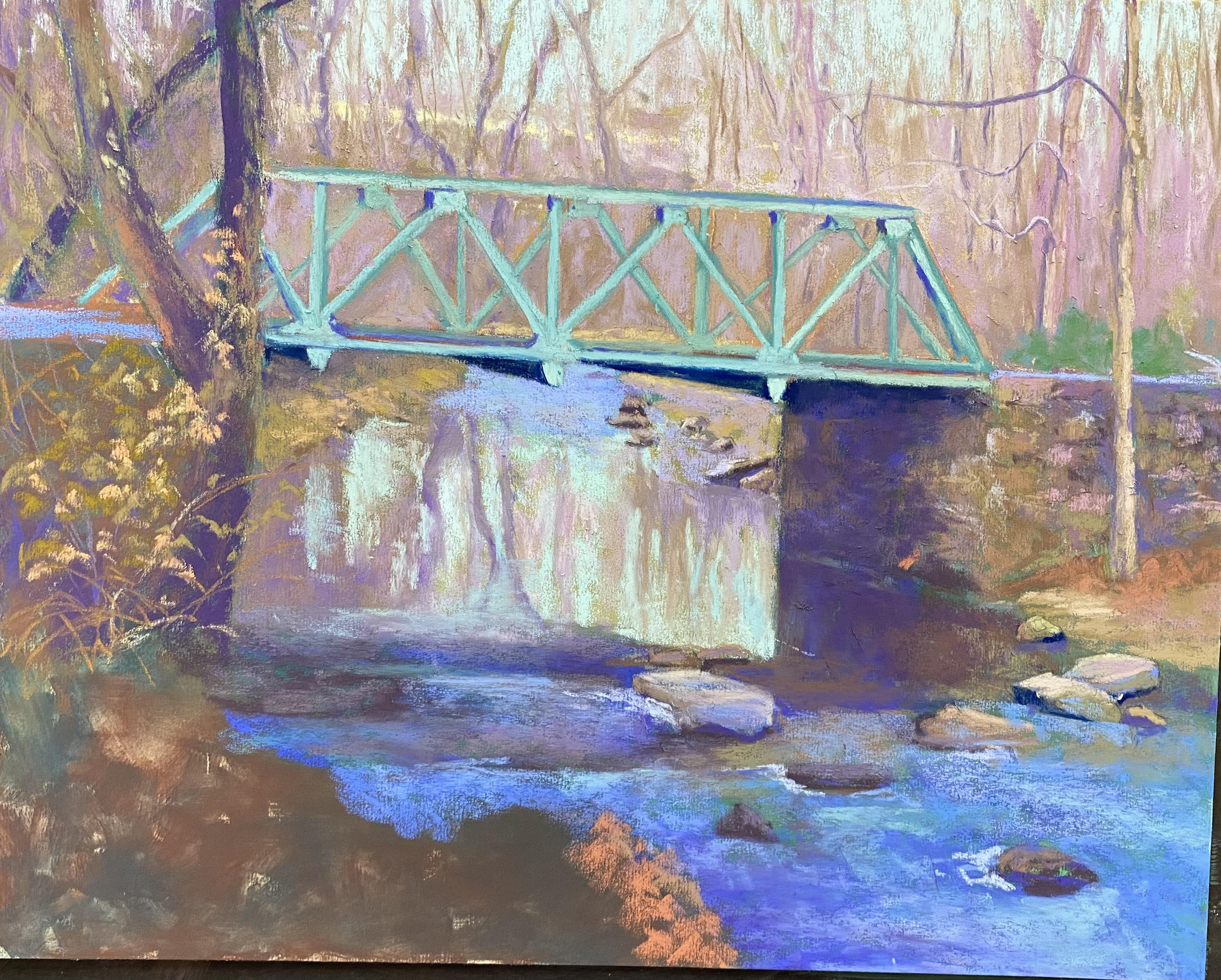
Painting in later stage

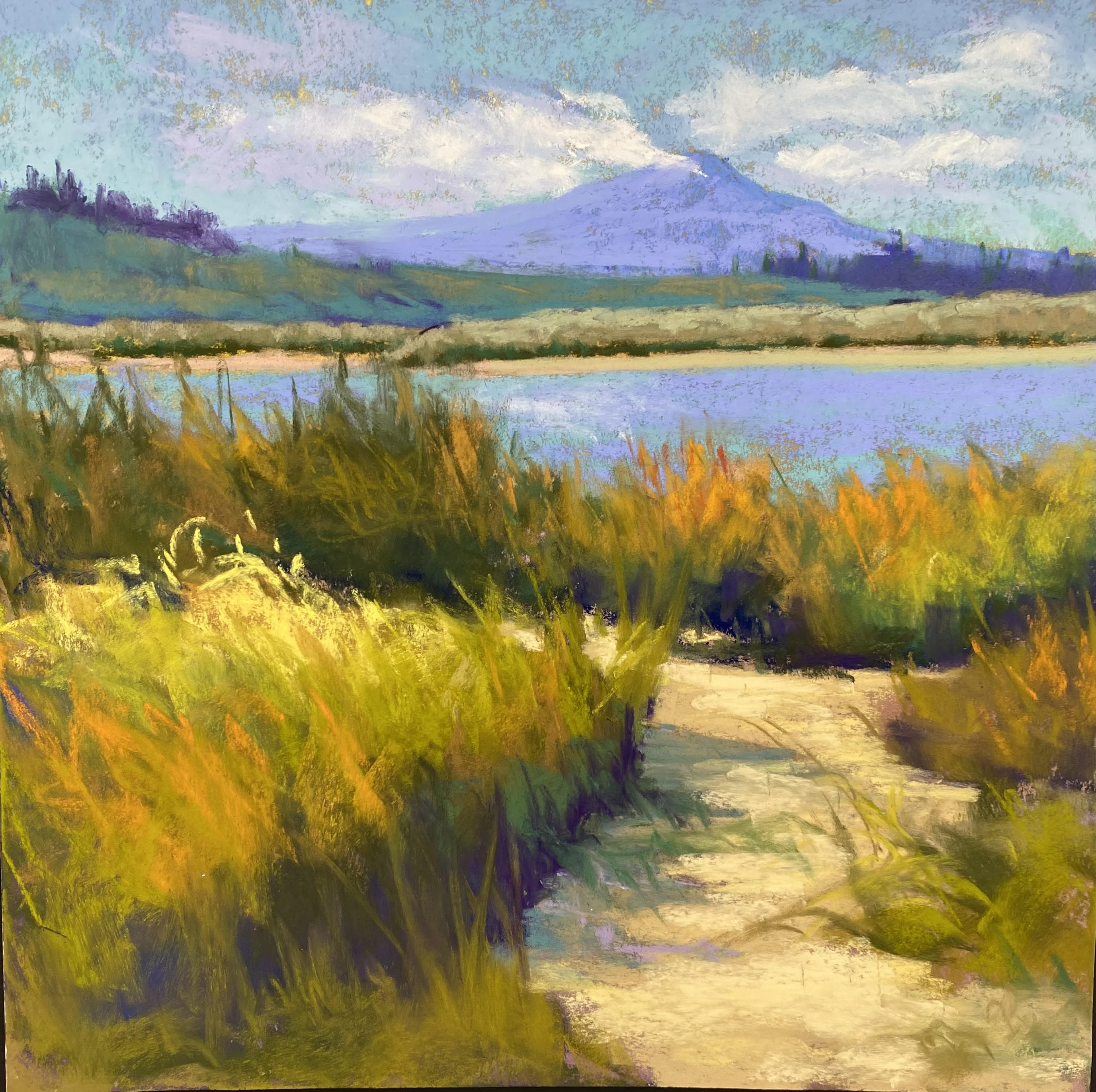
Hello Friends, I haven’t been very good at posting lately.  I spent two weeks painting scenes from Scotland, then started teaching three classes on Mondays and Wednesdays.  This last Monday, I did a demo for the class, which included very expericed to beginner artists!  I chose a photo I took in 2017 and always wanted to paint.  The one problem with it was that the entire photo was in a mid-value range, except for the area under the bridge, which was amost black.  So very unbalanced and I knew I had to change that.  Other than that, the changes were some simplification of the trees, bushes, etc.

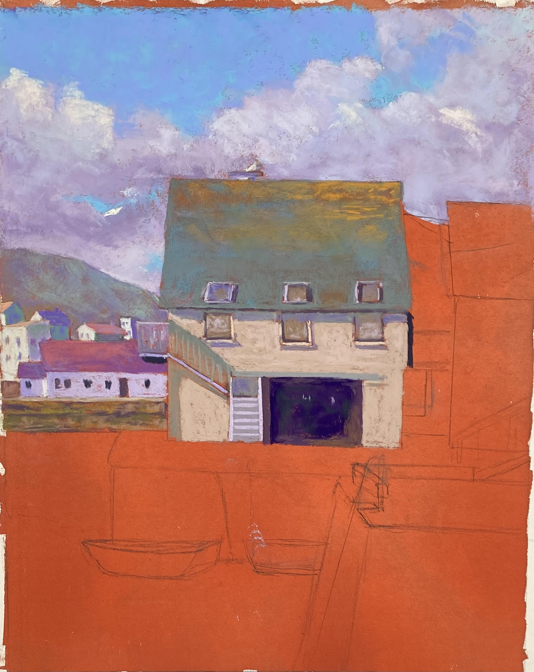
The first problem of doing an underpainting, of course was the bridge. I had carefully drawn it in, with all the nice details.  Then I realized that the background and bridge were the same in value so I lost most of the detail.  But I got it back, thankfully–with the help of my students.  Another issue was the background trees. I had planned to keep them very simple and initially brought the sky holes and trees down to the top of the bridge.  After the demo, working on my own, I realized that this didn’t work at all!  First, I added some yellow ochre just above the road level of the bridge, to indicate the top of the grasses that appear below.  Then, I added in the line of a distant hill and background trees and made sure the sky didn’t come below them.  Initially that hill line was almost parallel to the top of the bridge and this wasn’t good at all!  (Everything going downhill!) So I tried making it opposite, with it lower on the left and higher on the right. Finally I got rid of it and very lightly indicated a horizontal line that is less noticeable but works OK.  I couldn’t call it finished until I did that!

I faced the major problem of the dark underside of the bridge, by making the tree at left darker, using the same violets and browns that are in the bridge. And I connected the two with dark in the water.  The area at left, while it looks complicated, was quite easy.  I started with a dark underpainting, then added more dark pastels on over (mainly violet), then used various soft ochres and rusts for the leaves. (I kept them fairly dull so as not to compete with the leaves on the right.) This area really looked good when I added “water holes” in the area at bottom middle, to break up the hump and show the river behind the leaves.  The “hump” was important to my composition as I didn’t want a strong diagonal in this corner.

The river has two distinct areas: the reflections in calm water in the back and the moving, darker passages of blues in the foreground, along with a lot of rocks!  I used a variety of blues, violets, and blue greens, trying to indicate areas of reflection, shadow, and white water.  In the back, I was careful to try to indicate trees above and reflections below.

The last addition was the small tree in the foreground with its lovely red orange leaves.  In the photo, they were fairly light and when I tried a piece of color that matched, it didn’t look like anything.  So I went to a darker and brighter red orange Schmincke and put in the leaves with small saturated strokes.  I first put a lighter orange on top, and realized this was dull (it had white in it).  I then went to an orange that had more yellow and this worked beautifully.  Remember the power of yellow in saying “LIGHT”!

While this wasn’t an easy painting, it was something that was in my comfort zone. I knew I had a good composition and that I could fix the values and improve on the color.  After working all summer on the prepared boards with or without photos, it was kind of a relief to me!  But I’m not done. I plan to continue with the prepared surface and looser paintings.  And I have five mounted boards left and am thinking of trying some fall trees on them that won’t be so realistic.

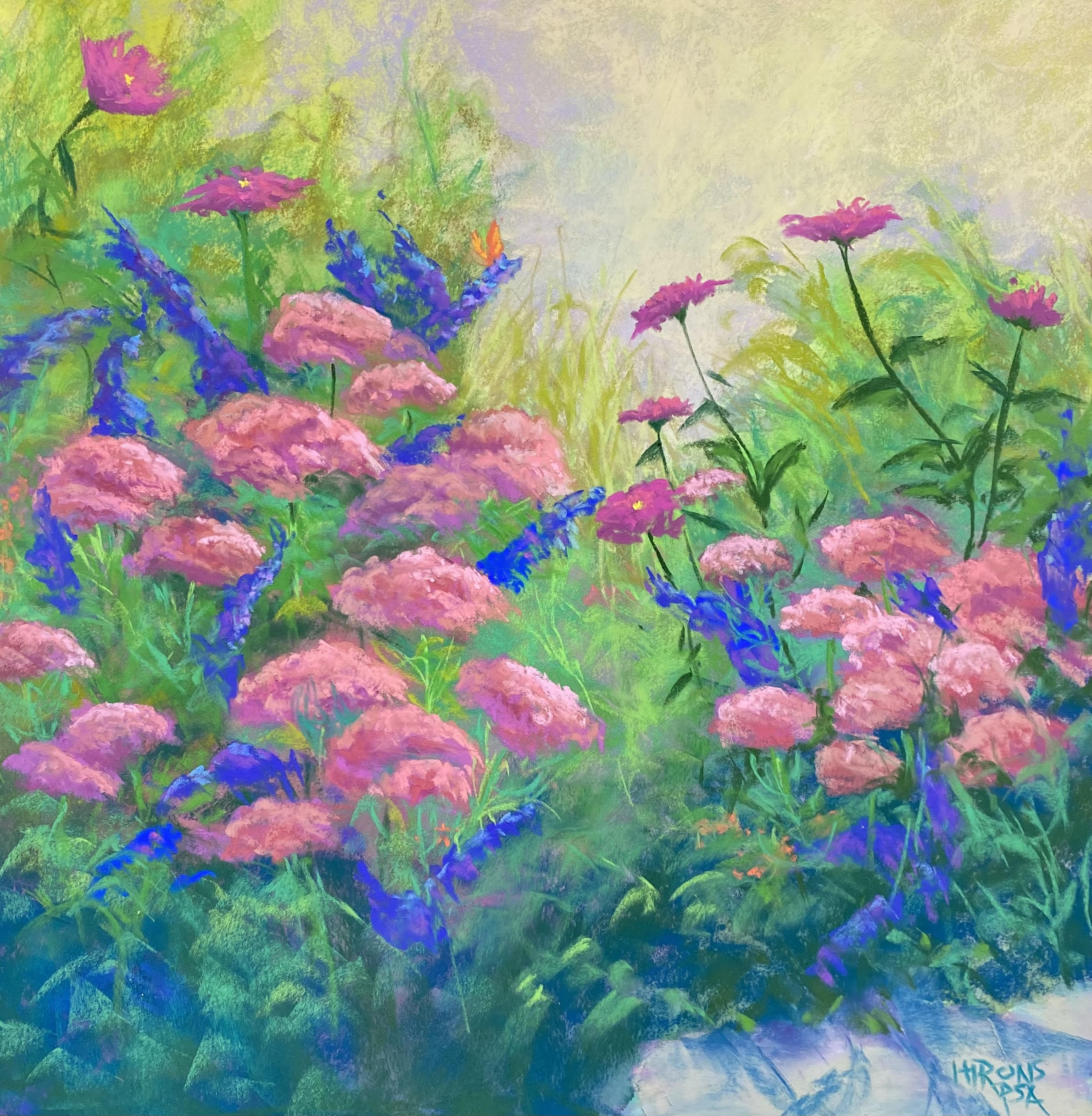
I’m also thinking of playing more with the Lux Archival. I recently did an imagined garden scene, based on a new garden here at Fox Hill.  I started with watercolor and came up with a basic composition. Then added sedum, butterfly bush and zinnias (from another garden) to it.  Here it is.  You can see the difference between these picture pretty easily I think!  I really had to make up almost everything in the one of the garden and I have no idea whether it’s any good or not.  Would love to hear what you have to say.

Fall Garden, 18 x 18, Lux Archival

Evening Light, Invergordon

Evening Light, Invergordon, 12 x 24, Rives

Hello Friends

It’s been awhile since I’ve posted. We were in the UK from Aug. 9-26 and I came back with covid.  A very mild case and short-lived, thankfully!  So today I headed to my framers to pick up mounted boards and then to the studio.  I worked on a 12 x 24 of Rives mounted on gatorfoam.  The surface is harder than the pure paper, but lovely and flat!  And I found it really wonderful to work on.  I applied two coats of a ocher-toned Golden pumice gel and the color was perfect under the violets and blues.

While I did a small color study in advance of the painting,  I found the values of the sky and clouds to be a problem initially.  So I darkened the clouds and kept the sky a light combination of blue green and blue.    At first, the clouds were stiff and lifeless.  But I applied Blue Earth violets and blues forcefully, adding random strokes to the clouds–and this really worked!  I loved the effect of it.  And the surface really enables this beautifully.  I was really happy with this!

Not much drawing needed in this painting.  Just a narrow swath of hillsides and three tiny boats!  For the land, I used a variety of violets, dull oranges and greens, and then violet added on top of the oranges to dull them down.

Before I added the water, I had a lovely yellow foreground and wondered whether I should change the composition!  But I wanted the reflections of the clouds.  It’s a very high key, light painting that would probably look best against black.  We’ll see.

I used my fingers to smudge the color in the water, then added more color on top.  It made it look more like reflections.

I was afraid to do this first painting.  I was worried that I’d follow the photo too much, which I probably did.  But I made a lot of changes to the clouds and the colors, so I’m not concerned about that.  Most of all, it was wonderful to work on a surface that doesn’t buckle and that enables many applications of pastel.  I’m looking forward to the remaining 9 boards!

I hope you’ve had a good summer.  I’m looking forward to classes beginning in two weeks and several shows this fall.  And continuing to paint and explore.

Jean

Cape Cod Dreaming

Cape Code Dreaming, 12 x 24, Stonehenge

First layer with Holdbein pastels

Hello Friends.  I’ve been painting a lot these last couple of weeks. Fortunately, my back is much better and I can stand and walk without any pain.  All of which makes me feel a LOT more positive!

I tried something new today.  After doing the hydrangea picture, which I loved, I did another hydrangea using hard pastels to begin with.  I don’t think it was quite as successful, but I liked it.  Then I did an 18 x 18 with more hard pastels and soft on top and got more frustrated.  Paper sagged and rippled in places, which I didn’t like at all!  I’m going to try the 280 gram Rives to see how that works since that is what Dakota sells.

Anyway, today, I did a 12 x 24 and decided to begin with my box of Holbeins.  I love the colors of these sticks, which are between hard and soft and quite unique.  The blue greens are wonderful and I started the sky with those.  I completely made up the composition for this one. No reference photo OR drawing!  I just decided to wing it.  I really liked using the Holdbeins, as opposed to the Caran d’ache.  They are much softer and go on faster and more evenly (when the paper isn’t buckling).  I drew in water various levels of hills and bushes.  I wasn’t sure where I was going with any of this.  My first thought was fog but there was too much sky to be all foggy and I wanted to show the water.  I liked the path and ended up having it lead to a beach.  I used various shapes of bushes, with rosa rugosa (beach roses) in mind.  I ended up adding some taller evergreens to give some variety to the composition.  I began the grasses withg greens, then added organges on top and ended with a combination of both.

The sky became more blue violet and I decded to add the tops of sunlit clouds to try to give the sense of light.  I used quite a few colors in the path, including violets, green, pinks, and ochres.

I added the small yellow flowers and the roses and I’m not sure how much I like either, but i had them in mind.  I decided to call it “Cape Cod Dreaming” as it’s what it reminded me of.  I haven’t been there in over a year now and i”m not a beach person, but walking through fields like this is my idea of heaven.

Hydrangea Blues

Hydrangea Blues, 12″ x 24″, Stonehenge

Underpainting over toned surface

Initial layin

Almost complete

Happy July 4th!  (Although I”m not sure women can celebrate something called “Independence” day!)  Anyway,  I finished off a painting today and thought I’d share it with you.  I was going to do another Lake Bonneville picture, but I was struck by the beautiful hydrangea bush in front of our building.  So I took pictures from a lot of angles and decided to do a 12 x 24 on the Stonehenge paper.  I am really loving this surface.  Nice and sturdy.

The primary challenge for me was the composition.  It’s just a long bank of bushes with grass in the front and light coming primarily from the left.  So I tried to vary the flowers as they rise about the bush and played with varying colors to give more interest to it.  The pattern of light on the grass also provides some directional movement, which I think helps.

I decided to do something different in beginning the painting–use hard pastel.  I put in the sky and added Girault on top and really liked it.  Then I decided to do a hard pastel underpainting for the flowers and grass in order to provide the darks.  This worked really nicely.  After that, I used various hard pastels in greens, blue greens and warm brown greens to lay in the flowers and light and shadow on the grass.  I then used soft pastels to develop the flowers, grasses, leaves, etc.

One of the things that I’ve liked least in this series of paintings has been the skies. Using Ludwigs and other soft pastels has made them too cakey.  I really liked the effect of the hard pastels and Girault for the background and I plan to do more with this in future paintings.  My initial thoughts were to do this one quickly land loosely like the Fog and Poppy painting (which I have sold).  But when I began this one, I realized that I wanted to take my time with it.  I loved playing with the various warm greens and cool blue greens.  When I was almost done, however, I felt that it was missing something, and I decided to add pinks.  I got four values of very light, medium and dark pink/magenta and added some of the lights to the flowers and some of the dark to the undergrowth.  It can be hard to see, but it adds just enough contrast to make it more interesting.

Working on these pictures has been really energizing for me.  Unfortunately, my back isn’t cooperating and it’s also been painful.  Nevertheless, I plan to continue to explore and see where it takes me.  I hope that you are also enjoying whatever creative endeavors you are involved in.  Best wishes for the holiday. Hopefully you aren’t flying somewhere!

Jean


Lake Bonneville, #1

Lake Bonneville, #1, Stonehenge paper, 20″ x 20″

Lake Bonneville, #1 (Study)
Lux Archival, 12″ x 12″

I decided to start a new series of paintings based on photos from Lake Bonneville in Oregon on the Columbia River.  We were there last October and it was one of the loveliest places we visited.  I liked the combination of mountain, lake, grasses and path.  I did a study that I like a lot.  For the painting, I worked on a new paper: Stonehenge. The Rives I had was very lightweight and not great.  The Stonehenge is a heavier paper and worked well, particularly after sitting under weights over the weekend.

The study went so well and seemed so easy.  Not so the painting!  There was too much sky and mountain and it wa difficult to apply well.  I finally had to add another lighter field to keep the mountain from being so big.  I’m finding the skies to be the most difficult aspect of working on this surface as it’s impossible to get smooth applications of color.  But I like it for the grasses, etc.

The painting lacks the bright yellows of the study and I may add those in.

In this case, I didn’t follow the photo completely, but I did try to copy the study and i’m not sure that worked very well.  The sanded paper works so beautifully for the skies and the smaller size is much easier to deal with.  But I will keep at it.  I might try a 12 x 24 next.


Fog and Poppies

Fog and Poppies, 12″ x 24″, Rives with Golden Fine Pumice Gel

On Friday I went to the studio and did a relatively fast painting in a 12 x 24 format, the first I’ve done from this series.  I was intrigued with the idea of fog, despite the fact that there was no fog.  But then, I did grow up on the coast!

I used my typical warm surface but this one was lighter, knowing that the overall values would be lighter.  I started with some hard pastel to lay out the bushes and trees, then moved to soft.  For the sky, I focused on violets and blues to handle the idea of fog.  It would probably be lighter than this, but I liked it.  But, of course, I wanted a little light in there that could shine on the water so I added in a little hint of yellow.  I found it really fun to loosely add the lighter colors over the tree/bushes at left.

I think that this composition worked well with the long, narrow shape.  I envisioned a hill on the far right and liked that idea.  I initially used a warm color for the grasses, then added a whited green on over.  For the bushes, I used darker greens then grayed whitish cool and warm greens (Ludwigs) and that worked relaly nicely.  In the bushes at the bottom, I added some yellow greens as these were closer and would have more color in them.  After doing the grasses and bushes, I had a lot of muted cool colors and I decide I needed oranges.  So the Rehoboth Bay was suddenly decorated with California poppies!!!  I decided I’d better not call this “Rehoboth Bay”  (it IS Rehoboth, not Delaware Bay as I’ve called previous studies).

I now have two 18 x 18s and one 12 x 24.  I tried to do another 18 x 18 today but don’t like it much.  So perhaps I’ve exhausted this subject for awhile.  I have three studies and three paintings that I would frame from this.  I’d like to move on to a new subject with some different elements from the Columbia River trip last October.  I will be having a show in March 2023 that I think I will call “Intuiting the Landscape”.  I want to include studies as well as the paintings.  I may move to something with buildings but for now I think I’ll stick to pure landscape.

Delaware Bay, #2

Delaware Bay, #2, 18″ x 18″ Rives

So here is the second painting, completed this morning. I was careful to make the land larger than the sky in this one. And I decided to use a violet sky, based on one of my studies.  Looking at it, I’m wondering if it needs some toning down–lighter?  More light?  Less violet?  Not sure.  I’m liking the sky in no. 1 better!  But I won’t make any changes at this point.

For this one, I began again with violets in the darks, then used various greens over them.  I wanted the bushes and land area to be darker than what I had in the first one.  I created a shape of bushes in the lower left, and led the bushes off to the far right.

For the foreground, I wanted to play with pinks and oranges, which I used years ago in a Chincoteague painting.  I like it, but I’m not sure it works with the sky.  I think the sky needs to be lighter with more warm colors in it.  SO, I just might have to work further on this one.  Will see.  Any comments will be most appreciated!

Well–I decided I had to revise the sky!  I used a much lighter, duller violet over the original color–lightly. Then added more light, using a very light pink white. And I added more pinks into the clouds.  I think it’s better now.  Time to quit!

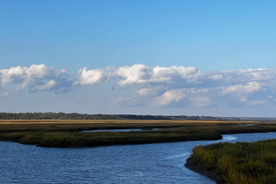
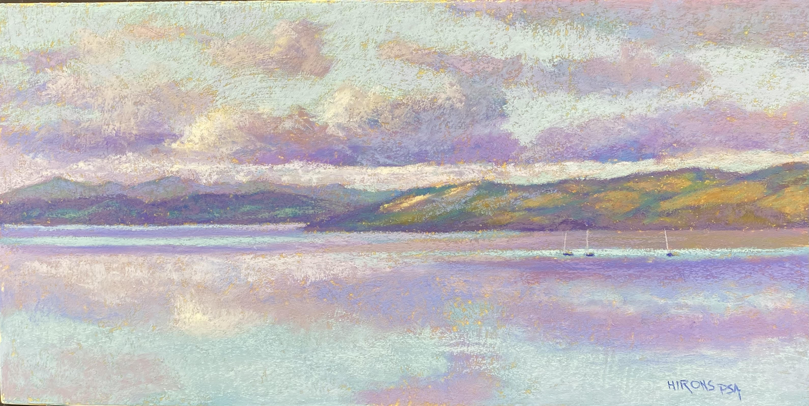
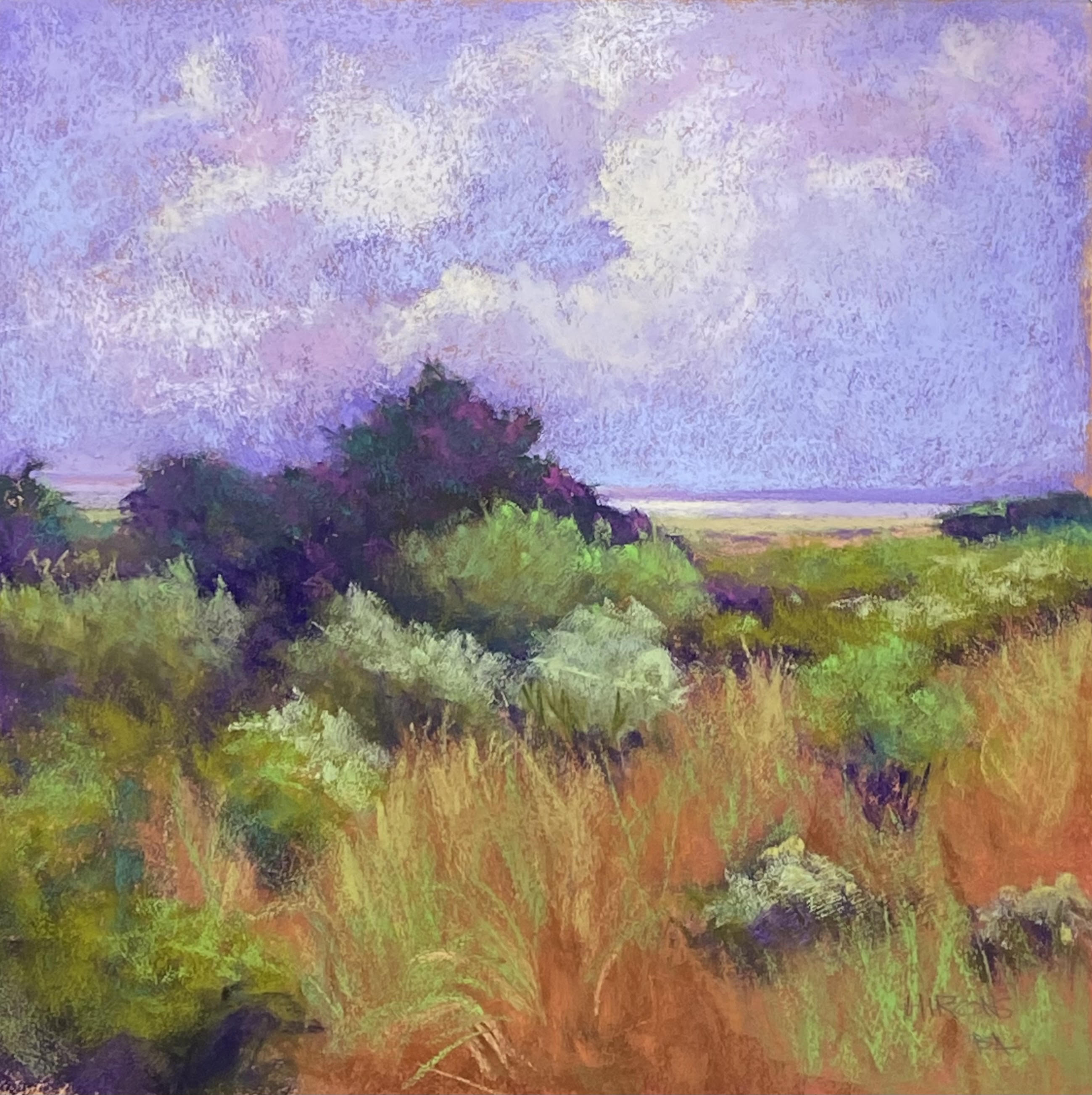
I’m back in the studio–just sold two of my studies!  I also came to revise the painting after thinking about it more.  When I came in, the painting was on the floor folded over!  Well!  I guess that told me something.  Anyway, I have reworked it.  There is now some aqua in the sky along with the violet, which I think gives it more dimension and softness.  I added lighter colors to some of the bushes (which I had in a study) and I’ve changed the foreground grasses.  I wiped off the reds and went back in with more sienna colors and added green and yellow grasses into that.  It’s more detailed now and definitely less “abstract”!  Not really abstract at all!  I told my friend that perhaps I was “intuiting” the landscape as opposed to “abstracting” it.  Anyway, I think it’s a better picture and I hae put glassine on it and I”m done with it for now.  (Sorry the underlining showed up and I can’t find a way to get rid of it)  Also, I realized that what I’ve been painting is Rehoboth, not Delaware Bay!  The latter is much bigger! 

Rehoboth Bay, #2 18″ x 18″


Revised image