
And here is my second post of the day! I completed this painting on Friday after starting it as a demonstration for the Rockville Art League on Thursday night. My presentation was billed as “Creating a Useful Underpainting”. I chose the photo from one that I took a week ago Wednesday when my husband and I were in Washington, VA, prior to celebrating our 20th anniversary at the Inn at Little Washington (purported to be the best restaurant in the country. It was great, but back to the picture). I saw this little shed catching the afternoon light and the house next to it all in shadow and it really excited me. I took many pictures of it from different angles as we walked on a lovely path, where a sign said “all welcome”! (This place is fantasy land!!!)
I spent a lot of time on the composition. In the photo, the peaks of the two buildings are at the same level. I kept redrawing the shed until it was low enough and where I wanted it, nestled into the trees and surrounding fields. The other major change in the composition was to open up the background with a very large sky hole. I thought that the solid mass of green was rather ominous looking and overpowering.
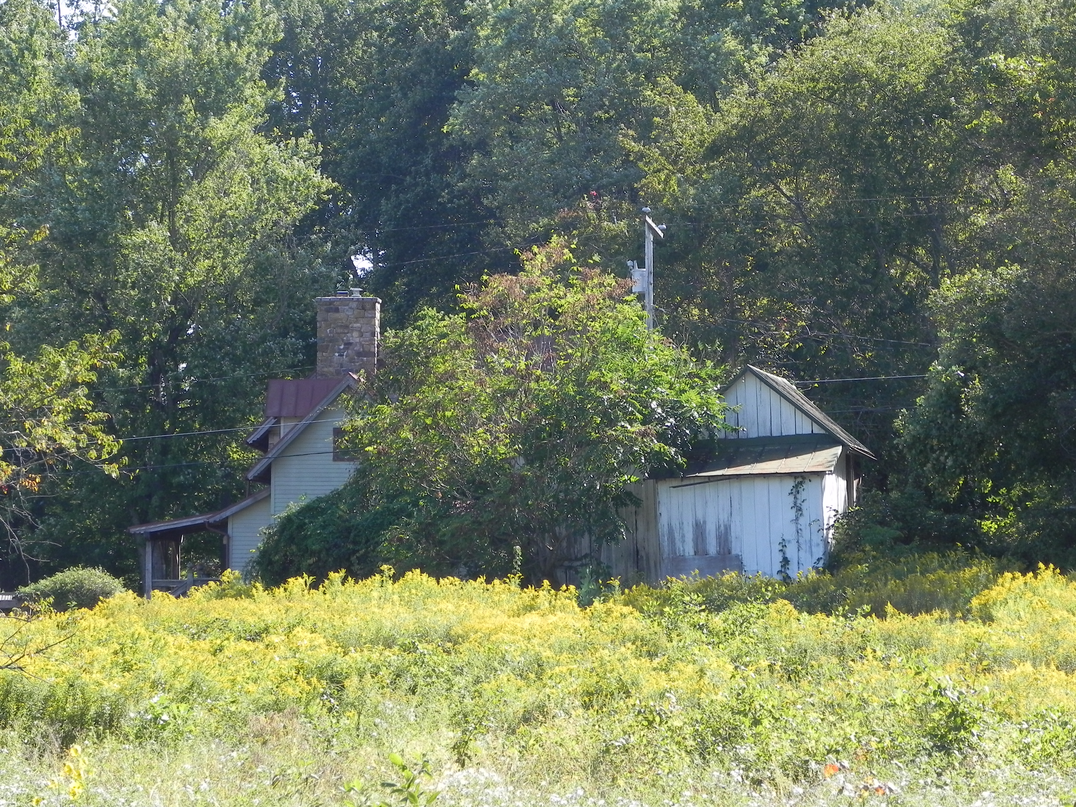
Photo reference
As I was drawing it, I realized that I was going to use this picture as an example of the type of hard pastel and alcohol underpainting that I do almost exclusively these days. However–I also realized that this is what I call a “center of interest composition” rather than the typical “big shape” composition that I more often do. And I realized that what might be better would be a watercolor underpainting that could produce a softer background and a foreground with less detail. However, I haven’t worked with watercolor successfully in some years and I certainly didn’t want to try it out on the Rockville Art League!!!
SO–I talked with my class. The focus of our fall class is on achieving different looks by using different materials and techniques. I realized that I have the perfect subject here! I’m going to do a demo for them on the 12th using the same subject, using watercolor and perhaps not covering the entire surface. And then, we are going to make our own surfaces and I’ll do it again on the Rives printmaking paper with a toned surface and no underpainting to see how that looks. I’ll share them all with you. I’ll do them all in the same size. This should be a really interesting experiment. Hope I don’t get too sick of the subject!
For the underpainting (which I couldn’t film), I used mainly red violets, and warm reds and browns and oranges in the background trees, with browns and greens in the field. I used a brown on the buildings. I put some violet onto the shadowed side of the shed, then a grayed green on top of that. Really liked the effect.
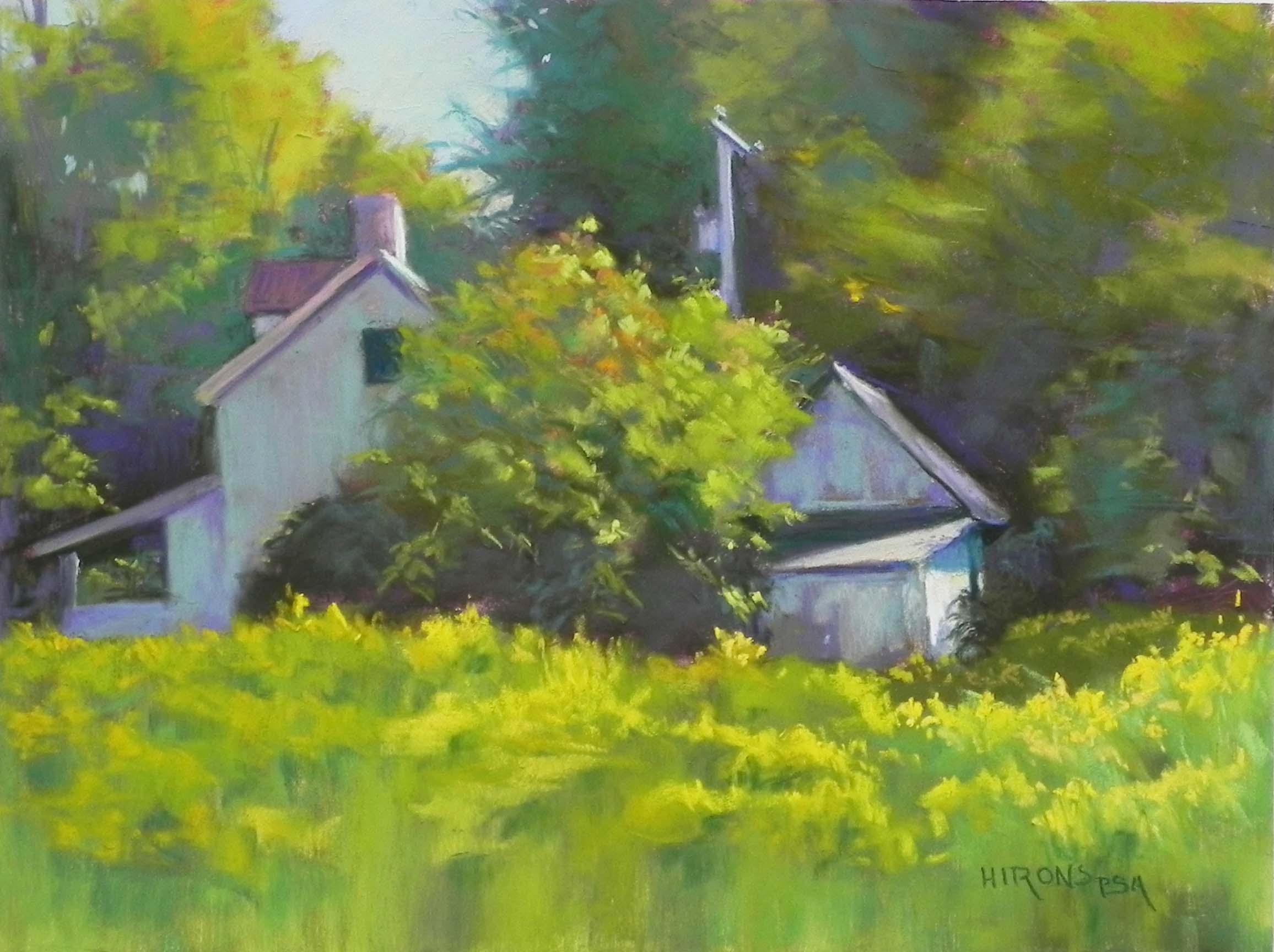
Catching the Light, no. 1, 12 x 16, Pastelbord
A very nice painting!