
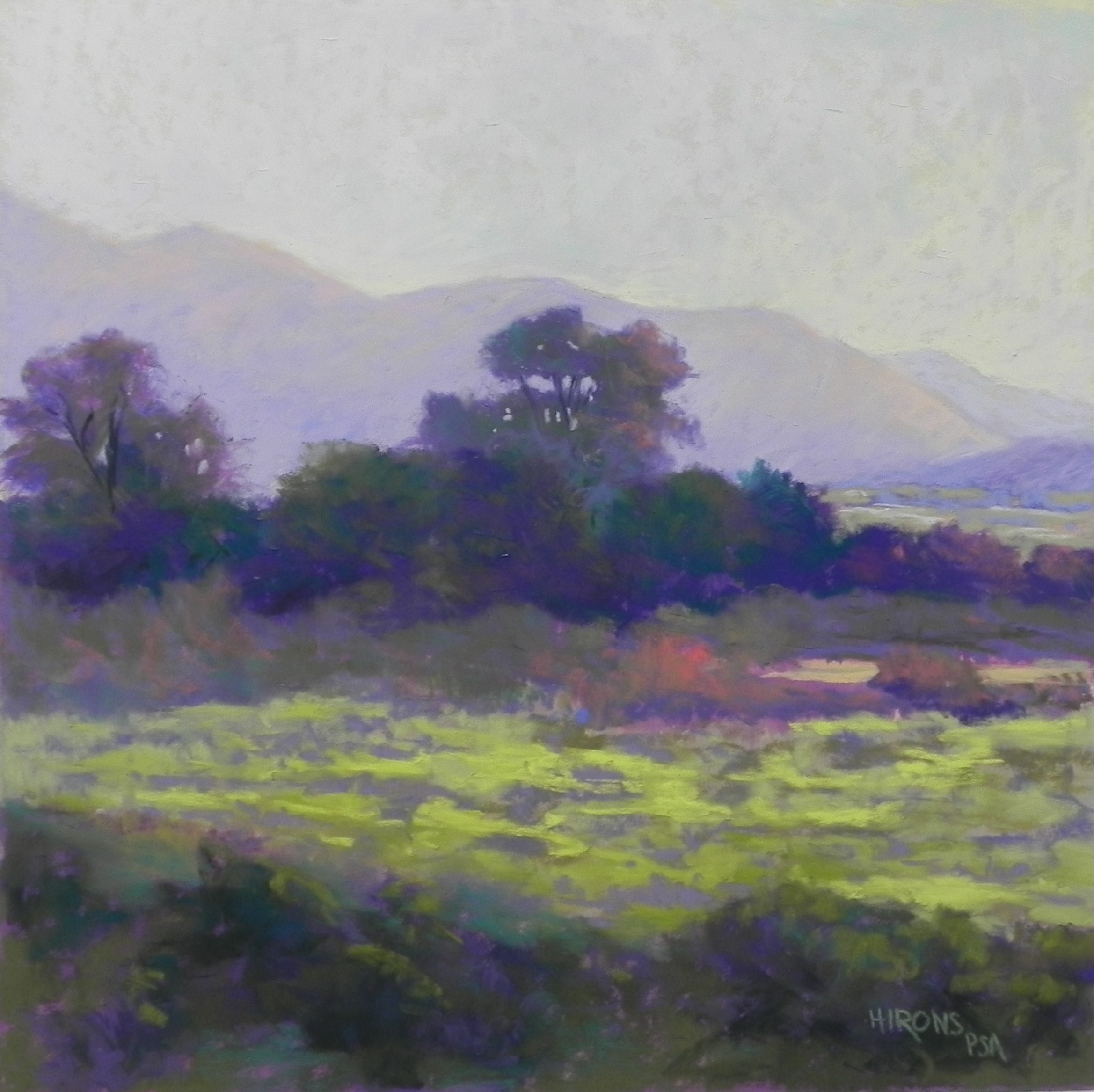
Colorado Sunrise, no. 1, Fischer 500, 12 x 12
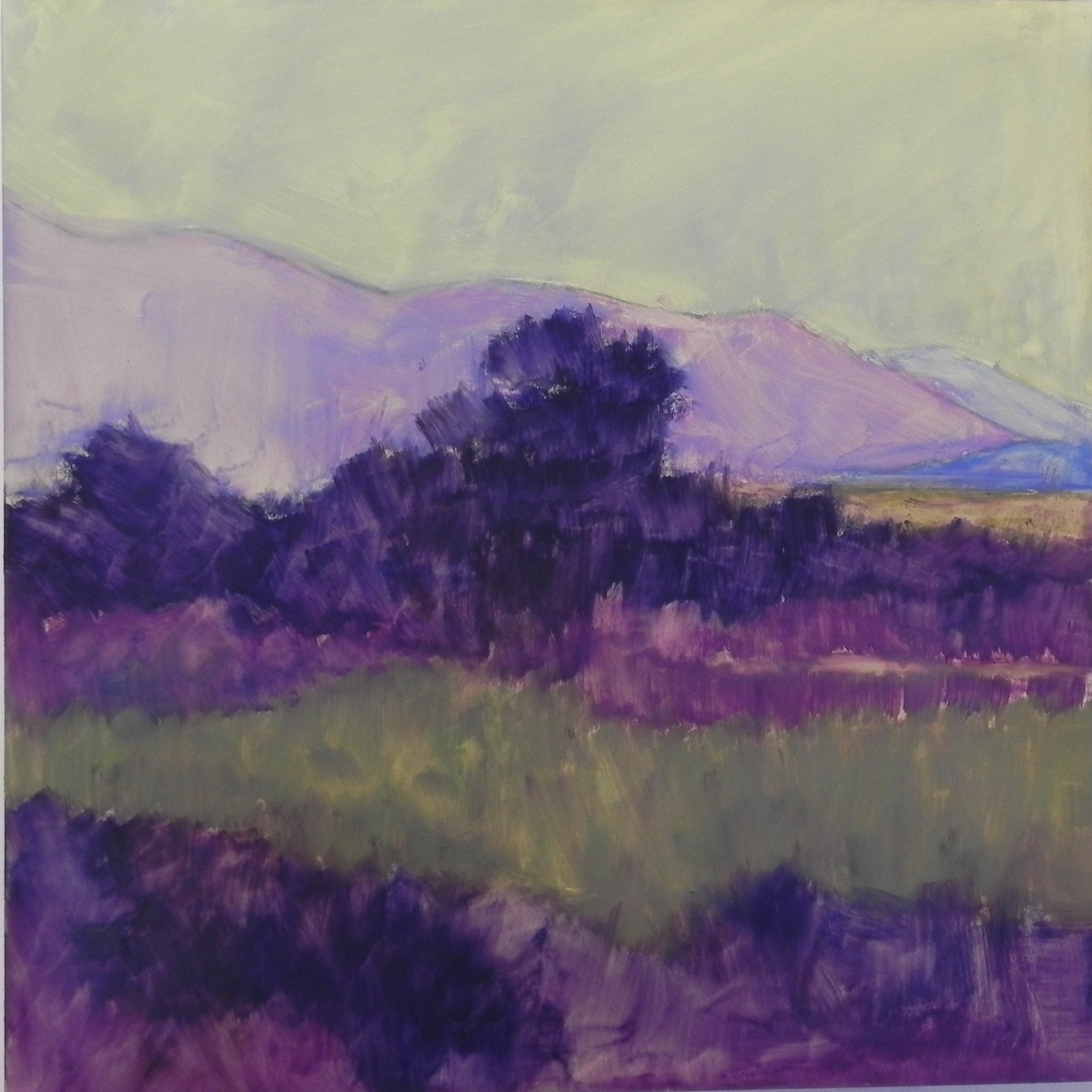
Underpainting with Caran d’ache hard pastels
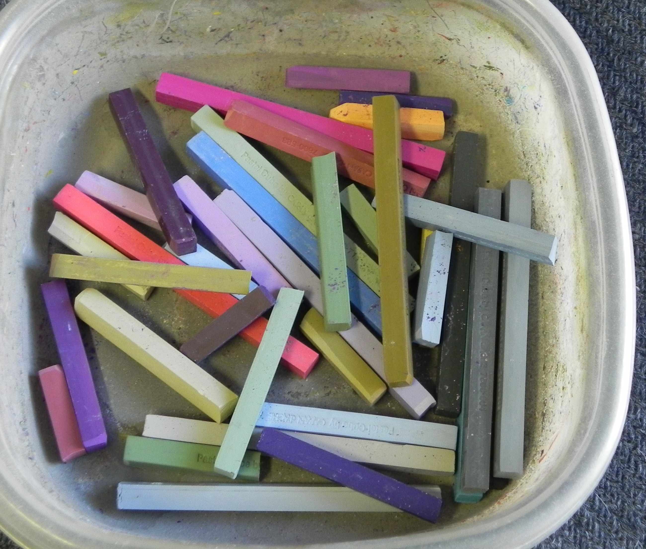
Caran d’ache cubes
Happy New Years dear friends!!! I’ve been without an internet connection since Dec. 14th, my printer isn’t working well, and now Photoshop won’t open. BUT–I now have time to paint!!! Yesterday I did my first painting (and we got the Comcast connection restored) and I’m happy to be able to share with you once again. It’s been one year since I started this blog and I can truly say that it was one of the things that gave me the most joy in 2013. So I’m happy to be back online again. Since my printer isn’t working, I used a black and white photo that I had printed earlier from our Colorado trip in June. I decided to do a square using the Fisher 500 paper. I also plan to do this as a 16 x 20 for an upcoming demo on UART 500 and will then do a larger version on Rives. (I got to see the Van Gogh Repetitions show in December. If Van Gogh can do it, so can I!!!). For Christmas, I got a selection of the new Caran d’ache “cubes” (photo included). I like the colors very much–some much needed lighter shades of violets and greens, and beautiful green gold colors. They are hard though. Definitely harder than the NuPastel and Faber Castell, and I was working on a very soft sanded surface. Not sure what they’ll be like on the Rives. I did an underpainting using mineral spirits and this definitely worked better than the alcohol. I was most interested in the value shapes. What you’ll see from the two images is that the tree on the left was not part of the original design. I added that later (it was much further to the left in the photo) and I think it provides much needed balance. In my compositional sketches, I played with making the central tree go above the mountain, but decided I liked the backdrop as it was and made sure that the top of the tree didn’t touch the top of the mountain. Colorwise, I began with violets and greens, as you can see from the underpainting and continued with these colors when going to the soft pastels. I used a mix of Girault and softer sticks, using a very soft yellow green at the end in the sunlit field. I added warmer oranges and reds towards the end and this made the painting come alive. The photo doesn’t clearly show the orange light on the background mountain or the variety of colors in the sky, I’m afraid. The piece of orangey-red in the center may be a bit strong, I think. But I was reluctant to get rid of it! I brought this painting to our opening at the Capitol Arts Network last night and people really liked it. I now want to do it larger. But I love the square format and want to keep doing a number of 12 x 12 squares. Some day I might do a whole show of them! Who knows. I hope that 2014 is starting well for you all. We have very cold temperatures and bright blue skies with snow covering the trees and roof tops. So it’s quite lovely. But tomorrow we will have ice and rain–sigh! It’s January, not the best month for weather, but one of my favorite months of the year painting-wise. Enjoy! And share your questions and successes with us all.
lovely painting!
Thanks Ramona. Nice to hear from you. Jean
Happy New Year Jean! Enjoyed your painting of Colorado! I wondered if the new Caran D’Ache pastels work better on a harder surface and if you like the Fisher 400 surface?
They are definitely hard. I plan to do a painting or two on the Rives this coming week and I’ll let you know what tbey are like on that surface. I do really like the colors so I’m hoping they will work.
I may be posting this in the wrong area but I must thank you for your book Finding your style in pastel.
I received it yesterday and I’m on chapter nine and very grateful that I purchased this book. I could say how wonderful the book is written, how informative, how it answers the why’s and how’s of pastel marks. Or how it explains the types of pastel surfaces and there effects with hard and soft. Or the wonderful explanations of values and colors. This book has it all; much more than what I have mentioned. So I will simply say thank you, thank you, and thank you.
Dear Kristi–Thank you, thank you, thank YOU! It’s so wonderful to hear this. I put so much into the book, as did my designer, my dear friend Elroy. It’s wonderful to hear that you are enjoying the book. Please follow the blog and participate. I’d love to hear more from you! Jean
Thank you Jean for your kindness and hospitality. I am enjoying reading your blog, learning from you and hearing your thoughts; what a wonderful time you have. Thank you for sharing.