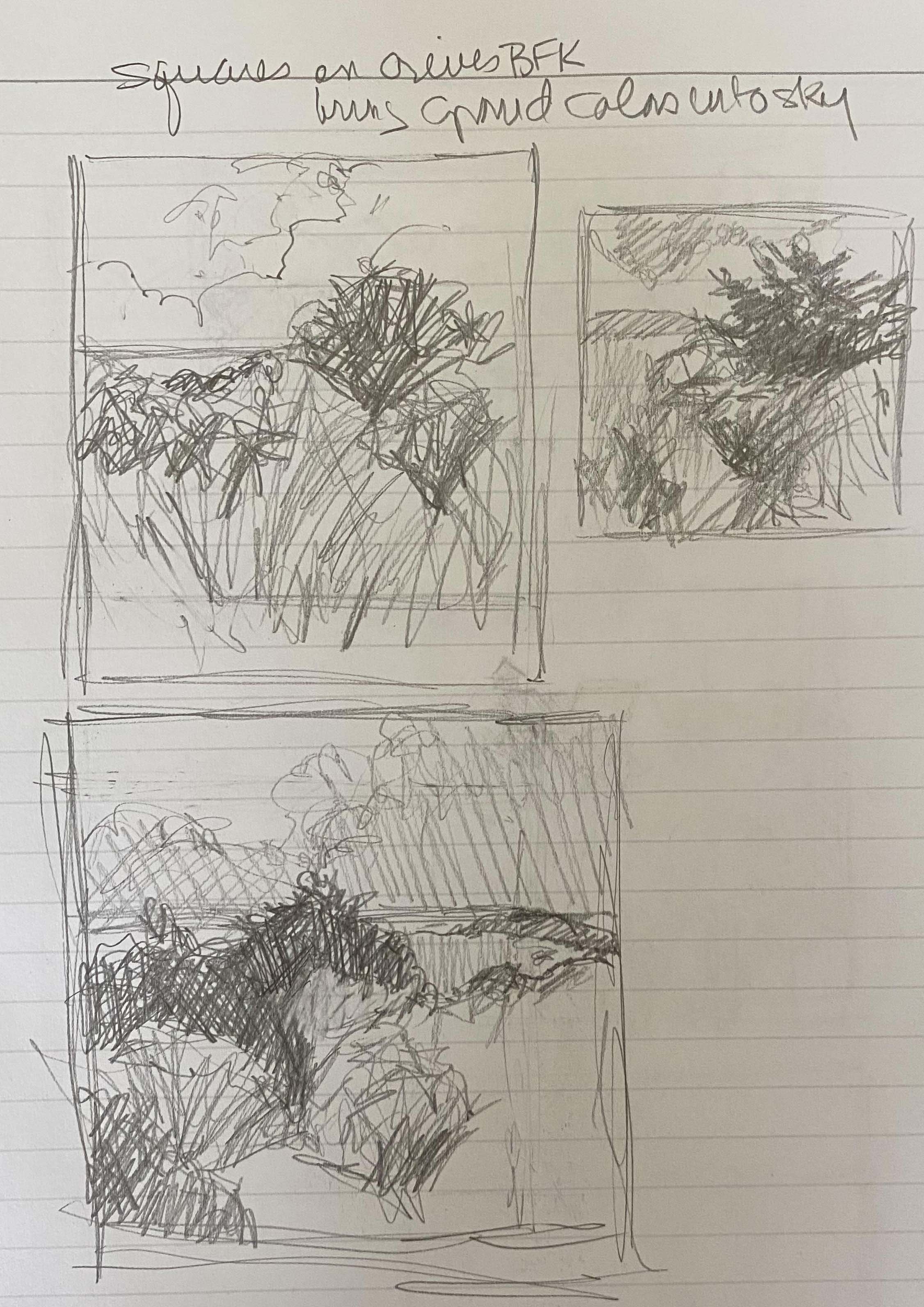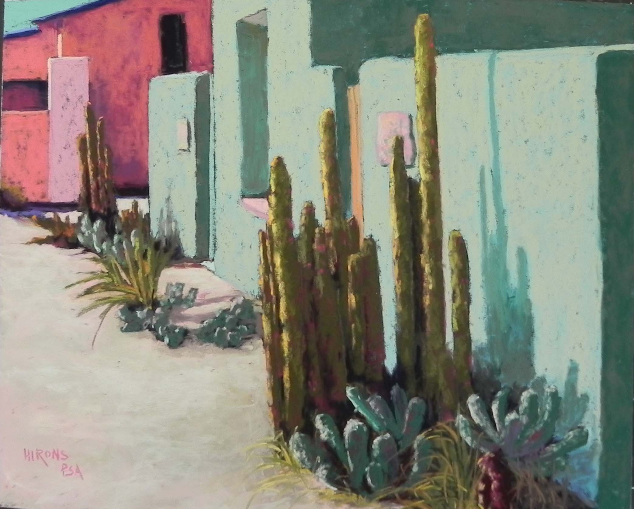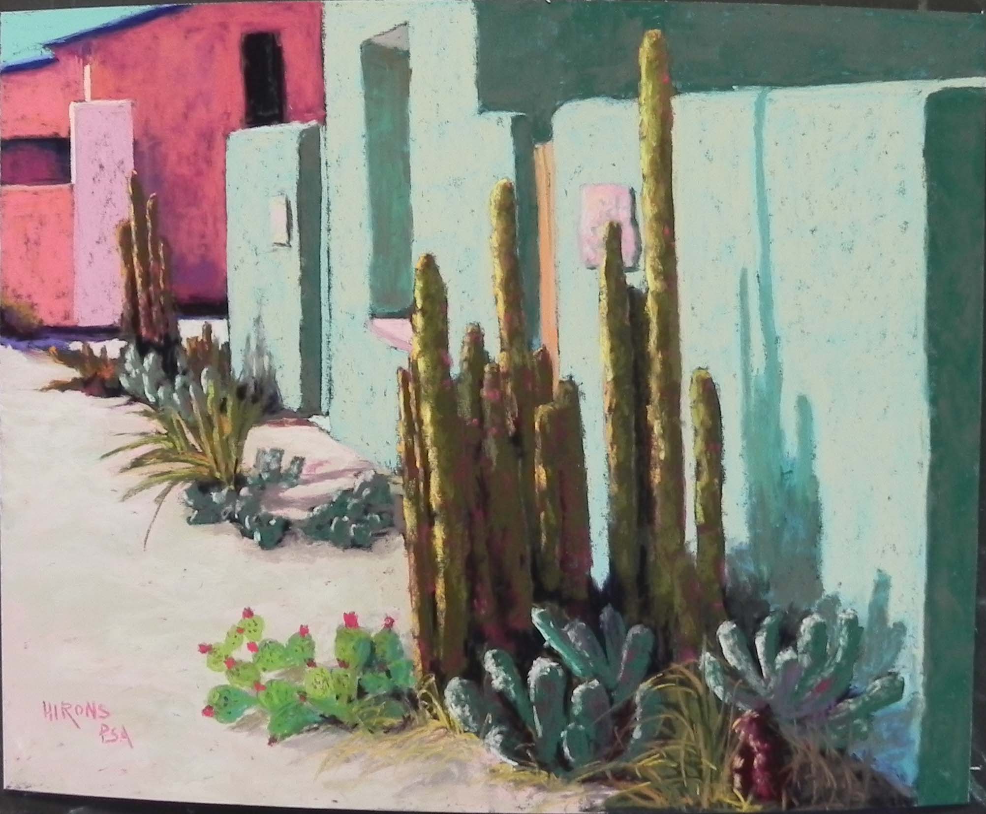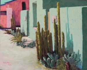
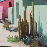
Two Adobes, 29 Palms, 16 x 20, UART dark board
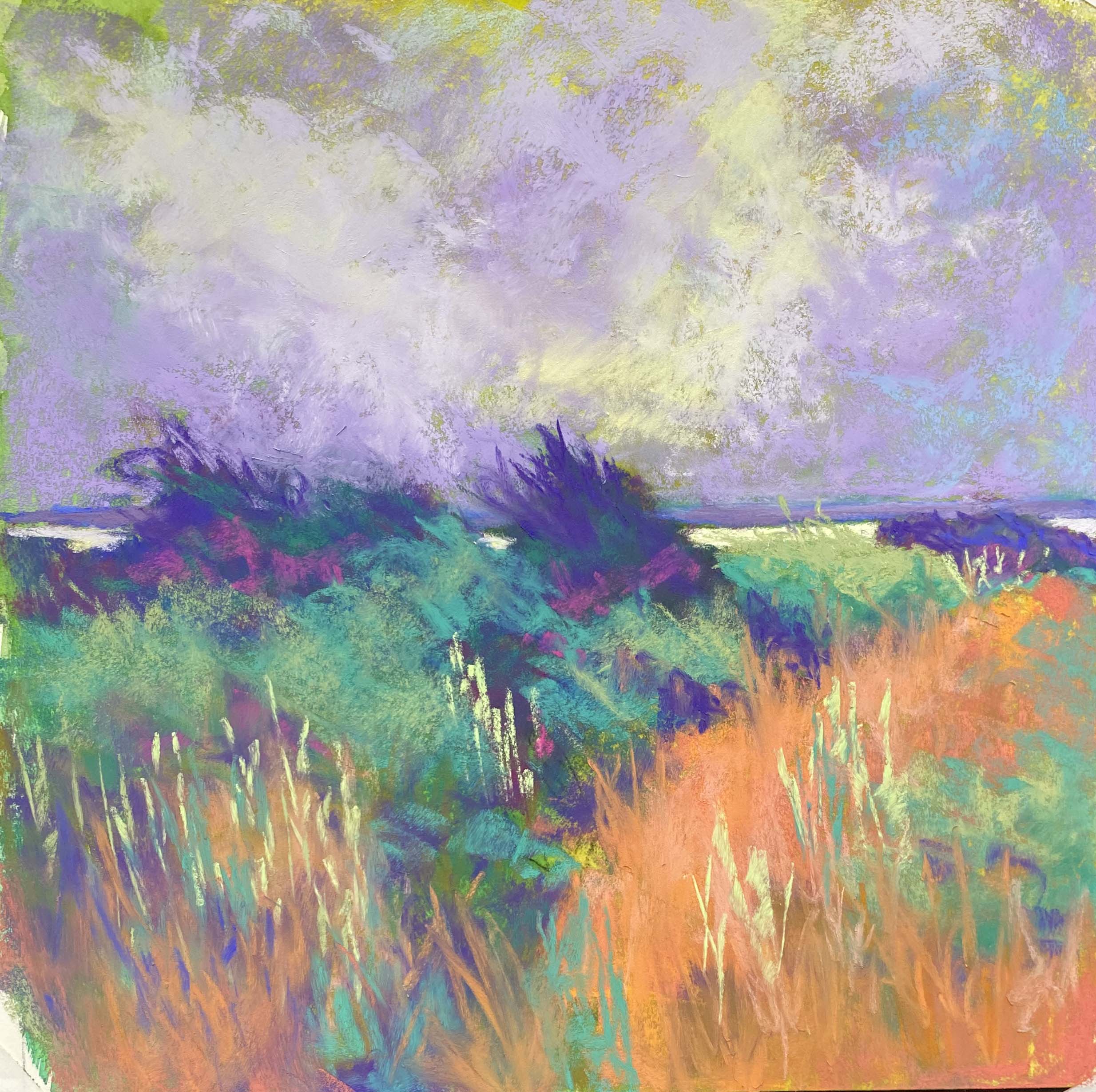
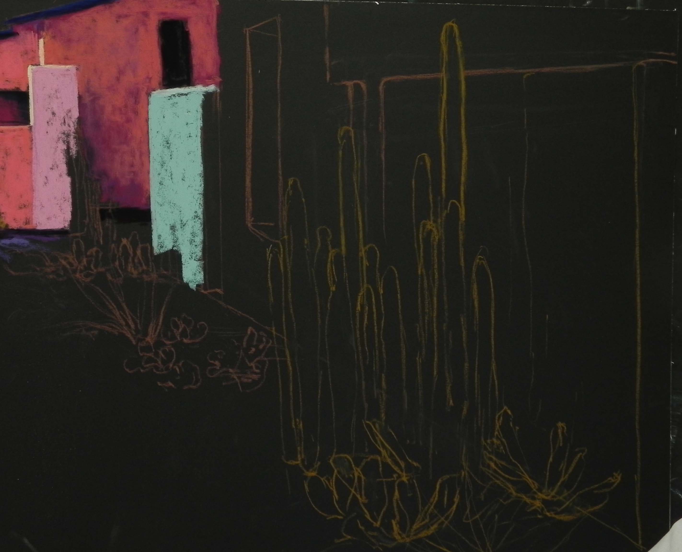
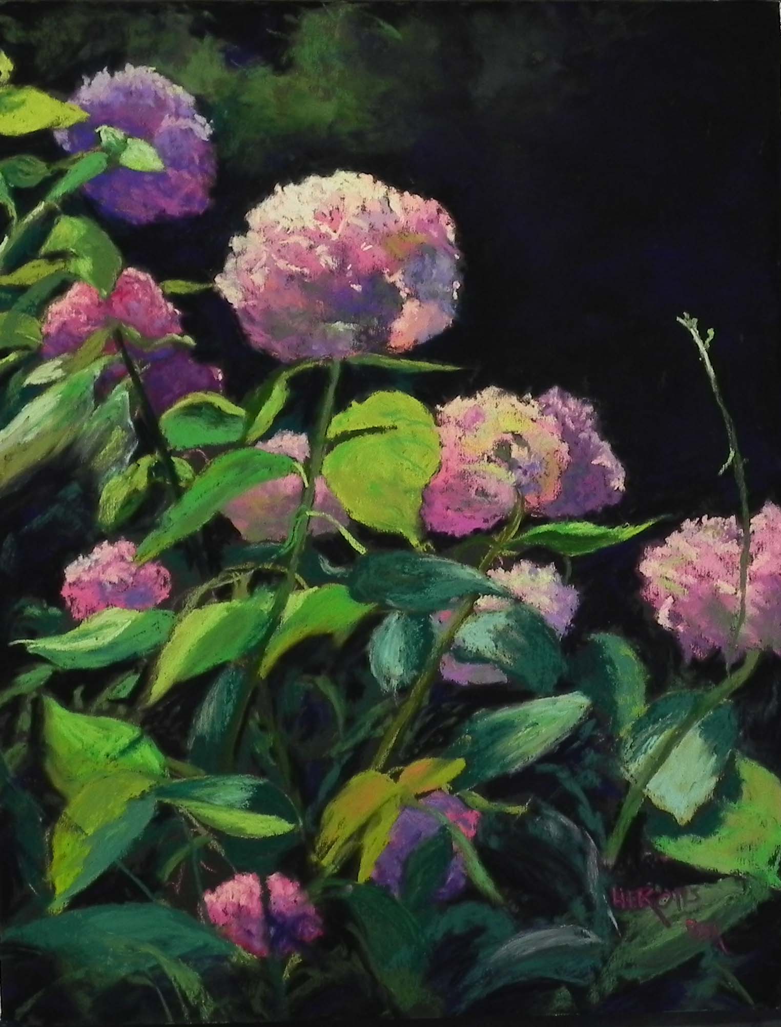
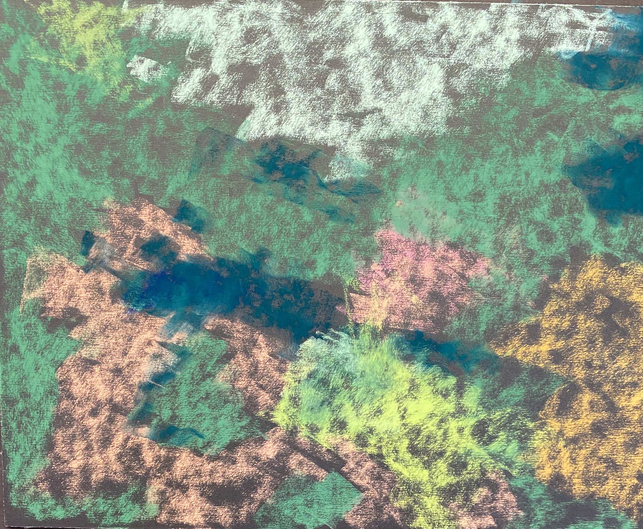
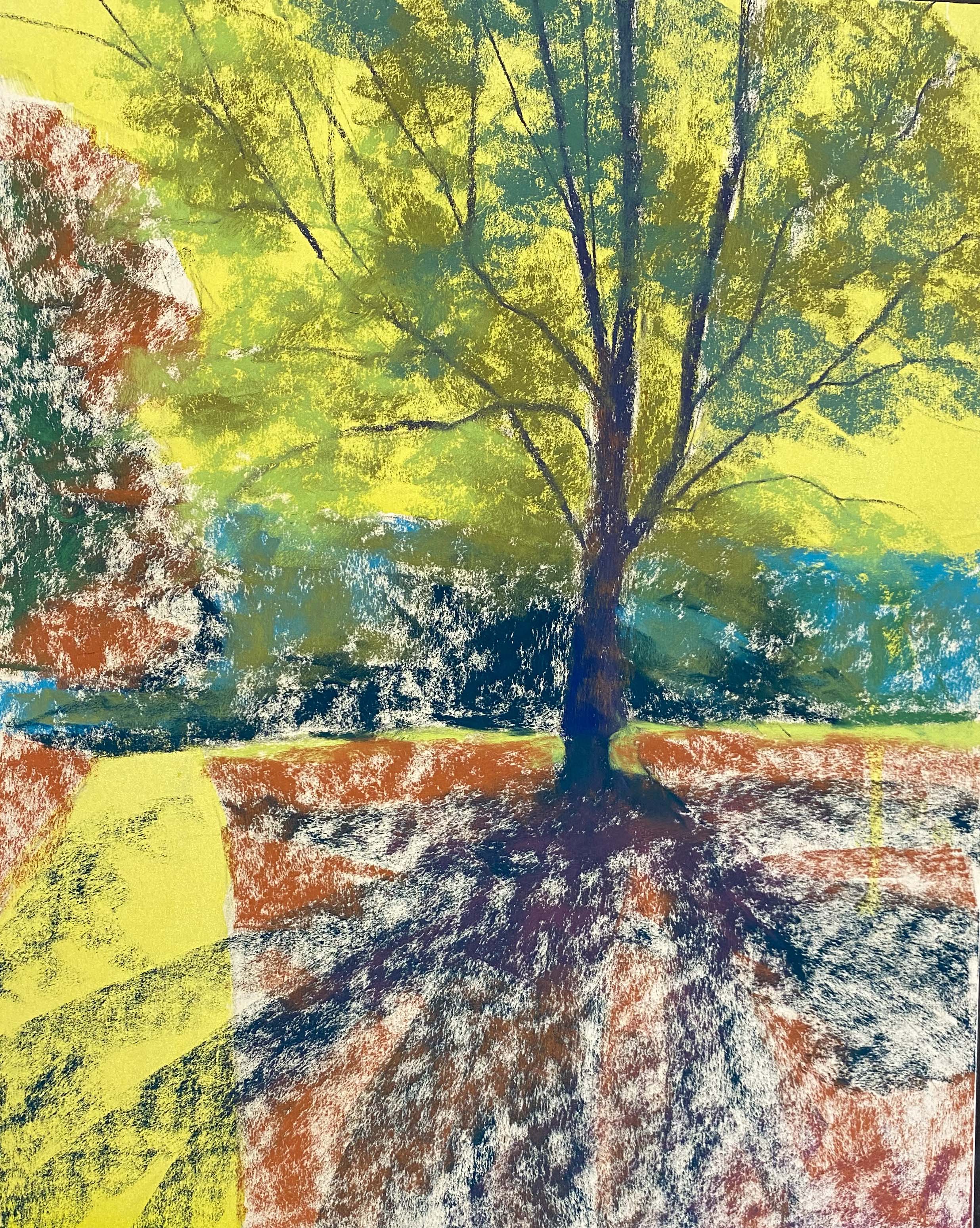
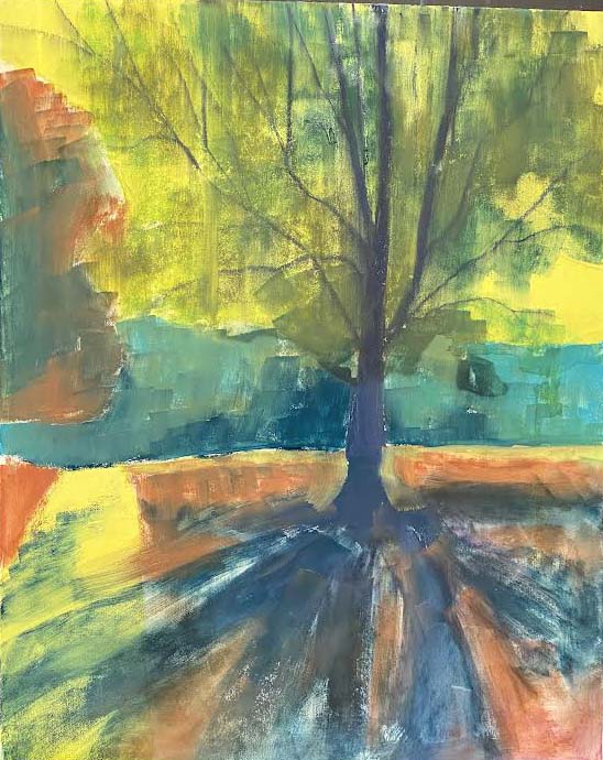
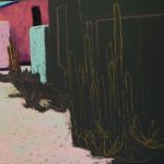
Stage 1
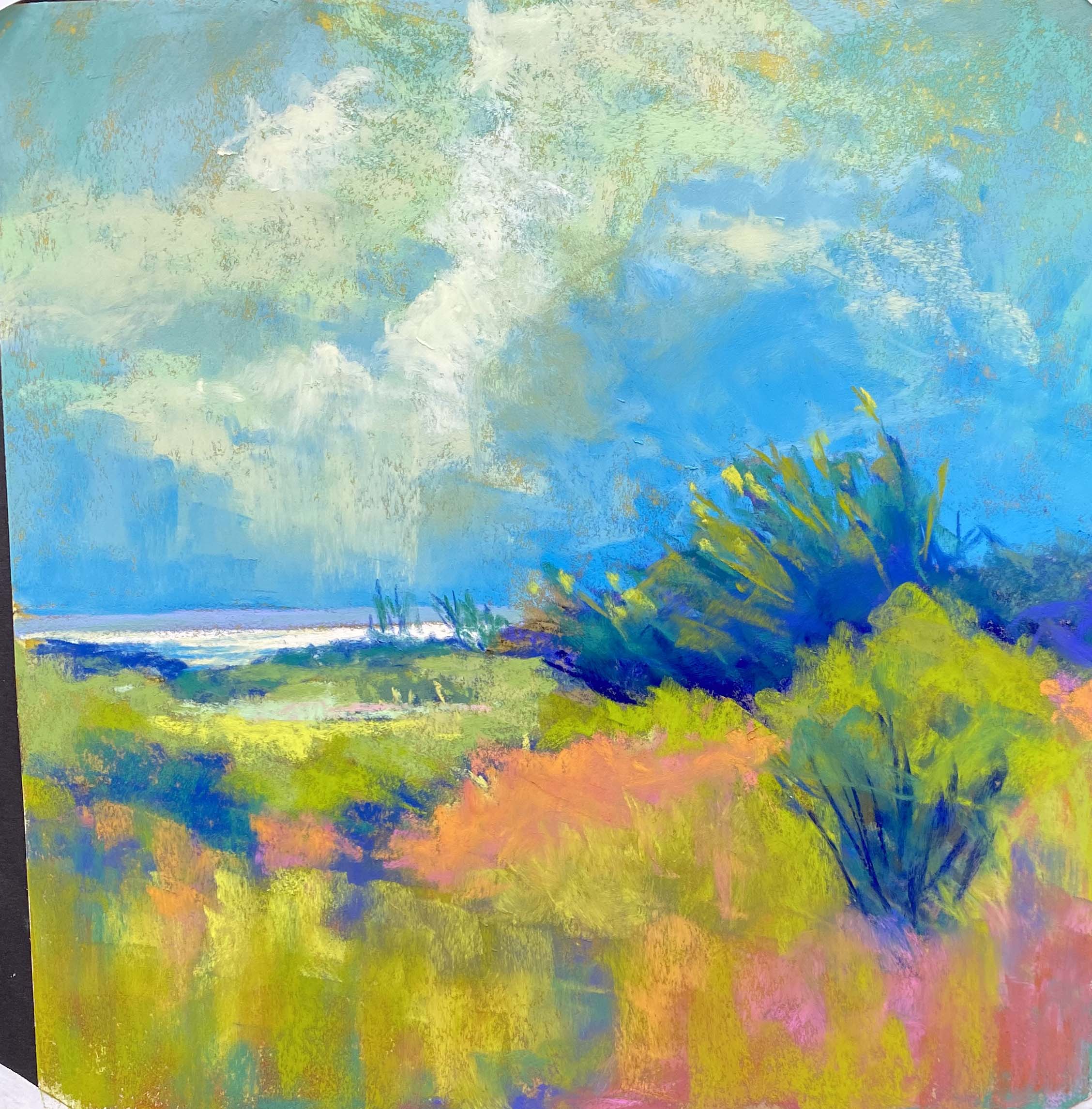
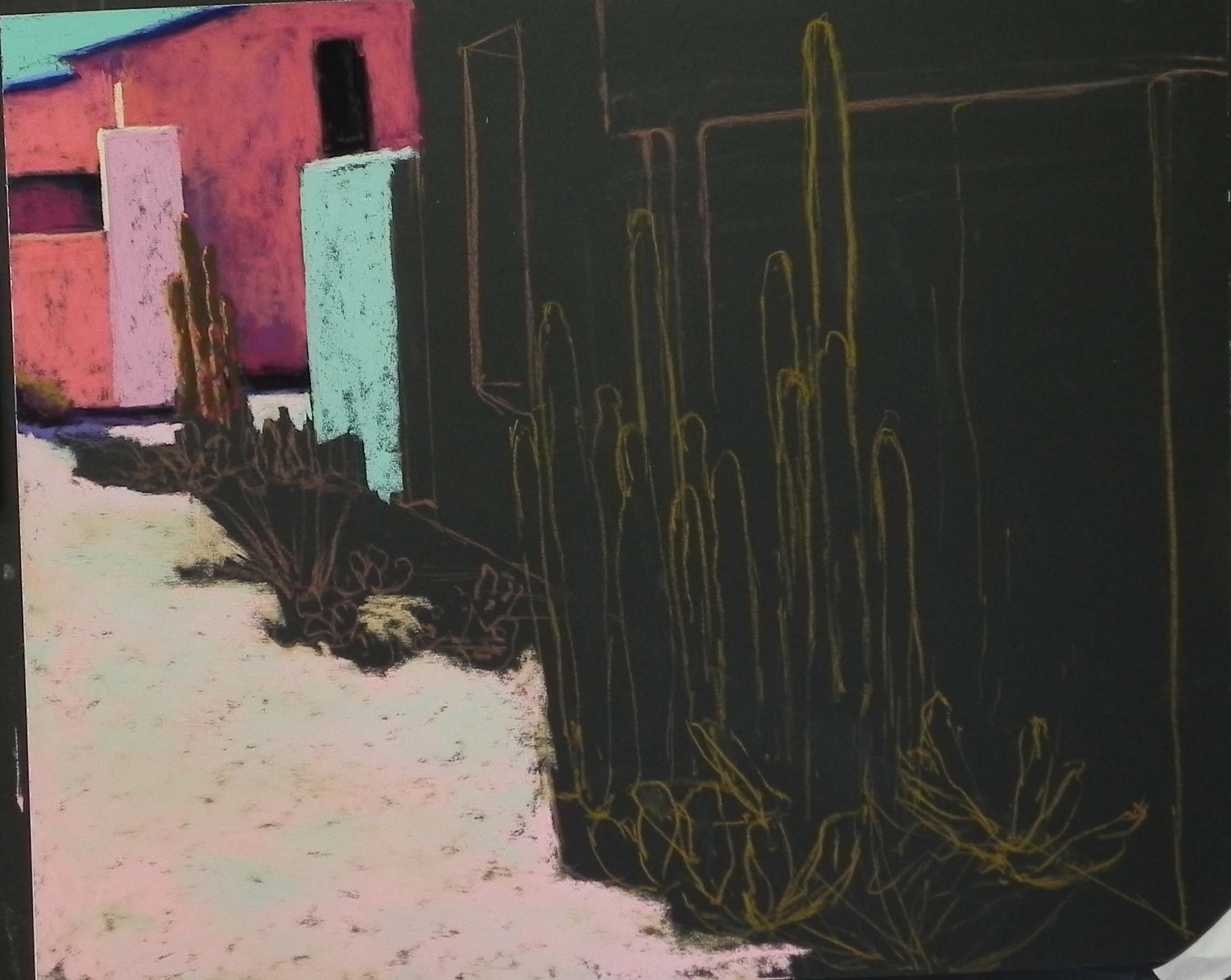
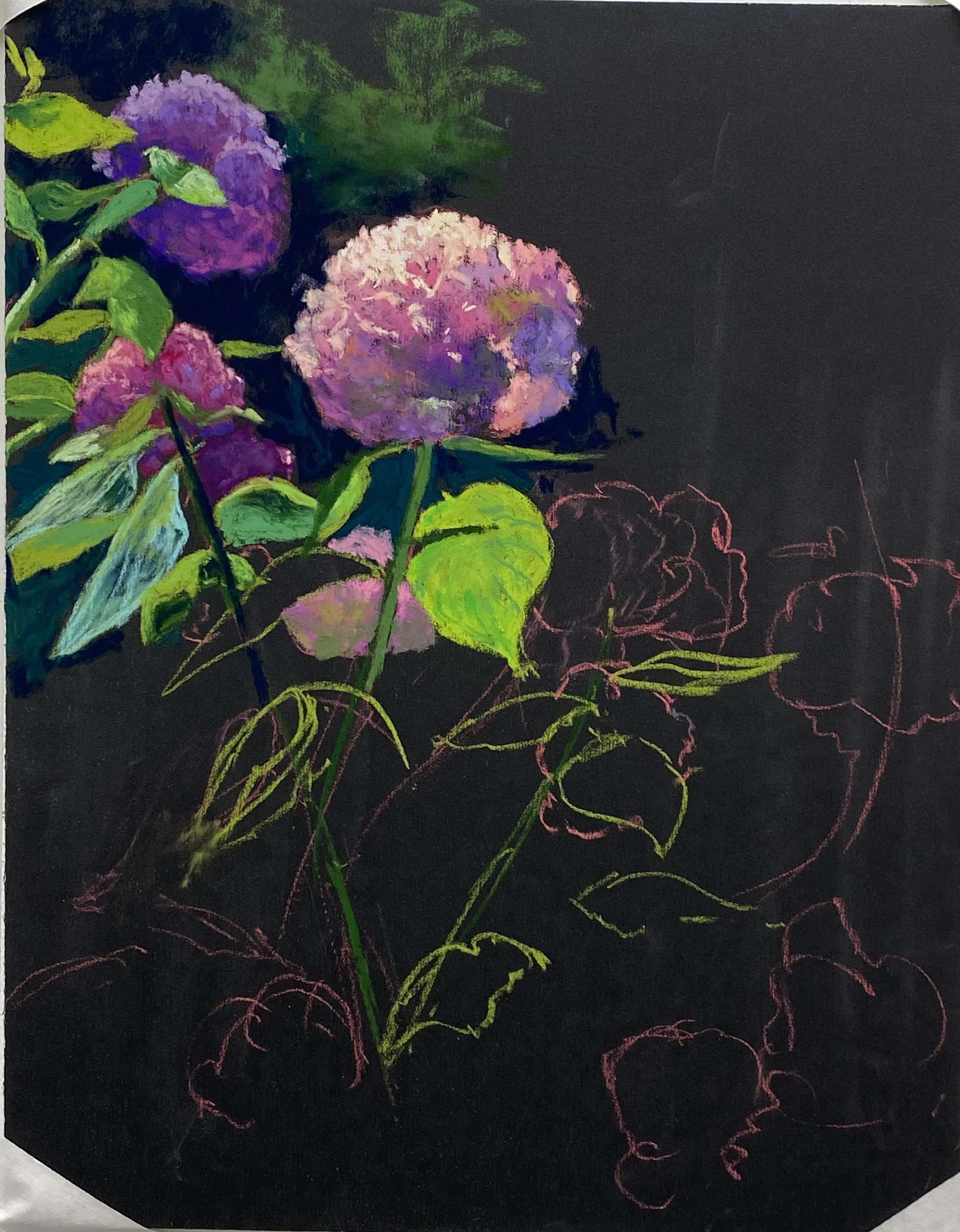
Stage 2
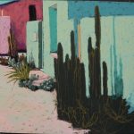
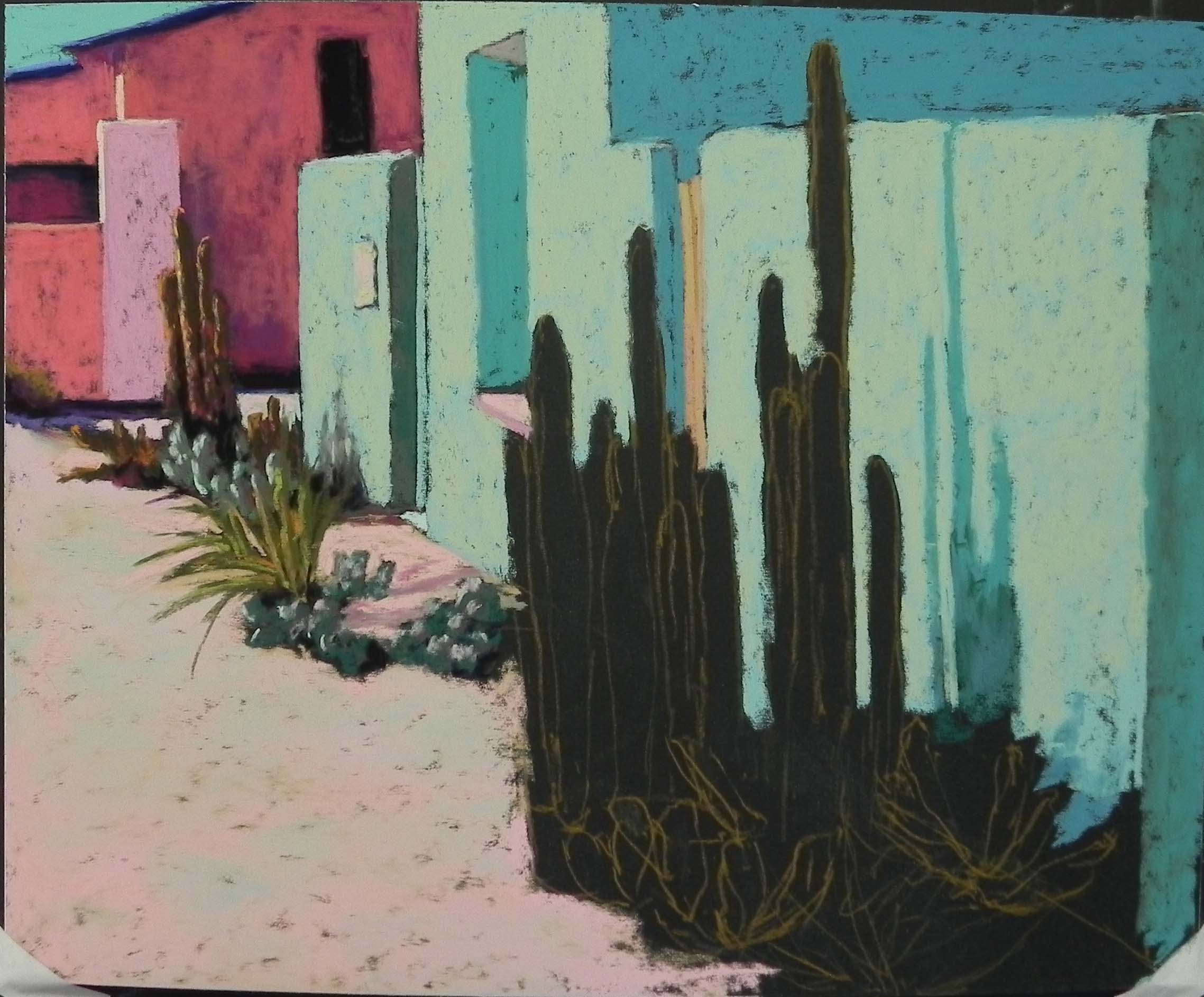
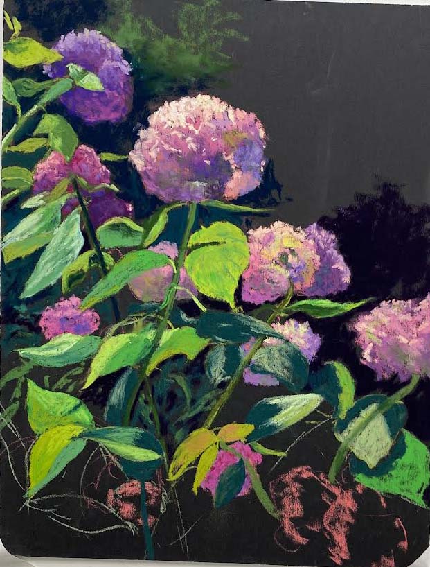
Stage 3
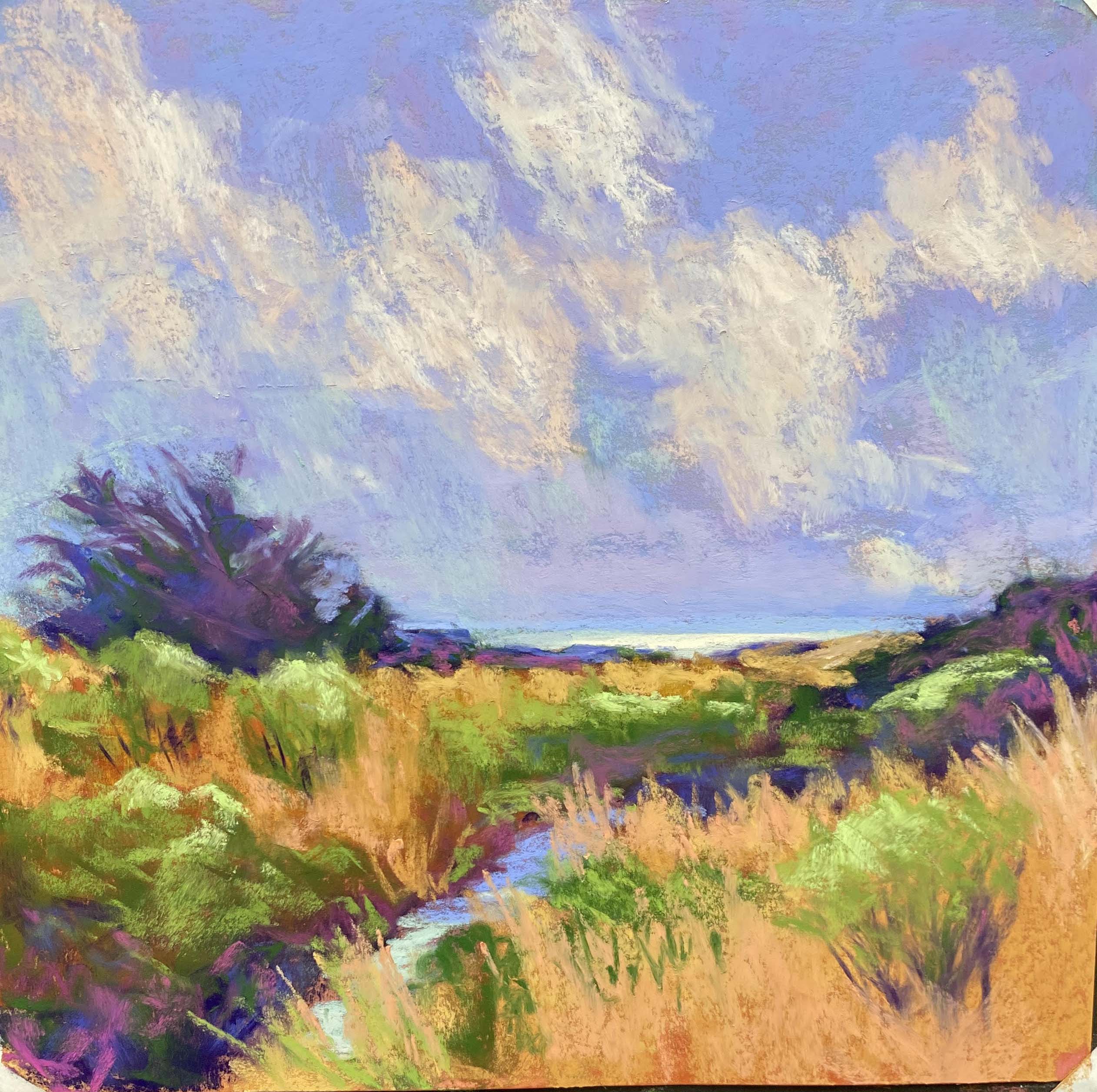
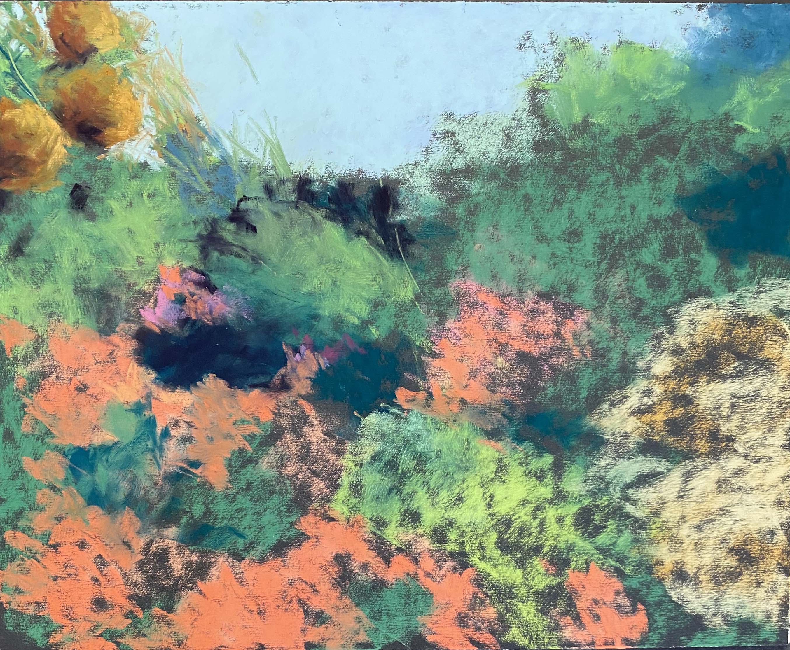
Stage 4
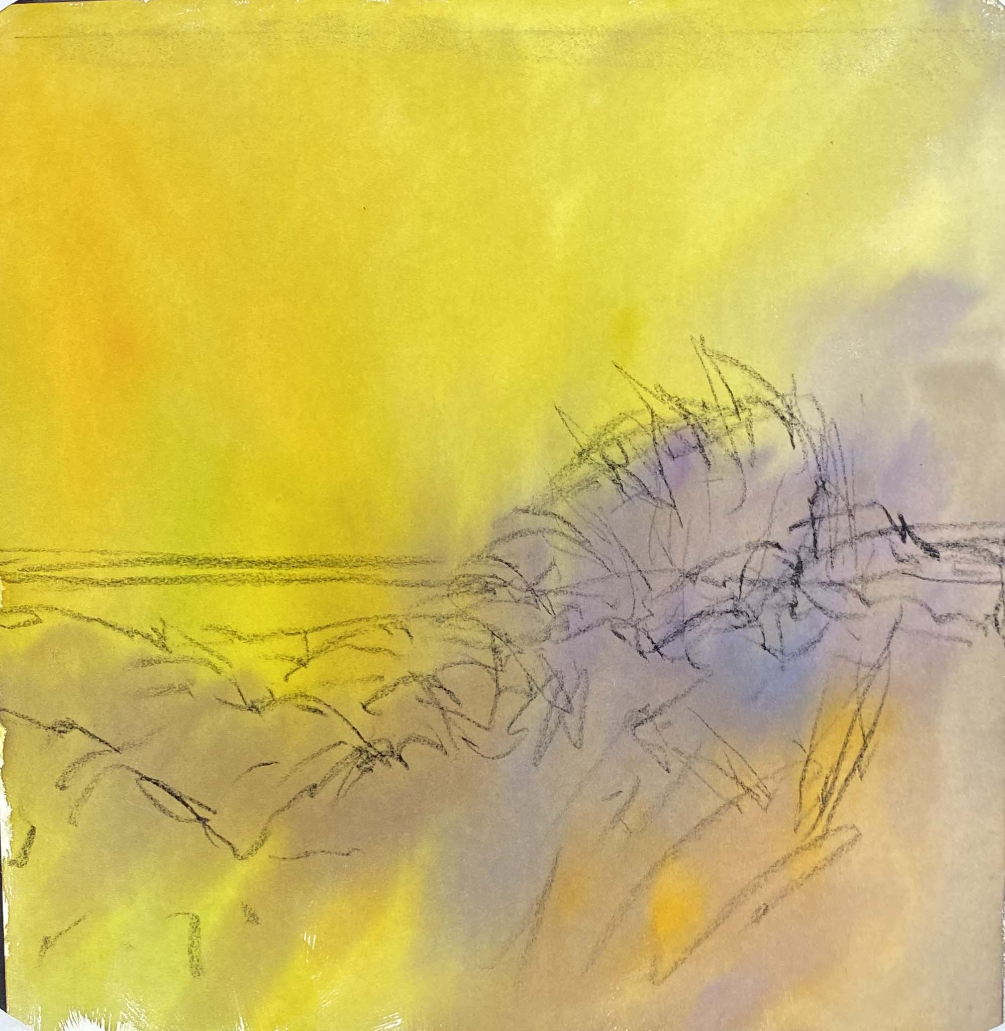
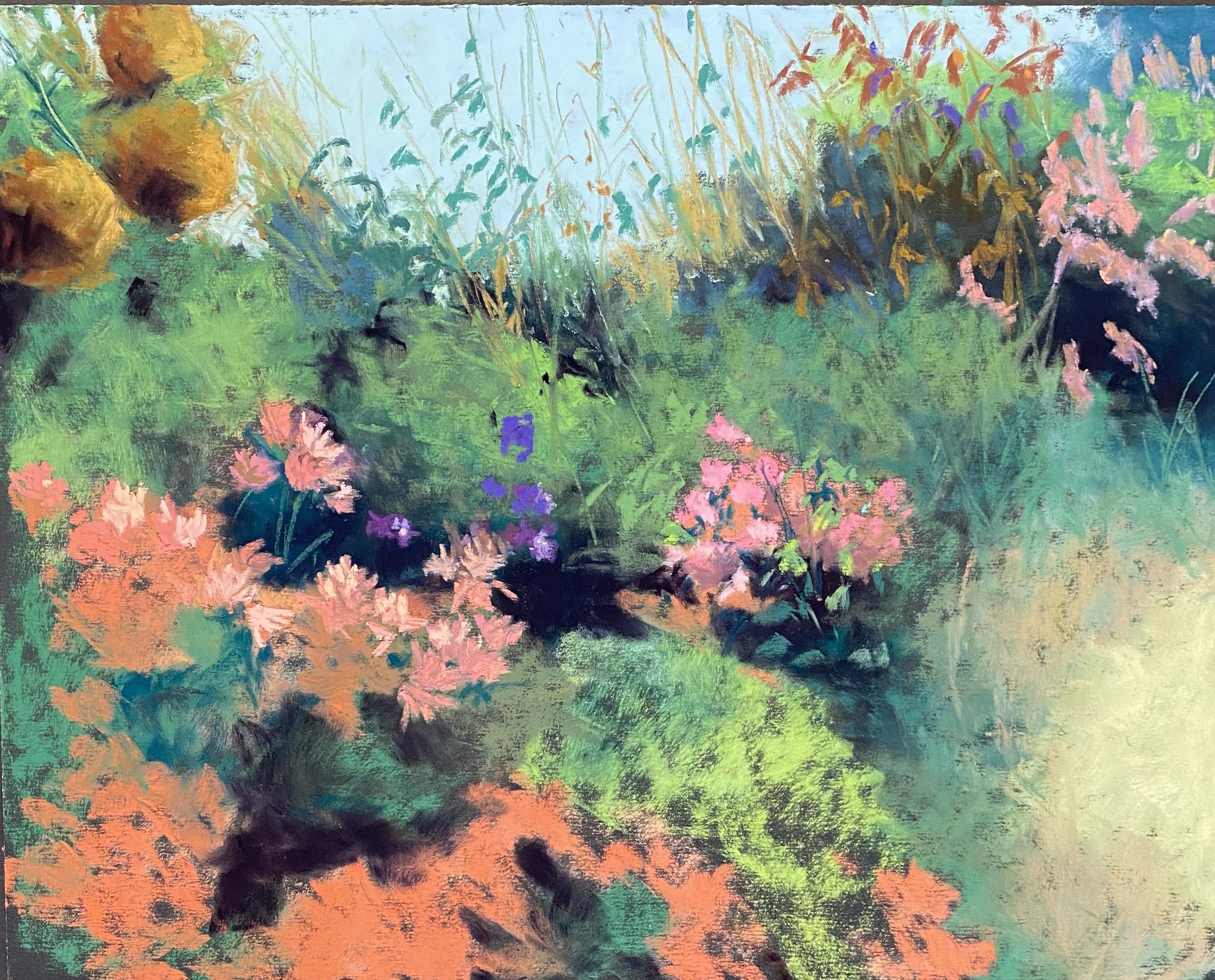
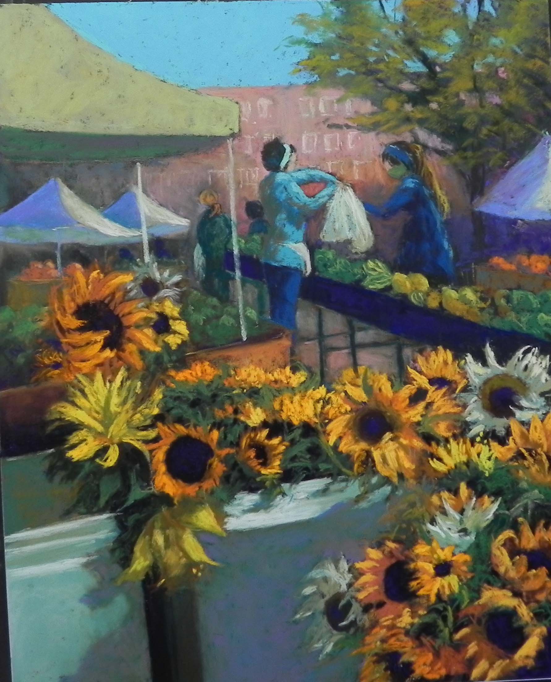
I’ve been cleaning out my studio and going through a lot of old stuff. One of the things is a box of old color photos that I’ve saved from a far larger number that I took prior to the days of digital and the cell phone. One of the pictures was taken in 29 Palms, California in 2003. We stayed at a place that had a wonderful array of colorful adobes. The photo had two in shades of majenta/pink and green/turquoise, along with tall cacti of some sort. So I decided to try doing it on one of my 16 x 20 UART dark boards.
(A note: while I like the Dakota boards, I have found that the dark 400 UART on these boards warp terribly. I’ve tried putting gesso on the back and it makes no difference. I lately worked on the same size of UART 320 original color and no problem. Nice and flat. So I’m not sure what’s going on. Have any of you experienced this? My newer 11 x 14s don’t seem to have the same problem.)
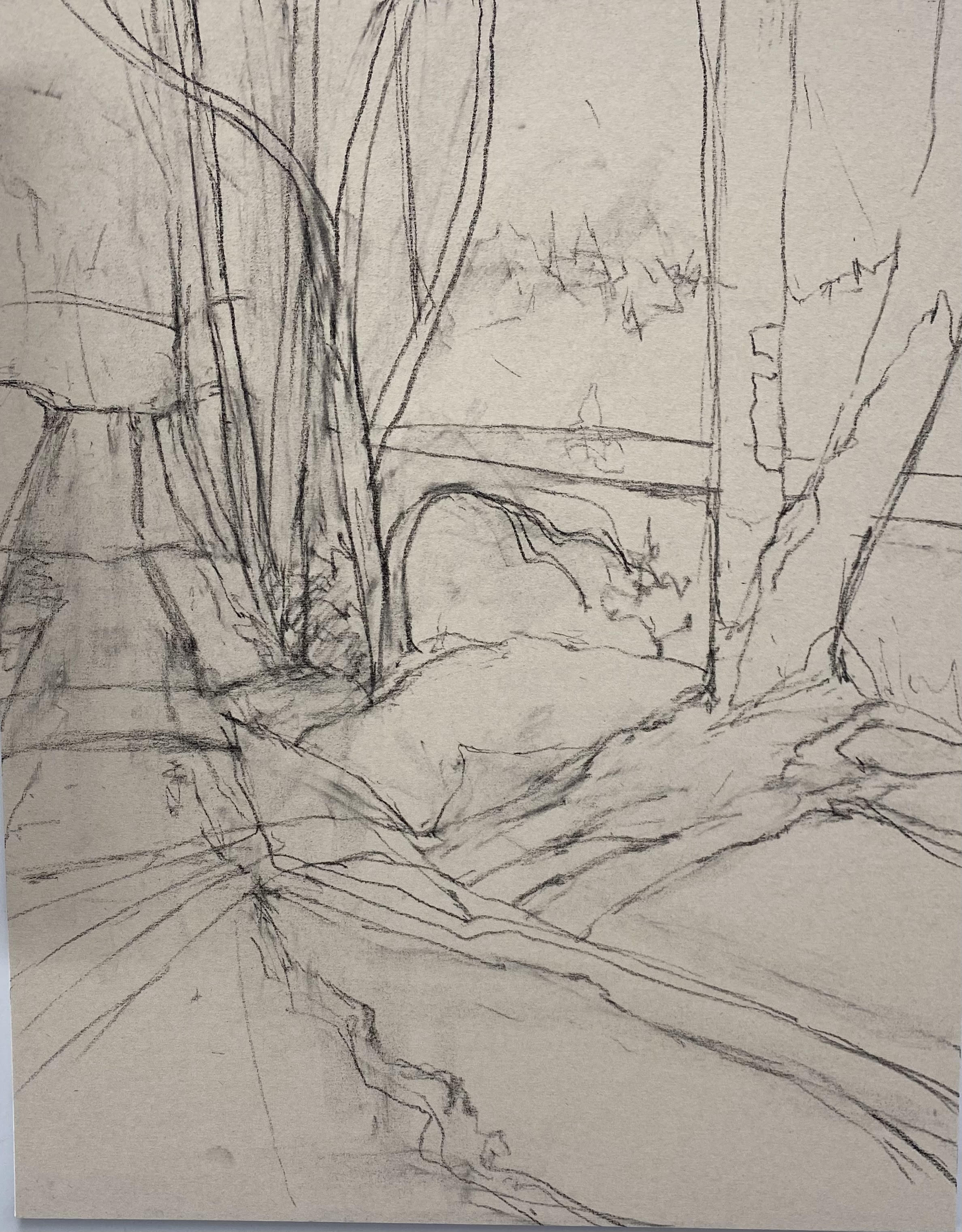
I began with a simple line drawing using a pastel pencil. Then began with the majentas and pinks, starting with Girault, but quickly moving to Ludwig (much better). I liked the shape of blue sky behind the building and simplified what was in the photo (roof line, etc.). This part was really fun!
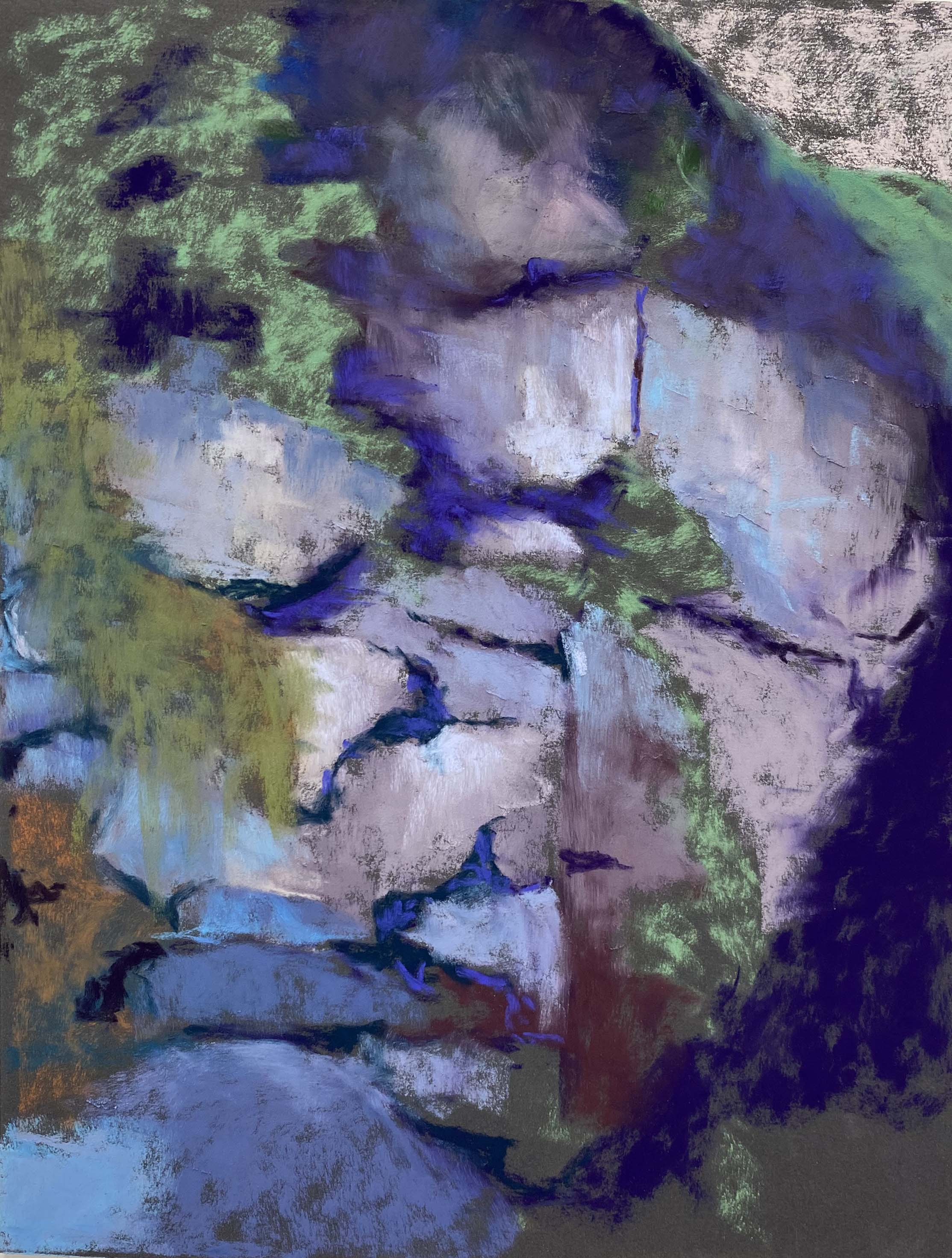
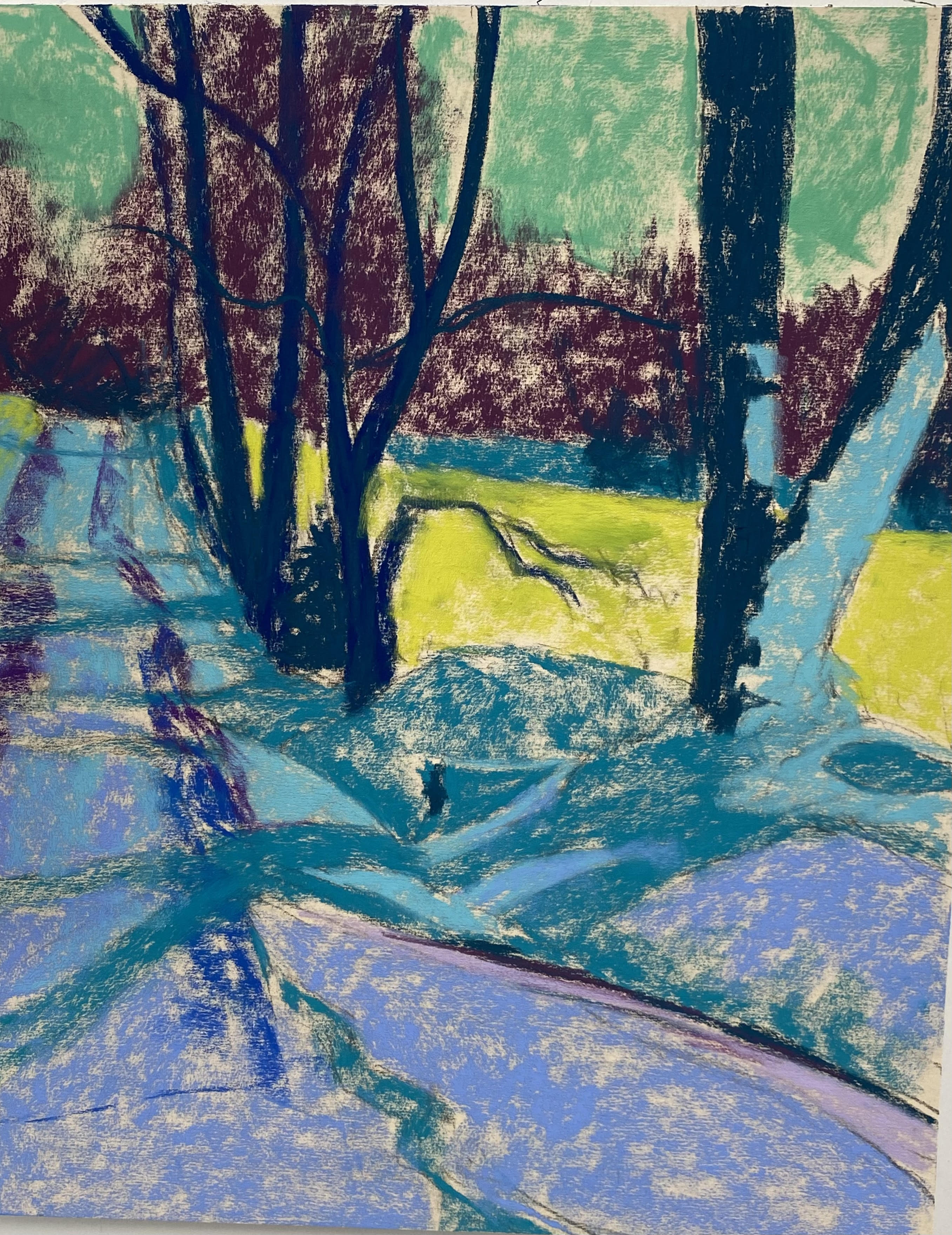
In Stage 2, I’ve added a layer of light pink and light green in as the sand and done a first coat of the far left wall of the green building. I began the building using a Ludwig turquoise, but wanted it to be warmer. Found a soft, grayed warm green (light) and added that over the turquoise, letting little pieces show through. I really liked the effect.
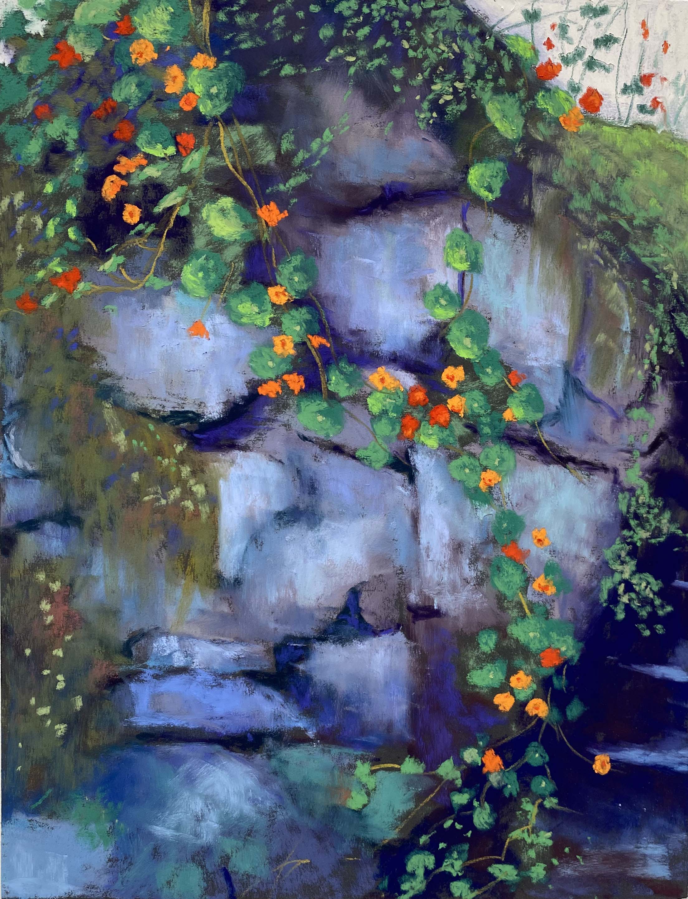
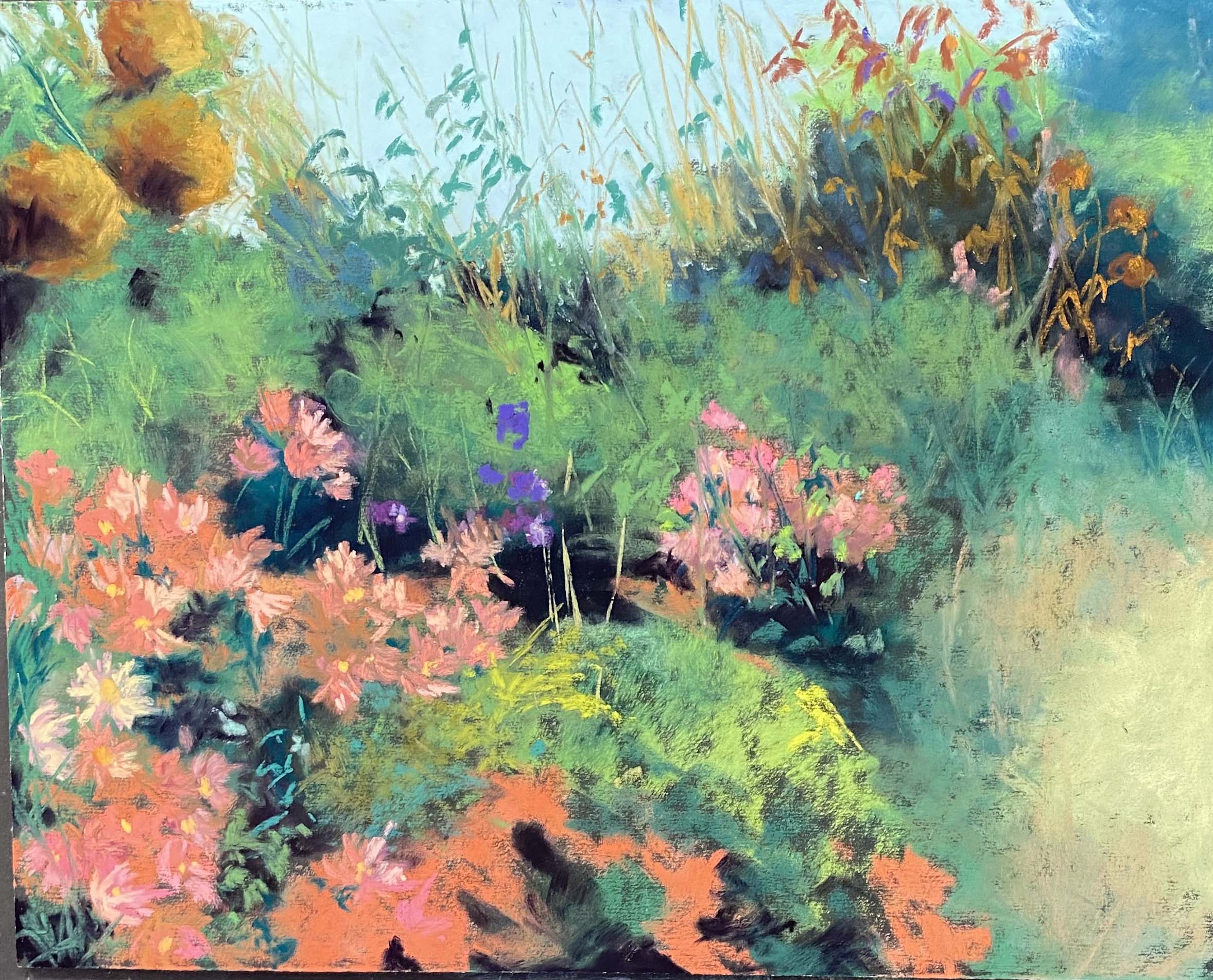
I had a hard time with the shadowed side of the green building. I first put in a teal Great American but it wasn’t dark enough. So I added two colors on top! A dark turquoise Blue Earth and a gray from the same box. The color was much better but I was adding dark over lighter color in a fairly large area and not happy about it! However, I like the final effect.
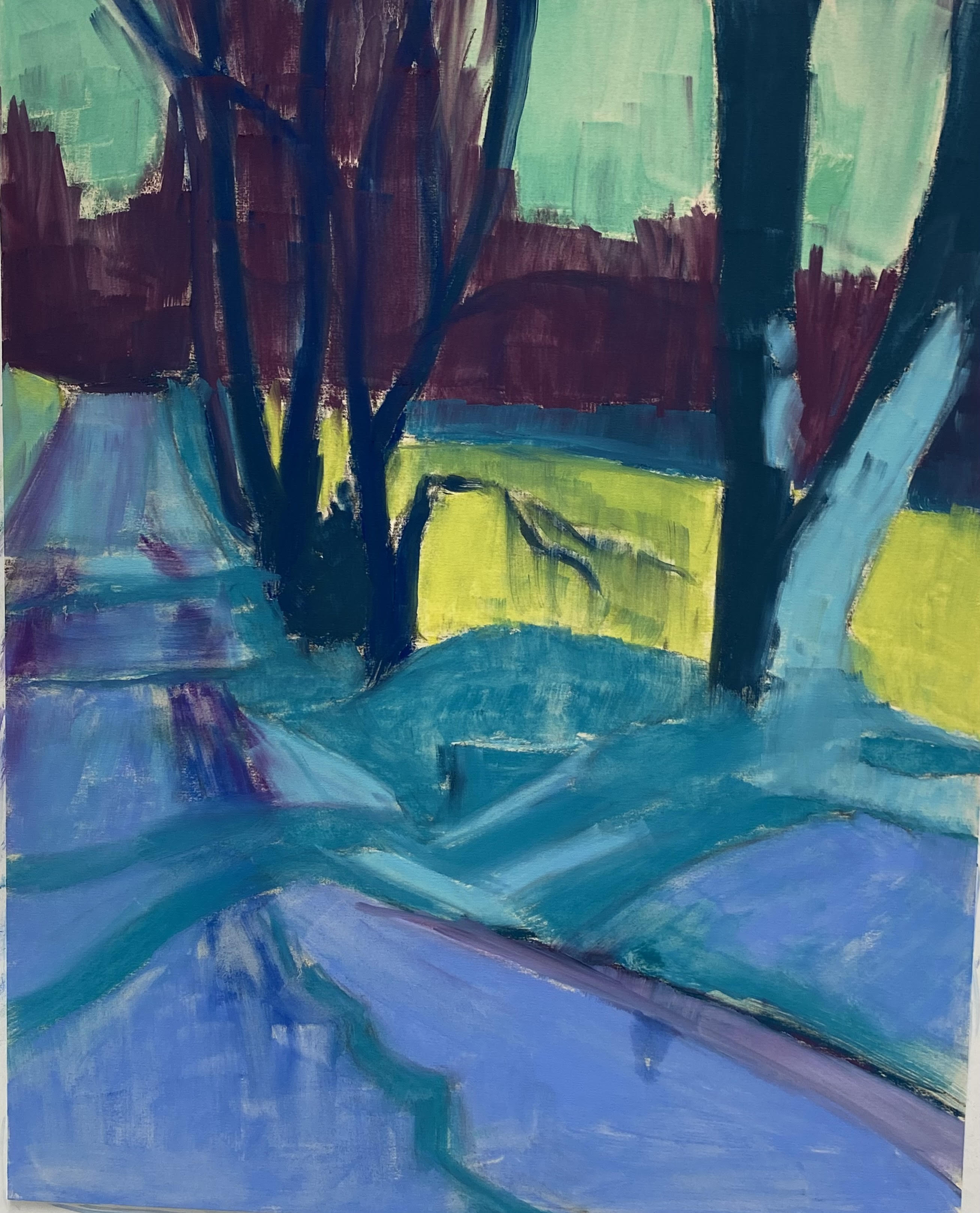
In Stage 4, I’ve decided that compositionally, I think I need more on the bottom extending to the left. There’s a strong diagonal that I felt needed to be broken. I tried adding more of what was there, then decided to add another type of cactus (prickly pear) that wasn’t in the photo. I used a reference photo from the computer and the color was all wrong. So I brushed it out and relaid in the color of the sand and I’m much happier with it. The diagonal can stay! Also, I decided that the sand looked too pink, so I pulled out the warm neutral box of Blue Earths and these worked really nicely.
For the large cacti, I began with several values of the quinacrione red Blue Earth, then used similar values from the “lemon” box on top, allowing some of the pinks to show through. I wanted to bring the red forward and not have it isolated in the back. I added some more pieces on top of the green. For the smaller cacti in front, I used the tuquoise Blue Earth, along with the Quinacridone red, then very light pieces on the edges. This worked beautifully because they were in front of the tall cacti that were dark at the bottom.
In the photo, the tall cacti went right to the bottom and there was only a hint of the others. So I had to extend this area, which wasn’t real easy! I’m not much of an expert in cacti, having lived my entire life in New England and the Mid-Atlantic!
However, this was a really fun painitng to do and something out of the ordinary. I guess I’m into a sunny cactus mood–given that we are in cold, windy February!