
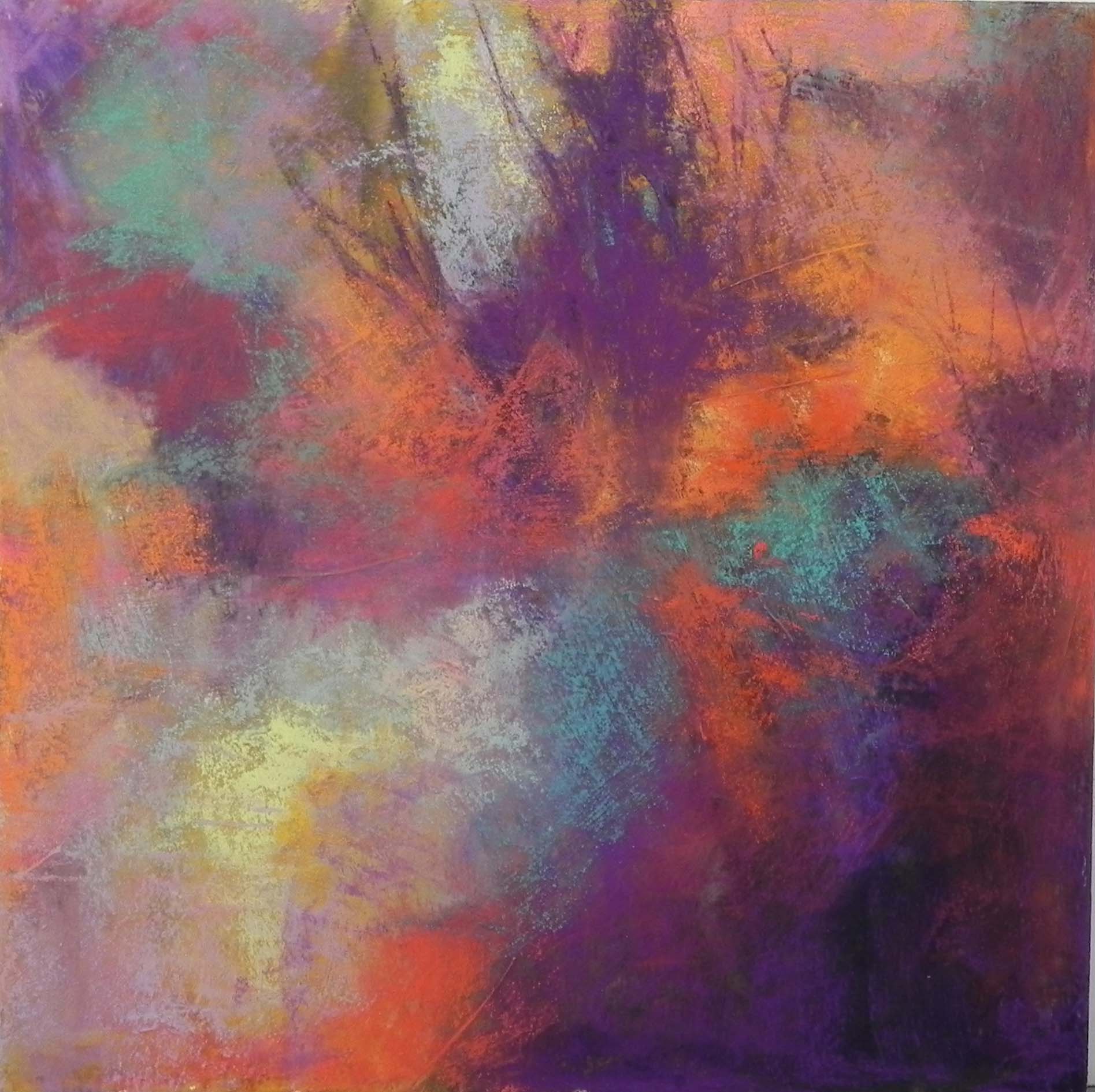
Abstract #1, 12 x 12, mat board with AS liquid primer
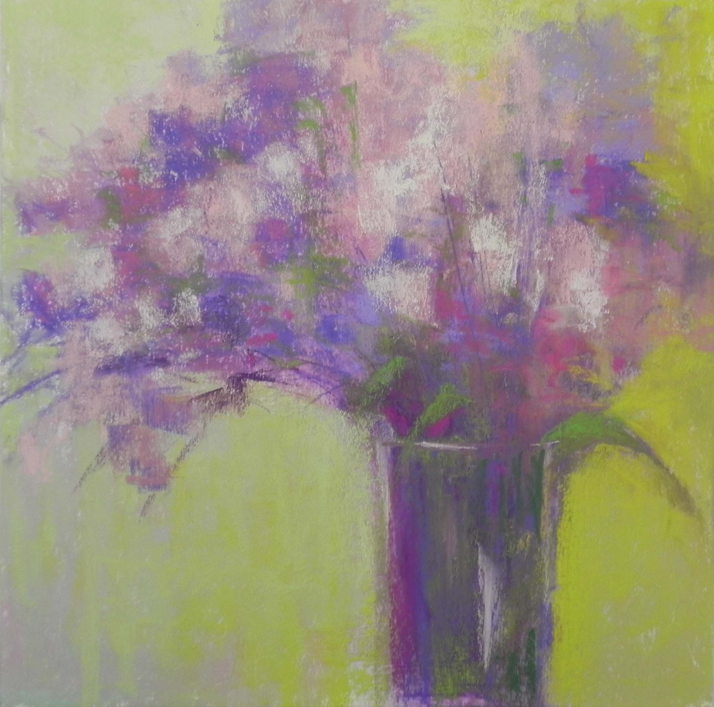
Floral abstract, 12 x 12, mat board with AS liquid primer
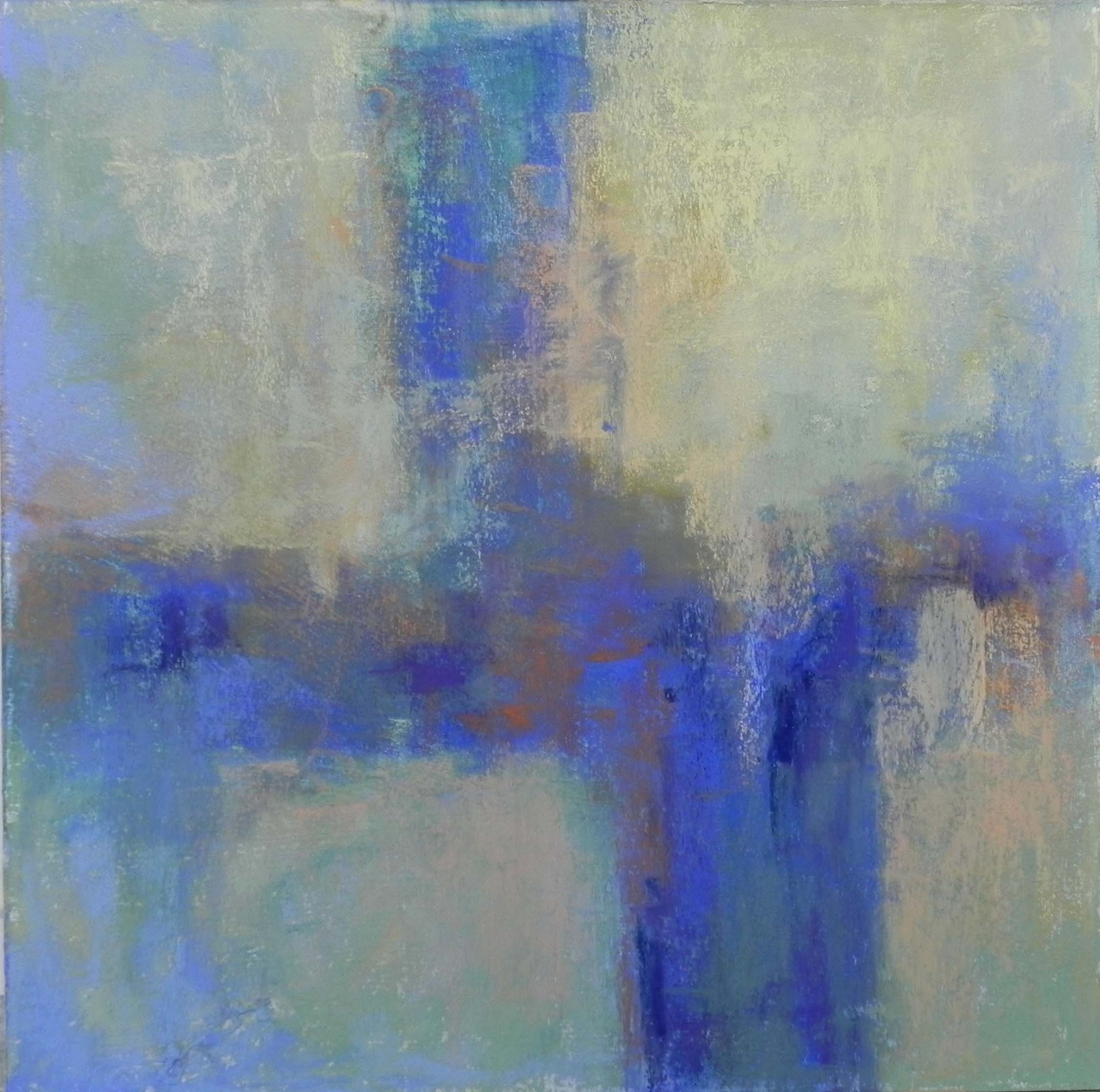
Blue-green Abstract, 12 x 12
I spent a very enjoyable day in the studio today playing! My friend and fellow resident artist, Julie Smith, joined me and we referred to Debora Stewart’s new book on Abstract Painting. Before Julie arrived, I did a number of drawing exercises on newsprint using charcoal. First I drew with my left hand, then did some drawings that were based on photos with strong shapes. Nothing appealed to me. So I decided to just jump in. I used 8-ply mat board given to me by my framer (holes!) cut to 12 x 12. It’s a great size and shape to work on and it’s nice having inexpensive surfaces on which to work.
For the first painting, I used purple, gold, and black liquid acrylic and painted it on the board with brush and water. Once dry, I layered two coats of clear Art Spectrum liquid primer over the top. I began with Holbein pastels in violets, oranges, and cool greens, laying in color, paying some attention to the acrylic underpainting. Then moved on to softer pastels, using a lot of the Blue Earth and Schminckes. I had fun with this piece, but it came out rather dark and it isn’t particularly good, I don’t think.
For the second painting, I decided to use Debora’s method of putting down color with charcoal and adding the gel on over it. This wasn’t sand paper, however, and the plain mat board doesn’t take much pastel. However, I wanted a light palette. I decided to do flowers based on a bouquet I have at home (but not at the studio). I laid in color with the Holbeins, then put the liquid primer on over it. It spread the color a little, but not a lot. I dried it, added some more color and another layer of liquid primer, then painted over it. Was quite happy with the results. (I have no patience for detailed flower pictures!)
For my third and final painting of the day, I used the same technique but went with a non-objective cruciform shape. I wanted to use blue greens with oranges, a favorite color palette that I don’t often get to use for my landscapes. I think this was the most satisfying of the three!
Julie will be back tomorrow. She is a marvelous acrylic and collage artist and is working on a diptych inspired by a painting in Debora’s book. I think tomorrow I’ll be painting a picture from France, but I might try using one of these techniques. July is a great time for trying something new!