
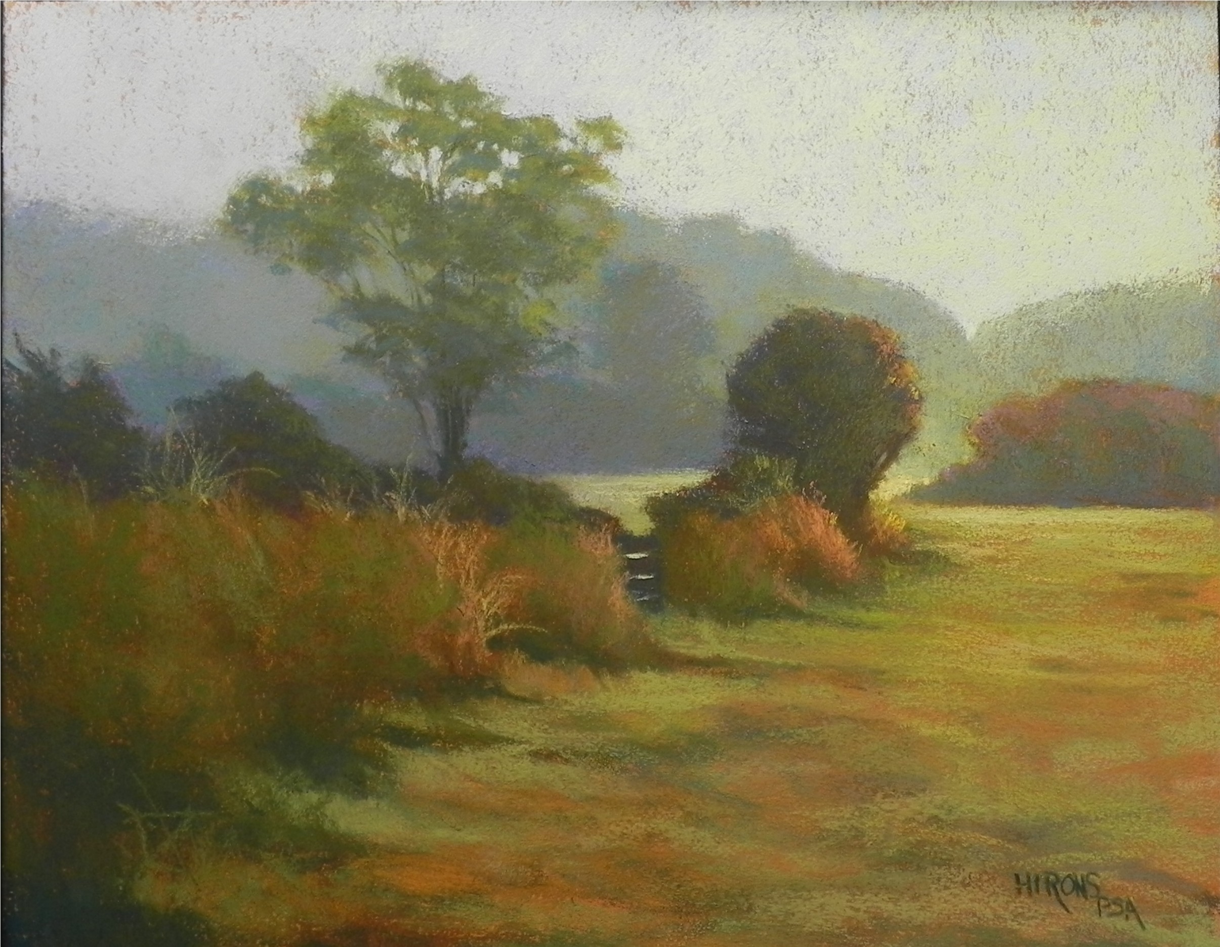
Public Footpath, Dartmoor, 16 x 20, Rives BFK and gel
Here is my latest experiment using Rives paper, broken color, and morning light. The picture is from Dartmoor in Devon, England. I went for an early morning walk down the street from our B&B before breakfast. This is an area we had walked in the day before. I took the picture looking into the sun and everything was light-infused. I had to paint it from my Samsung tablet and it was pretty hard to see any colors other than brown! (I’m not sure the background colors and sky are coming through in my photo.) The background is blue greens with some violet on the left and warm colors brushed over on the right. The foreground was pretty dark in the picture. I used a combination of dark cool greens and dark warm reddish browns. The excitement for me was the spot of light to the right of the round bush and the light infusing the background hill. The color of the gel was a fairly dark sienna, on the reddish side. Not sure I’d use it again. I am enjoying working on this new surface and particularly using it to try to obtain the effects of diffused light. I’ve thought about doing the same picture again on UART just to see how different it might be. Working on this piece was interesting because most of the time I was working without a reference. I used it to begin with to get the composition in, then to try to figure out the coloring. But after the initial go at it, I just added color to the painting as I thought it needed it. The sky was a challenge. I began it with a light aqua in the dip at right, and progressed to cooler colors on the left. Yesterday while in my studio, I realized that it needed warm color brushed over. So I used a pale orange on the right, progressing to warm yellow green, and red violet on the left. It definitely gave me more of the effect that I was aiming for. Still not sure about the picture and would love comments or suggestions. With my show up and no plans for another any time soon, I feel free to experiment and try out new techniques and subject matter. Having the blog to share this on is so much fun!
Beautiful atmospheric piece. I agree with how you changed the sky, it lends a lot to the overall feeling.
Janet–how lovely to hear from you! I’m glad you like the sky color. There were also last minute changes to the foreground bushes. I took a picture of it and in the viewfinder I could see that there was too much orange. So I quickly brushed more green on over it and took another picture. It made all the difference. It’s been fun working on this piece because I’ve let the picture speak to me about the colors that are needed and not the original photo.
Hello Jean,
I am fascinated by your beautiful painting, “Public Footpath, Dartmoor”. Your use of colors is enchanting. I am, however, curious about a few things. What is Rives paper and what effect do you achieve with pastels on the Rives? Also, what do you mean by using “gel”?
Marie–Sorry to confuse you. Rives BFK is a soft, lightly textured printmaking paper. The gel I use is Art Spectrum Colourfix liquid primer. I have been using the primer for many years now, but was using it on gatorfoam, which is a very hard surface. When I apply it to gatorfoam or reused Pastelbord, the brush strokes are very much in evidence. (I have a number of paintings in my current show that exhibit them and people like the affect.) However, in the past few years, I’ve experimented with softer, more pliant surfaces–smooth mat board, museum board, and the Rives paper. What I like about the Rives is that even with two coats of the gel, the subtle texture of the paper is maintained and when I lightly brush on the pastel, it leaves a lot of the underside showing. This creates a broken color effect that is great for atmospheric effects. I have long been a devotee of Duane Wakeham. I’ve tried using the Arches 300 watercolor paper that he uses but have never been successful with it. The Rives paper and the paintings I have been doing since this summer are the closest I’ve ever come to anything like what Duane does. If you don’t know his work, look for him on the PSA website. His paintings in the Pastel Journal were the first that made me say “WOW” and I’ve never lost my love for them. He paints northern California and has four paintings in my book. The series of paintings from Sepowet and Colorado were all done using this surface and technique. I plan to continue experimenting with it.
Thank you so much Jean for the information. You have inspired me to try something new.