
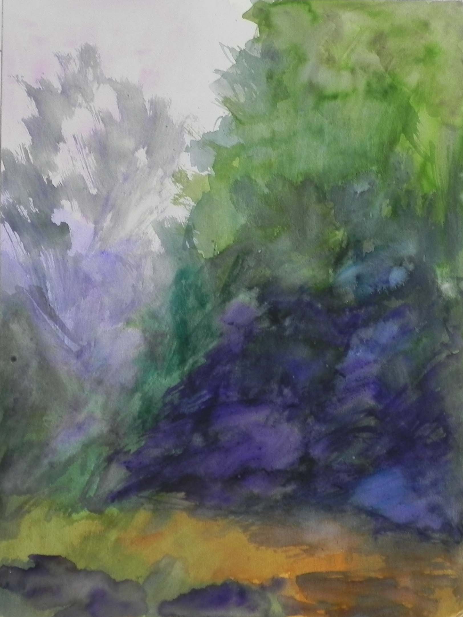
Watercolor underpainting
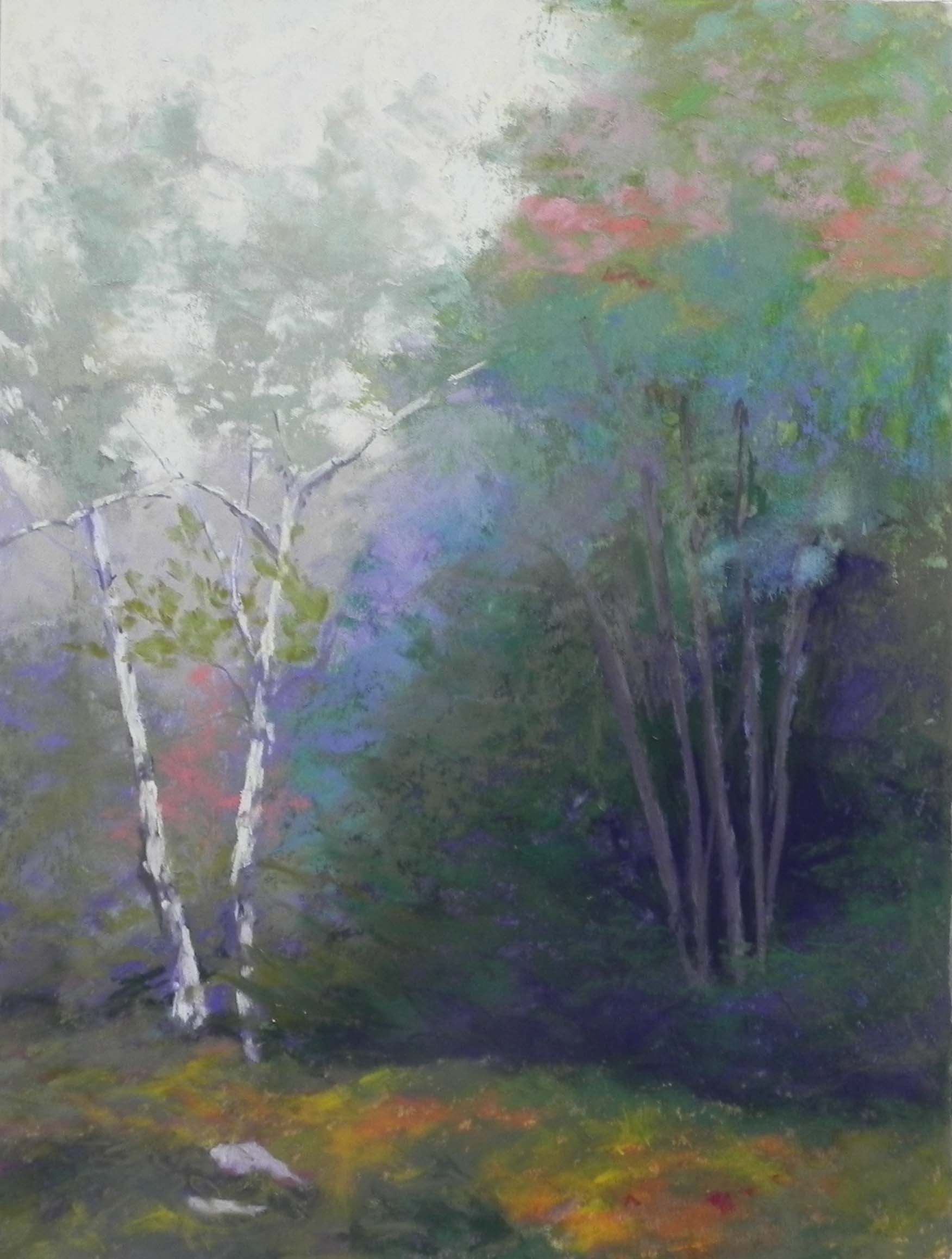
Pastel applications before reds were added
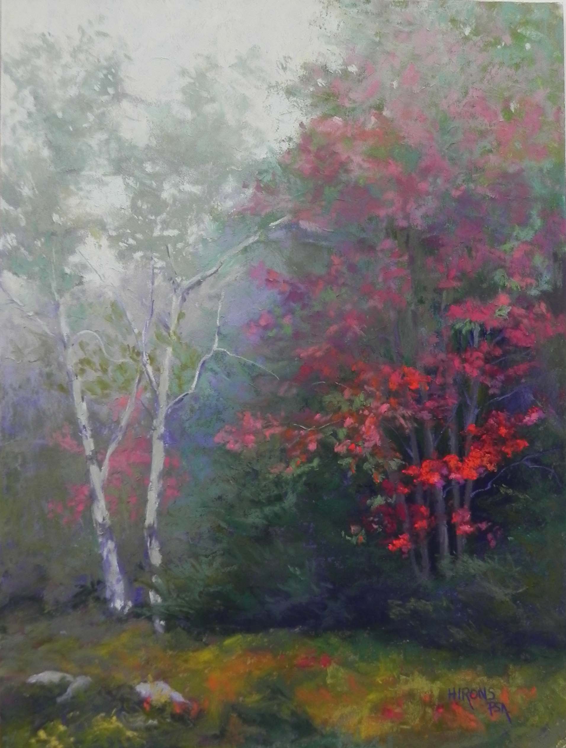
Red Emerging, 16″ x 12″, mounted Pastel Premiere
It’s a very busy month of October, as it always seems to be. But I had time over the past couple of days to do a painting from our trip to Vermont. It’s really interesting that I was so happy to have sunny weather most of the time, but the best pictures came from the day with fog and no sun! We drove to the top of Mt. Ascutney, which was completely enveloped in fog. As we were starting to drive down, I saw this red maple and stopped to get some photos. I loved the way the fog was enveloping the top of the trees, but the reds at lower right were quite vibrant. I knew right away that I would want to do a painting of this.
I took advantage of a mounted 12 x 16 sheet of white Pastel Premiere that Robert from French Canvas sent to me as a test. I had asked him if he would mount this surface, in addition to the UART. I like his panels very much and find that they don’t warp like others have. (These are the “True Grit” pastel panels). One of the advantages of having a mounted board was being able to do a watercolor underpainting. Given the lack of distinction in the picture, watercolor was a great way to start. I’ve used it on unmounted premiere and it buckles, so I won’t do it again.
The painting posed some challenges. Compositionally, it is almost divided in half. I tried to remedy this by adding a fainter red to the lower left side behind the birches. I think that this helps carry the color around the picture (there wasn’t any red there). When I first added the birch trees, they were fairly bright, as you can see in the half-painted picture. I needed to push them back so that the reds on the right would be the clear focus of the picture. I found the perfect color in one of the Blue Earth grayed turquoise pastels.
I was also worried about painting in the greens and putting the reds on over them, but it was actually quite easy and it kept the reds from being too much. Since they are in fog, they aren’t supposed to be really bright. I also used softer pastels, mainly Schminckes for the brightest pieces, along with Ludwigs and Girault. The grayed Blue Earth quinacrodone red were also very useful. For the background trees and foreground, I used various greens, Ludwig “eggplant” and lighter colors, but kept the values fairly close. I changed the rocks at lower left from the original start to have three and trying to position them in an interesting way.
I really enjoyed doing this painting. It wasn’t about drawing but about “painting”!
Beautiful and atmospheric. Also very useful to me as I was wondering how to achieve that foggy look: thank you for the detailed information on how to achieve it. 🙂
A very beautiful painting!