
Studies on BFK Rives using various pastels
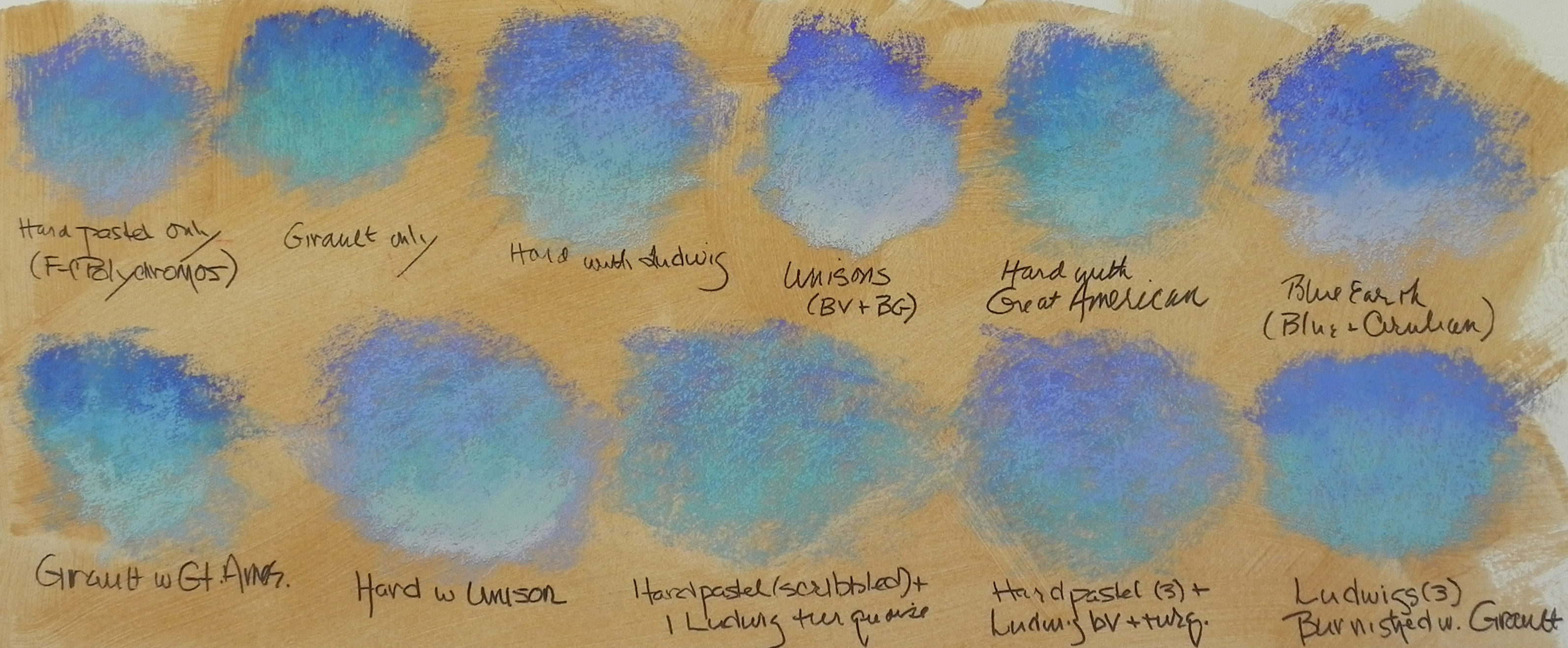
I’ve just been playing in my studio with a scrap of Rives and my favorite color gel (burnt umber light) to see what combinations of pastels will produce the best results for skies. This has often been the most difficult aspect of using a textured surface. Foliage is textured, the sky isn’t! However, we have to get over our desire to have everything exactly as it looks in nature–I’ve discovered. If you are going to have texture in a picture, it must be everywhere. However, how to avoid a gummy look is what I’m after, as well as not overdoing it and losing the color of the surface. With this in mind I first started out with just hard pastels, then just Girault, then some combinations using the soft pastels I have used in the past on this and other surfaces: Ludwig, Unison, Great American and Blue Earth. I started with the hard pastel (these are the Polychromos, which are no where as hard as the Caran d’ache) layering them on their sides. Later, in the bottom row, I made a scribbling stroke, so as not to fill in the surface. I tried using a progression of colors and values and the using just one or two colors. What excites me the most, I think, is the scribbled hard pastel with one or two Ludwigs on top. (I ruled out the Great Americans and Blue Earth, which I loved on sanded surfaces. ) It allows for a lot of the “gold” surface to show through, and the soft pastel glows rather than looking gummy. (You’ll have to double click on the image to be able to see this). This has been fun! I’ve probably not resolved it all yet, but I’m liking the results so far.
AND now for spring!!! 65 on Tuesday they say. We are all ready for this! Happy weekend. You’ll also note that I figured out how to add the image and then the text (it was as simple as hitting the enter key!)