
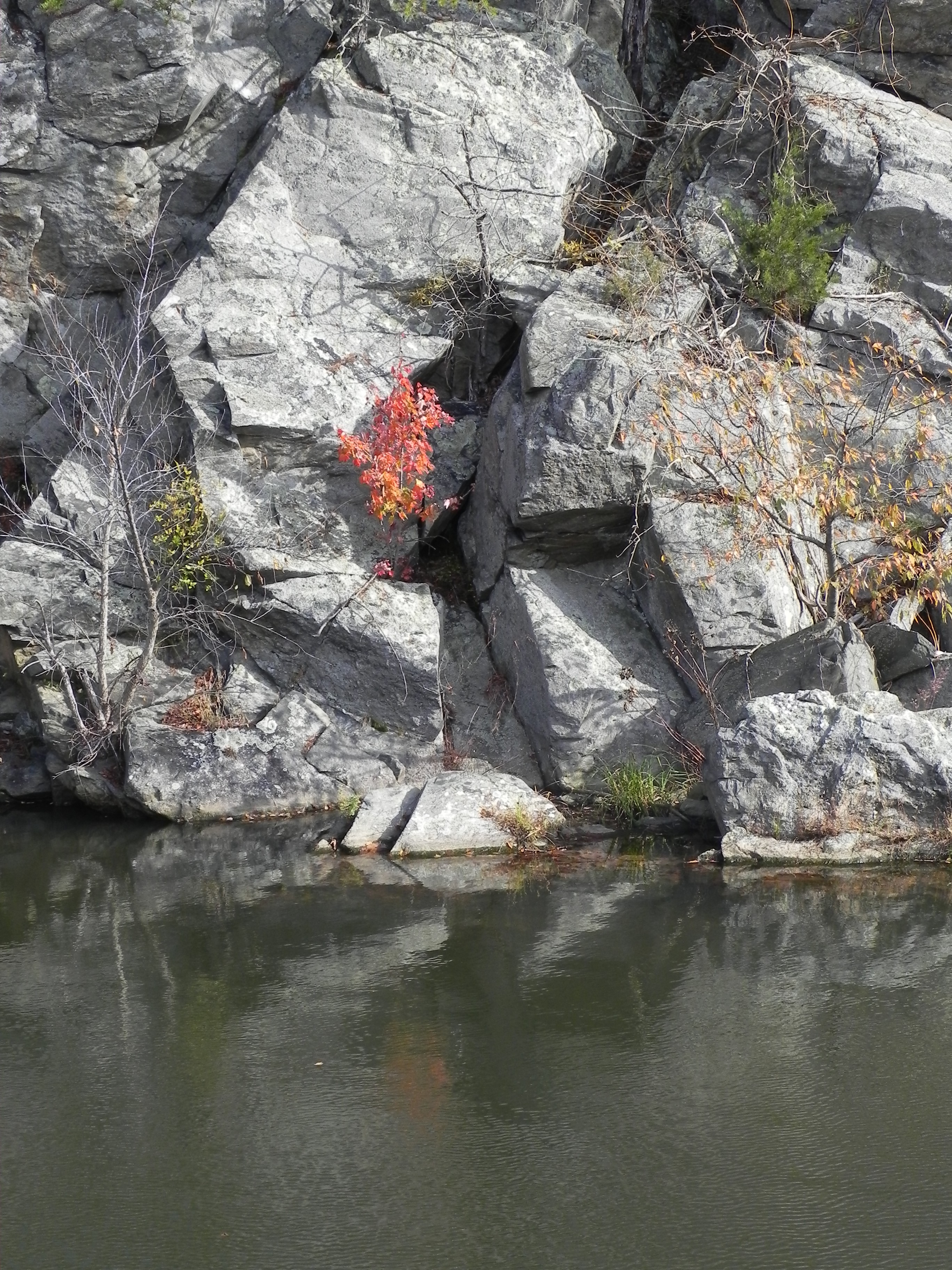
Reference photo
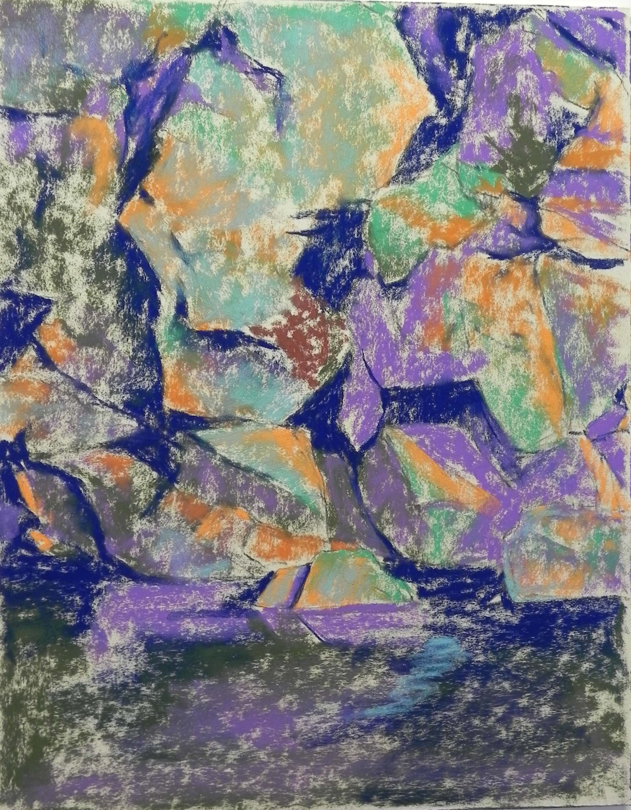
Red in the Middle, underpainting stage 1
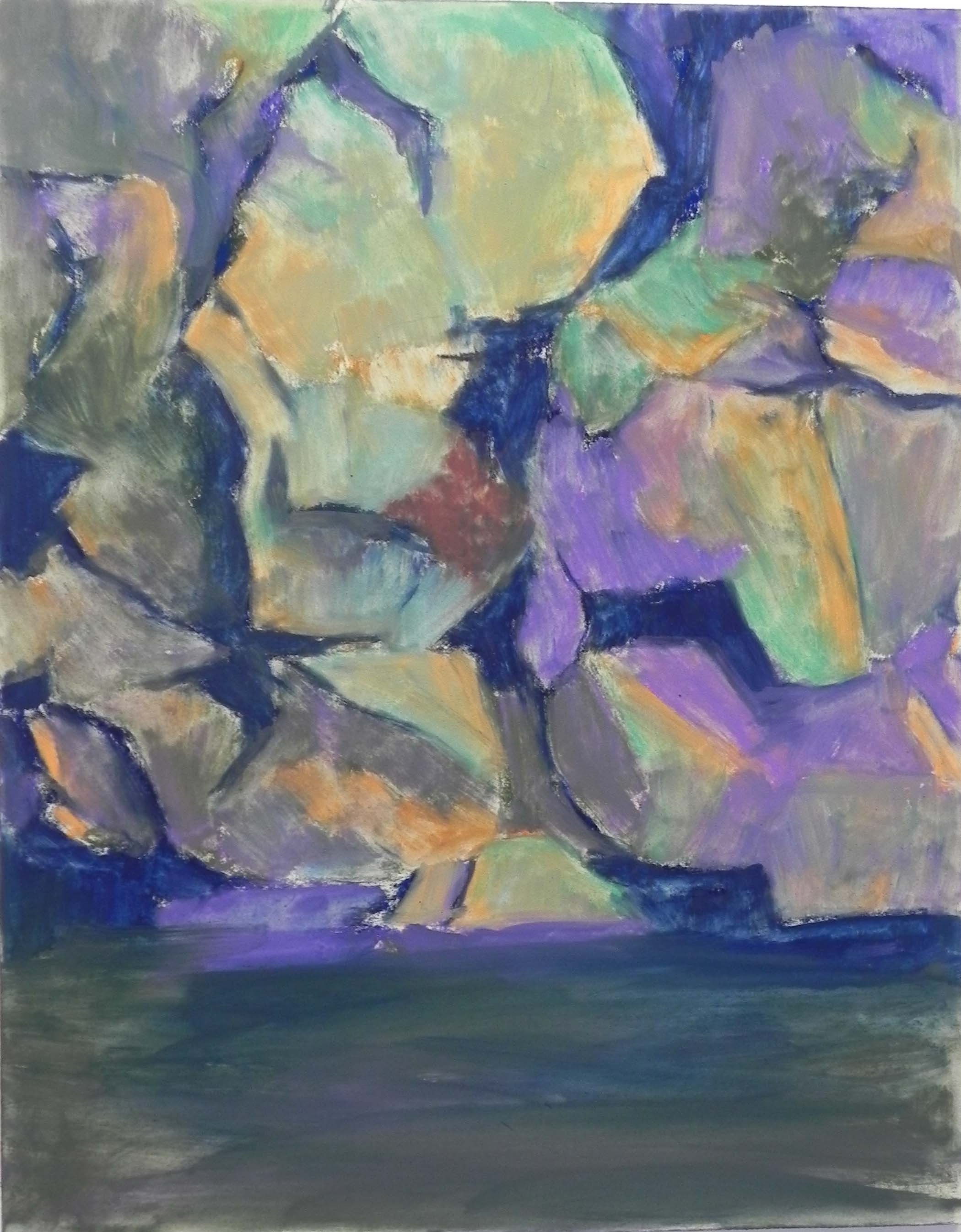
Red in the Middle, underpainting, stage 2
It’s snowing here all day and ending in the wonderful “wintry mix” so my class is cancelled and I’m painting in my home studio. Decided to do a “demo” using the blog all interested in watching. Yesterday I finally found the pictures I took last Oct. from Great Falls and Wide Water on the C&O canal. (My computer is putting them in a strange place!). I knew I had some great shots of the rocks at Wide Water and seeing the pictures was so exciting! I’m hoping to do a series of 11 x 14 paintings and this is the first. I love the angularity of the rocks and the bright bit of red tree among all the gray and almost smack in the middle of the picture. I decided to leave it there and break the rules of composition! Why not.
In this post, I’m showing the reference photo and two stages of the hard pastel underpainting–the first with four colors of hard pastels and the second after the alcohol has been applied. The surface is an 11 x 14 UART 400 board purchased from True Grit pastel panels (www.Frenchcanvas.com). These are quite nice and come in many sizes, so if you like UART and working on a mounted surface, you might consider this source.
I’m limited in my hard pastels at home. Fortunately, I found a small piece of very dark blue (almost gone now!). I chose a violet and olive green for the mid darks, a brighter green and two shades of orange for the mid and light lights. I added a little aqua over this at the end. For the red tree, I used some reddish brown, not wanting to go to the red too soon. I began with a pencil sketch on the paper, quite detailed. So I used the colors as a code for what’s what! I lay the piece flat and used a very small rush to apply the alcohol, so as not to lose my shapes. I think the final underpainting is going to be quite helpful. Because this is such a complicated picture, I decided to use a warm under warm, cool under cool approach so as not to get too confused.
The rocks are gray, but they have a greenish tint to them at Wide Water. I envision using grayed greens and violets but I want them to be subdued so that the little red tree really shines. I love the pattern of dark lines and shapes leading to it and need to be sure that that comes out in the painting.