
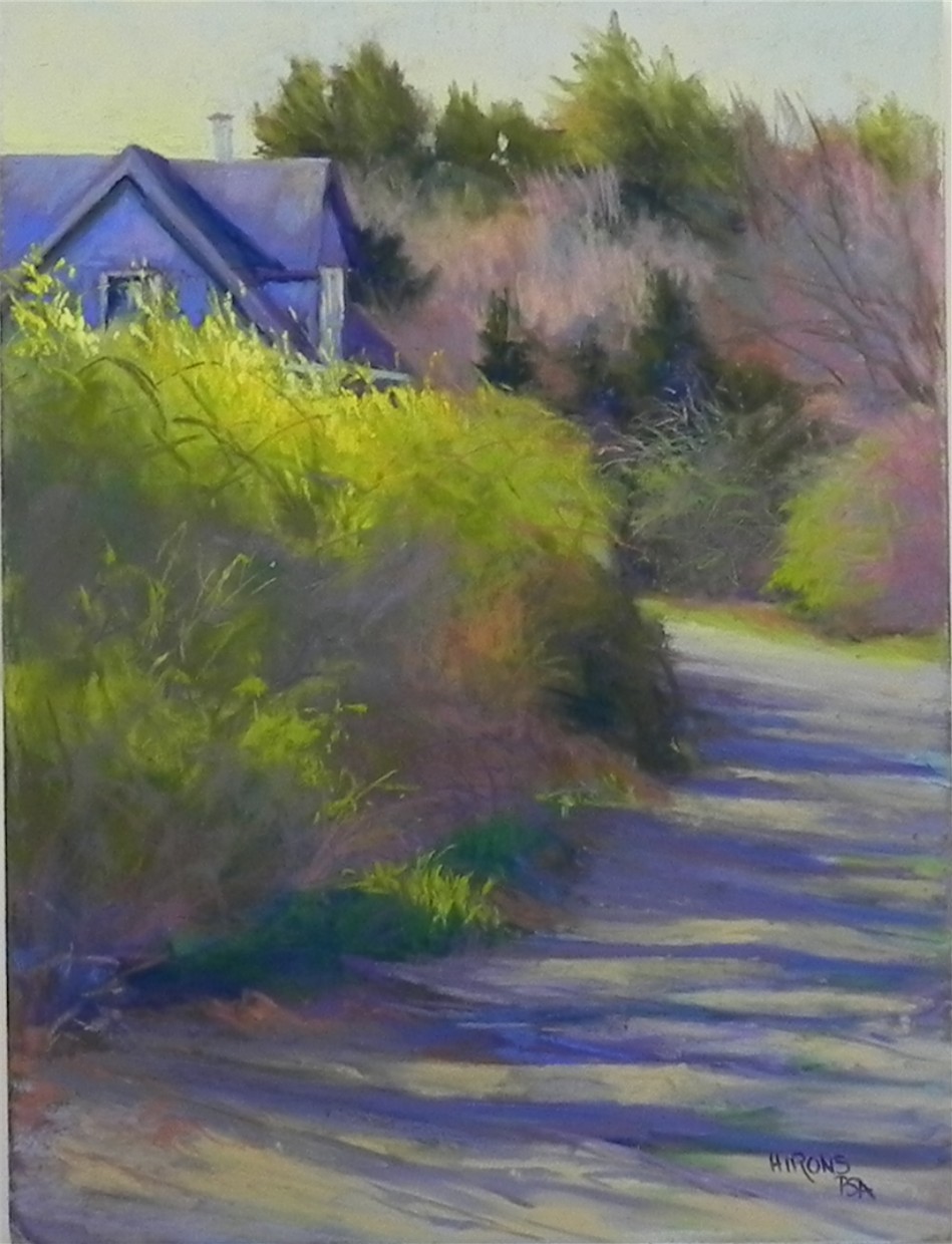
Spring’s Arrival, 16 x 12, UART 500
Some pictures are a joy to paint, others give us a lot of grief! This week I learned that two pictures from the first category–Gracie and Fog Study in Blue–were accepted for the juried show at the international pastel convention in Albuquerque (IAPS). I was delighted, of course. At the same time, I was struggling with this picture from my recent trip to Mattapoisett. The car was parked on this driveway and I was excited by the position of the house, the curve of the road, and the light. There was no forsythia in the picture, but it was in full bloom elsewhere, so I decided to add it against the cool blue violet of the house. I began with a drawing in graphite, then did a watercolor wash and lost most of my drawing! Had to work and rework the house to finally get it right. The background trees and bushes in the foreground weren’t too bad. But the road! I brushed it off at least twice trying to get the right values and angles for the shadows. I no longer have much of a sense of it. It seems busy to me. Would welcome any comments or suggestions! (I’m worried that my recent “up” time was ruined by a fall in Mass. and continuing back pain. Perhaps I’m now in a “down” time! Fortunately, my ups and downs aren’t very drastic, but I do find that I go periods of painting well or not so well, a common thing with many artists, I think.)
Jean, sorry to hear your back is still bothering you. I do not see anything that needs to be changed in your painting. As usual, your work is wonderful! I am happy you mention the surface you painted on. I also enjoyed your last posting of the barn scene. That is my next goal.
Sometimes a back injury will take a while to heal. I am speaking from experience. You mentioned forsythias that were in bloom and that you put them in your painting, and they are lovely. The blooms seem to be a cool yellow against the cool blue of the house. Maybe a warmer yellow for the forsythia blooms might be more dramatic. Love the painting just as it is but you said it “seems busy” to you. The warmer yellow might bring the forsythia shrubs forward and the cool house and cool background would not be as noticeable and therefore less “busy”. Love the shadows in the road!
Thanks for the suggestion Marie. Actually, the image is cooler than the painting. I should have mentioned that. I did put some yellow orange in to warm them up but it’s not showing. I probably could change the color a little more to see if it helps.