
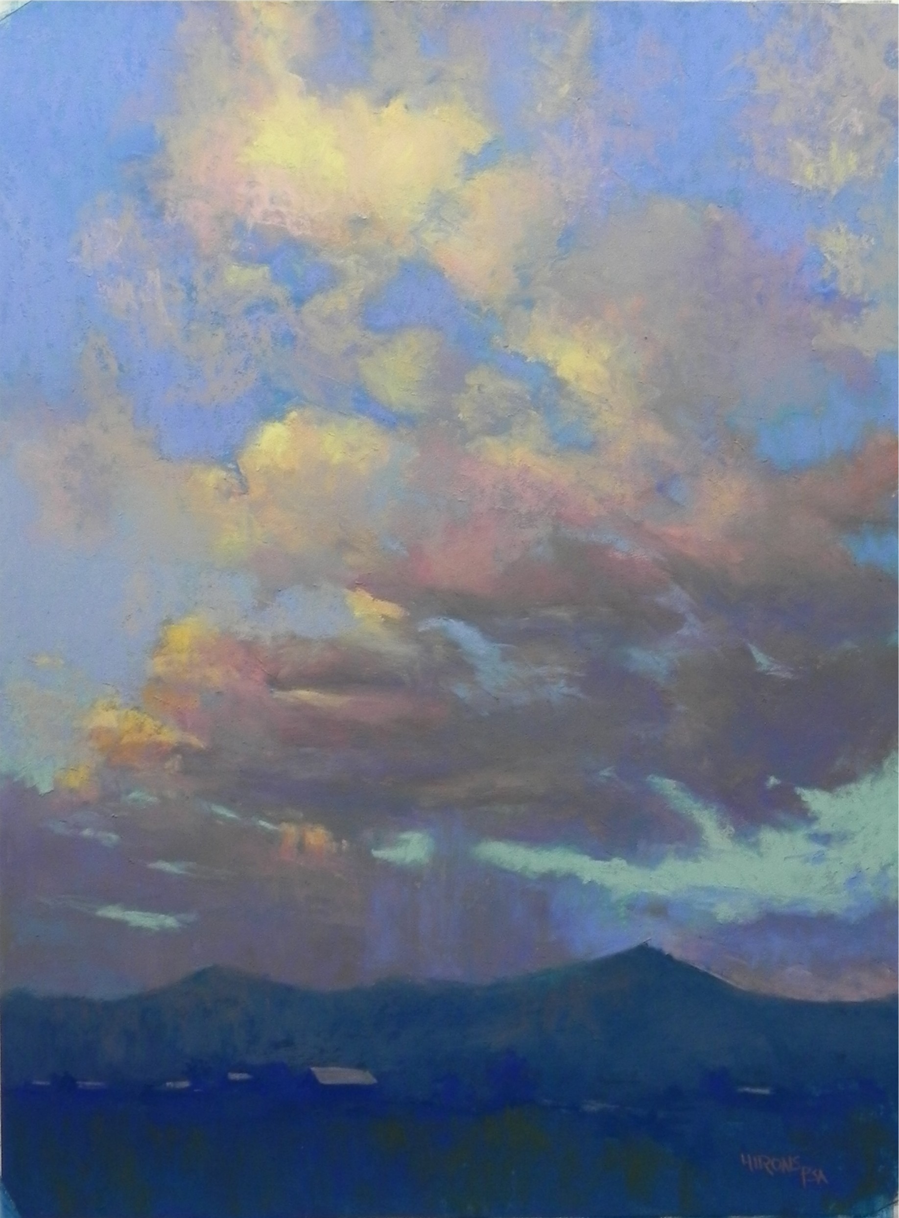
Taos Sunset #3, 24 x 18, Wallis Museum Grade board
I put this in a place in my studio where I could look at it and the more I looked at it the more I became convinced that the sky was too dark. So yesterday, I brushed a lot of it off (just blue sky, not clouds) and went over it with lighter blues and a lighter blue green at the bottom. I had to brush off as the surface was getting cakey and I didn’t like it. For some reason, finding appropriate sky color is one of the most difficult things for me! Either they are too dark or too light, too violet or too green. The Blue Earth pastels have helped a lot and they are what I primarily used in this painting. But they are very soft and build up fast. Girault doesn’t have the best sky colors, from my perspective. I ended up adding some of my new Ludwig ultramarines to the top, which gives it a more violet cast, but I like the effect. The bottom is pretty dark but I decided not to change it. And next–Taos Sunset #3!