
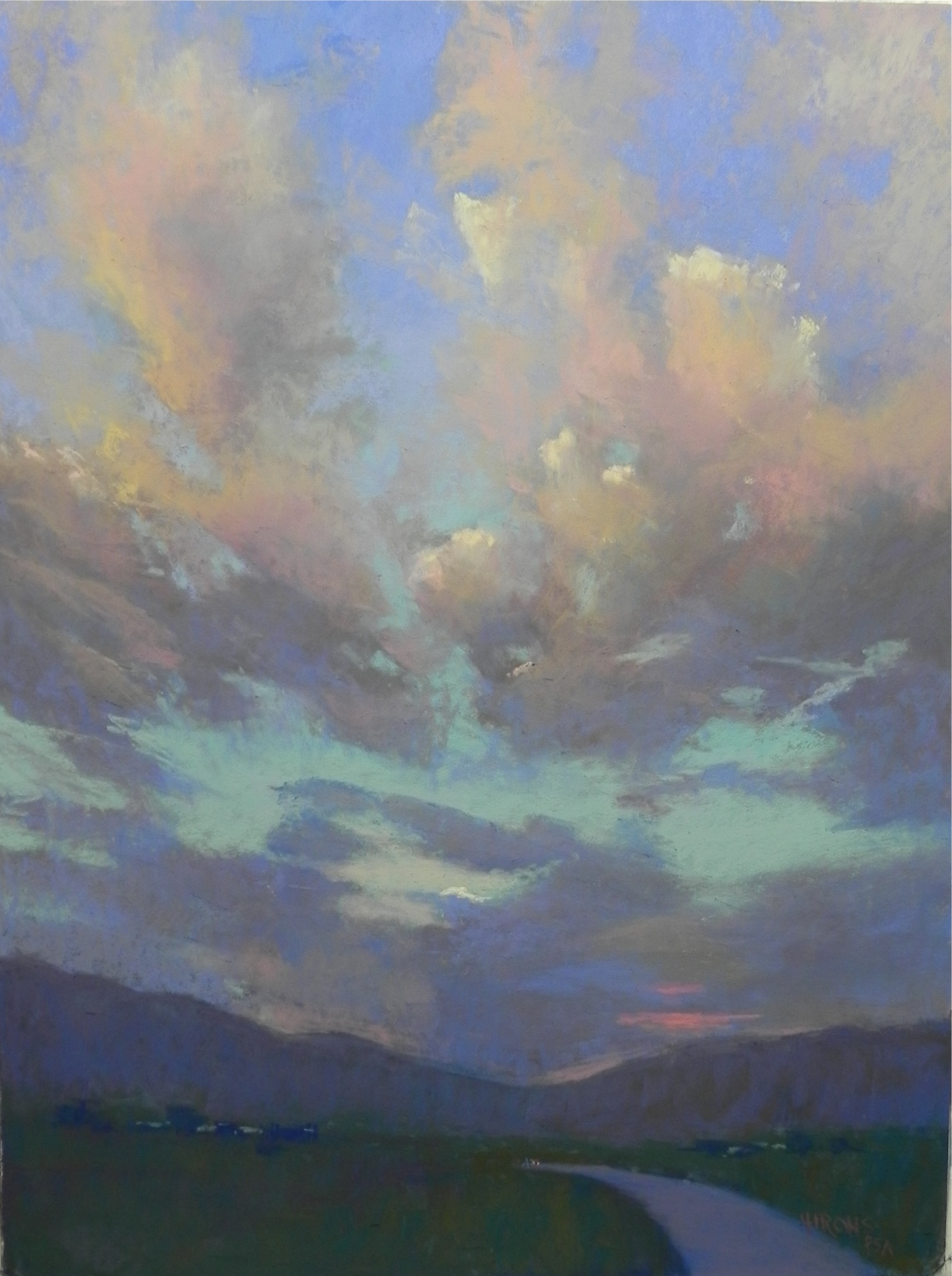
Taos Sunset #3, 24 x 18, Wallis Museum board
Here is the final picture. I have worked it and reworked it and refilmed it many times. These cloud pictures never seem to get done! I’m longing for a nice building at this point–something with defined edges and shadows! I used a lot of Girault in the clouds and only lightly added color to the sky, given the blue that was in the underpainting. I tried to use the same colors that are in #2 as the two pictures were taken right after one another. However, the foreground is a little lighter in this one. You can’t see it in this photo, I don’t think, by I added two little salmon colored dots where the road disappears to indicate a car. This is not as vibrant as it might be, but I like the subtlety. I’m glad that I did these and I’m glad to have them done! I don’t usually do this type of subject matter and it was fun for a change.
Absolutely love your third Taos sky painting. I have difficulty choosing the proper “blue” for a sky painting. I find that the lighting in which I start the sky has a tremendous influence on the final result. I have had to correct the “blue” because I have found that with different lighting the “blue” chosen is either to dark or just too grayed. I never seem to find the “blue” that satisfies my needs–any suggestions.
Is there a particular manufacturer and/or blue pastel number that you would recommend? I primarily use Sennelier and Great American for my soft pastels. I use Prismacolor hard pastels for beginning my paintings but I do not like the light color blue they provide for sky color.
Any suggestions or help would be most appreciated
Marie–Glad you like it. I never know! As to sky colors, I’ve separated into a small corn meal box some of the Great Americans that I like for skies. My favorite is Beacon, which is a warm blue. But the last time I ordered some, they seemed to be cooler. This brand is one I love but I don’t like the way the colors can change. Some of the others in the box are Surf Angel, Cindy and Perry Winkle, all in lighter tones. If I have a large area of sky, I’ll use a mix of blues, violets, pinks, and greens. I also like some of the Terry Ludwig blues, particularly the ultramarine. The Blue Earth blue and cerulean sets, however, were the first REALLY blue pastels I have acquired. (Haven’t looked at my Sennelier sit, I have to admit, and Schmincke’s are so soft). The Girault blues that I have tend to be a little dark or too light. One issue is how much texture or build up you want in the sky. The sky isn’t a textured surface, like clouds can be. So having thin layers of color that allow clouds to sit on top is a good thing. On days like this one–94 and humid, the sky is a very light blue green. I painted out this morning and that’s what I used. You’ll see it in the next post.
Love the colors. And thanks for telling us what blue pastels you like.