
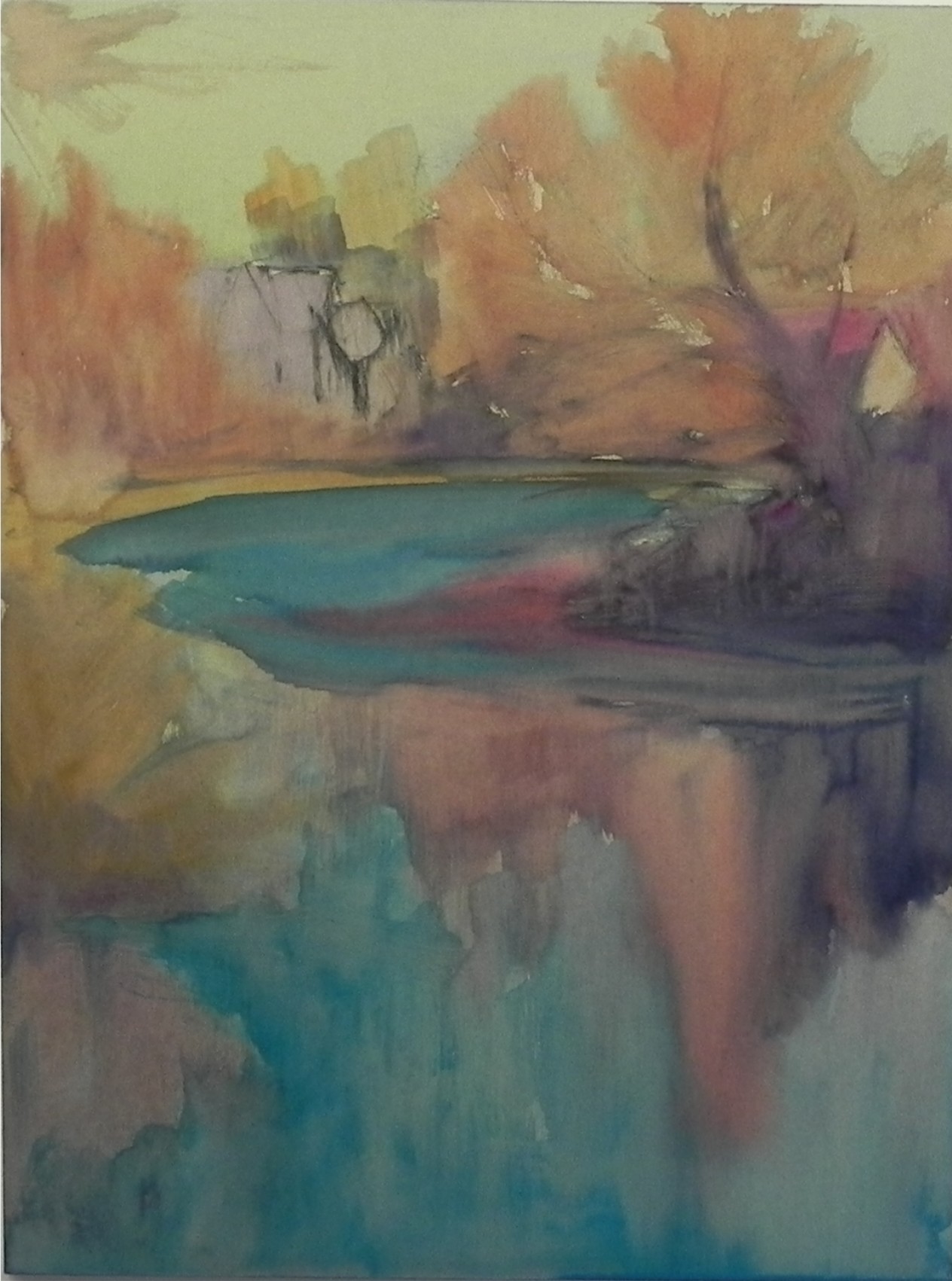
Watercolor underpainting
Aqua river, 16 x 12, UART 500
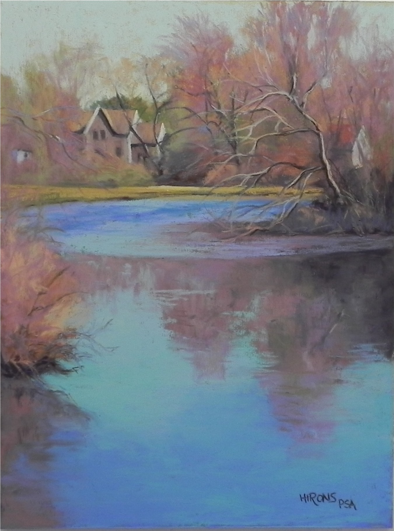
I am well known as liking the color purple–in my paintings and my clothing. But really, the color that excites me the most is aqua–particularly when I see it in water. It was the lovely blue green that excited me most about this scene of the Mattapoisett River. Yes, I like the house and the fact that there are two other buildings barely visible. The soft reds of the early spring budding trees add a lovely contrasting color. I spent some time deciding on a surface. I wanted to use a square but opted for a 12 x 16 because I have frames! (I have to think about economics these days.) I used the last piece of mounted 12 x 16 UART 500 and really enjoyed working on it. I relate to this surface quite differently than some others, I think. I decided on a water color underpainting to keep it loose, using warm colors in the sky. Left some of the sky showing through the light aqua pastel, but in the water I used more saturated and blended applications. I was really happy when I found just the right blue green to add to the right of the bush. I feel that this color grabs the eye and leads us into the picture (I hope!). I will probably change the title–any suggestions?
I love your painting and the colors you have chosen for the painting. I offer a suggestion for a title, “Tranquil River”. That is what comes to my mind when I view the beautiful painting.
Yes, it is indeed very tranquill. I don’t often take this specific shot and I liked the overall shapes of the water and reflections. It is extremely calm. I enjoyed using these bright, cheerful colors!
Your painting is lovely and so calm. My suggestion for a title is “Advent of Spring.”
Since taking your workshop a couple of weeks ago, I’ve been reading your book and I’m finding it very helpful to review many of the principles you taught us. When I read your blog and you mentioned “saturation and blended colors” I knew exactly what you meant.
Thanks Lillian for the comments and the suggested title. It will probably be something like this. It was such a pleasure meeting you all on the Cape and I really enjoyed the workshop.