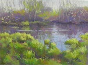
For this quiet picture, I used a different approach from my last painting. I decided that this is a center of interest painting, rather than big shape (even though the shapes are really critical in this painting) and decided to work on Wallis mounted museum grade white paper. I used a watercolor underpainting and primarily used Girault pastels. (I did not use hard pastels because I wanted to begin with more grayed tones that are not available in the hard sticks). The soft pastels were limited to the bright yellows and yellow greens in the foreground, but a lot of these are also Girault. When I work on Wallis, I like to use a light touch, barely touching the pastel to the paper. I learned this from watching Albert Handell and Richard McKinley. Wallis paper is “pastel grabber” in my definition, in that it readily accepts the pastel with little resistance. For this reason, I like to use the grainy Giraults, which can leave very soft layers without cakey build up. Compositionally, I found a number of challenges in the original photo. The photo was taken in fall, so there were a number of oranges, including the bright grasses on the far shore. I tried putting that in as orange, but it distracted from the bright yellows of the foreground grasses, which were where I wanted the eye to go. I added a third little duck in this area to enhance the center of interest (I seem to be into ducks lately!). Using greens in the background, instead of the warmer oranges and reds of the photo, helped tie the picture together. The foreground greens are so strong. I introduced a lot of the background violet into them, along with small pieces of orange. Another change to the composition was to bring the water down into the lower right of the composition. The original shape was too straight and boring. This added a degree of tension and more interesting shapes that I found pleasing. While the sky looks pretty bland, I added a number of blues to it, but kept them subtle and they don’t show up very well in the image. The quietness is enhanced by the horizontal format, the use of many grayed colors, and the subject matter of ducks swimming on a peaceful river. The only excitement is in the light hitting the foreground grasses, which I tried to limit.


So beautifully done. … and explained. Thank you.