Taming the Chroma

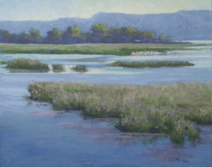
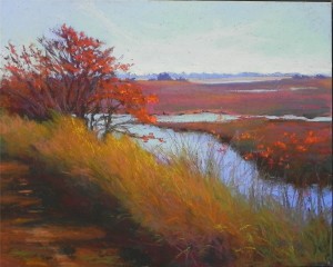
 About six years ago I did a painting of this scene from Prime Hook Wildlife Refuge on the Delaware Bay. I was in a phase of painting with very bright colors and using very few neutrals. If you want to see the original, look at my website (www.jeanhirons.com), go to the MidAtlantic gallery and click to get to the second page. It is near the bottom. You might want to put your blinders on first!  While scanning through old photos in preparation for an October 2013 show, I came upon the original photo that I used to paint the scene.  I loved the composition and saw the possibility of doing a more subtle painting.  I had a 16 x20 pastelbord that I had washed off and brushed with a red-toned gel and decided it would be perfect for this. This time I was careful to limit the really saturated colors, and began with dark browns and greens under the grasses. The background marshes are a mix of warm and cool reds with violets and green on top. There is still a lot of bright color but I am much happier with this version.  (Keep in mind that digital photography heightens the reds and oranges, so the reproduction is probably a little brighter than the painting.)


When I started painting in pastel, I tried to use color rather than neutrals. Some people really liked the heightened sense of color, but I’ve found that I am not more drawn to nuanced color with a few bright spots. I guess this is the aging process!  But I do think it makes for paintings that are easier to live with.

The Challenge of Foregrounds

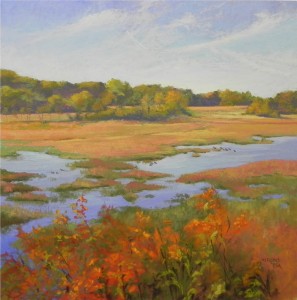
Autumn on the Marsh, 20 x 20, UArt

This is another painting with a challenging foreground (see Working with Reds).  I’ve always found the foreground to be one of the primary problems faced by the landscape painter. Given aerial perspective, the foreground is often the place with the strongest darks and most vibrant colors. But we want the viewer to look at the entire painting and not get trapped in the foreground. So how to make this work?  I began this painting working slowly at the top, using direct applications of Ludwig and Great American pastels on UArt 400 grit paper without an underpainting. I really enjoyed doing it all until I got to the bottom, which I left for another day!  My first solution was to get up at 4:30AM–a fearless time when I am totally focused!  I decided to do an underpainting in the lower part that would make it easier for me to place the leaves and branches over it. I used the same Ludwig pastels (light applications)  and alcohol. Then I took the bright red orange, orange, yellow orange, and yellow green pastels and worked very quickly to develop a pattern and not get too picky.  I also added a very dark brown (a color I hardly ever use). I tried to used the upper branches to lead the eye into the upper right of the painting.  I then used some of the duller warm Ludwigs that I’d used in the background to tone it down and fill in.  Finally, I used some of the bright orange in small amounts in the distant trees to tie in the color.  I think this works.  The strong foreground color grabs the eye, then, I hope, leads us into the background waterway and distant fields. Compositionally, I consider this to be a big shape painting. It’s about the V-shape of water with land around it, with no one strong center of interest. I did add little groupings of ducks to provide more interest. But it’really about shape and flow and color.

Working with Reds


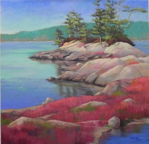
Blue Hill in Autumn, 20 x 20, UART

This is another somewhat experimental piece. Some months ago I purchased the Terry Ludwig vibrants set and have been looking for an opportunity to use them. In November, a friend took reference shots of the red blueberry barrons in Maine.  I wanted to use both and had the idea of making up the composition. But I found this scene from the Blue Hill area of Maine that I had filmed in summer, when the foreground was all green.  I have no idea whether blueberries would grow on this kind of rocky outcropping, but I like the composition and decided to use it. The main challenge was that all of the reds were at the bottom of the picture and I was afraid that the eye would get stuck there. I tried to alleviate this by adding patches of fainter red growth on the rocks, and using some dark reds in the area beneath the trees. To improve on the composition and flow, I carved out the lower right corner and added water and reflections. The trees and mid-rock areas are similary to what was in the photo; the foreground is my own invention!  I used a variety of warm and cool reds and added some warm and cool greens to tie it to the background and break up the reds.  I have been experimenting also with the use of square formats lately and find them to be a challenge. But I love the look of them. I think this composition suits the square nicely.

Painting Without a Net

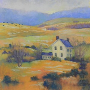
January Pastorale, 17 x 17, Art Spectrum “Supertooth”

I’m calling this post ‘painting without a net” because I did this painting without any photo references. On Friday I drove to western Pennsylvania and back, a trip I take every two months to visit a friend in prison. The weather was lousy so I didn’t bring my camera. But I kept seeing things of interest, like dark cattle on a hill against the blue mountain, and a farm house interestingly placed at the foot of the hills. I saw all of these things in a split second. Yesterday, I decided to make up a composition that would capture some of what I saw and I had a really good time doing it. Aside from the house, the entire composition is really about abstraction: shapes, lines, and color.  I did a basic drawing, but decided to keep myself free to add hills and shrubbery as I felt the composition needed them. I placed a  large tree to the right of the house, then took it out and put in smaller, more wispy trees. I began with Giraults so as not to add thick layers of pastel that would be hard to remove. But I removed very little.

Like many of you, I’m sure, I’m used to working from photos, while also wanting to be a little less detailed, a little more abstract. Pure abstraction doesn’t offer enough satisfaction for me, but I DO love to just play with colors and shapes. Doing landscapes without the crutch of a photo allows me to have a certain amount of freedom while still creating a picture someone else can relate to. I very much enjoyed the articles in the most recent Pastel Journal (Feb. 2013) on three landscape painters and their interpretations, from fairly detailed to very, very suggestive. I want to be somewhere in between–I want my paintings to have the integrity of looking believable and being well constructed. In this painting, I got hung up on the dark bushes in the foreground. I like the shapes, the dark blues, and felt the composition needed them. But then I got worried about reality–would they look like they were in summer foliage amid patches of snow? So I tried to make them look like some kind of evergreen. Then decided to not worry about it a lot. People can make of them what they want!

Center of Interest Composition

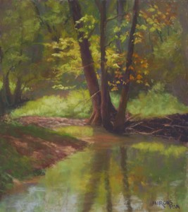
I define a center of interest composition as one in which the COI is very prominent.  I am less likely to create this type of composition, because, for some reason, I’m generally less drawn to this in nature. But, in this case, the light was hitting a stream and trees in a beautiful manner that really caught my attention. The center of interest is the area to the left of the trees where the light is brightest and the greens are reflecting into the water. For this painting, which I did as a demo, I began with a loose-wash underpainting using watercolor. The primary color is yellow green, with smaller amounts of complementary red violet. I began with majenta watercolor in the background to provide contrast, then added more local color in other areas. I wanted to be able to leave the background fairly loose and unfinished, concentrating the pastel in the center of interest. As frequently happens, however, I added pastel everywhere as it just didn’t look complete!  However, the most saturated pieces of color are definitely in the sunlit tree and grasses. I used grayed Giraults for the background, and very soft Schminckes and others soft pastels for the center of interest.    I hope that the difference in composition is clear from these two paintings and my approach to the underpaintings as well.

Which kind of painter are you?  Do you favor one type of composition over another?  Do you give thought to the type of composition when deciding on the approach to an underpainting (when one is done).  I’ll share other painting where no underpainting is used at all, but the compositional decisions are still critical.

Stream Light, 12 x 13, Wallis

Big Shape or Center of Interest Composition?

When I begin considering an image as a potential painting, one of the first decisions is whether this is a potential “big shape” vs. “center of interest” composition. These are the terms I’ve defined to express the different ways in which I’ve observed well known painters deal with compositions, and I’ve found them to be useful in my own work. (I discuss this in Chapter 6 of my book.)  In this post, I’m focusing on a big shape painting, which is what I tend to do most often.  In the big shape composition, the impetus generally comes from the strength of the shapes, the flow of values, and the colors that I see or add to a landscape. (In the center of interest composition, the focus is more often on the light hitting a certain area.) Quite often the center of interest is rather minimal or needs to be added. In this painting, for example, I added the grouping of birds in the upper right portion of the painting as a center of interest. However, the painting is really about the shapes, colors, and quality of the light.  For me, this decision goes beyond the composition to influence the ways in which I will begin the picture.  With a big shape picture, I am more likely to block in the shapes in an underpainting, either using pastel or watercolor. For a center of interest painting, I’m more likely to use a loose-wash watercolor underpainting. For Great River Vista, I did a block in using watercolor. I wanted to keep the colors light and airy, and was afraid that a hard pastel underpainting might overpower the delicacy of the colors.

Great River Vista, 16 x 20, Pastelbord

The Joy of Smudging

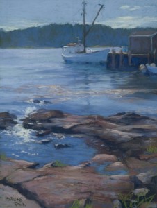
Evening Calm, Port Clyde Wallis 16 x 12

Those who have studied with me know that I discourage a lot of finger blending. I find that it dulls the work and the pastel doesn’t sparkle. But selective smudging and blending can be a real boon to a painting and I’ve been doing more of it lately.  In this painting, I began by following the photograph too closely. The boat was very detailed, the background trees were green, and there was little unity. As I got down to the rocks and splashing water, I knew that this was where I wanted the eye to go and that I had to do something to fade out the background. My first solution was uniformity of color.  Using a blue violet Girault, I cooled down the distant trees and added this color to the dock at right. I twas already in the boat. Then I got rid of most of the details in the boat, leaving only a few pieces of light. Finally, I took my finger and smudged the bottom of the boat into the water. At this point, I was really pleased with the picture!  The center of interst is clearly the white, frothy water and rocks, but the background forms an interesting shape of dock, boat and hillside.

The Color of Fog

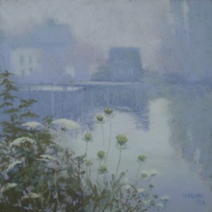
Fog Study in Blue Violet, 12 x 12, pastelbord


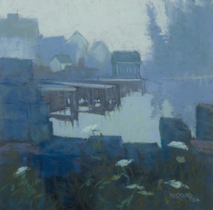
One of the things I like about painting skies that are basically “white” is the opportunity to work with a limited palette and choose whatever color I like for the sky.  These two paintings are from the same spot in Maine. They were painted in my studio from photos, but I painted there on site as well. Each suggested different colors to me.  Fog Study in Blue has the stronger composition, with more darks and stronger shapes. I used my new boxes of Dakota’s Blue Earth pastels (blue and cerulean) for the painting and really enjoyed them. I think this is one of the bluest paintings I’ve ever done!   Fog Study in Blue Violet was painted the day after we learned of the death of a dear friend who loved Maine. So I painted this with him in mind and it is a much gentler, almost ethereal painting. I used more detail in the foreground since there was so little in the background.  The colors are more in the blue violet range, a color I use a lot and love.    I will continue with more fog pictures, as the opportunities arise.  While the focus of the discussion has been on color, the most critical aspect of painting fog is edges!  I kept all of the distant buildings very soft edged. Only the lobster traps in the foreground of Fog Study in Blue have hard edges. The resulting contrast with water highlights the importance of the water shape, an important element in the painting.