More miniatures

Foggy Day Beach, 4" x 6", pastelmat

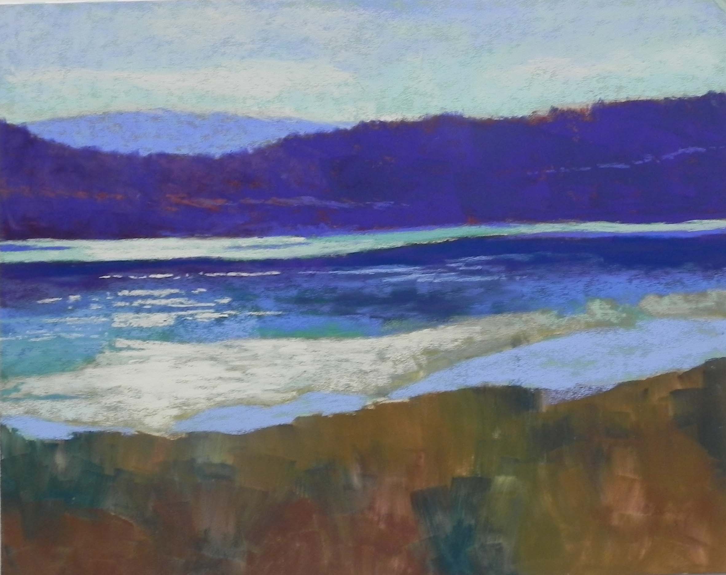
Foggy Beach, 4″ x 6″, pastelmat

Foggy Day Beach, 4" x 6", pastelmat

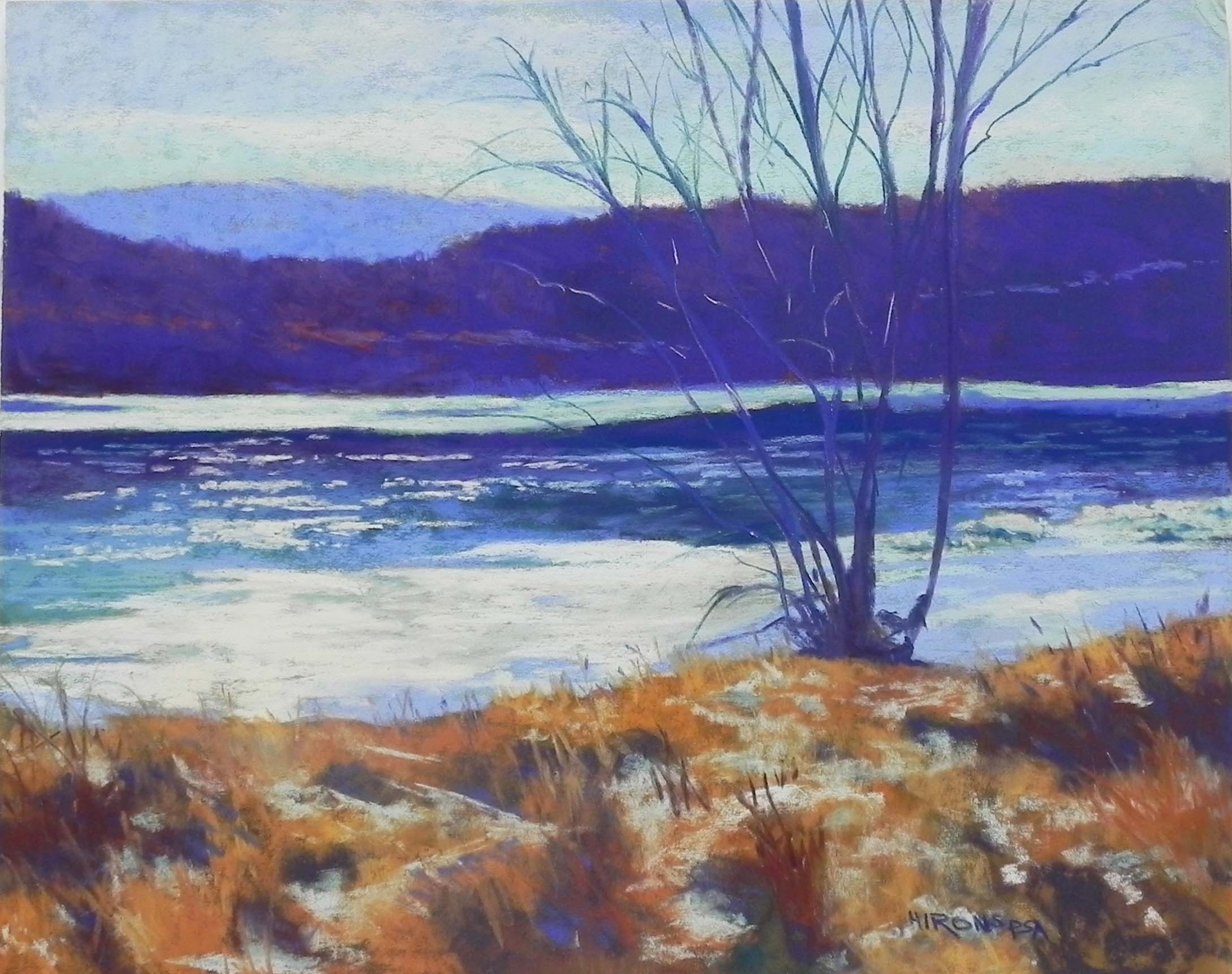
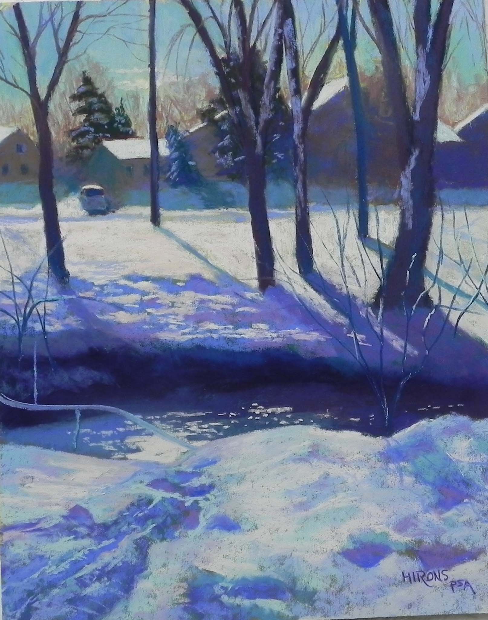
Foggy Day Beach, 4″ x 6″, pastelmat

Hello Friends!  How are you all doing?  It’s a rainy day here in the Washington DC area. I’ve just had my third Skype class with a new pastel student and it’s been working pretty well.  I’m enjoying it and learning at the same time about distance learning etc. etc.  We are going to come to hate those two words “social distancing”!!!  (Particularly if you are an extrovert, like me!)

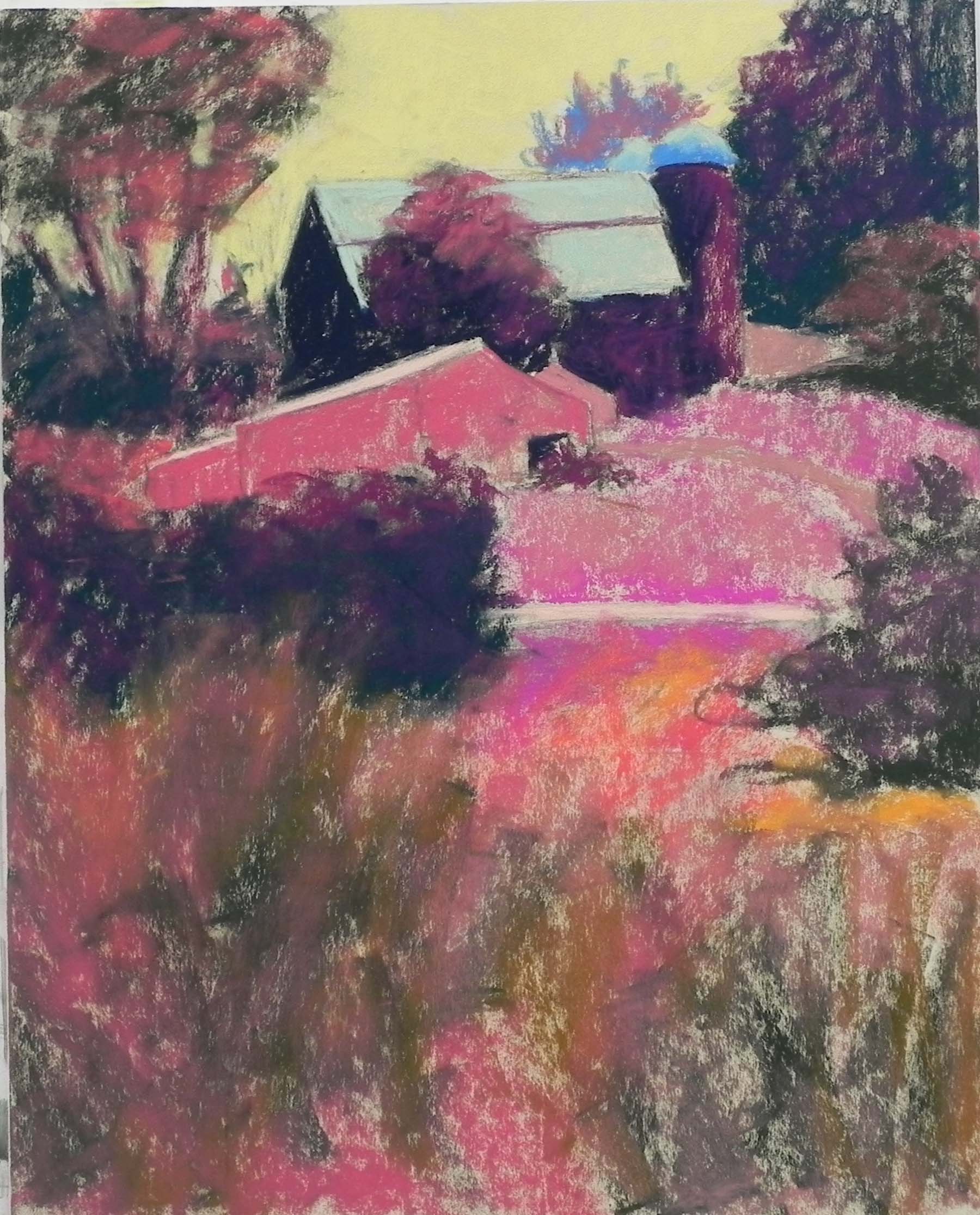
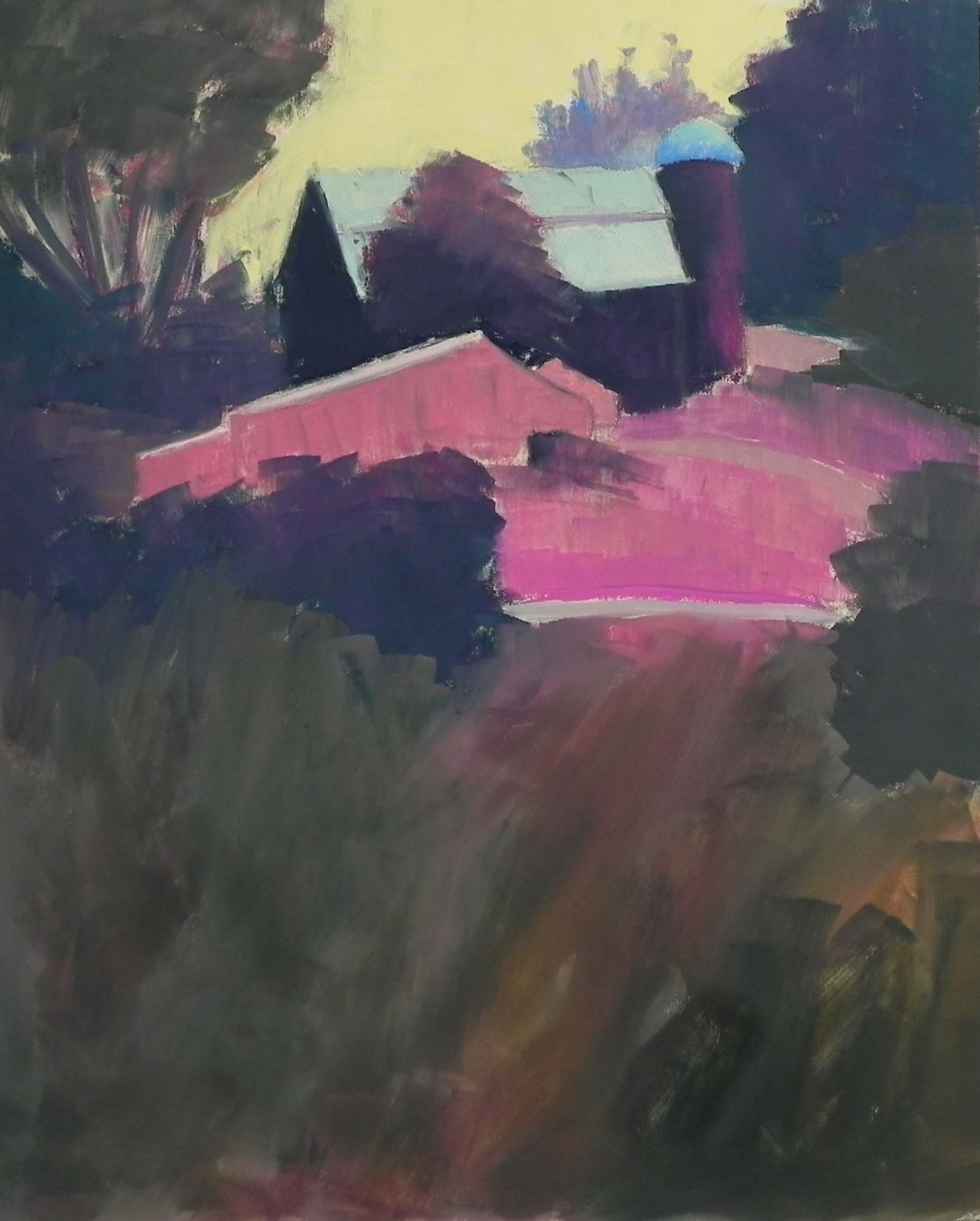
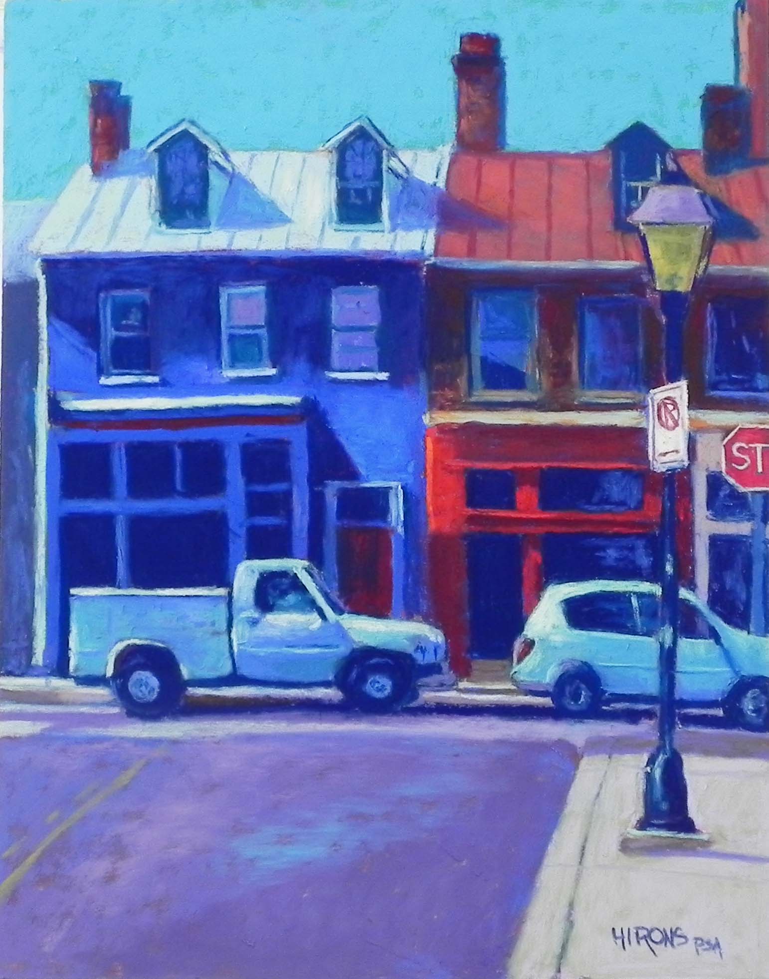
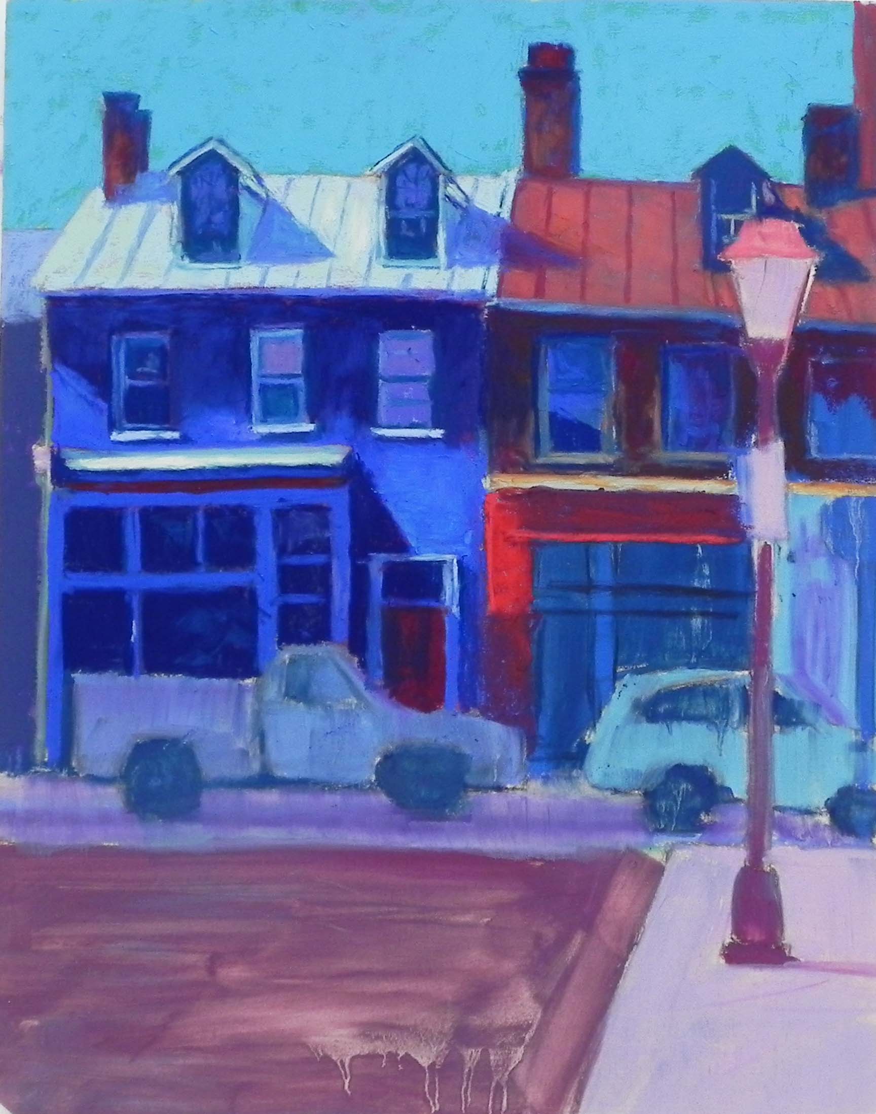
But I’ve really been having a pretty good time doing more of the miniatures.  I left one of them with some paper showing so you can see what I’m working on.  The pastelmat has such a lovely smooth surface so it doesn’t interfere with the tiny strokes of pastel.  However, I’ve also got Pastel Premiere Italian Clay and may try that out to see if I like it as well or better.

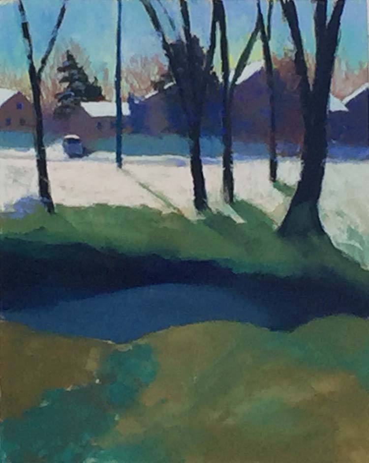
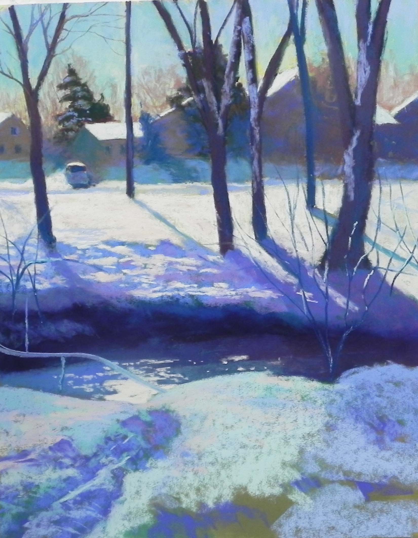
I enjoyed doing the “Foggy Beach” picture, using observed color and really seeing slight variations. But I’m not sure that this type of subject matter is the best for miniatures.  I did Foggy Day Beach, which is a painting I have in my front hall in a 16″ x 20″  version.  Again, not sure about the success of fog.  But at least the trees are dark and there is a lot of contrast in it.

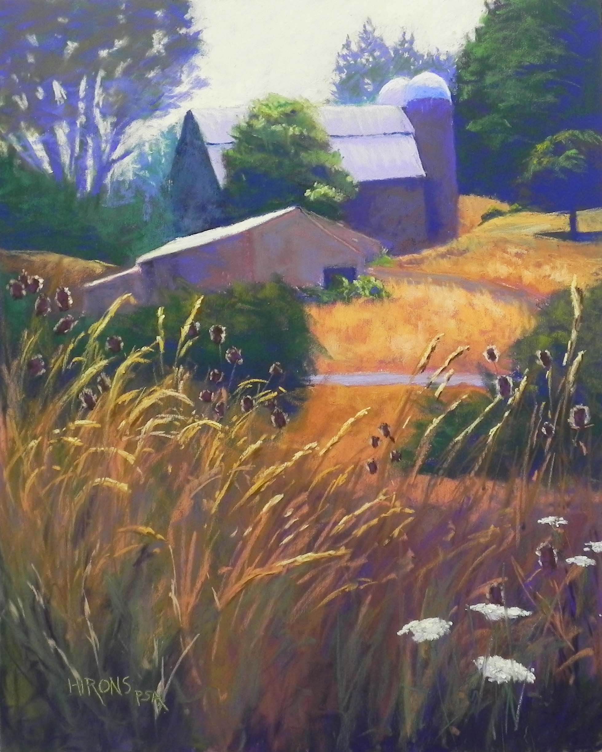
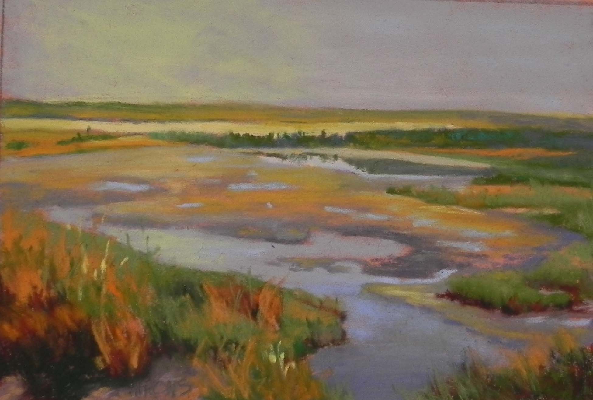
The California picture has a very hazy distant background but vivid flowers in the front.  What I enjoyed most was indicating the little buildings in the distant hillside.  I really don’t like the tall plant at all and wish I’d left it out. But my step daughter loves this painting and so I’ll be happy to send it to her.

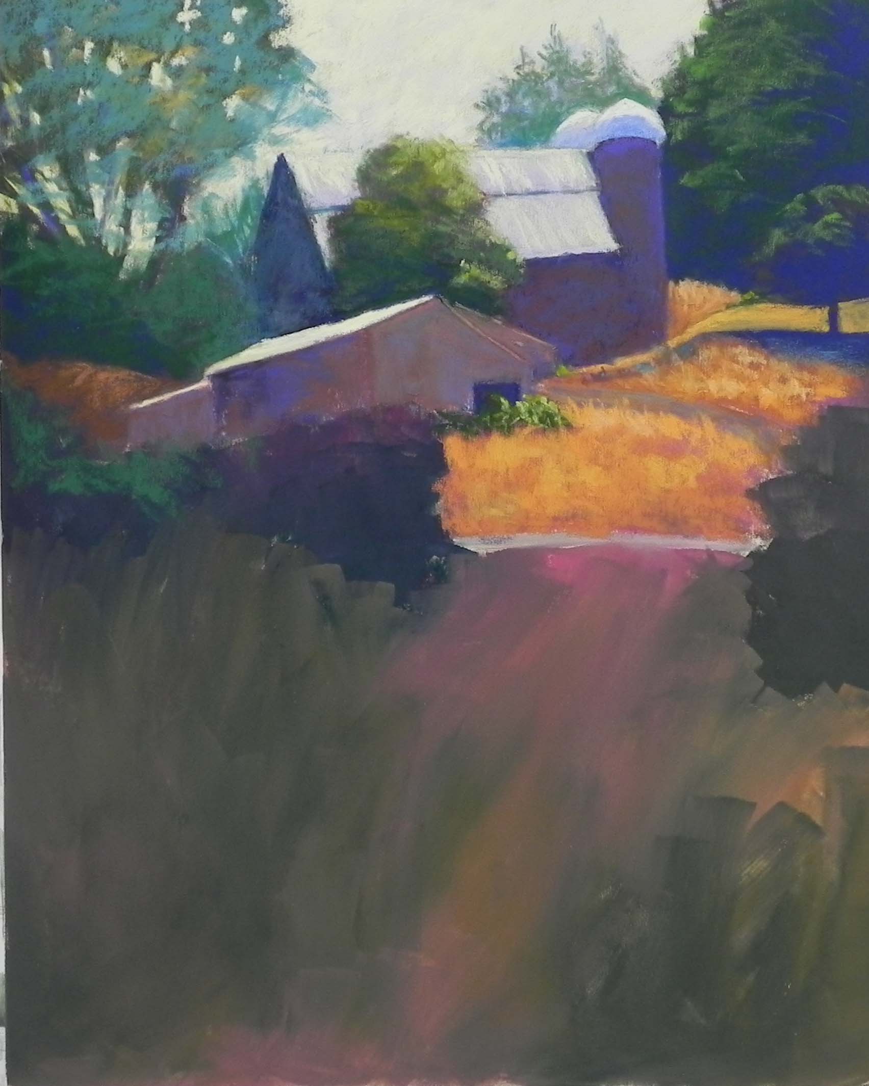
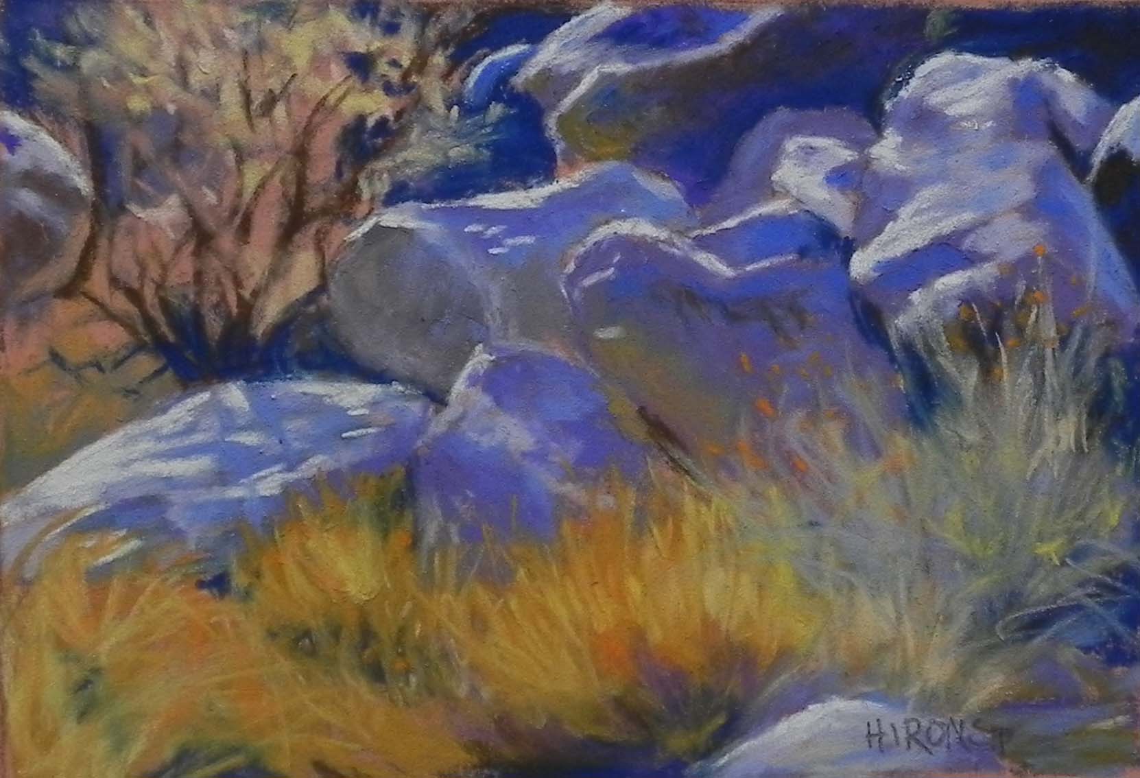
For these paintings I have been using a lot of Giraults.  The first is exclusively Girault. For the other two I used some tiny pieces of soft pastel that I’ve collected over the years.  I am not using pastel pencils (they are at the studio) or hard pastel either (all my good ones are at the studio).  So I’m making do with what I’ve got and it’s felt good.  I have a picture from Zion that I’ll work on today.  I still like my first one of the rocks best.

I’m finding it hard to film these and it blows them up too much and they look terrible!   Anyone have experience with this?

Take care and stay well.  Jean

California Coast 4" x 6", Pastelmat

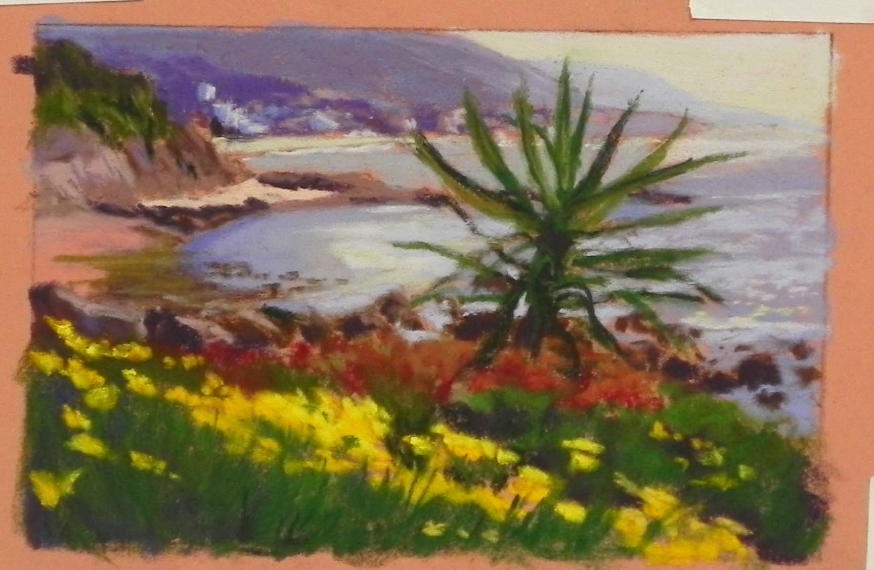
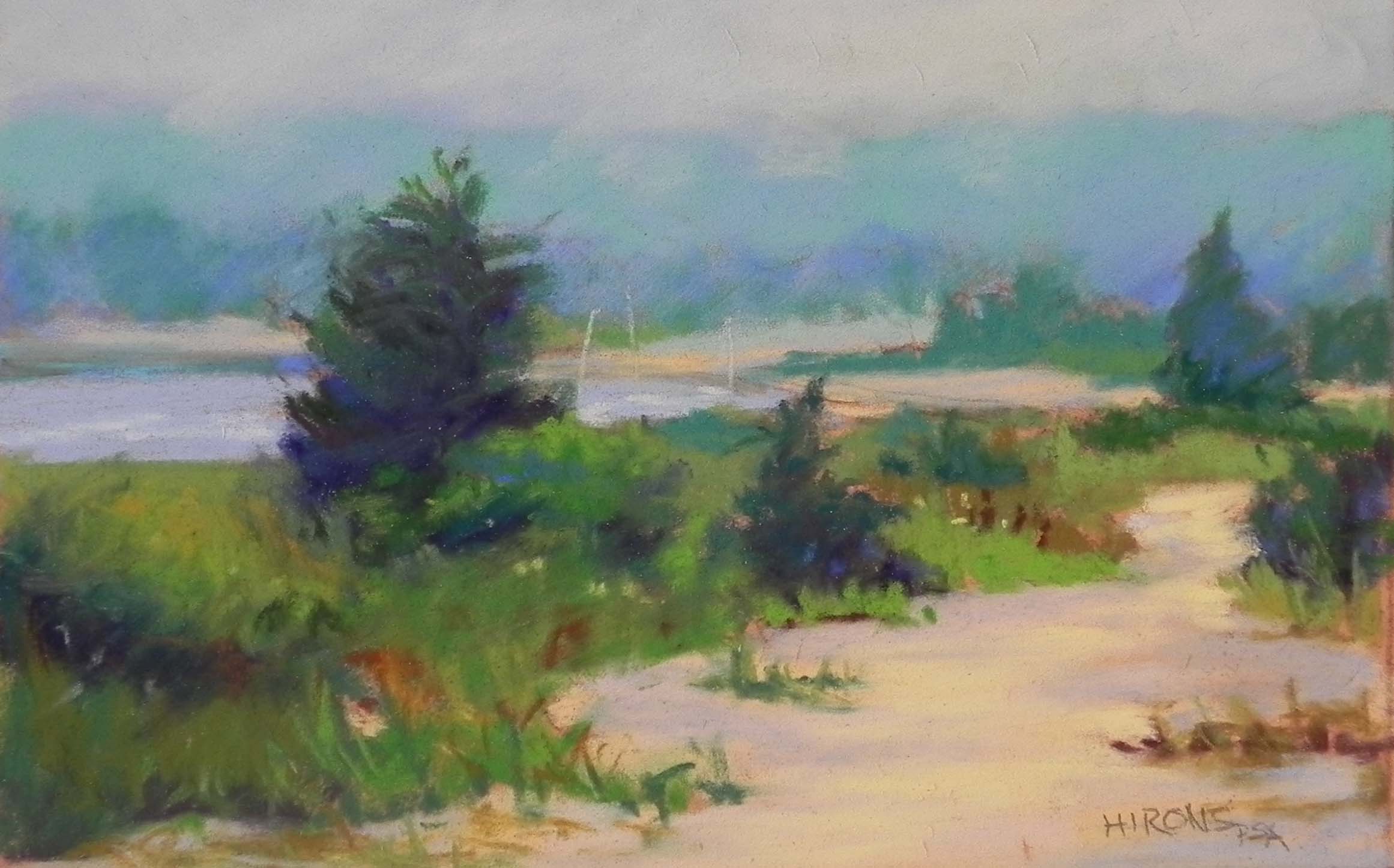
California Coast 4″ x 6″, Pastelmat

Willamette Valley Morning

Willamette Valley Morning, 20" x 16", UART 320

Willamette Valley Morning, 20″ x 16″, UART 320

Underpainting, stage 1

Underpainting, stage 1

Underpainting, stage 2

Underpainting, stage 2

Painting partially completed yesterday

Painting partially completed yesterday

Hello Friends.  This morning I went to the studio to work on a painting that I was unhappy with after beginning it yesterday morning.  I was by myself and listened to Bach fugues and found this really wonderful!  I highly recommend the combination of being engrossed in a painting and listening to good music.  It really beats reading the Washington Post these days!

The painting is from an old black and white photo that I’ve had in one of my notebooks for some years.  Its from Oregon and I think it was taken in the afternoon.  I did a drawing of it, making the farm and surrounding bushes more prominent. In the photo, the tall grasses take up more than half of the painting and the buildings are less prominent.

I had a vision of making this a morning picture with light streaming from the sky onto the roofs and grass heads.  But I wasn’t completely sure where I was going and I’ve been quite distracted lately!  I began the underpainting with little thought to the later colors I’d be using, choosing primarily reds and greens!  I guess the red seemed cheerful.  I added lighter reds over some of the darker colors, but, as you can see, when I applied the alcohol, it all became pretty dark!  When I looked at my painting yesterday at home (from the camera images) I was pretty unhappy.  The roof was too light, the sky seemed gray, and the tree at left had been painted with a grayed blue green, that didn’t work at all.

So my first step this morning was to brush off the roof of the barn, the tree, and the background trees.  I reworked them all, using violets and decided to work with violet, green and orange and nothing else (except the yellow of the sky).  Funny thing about using violet!!!  But, of course, I used blue violet, which is the complement of the yellow orange grasses, so it’s all quite harmonious.  For the tree at left, I began with a medium dark violet, then brushed a warm green over it.  I didn’t want much detail.

For the grasses at bottom, I began with a mixture of darks and just laid in some color, then used a variety of Giraults to build up the sense of grasses. Got out my Blue Earth yellow pastels and used them on the grass heads and the sunlit seed heads.  Finally, I added some the Queen Anne’s lace and put a few grasses over them and called it a day.

I’m happy with the overall feel of the painting and particularly the composition.  It’s not a great painting, but it’s the kind of soothing picture that is nice to work on when I’m feeling less than comfortable.  I hope you are all finding good ways of coping. As I said, I highly recommend painting and music — whatever you like! Stay well.

Red, White and Blue (Frederick)

Red, White, and Blue (Frederick), 14" x 11", Uart 320

Red, White, and Blue (Frederick), 14″ x 11″, Uart 320

Underpainting, stage 1

Underpainting, stage 1

Underpainting, stage 2

Underpainting, stage 2

Partial completion (where i began today)

Partial completion (where i began today)

I spent the morning in the studio with two others, keeping apart.  Nice to have company. Very sad to have to end my classes with no idea of when they will start up again (or where!).  But hopefully, we’ll all get through this and move on to better times.  So, anyway, this is a painting I began a week or two ago.  I loved the colors in the buildings and the two white vehicles in front, as well as the white roof and the angle of the sidewalk.  I did a little simplification, leaving out a tree on the left and another sign on the right above the stop sign.  Also left out the “Popcorn” sign in the window of the red building!

The title came to me when I took the picture.  There is of course, no real white in this picture. But I think there is enough light areas to read as white in shadow.

For the underpainting, I used a fairly dark green in the sky as the sky color was intense.  Then red under blue and blue under red.  For the vehicles it was just easier to use the blues and blue greens that I ended up with.

The really “aha” moment was when I used a dark turquoise blue on top of the pure blue that I had in the building at left.  If really made it look sunlit.  Then I added the reds and an orange on the left edge.  (Note: digital photography always seems to emphasize oranges and reds. In the painting it’s not this extreme.)

Most of the real detail was done today–the lightpost and signs and the vehicles. I used a lot of soft pastels in the broader areas of the buildings, Giraults and some soft in the vehicles, and some hard pastels to do the signs.  For the sidewalk, I used an off yellow with a very light violet on top to tone it down.  I was pleased with the effect.

For the road, I used a medium dark blue, then a violet over the blue, allowing some of the red violet underpainting to show through.  Put in the yellow lane marker, then brushed some pink over it to combine the colors from above.  Finally, I took the same blue that I used in the sky and added some of it to the road.  And a little soft yellow white was added to the back of the car.

I’m quite happy with this picture–and with the gallery.  I was really amazed to learn on Saturday night that someone had bought one of my paintings!  I’ve only been there a few weeks and there IS this virus!!!  Nice that people are finding ways to still enjoy lifel and support artists and gallery owners at the same time.

Stay as safe as possible.  I know it’s pretty hard. We all have to eat!  And it’s even harder for those living alone.  I”m looking forward to throwing a party for all of my students once this thing is past.

Sunlit Rocks–my first miniature!

Sunlit Rocks, 4" x 6", Pastelmat

Sunlit Rocks, 4″ x 6″, Pastelmat

Being stuck at home, I decided that it might be a good time to try to do a miniature.  I promised myself I would do some to enter into the miniature show at Strathmore next December.  I have a large sheet of Pastelmat, which I thought would be good for it. And I have a whole wooden box of Giraults.  So I started one of a cactus and hated it!  Then chose a photo of rocks, grasses and sunlight from the West.  For the miniatures, I’m going to a box of 4 x 6 photos (and smaller) from the years before my digital camera.  It’s really fun to go back to these pictures.  I feel like I can do anything, as long as it pleases me and I think it will work.

This began with a graphite drawing and that’s all.  The paper is the sienna color.  The rocks are a combination of violets and blues.  For the sunlit area, I used white!!!  My students will realize that I’m taking great liberties here!  But I didn’t have a light enough yellow at home in my box and there was a lovely, unused white with a nice hard edge!

In the dark areas, I used a dark blue and a dark brown.  This is pretty much a painting of complements–violet and yellow, with some blues and oranges.  I’m glad that I chose this image as it has strong light, which I’m trying to focus on now.

Also trying not to succumb to feeling really nervous and worried!  I’ve started relearning one of my favorite Chopin nocturnes that is SO beautiful.  Art and music are so wonderful to have at this time.  I hope you are all coping with the stress in your own ways.  It’s a hard time.  Of course, nothing much has happened here yet, but I worry that the planeloads of people at Dulles, all crammed together could be the beginning of a nightmare.  We’ll just have to see.  Meanwhile, I plan to continue to paint for as long as I can and will share my efforts with you.

Sunlight on the Delaware (Demo)

Sunlight on the Delaware, 16" x 20", UART 320

Sunlight on the Delaware, 16″ x 20″, UART 320

Underpainting, stage 1

Underpainting, stage 1

Underpainting, stage 2

Underpainting, stage 2

Partially completed

Partially completed

Today was a very happy day for me!  Not only did I get to do a demo for a lovely group of students, BUT I’m really happy by the results of Super Tuesday.  Feeling a lot more hope than I did a week ago.  So, now back to the art.  I did the demo for my Wednesday class, plus a couple of new people from Saturdays.  I chose a photo taken alongside the Delaware River in the Delaware WaterGap, probably from December of 2016.  There was a light dusting of snow on the ground but what was really striking was the light on the ice.  I liked the composition with the lovely tree and the warm grasses in the foreground.  The scattering of snow also made it interesting, but I wasn’t quite sure how I was going to do this — I think it’s a first!

For the underpainting, I chose warm under cool/cool under warm for the mountain/tree ridge and the ice.  But I decided to use a light cool green for the sky to give it the feeling of winter.  And for the foreground–the most complicated part, I decided to use several browns and a violet that would be darker and duller than where I’d be going but that wouldn’t have to be completely covered.  For the water, i wanted to just go with dark blue to begin with, but decided I had to add some of the colors from the tree back and sky as it’s what’s creating the color.

For the sky, I began with several blue violets, then blue greens on over.  I used a Ludwig very light orange to get clouds in there, softening them with more blue green.  Went back and forth over it several times until I was happy.

The background mountain was the easy part!  But I started a little too light and had to darken it once I’d added the tree ridge.  For the ridge, I began with one Ludwig dark blue violet over all of it.  Then I used a dark red violet and a softer warmer, red violet on the left side (where the light is) and a dark, cool blue on the right.  For the distant road that is visble through the trees (of sunlit top of a field?) I used a grayed reddish brown.  I’m not sure how well you can see the subtle differences in the online version, but we all liked how it looked in the painting.

The water and ice were pretty easy.  I used a variety of blues in the water, and some of my turquoise set to begin the ice.  I wanted ot be sure that the background strip of ice would be a little cooler and not compete with the foreground.  To begin the large ice floe, I used a beige and a light turquoise and liked the combination.  Then I added my lightest yellow in very saturated strokes to achieve the sense of light hitting it.

Next I did the tree, using first a Ludwig blue violet for the bigger branches, followed by a hard NuPastel for the smaller ones.  That completed the easy part!!!

I started slowly with the foreground and found myself getting too fussy. So I quit that and used Giraults to lay in areas of lighter and darker grasses throughout the bottom, using some violets and blues in the shaded areas.  Then, I used one of my light turquoises and very lightly started applying it to the browns and it worked.  Liked it even better when I got bolder and used the side to make some diagnonal lines.  Within intending it, I seem to have made a pathway from the bottom left up to the light.

This was fun and had enough challenges to make it a good teaching experience.

Morning After the Snow

Morning After the Snow, 20 x 16", UART 320

Morning After the Snow, 20 x 16″, UART 320

Underpainting, stage 1

Underpainting, stage 1

Underpainting, stage 2

Underpainting, stage 2

Paiinting, stage 1

Paiinting, stage 1

At end of demo

At end of demo

Today I did my first of two snow demos for my weekday classes.  They are both snow paintings (my last!) for my December 2020 show.  Now that the cherry blossoms are coming out, the snow is not quite as welcome looking, however, we had none this year!

This painting is of our neighborhood (it’s from Dogwood Park in Rockville).  I chose the image because of the light on the water in the creek, and the light pieces of snow on the roofs in the background.  I knew that it wouldn’t be easy, particularly since the foreground was filled with ruts and foot prints. And –there was NO color in the photo.  So I chose to paint it from a black and white photo, using intuitive color, which gave me a nice change to teach more about this method to my newer students.

I chose a series of greens and browns for the underpainting, with dark blue and dark red in the stream bed.  For the houses in the background, I used a combination of cool and warm. Then when painting over them, used a violet and a warm yellow brown of the same value.  The sun is coming from the upper left corner, so I tried to vary the color and temperature of the sky and the houses as they went to the right, as well as the snow .  I started the roofs with a blue green, then added some very light Ludwig pink.  Most of the snow colors are Ludwigs.  I think that Girault and Ludwig have become my two favorites (in case you couldn’t tell!).

When working on the sunlit swath of snow behind the trees, I added some Girault very light warm greenish-brown. I meant to use that color in the underpainting and didn’t!  So I put it in, then used some Ludwig pink and orange on top.  I also added some slightly darker oranges and pinks as I went along.

For the area of sun and shadow above the stream bed, I started with a Ludwig blue and put it across the entire area, then added the lights into it. That worked quite well.

The center of interest is supposed to be the light in the water.  I used the lightest yellow and a very saturated stroke over pieces of grayed blue green.  Then I added a branch on top of it.

The foreground was the challenge, as I noted. I thought about leaving it smooth with shadows, but given the angle of the light, there wouldn’t have been any shadows!  And, I really liked the strong diagonal that the ruts made, which leads the eye into the picture and to the sunlight on the water.  So I went with it and worked quickly, doing most of the lower left during the demo.  The rest of the bottom was done afterwards and I tried to keep it loose and suggestive.

I’m really happy with this painting!  I think I’ll enter it into a competition before the Dec. show.  We’ll see.  Anyway, it was a fun challenge and I felt good to have achieved a painting that captures what I had in mind.