
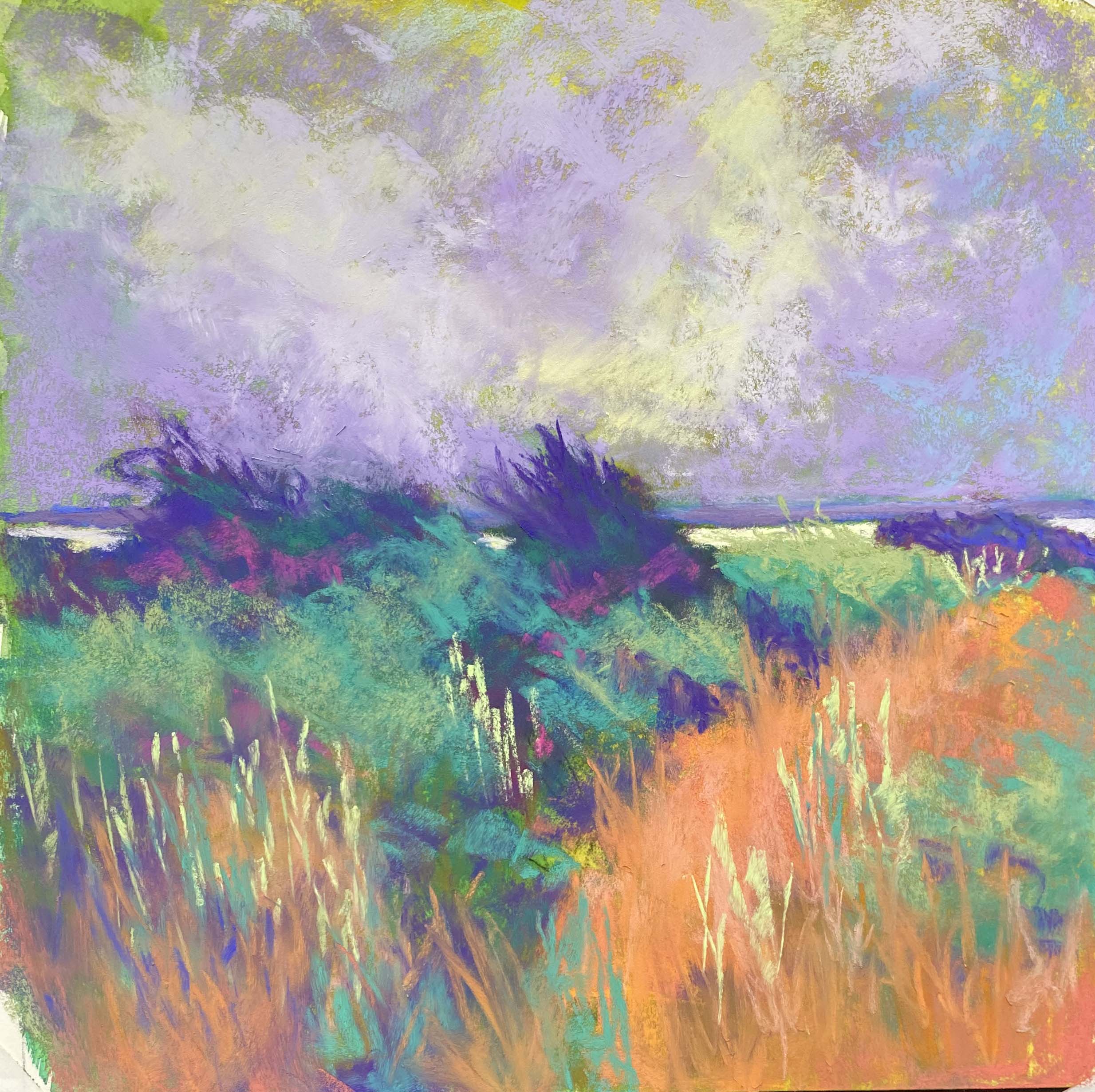
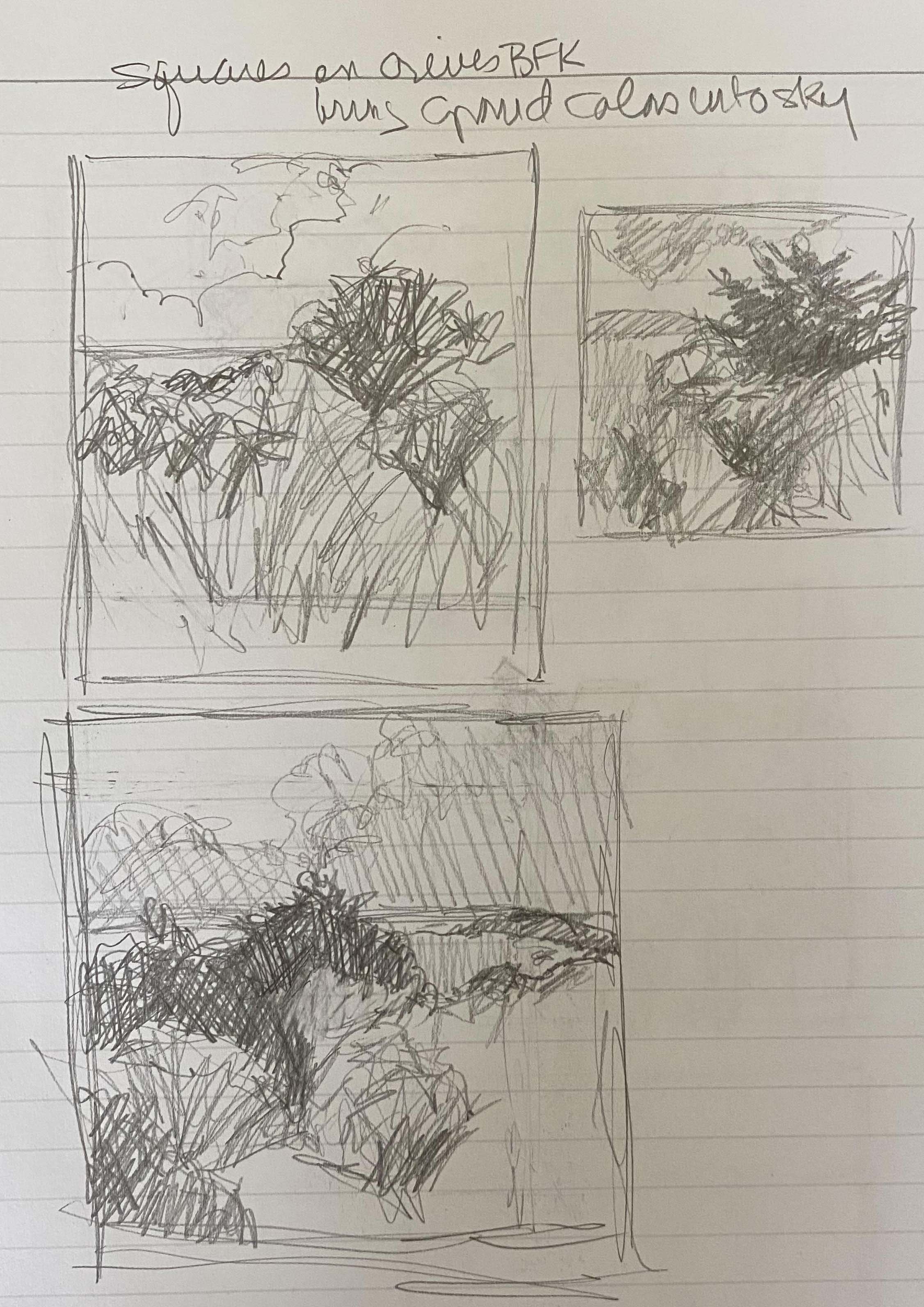
Delaware Bay #1 (study) 12 x 12, Lux Archival
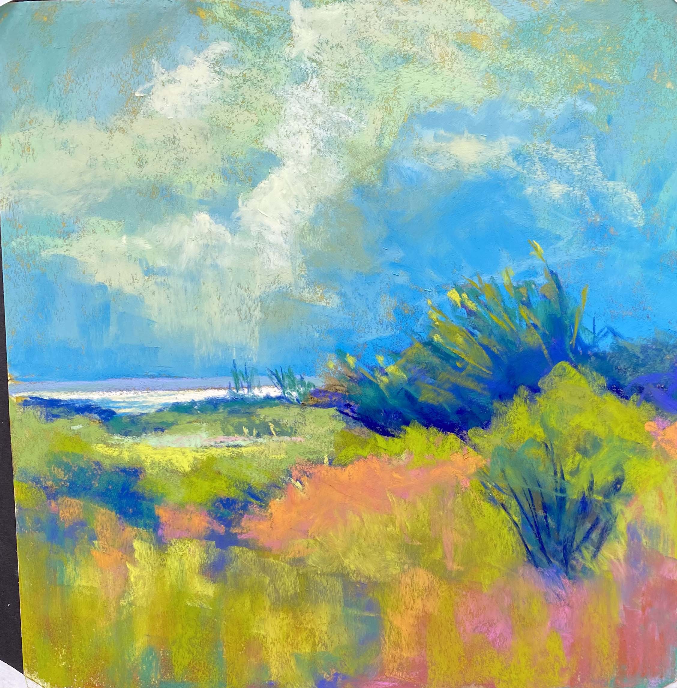
Delaware Bay #2 (study)
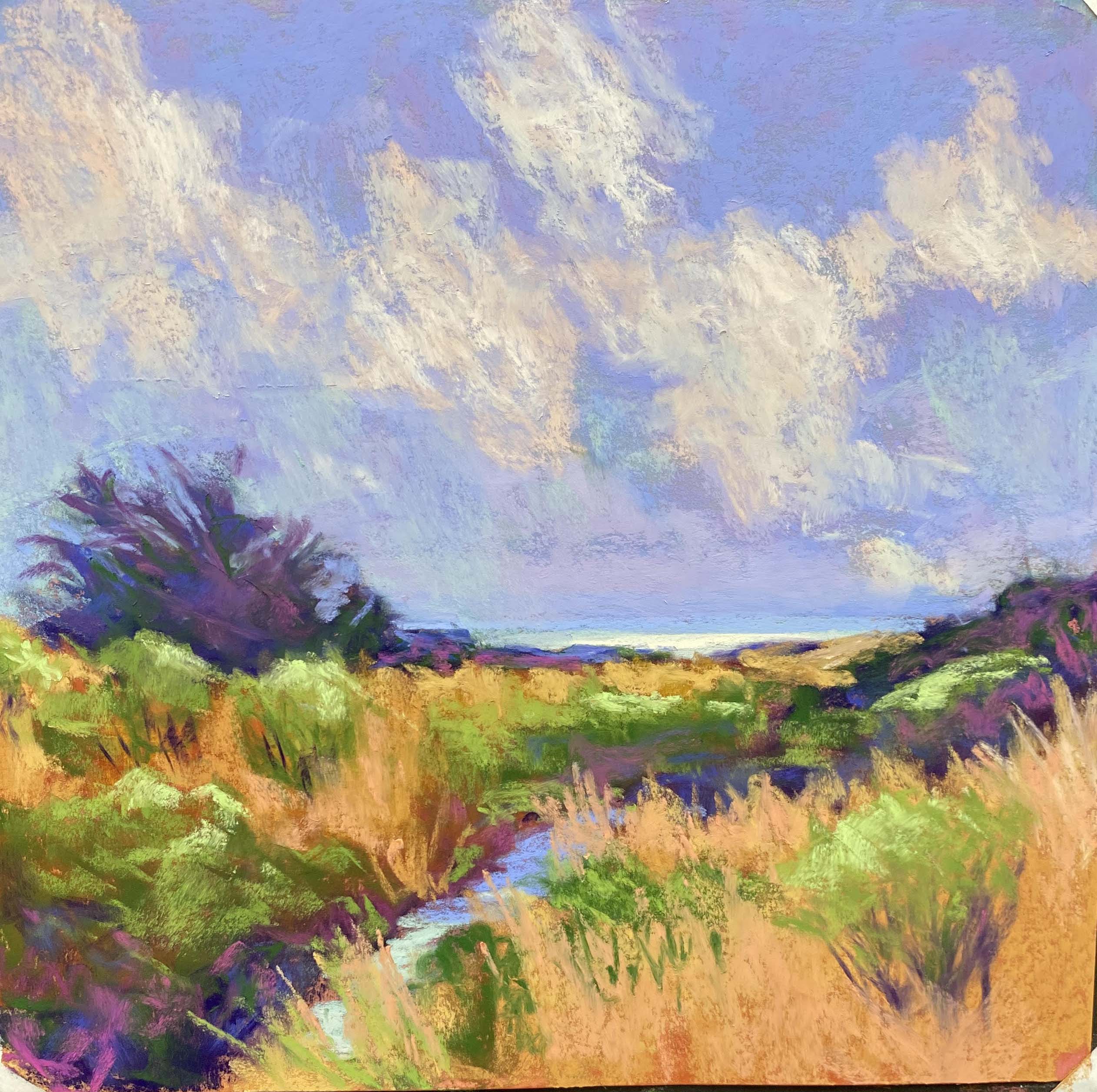
Delaware Bay #3 (study)
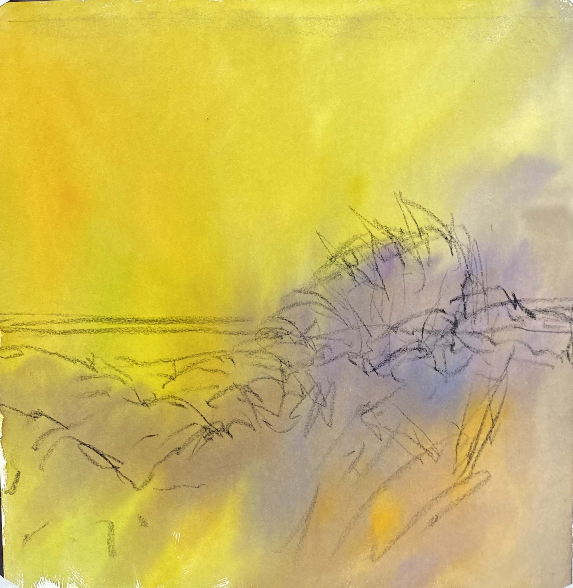
Watercolor toning and charcoal for #2
Drawings
Hello Friends! It’s been a long time since March when I last posted and so much has happened. We moved. That was pretty traumatic and exhausing. But then, my former husband died and we had to clean out his apartment. Then I got sciatica and couldn’t walk or even stand. Had to cancel our May trip to Slovenia and Croatia. On top of that, the gallery I was in in Frederick decided to let me go as I hadn’t sold anything this year. So, I’ve been pretty depressed! However, I finally got to see an orthopedist this past week, took prednisone, and the pain went away (for now at least).
When I was unable to walk and didn’t have any of my art supplies here, I decided to draw using what I could find–a small lined notebook and a mechanical pencil. I did sketches from a Sept. 2020 trip to Lewes, DE where we visited the Delaware Bay on a stormy day. Really dramatic skies and flowing grass lands with small shrubs. I decided this would be a good subject to play with. At this point I feel like I’ve got nothing to lose and it’s time to experiment. I’ve always wanted to do more abstraction with the landscape–but not total. I have little appetite for non-representation.
My initial thinking was that I would work on Rives with a gel applied. On Wednesday, when I was feeling SO HAPPY to be pain free, I went to the studio and didn’t find any Rives. But what I found was a lot of sheets of Lux Archival paper that I had purchased in the past couple of years. I decided to work in 12 x 12 squares and I used watercolor to tone the paper–not really an underpainting. The paper takes the water beautifully with no buckling at all. And I didn’t have a firm idea of my composition when I started, so toning was the perfect start. My intention would then be to take the best of them and work larger (20 x 20 maybe) on the prepared Rives paper.
Looking at the three studies, I like the second best. Not so much fussy detail and more shapes of color. I wanted to make the sky work with the land and used green in the clouds. That was quite interesting, which proved interesting. I had a photo up to look at but paid little attention to it. I tried to work intuitively on the composition, values, and color, feeling where I needed to make changes, rather than worrying about what was there.
These are far from “perfect” and I’m not sure that word could ever be applied to this sort of thing. But I’ve decided to “play” this summer, sticking with this format for now, but maybe adding a building in a few. And I will prepare a discussion on abstracting the landscape for my summer classes which begin June 6th. I will be teaching two in the studio and one on zoom (Wed. afternoons). The studio classes are full, but there’s always room on zoom! I plan to paint on Mondays afternoons. I’m praying that my phyiscal condition will continue to improve (I’ve had an MRI and will see the doctor this coming Tues. I expect PT to be in my future!).
I hope you have been able to enjoy the beautiful spring weather, which has disappeared here for the weekend–high 90s predicted! I hope to do more work and will post future experiments. Stay well!