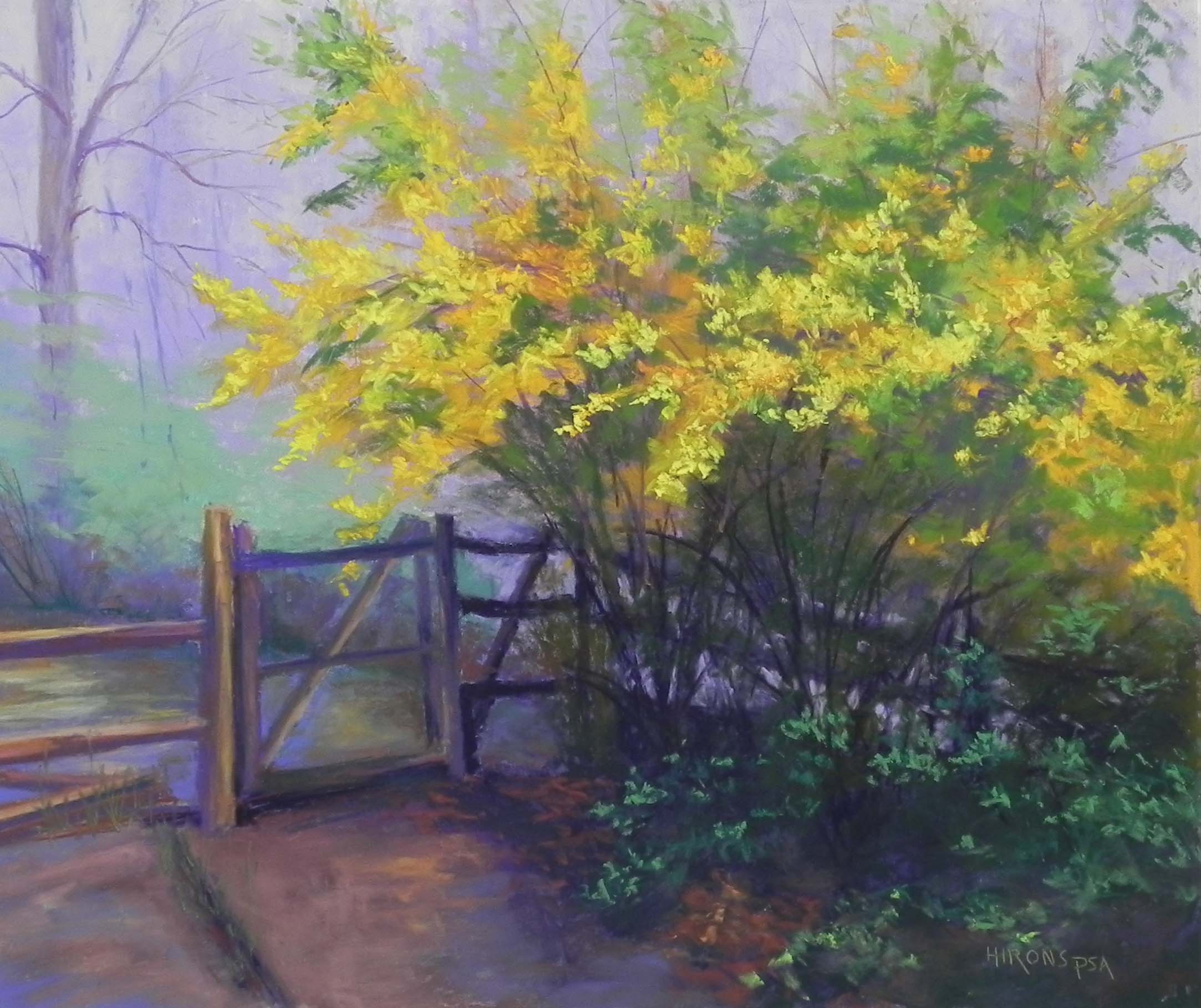
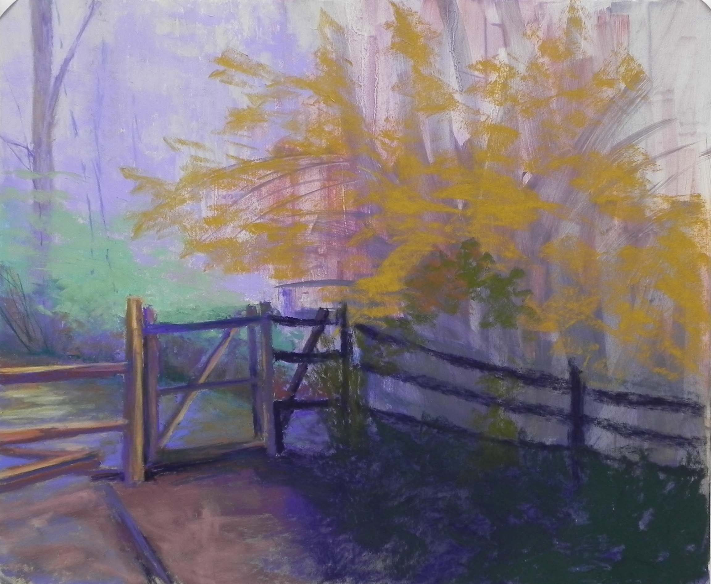
Forsythia, 20″ x 24″, Pastel Premiere 600 grit
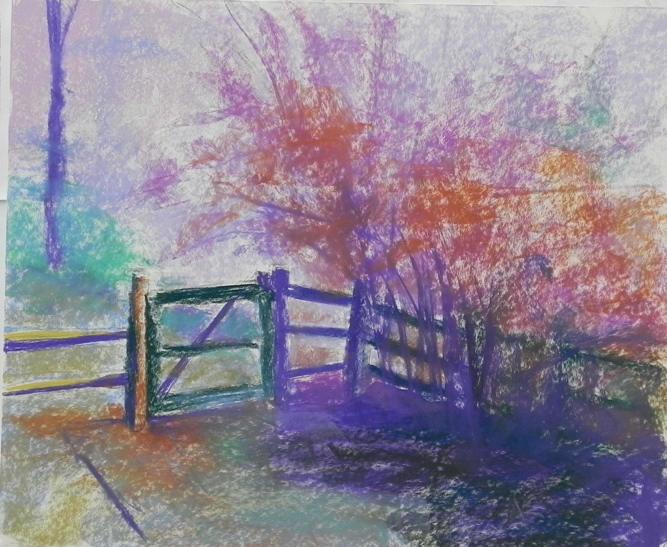
Underpainting with water
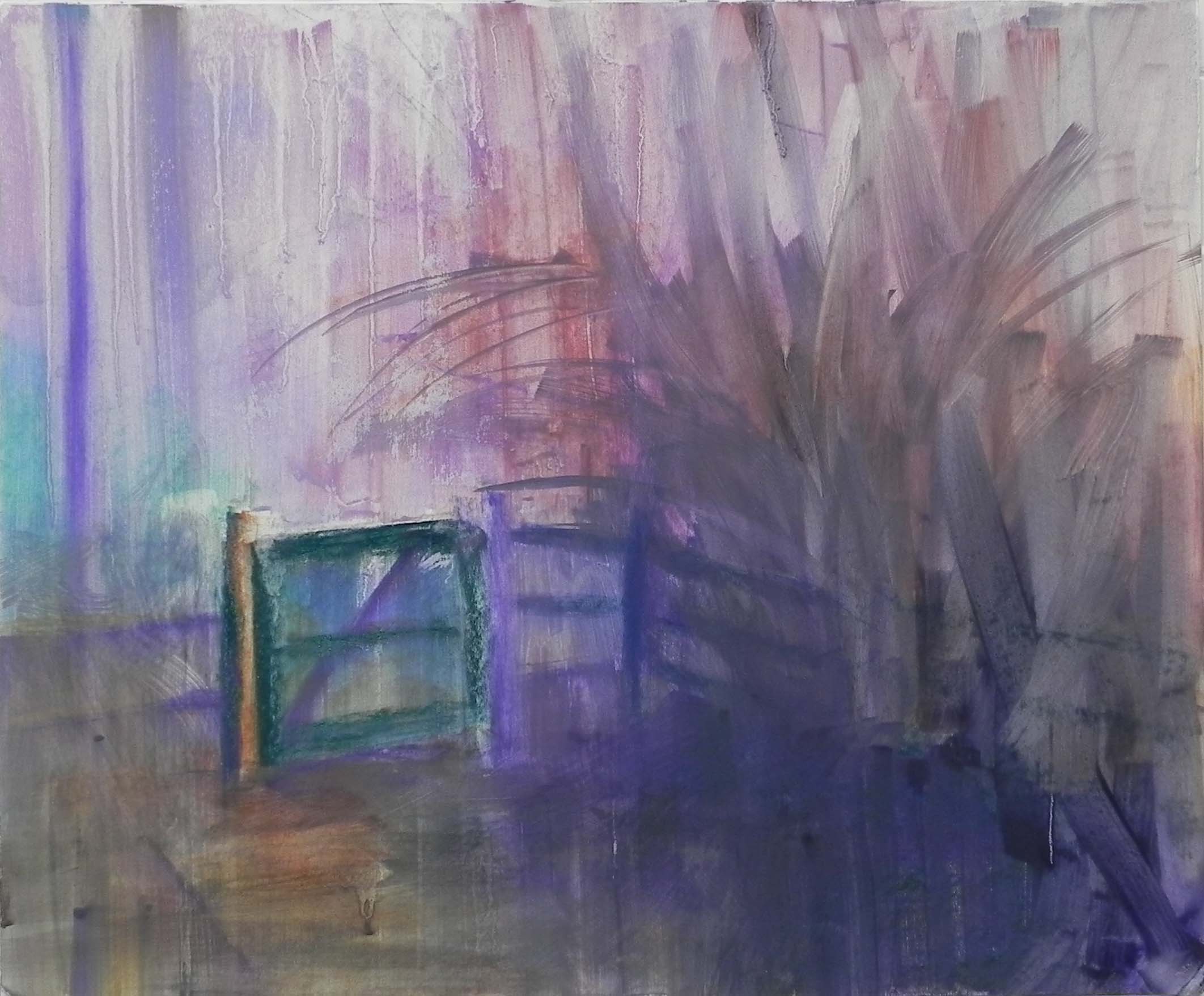
Painting with background laid in
I did this painting to prove to myself that I can work with colors I really don’t like–YELLOW! UGH. Trying to figure out a pleasing color palette on this was hard. I finally just copied the photograph! So it’s yellow, orange, green, and violet.
The photo is of our side yard last spring. It was a misty morning and i really liked the way the forsythia stood out from the violet background. But there was a lot of green in it. I thought of leaving it out, but, as you can see, I didn’t. I think it’s better as a result.
This is my last mounted board of the 600 grit paper, thank goodness! I new I couldn’t use alcohol, but the water color underpaintings have been doing very little for me. So I decided to use hard pastel and water. Given that the paper was mounted, it was fine, although definitely not as good as alcohol. (I don’t advise students to buy the white paper because it buckles with water on it and isn’t very practical. )
I worked on getting the darks in on the lower right to begin with. I used a dark Unison green and Terry Ludwig eggplant. That worked pretty well. For the background I used three values of violet, including a very light whitish violet for the lighter areas. This was the easy part! Then I used a very soft, cool green for the background bush on the left. Thought that worked as well.
For the forsythia, I used a combination of real oranges, yellow oranges, yellow greens and true yellow. I think it works pretty well.
That’s enough of this stuff. On to some buildings I think!
On Friday, I got accepted to the District Arts Gallery in Frederick and they really like my city paintings. So I may do some small ones of Frederick as a change from this!