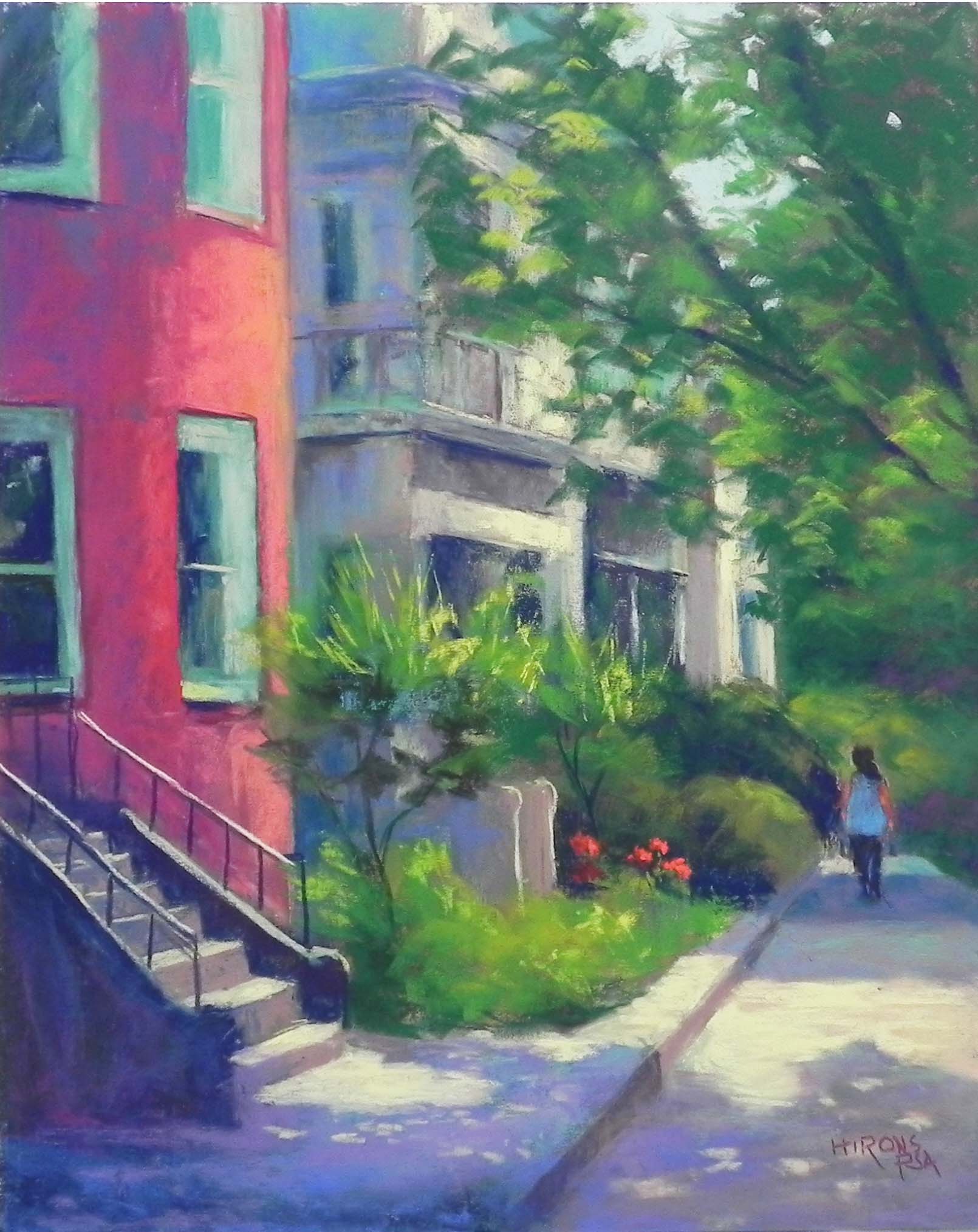
A Stroll in Dupont Circle, 20″ x 16″, UART 320
Drawing
Hard pastel underpainting, stage 1
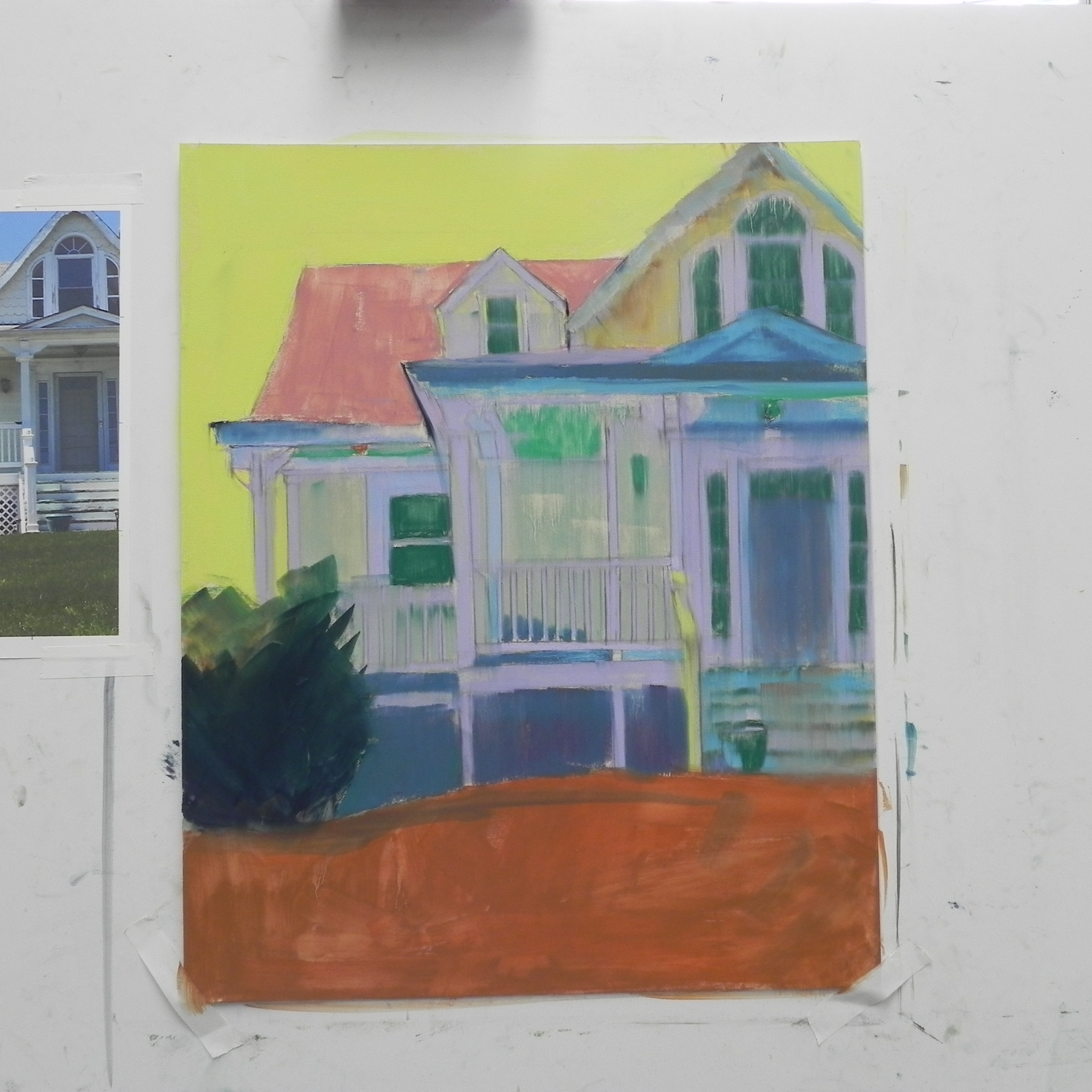
Underpainting with alcohol
Painting, stage 1
So it’s IAPS time and I’m not there! First time since 2003 that I’ve missed a conference. It was intentional but worked out well as I had my second cataract surgery this past Monday. I’m doing great and am happy to have it over with. I miss seeing so many lovely people and the wonderful paintings in the show, not to mention the Terry Ludwig display. But I REALLY don’t need more pastels right now!!!
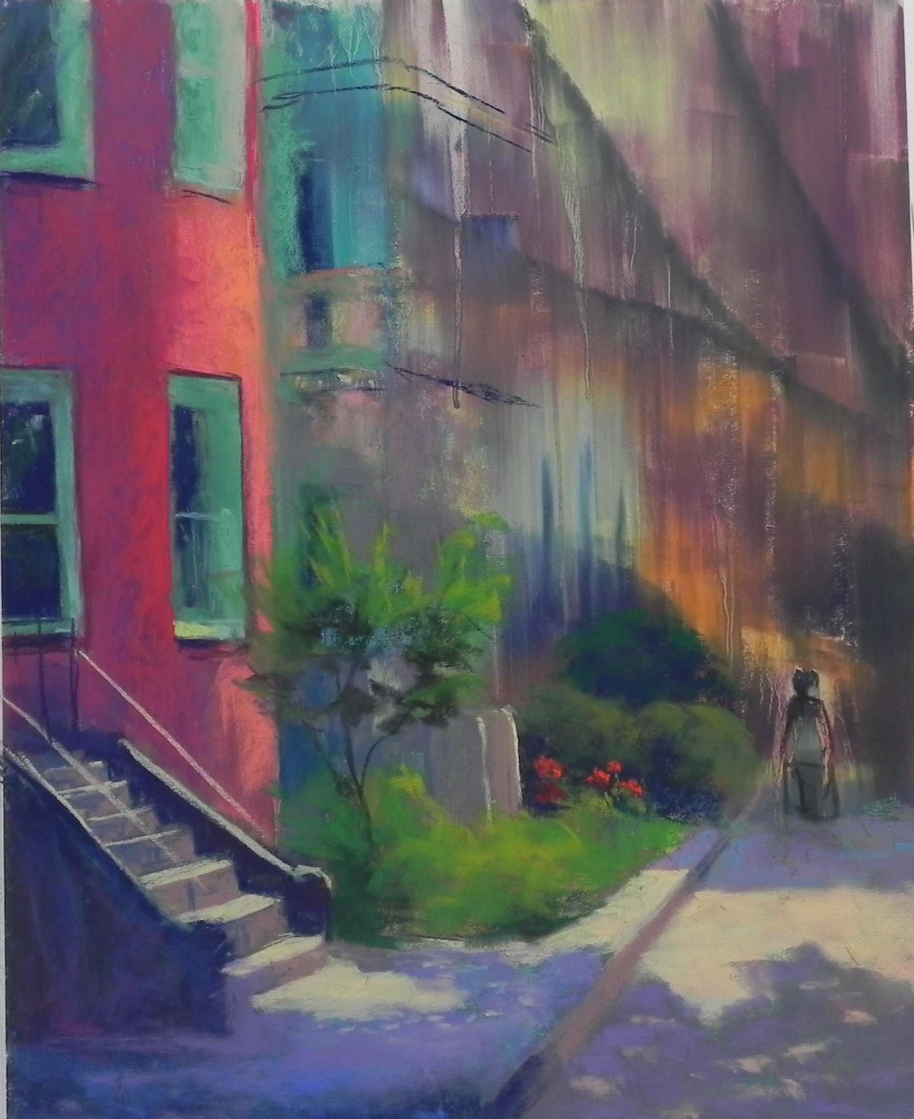
I recently, somewhat belatedly, received the issue of the Pastel Journal with the Pastel 100 in it. I was particularly taken by the landscape painting of Nancy Nowak’s called A Stroll in the French Quarter. It was SO wonderfully loose and expressive and I said “why can’t I do this”! It gave me inspiration.
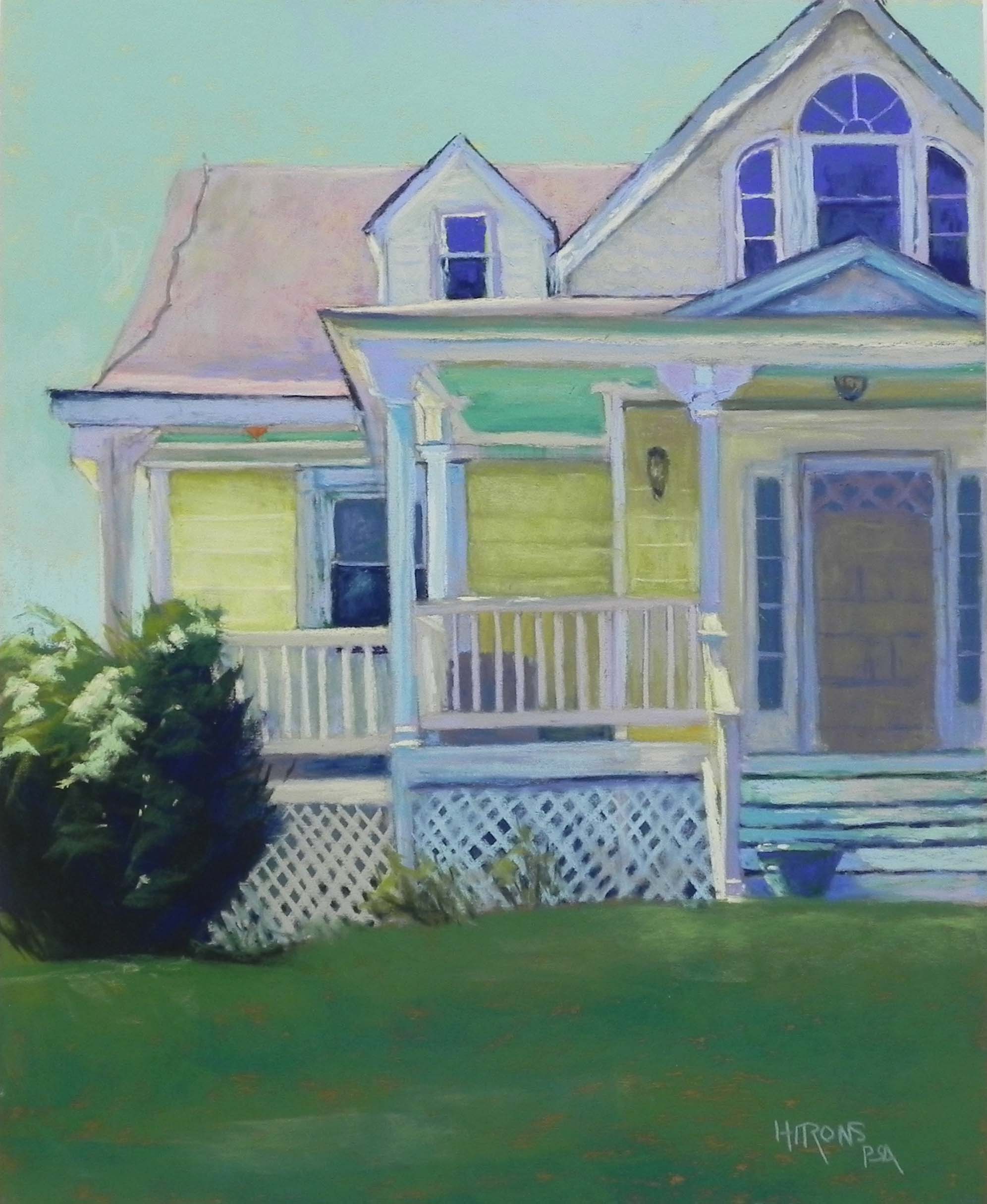
A second inspiration is the fact that I’m having a show in Dupont Circle next year at the Women’s National Democratic Club. I’ve not painted this area, but it’s so easy to get to and has always been one of my favorite places. I’ve decided to focus on the townhouses with English basements, which really make the place distinctive. This is a lovely time of year with foliage and shadows and flowers. So I plan to make several photo trips.
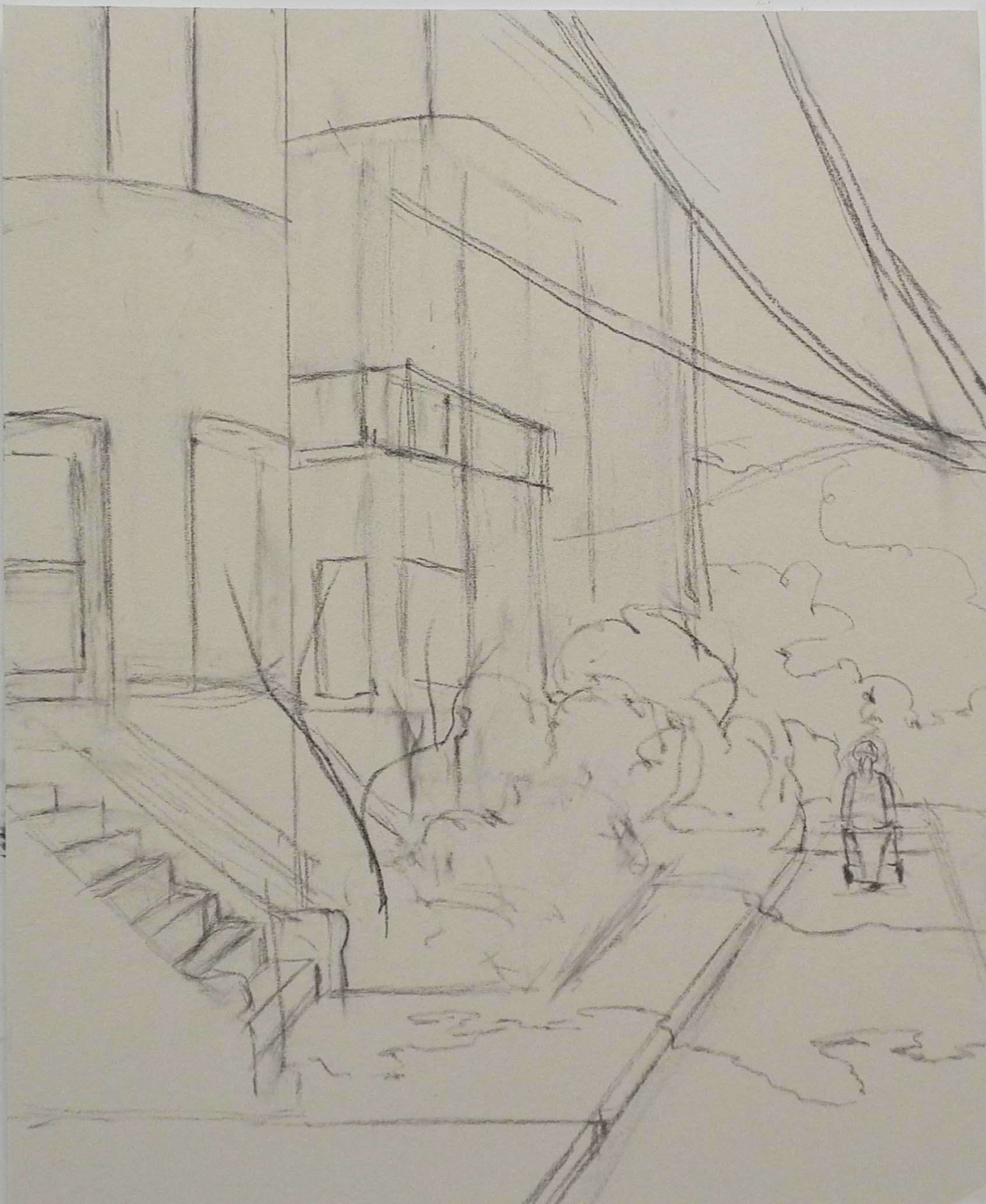
So back to getting looser. I started with a very loose drawing in my sketchbook, using a graphite stick to focus on shapes rather than lines. I then put in a fairly simple drawing on the board. I spent a lot less time on the drawing than I normally do. In most ways it was OK, but I didn’t do enough measuring and ended up with the row of houses coming a little too close to the street. I was trying so hard to focus on value shapes, but with buildings, it IS important to have some of the basic things established! I did get the placement of the sidewalk and the width of the red house and these were key.
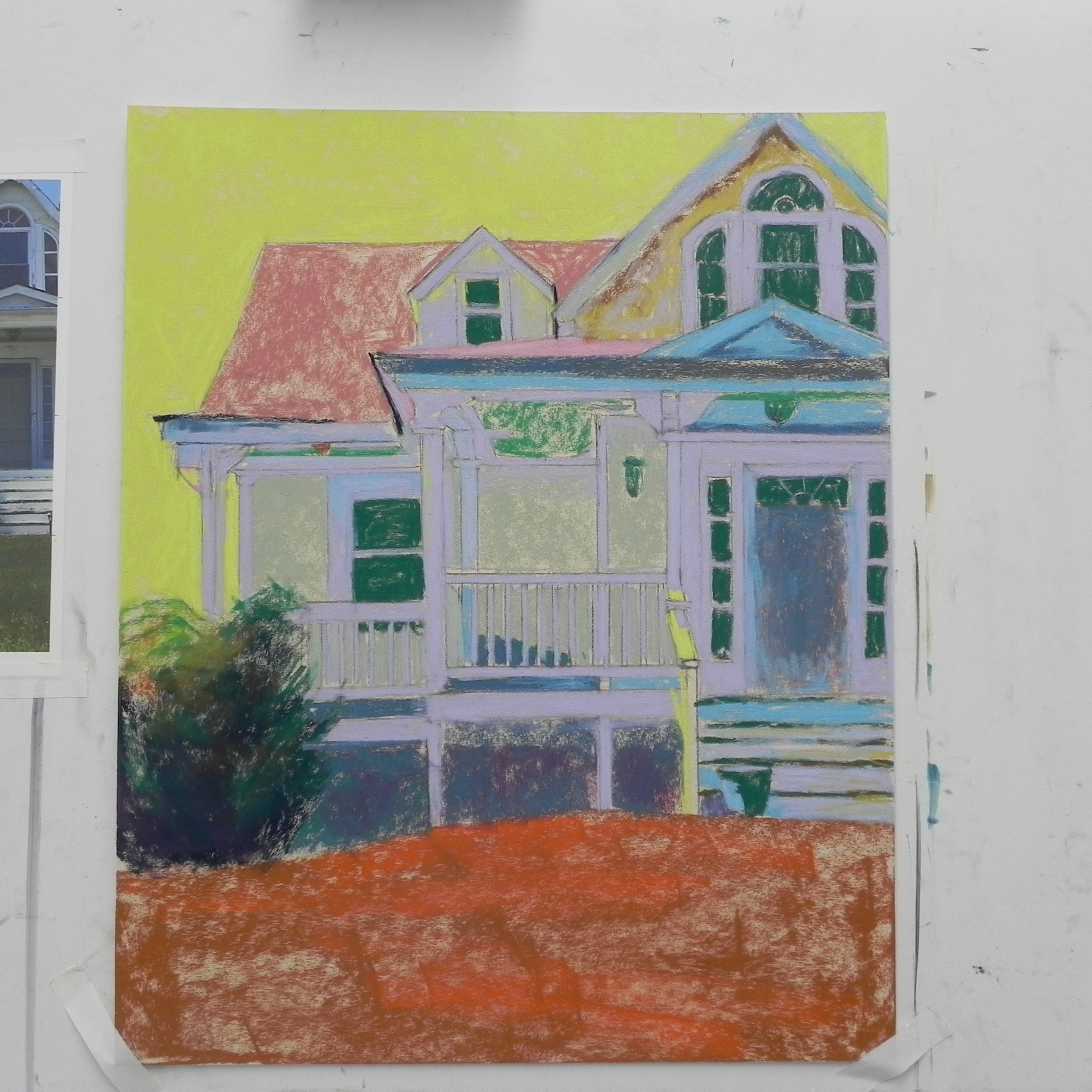
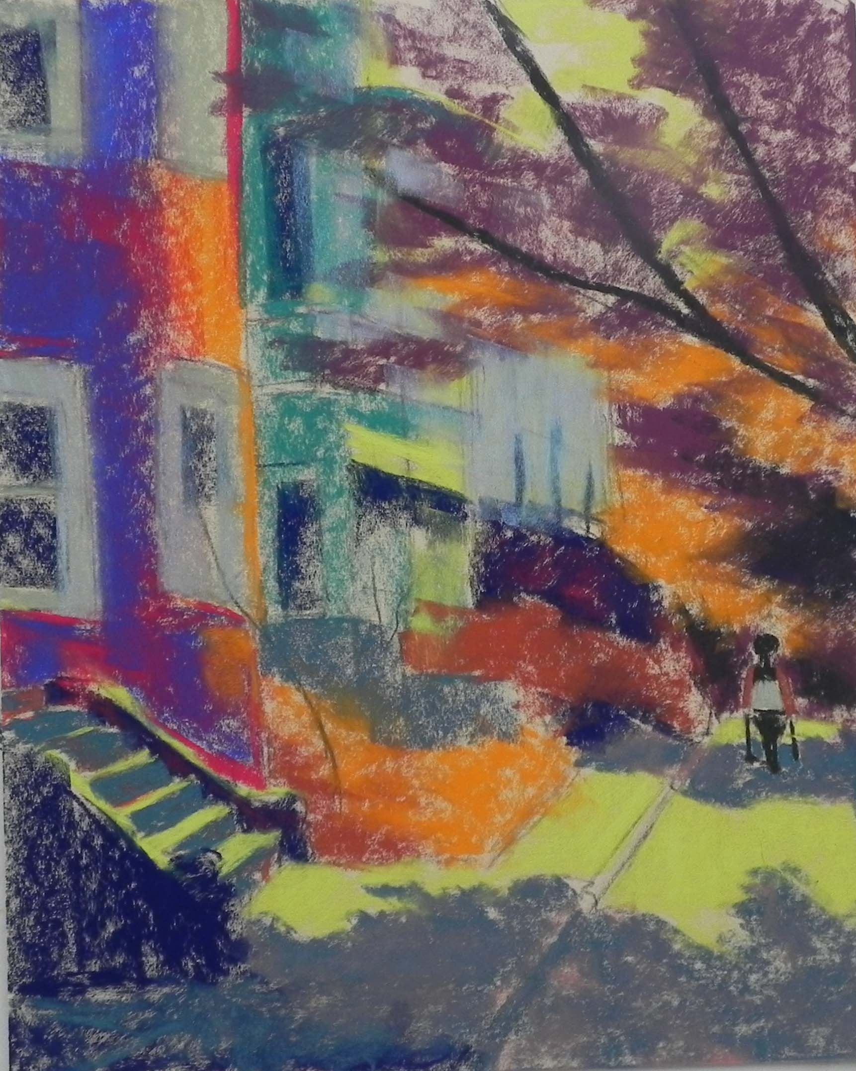
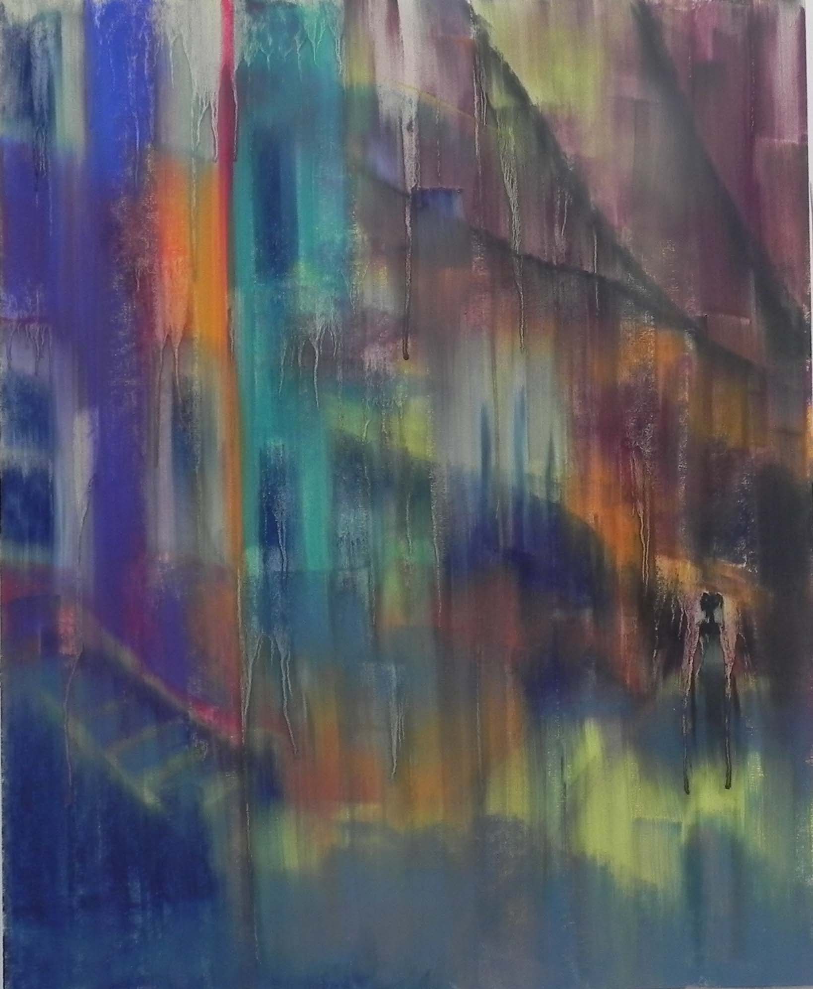
For the underpainting, I went a little crazy!!! I decided that in order to see what I was doing I would use warm under warm and cool under cool. I used yellow green Nupastel for the sidewalk and other sunlit places and a bright orange for the building, and sunlit foliage. I didn’t stick to any particular color scheme, just went with basic value and temperature. I then got out the alcohol and a wide flat brush and brushed it down using a lot of alcohol. Good thing I didn’t spend hours on the drawing, eh??!!! It actually worked, however. Having used bright colors, I could clearly enough see where the major warm and cool shapes were and the buildings.
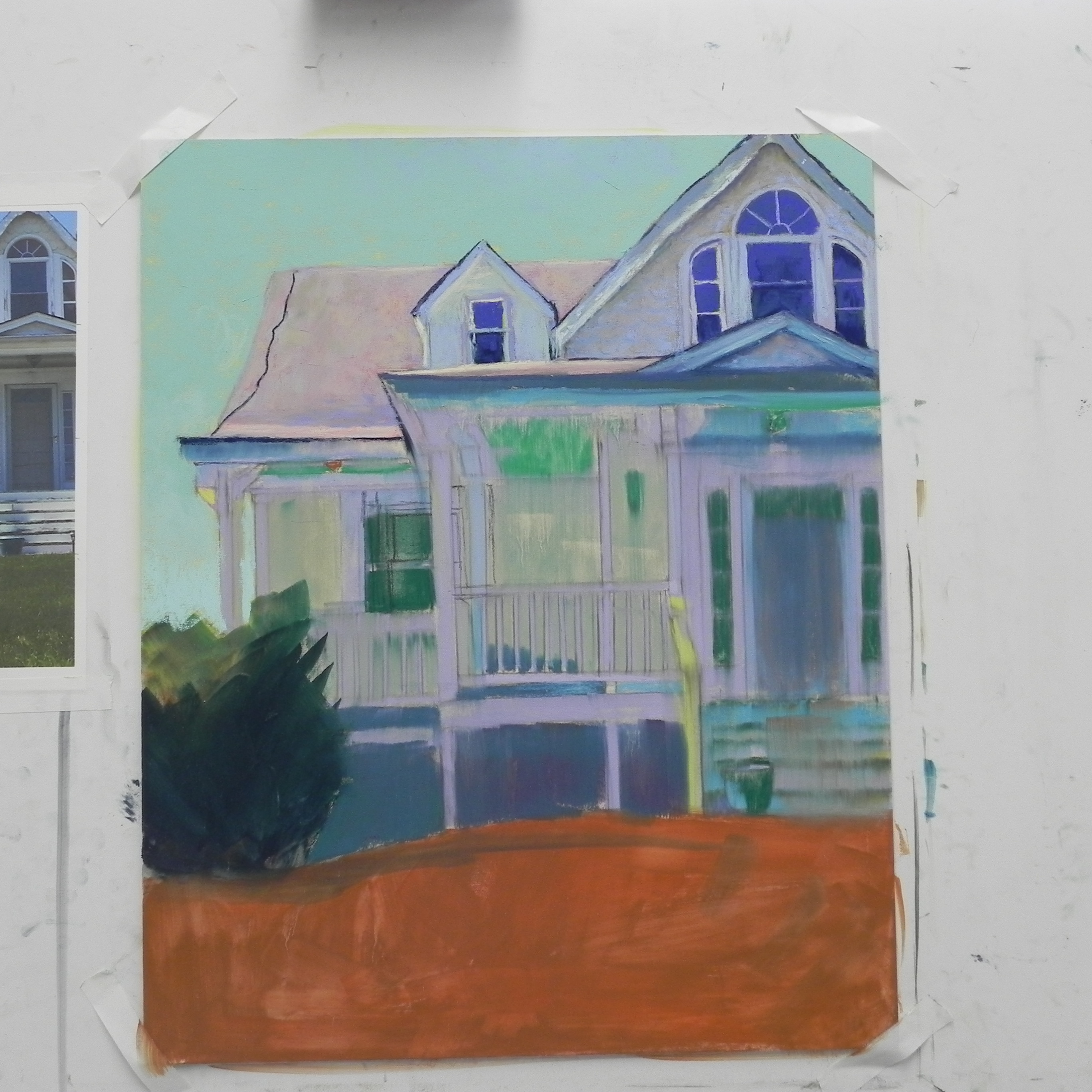
I started on the left side with the red building, then moved down to the bottom of the painting, putting in the sidewalk and foliage. I normally work from the top down, but the top was the most nebulous part of the photo, so the bottom was a lot easier to deal with. I used nothing but Giraults to begin with and kept the light areas of the buildings and sidewalk fairly dull so as to be able to brighten them with softer pastel later.
I worked fairly fast and tried to keep my edges soft and my strokes suggestive and loose. The buildings to the left of the red one were partially covered by the tree, so it wasn’t real easy to see what was going on. I tried to indicate a balcony, windows, and shadows. Then I put in the tree and sky, using a pale aqua. I started with a yellow and decided it was way too bright. (In the photo, the sky was white, of course. )
The figure was an issue. If you look at the drawing, you’ll see something coming down each side of it. I thought she was pushing a baby carriage. However, when I put on my reading glasses-now much needed!–I saw that the figure was actually riding on a scooter of some sort. So I decided to change it to a simple woman walking and changed an arm to like like it is in front of her. I was much happier with it.
I used a Ludwig yellow to brighten up the sidewalk and stairs and put a little Ludwig red on the house. I used a Schmincke to brighten the flowers and some Blue Earth greens for the garden greenery. I had used too much green in the windows and tried to soften them with a beige color, but I was trying hard NOT to overdo them.
I’m pretty happy with this attempt at a more expressive painting. I’ll keep working on it and see where it leads me.