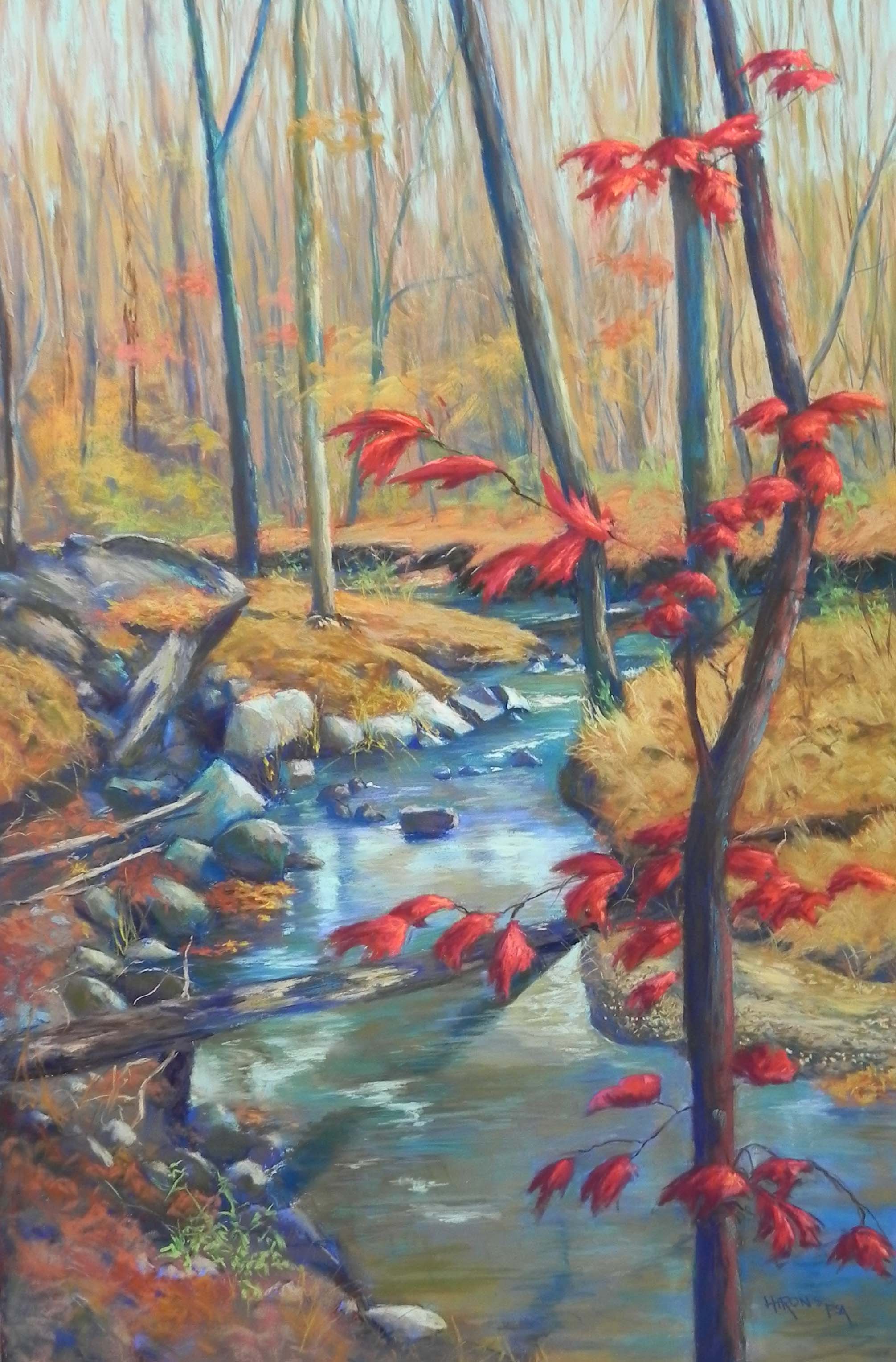
Hawlings River Bend, 36″ x 24″, Lux Archival
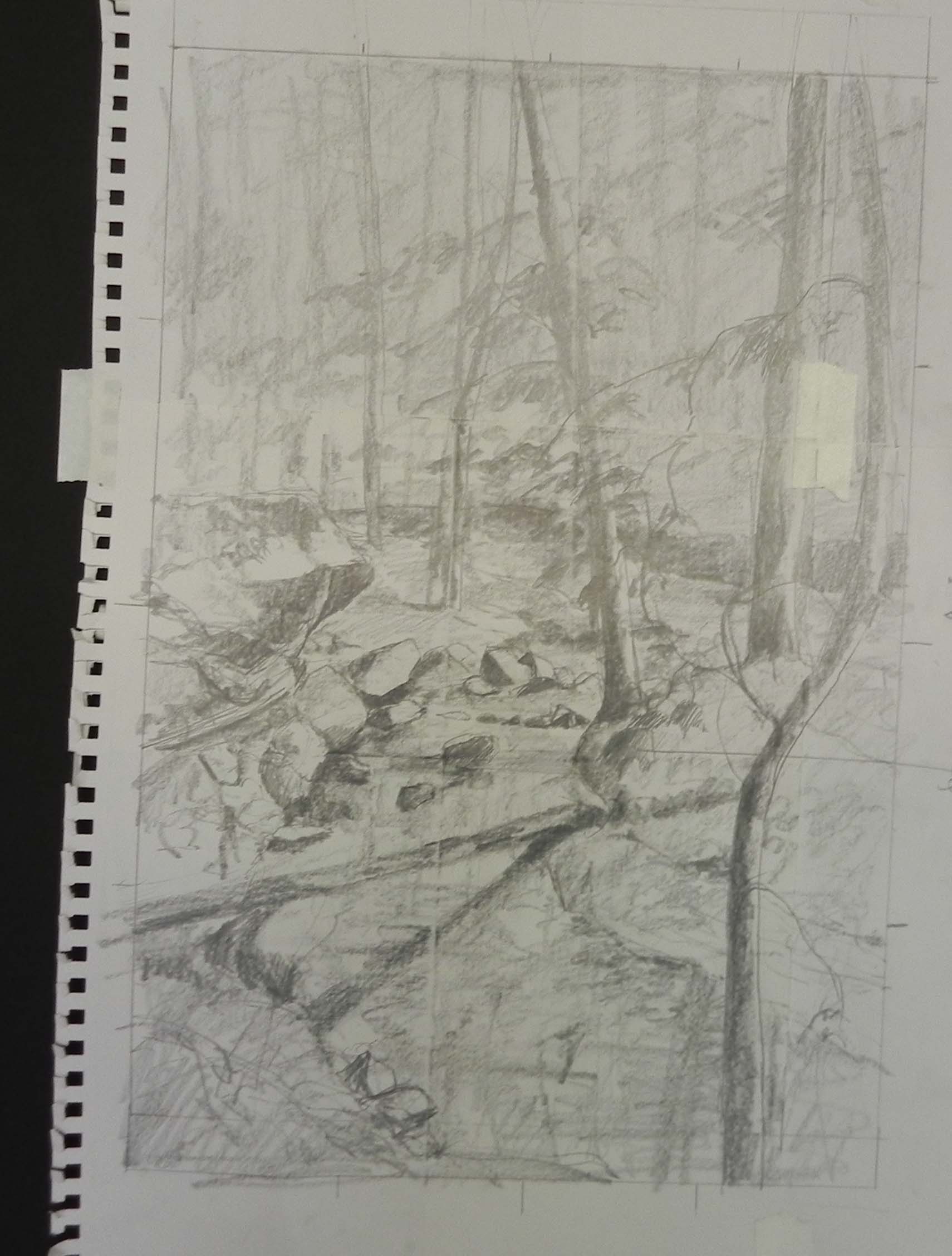
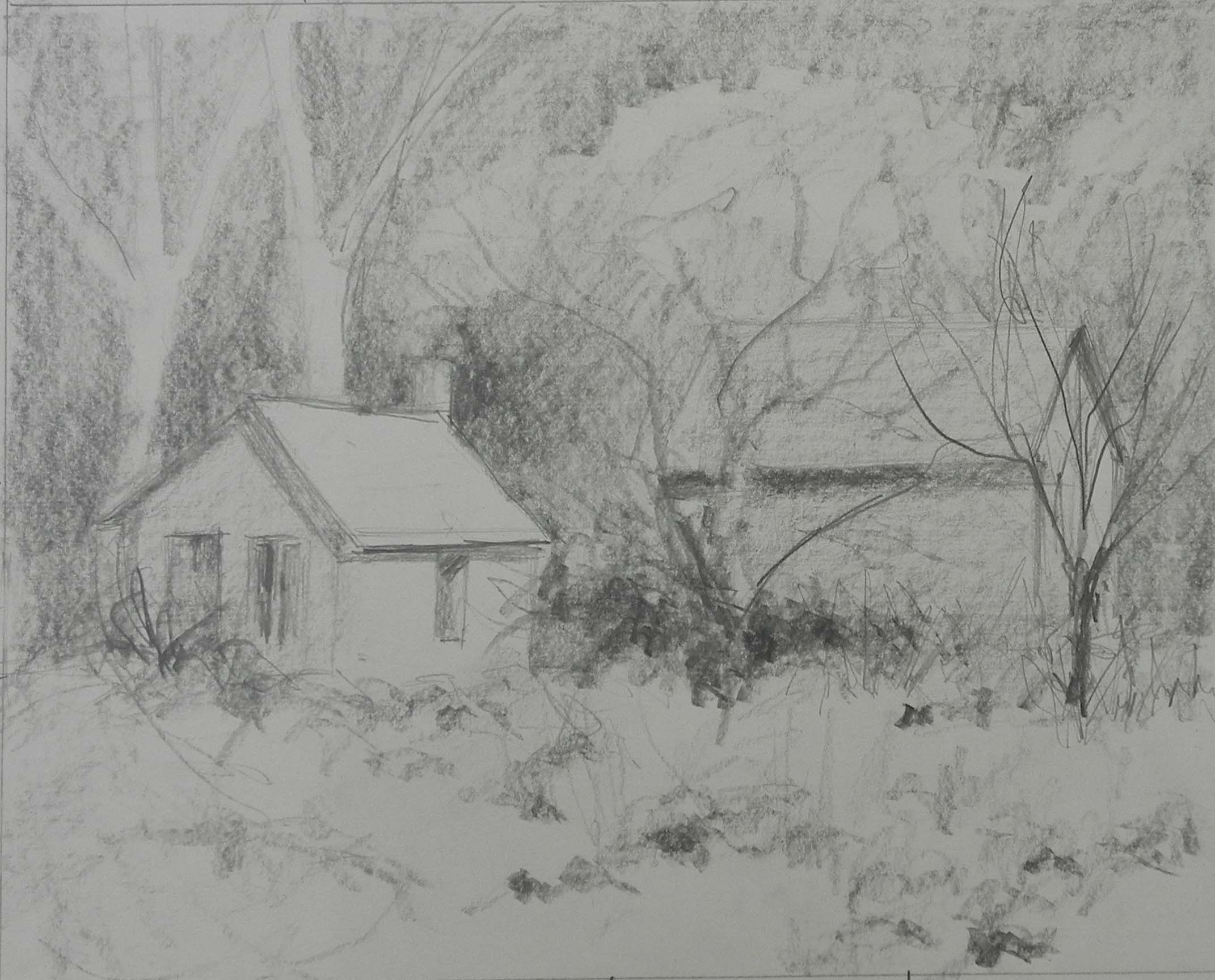
Graphite drawing, 18″ x 12″
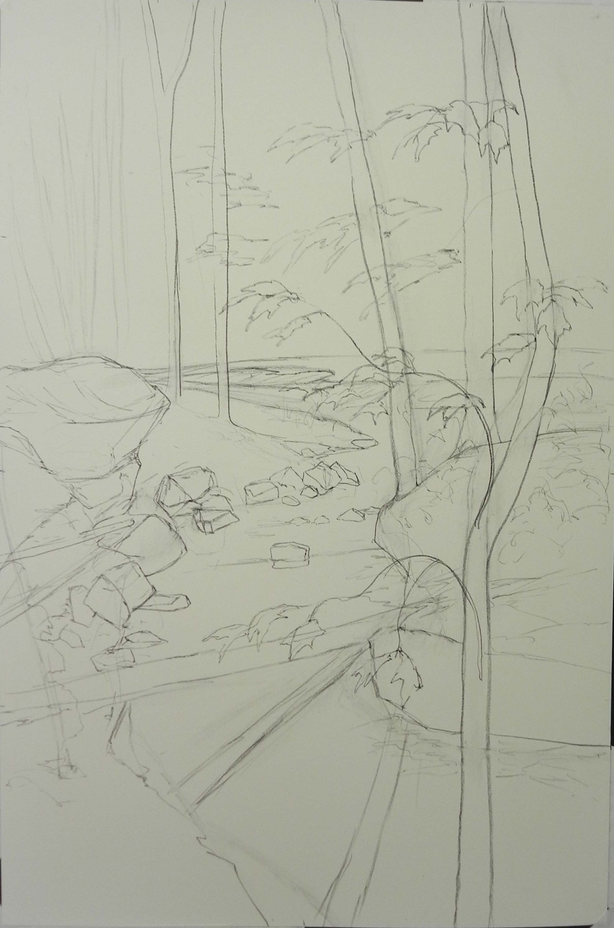
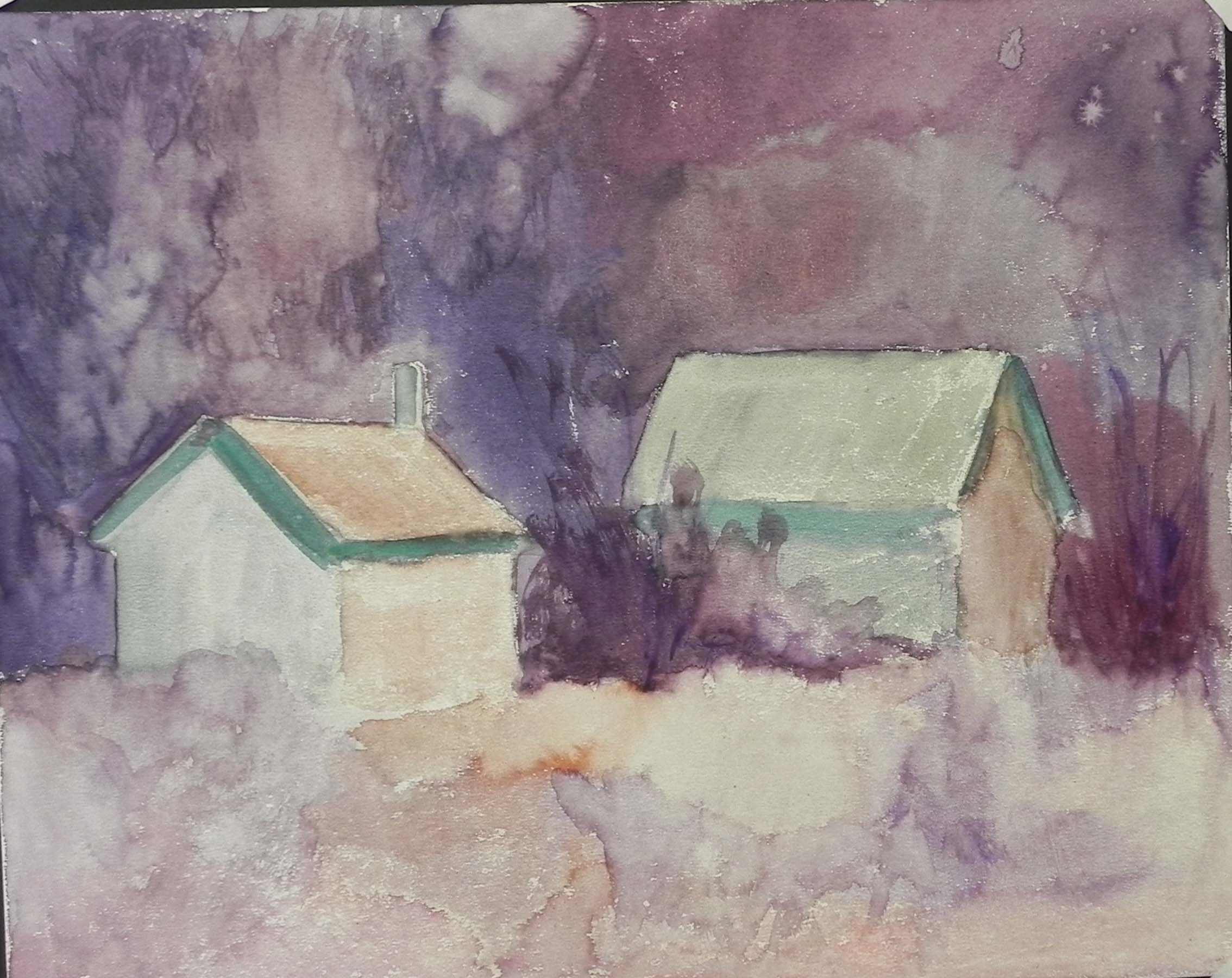
Drawing on Lux Archival paper
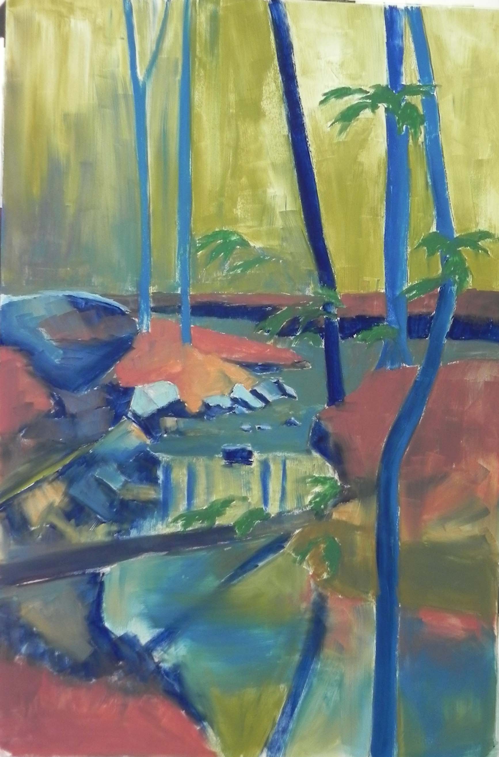
Underpainting (hard pastel and alcohol)
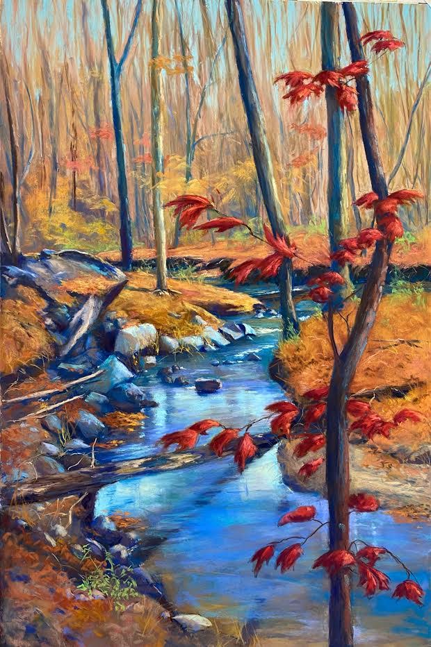
Painting as initially completed
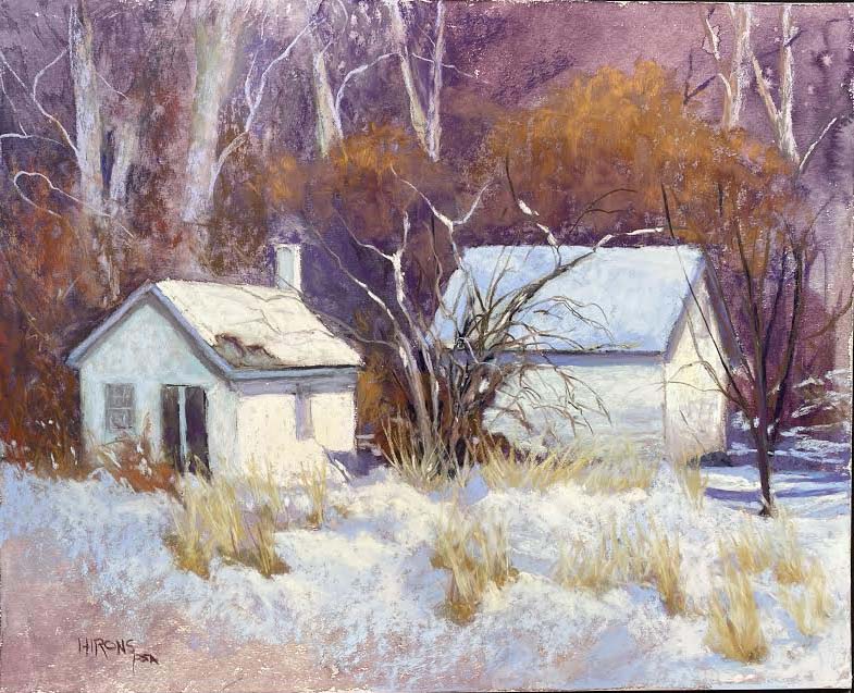
On Sunday I completed a painting that was commissioned by a lovely couple in Laytonsville. They knew of me from purchasing a small painting of rocks from District Arts Gallery in Frederick MD. Now they wanted me to paint the stream and rocks behind their house. It was winter. They wanted fall. There were no fall pictures. And they wanted it to be big! SO–I gulped and said “sure”.
I’ve never painted anything this large so I had to think about what paper I would use. The original request was for a 41 x 31 framed painting. But that became more flexible. However, looking at Dakota’s website, I saw that Lux Archival comes in a 5 pack of 24 x 36, which was perfect for the painting. The framing would be with a floating double mat and taupe frame by Larson-Juhl.
So I ordered the paper and began drawing. I had to tape four sheets of drawing paper together to get a big enough drawing of half size! And I was using two different photographs. One had a better image of the river, the other had tree in foreground, which I decided would work nicely. I used the photo from Rock Creek of the red leaves that are in my December paiting. Both reference photos were black and white. The winter color was just too dull.
After doing the initial drawing and getting it transferred to the paper, I felt a lot better. That large sheet of white blank paper was VERY daunting! Then I got the underpainting in and felt even better. But I was really at a loss about the color. They wanted blues, reds, and neutrals. But what to do with all that ground that would be covered in fall leaves? Their other painting is “Terra Cotta Leaves” and they loved the colors in it, so I decided to look for terra cottas. But I ended up with a lot of oranges! And when I started working on the water, I used too much blue. I was disappointed in the surface–it just doesn’t have the tooth of the UART or Pastel Premiere so trying to get texture in the moving water just didn’t work.
Anyway, I sent them the image “painting as initially completed” and they came last Tuesday to look at it. I also sent this to my students and they all loved it. But I knew it wasn’t there yet. Greg and Mo were not sure what to expect when they came to see me, never having commissioned a painting. But I wasn’t hurt or upset in any way! I was just stumped as to the colors that would work. When they came, they suggested more straw colors in the land pieces and toned down water.
So I found some grayed yellows and converted the oranges to that and I knew it was better. Then I added some warm grayed greens to the rocks. When I looked at the color image, I realized that all of the dark in the rocks was lichen and it was green. And there is the really large rock, which I thought was pretty ugly. But it’s why they bought they property!!! Hmm. So by adding the greens, I could then add more brownish greens into the water to kill the blues. Also, in the original, I had used the same bright turquoise for three parts of the water in light and they were in competition with each other. So I toned down the water below the fallen tree and broke it up as well.
Then I added the effect of sand pebbles to the piece of land at lower right. This was a request and I found it to be pretty easy to do. And finally, I decided to use my fingers to blend the tops of the sky/trees together to push it back. That worked really nicely. A little blending in the water as well but not much.
Yesterday they came back for the final approval. Greg asked that I show more of the rock, which I had covered in too many leaves. I got to show them how easy it is to brush off a small area and replace with other colors. Then I added a swiggle of the light brown in the water leading to the rock in the middle of the stream. That was it. I signed it and tomorrow it will go to the framers.
What a relief!!!