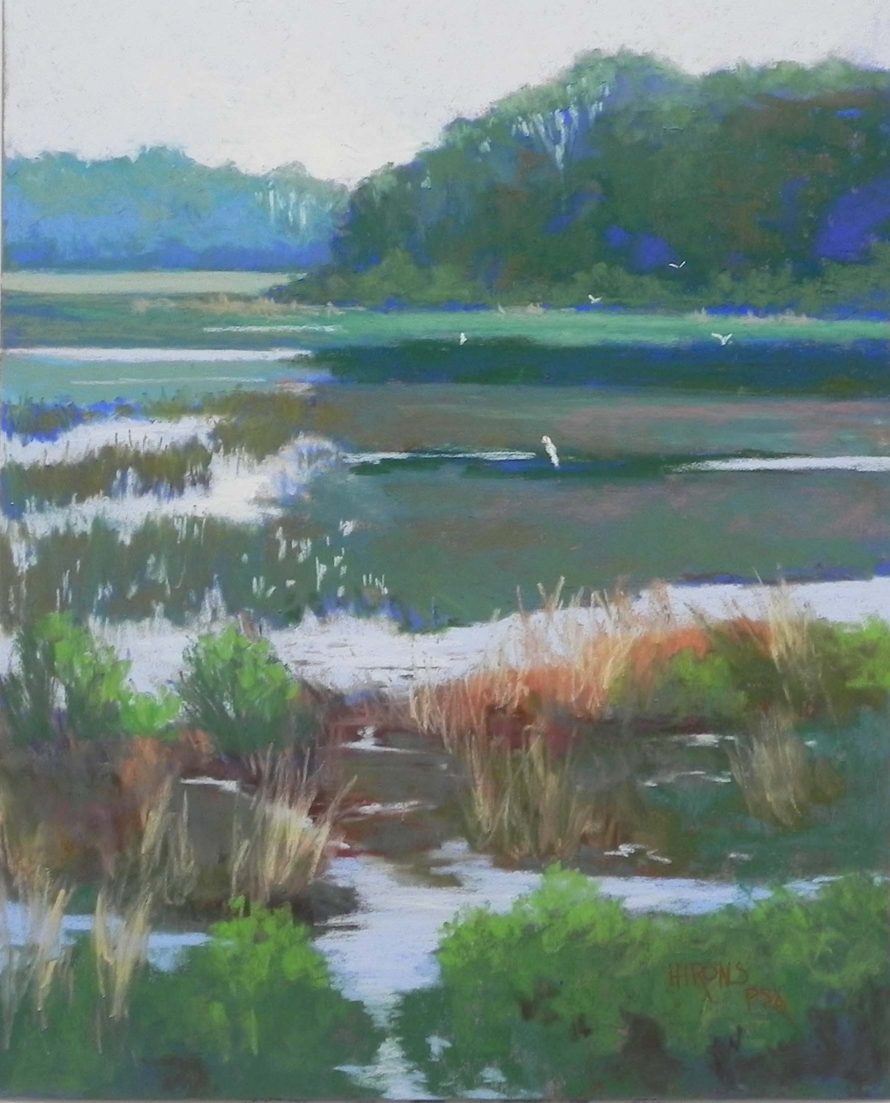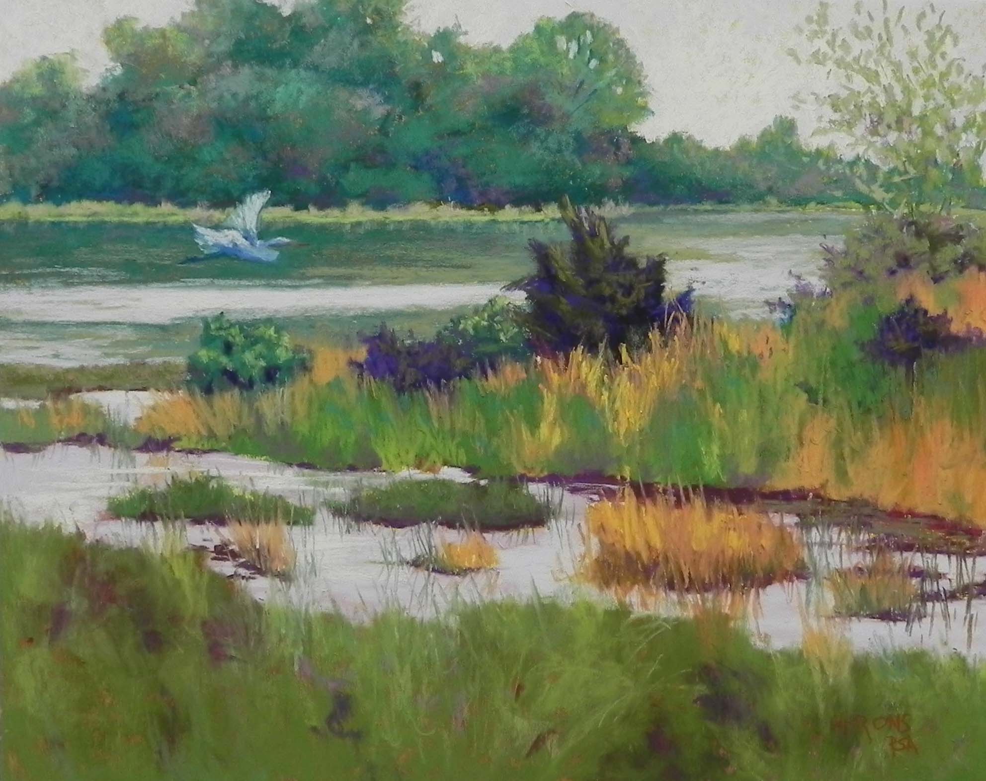
Flying In, 16″ x 20″, Pastel Premiere White 400 grit
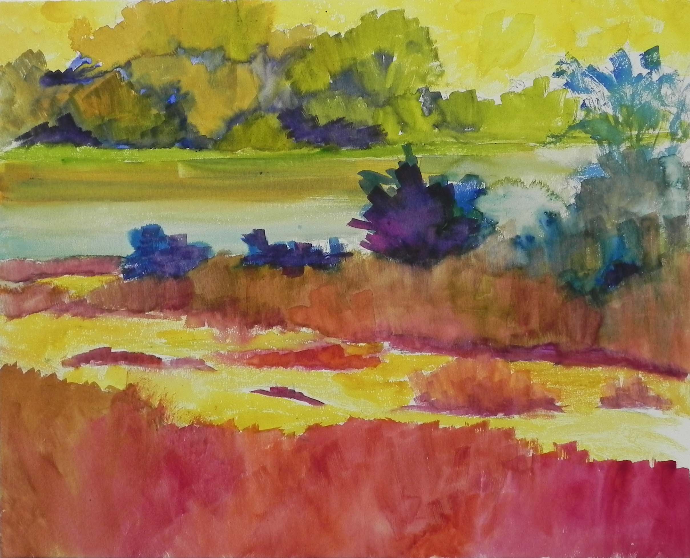
Watercolor underpainting
Just completed a third painting from the Delaware Bay trip after finishing a weekend class. My final touch was to add the herron (egret) flying into the picture. It was not easy! More on that below.
I did this on Pastel Premiere white so used watercolor for the underpainting, using warm greens under the cools that I would put on top, and warm reddish oranges in the foreground. It worked OK.
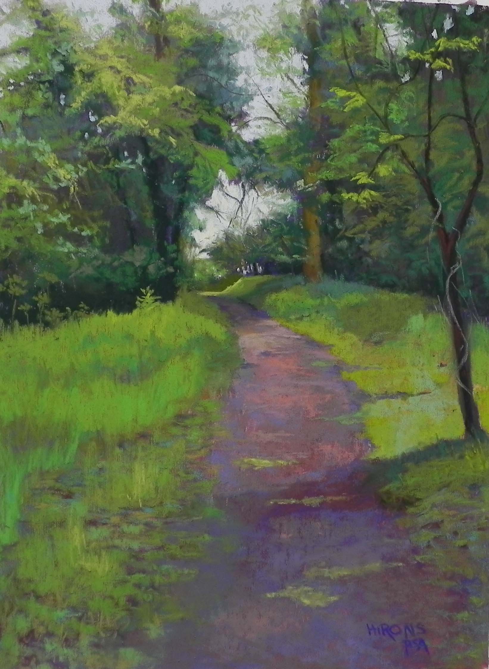
Compositionally, I made two slight changes that I liked. In the photo, the trees are all about the same height with a lot of sky above them. I made them go off the top and dip in places to be more interesting. Then I moved back the shoreline at the upper right to give more distance to the picture.
I began the sky with a very light, soft red violet and went on over it with Ludwig pale yellow. I used nothing by Blue Earth pastels in the background trees, using my boxes of turquoise, and cool and warm reds. I did it very slowly and delicately and had such a good time with it! These are wonderful pastels if you learn to use them with a really light touch.
The foreground was more difficult. I began the dark bushes with red violets and added warm greens on top–this took a certain amount of give and take. When it came to the grasses and orange reeds, I found the Giraults to be more useful.
I knew that I wanted some kind of bird flying in from the left. I did a search of the great white egret and used it for my reference. However, I used soft blues and greens, along with a little white, so he may look more like a blue herron. I tried using pastel pencils–ended up just using them for the beak and leg and used small pieces of soft pastels for the body and wings. The main thing is that I think I got him the right size!
What about the title? As soon as the bird got into the picture, it was all about him! So I came up with this for the lack of anything better. Other suggestions will be greatfully received.
This is the last marsh picture I’ll do for now. I have a couple of pictures of back alleys in Lewes, DE that I like that would be different.
Hope you all have a lovely Memorial Day weekend.