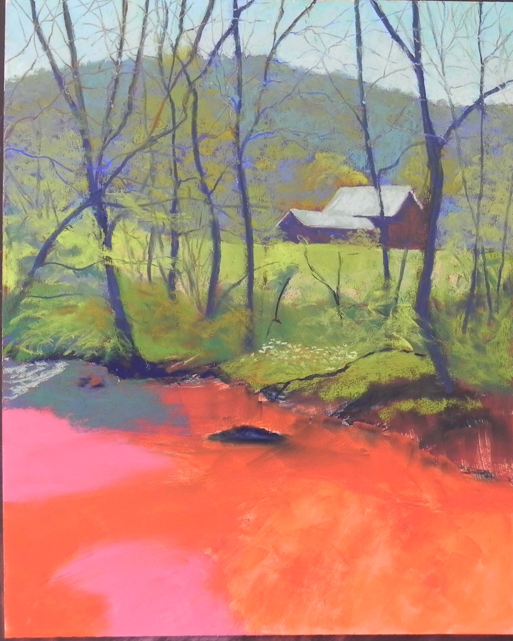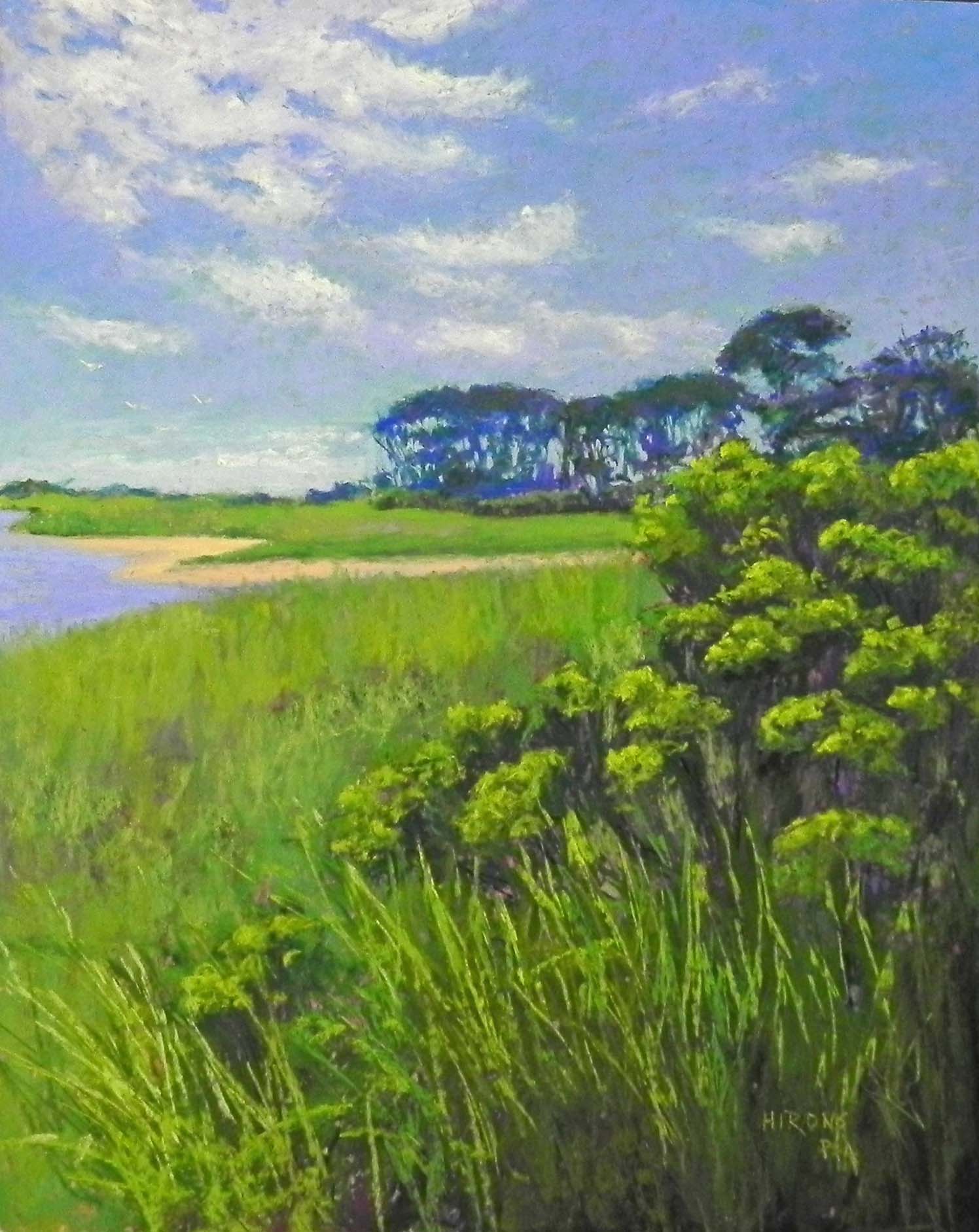
Henlopen Light, 20 x 16, white pastel premiere
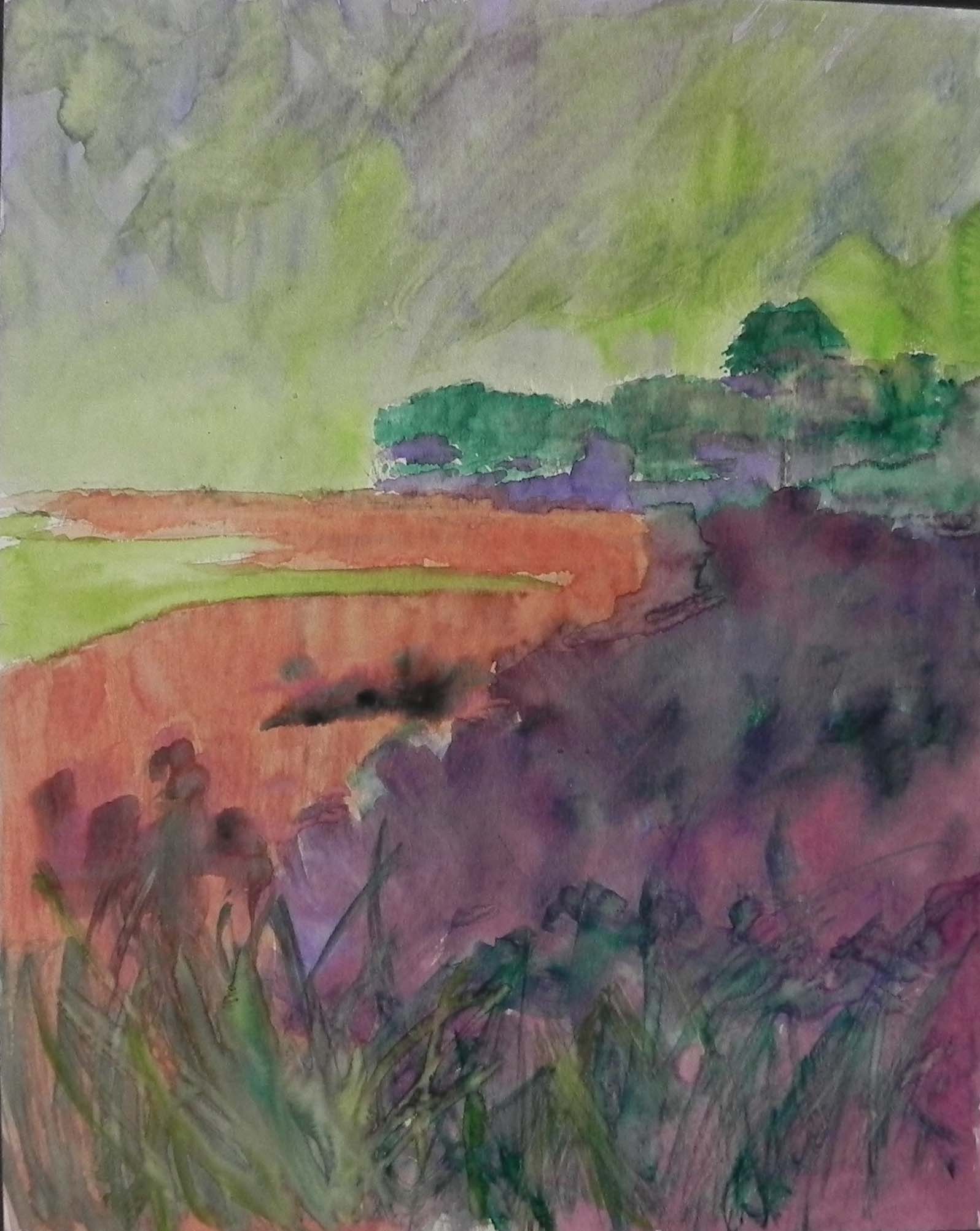
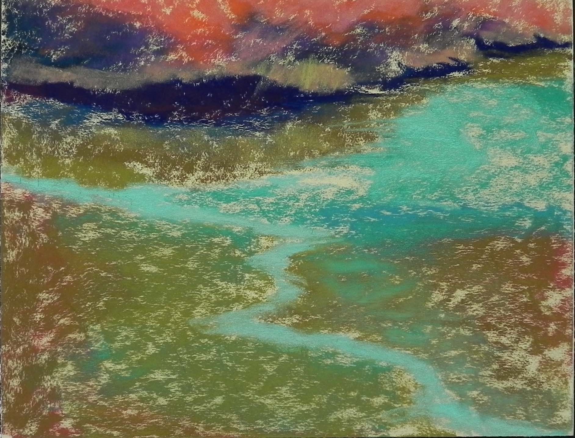
Watercolor underpainting
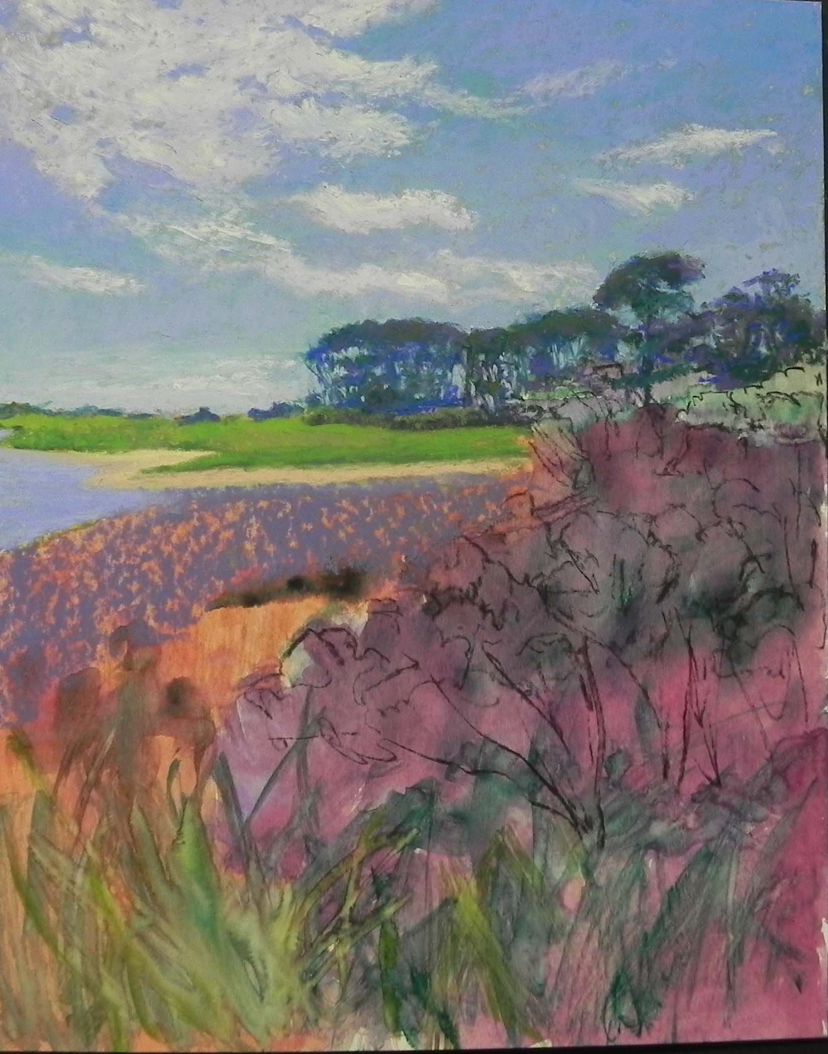
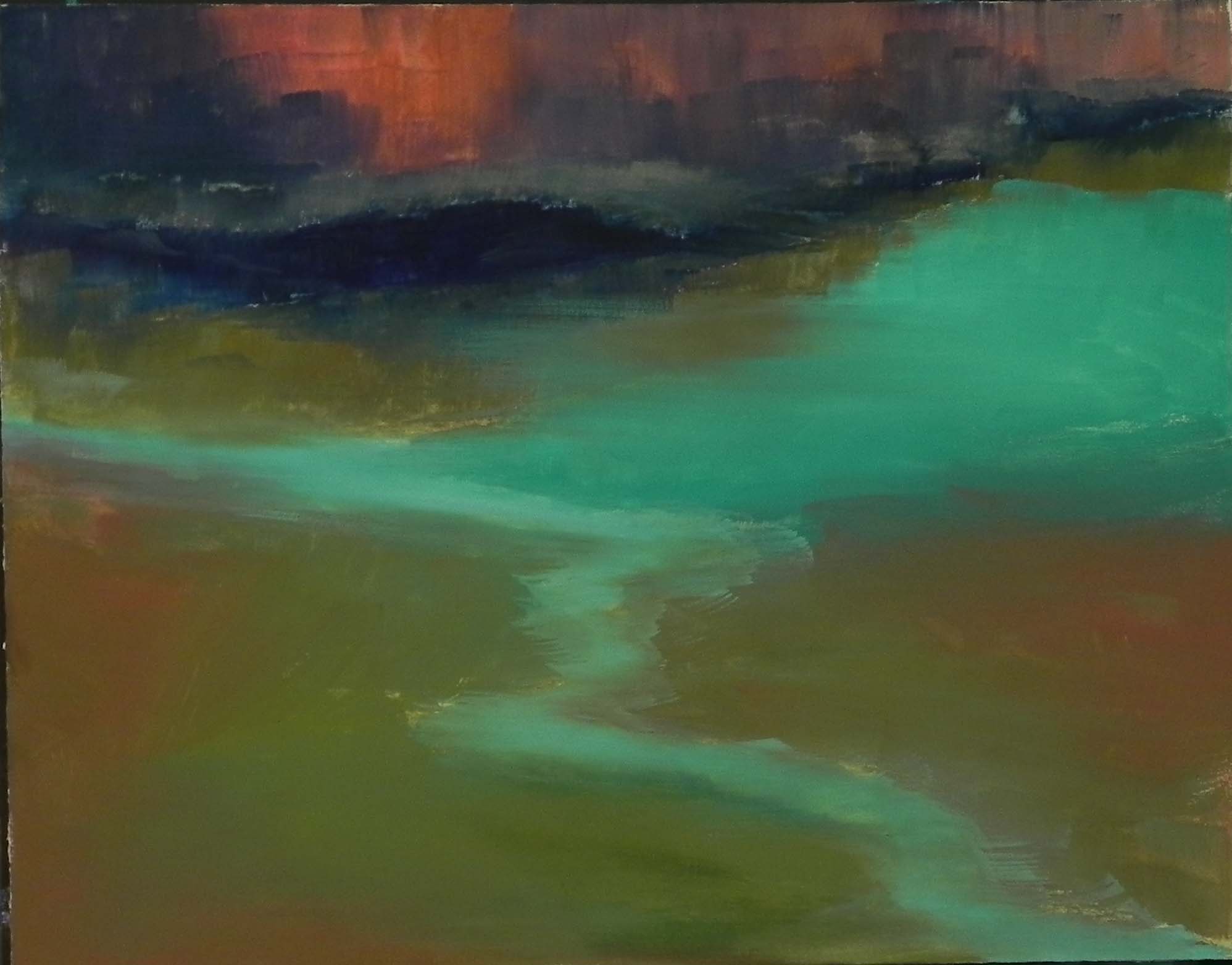
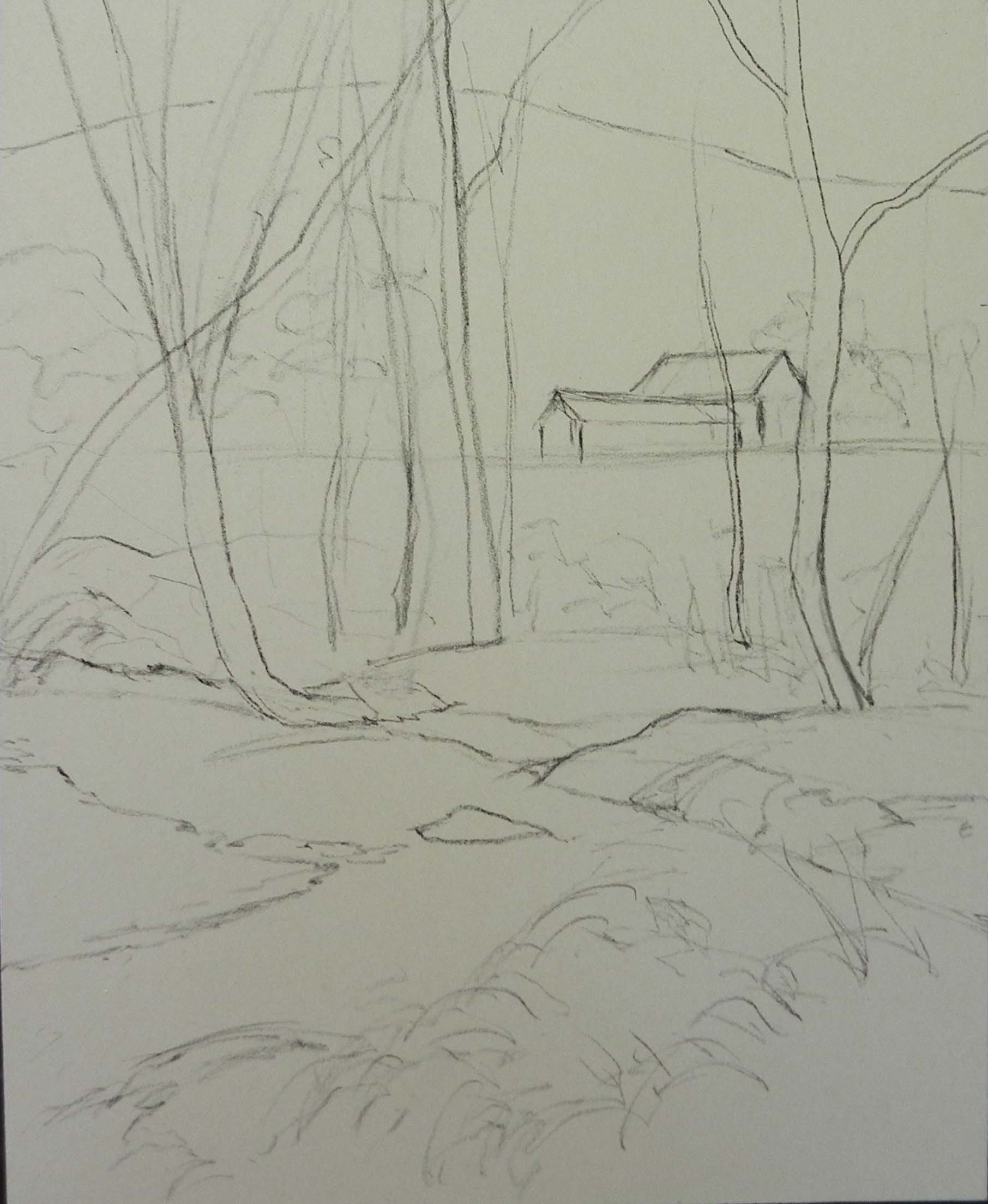
Charcoal added over watercolor
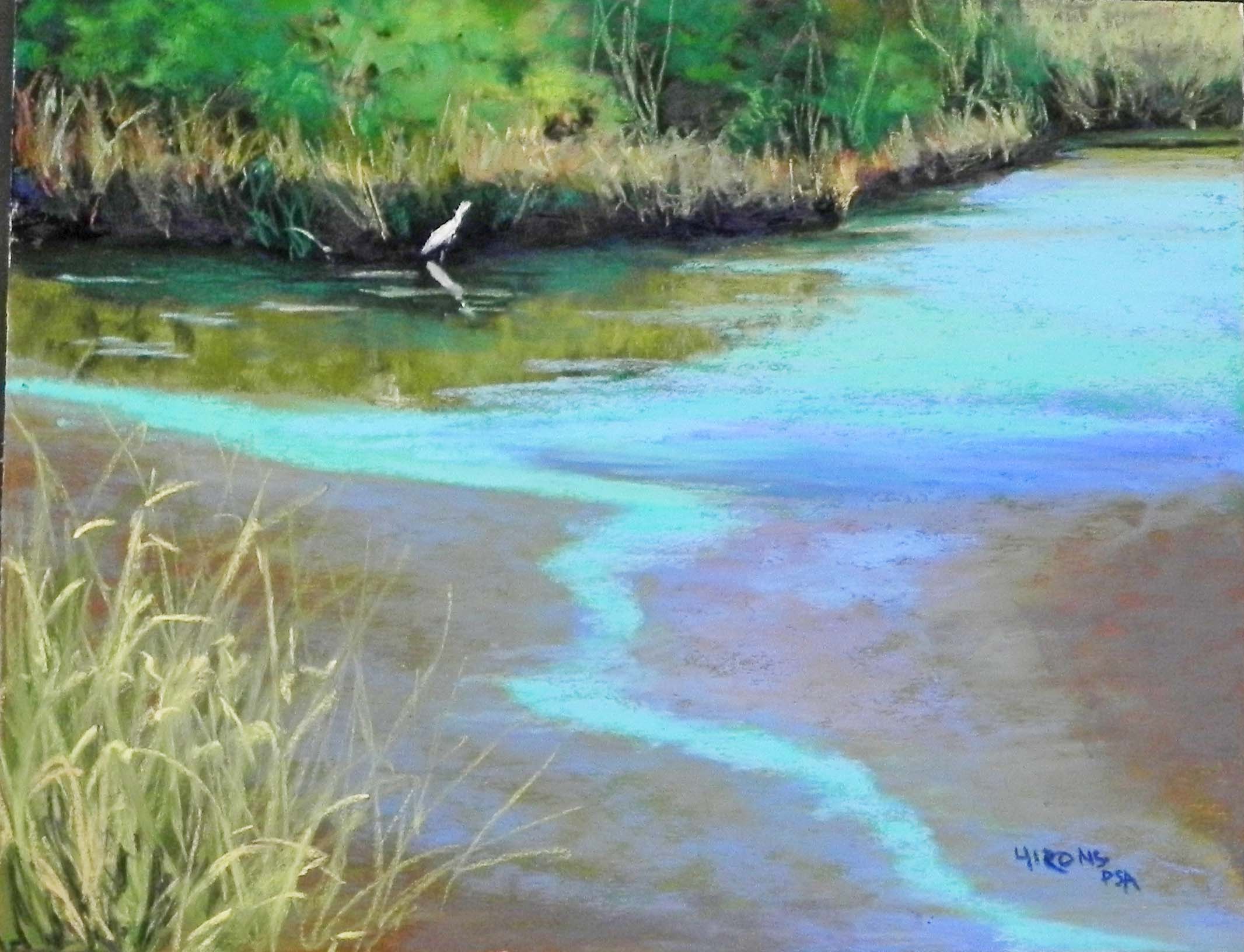
For my second painting, I wanted to capture the light of the late afternoon sun on the grasses in Cape Henlopen on the walk to Gordon’s Pond. It was quite spectactular. But I couldn’t find any one photo that had enough compositional interest to it. I finally found one with distant pine trees and bayberry bushes in the foreground and used another for the grasses.
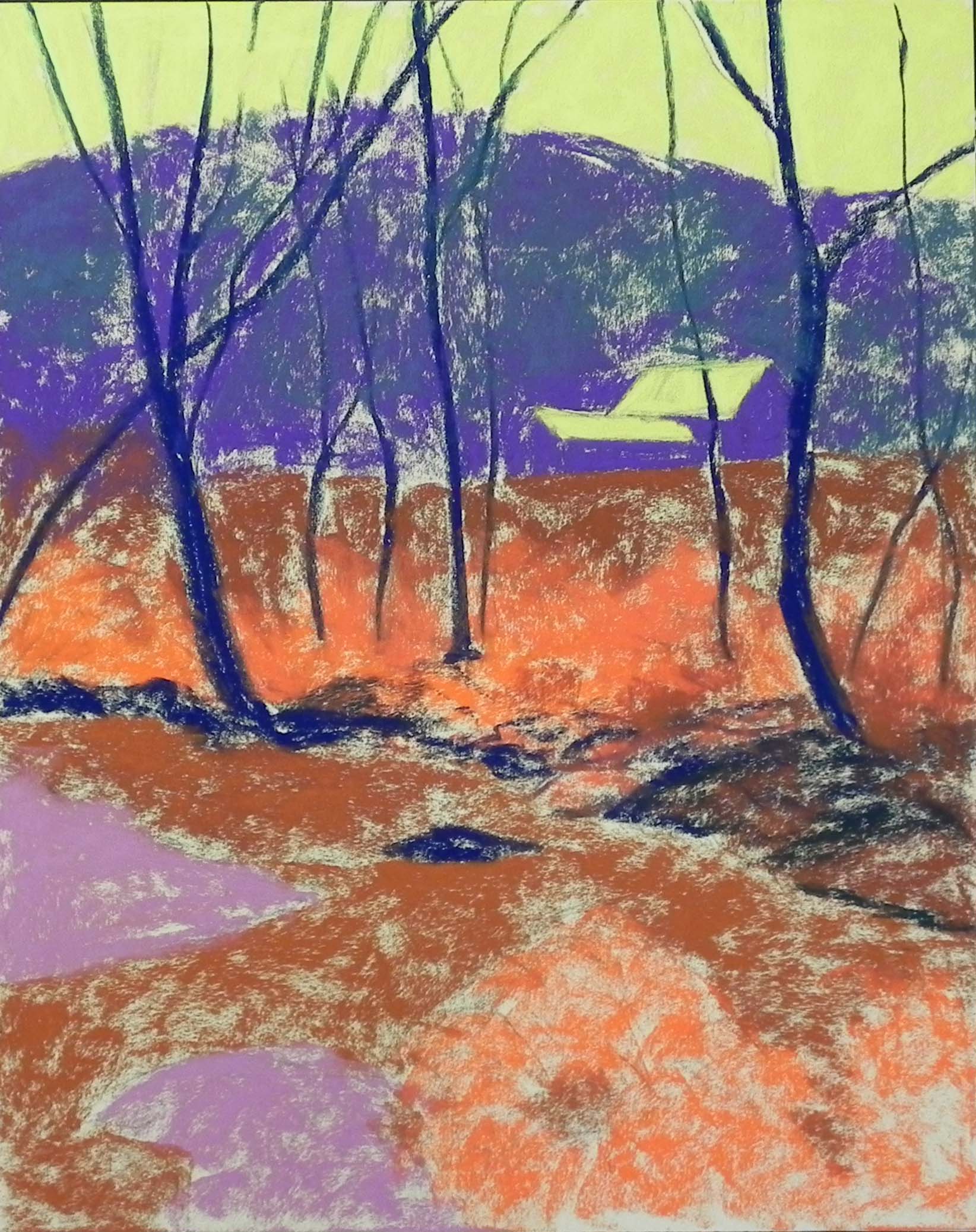
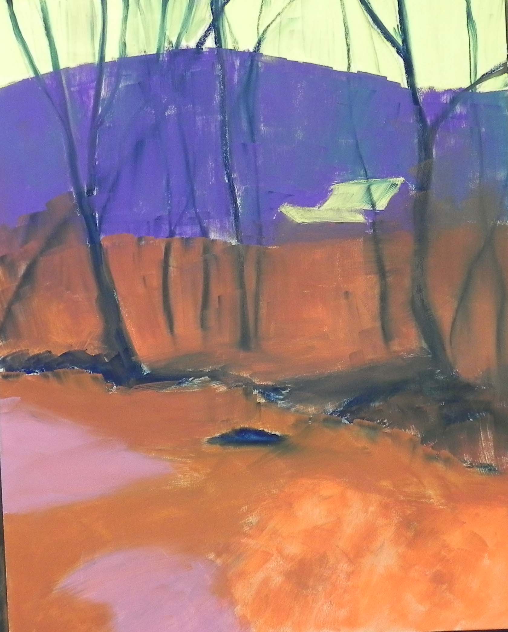
The more difficult part turned out to be the surface. I used mounted white Pastel Premiere and the tooth was really weird. I used a watercolor underpainting, which went on typically too light. But then when I started with pastel in the clouds and sky, the surface turned out to be all “pock-marked” and left little holes everywhere. It wasnt what I remember this surface being like at all! I really loved it when I did a painting in March. I’m wondering if its the wrong grit? Maybe the 600 instead of the gritty 320-400. Anyway, it was a big disappointment.
The underpainting wasn’t very good, but putting the cool red under the bayberry bushes was good. The sky and clouds were kind of a nightmare due to the surface. I should have put on one coat of pastel and used my fingers to get rid of the holes but didn’t. And I wasn’t sure what color to make the sky. I didn’t want it to be too green. So I started with a real blue Beacon then added several values of Ludwig violet on over it, along with a little turquise. As I was working, I realized that — of course, red violet is the complement of yellow green and it’s the color I needed to set off the greens. That was a happy moment! I added some red violet onto the tops of the trees and used it, along with green in the dark areas under the bushes and grasses.
As you can see, I used a lot of violets in various places, beginning the grassy background with violet, adding greens, then some darker pieces of violet to indicate plant life. For the greens, I got out my new box of Blue Earth “earth green” and had a great time building up the colors. Used these on their sides for the foreground grasses as well.
The clouds were a real problem. Due to the problems with the surface, I covered up too much sky to begin with, lost the blues in between, etc. I went back and reworked them to put in more sky holes and make sure they didn’t all end in the same place. One thing that was nice was adding some light red violet Girault on top of the warmer colors. It gave the feeling of light peaking through the clouds.
I think I captured the way it felt to be there. And I painted it on a very cold, rainy day so I was thinking back fondly! But now the sun has returned for Memorial Day. Meanwhile, the cicadas are singing up a storm! It’s a time of renewed promise and joy. I hope you are enjoying the day and our new-found freedom!