
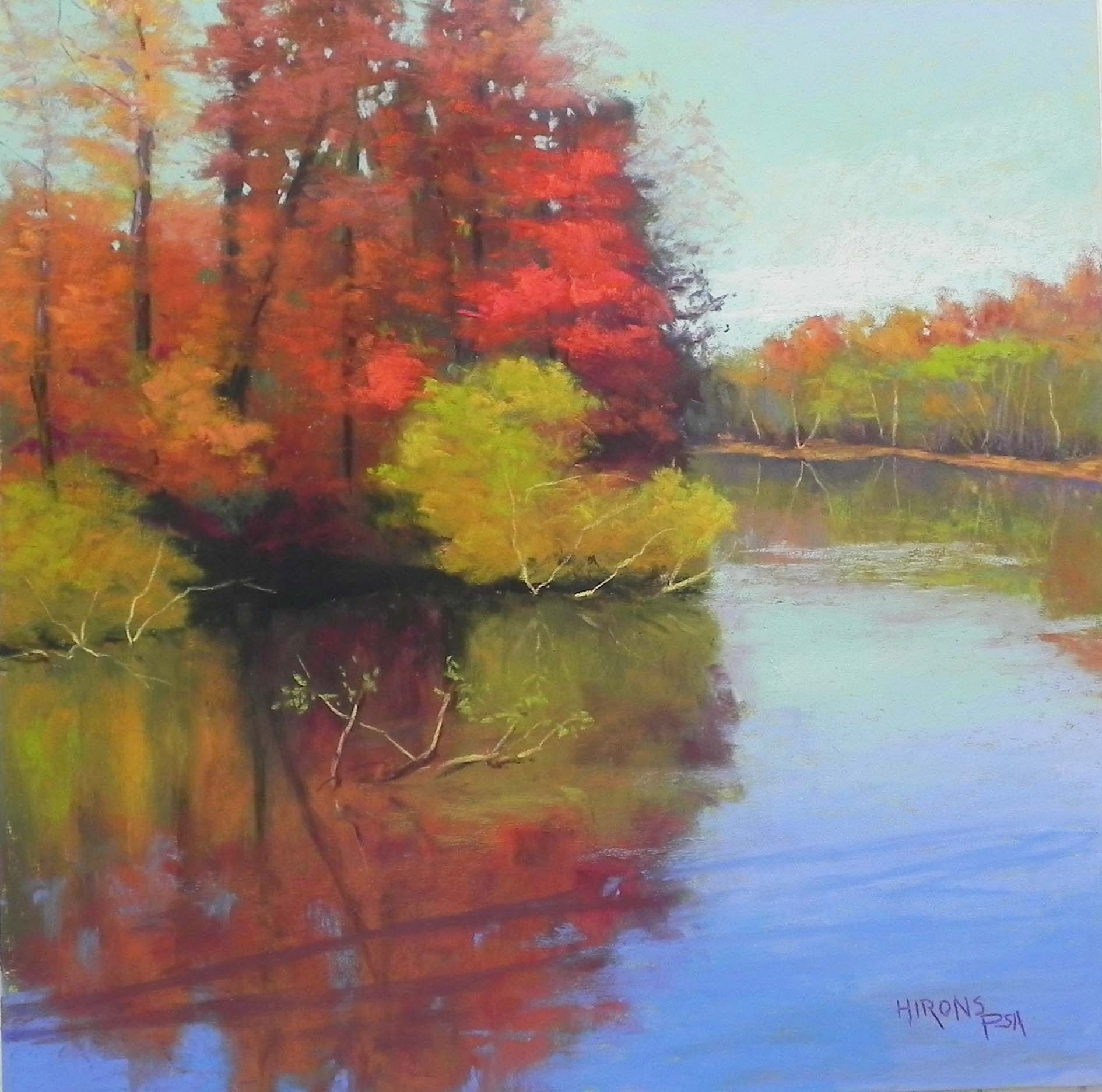
Autumn Valentine 20 x 20, UART 320
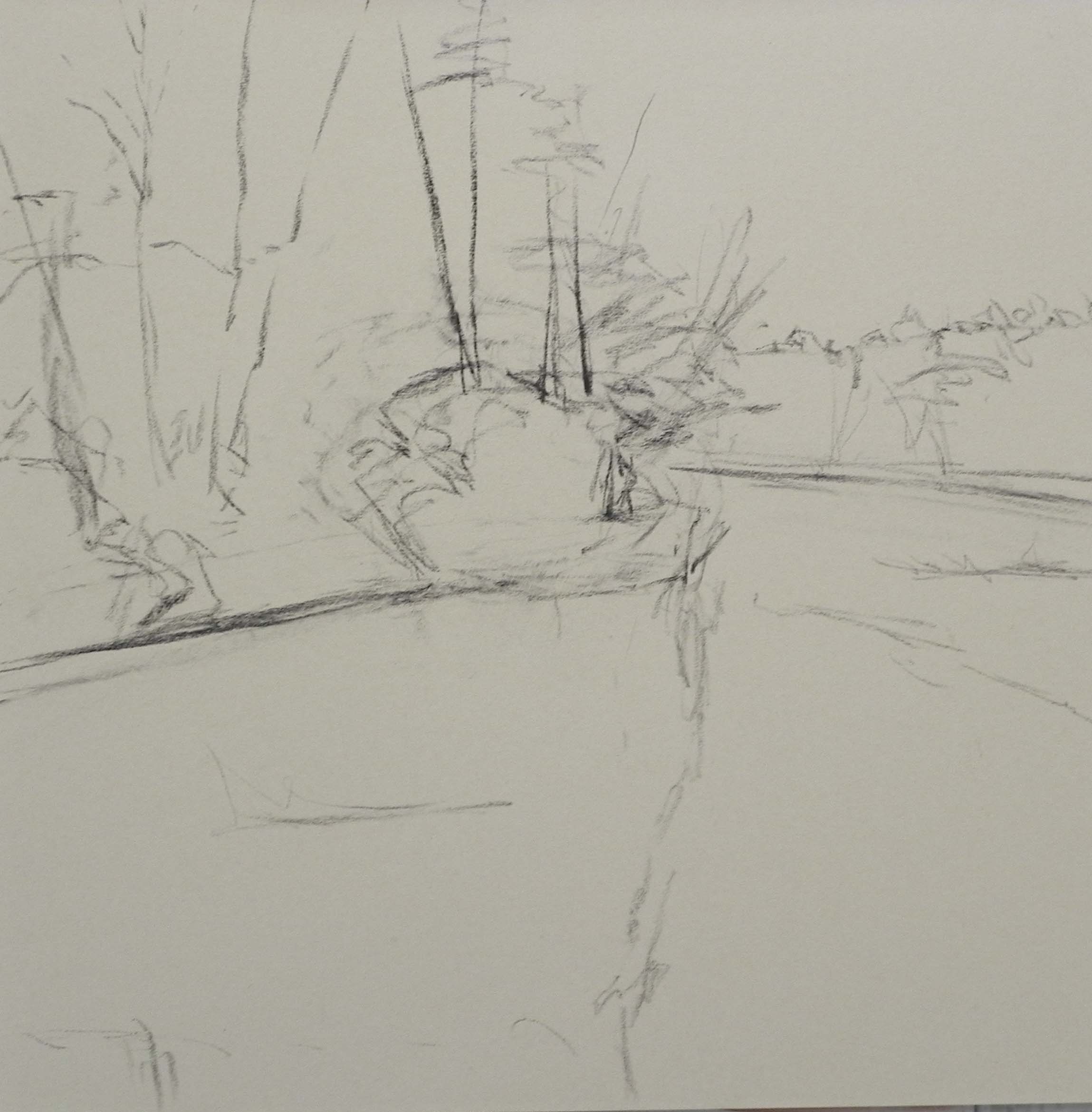
Initial drawing on the board
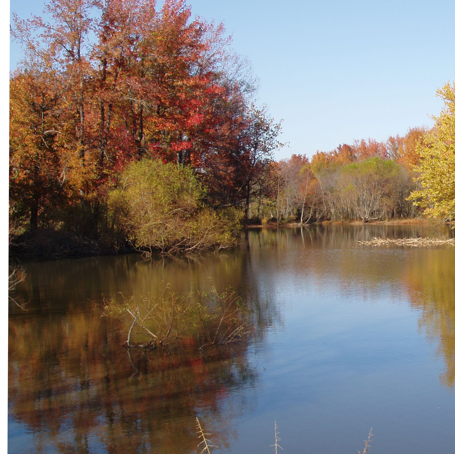
Reference photo
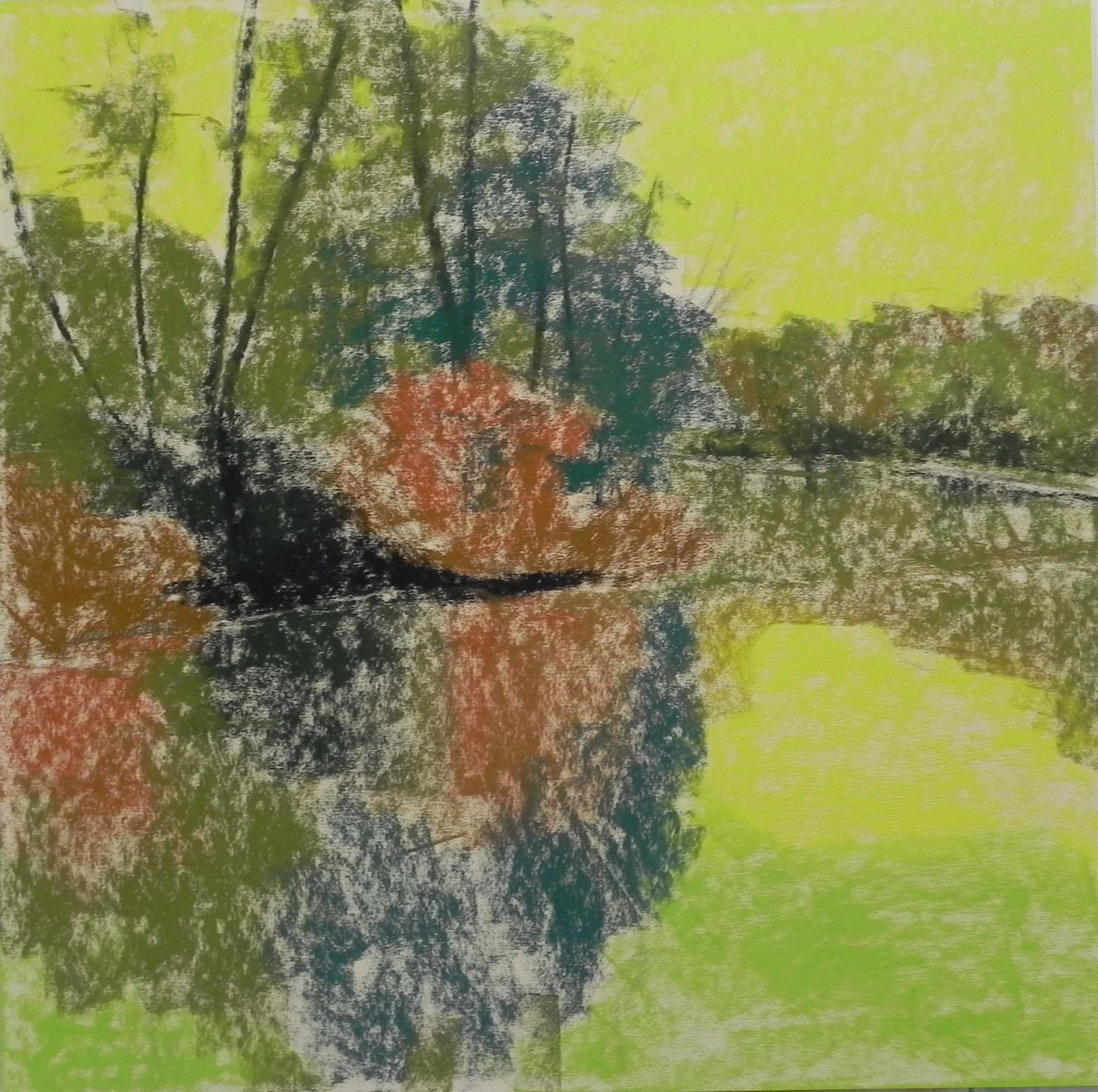
Underpainting, stage 1
Underpainting with Gamsol
I spent what will probably be my last painting day in my current studio with four dear friends, all painting in pastel. The painting is a fall painting that I’m going to put in a 20 x 20 gold leaf frame that I spent a fortune on back in 2013. I wanted to do a fall painting to put in it. And this experience will also help me with my upcoming demo at the Rockville Art League on Oct. 3rd, which will be a 20 x 16 from the same area and time. The river or pond is in Maryland somewhere near Blackwater National Wildlife Refuge. I took the picture a long time ago.
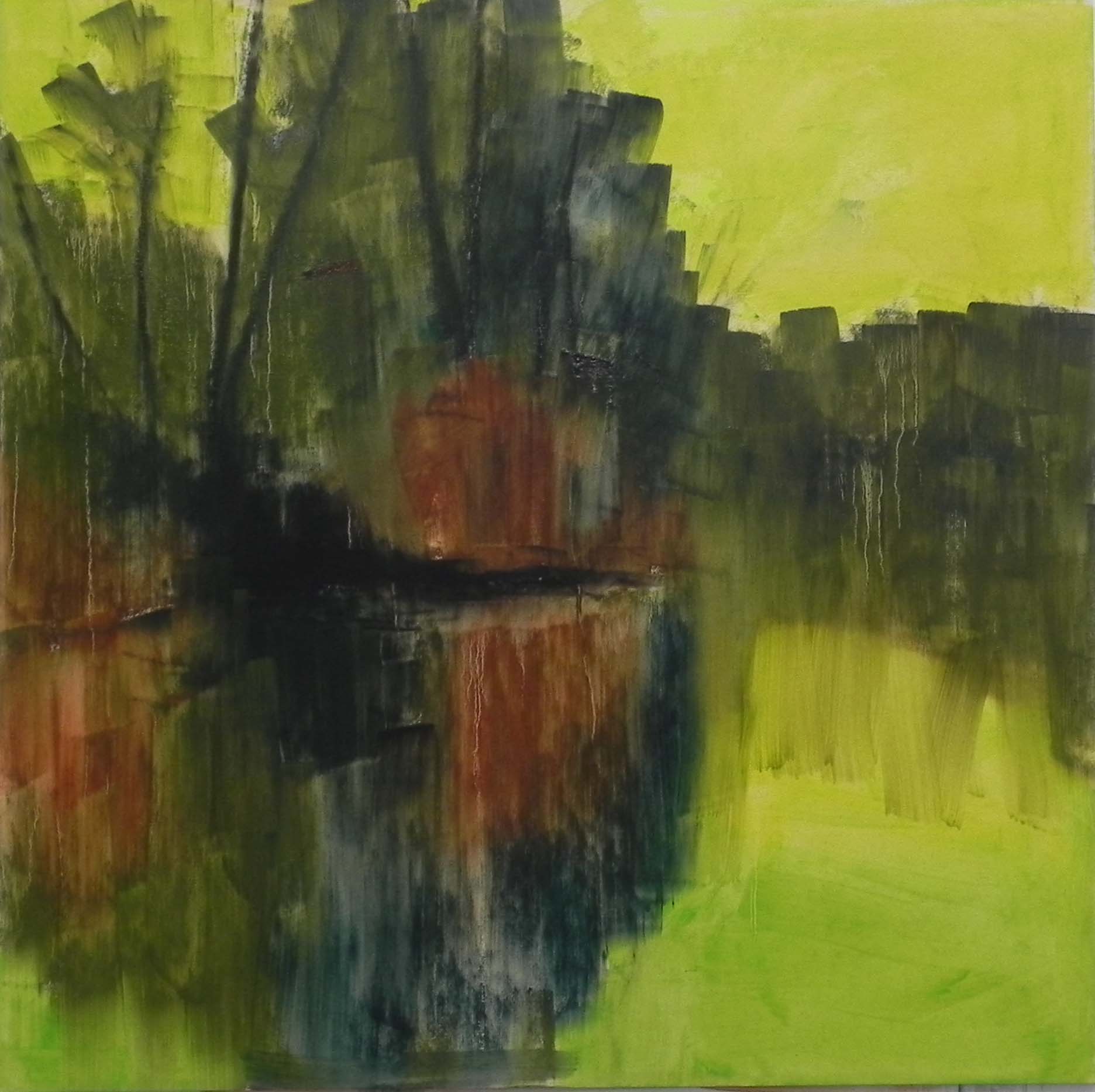
I don’t always like painting out of season, but after all the greens of my last painting, this one was fun! I’m including the reference photo so you can see what it looked like. I was concerned about the composition–breaking the picture in half both ways! I tried to give more of an angle to the base of the trees and I added a second green bush to cut down the area of dark. I also moved the overall shape of the trees to the right so it wouldn’t cut the painting in half from top to bottom. The drawing shows this, I think.
For the underpainting, I kept it pretty simple–a truly big shape underpainting! I used yellow greens and a darker green for sky and water then greens and browns for under the trees and reflections. This is my standard approach to fall. You have to do something to keep the reds and oranges from being overwhelming. I used a mid-toned warm green and a darker cool green, which helped differentiate the masses. I decided to use Gamsol again, simply because it’s still on my cart in the studio. Found I needed to use the hair dryer however to get it dry!
I used Giraults and some Henri Roches to begin with and found they layered beautifully on the surface, with lots of room to add more. For the brighter reds on the right, I used Schminckes and kept it to a fairly simple shape so as to have an impact.
The sky began as all aquas but I added some blue at the top and went to darker true blues in the water. The sprig of sticks coming up through the water was right below the greenish bush in the photo. I decided to keep it but moved it more to the left for balance. I eliminated a large yellow tree on the right and just went with the background trees. The last thing I did was to add the shadow of a tree to the bottom of the picture. I really liked the diagonal lines and the way these broke up the large shape of reflection and tied the reflections to the water.
So a productive and happy day, but sad to say goodbye to my space. In Sept. (I hope) we’ll be moving to a new cleaner building, closer to my home. All the artists will be on one floor and there is a lovely large, sunlit classroom. So it’s a real plus for us. But my studio there will be smaller. Sigh!
Meanwhile, John and I will be taking off on Thursday for a Viking cruise to the Baltic Sea, Oslo to Stockholm with stops in Copenhagen, Germany, Poland, Tallinn (Estonia), St. Petersburg, and Helsinki! Something different!!! Hope you all have a good month of August.