Morning Light, Porto

Morning Light, Porto, 20" x 16", UART 400

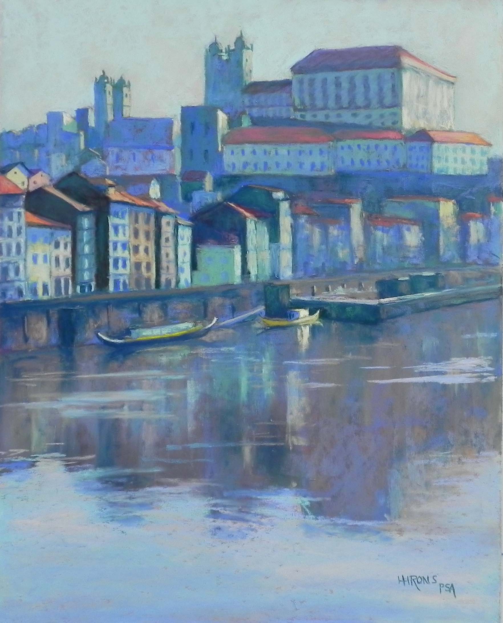
Morning Light, Porto, 20″ x 16″, UART 400
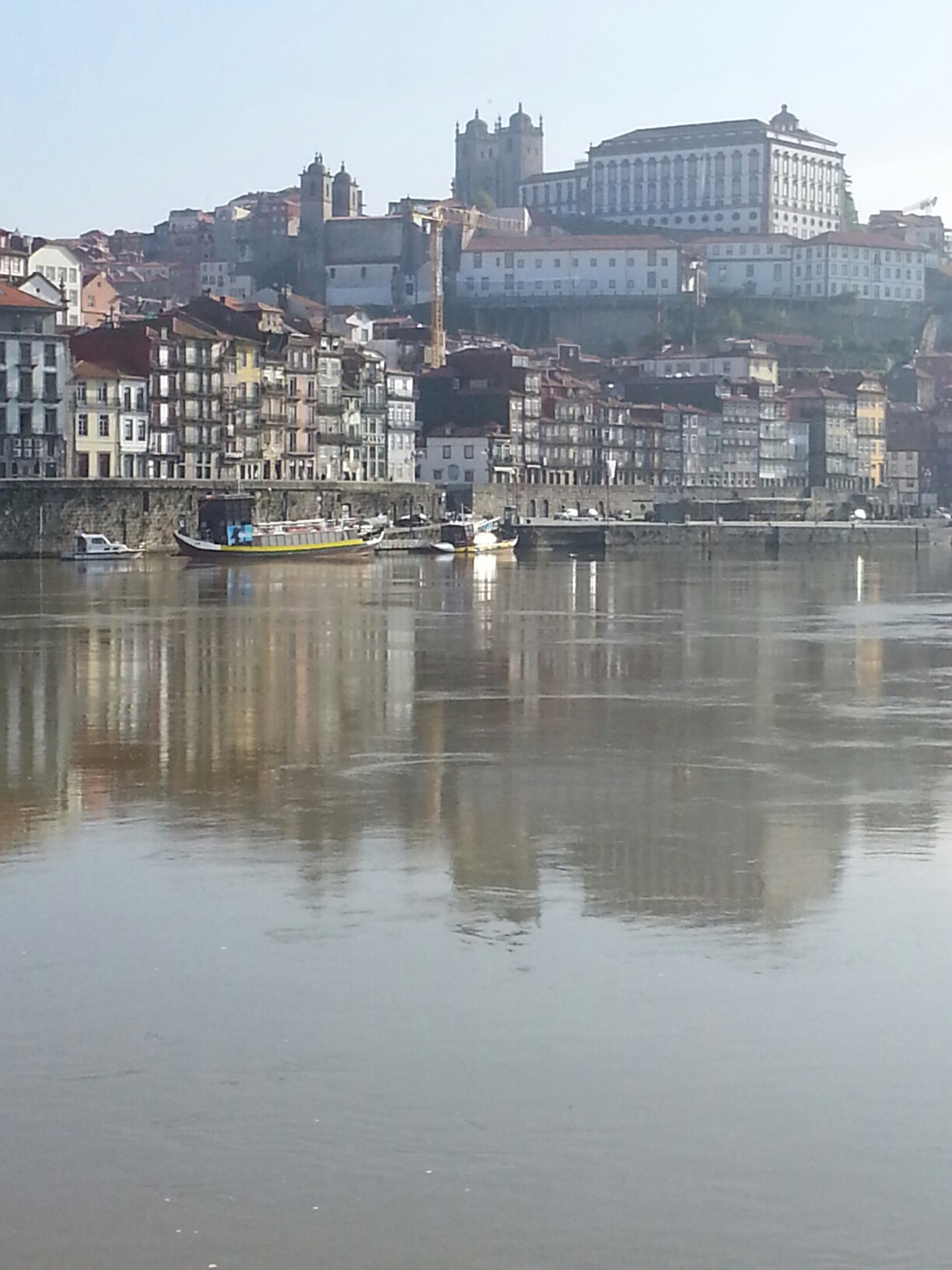
Reference photo

Reference photo

I began this painting a couple weeks ago and just finished it today. I kept seeing more things I wanted to change!  Now, I’m finally happy with it.  I don’t seem to have a picture of the underpainting, so I’ll include the reference photo and final painting.  I made two significant changes to the original photo.  First, compositionally, I gave the shoreline more of an angle. I wanted to play on the triangles of buildings and reflections.  I also left out a small boat on the left that I didn’t like and did a lot of simplification, particularly in the skyline. I deleted a lot of things at the top of the picture so as to have a clean line of buildings against sky.

The second change, as you can see, is in the color. The photo is gray and brown!  My two least favorite colors.  I decided to work with a split complement of blue greens, blue violets, and warm red oranges in the roofs.  All of it had to be toned down and grayed over, particularly the building at the top.  But I really liked the color combination.  I began the sky with Giraults but when I came in on the second day, I realized that it was too blue violet and dark. So I used one Ludwig aqua and went over the sky, leaving small pieces of warm orangey underpainting showing through.  It felt like the light came on!  I liked the simplicity of it.

The buildings at lower left were a challenge because they were the closest and required some details of windows.  The photo was very complicated, but I tried to indicate windows without too much detail. The buildings past that were a lot easier!  I just used shapes of warm and cool colors to indicate light and shadow.

The water and reflections took some work and I went over it many times.  I really liked the small boat with the light hitting it and decided that that would be the center of interest.  I omitted other small lights to the right of it that would have been a distraction.

Really happy with the way this one came out.

Spring Fields, Douro

Spring Fields, Douro, 16 x 16,  UART 400

Spring Fields, Douro, 16 x 16, UART 400

Reference photo 1

Reference photo 1

Reference photo 2

Reference photo 2

Underpainting, stage 1

Underpainting, stage 1

Underpainting, stage 2

Underpainting, stage 2

I’ve just completed a painting from Portugal on yet another cold, rainy day. For this painting, I decided to use one of my new 16″ x 16″ True Grit pastel panels (all UART 400) that I purchased from French Canvas.  I like these mounted surfaces very much. No buckling!  And interesting sizes as well.  Anyway, I decided to paint a scene of a small red roofed farm building that I filmed from many different angles. I printed four different images and played with them. Decided on two and taped them next to my board.

To begin with, I really wasn’t sure what I was going to do with the background (top) or the foreground trees/bushes.  After one sketch, I decided to jump in and see what would develop.  I began the underpainting with color shapes, using a lot of “pastel” colors.  Because these were light, there was a lot of white in them and the resulting underpainting looks rather chalky.  But it was OK for my purposes.

The top of the painting went through several stages. I started it out with blues, thinking of making it into trees, as in photo 2.  But I didn’t like it. I finally decided to enlarge the building to bring it closer and just have more fields in the distance. However, the blue undertones helped it recede.  For the fields, I played with various colors, using pale greens over pink undercolor, and orange over the greens in the upper left field.  I added small trees and gave some patterning to them to make them as interesting as possible, while not too prominent.

The building was a challenge.  The roof was too red. I went back and forth between pink and orange to tone it down. I added lighter, more grayed reds and finally a little light green to gray it a bit. I enlarged it from the original drawing, as you’ll see from the underpainting.  I like the size of it now and its position.

For the foreground, I decided to use olive trees, the white flowering bush in photo 1, and some of the yellow flowers that were spectacularly blooming everywhere. I decided that I really liked using the cool blue greens for the olives, as they complemented the cool red of the roof.  I added some browns to them and finally a few touches of light grayed red.  At the very end, I added a few pink flowers near the white bush to further bring the red forward.

I really enjoyed doing this picture. It reminds me of the Impressionists, of course.  We just don’t see small varied fields like these in the US.  I also really enjoyed using the square format and liked the 16 x 16, not as small as the 12 x 12, but easier than the 20 x 20’s I’ve done in the past.


Magnolia, Kenwood

Magnolia, Kenwood, 20 x 24, pastel premiere white

Magnolia, Kenwood, 20 x 24, pastel premiere white

Hello friends. It’s been awhile since I’ve posted as I was away most of April.  We spent two weeks in Portugal, which was quite lovely and a whole lot drier and sunnier than it is here. We are having an unprecedented period of rain and showers and I pray that it won’t last too much longer!  It’s really affecting my spirits.

Anyway, this picture is in the category of “what was I thinking?”!!!  I took the picture last year in a lovely neighborhood of Bethesda, Kenwood, which is noted for its cherry trees. I liked the idea of painting this magnolia–not a cherry.  I took the picture because I really liked the light hitting the white house in the gap in the tree.  I liked the picture but had decided it would be pretty labor-intensive to do (that was last year!).  This year, I decided to give it a try.

For the underpainting, I used blues in four different values to lay in the tree trunk, house and shape of the blossoms. I wanted to begin fairly cool, to help indicate a sense of shadow.  I began the blossoms with a dark magenta, laying in a general area of them, then added progressively lighter pinks and finally a pinkish white. In the shadowed areas, I added violets to the magentas. I used my lemon yellow AS extra soft tinted white for the house and some of the white blossoms and like the contrast with the cooler pinks.

I made one small change in the composition. In the back left, there was a fence, which I changed into several steps. I thought that would leave the imagination open to wandering beyond, rather than shutting it off with the fence. It’s a small detail, barely seen, but I liked the effect.

Don’t know what I’ll be up to next. Was hoping to get outside but no chance of that just yet.  I hope it’s sunnier where a lot of you are!