
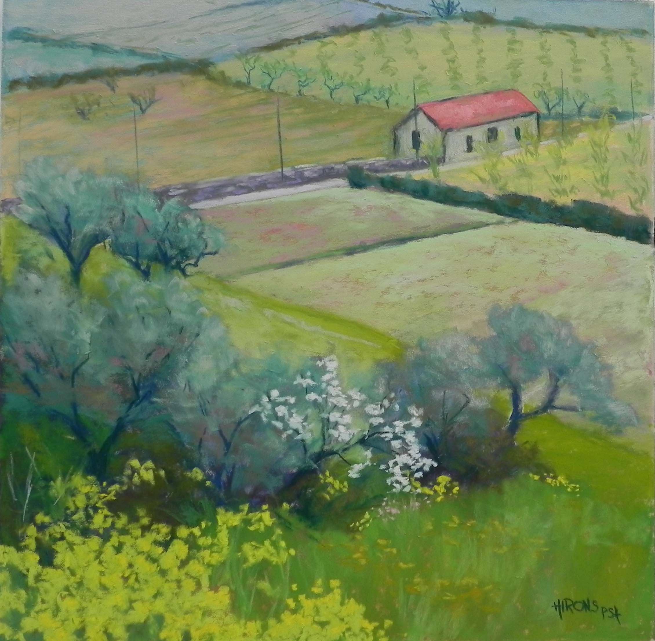
Spring Fields, Douro, 16 x 16, UART 400
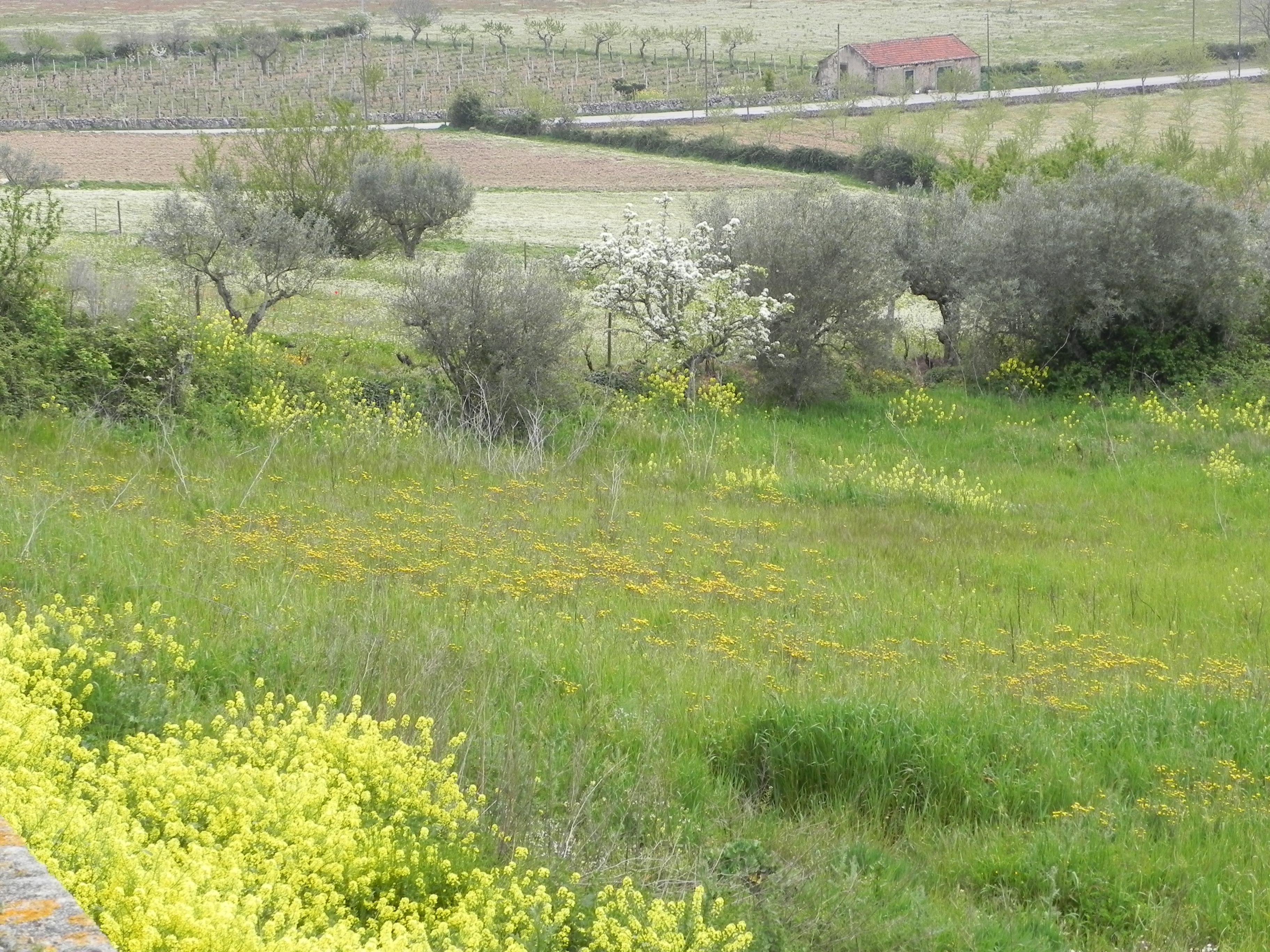
Reference photo 1
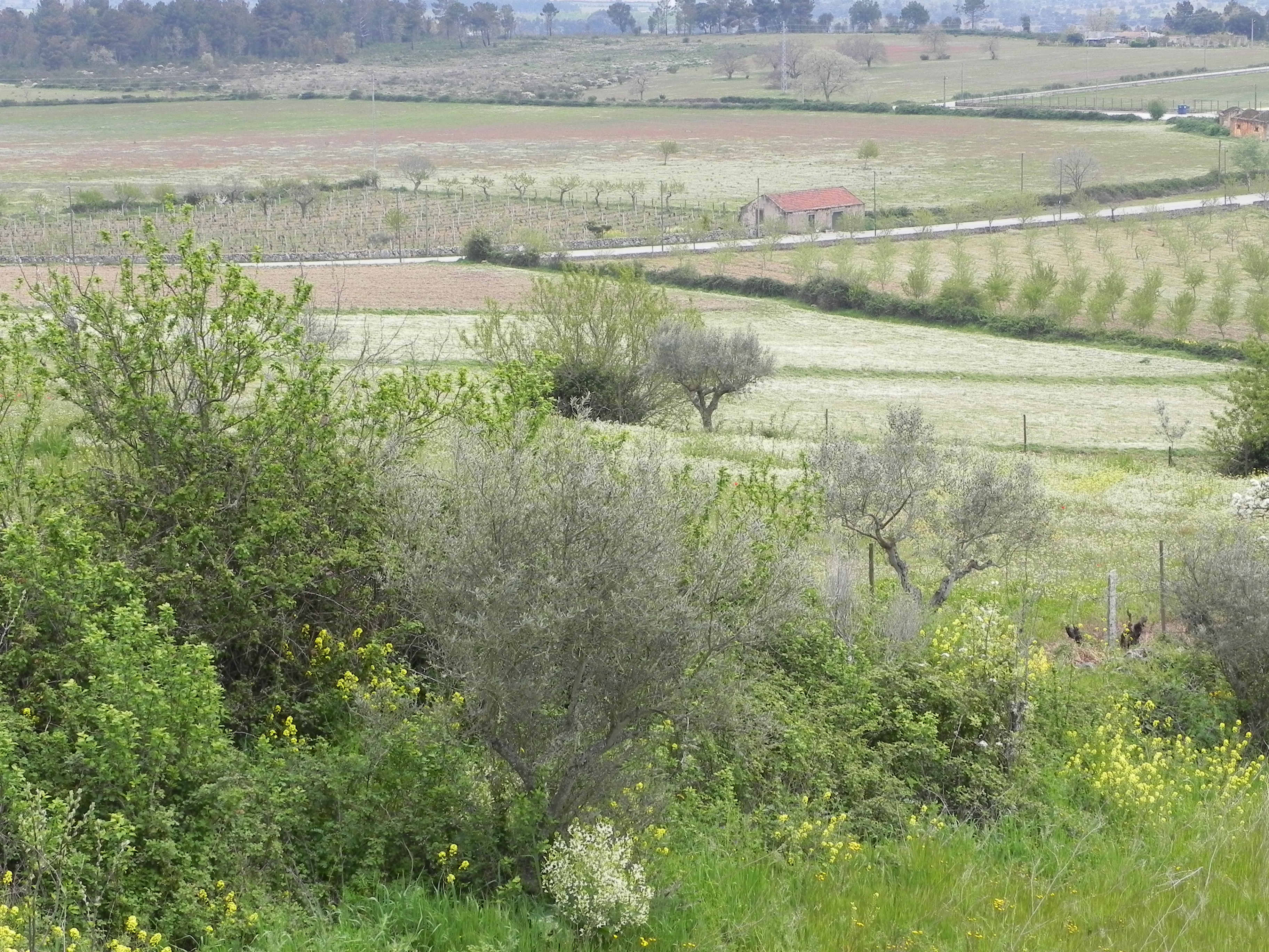
Reference photo 2
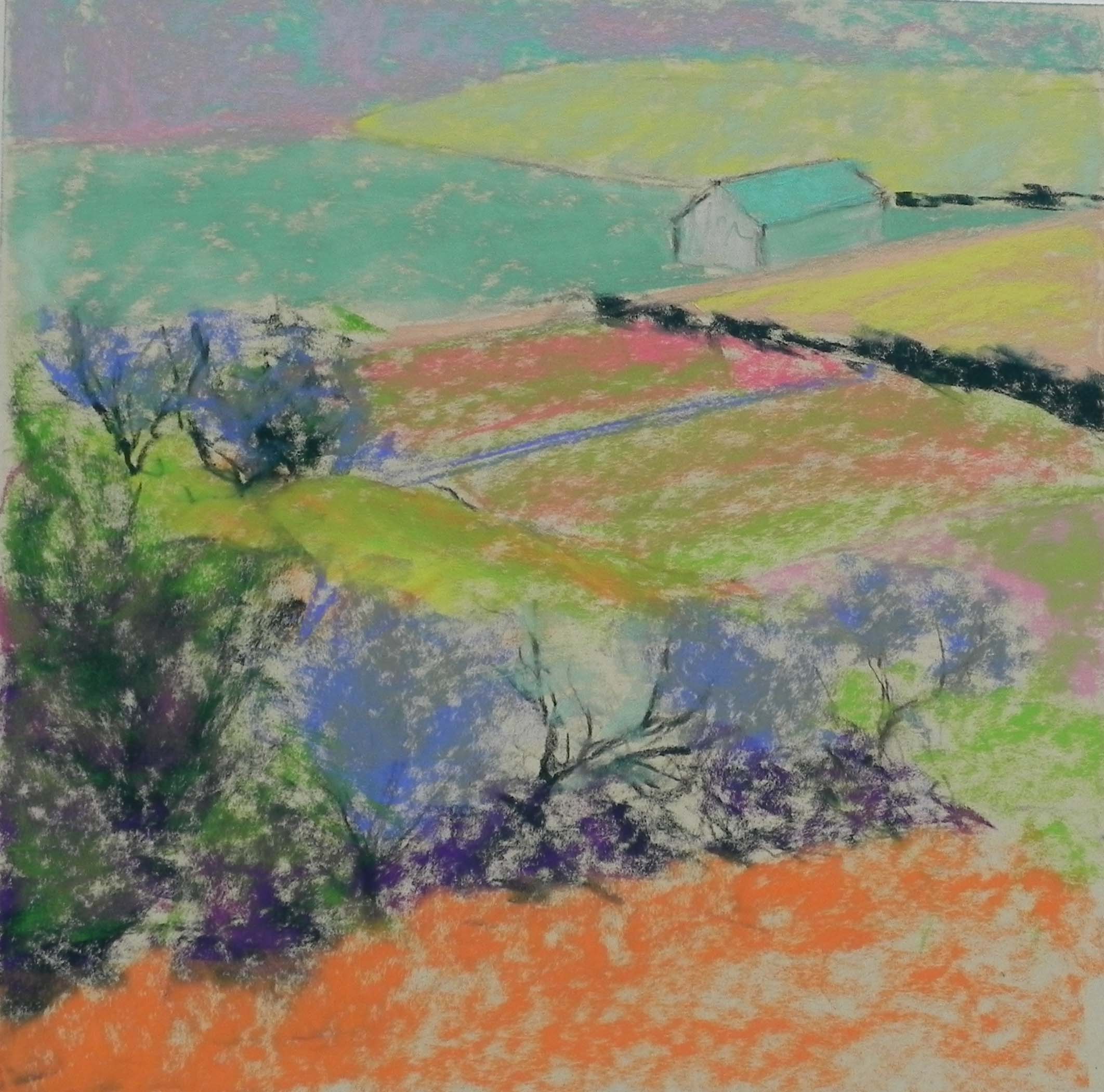
Underpainting, stage 1
Underpainting, stage 2
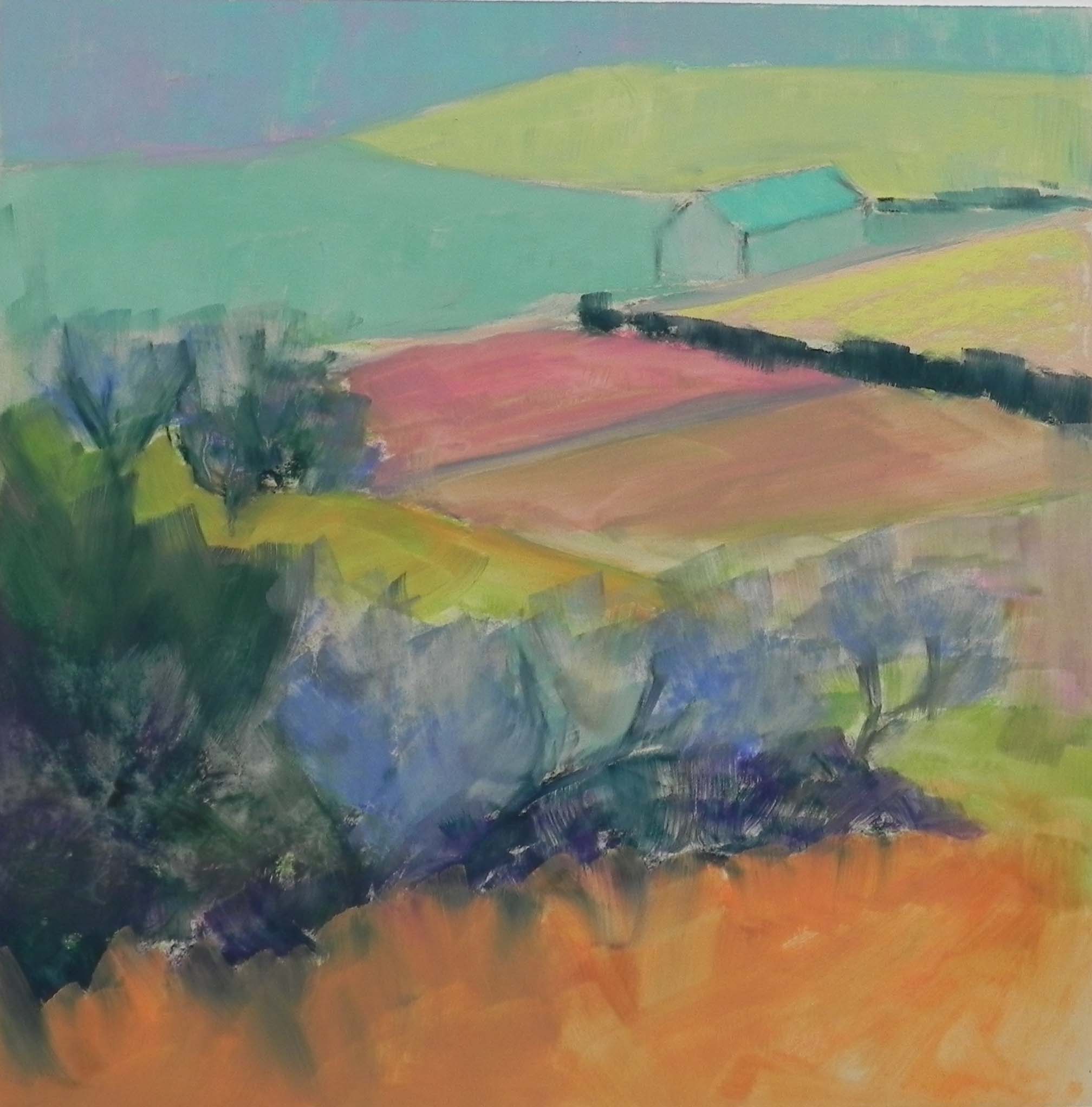
I’ve just completed a painting from Portugal on yet another cold, rainy day. For this painting, I decided to use one of my new 16″ x 16″ True Grit pastel panels (all UART 400) that I purchased from French Canvas. I like these mounted surfaces very much. No buckling! And interesting sizes as well. Anyway, I decided to paint a scene of a small red roofed farm building that I filmed from many different angles. I printed four different images and played with them. Decided on two and taped them next to my board.
To begin with, I really wasn’t sure what I was going to do with the background (top) or the foreground trees/bushes. After one sketch, I decided to jump in and see what would develop. I began the underpainting with color shapes, using a lot of “pastel” colors. Because these were light, there was a lot of white in them and the resulting underpainting looks rather chalky. But it was OK for my purposes.
The top of the painting went through several stages. I started it out with blues, thinking of making it into trees, as in photo 2. But I didn’t like it. I finally decided to enlarge the building to bring it closer and just have more fields in the distance. However, the blue undertones helped it recede. For the fields, I played with various colors, using pale greens over pink undercolor, and orange over the greens in the upper left field. I added small trees and gave some patterning to them to make them as interesting as possible, while not too prominent.
The building was a challenge. The roof was too red. I went back and forth between pink and orange to tone it down. I added lighter, more grayed reds and finally a little light green to gray it a bit. I enlarged it from the original drawing, as you’ll see from the underpainting. I like the size of it now and its position.
For the foreground, I decided to use olive trees, the white flowering bush in photo 1, and some of the yellow flowers that were spectacularly blooming everywhere. I decided that I really liked using the cool blue greens for the olives, as they complemented the cool red of the roof. I added some browns to them and finally a few touches of light grayed red. At the very end, I added a few pink flowers near the white bush to further bring the red forward.
I really enjoyed doing this picture. It reminds me of the Impressionists, of course. We just don’t see small varied fields like these in the US. I also really enjoyed using the square format and liked the 16 x 16, not as small as the 12 x 12, but easier than the 20 x 20’s I’ve done in the past.