Hello Friends
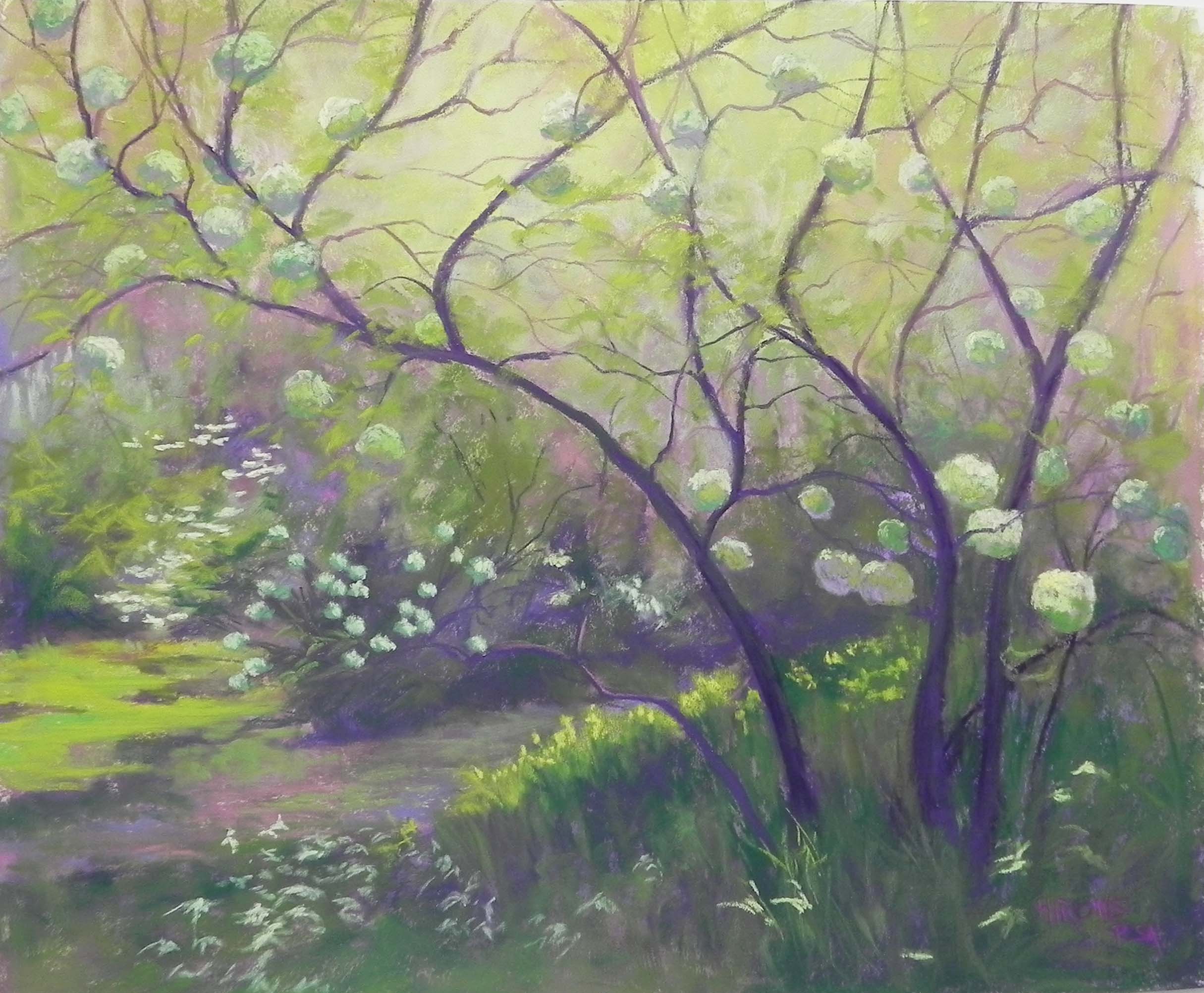
Snowball Vibernum, McCrillis Gardens 20″ x 26″, Pastel Premiere white (unmounted)
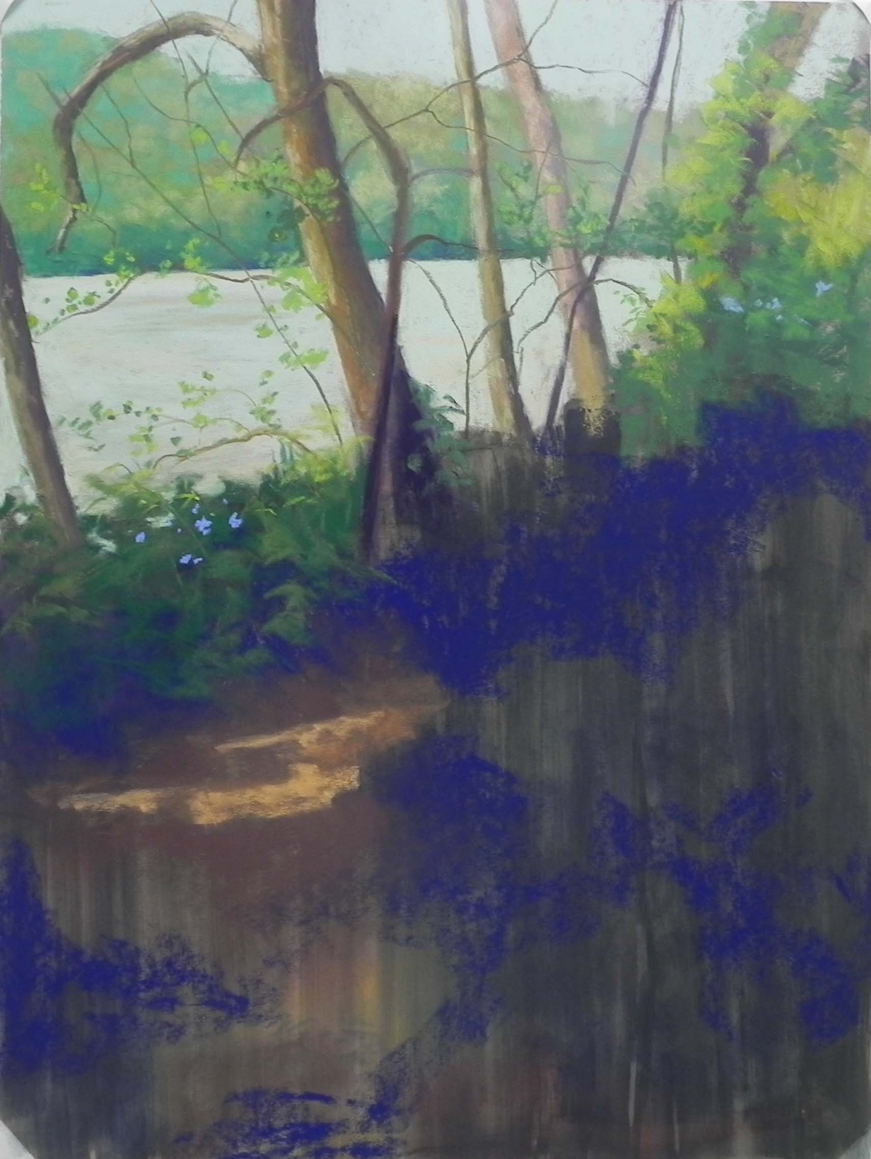
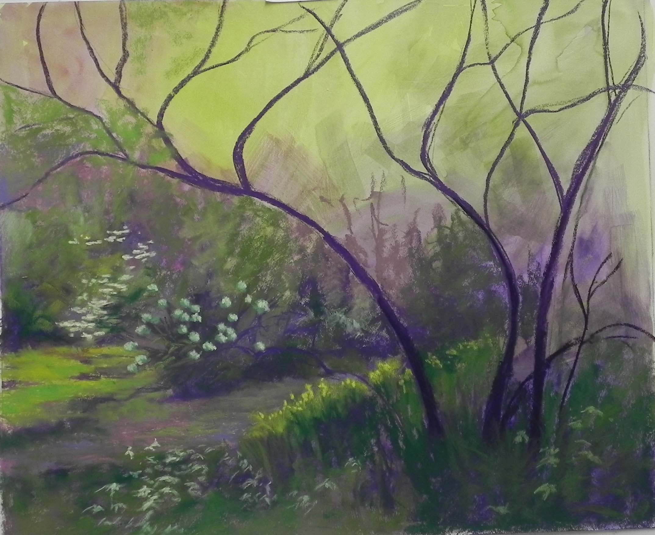
Reference photo (untouched)
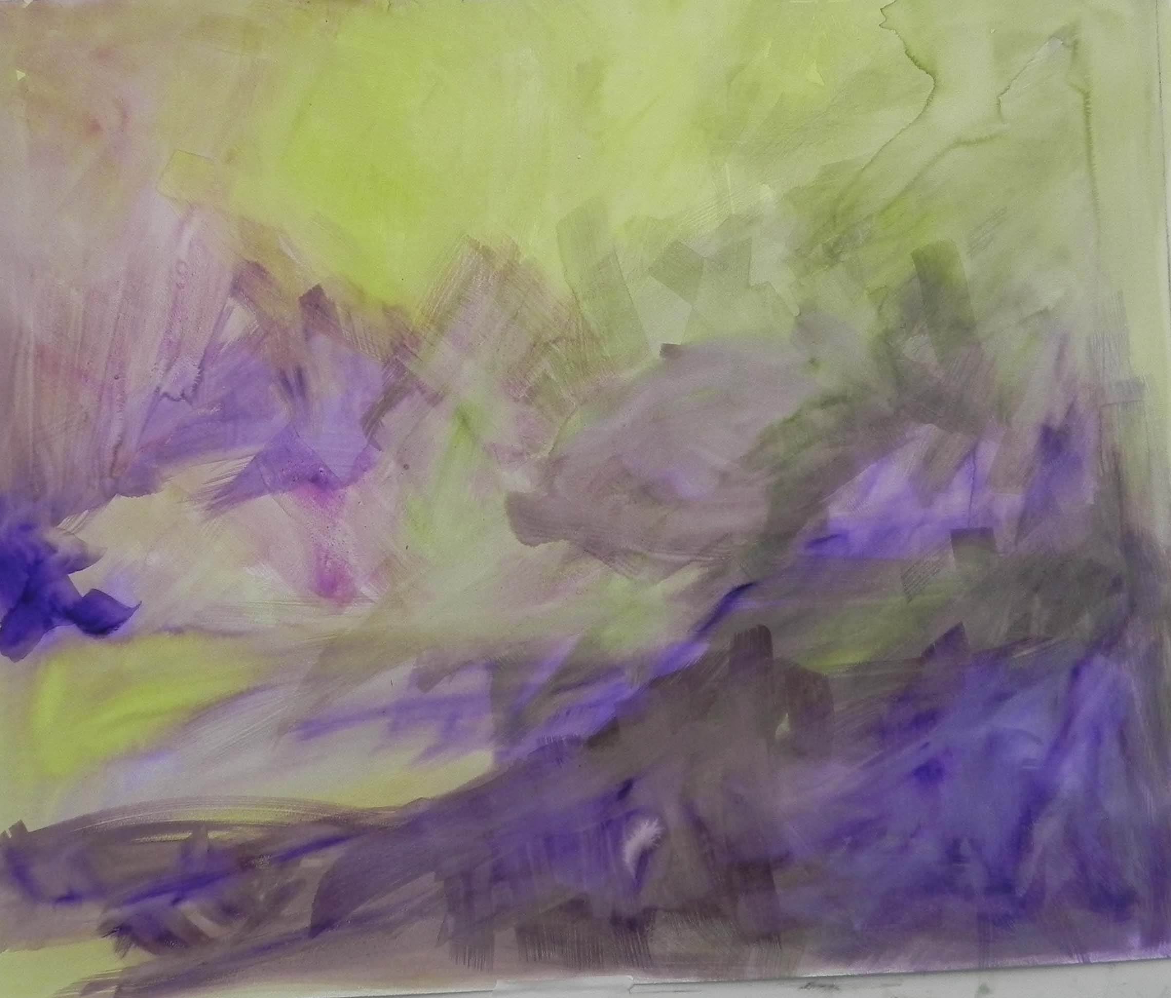
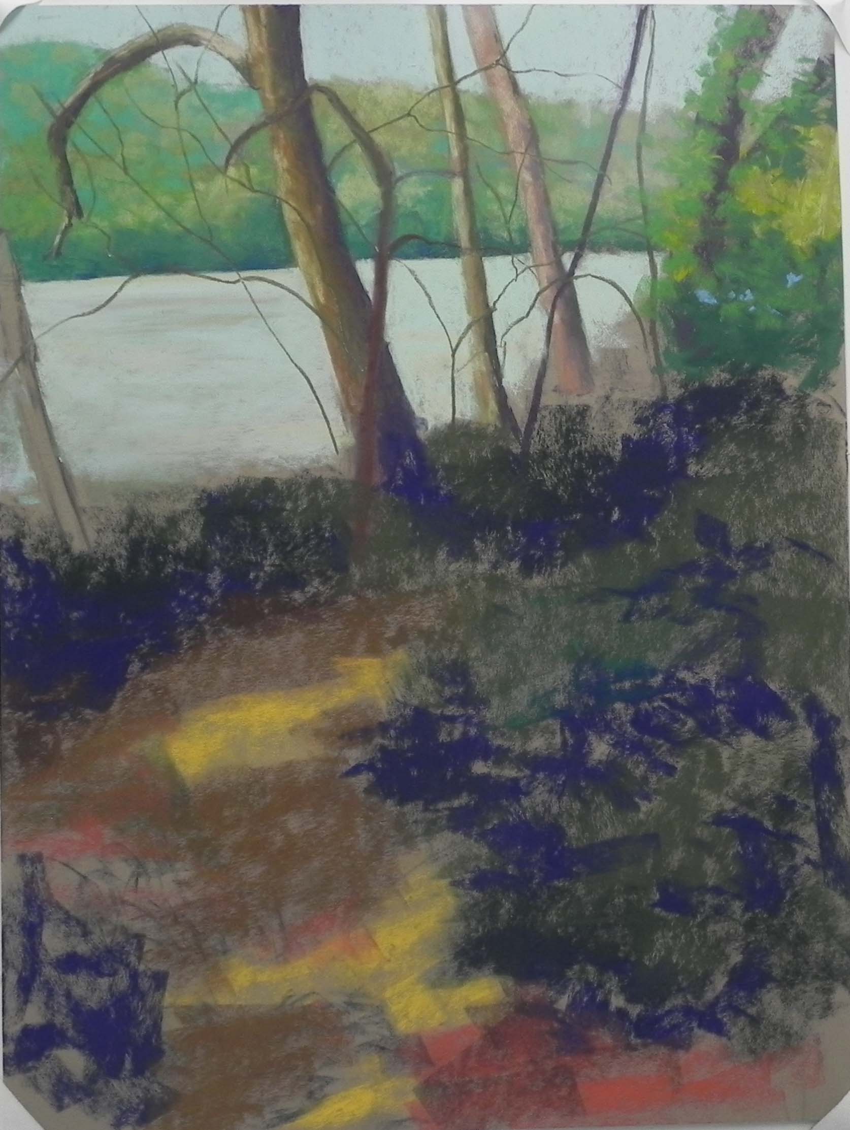
Watercolor wash added to paper
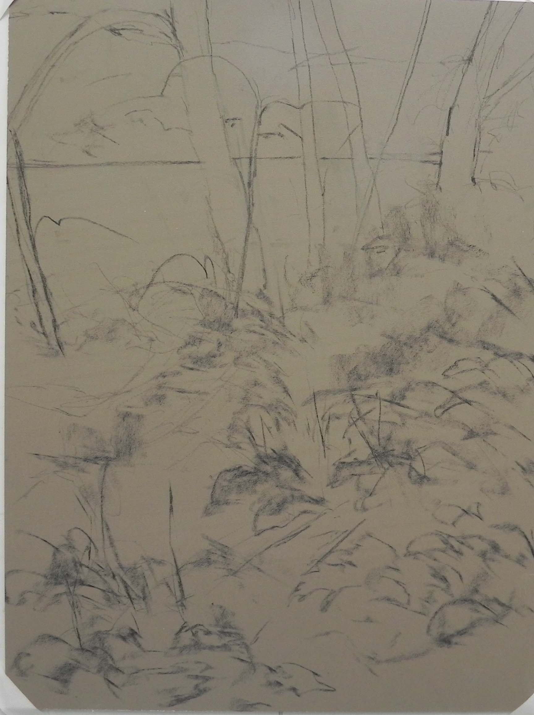
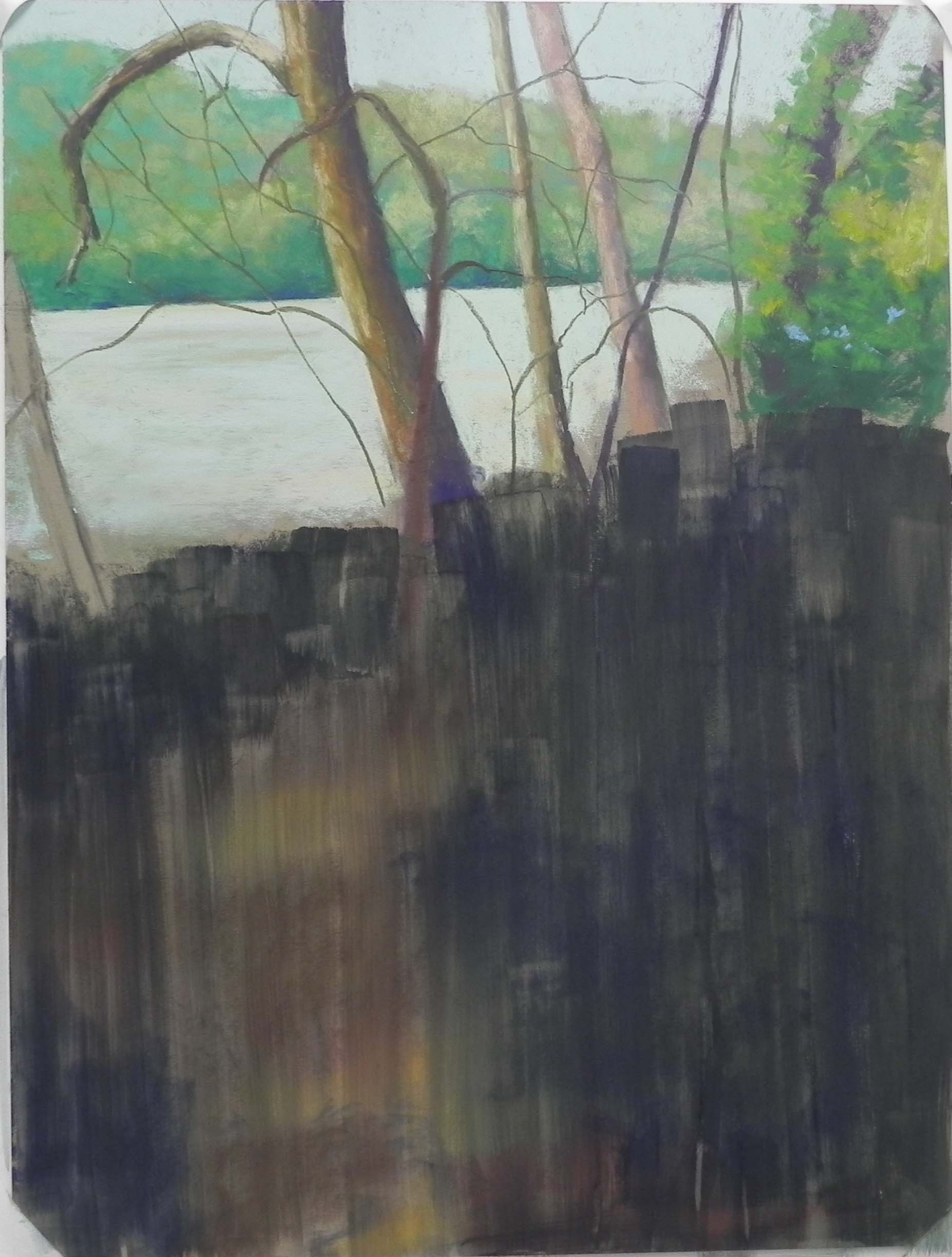
Before adding the flowers and additional stems
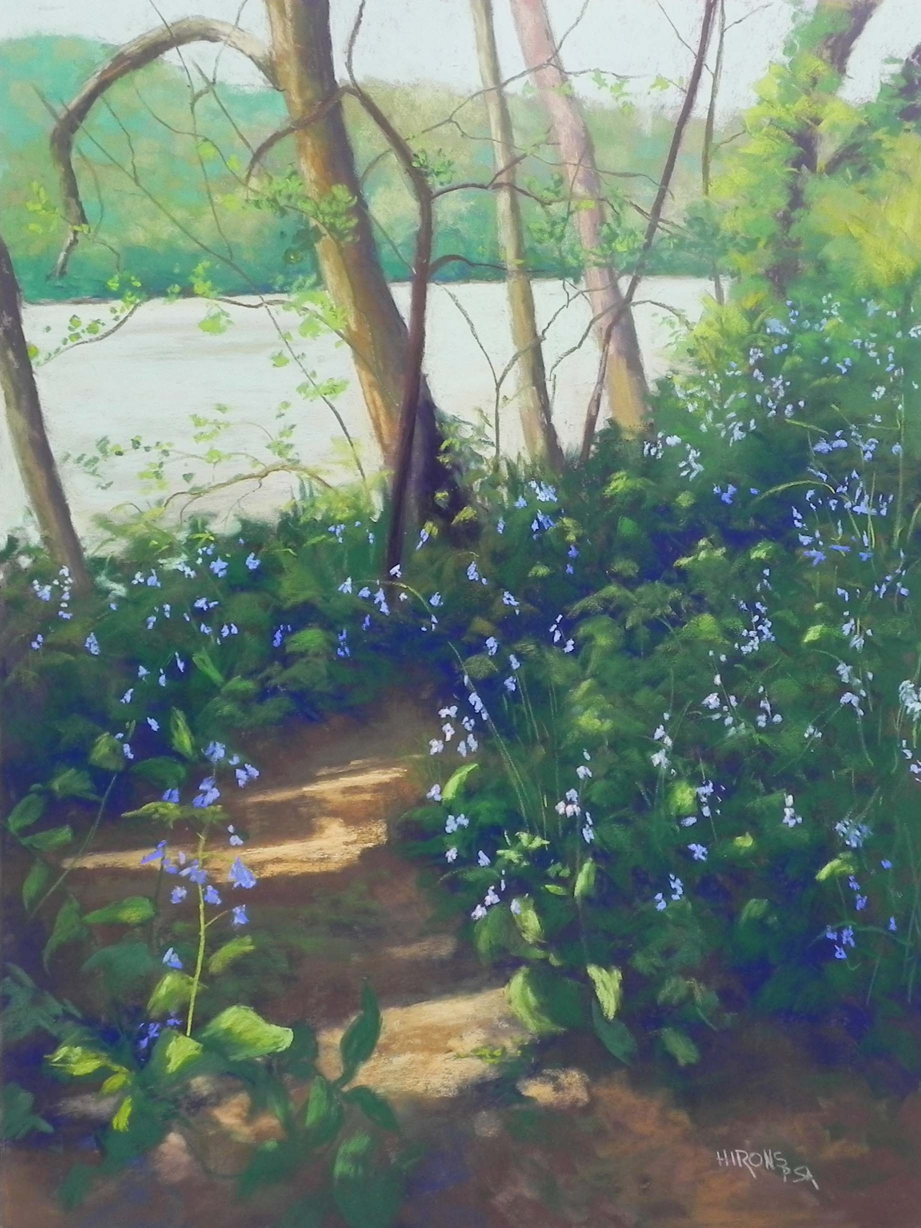
Today I put the finishing touches on a painting I began a week ago today. I really had NO idea whether I be would successful with this or not. The reference photo is pretty dreadful! I used it for the pattern of the trees, which I liked and decided to emphasize. In order to get away from all green and a thousand small branches and flowers, I started with watercolor and went for a lot of red violets, along with greens and yellow greens. The yellow in the sky gave a lovely glow that I knew I wanted to retain. In the photo you can see little bits of blue sky, but I wanted NO blue in this.
I was concerned about the paper. I realized that I’d like to use watercolor, that I wasn’t sure I wanted to waste a mounted board on what might be a disaster, and that I had a lot of 20 x 28 sheets of white Pastel Premiere in a nice grit (320?). My primary concern was that I know how much this paper buckles, and it did. I put glassine and cardboard and a lot of PJ’s on it for my 3 hour class and it helped. But there were still small ridges that were a problem.
Due to the ridges, I found that Giraults didn’t work very well in the initial layers. SO–I got out my box of Henri Roche’s and used them. They are softer than the Girault and went on beautifully, while not being too soft and mucky.
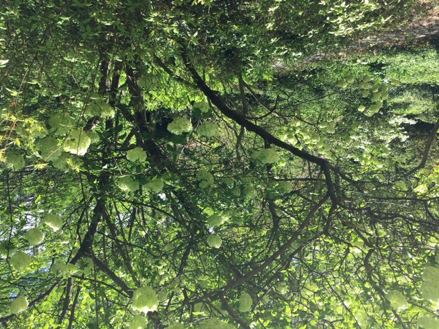
Composition: a problem! Not a lot in this photo. But I did see a path leading into the picture and and loved the trees. I decided to lead the eye back on the left with greens and distant dogwood, then into the picture with the darks of the path. I added yellow flowers in sunlight along the path. You can see the finished result before I got into all of the detail. For the flowers, I used various greens and red violets (all soft) and very soft Schminckes for the sunlit parts. Very pale greens and a yellow. (I used another reference photo of a bush in sun!)
This was one of those picture that you’re never if its finished. But I signed and filmed it and am moving on to another house painting–so much more defined!!! It was fun taking the challenge on this one however, and it has a rather mysterious look to it due to the sky and the lovely large balls!