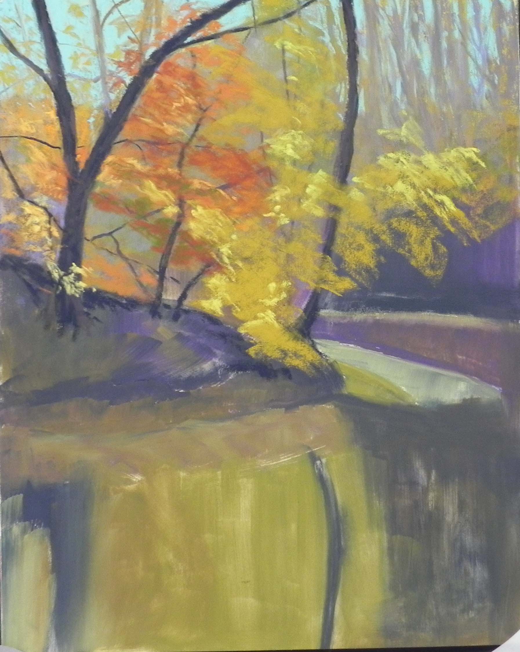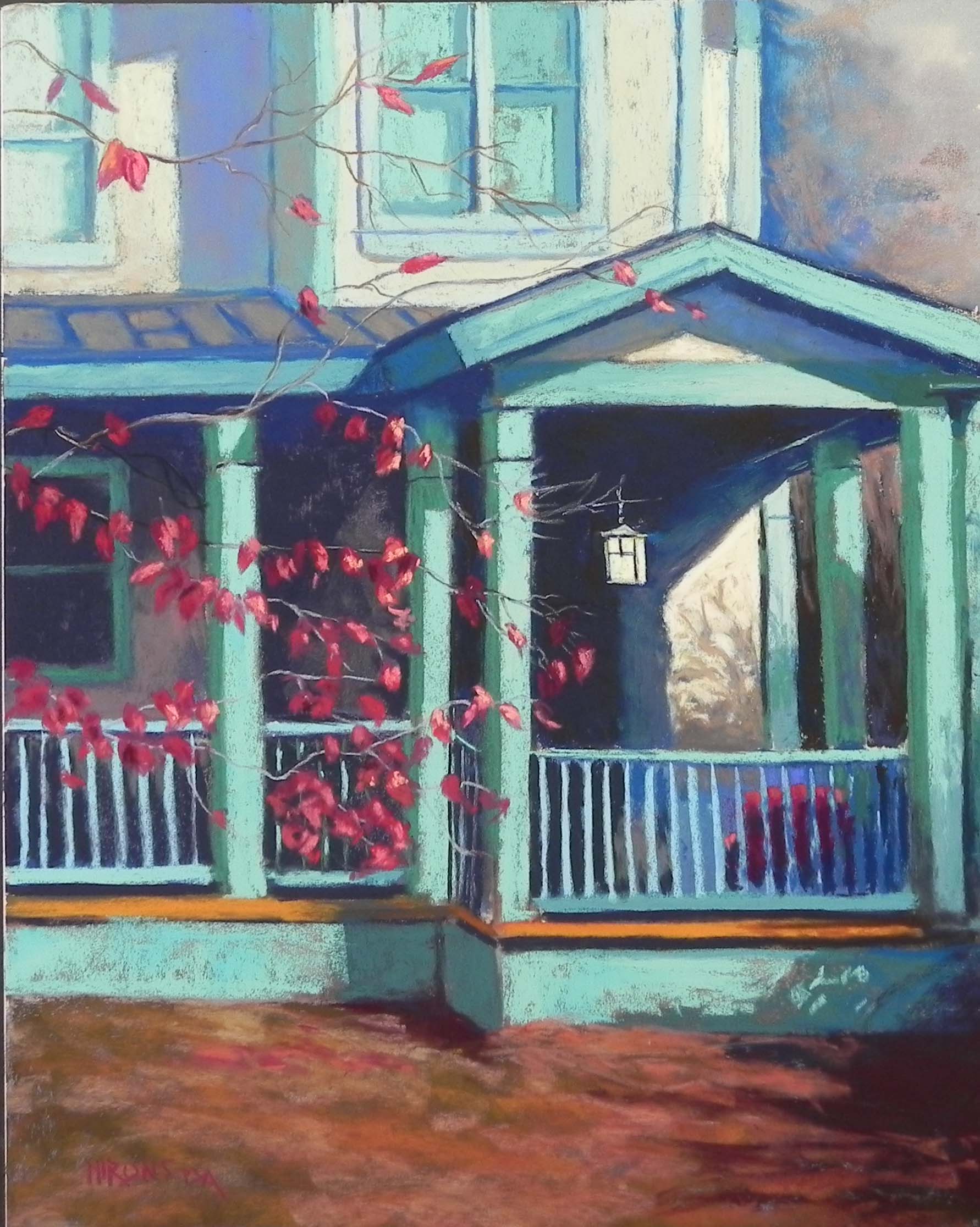
The Japanese Lantern, 20″ x 16″, UART 320
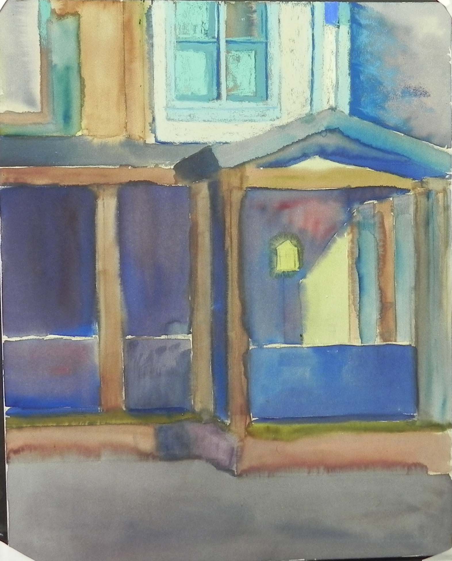
Watercolor underpainting
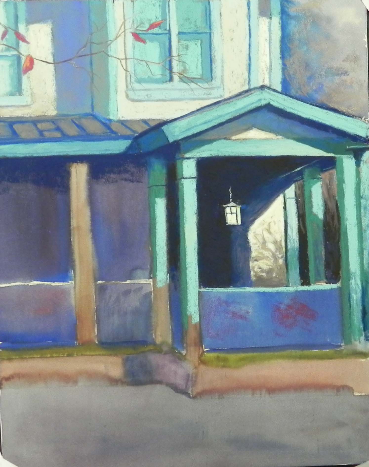
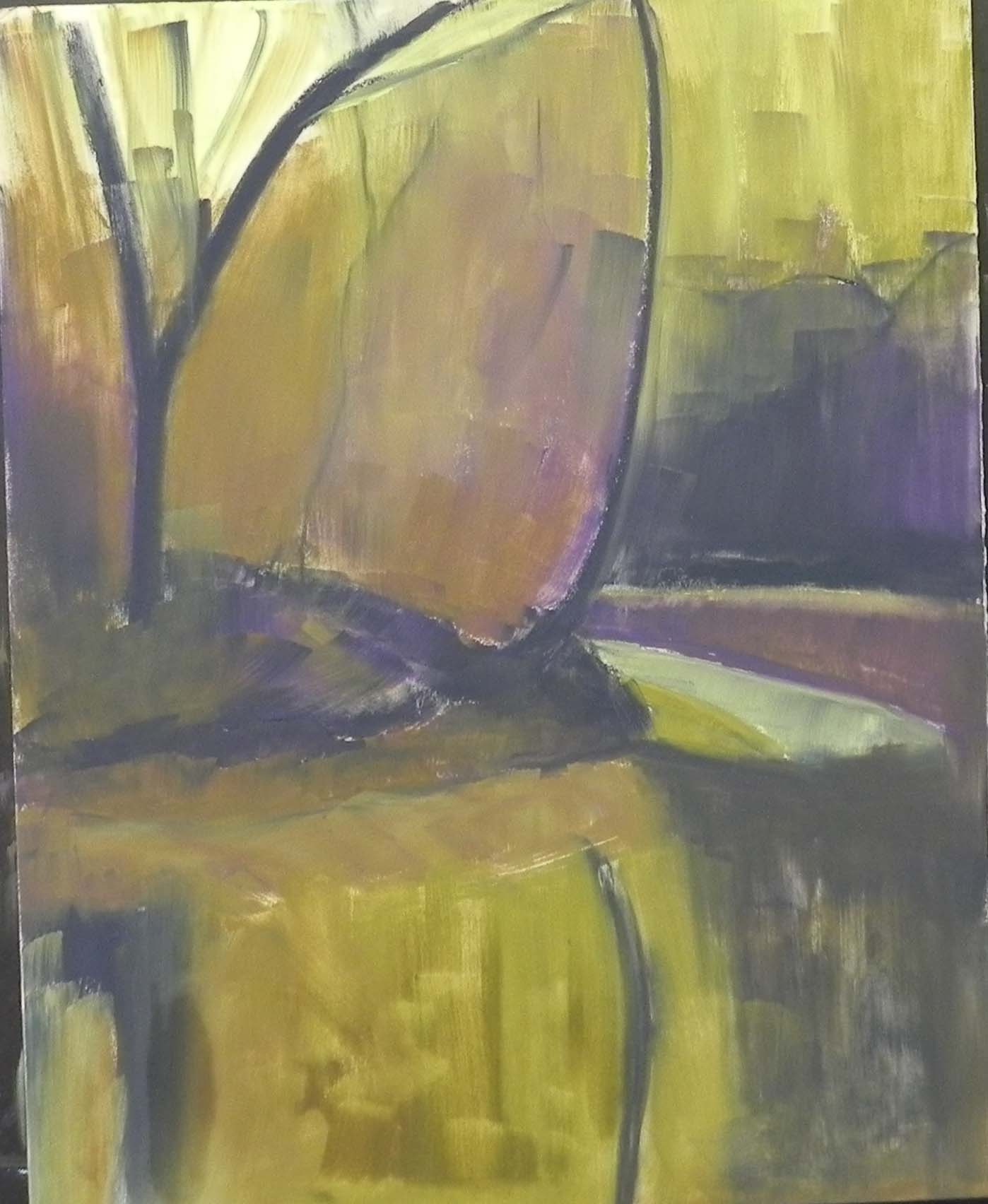
Painting partially completed
I decided to do another painting, given how much fun I’m having! And indeed, I spent several lovely days working on this one, including one where it was snowing beautifully outside my windows. I’ve let this one sit for a little while to see if i’m really done and have decided that I probably am. But, of course, it’s not framed!
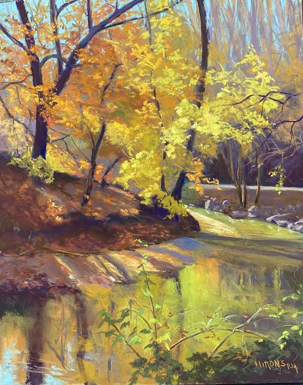
This is a house in Garret Park, MD that I’ve filmed several times in the fall. The trim on the house is a wonderful turquoisy blue and there is a dogwood, plus a Japanese maple in front of it (which I omitted). This gives me the perfect combination of blue green with cool reds–one of my favorites. The photo was a horizontal that I cropped down to focus on the light in the doorway, which is set off so beautifully by the dark background and diagonal of light.
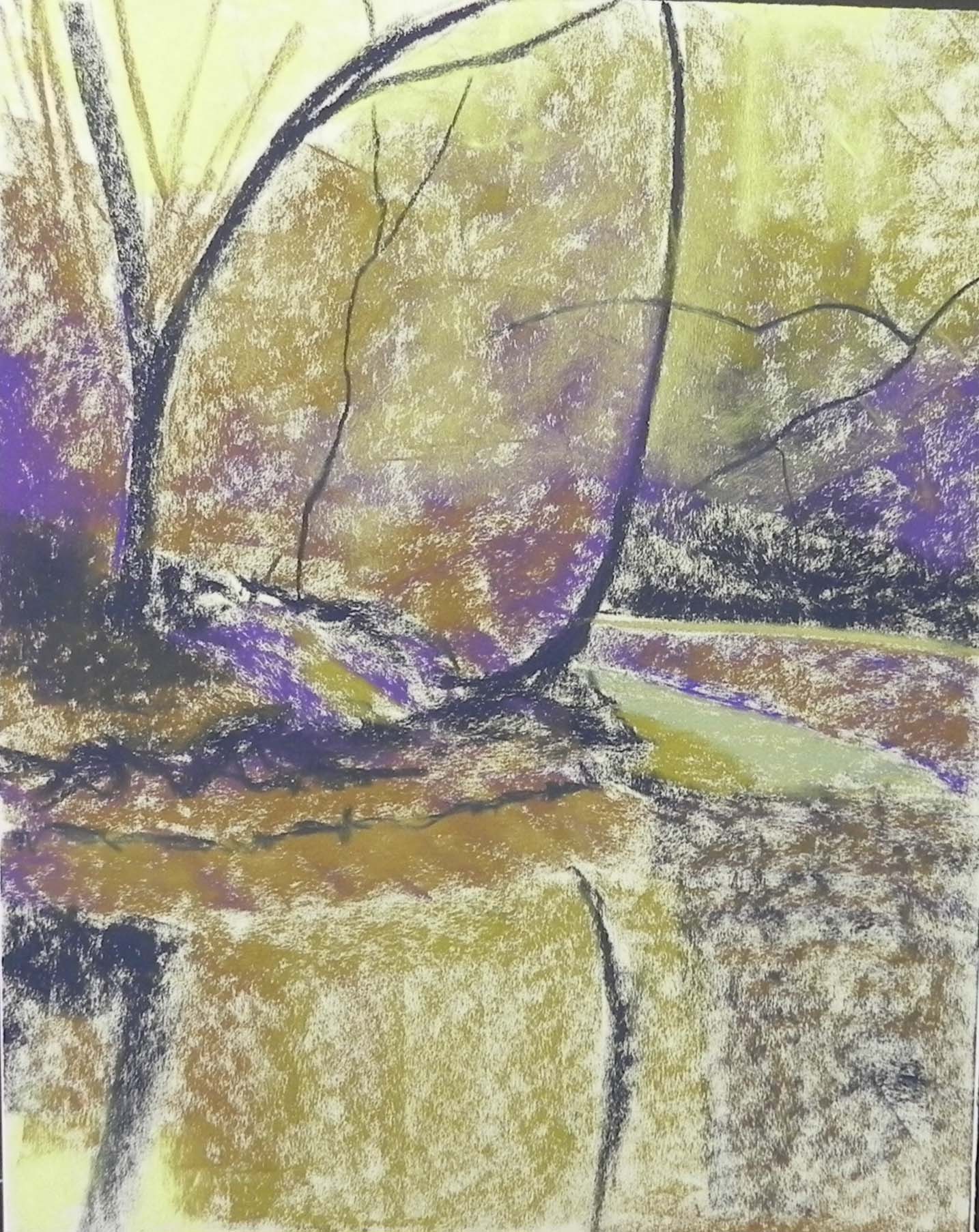
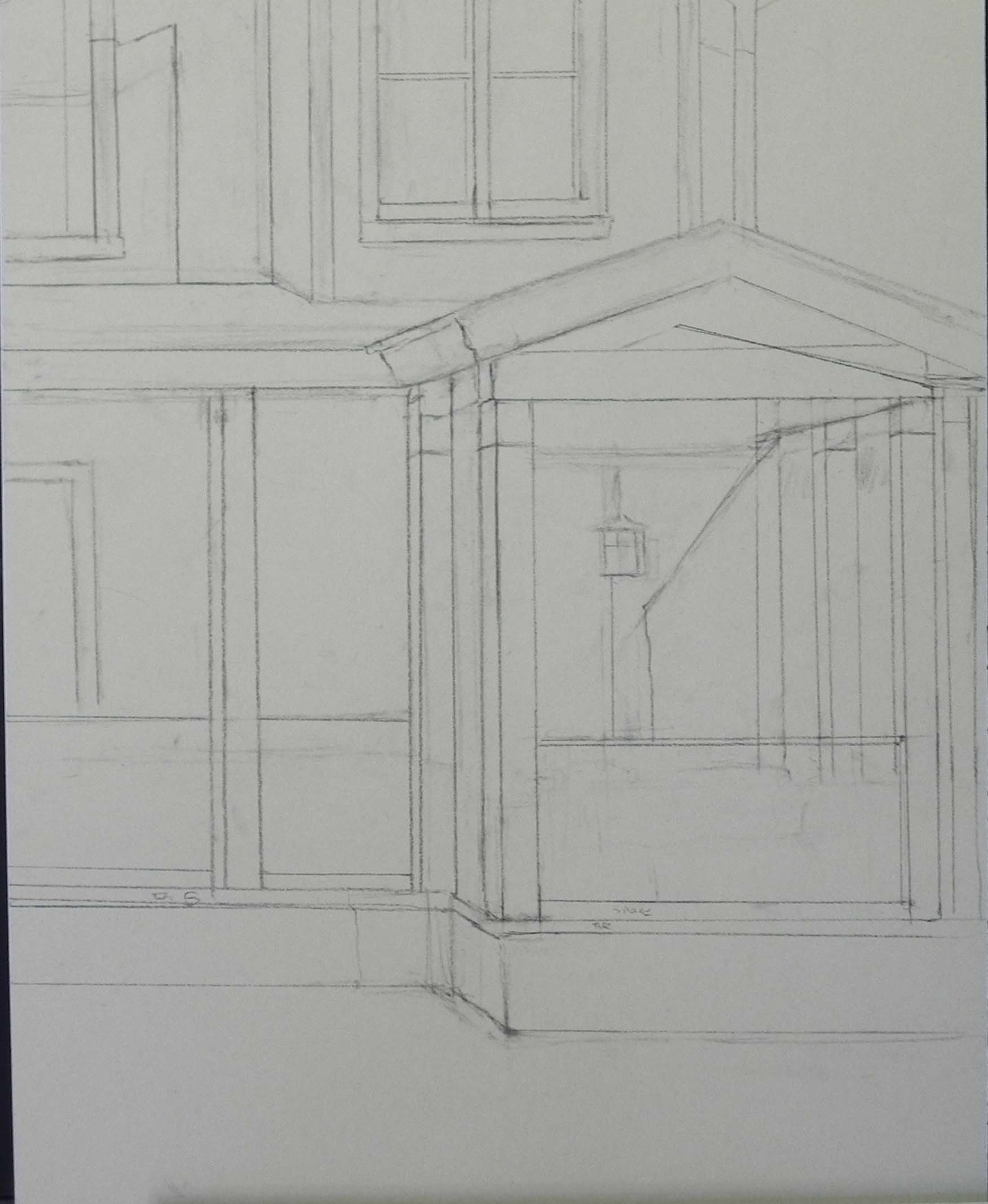
I started this having woken up one morning thinking aboud “center of interest” paintings and wanting to do something that was looser. I initially thought about another leaf painting, but then saw this one, taken very recently. Given the strength of the center of interest, I thought maybe this would work and I decided to do a watercolor underpainting. I was aiming for loose-ness–but….
I began with a drawing of just the house. Then I worked over that with the watercolor. I worked flat and kept it pretty defined. I have a really hard time with watercolor! Can never seem to get the right colors. But I wanted to limit it to warm reddish browns and blues. So I did my best. In the image, you’ll see that I began doing the painting before I realized that I hadn’t filmed it. So, the only really loose part is the upper right corner, where I added some pastel, but left the watercolor showing. In the photo there is a large green tree there, which I knew I didn’t want.
The Japanese maple was in front of the porch on left and I decided that it was too confusing and that keeping just the dogwood branches would work better. The foreground was brown and I assume it was a mixture of mulch and leaves. I was really happy to have this color, rather than green grass.
I used primarily Giraults and Ludwigs for this painting, no Blue Earth. The various turquoises came from my box of 30 Ludwig turquoises and I used the reds in my “brilliants” set for the leaves. I was happy with the watercolor underpainting and I tried to layer the turquoise lightly, so as to let some of the warm color come through–this is best in the lower part of the building at left.
For the white stucco walls I used a combination of warm and cool Giraults, beginning with a little darker brown.
The complicated part was the railings and what was behind them. There was a red couch of some sort on the right and I loved the way that worked, bringing the red over to the right side of the painting.
The branches and leaves were all added after I painted in the house. I wasn’t sure how much to add. The upper branches in the photo had no leaves at all, but I needed to have some. I used more below where the leaves are hiding the porch behind it. (This is where the maple was so it was quite confusing).
I’m pretty happy with this but any suggestions will be gratefully received.
I forgot to mention the title. I saw this immediately as being a “Japanese” designed light fixture but I have no idea! It might be just kind of Arts and Crafts. But this was the title that came to me and I decided to stick with it.