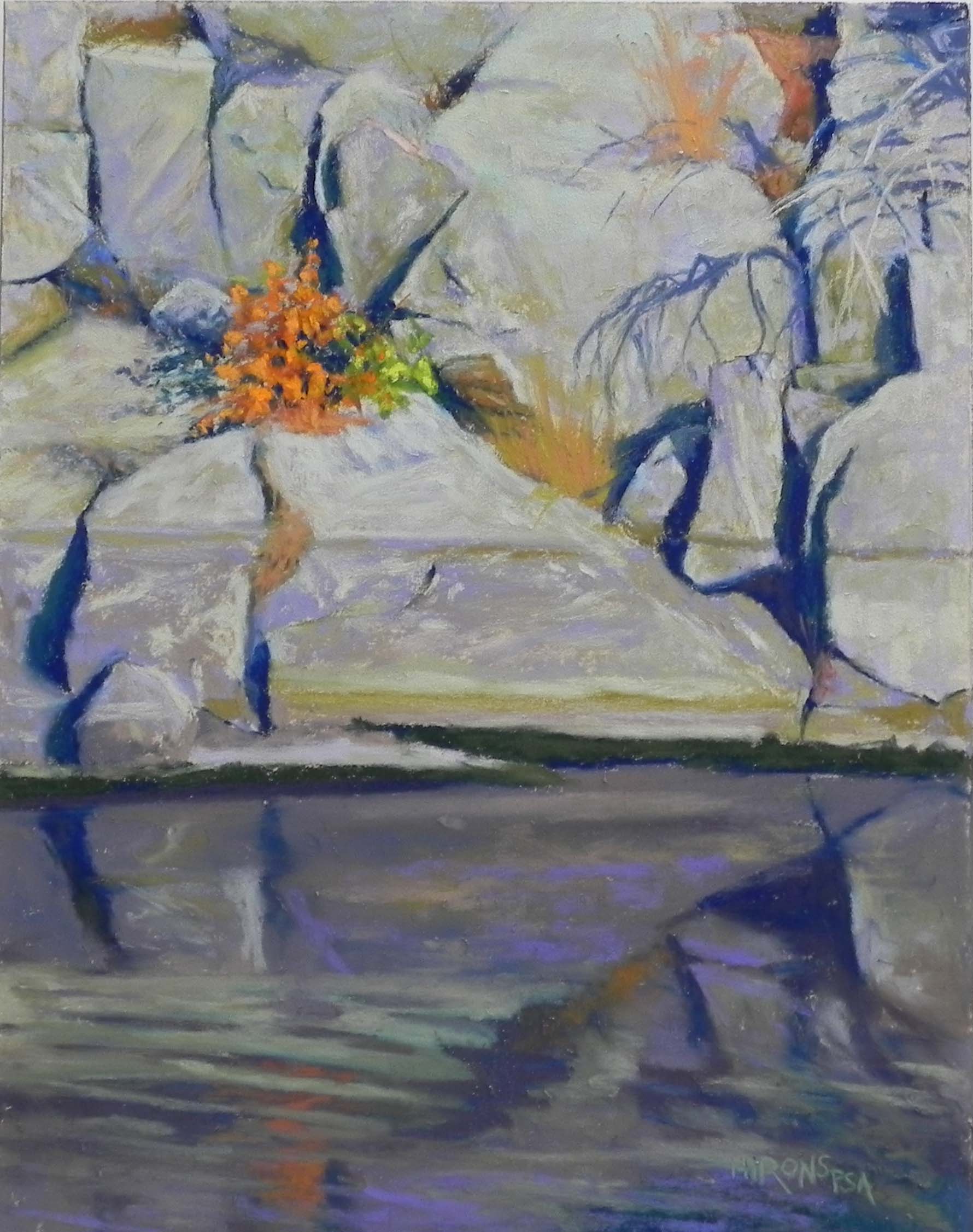
Bittersweet, 16″ x 20″, UART 320
Toned board
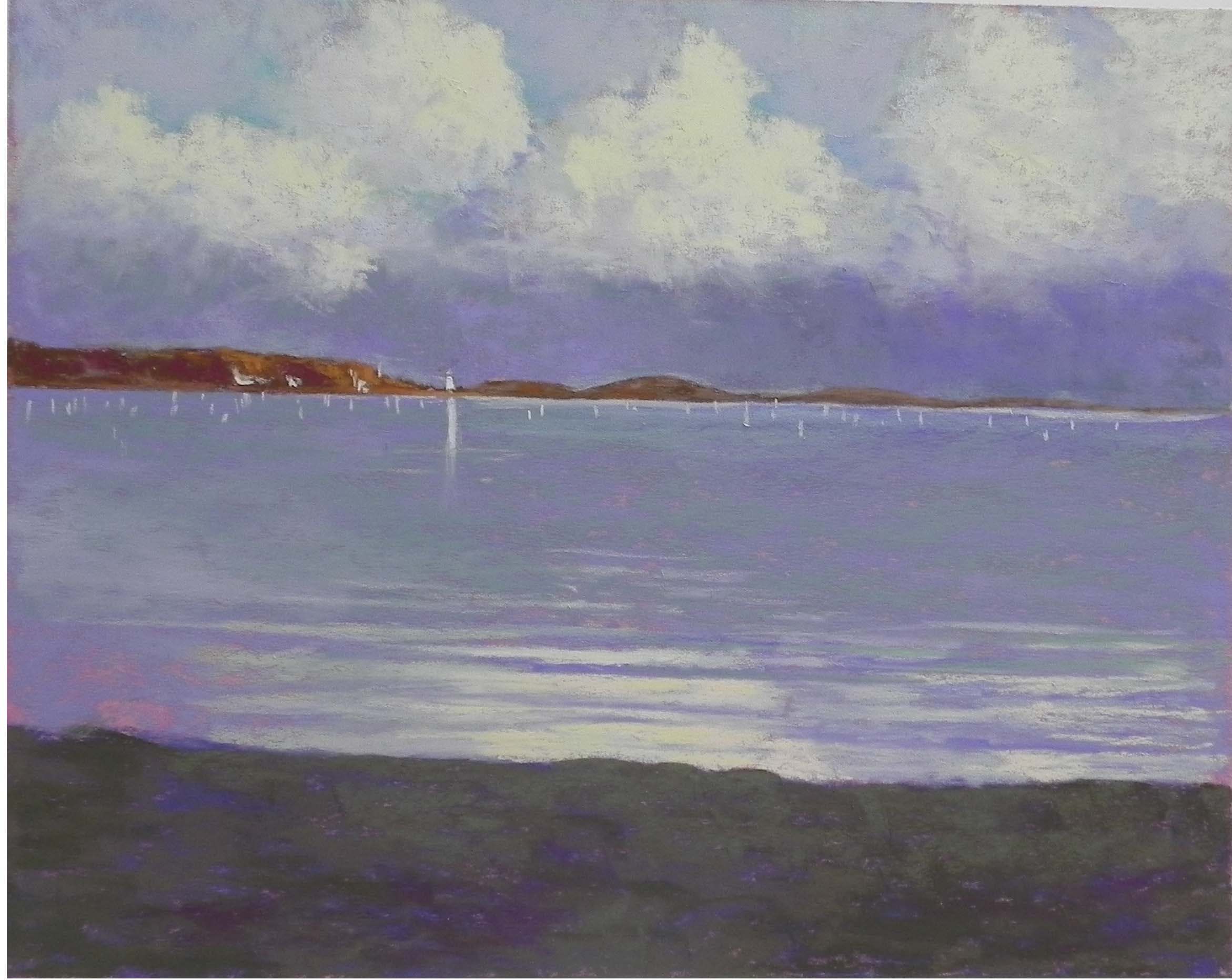
Painting before adding the branches
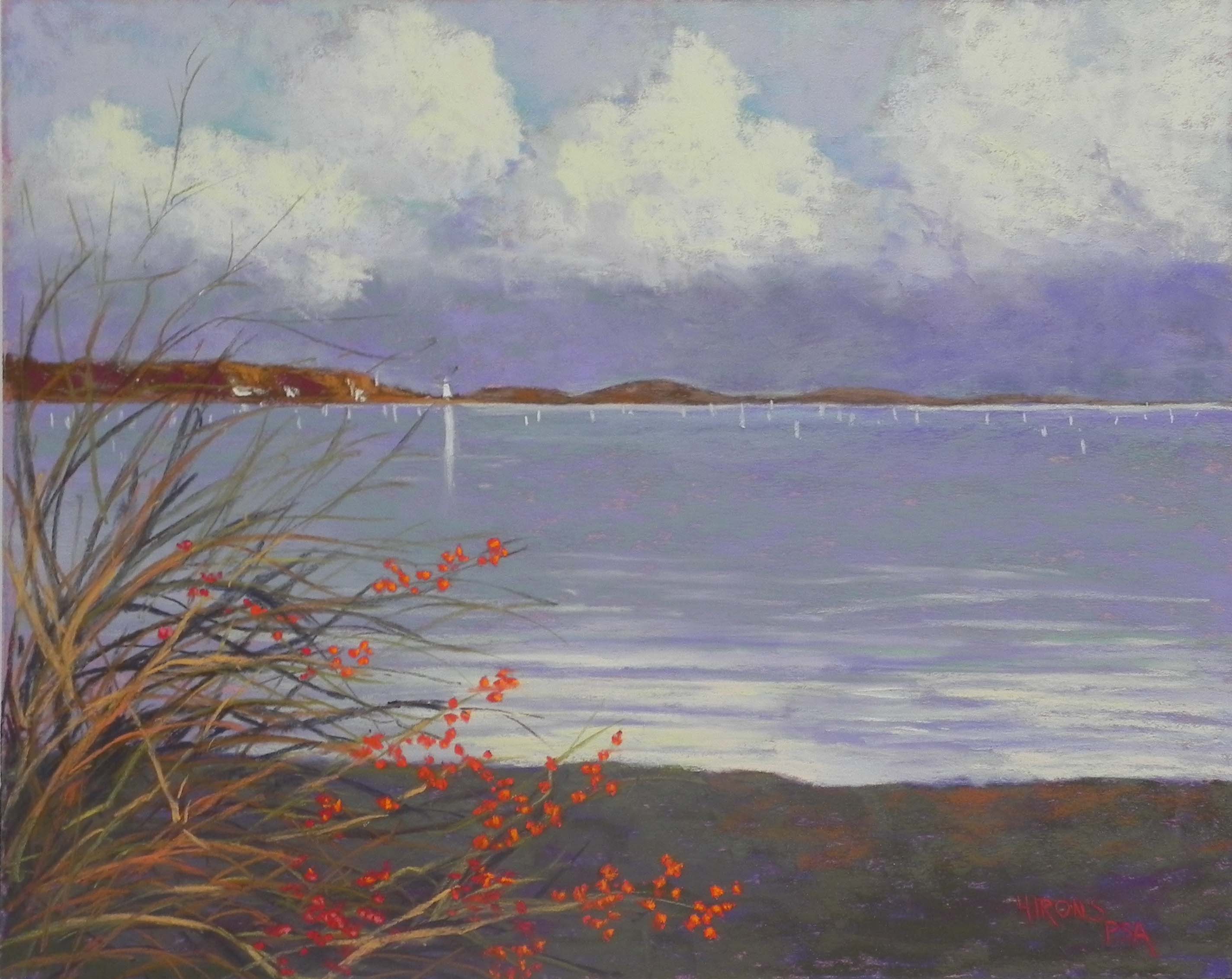
Having spent yesterday cleaning out closets and getting the guest room presentable for visitors coming for the Women’s March, today I felt that I could spend the day in my studio. I printed out a picture I took of Mattapoisett harbor last Thursday just after the rain had stopped. It was quite dramatic and I had a great time doing it. Got to use one of my new True Grit UART 320 16 x 20 panels and really liked it for something other than rocks!
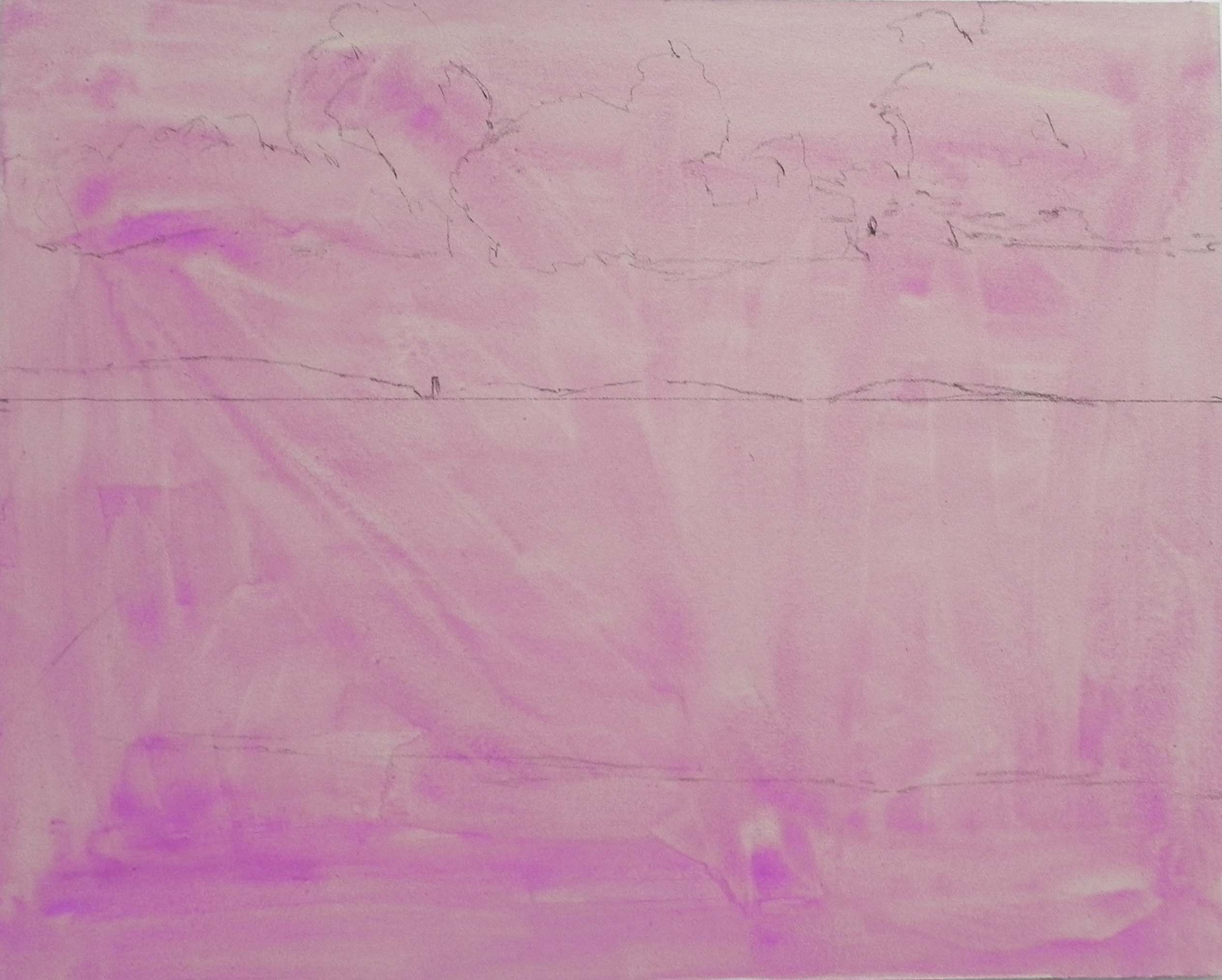
I wasn’t sure what I was going to do about an underpainting and decided to tone the surface with watercolor. I used a cobalt magenta, two coats that gave a nice color to the surface. I had hoped to leave more showing through but I think there is some in the clouds. This painting had so little drawing in it, I found it easier, to just tone the paper, then lightly draw on the horizon, clouds and land forms with graphite. I made one compositional change, leaving out a large rock on the right hand side. I wasn’t sure that it added anything.
I found that the 320 surface worked very nicely for the clouds and the water. The added texture was quite lovely. I started the sky with blues and blue greens on the top, then went to a violet Girault for the area below the clouds. Over this I added one of the very grayed “turquoise” Blue Earth pastels, which helped approximate the colors I was seeing–a really greenish violet. I used the same colors in the water. I used a darker violet and green under the clouds in the middle to right, then went over them with the lighter violet. I wanted to give a subtle sense of the darkness not being all the same.
For the sand at bottom (dark, wet sand), I started with a darker violet, then went over it with three values of a very grayed Schmincke brownish green.
My biggest challenge was with the color of the clouds. In the photo, they were darker with more orange-yellow in them but I didn’t like this when I tried it, so I decided to stay with the lighter yellows. I used a combination of light violet and cool greens in the shadow areas.
The bushes were added after the water and sand had been completed. I used two different reds for the berries with highlights or orange. Picking bittersweet for the house is something I remember from my early days of living on Mattapoisett Neck, so its has a special significance to me.
It was nice to do the lighthouse as just a tiny big of yellow white with a long reflection. Because of the gray around it, it really stands out, even though tiny.
So this is my last painting for 2016. I am not particularly looking forward to 2017, given the state of affairs. However, I hope that we can continue to paint and that the economy won’t tank anytime too soon!!! My best to you all for the new year, whatever it brings us.