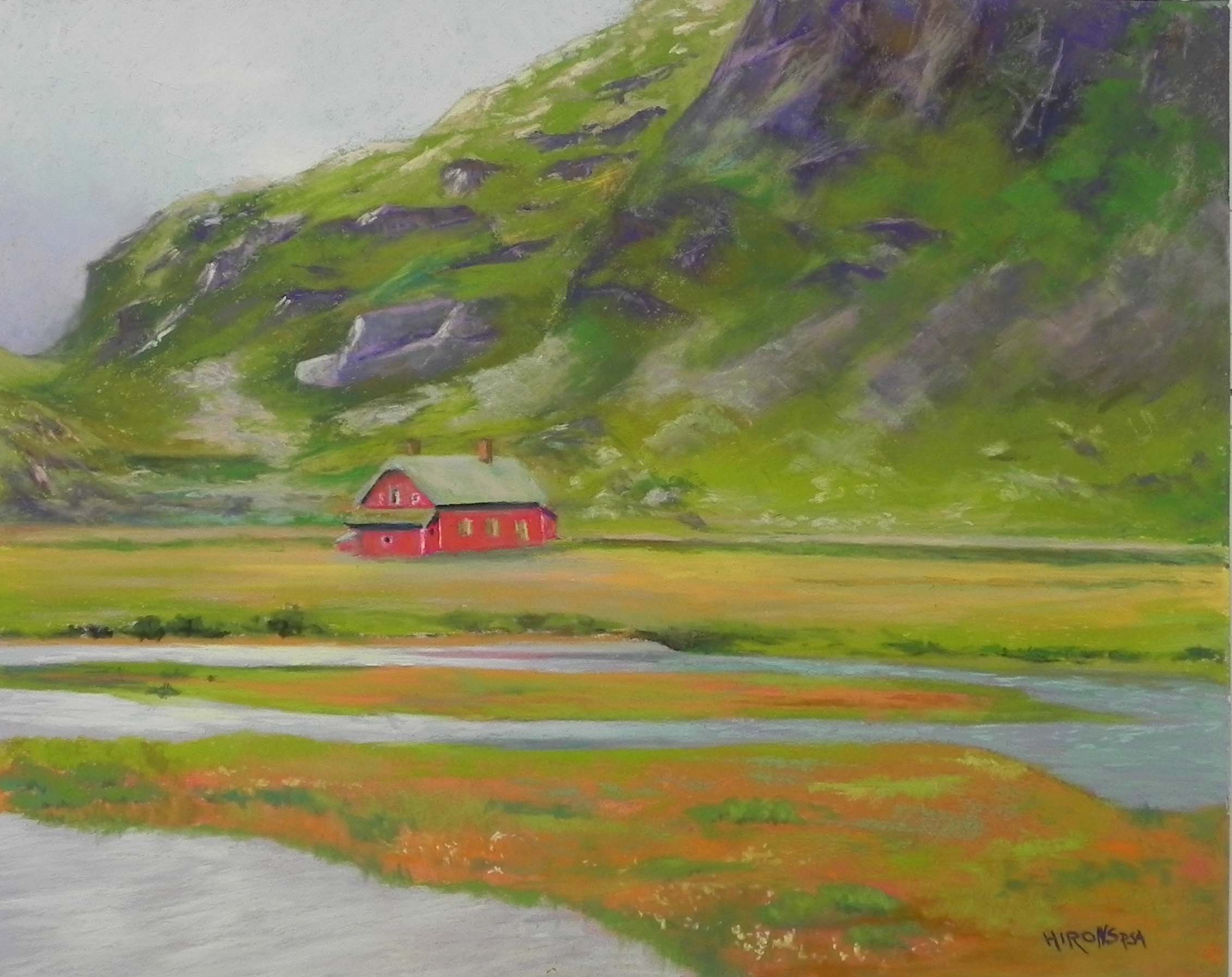
Isolation/Hope (Norway), 16″ x 20″, Lux Archival
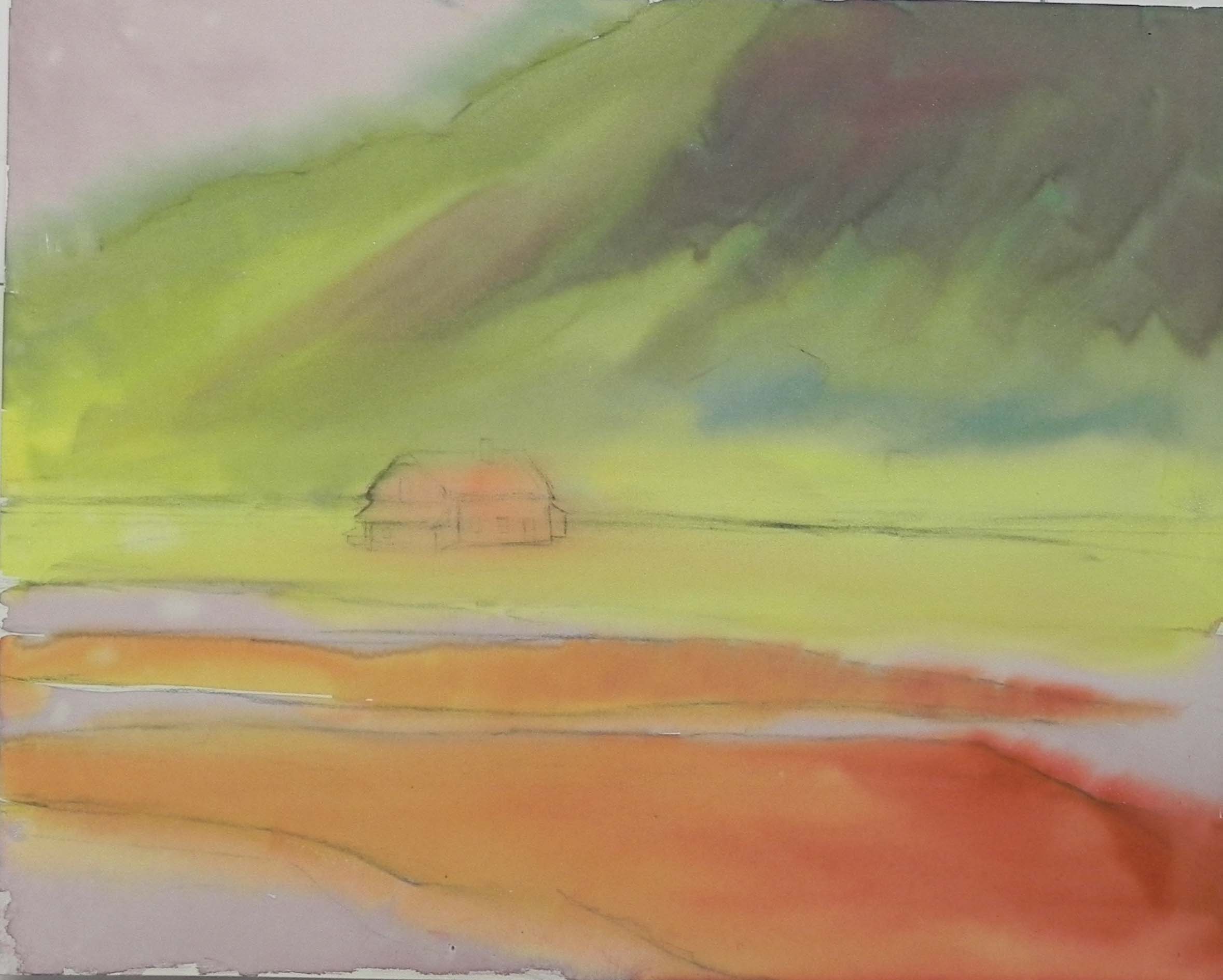
Ink wash underpainting
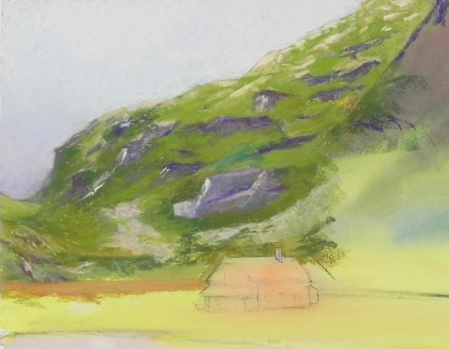
Detail of mountains
Hello Friends. I hope you are doing OK. Did you see my last Youtube video on Making Initial Decisions? I plan to do another one soon on creating “useful” underpaintings.
But in the meantime, I’ve just finished a painting on the new Lux Archival surface, which arrived from Dakota this past week. It’s quite nice, although I scrapped the first painting I tried. (Might try hosing it down outside!). The paper has a nice backing and stays absolutely flat, which is really lovely. It’s expensive ($10.75 a sheet) and only comes in 8 x 10 and 16 x 20 or a roll. But it’s a lot cheaper than a $20 mounted 16 x 20 UART board.
For the first painting (the photo and drawing for which are featured in my video), I decided to do a regular hard pastel and alcohol underpainting with the beautiful new Caran d’ache hard pastels that came along with the paper in my order. Then I began with soft pastels. It wasn’t good! I felt like I was filling in the tooth of the paper too soon. And, despite all of my “initial decisions”, the composition just wasn’t interesting enough! So I decided to work on this picture from our August 2019 trip to Scandinavia and the Baltic. We began in Oslo and took the scenic train to Bergen. At the top of the mountain range was this house, looking really lonely. I wondered WHO owns it? I’ve always thought about doing it, but now seemed like the perfect time.
I would have done a water color underpainting, but realized I hadn’t retrieved them from my other studio. But I had some bottles of ink that I’d tried out for my class some years ago. So I used those instead. Worked fine and no buckling whatsoever!
Next, I decided that at least to begin with, I would stick to hard pastels and Giraults and that worked quite well. I used my new set of blue/violet Giraults in the sky and used a combination of hard and Girault for the background mountain. That was definitely the hard part! Particularly the right side, where there were gravel banks coming down the hill. I had to keep the values fairly muted so they didn’t stand out.
For the building, I started it with hard pastels using a cherry red and a lighter pinkish red. The color of the building is really cherry red–you see it throughout Norway (what I saw of it anyway). Today, when I went back to it, I decided I didn’t like it . The detail was too perfect! And it stood out too much compared with all the oranges in the foreground. So I used a warmer Ludwig red and lightly went over it. I also used a hard Caran d’ache olive brown to soften the entire building. Was much happier with it.
I decided to use more soft pastels in the foreground and it worked well. I think that slowly building up is the way to go with this paper. But others might disagree.
Finally, I added sunlight in the water and some yellow peaking over the mountain in the background. A small sign of hope! This wasn’t in the photo, but I had to add it!