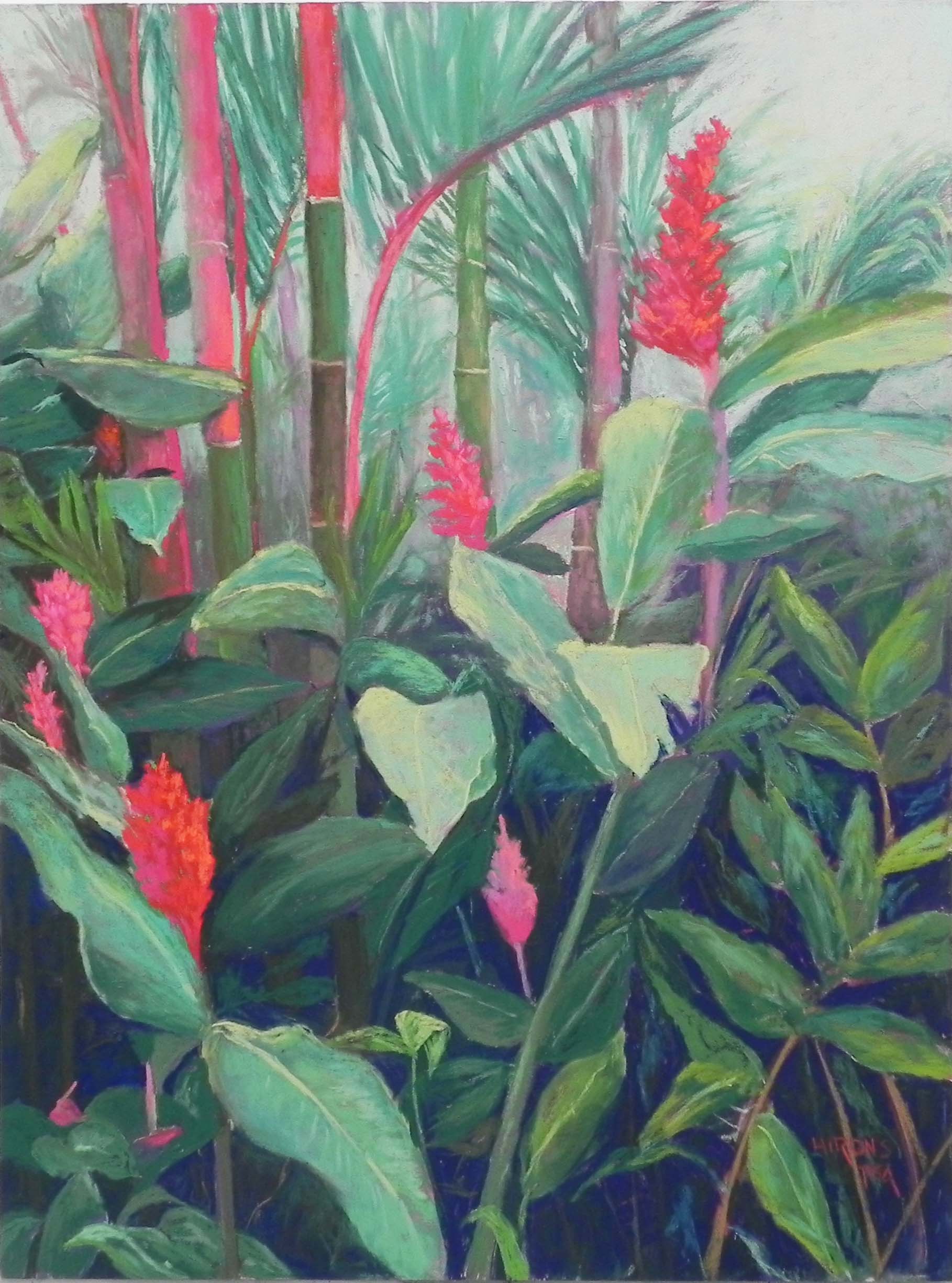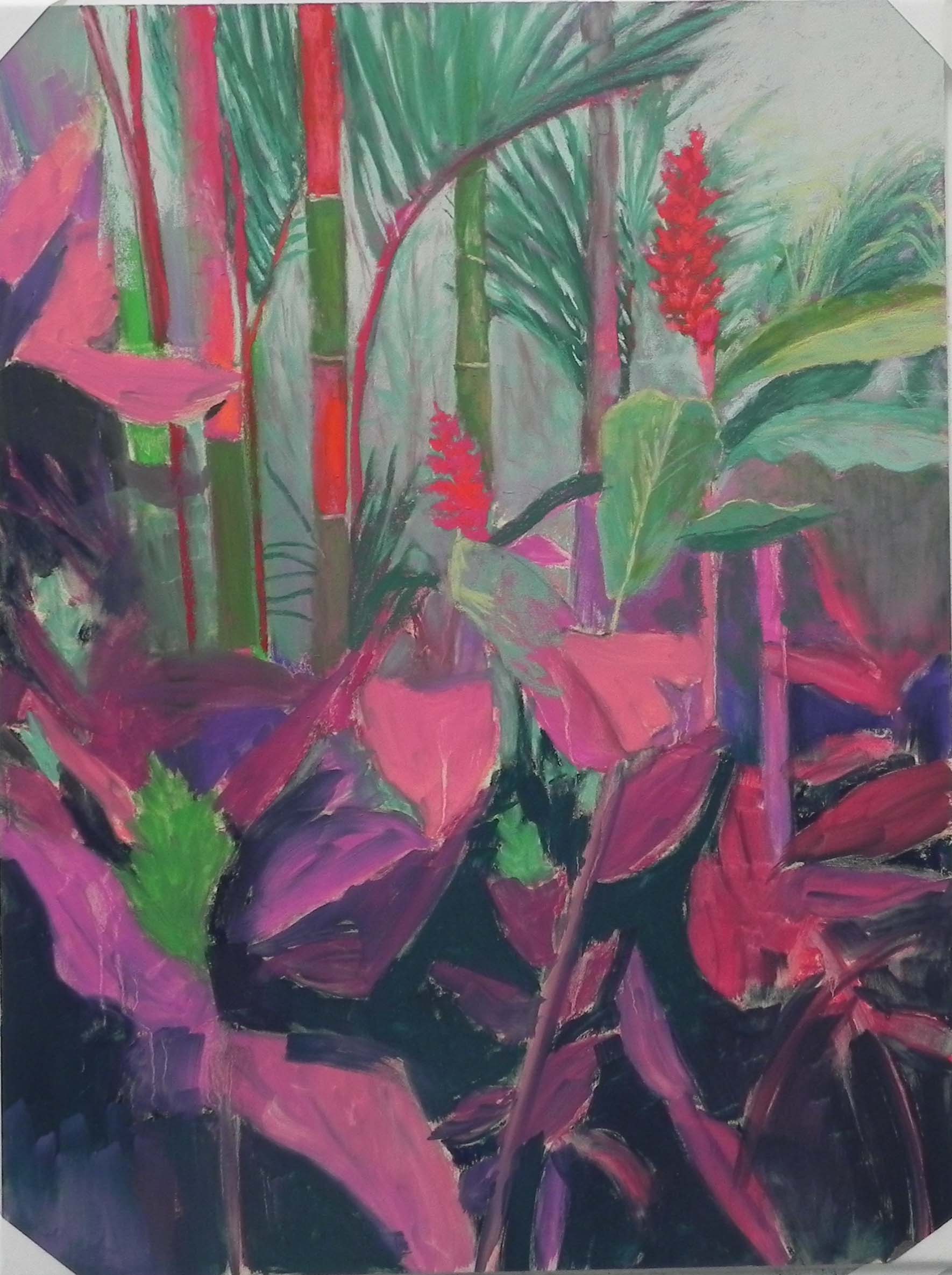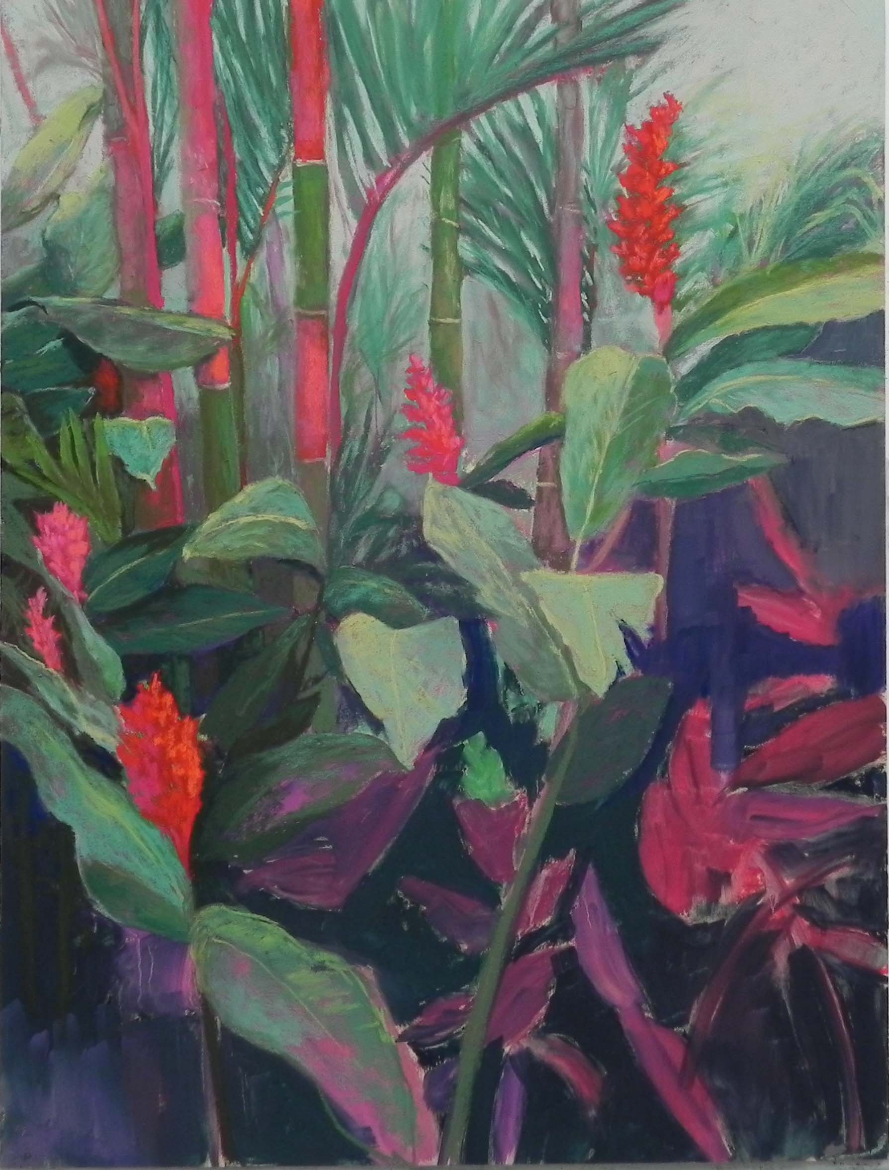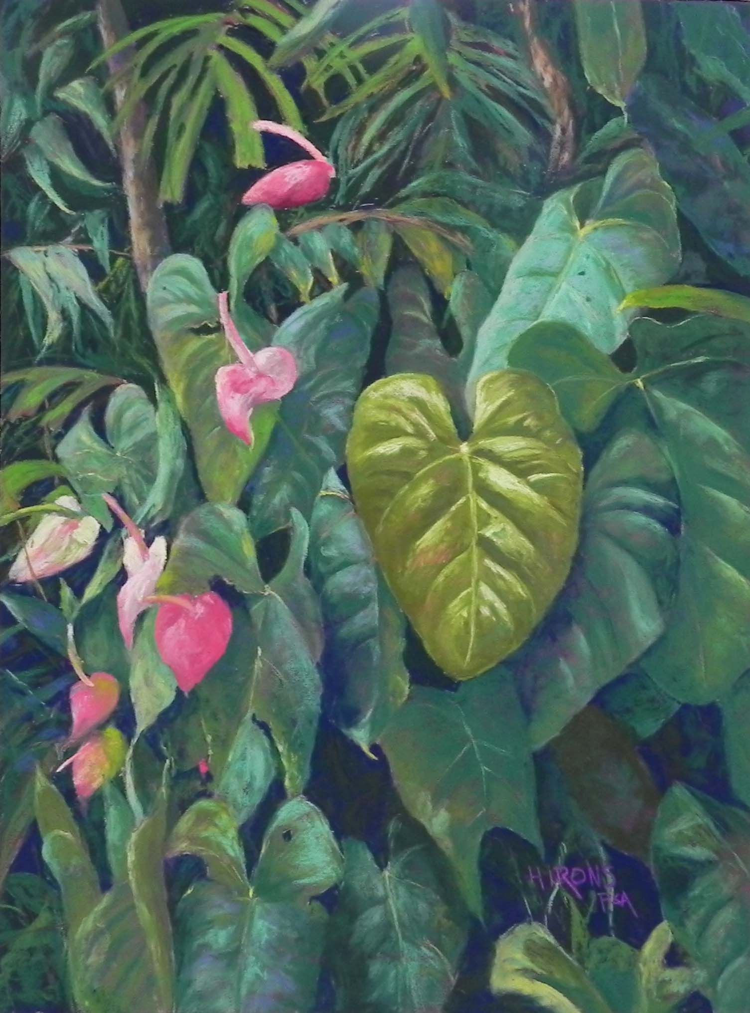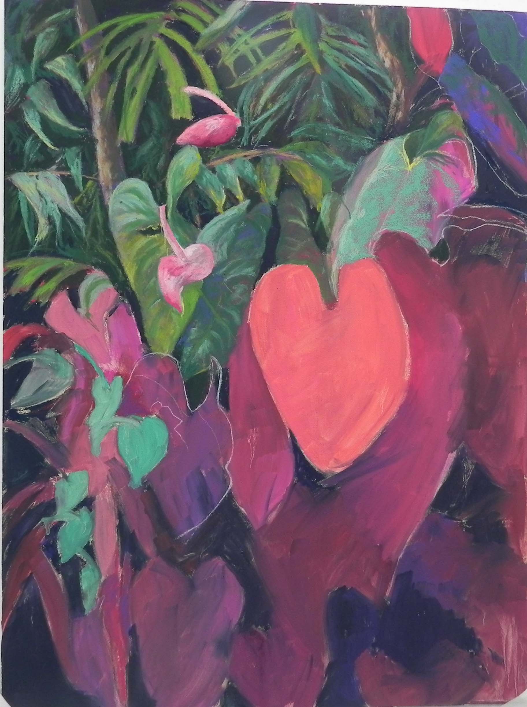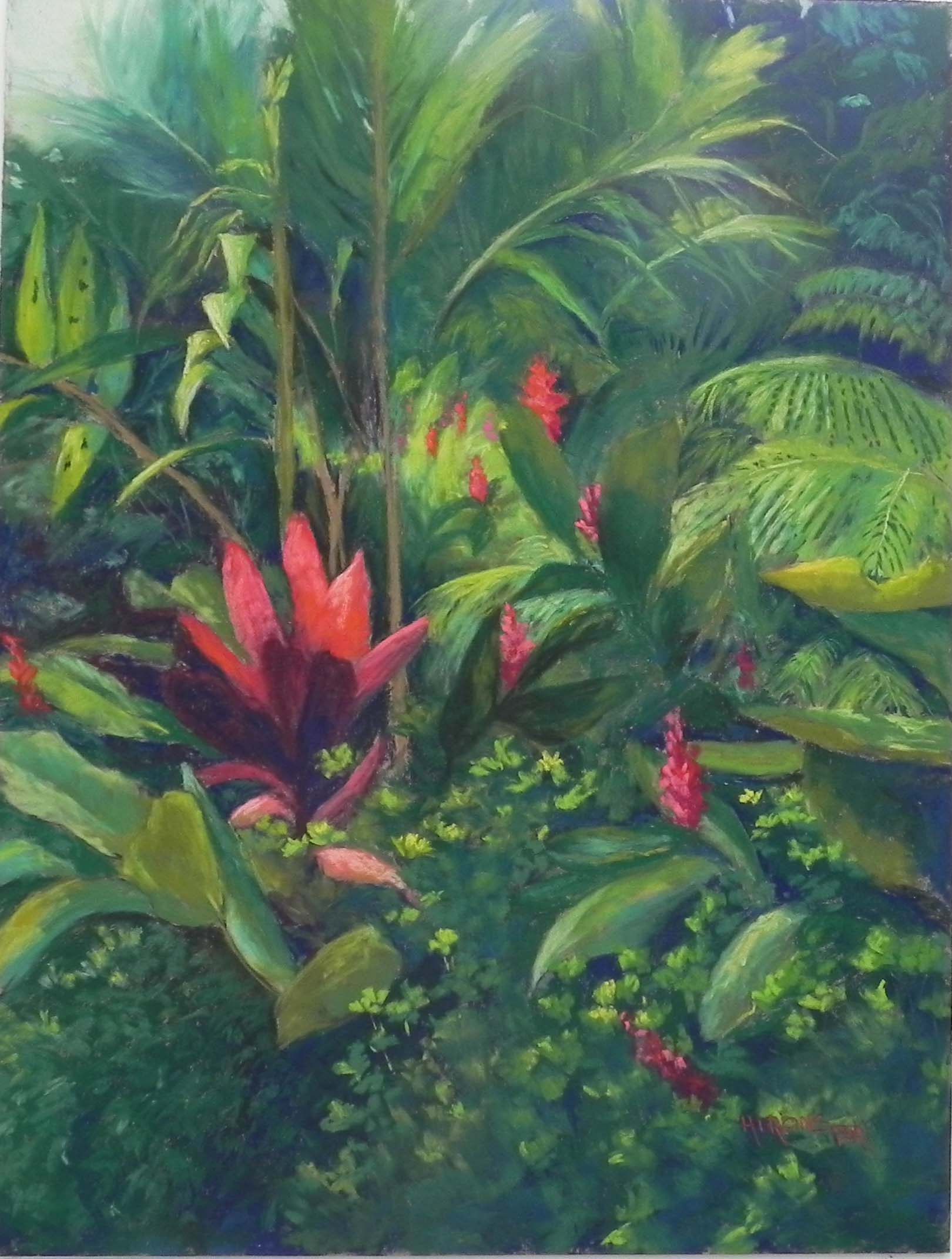
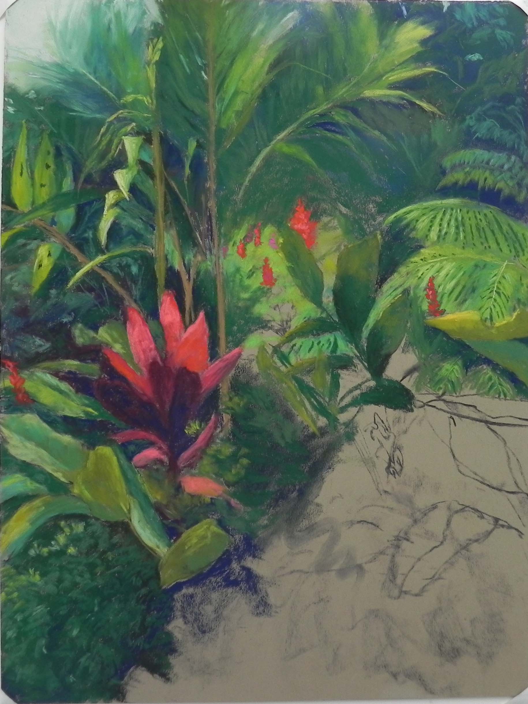
Red Unfolding, 24 x 18, Pastel Premiere “Italian clay”
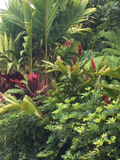
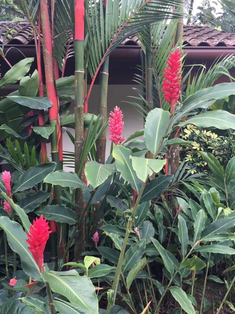
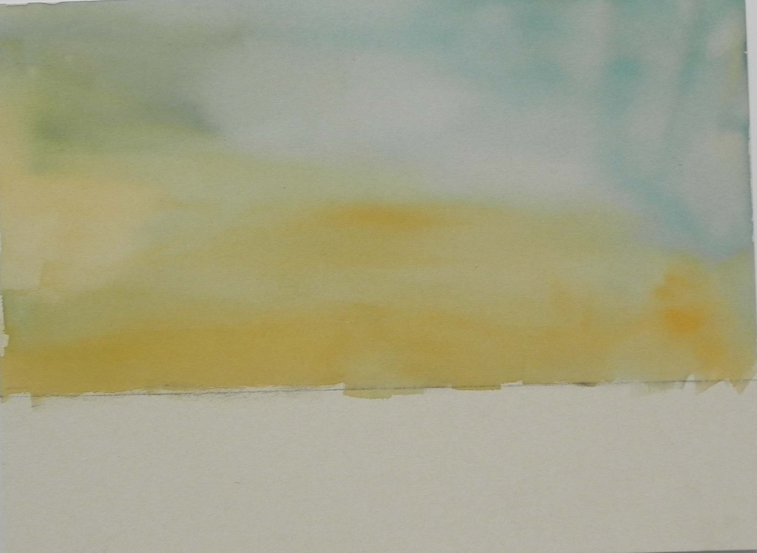
Photo reference
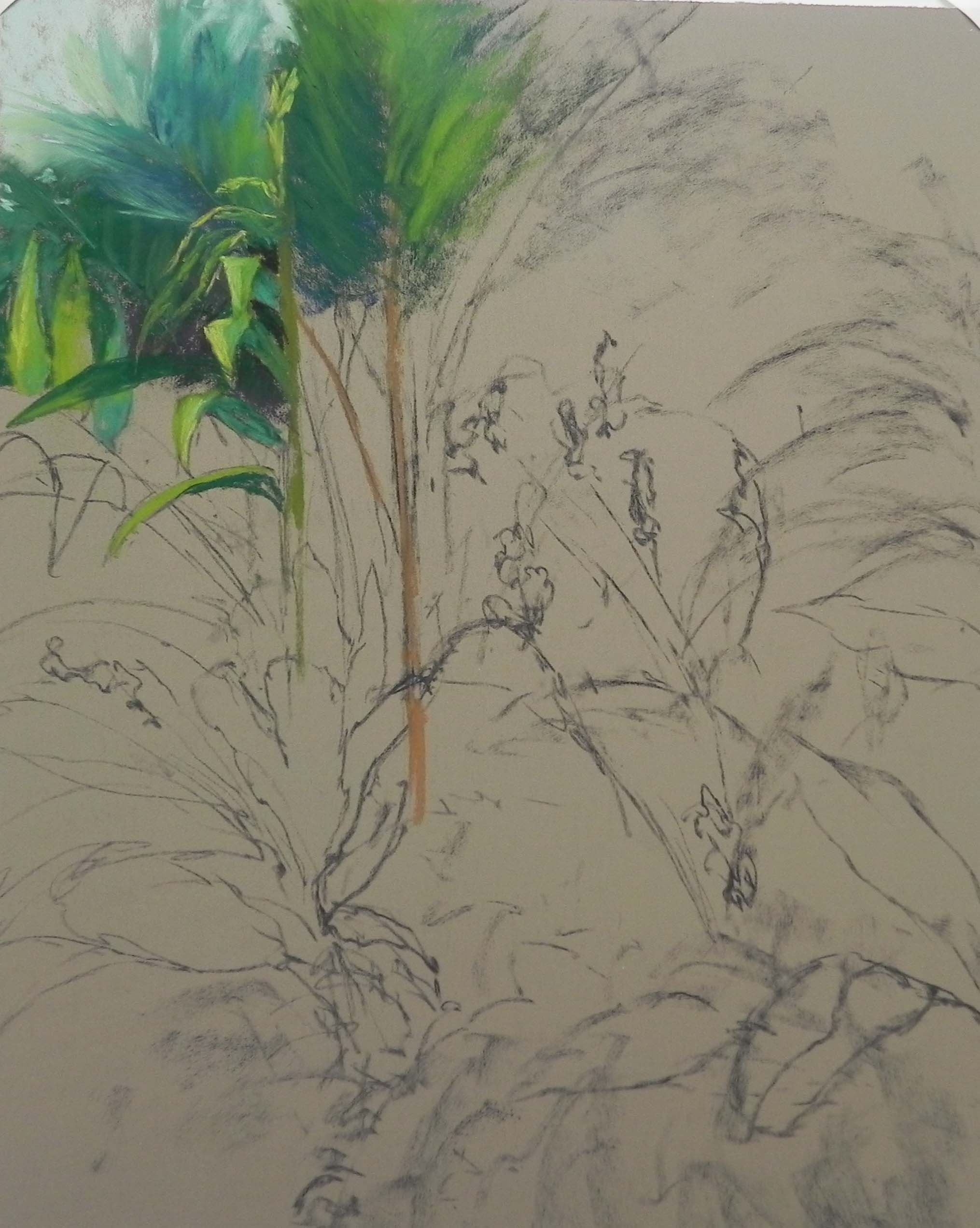
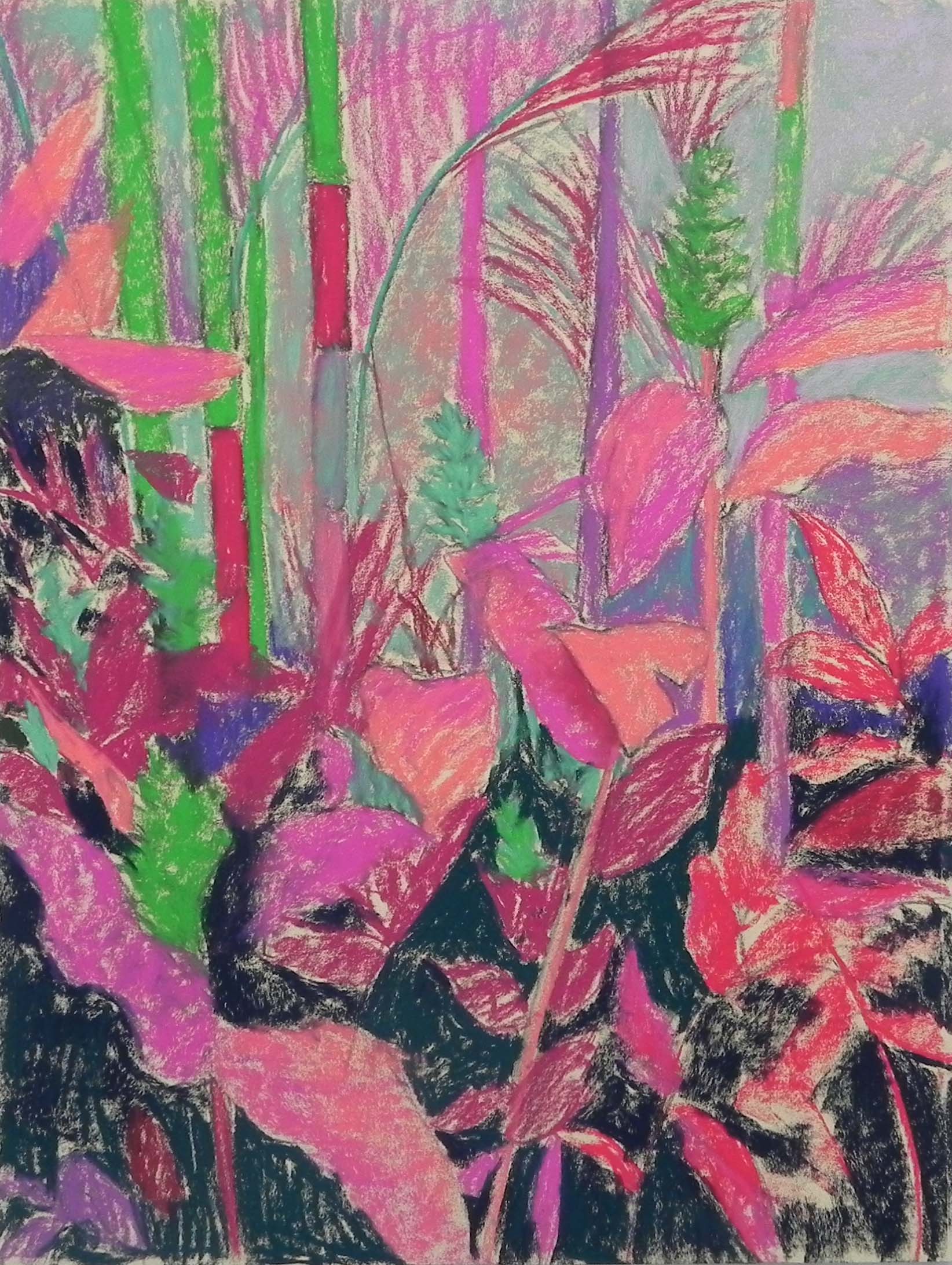
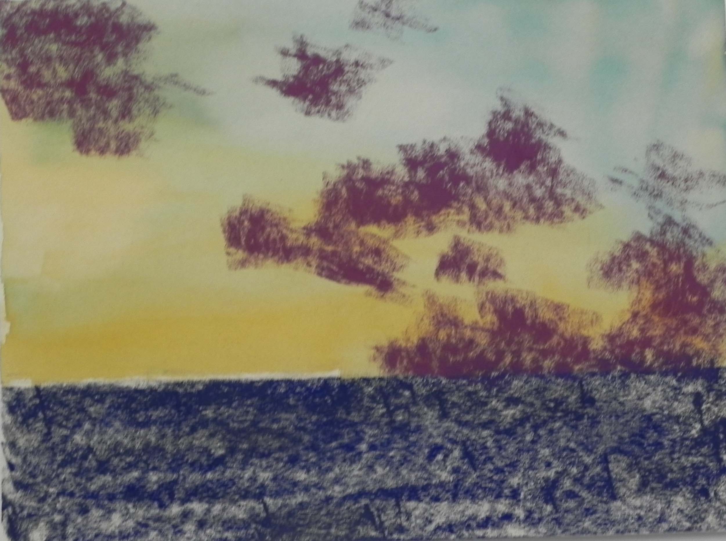
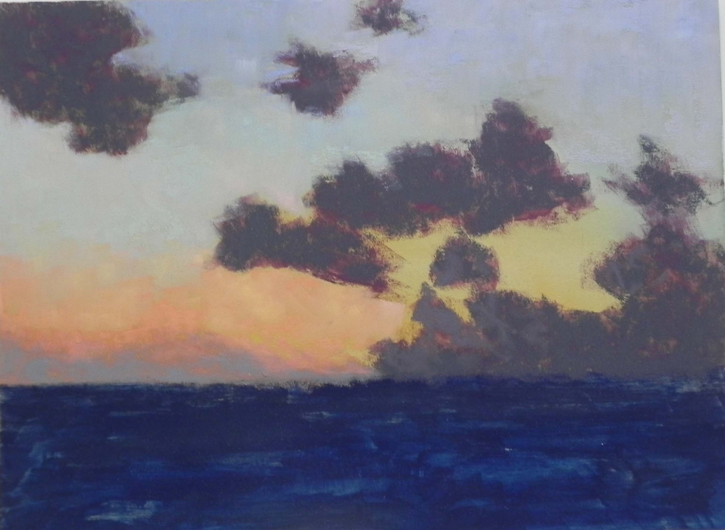
Initial pastel application after drawing
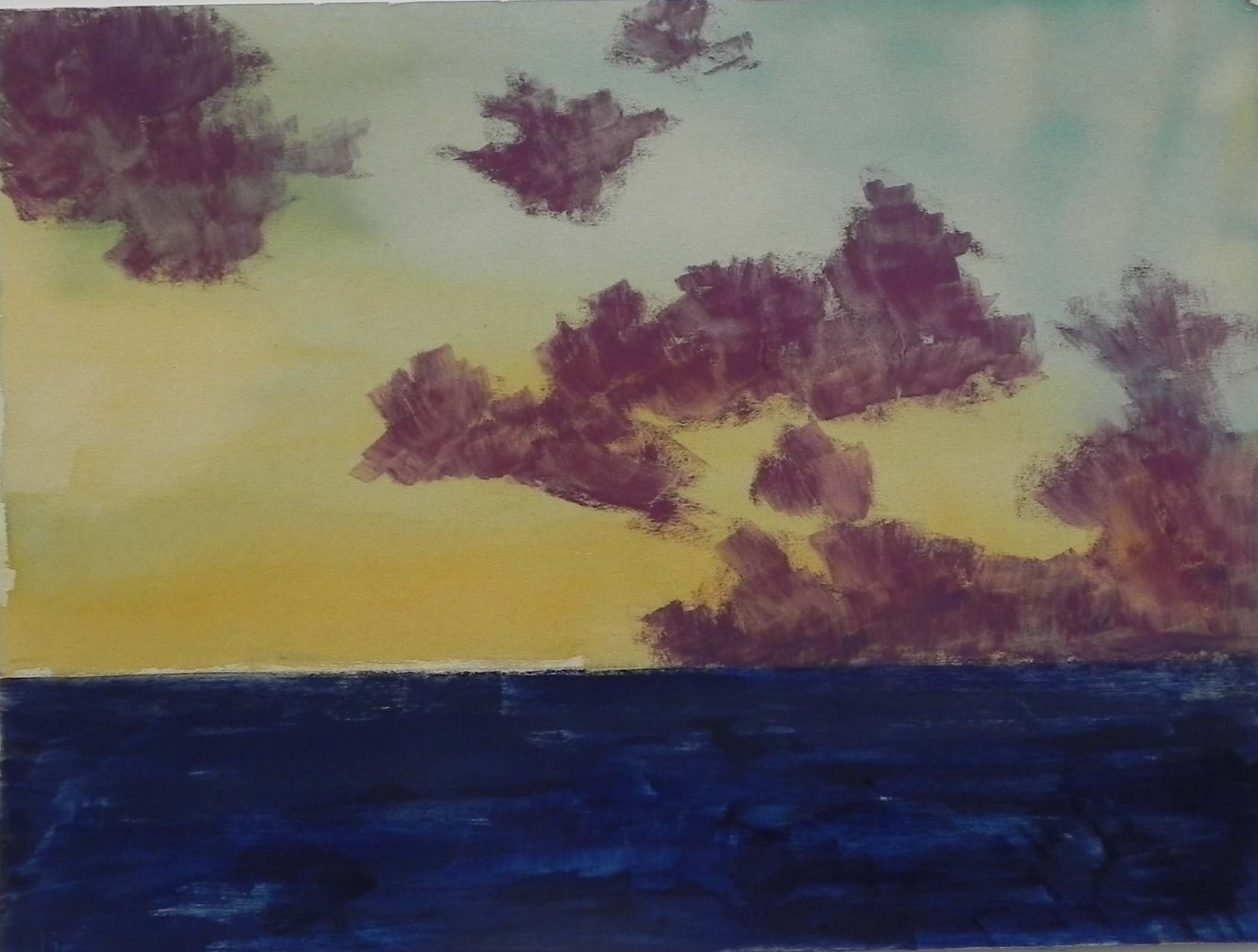
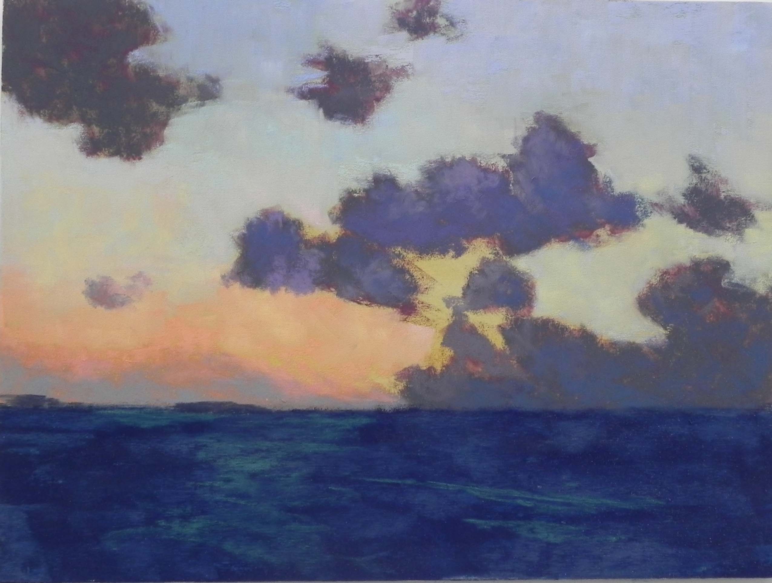
Stage 2
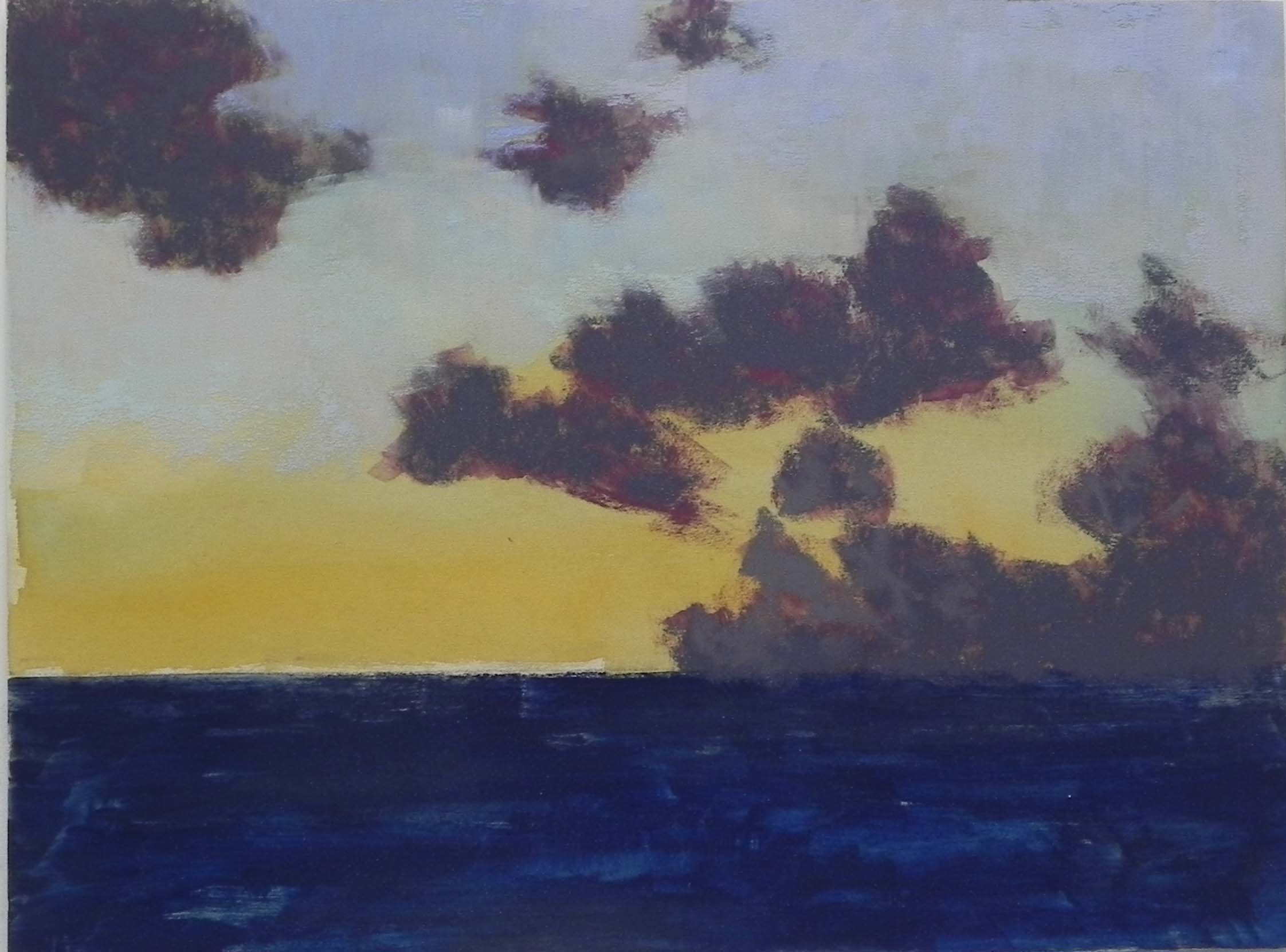
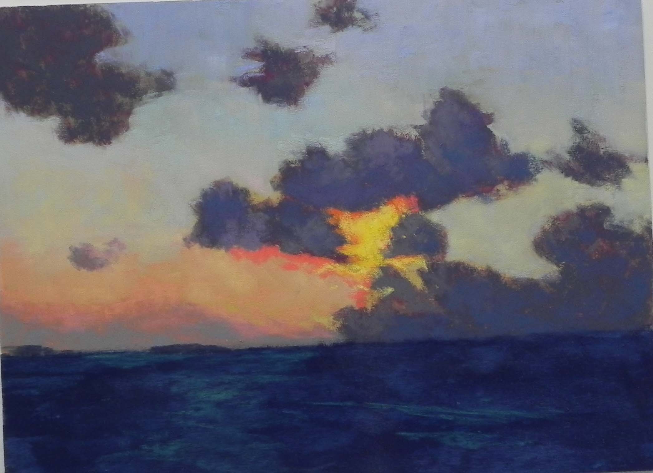
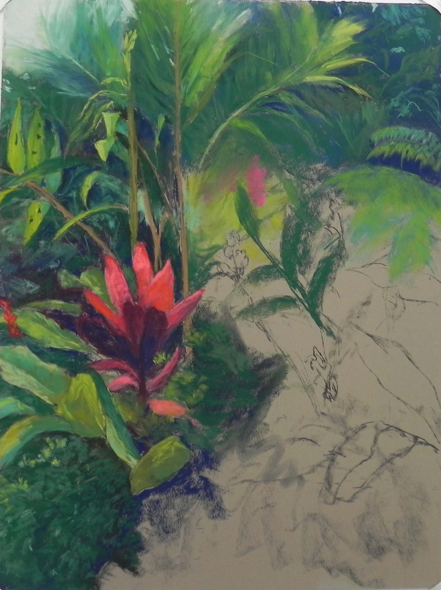
Stage 3
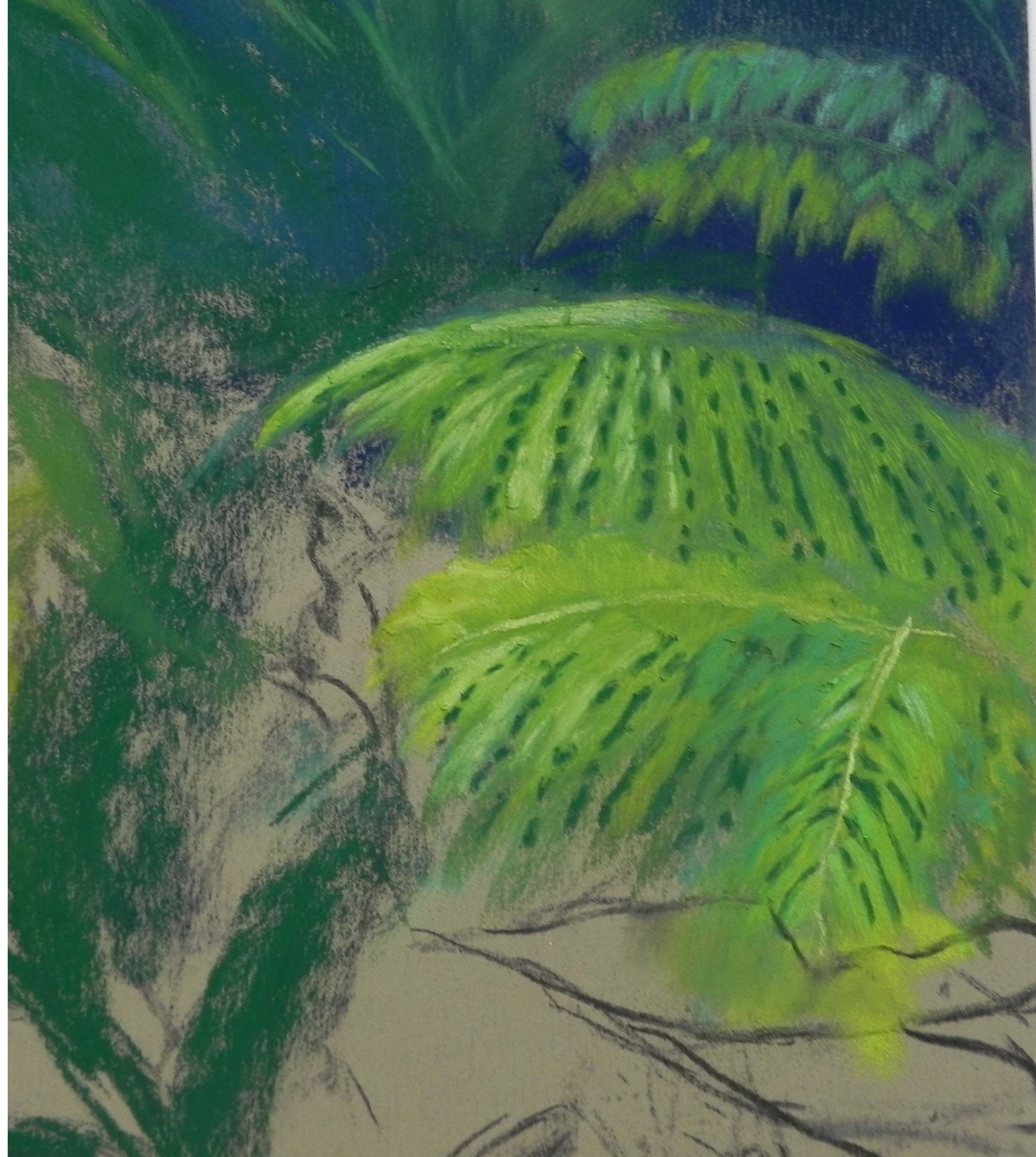
Detail of ferns
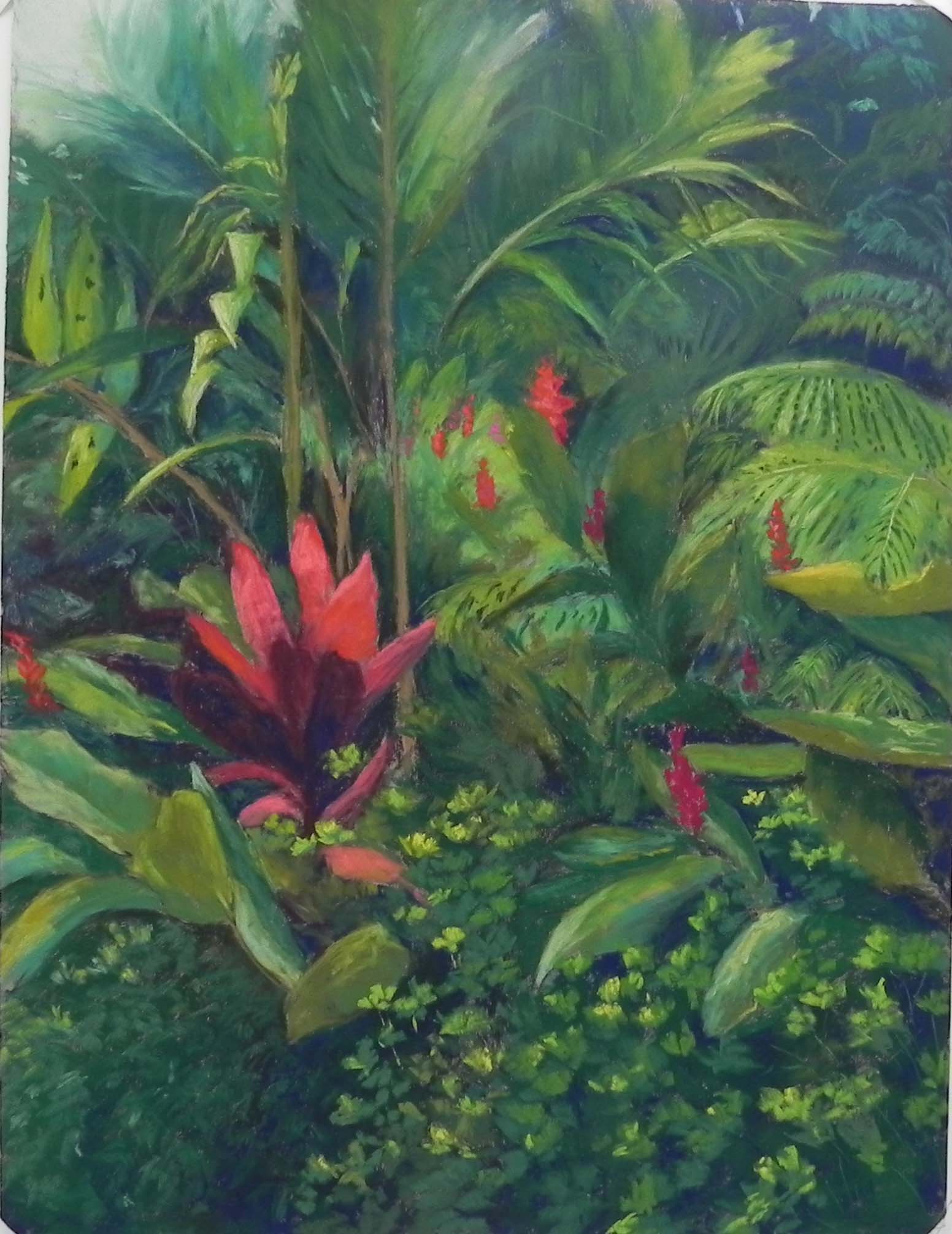
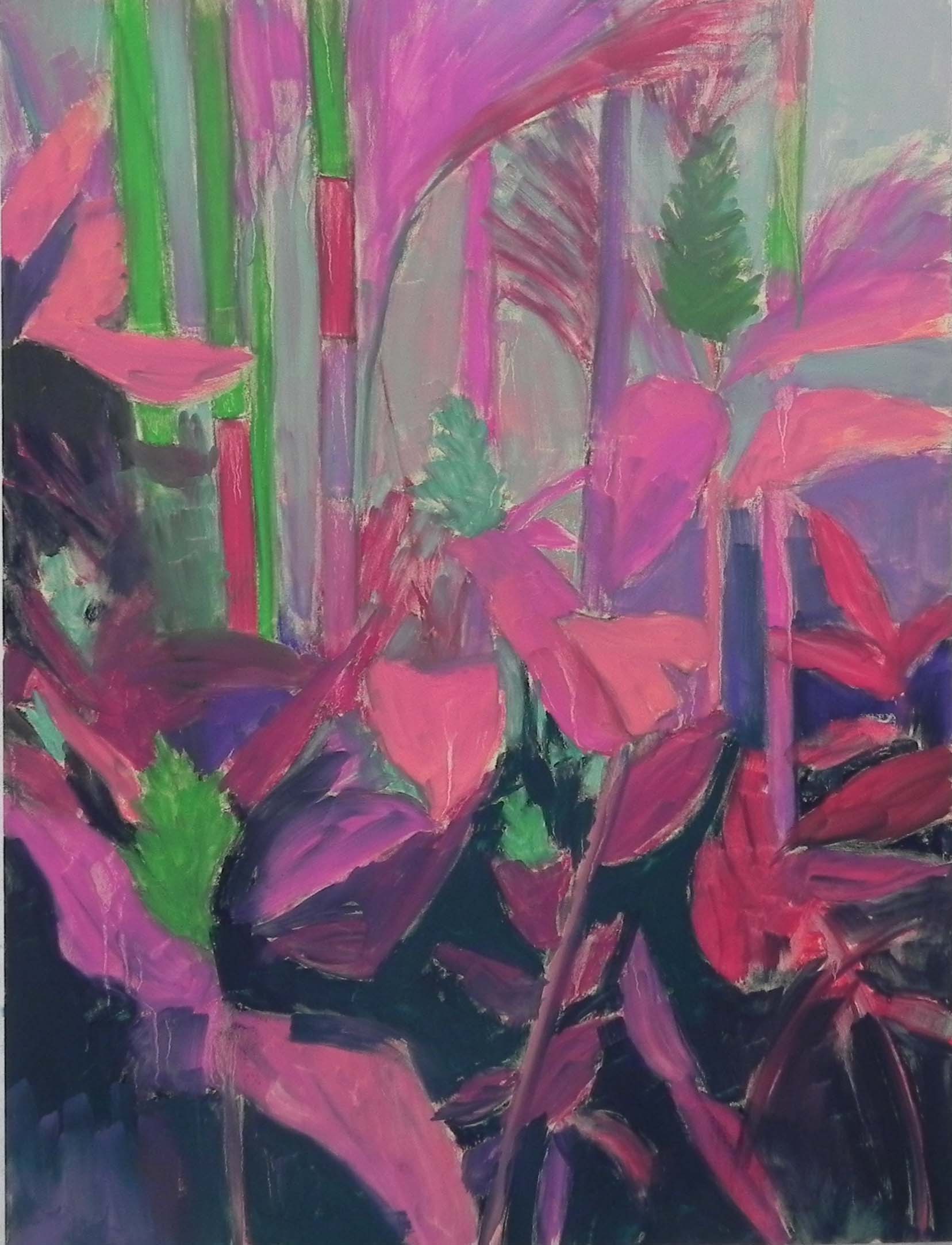
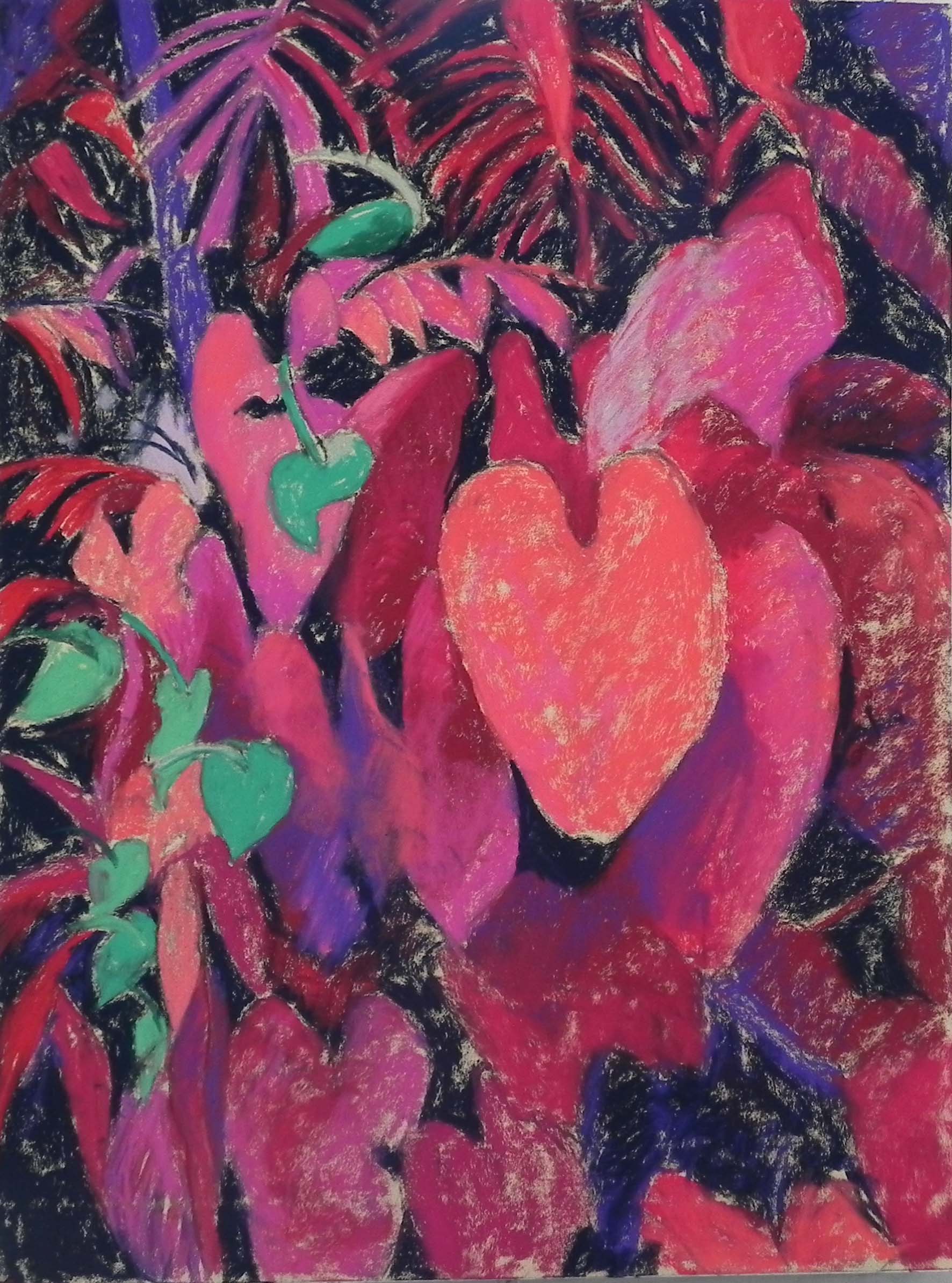
Filled in but not complete
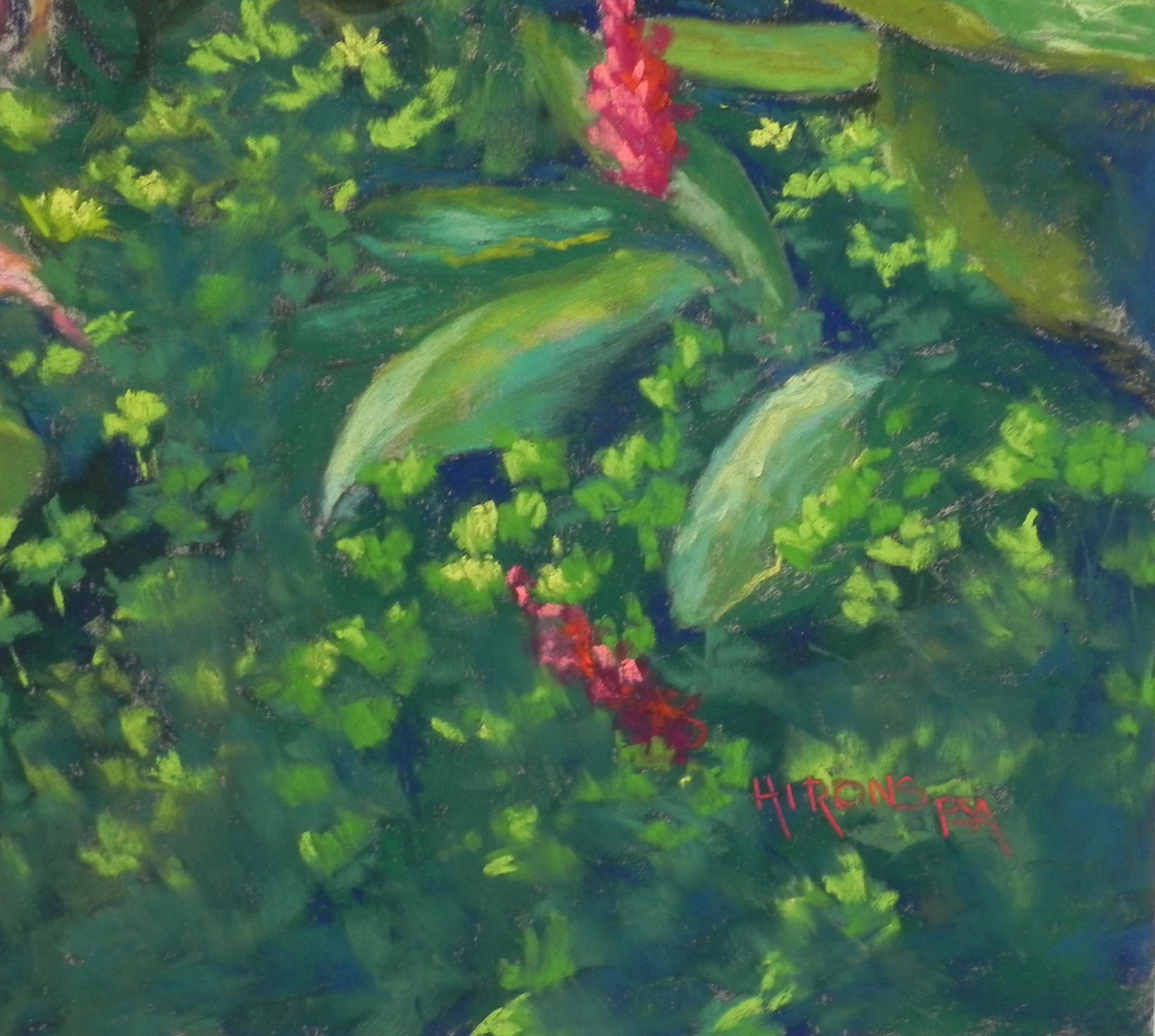
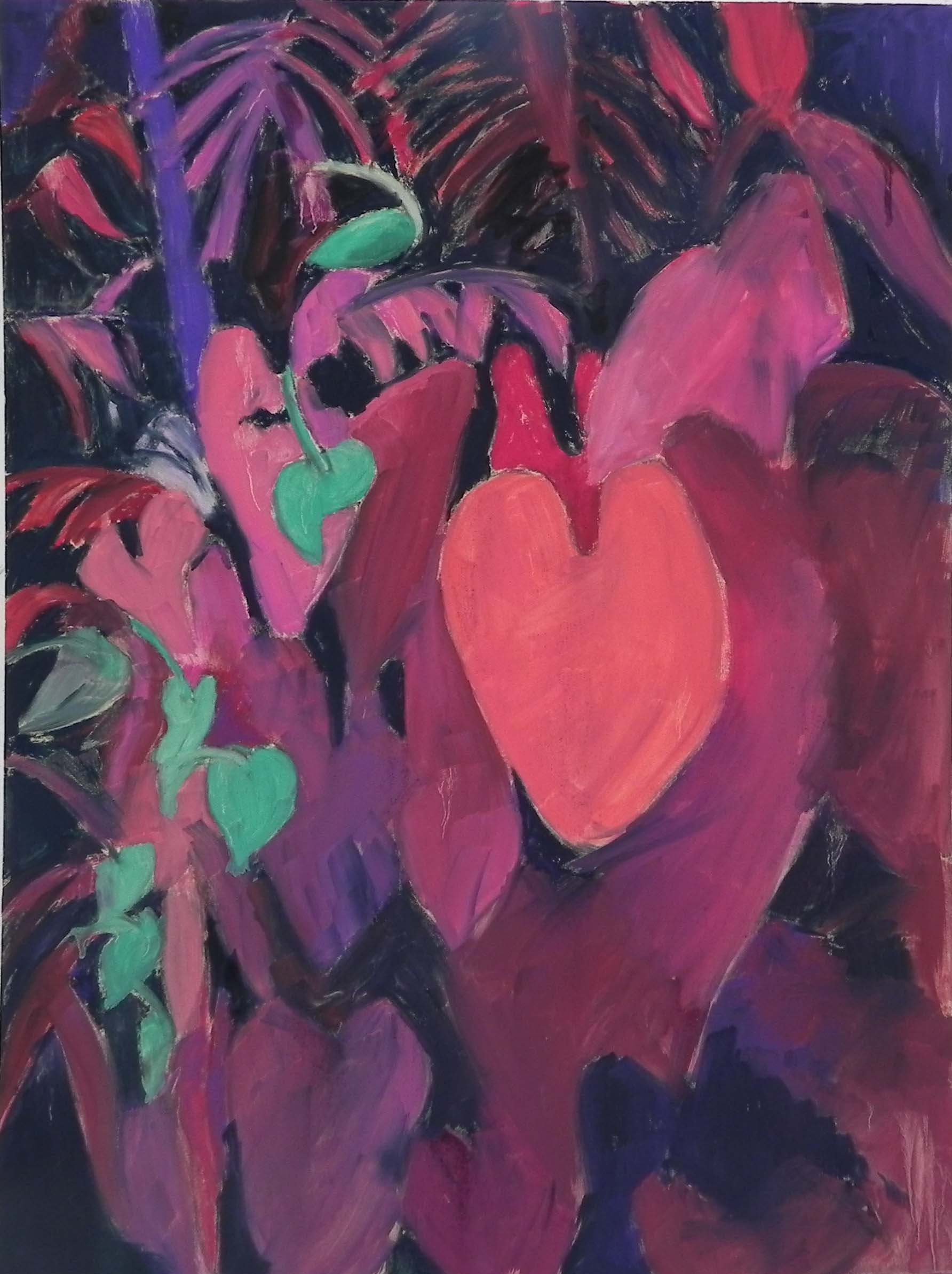
Detail of bottom right
This afternoon I spent about an hour finishing my third 24 x 18 botanical from Costa Rica. I had worked on it a lot on Wednesday afternoon and wasn’t real happy but couldn’t do anymore. Today I went in with a fresh eye, knowing what I didn’t like and worked it to my satisfaction. I’m much happier with it now and want to share the process with you.
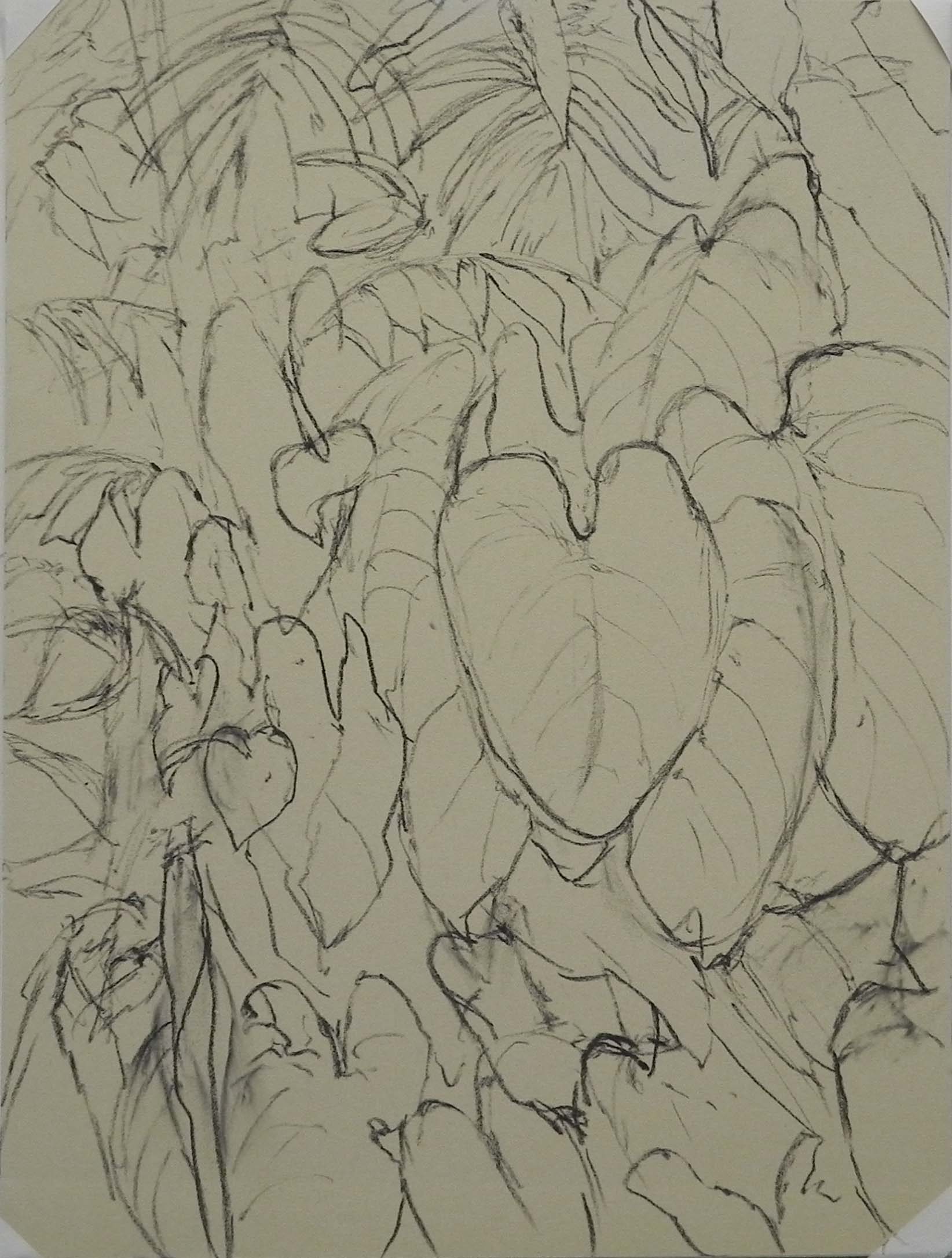
To begin with, I had a very complicated image that most people thought I was nuts to tackle! But one good friend and excellent pastelist told me to go for it and I was happy that I was giving it a try. I knew that I had to do more with the red plant on the left side of the photo, making it larger and more prominent. Then, my plan was to use the small ginger flowers to give a flow into the center of the painting where there would be more light. That was the plan!
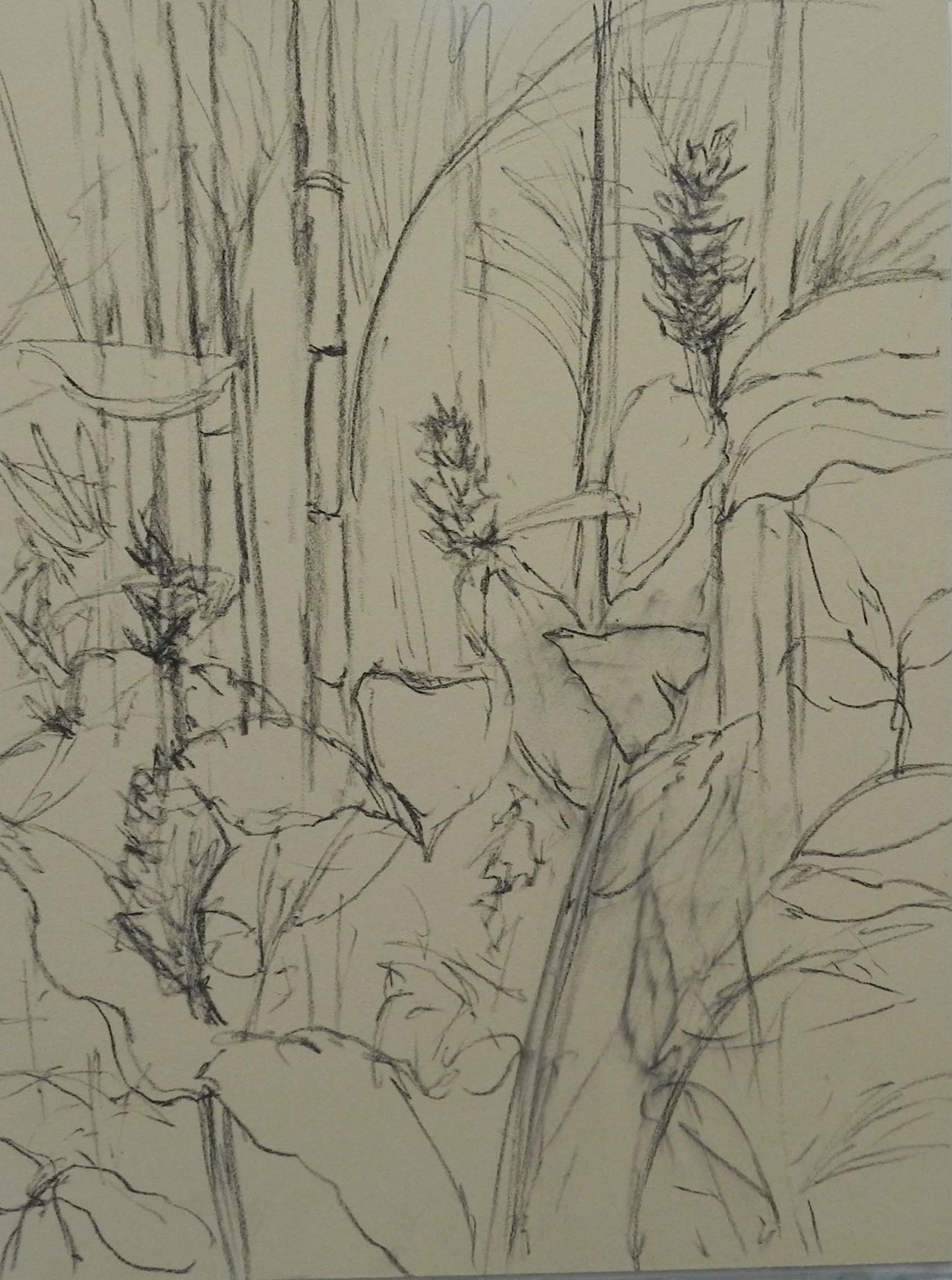
The details were what scared me! The palms and the ferns and all that schefflera at the bottom. (It’s odd to see house plants growing in the wild!). Because of the details and lack of large shapes, I decided that I did not want to do an underpainting and used mounted Pastel Premiere Italian clay instead. I did a rough drawing with my graphite stick then began with the upper left corner where there was some sky. I immediately had fun doing the ferns! I used Giraults–of course–and lightly applied some darker then lighter color, leaving streaks showing through. By using the side of the stick in a motion that mimiced the palms, I found it was quite easy to do them. Of course, I also loved the pattern of front tips pointing down above the red plant, and the pointy leaves standing straight up on the far left. These were the fun details!
I tried several darks for the background and ended up using the darkest blue and a cool green. I laid in light applications of the pastel, then worked the details in over and it worked quite well. I really was happy I hadn’t done an underpainting!
I was afraid of the ferns, but found them not to be so bad. I just lay in the greens, then put in a pattern of darks to separate the fronds. It really was much easier than I thought it would be.
For the red plant (I don’t know what it is called) I made it larger and more full than in the picture or in another reference I used. I used a deep magenta with some dark blue for the dark petals used cool and warm Giraults and Ludwigs for the sunlit petals. I was quite pleased with their shape and the way it gave so much more to the painting.
The hard parts were the middle and the bottom right. I worked on both, putting in too much detail and finally covered the surface and called it quits. I knew there were two things i didn’t like in the “not complete” picture. The middle area was muddled and it was very hard to read what was going on. I had not accomplished the idea of using the small reds to lead the eye into the center of the painting. The other problem was the schefflera. There was too much detail and it was a distraction. I began by brushing out some of the color in the middle. I added three dark leaves and then more light to make it clearer. I also changed some of the ginger flowers, getting rid of one on the mid right and adding a new one in the bottom right. To fix the problem of the bottom right, I took the blue that was in the upper left corner and lightly brushed it on over the entire area, smudging the leaves and getting rid of a lot of the detail. I immediately felt that the painting was the better for it. I’ve added a detail so you can see what it looks like.
I’m going to do reproductions of these three paintings. They were a lot of work and I hope they’ll be popular. Now on to something different I think!