Who are you? Who are we?

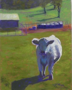
Who are you? Who are we? 14" x 11" UART 320

Who are you? Who are we?
14″ x 11″ UART 320

Reference photo

Reference photo

Underpainting before alcohol

Underpainting before alcohol

Underpainting with alcohol

Underpainting with alcohol

And now for something completely different!  In late October my husband and I drove to Pennsylvania to see a fellow who I visit in prison.  On the way we drove through rural Maryland and I stopped and took pictures.  I was running up the road in Uniontown to take pictures of the backs of houses when this fellow took a real interest in me!  I was instantly besotted!!!  What a gorgeous cow–well, steer I guess.  Anyway, his innocent look and the lovely light and shadow on him were just wonderful.  Two days after taking the picture, the shootings at the synagogue in Pittsburgh took place.  I decided to use this painting to say something about my unhappiness with the state of our country and its leadership.  The rising level of anti-Semitism is something I hoped I’d never see in this country.  So, this is where the title comes from.

During one of my classes, I did a quick drawing of him.  It came out really good.  I measured it as a 12 x 9 and my idea was to enlarge it to a 24 x 18.  I thought he’d be the perfect project for our Open Studios weekend.  I spent all Friday night trying to draw this &&^^*^% cow! People kept coming in and giving me advice and I finally gave up.  As I mentioned in an earlier post, the 18 x 24 board was used to do the Towpath, Violette’s Lock painting and I was very happy with that.

But, I still wanted to do Mr. Cow. So I decided that the answer was to trace my drawing and use an 11 x 14 board.  I used tracing paper and decided to try using pan pastel on the back of the drawing.  It barely gave me an image–don’t do this!  But I got the drawing down, then refined it.

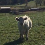
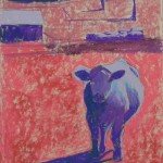
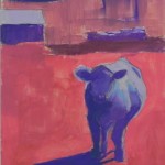
There wasn’t much color in the photo, as you can see.  Greens with a white cow in light and shadow.  I wanted my cow to be colorful but not electric blue or purple, as you see in some paintings!  I used Caran de’ache hard pastels for much of the underpainting because they have light violets and blues that aren’t available in NuPastel.  The red under the grass is also of this brand.  I was worried about doing the underpainting, having gone through such agony with the drawing.  But it worked OK.

I kept the background pretty simple. In the photo, the roof and the light on the cow are about the same.  I started with a green in the roof and added some yellow, but nothing like the light on the cow.  One thing I’m not sure I’m pleased with is the use of the cooler green in the grass in the background.  It probably should be closer to the foreground, as seen in the photo.  (A note also that when I was trying to do this as an 18 x 24, the large amount of grass was much more of an issue than it is in this smaller size.)

For the cow, I layered violet, blue, green, and brown in the dark areas. For the light, I began with a bright, very light blue green, then pink, some yellow, light violet, then an Art Spectrum extra soft lemon yellow which really made him come alive!

This went very quickly and I enjoyed doing it.  I could have spent more time on it, perhaps, but I think it says what I wanted to say.

Autumn Walk, Violette’s Lock

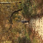
Reference photo

Reference photo

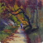
Early stage

Early stage

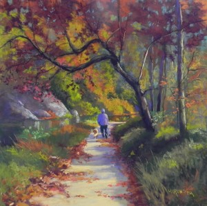
Autumn Walk, Violette's Lock, 20" x 20", UART 320

Autumn Walk, Violette’s Lock, 20″ x 20″, UART 320

Yesterday I finished this 20 x 20 painting that I started several weeks ago.  I decided to do it, even though the reference photo was not very inspiring–color or value-wise. I’m including it so you can see how little value variation there is in it. (Sorry, I can’t seem to get it right-side up!)

My underpainting was just a lot of color with the tree and towpath delineated. I brushed alcohol on with a big brush and I basically had a brown surface!

There were a number of challenges with this painting. First, the subject is right in the middle.  I decided that was probably OK.  The towpath and canal lead the eye past the subject to the right so I felt comfortable with it.  Second, there wasn’t much of interest along the canal on the left side.  There was some kind of rock there barely visible. So I made up some rocks to give a little more structure and interest to the painting.  The major problem was the lack of value differences–even sideways, you can see that the only things that stand out are the light towpath and the dark tree. All of the foliage is about the same!  So I decided to make the leaves on the tree darker, using several values of deep Ludwig reds.  Behind them, I placed various greens and oranges and a blue green.

The picture called “early stage” was what it looked like on Saturday morning when I went to the studio prior to class.  I really didn’t like several things. First, the red leaves at top were identical blobs of color!  Second, the orange to the right of the man was too extreme. It detracted from the man and his dog, who have to be the center of interest.  I resolved the latter issue by placing greens on over, letting a little orange show through.  I resolved the first problem by breaking up the reds with a deep blue green.  I loved the effect of this!  I also decided to try using a rubber blender to “pat down” the leaves in the distance to set them back and give a more dreamy quality to the scene.  I finished the lower right corner yesterday morning and make a few more small changes, then let it go.  I decided that this was the type of painting one could work on forever!

It can be hard to do paintings that have no sky. The sky opens things up and provides a lightness that’s missing when all one has are trees.  But I think that the light on the towpath gives the painting some cheeriness and leads the eye to the man and his dog.  (And, by the way, this dog was really easy to do!  Not much more than a few strokes and I had the back of a collie!!!)

The man’s coat in the picture is a black and white check. I had thought about making it red. But I instinctively picked up several violets and liked the relationship between the man’s coat and hat and the rocks to the left.  I’m happy with the balance of color.  Interestingly, when he walked by me, he said “not much color this year.”  I watched him go and realized I had the perfect subject!

Break in the Clouds

Break in the Clouds, 12" x 16", Pastel Premiere "Italian clay"

Break in the Clouds, 12″ x 16″, Pastel Premiere “Italian clay”

Partial underpainting and block in

Partial underpainting and block in

Early stage of completion

Early stage of completion

Today I did my second demo of the week and my second painting from the McKee-Beshers preserve in Poolesville, MD.  Like the first one (Sun on the Marsh), the background is just trees and quite dark.  Unlike the first one, however, the background trees have no light and there is a group of bushes in dramatic sunlight in front of the trees.

I chose a 12 x 16 mounted sheet of Pastel Premiere Italian clay to work on. I drew a composition using charcoal lightly on the surface.  One of my challenges was that the photo was not good. I had captured only a portion of the bushes in light and the bottom shapes were really boring.  I looked at other photos and combined them to come up with what I thought would be a decent composition.

After I did the purple underpainting, I used some Giraults to lightly lay in the shapes of the water and plants growing in the water. This is all watery with various types of plants growing and in light and shadow.  Once that was done I lightly indicated the bushes over the background to mark the shape.

For the background trees, I used several warm green Giraults and lightly brushed in foliage then added trunks with a light grayed blue green. Then I added the foliage of the large tree coming down on the left. I kept it to two fairly dull greens, so as not to compete with the bushes. I began the sunlit bushes with a light yellow green Girault, a sienna, and several values of yellow and brown.  I didn’t want to go to a bright yellow at first.  At one point it was decided that I hadn’t left enough holes, so I used the eggplant pastel to create them and it worked great.  (You can see the difference in the two photos of the initial and final completions).

I really liked the effect of using cool blue green in the water to denote the shaded area but my students had problems reading it and I ended up adding more of the dark green leaves and changing the shape of the reddish bottom.  For the warm sunlit water I first put in some Girault whitish green and yellow green, then some Blue Earth, then a little Roche. I kept experimenting!  Finally, I realized that the same plants were growing in this area and needed to be at least hinted at so I used my Blue Earths to put in small specs of lighter and darker greens.  With the water to my satisfaction I could then add some vertical twigs over in the lower left corner.

My final notes were in the bushes and grasses below them where i went to soft pastels, added a real yellow at the top and several oranges in the grasses.

All of this took exactly 2 hours!  I got lots of useful comments from the class and really enjoyed the exchange, even the harangues!  It’s a better painting because of their input.

Towpath, Violette’s Lock

Towpath, Violettes Lock sm

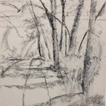
Initial charcoal drawing

Initial charcoal drawing

Charcoal with water

Charcoal with water

Underpainting before alcohol

Underpainting before alcohol

Underpainting with alcohol

Underpainting with alcohol

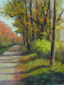
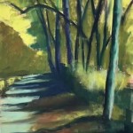
We had Open Studios weekend this past weekend and I always like to work on a fairly large painting during that time.  During a trip to Pennsylvania two weeks ago, I had taken a picture of a lovely young steer who was looking at me, with farm yard behind him.  I fell in love with this guy and I did a 9 x 12 drawing that came out quite nicely.  I decided to double it and make it a 24 x 18. I spent all of Friday night trying to draw the steer on my paper.  People came in and gave me advice and I kept erasing and changing.

On Saturday morning, I decided it was time to scrap this idea. I had taken a walk at Violette’s Lock on the C&O Canal on Thurs. afternoon and i had a picture I thought had real potential. (My husband didn’t think so!)  So I went to the studio early and erased the drawing. (If you look at the initial drawing, you can still see a little of him on the lower right side.  It would have been a terrible composition!)

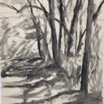
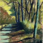
Not having done a drawing or any studies, I decided to work loosely. I took compressed charcoal and drew in the trees and shadows of the towpath.  I then applied water to this. It was SO freeing after the difficulty of drawing an animal!  I then added the underpainting and I lightly brushed on the alcohol with a wide brush moving from top to bottom. It worked really well.

The reason I took the photo was that I saw the potential of the green bushes catching the light. In the photo, these were smaller and much less pronounced–and right in the middle of the picture. I expanded them and liked the shape and I was pleased how well it came out in the underpainting.  As visitors came in at various stages, they could clearly see where I was going with the painting.

I have to say that doing this painting was sheer joy!  But I had some challenges, primarily with the towpath and its shadows.  Getting the values right was not easy. The shadows were darker in the grassy areas than on the dirt path. And I was looking at my IPAD, which is a squarer format, and making it into an elongated 24 x 18.  But it worked.

For this painting, I used a lot of Henri Roche pastels.  I won a set last year and decided they would work nicely in this painting. They are highly pigmented and soft but not buttery.  The orange pieces in the trees are all Roche. However, for the light greens, I used Unisons and softer pastels, which worked better.

One of the last things I did was to add light values of aqua into the dirt towpath, and a darker turquoise in the shadowed area of the grasses at bottom. I liked this a lot.

Someday I might try to do my steer. We’ll see!


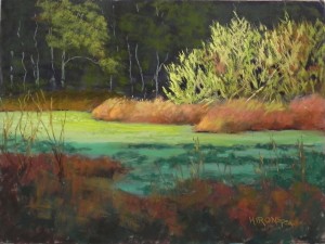
Sun on the Marsh

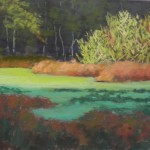
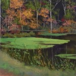
Sun on the Marsh, 20" x 16", UART 320

Sun on the Marsh, 20″ x 16″, UART 320

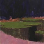
Initial underpainting

Initial underpainting

Early stage

Early stage

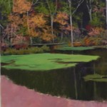
Revised underpainting

Revised underpainting

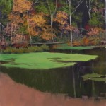
Initial "completion"

Initial “completion”

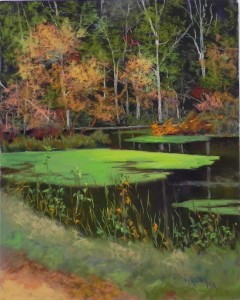
Hello Friends. It’s election day and we are all nervous. I’ve been reading hopeful stories of possible new members of Congress, but on the whole, I’m trying to focus on something else. Over the weekend I did a large happy painting, and yesterday I did a demo. I’m sharing the demo with you first.  This one was a challenge as the background was basically black with very lacy leaves and white trees. Quite exotic!

I decided to use a Ludwig “eggplant” pastel for the dark background. It’s much richer and darker than any hard pastel and I wanted to leave parts of it showing through.  I used regular hard pastels for the rest of the very abstract underpainting–just shapes.

I used a series of Giraults to lightly lay in the trees and foliage over the dark background.  I used a dark brown, warm green, and some of the eggplant for the water.  For the green pond scum in the middle, my initial thought was to do a “Tony Allain” swoosh of saturated color. But when I did it, it really was NOT GOOD!  So I brushed it off, put in some Girault and later added two values of Blue Earth greens on top.

I decided that the initial pink in the bottom was terrible!  So I added more brown to it and more alcohol and liked the color much better.  Then I added the grasses on top and the vertical pieces, using both the sides of Giraults and some sort Blue Earth to make interesting marks.  My class wanted more dark in the foreground, which was very light in the photo, so I decided to add an indication of leaves against the grasses.  I liked this as the bottom left corner now picks up the colors in the top.

This was a fun painting to do as it took some thinking about how to do it.  I discussed strokes with my class and this painting had a wide variety of them.  I’ll be doing another demo tomorrow, probably of the same area.  For those in the DC area, this is the McKee-Beschers reserve on River Road in Poolesville, past Seneca.  It’s a lovely area to walk, but in the fall you hear the pop of guns all over!  A little disconcerting.