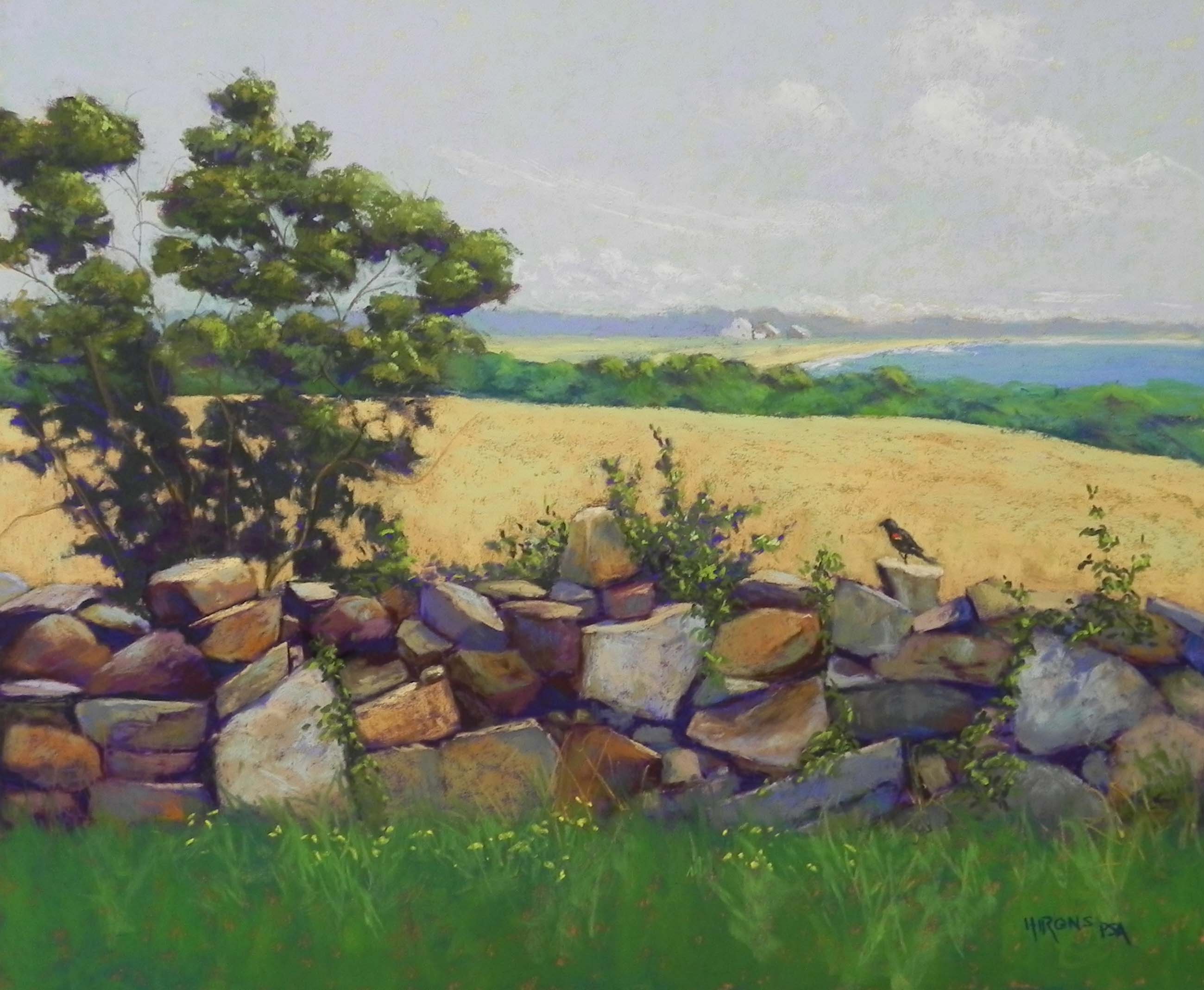
A Rock Wall by the Sea, 20 x 24, UART 320
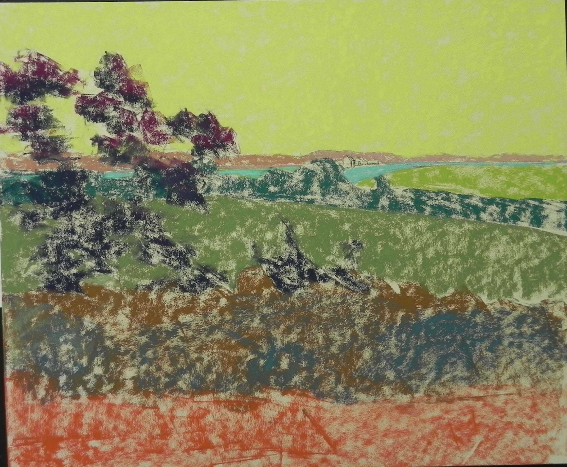
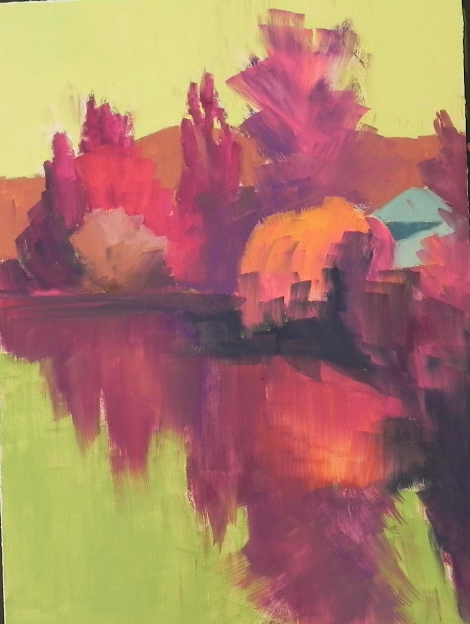
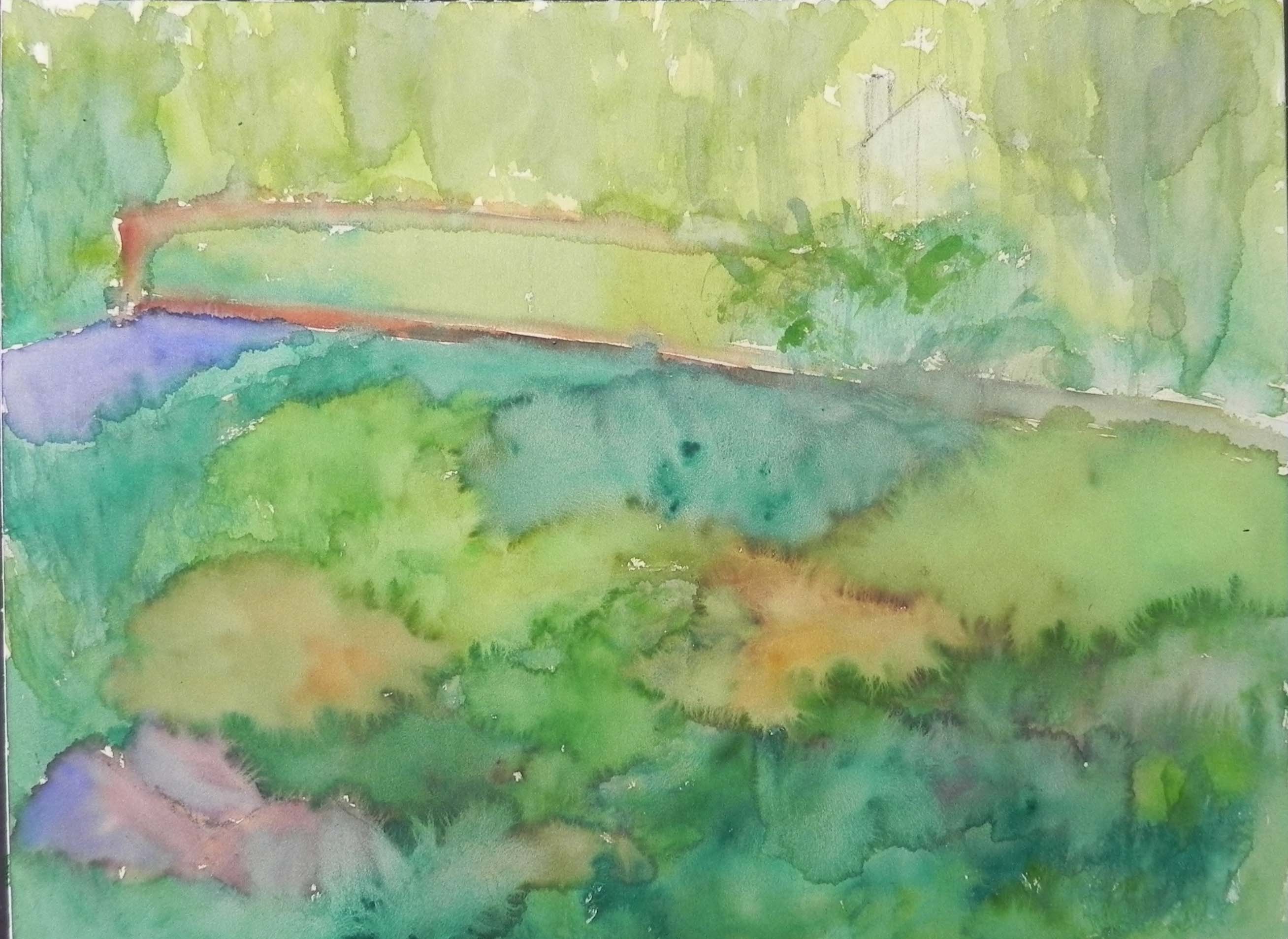
Underpainting step 1
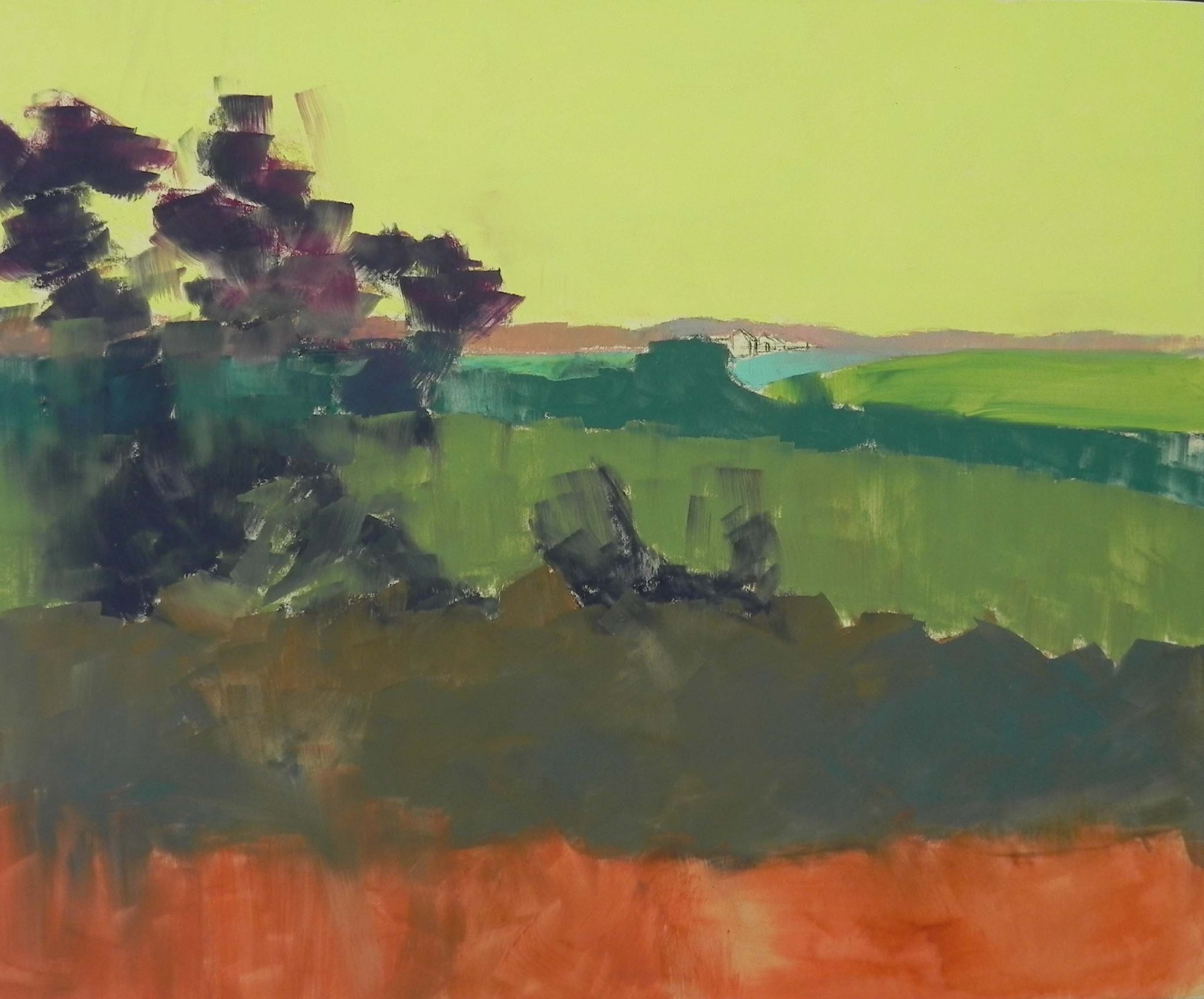
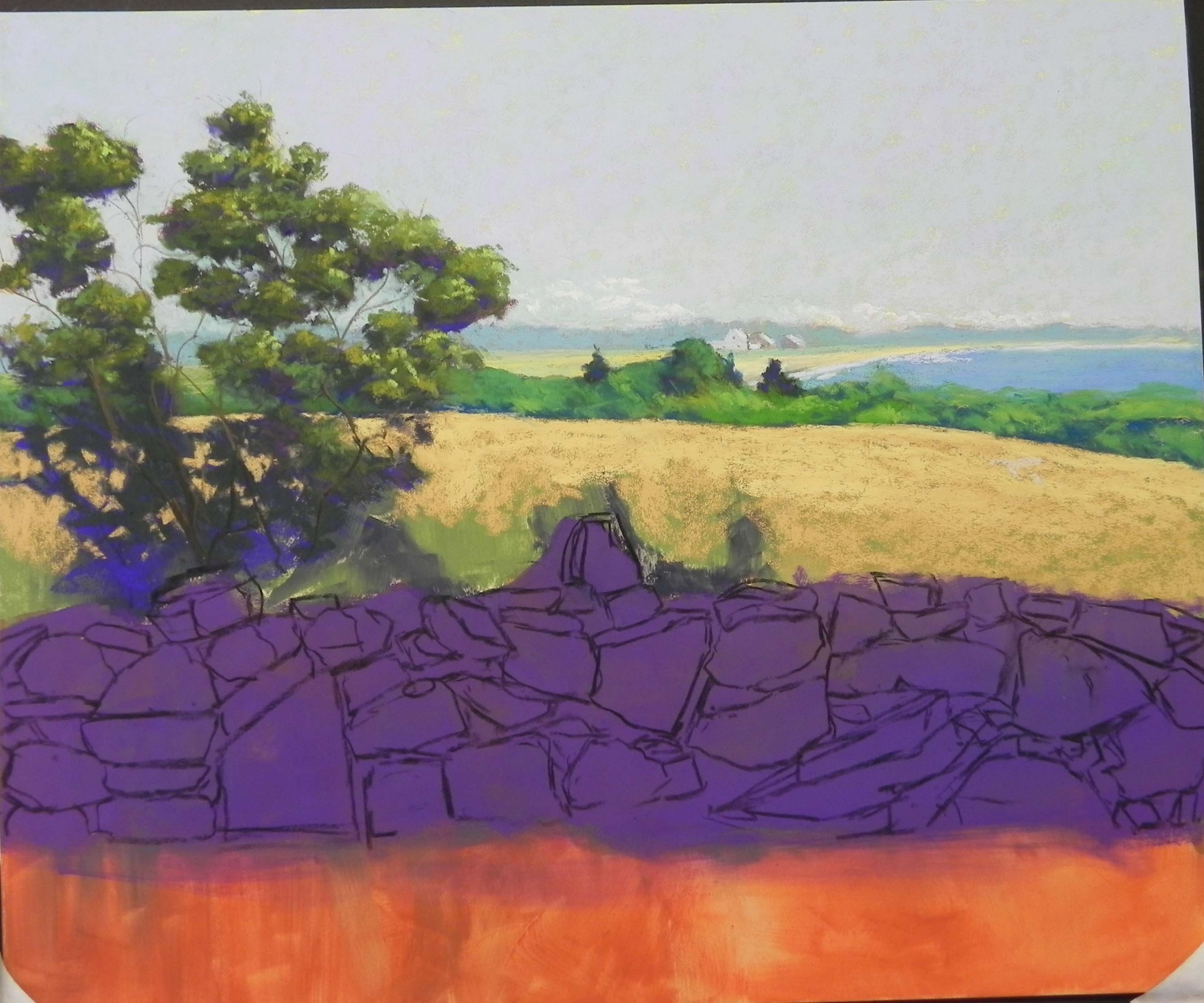
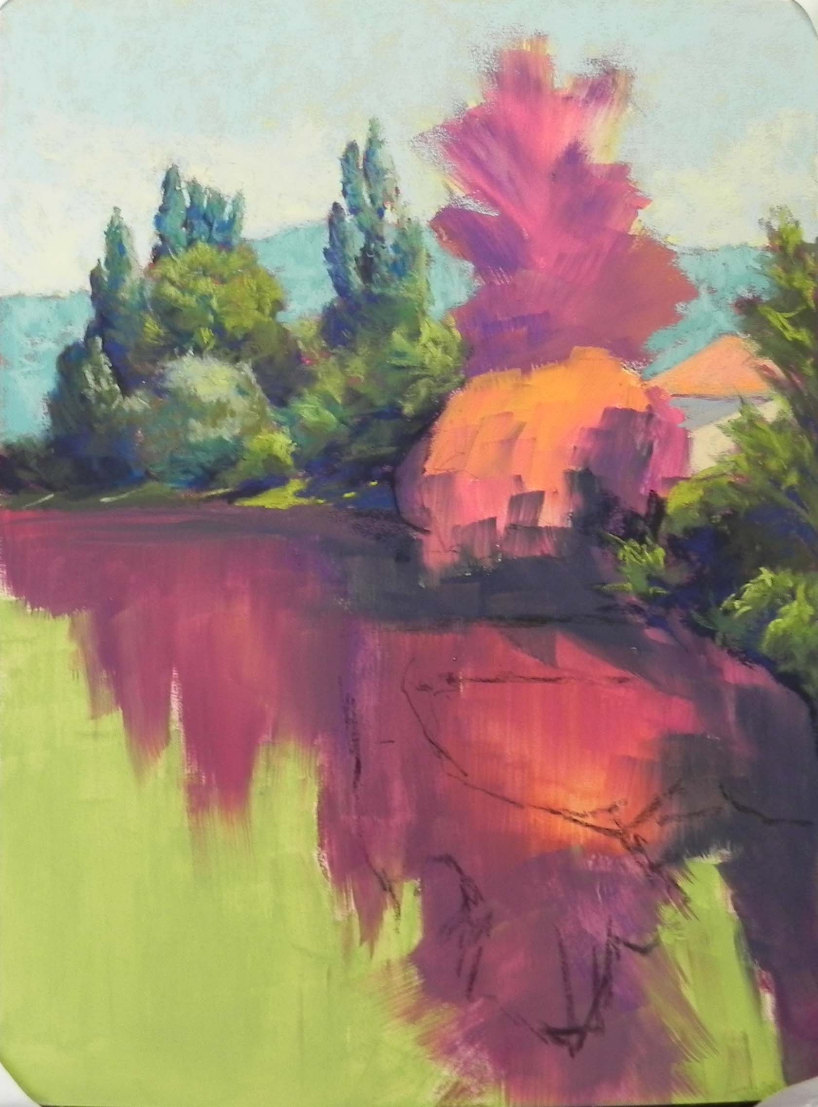
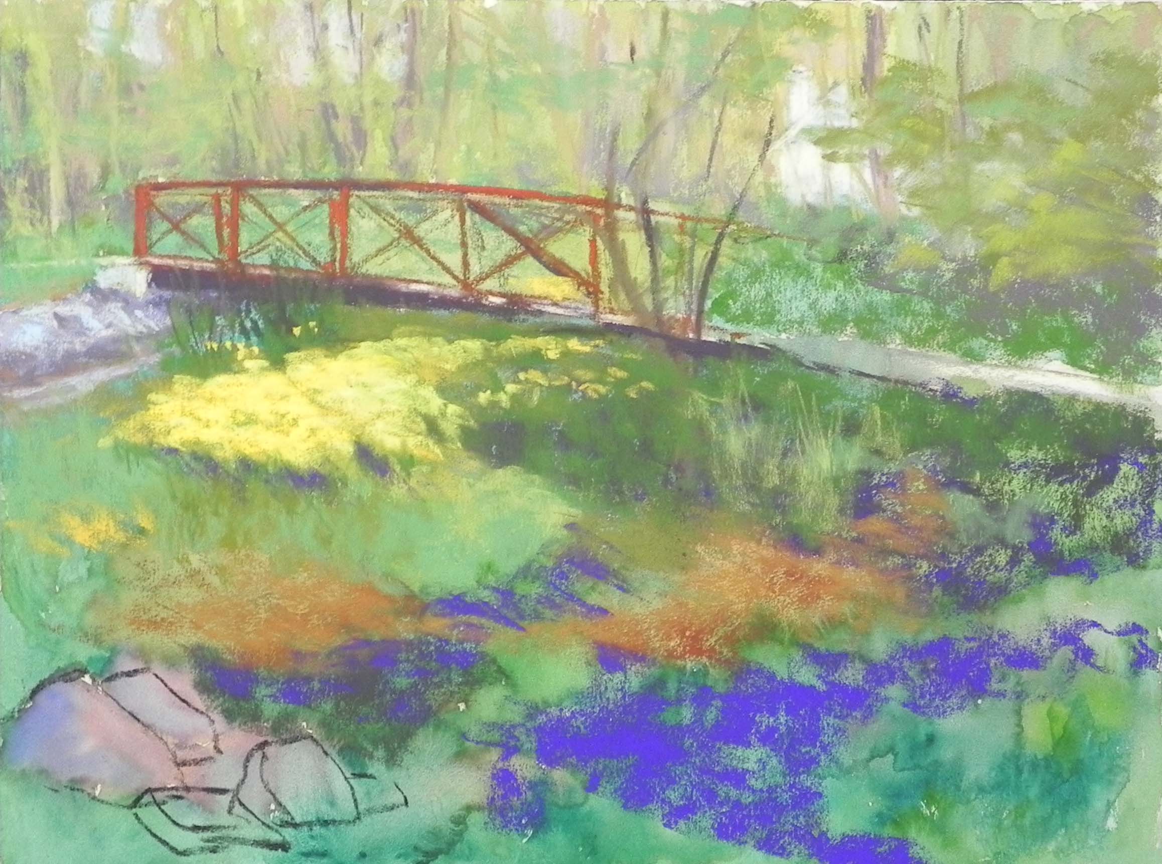
Revised underpainting and drawing of rocks with charcoal
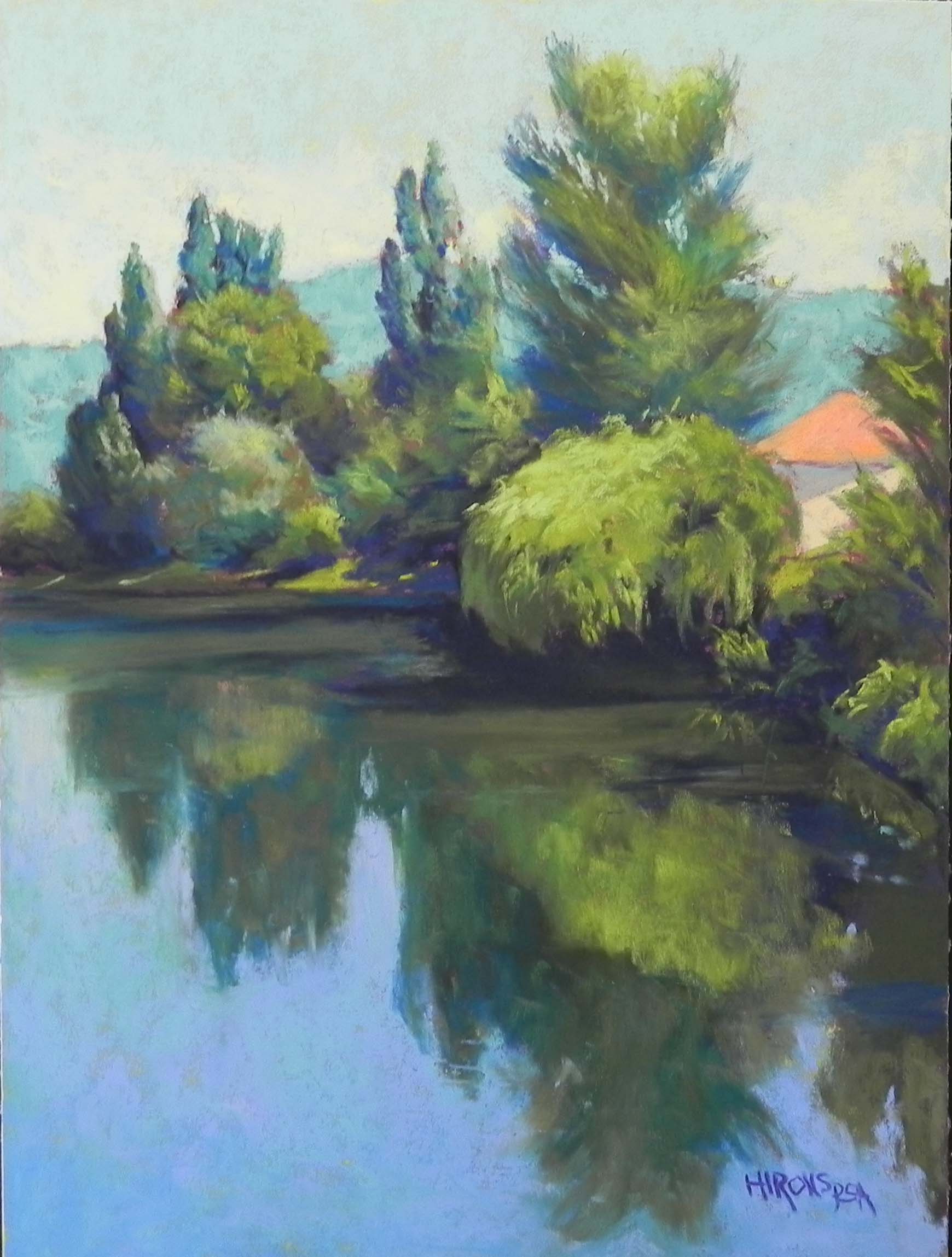
I’m going to be giving a Rock Workshop via Zoom in June so I’ve been looking through my photos of New England–knowing there are lots of rocks there! And I found a wonderful photo from Westport, Mass. taken on one of the many trips to the Bay Side restaurant with my mother. I loved the photo immediately and was surprised I had never done anything with it.
My first decision was not to draw the rocks until I had done the underpainting as I didn’t want to lose them all with the alcohol. But I used a combination of blue and brown that turned gray and had no life or good value. So later, as you can see, when I got to that part, I used a purple NuPastel and went over it and added alcohol. Then I drew in the rocks with charcoal. It worked really nicely and I could easily revise the charcoal when I needed to.
The first challenge was the sky (which doesn’t show really well in this photo). There were no clouds in the photo, completely blue but light and a little hazy. I started with that by using a combination of blue (Great American beacon in a lighter value), blue violet and blue green Ludwigs. I decided to add a layer of light clouds above the horizon and left it for later. At the end, I consulted with my husband and he thought some clouds would be useful. I have a nice reference photo of some cirrus and cumulous clouds in the upper right of the photo and decided to use that. I was really happy with the way they turned out. It’s too large an area to leave with nothing of interest.
My second challenge was the band of greenery and trees behind the trees. You’ll see i the early stages that I have some taller bushes and dark trees. I followed the photo too much and at the end took them all out. The simplification was much better. I have three small houses in the distance which are also a simplifcation. There were more and they are all on stilts! I don’t like the look, so I leave them out.
For the field, I used three values of a soft grayed yellow ochre (Schmincke perhaps), then I added a very light whited Blue Earth green on top of that. I really liked the effect and it helped tie the field to the greens in the background and foreground.
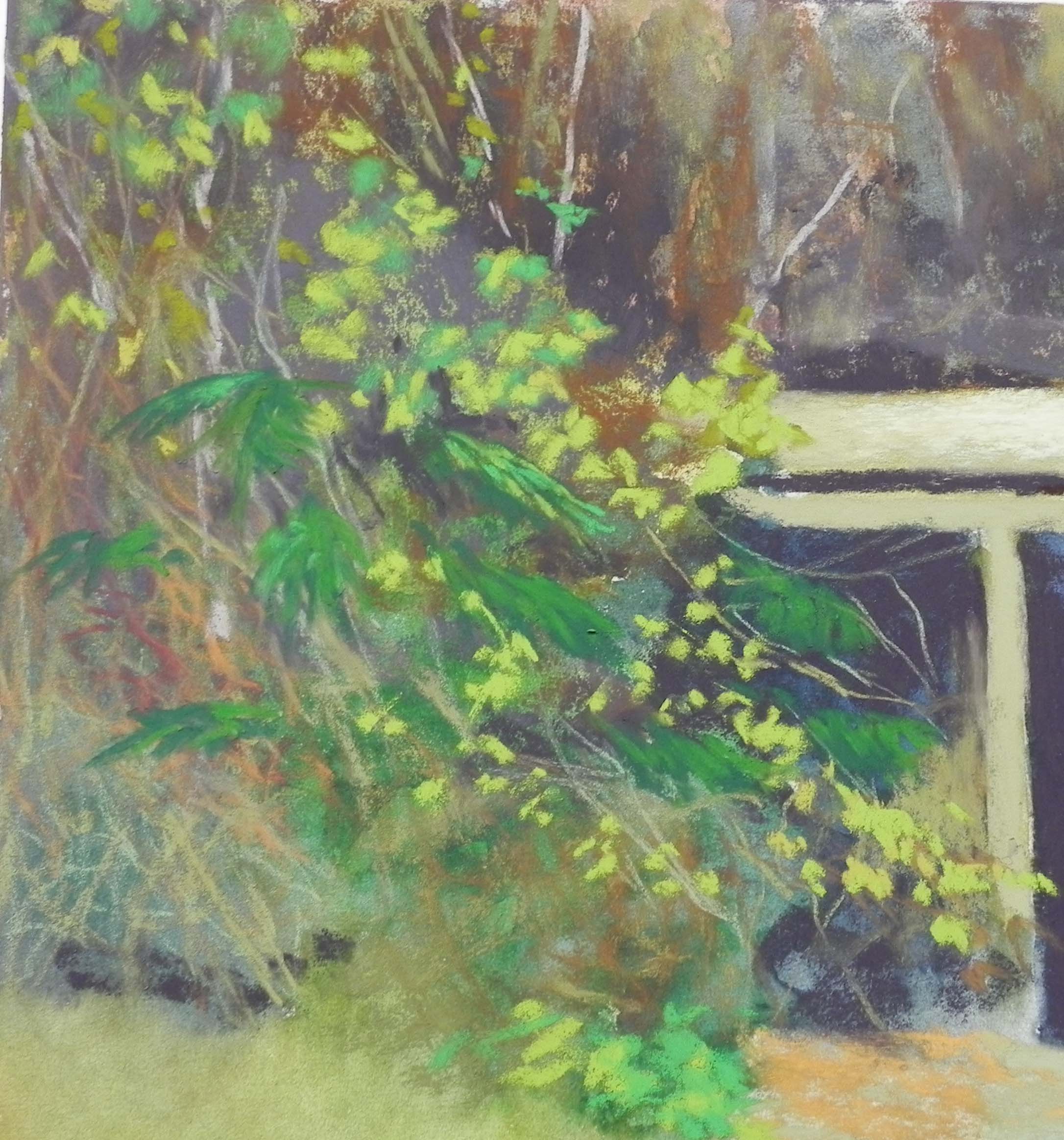
When doing the tree, I began with violets and dark green and used mainly Blue Earth greens, which worked nicely. But then I took a couple of NuPastels and added in very fine limbs that I liked a lot.
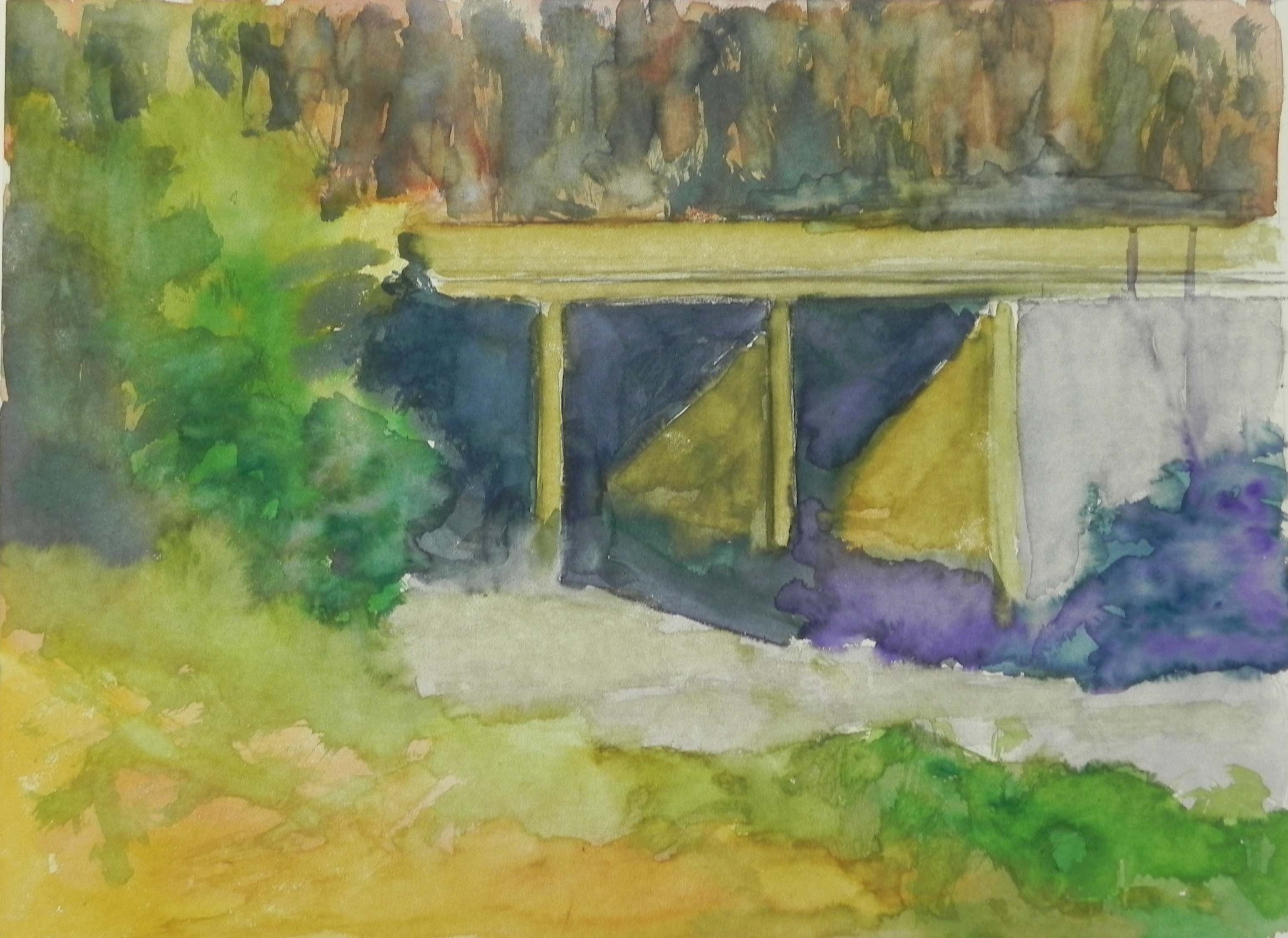
And then there was the rocks! The new purple underpainting was great. I was able to scumble soft pastels over it and leave some showing. I also began with a Ludwig eggplant for the crevices, eventually adding a dark blue gray Roche on top. I used a variety of orange-browns, grayed greens, blues and blue violets and some turquoise in various shades. As I got further to the right, I tried to keep the edges softer and less distinct. This is hard because they are all the same in the photo, but something we have to remember.
Finally, I added a red-winged blackbird to one of the raised rocks, as they are plentiful there, though not in the photo.
This was a really happy painting to work on! And–I’ve just made reservations to go to New England in June. I really miss the beautiful countryside of the South Coast, as well as my family and friends.