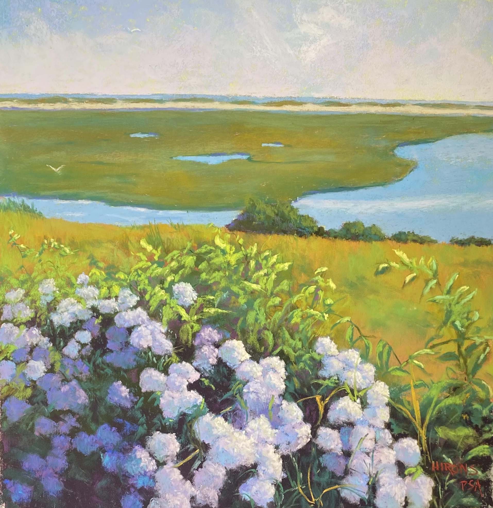
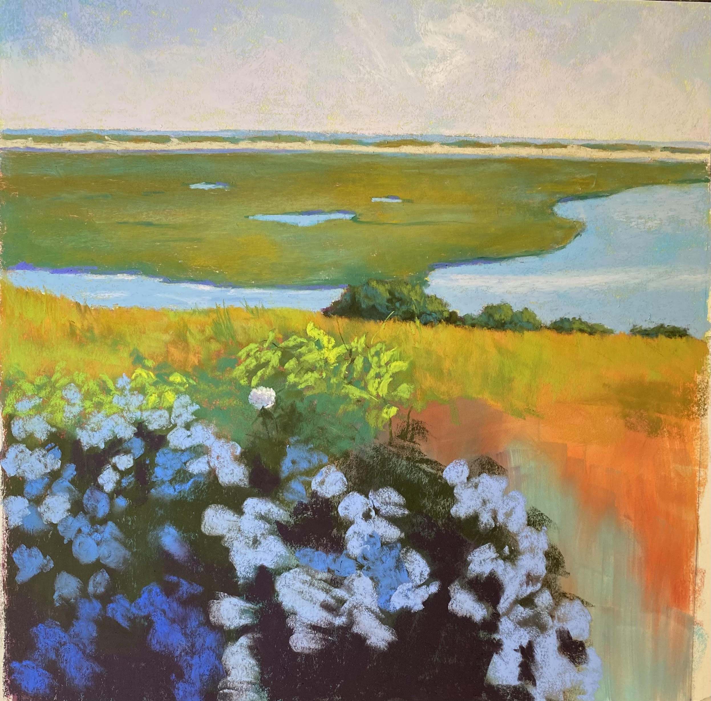
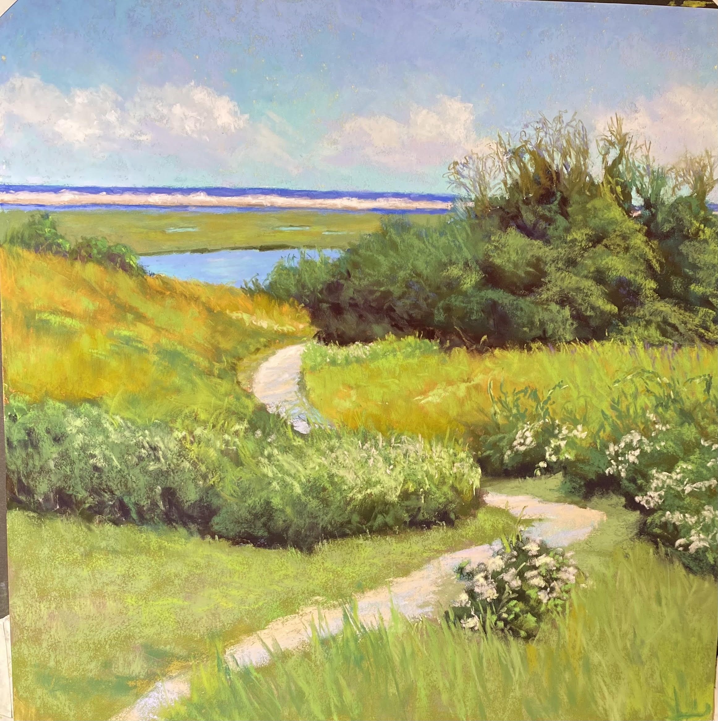
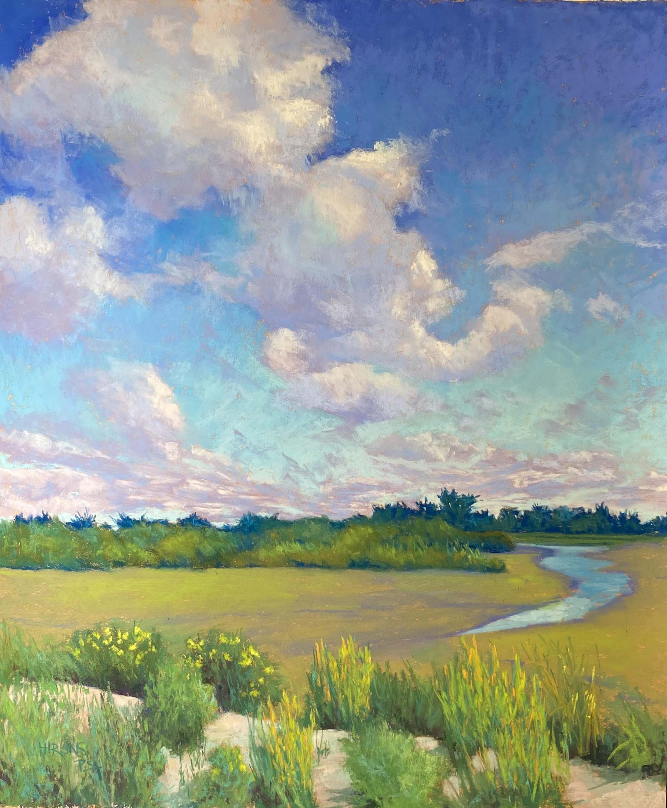
Nauset Marsh, #2, 18″ x 18″, Lux Archival
Underpainting with sky and marsh painted

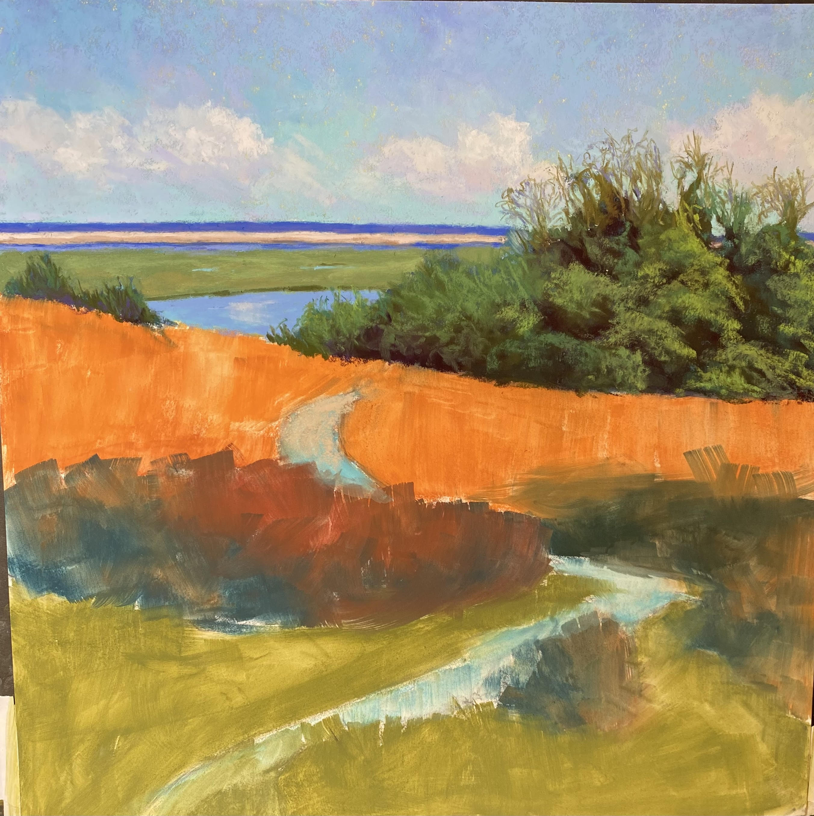
Trees painted

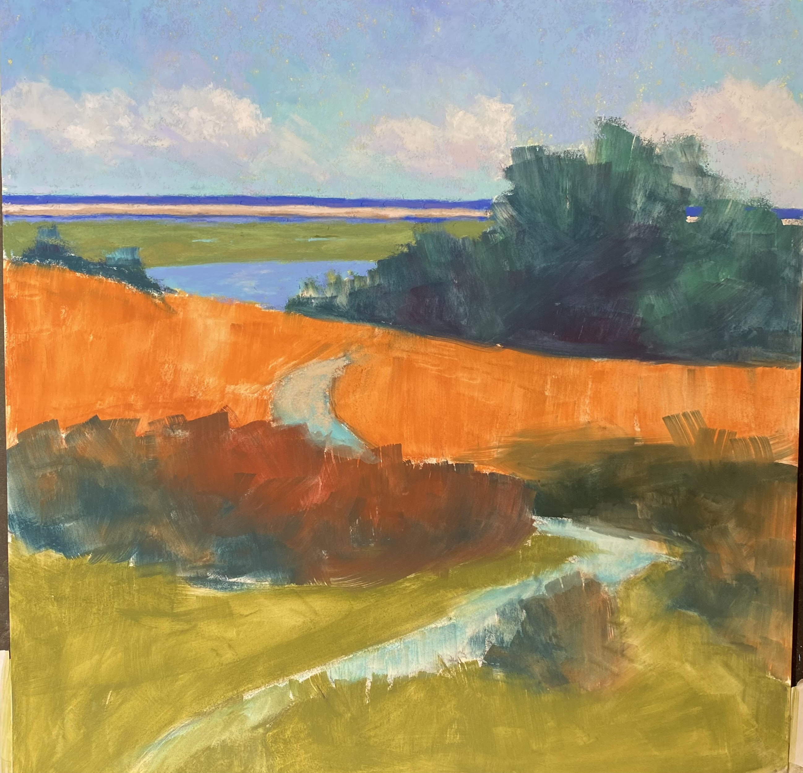
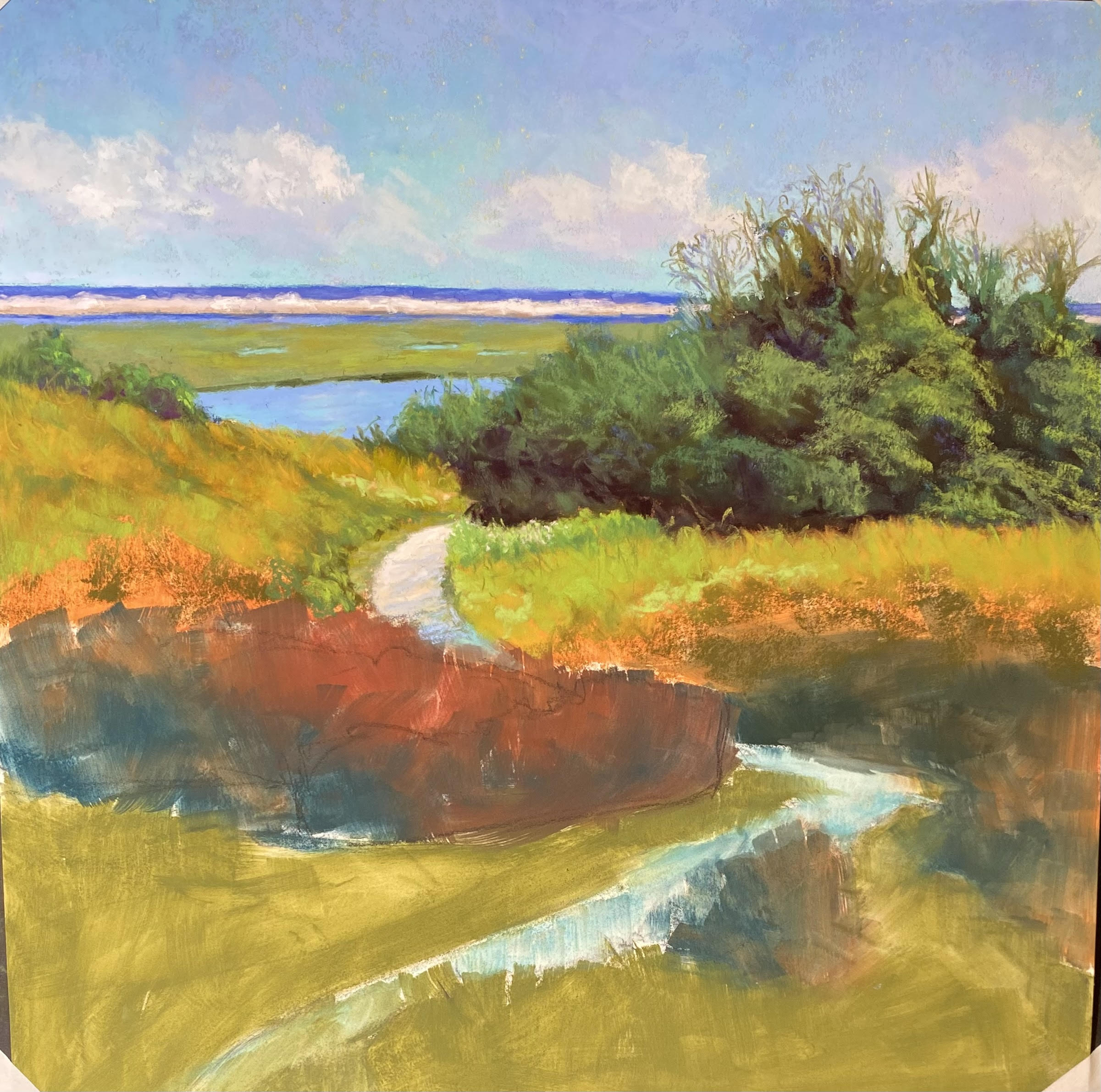
Marsh revised, midground started

Foreground added but not done

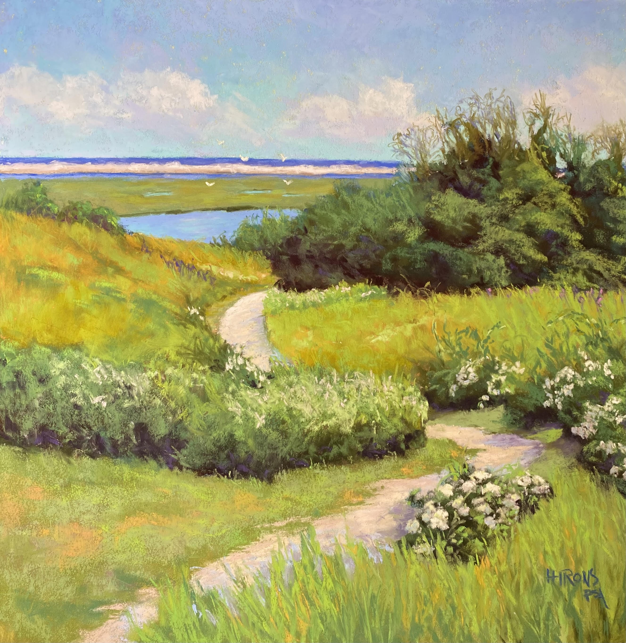
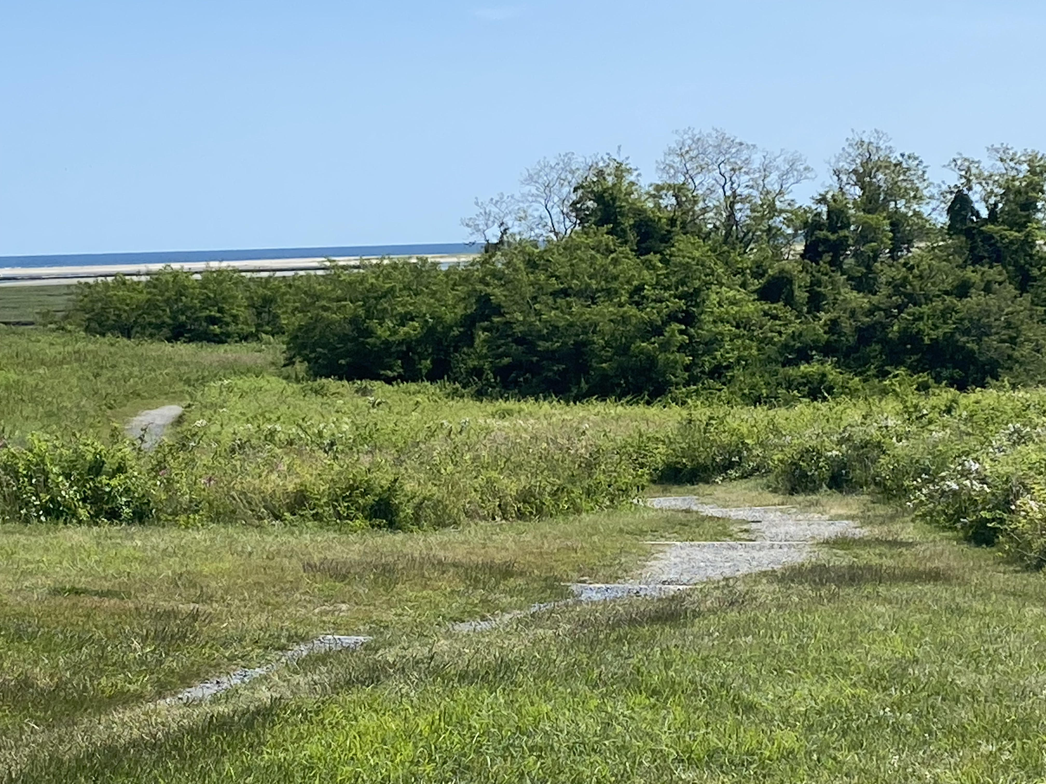
Reference Photo
I have been having such a great summer painting! To date, I have done 10 paintings and I learn more with each one. I’m working more and more slowly and carefully and trying to react to the painting and not the photograph. I haven’t done blogs on all of them, but I’ll include some at the end of this entry.
This is the second painting from Nauset Marsh on Cape Cod. It’s the Fort Hill area and is one of my favorite places in the world. I was so fortunate to have a beautiful day when we were there! It rained a lot of the rest of the time. I’ve included the photo so you can see what I was working from, and how different the painting is!
I began with a sketch for a square and immediately knew I wanted to see more of the water and marsh. It’s the path that makes this image worth working from and it’s not the first time I’ve done it. As you can see, I made a number of major changes, some as I went along to meet the needs of the painting.
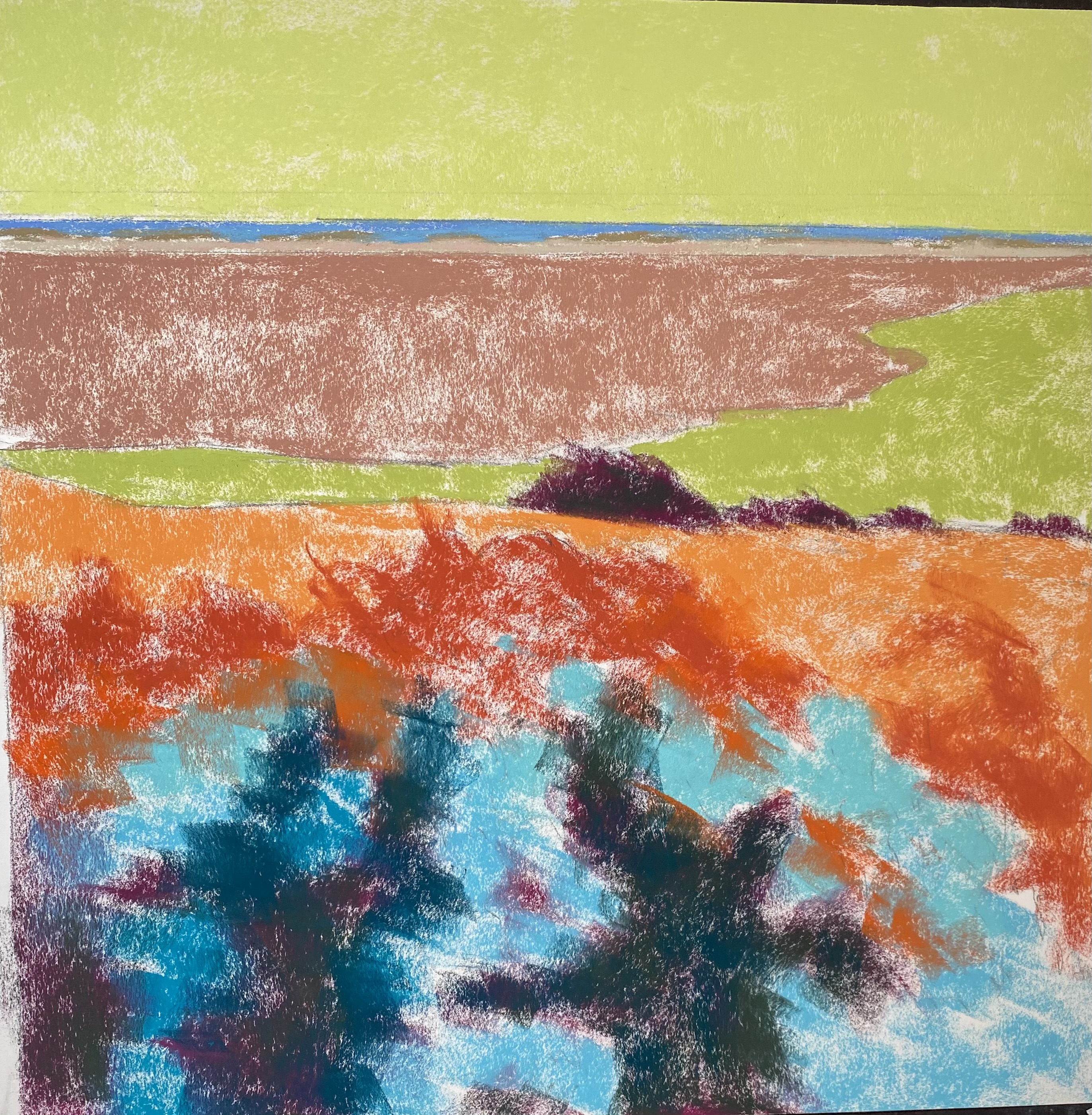
I decided to do an underpainting, after working on toned surfaces for the past month or so. I was afraid that the hard pastel underpainting would fill up too much tooth. But after working on the Pastel Premiere medium grit white, I can honestly say that the Lux Archival has enough tooth to deal with an underpainting. It’s a matter of using a light touch.
One of the first decisions was that the sky was too boring and I wanted clouds–lovely, sunny day clouds whose bottoms disappear into the sky. I added the distant ocean, sand bank, and marsh. In the photo, it’s a lot of little lines that are hard to decipher.
I next worked on the trees to the right. My intention had been to make them into leafy oaky-maple-type trees, but I realized that that’s not what’s there. So I followed the photo more carefully here. At first I had a solid line of field in front of them, but when I began working on the field, I started seeing more of the planes in the trees and brought some of them foreword, which I like much better.
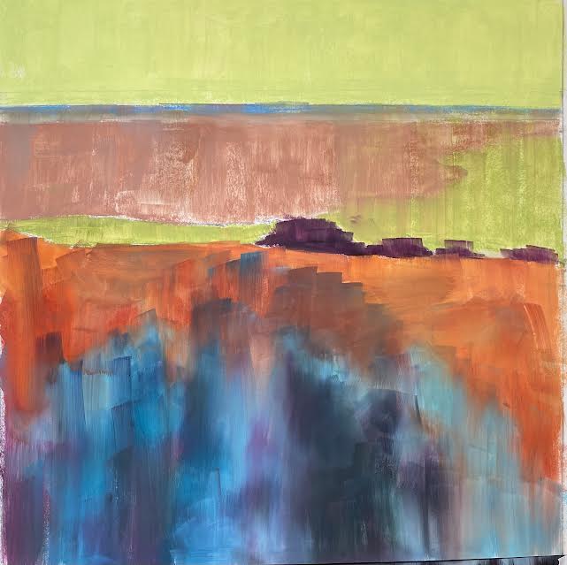
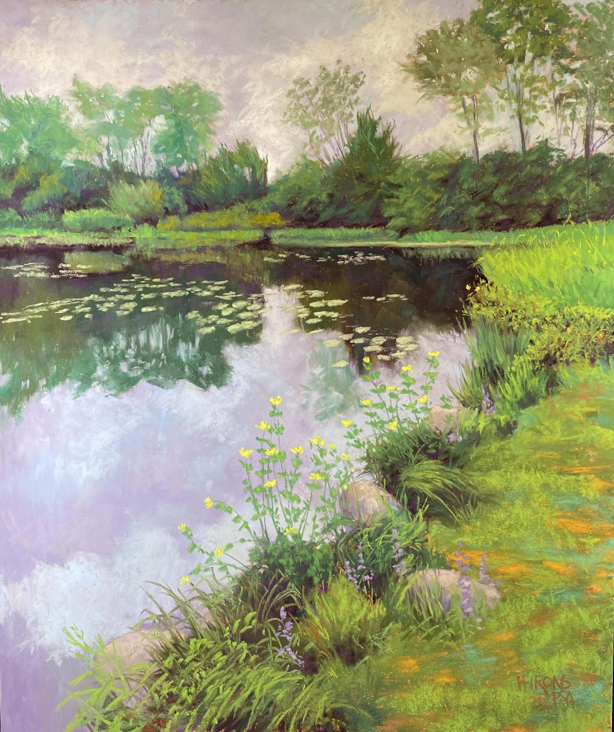
I came back a second day wanting to soften the background water/marsh, etc. I decided to add a hint of waves and raise the level of the light color in places and softened the dark blue of the distant ocean. I liked this a lot better.
I began the mid ground with some yellow oranges and greens, mainly Giraults. At one point I added purple lupines on the right and decided they were too much. I lightly brushed them out, added greens over, but had little pieces of purple left, which I really liked. I eventually added a bit more and some lighter pinky purple highlights. You have to look carefully to see them. I also added purples on the back left of the field where the path disappears.
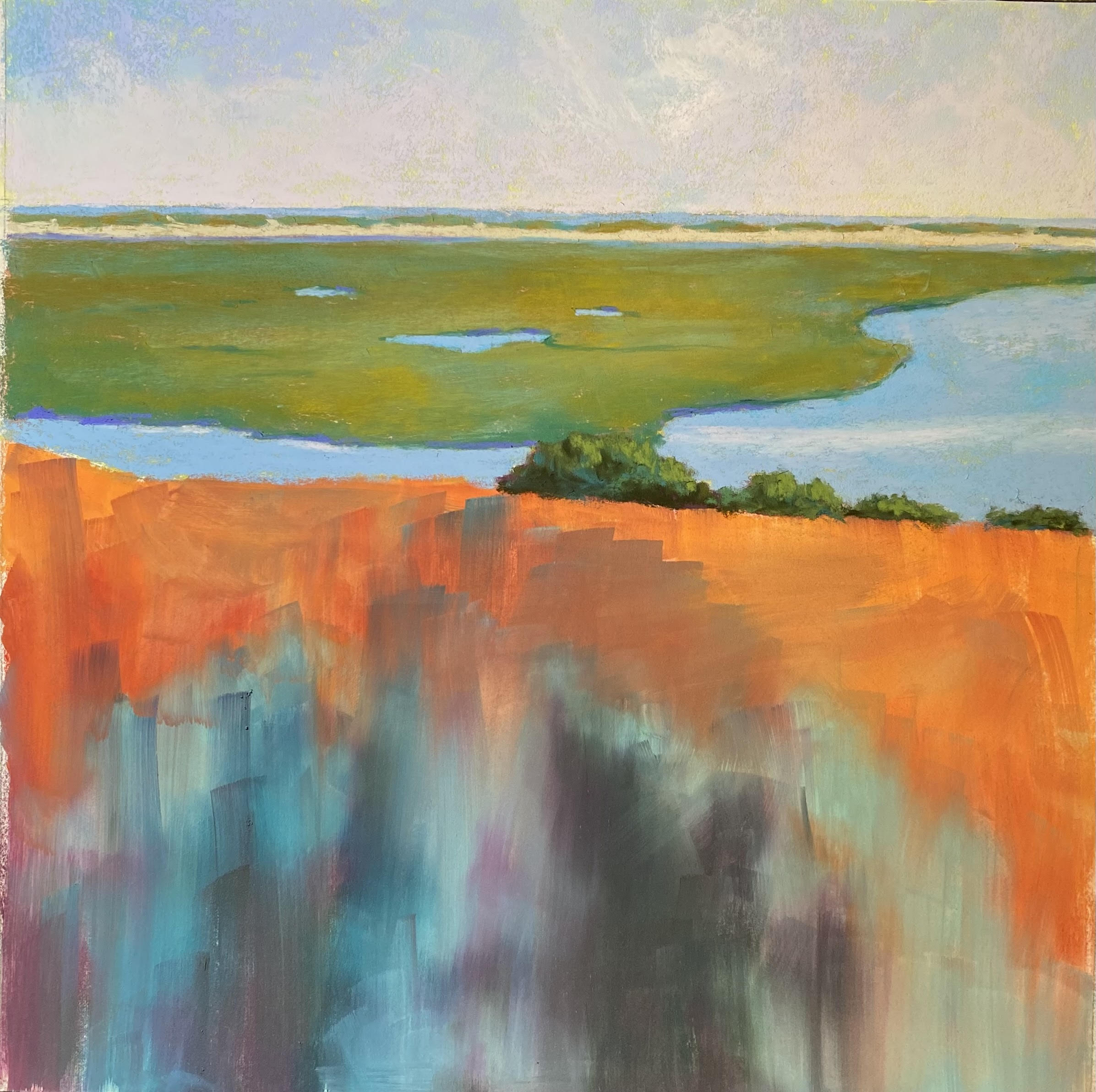
The foreground was more of a problem as it consisted of a large expanse of mowed grass. And the path is a series of steps broadly separated. I didn’t really want this. So I added another wild rose bush and tall grasses at bottom right, which help cover the path. The large bushes on left foreground were a challege. I started with the roses on the left side (as in the photo) and realized they were too much of a distraction. So I created something more general, with a hint of pink flowers at top (which are also on the small area of bushes to the lower left of the trees).
I worked more on the path, breaking it up, adding more lights and shadows. For the wild rose bushes, I began all of the flowers with one pinkish Blue Earth. To finish, I added blues and pinks to those in shadow (light is coming from the right) and light Ludwig yellow to those in full sun, primarily the bush in front, which isn’t in the photo.
And finally, I added the seagulls! I’m happy with this painting and the flow that it creates. It has the feel of how I think of Nauset Marsh, much more than the boring photo!
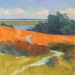
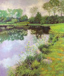
Here are the three paintings I did since my last blog post. As you can see, I’m really getting into detail and loving it! I hope to do two more 18 x 18 Nauset Marsh paintings before we leave for three weeks in Sept. When we come back it will be fall and I won’t want to paint these summer paintings. Enjoy the rest of the summer.

Woodland Pond, #2, 24″ x 20″, Pastel Premiere, medium grit, white

Sepowet Marsh, #2 24 x 20, Pastel Premiere medium grit white
Woodland Pond, #1, 24″ x 20″ Pastel Premiere Medium Grit white

 I wanted you all to know that my book, Finding Your Style in Pastel, is now in the process of being republished and it is available on Amazon in both paper and hard cover for a lot less!!! The prices are: hardback: $33.99 and paperback: $23.99. I am working with Ewings Publishing, which is going to do a marketing campaign which they hope will lead to finding a permanent publisher. MANY companies have wanted me to do this over the years and I’ve fought them off! I was so afraid of the picture quality. But I have copies of the books and, aside from the cover not being quite as bright, they look great.