Sepowet Marsh #1

Sepowet Marsh #1, 18″ x 18″, Lux Archival

Clouds completed

Begining greens and field

I completed another painting today.  It’s hot and this is all I really want to do (along with playing the piano).  And I really want to capture these paintings soon after being there and before other trips and changes of season make them less appealing.  And besides–i”m having a really good time!

This is based on two of the many cloud pictures I took at Sepowet Marsh in Tiverton, RI on the first Sunday of our trip.  The rain cleared out leaving sunny skies and wonderful clouds.  I expect to do one or two more.  The best thing about rain is that when it clears up the clouds are fanstastic!

I did this painting on Lux Archival and it was a joy to do, particularly compared with the last one!  It’s almost all Blue Earth and Girault, like the others, with a few Ludwigs in the sky.  I started using primarily violets in the clouds and it looked two one-dimensional.  I added greens and blues to them and it was so much better.

The greenery was painted in a way similar to the Bantam River picture and it worked nicely. I put a lot of Blue Earth violet into it and a small pieces of Eggplant.

For the grasses, I began with a magenta, then an orange, then a lighter orange and pink.  The photo looks too orange.  The painting has more of the violety magenta which ties it to the violets in the clouds.

The foreground came from a different photo.  I felt it needed something more and I’m happy with it.  I’m not sure it’s completely done (the turquoise piece in the sky at left is bothering me!)  But it’s close.


Purple Flag

Purple Flag, 20′ x 16″, Pastel Premiere white

Top done

Laying in left side with soft pastel

Darkened bottom; right side was daunting!

Painted in but not done

I completed a second painting from Litchfield, CT today.  I decided that a vertical 16 x 20 would be best and I had some mounted Pastel Premiere white medium grit in that size.  It’s the same paper I just worked on, only the other was not mounted.  What a difference–it was awful!!!  I toned it orange and that was a mistake.  It didn’t take the pastel the same way at all.  So it was really a struggle.  As you can see from the hard pastel that I applied, it left pock marks in between. It didn’t go on smoothly at all like it did in the last painting.

But I loved the composition and knew I wanted to do it from the minute I took the picture.  The pattern of the water leading tothe background really excited me.  Doing complex grasses like this when they are all green, however, means having to find or create patterns in them.   I did that with the lighter yellow greens.  I used a combination of rounded strokes for “rounded” bushes and vertical strokes for grasses.  Fortunately, you can make up a certain amount of it!

For the top, I used a grayed violet for the sky and various Girault and Blue Earth violets for the clouds.  I wanted it to look like the overcast, rainy day that it was.  I used a combination of greens and violets in the distant trees and liked the effect, so I continued it below, using pieces of various violets in the shadowed areas of the grasses.  The first four pictures were done using the photo.  Today when I went to finish it I didn’t look at the photo at all.  Instead, I decided to focus on what I thought was needed.  I added some lighter color to the area of water around the grass reflections and that made a huge difference.  I removed the dark shadows in the water from the lower left side as they didn’t read well.  And I worked at getting a pattern of yellow greens going to give structure to the painting.

I knew I wanted to add the lovely purple flag iris, that I found in other areas.  It’s barely visible but you can see it on the right side by the water.  I also could not resist adding in a little red winged blackbird to the grass in upper right. They were all over there, so I really didn’t need to make him up!

I’m really happy with this painting now, but I wasn’t happy with the experience of painting it!  I’m going back to the unmounted paper in 20×24, and I have one sheet of Lux Archival left for an 18 x 18.

On another note, I’m in the process of having my book republished!  It’s going to be available in soft and hard cover and I’m hoping that a publisher will pick it up.  I’ve had so many complements on it over the years.  So I finally decided to do it.  I hope it works!!! I’ll let you know.

Bantam River

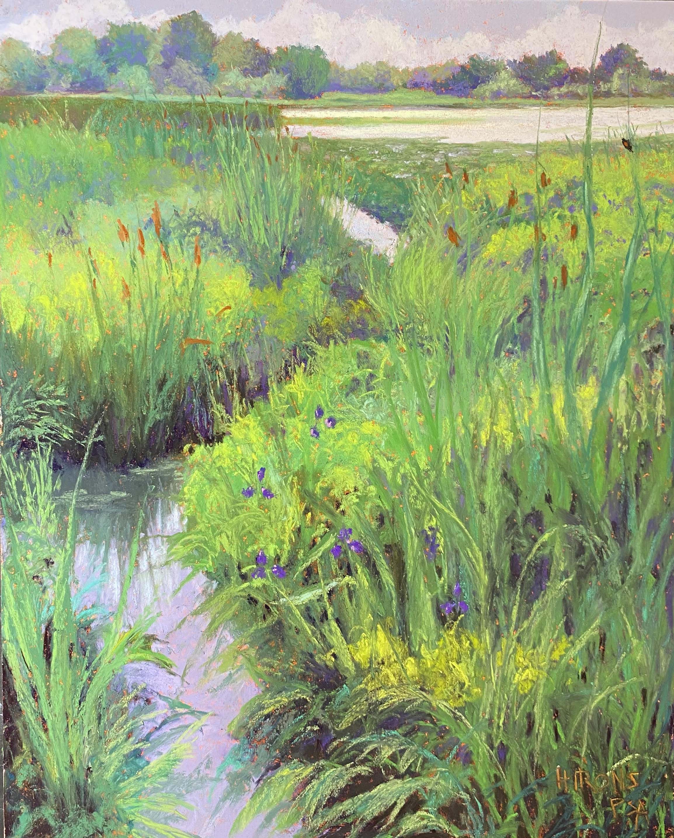
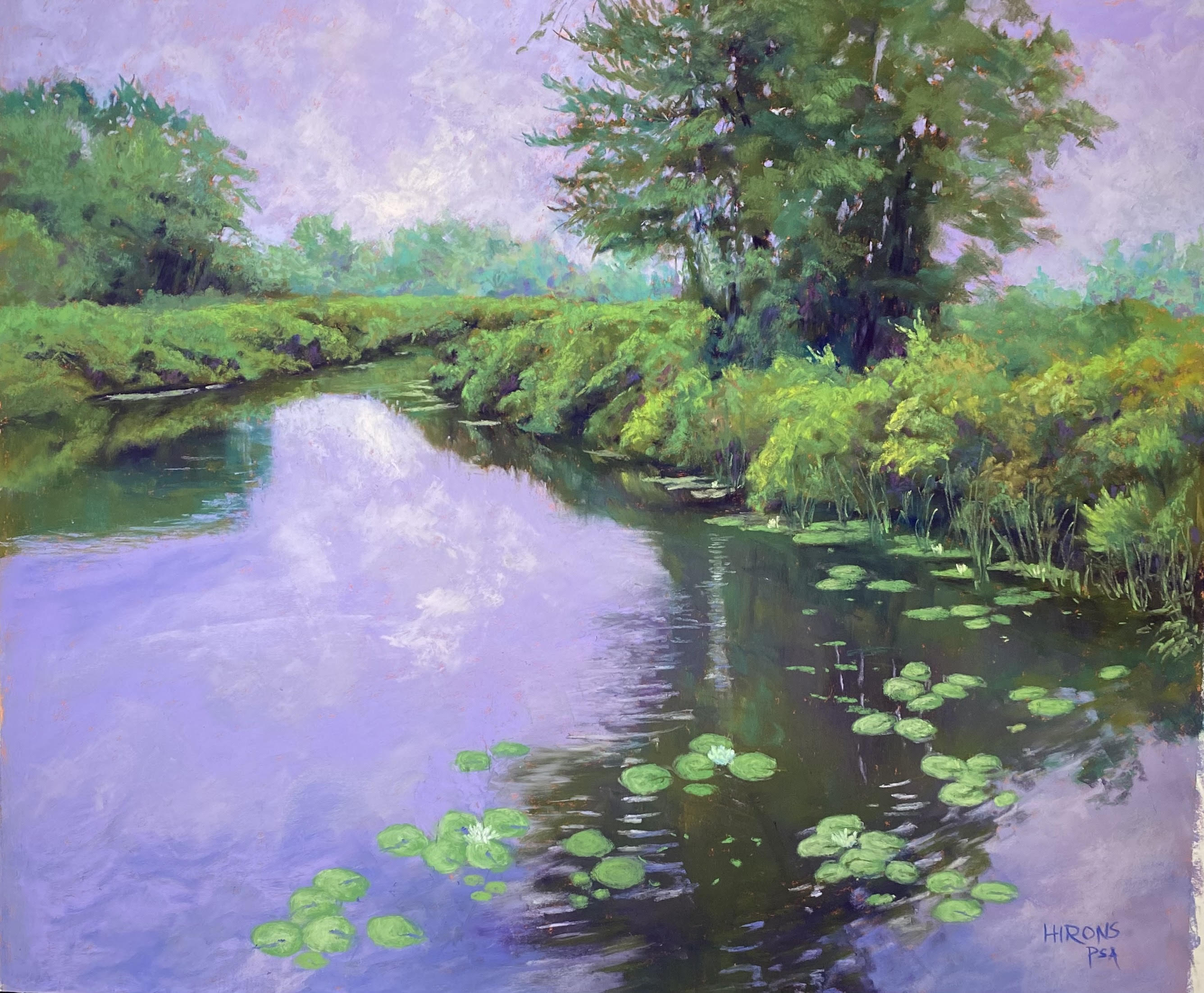
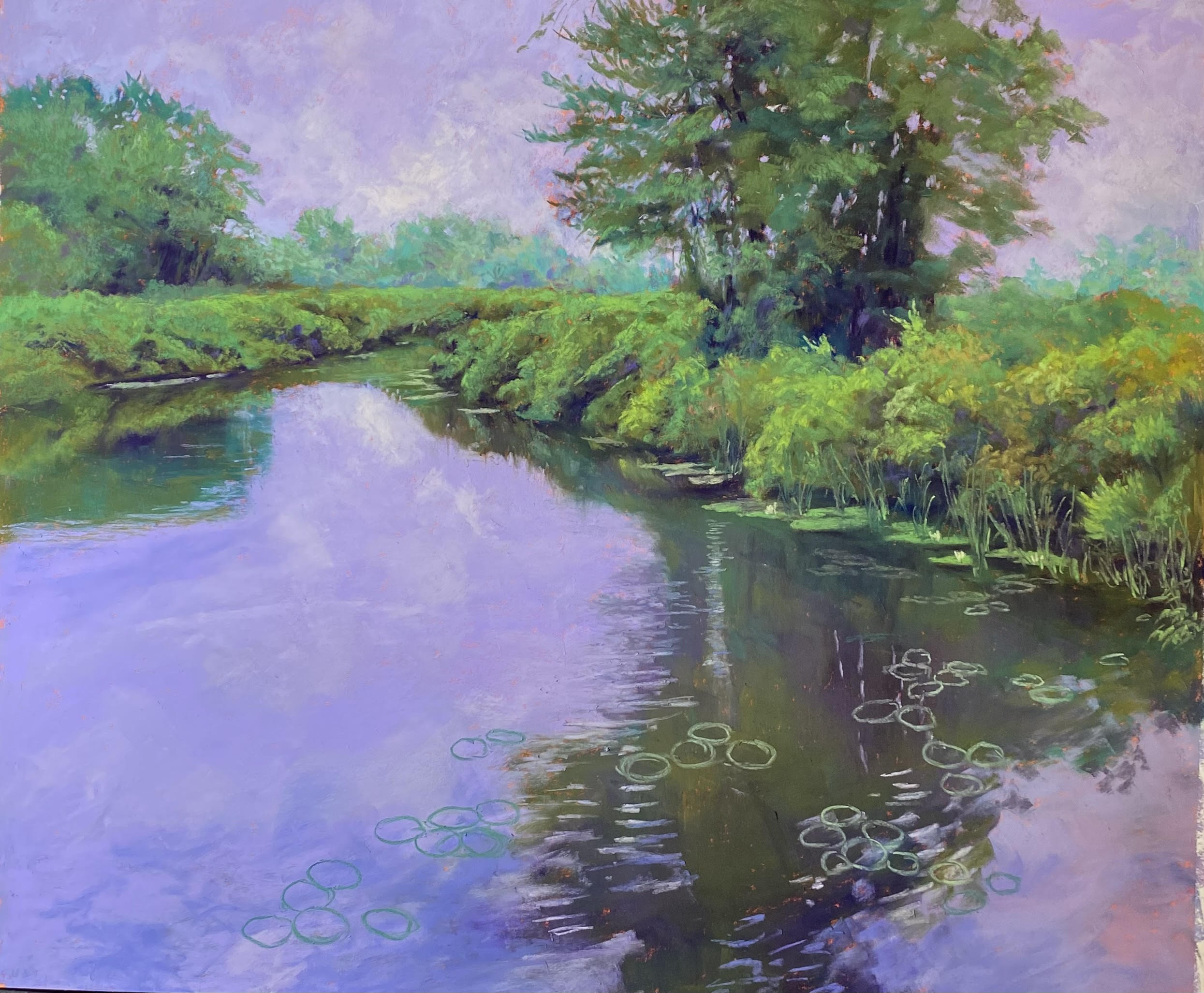
Bantam River,, 20″ x 24″, Pastel Premiere med. grit white

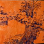
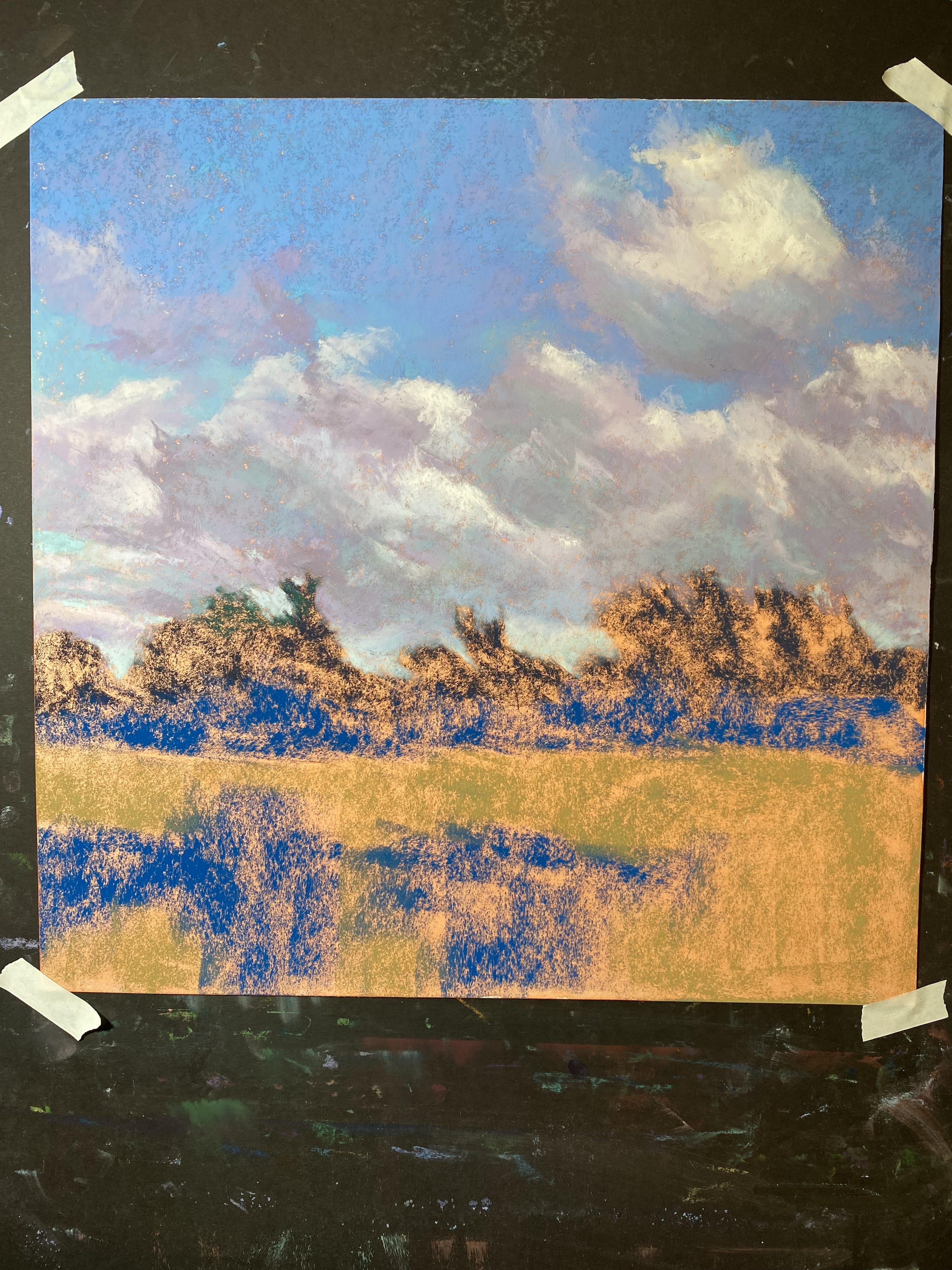
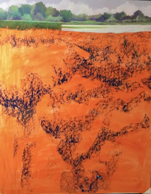
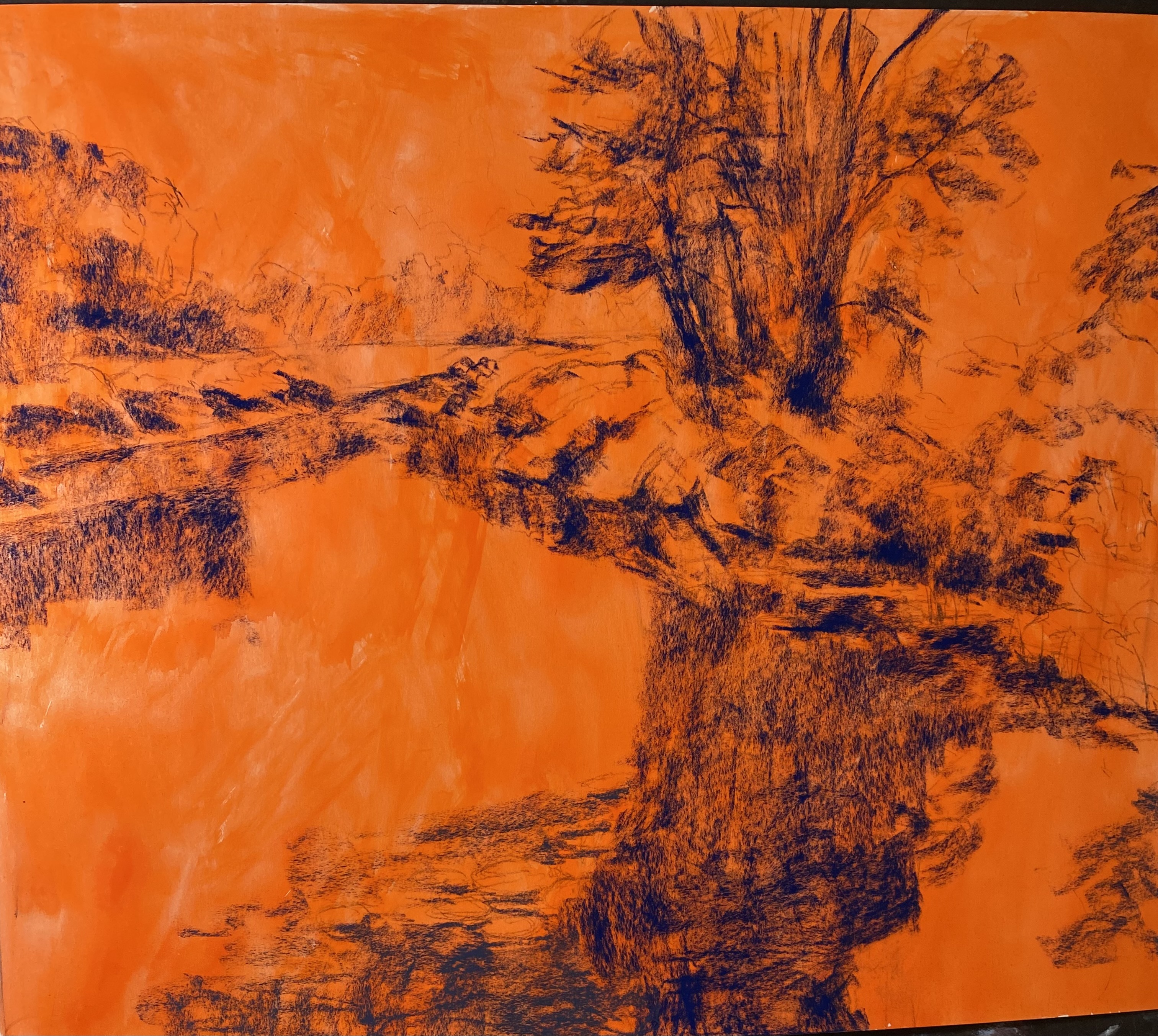
Compositional lay -in with dark blue NuPastel

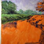
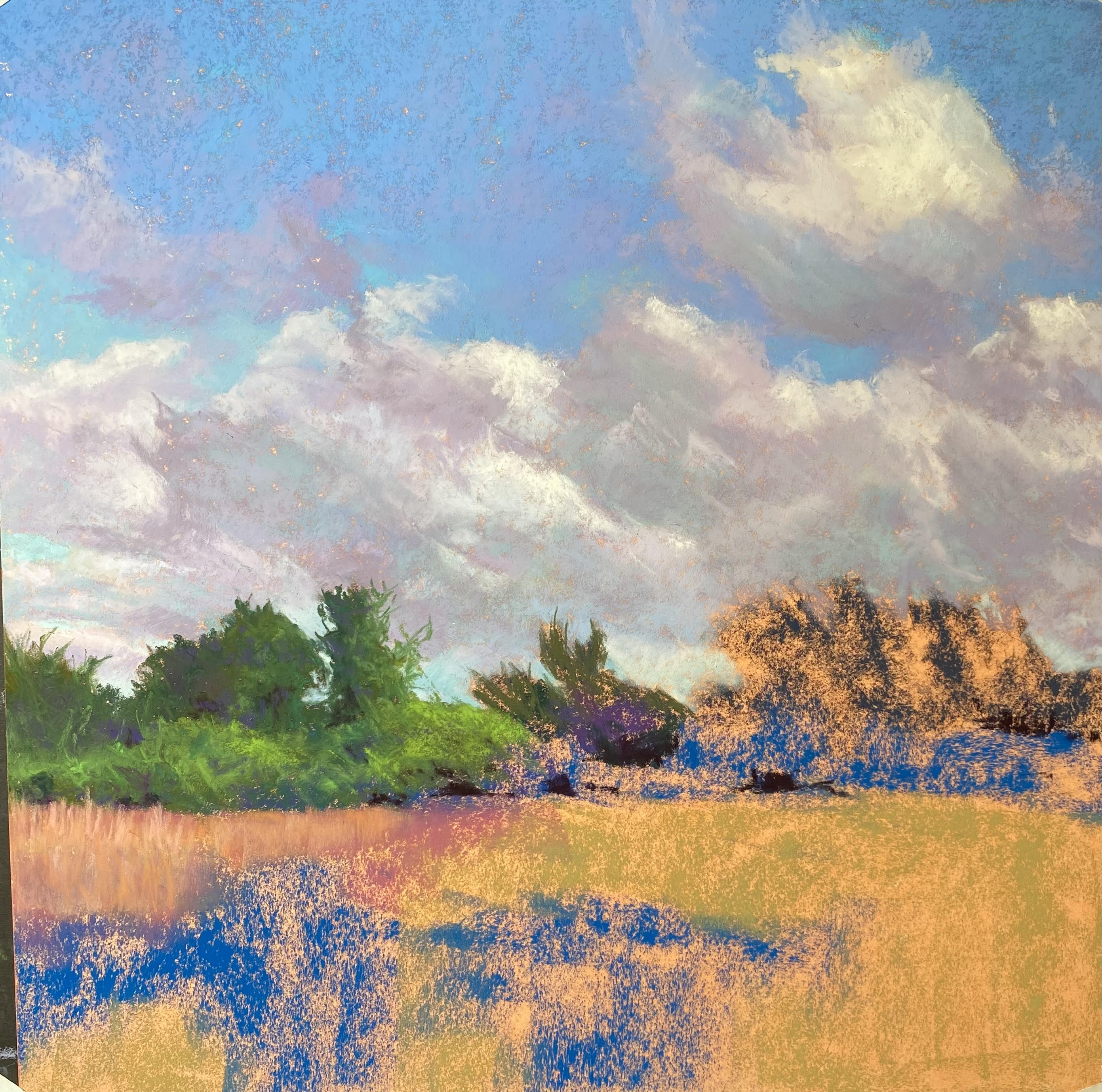
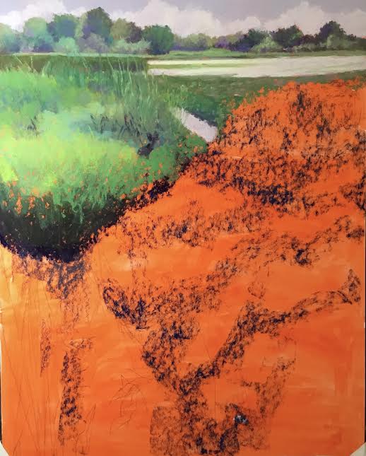
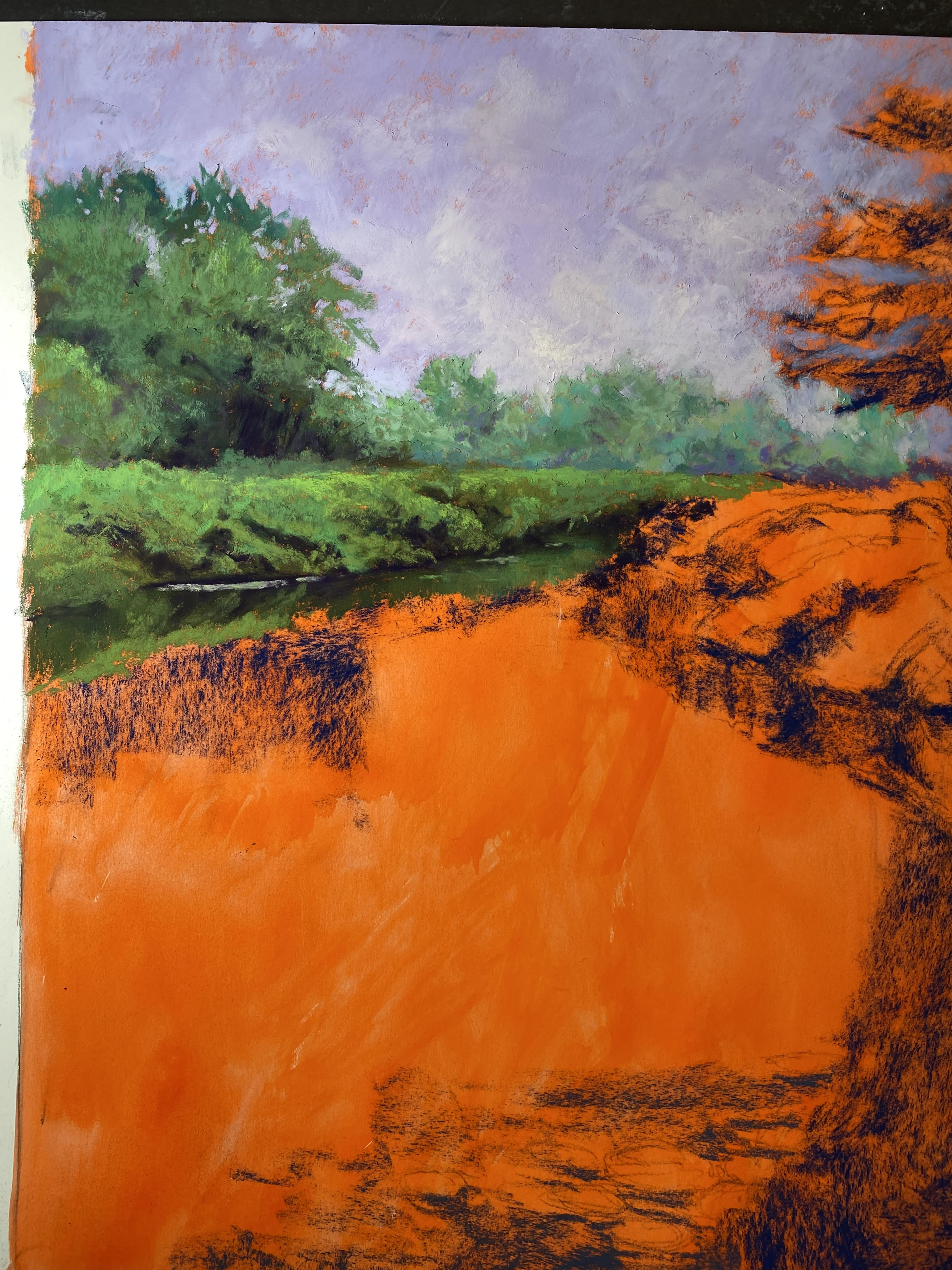
Background trees, sky, and left side

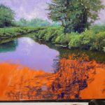
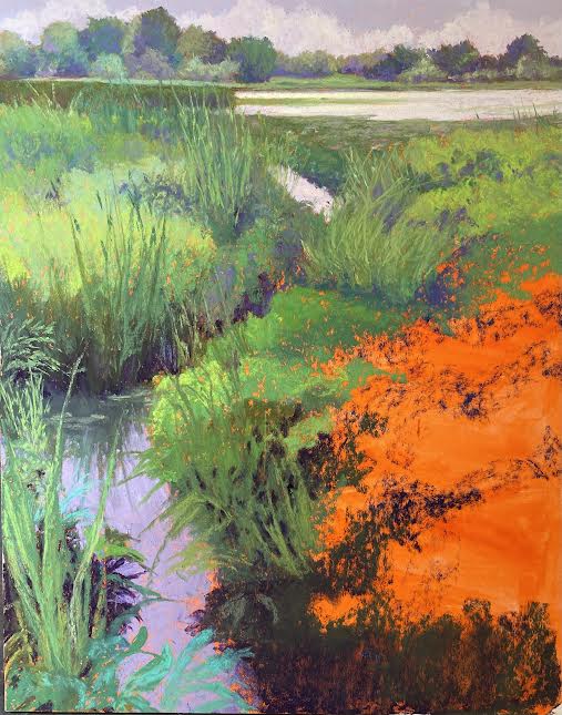
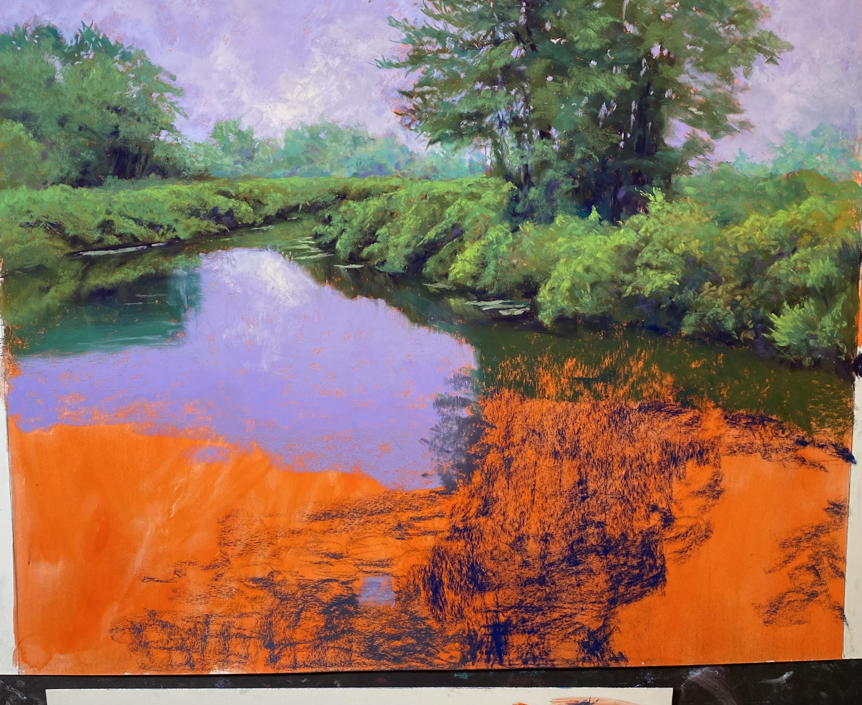
Right bushes and tree done

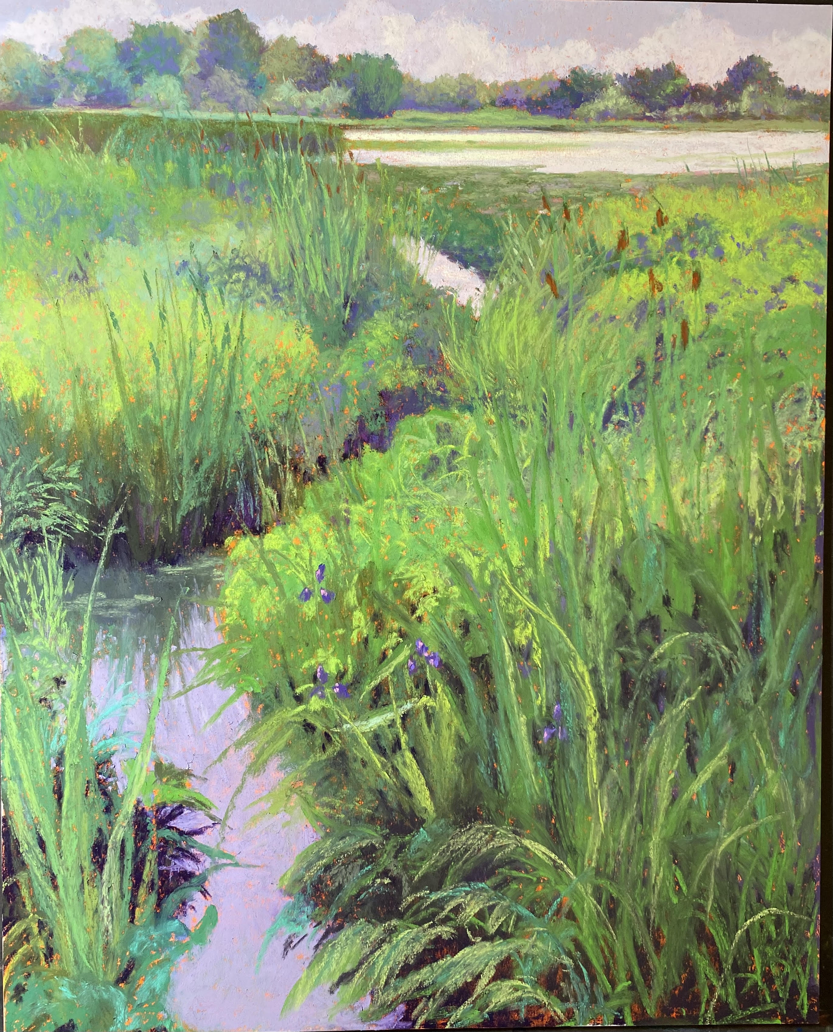
Water lillies drawn in

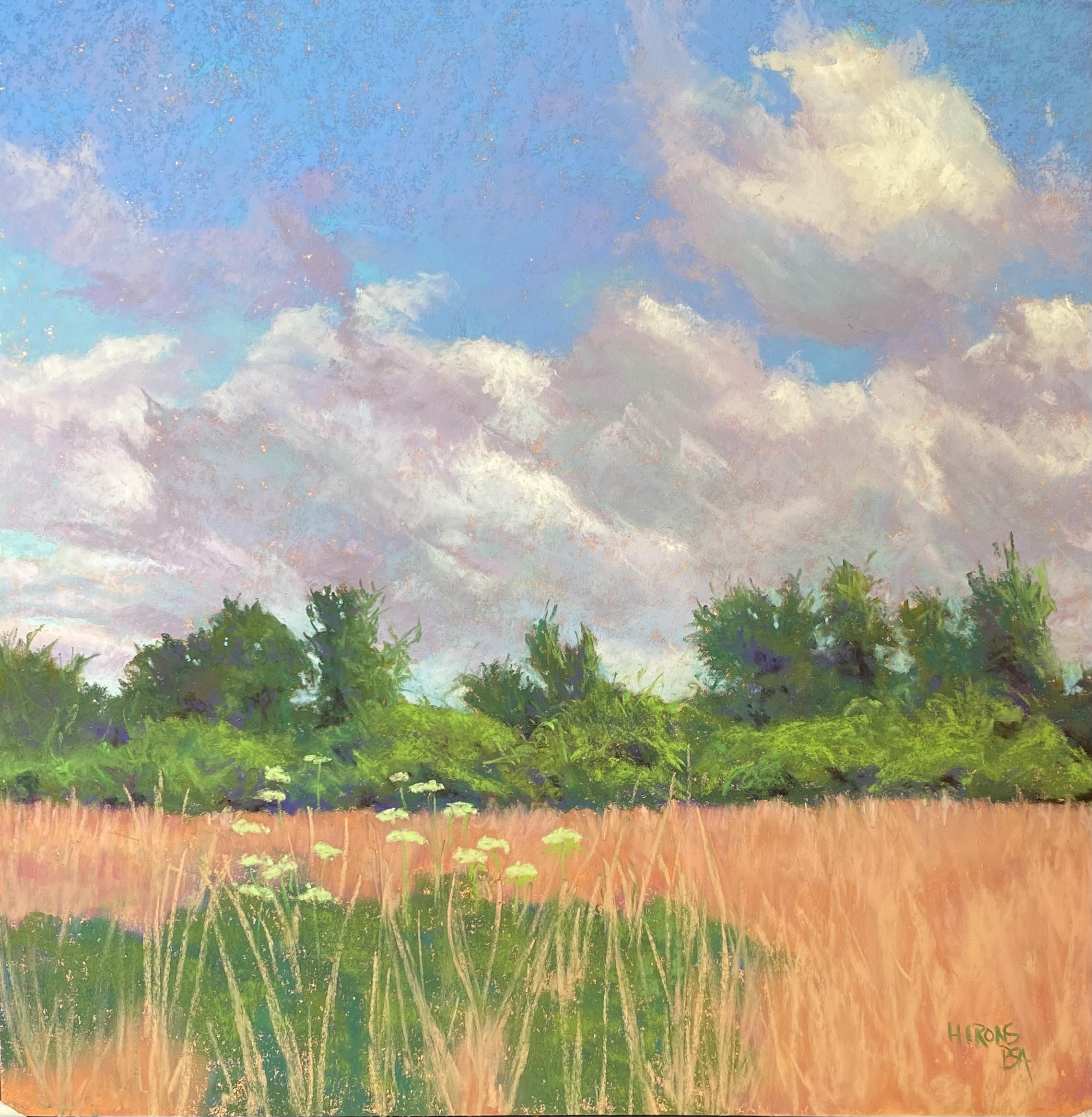
I haven’t posted in awhile.  I went to New England at the end of June and got a lot of wonderful shots of marshes and wetlands, both on sunny days and rainy.  I’ve complete 4 paintings, but the most recent has been a game changer for me!  I’m back to working on 20 x 24, my favorite size. And instead of working quickly on rough surfaces without the benefit of photos, I’ve done the exact opposite.  I’m working on Pastel Premier white medium grit (which doesn’t have as much grit as I thought).  But I decided to work very slowly and more thoughtfully, with the help of a photo and some compositional changes.  And I love what I’m doing!

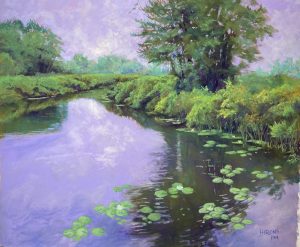
I thought I’d show you some of the progression of pictures that I took.  I really loved the photo, for the most part, except for the large area of water on the left side.  I was trying to figure out how to make it more interesting and realized that I could extend the water lillies over the the left, to help lead the eye into the picture and up into the bushes and tree.  When I did the initial lay-in with hard pastel, I indicated some of this.

I started with the background trees, rather than the sky.  I wanted to do this to try to get the values right.  I used soft pastels in cool greens and a medium value violet.  Then I put in the sky with a Girault violet.  I loved the way it went on so smoothly and flat.  I used my soft Blue Earth pastels for the clouds.  As a matter of fact, this painting is done almost exclusively with Blue Earth and Girault.  But there’s a lot of Ludwig Eggplant as well!  I was really worried about the lack of tooth in the paper, but it worked really nicely, as long as I began with the Giraults.

When I started working, I realized that I wanted to take my time with this painting and enjoy it.  For the greenery I started with the soft, then used dark warm and cool green Giraults to moosh it around.  This was really fun and very sensual!  I LOVED doing this and decided that this is how I want to keep working.

So I completed the left side, then moved to the right and the trees and then lay in the reflections of the trees.  Creating the dark reflections and light water ripples overlaying them was a challenge, but I used the Giraults for this.  Then I drew in the lillies so I’d know where I wanted them.  I added a few flowers but didn’t want to over do it with that.  It’s not about them.

The most exciting part was putting the light clouds into the sky and adding some of it to the water.  I added more as I went a long and tried not to over do it.  The very last thing I did was to add some dark red violet into the greens in small pieces and it looks really nice.

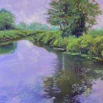
(Note that the photo doesn’t do this painting justice.  It’s not quite as deep violet as it appears.  Friends saw both the original and photo and agreed with me. But it’s the best I can do at the moment.)

This painting is of the Bantam River in Litchfield, CT, in the northwest corner of the state. It rained off and on the entire time we were there and we were very lucky that we got walks in without getting wet.  I think it had started to rain when I took this picture!

I’ve decided to work with the themes of marshes, wetlands, clouds, and water for some time.  This makes me happy and these places are SO beautiful, in sun and rain!

I realize that we are fortunate here in MD not to be having the extreme heat of the southwest or the floods of the north.  July and August are a good time to stay in an paint!  Expect to see more.